


Walk into almost any small restaurant, café, or wine bar and your eyes will do one thing before anything else: find the menu. Before you've spoken to anyone, before you've smelled the food, before you've decided whether you like the vibe, you've clocked the menu board.
And yet, for something every single customer looks at multiple times, it can be an underthought decision that a small restaurant owner makes.
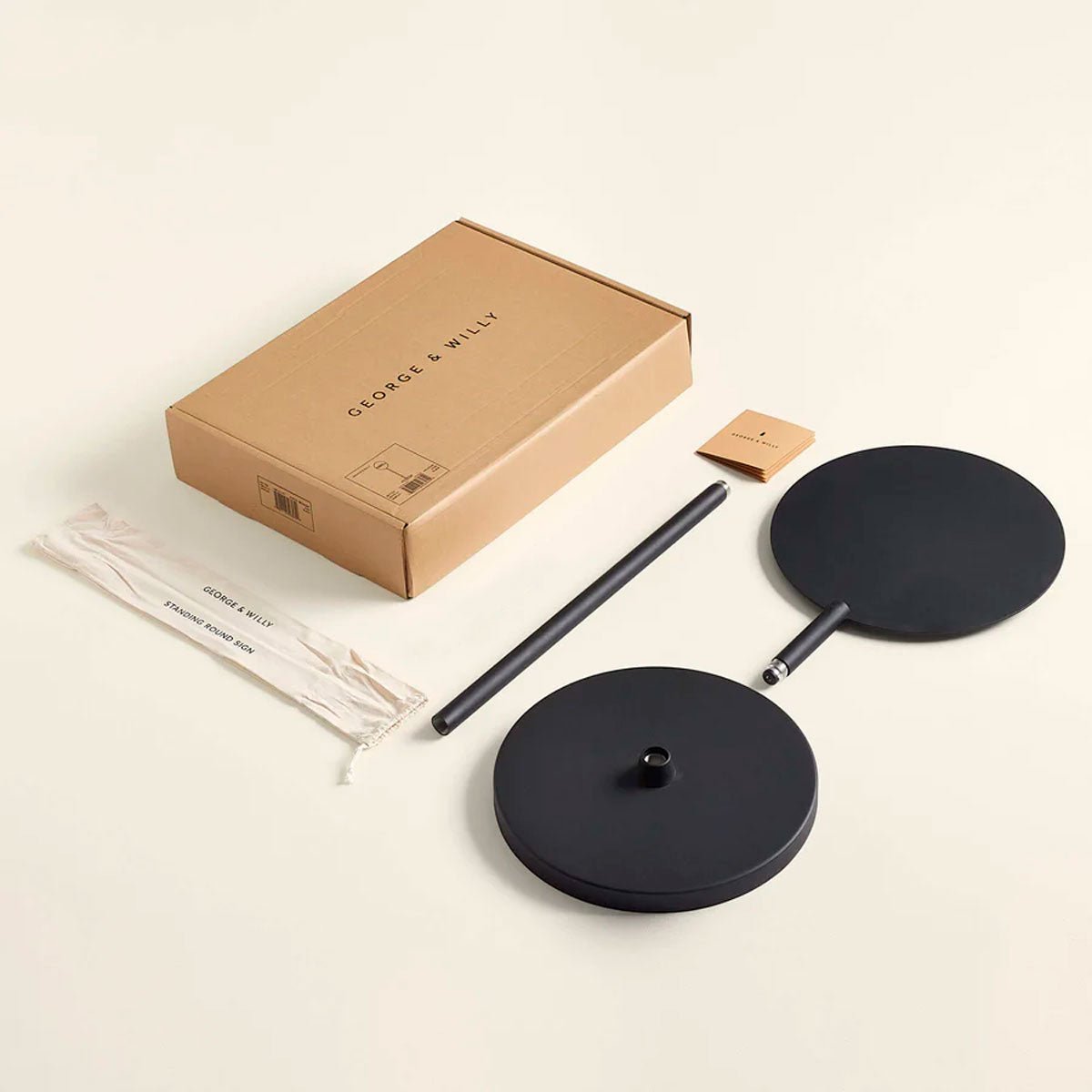
At George & Willy, we've helped hundreds of hospitality businesses choose and set up their menu displays. We see the before photos. We hear what went wrong with the last board. We field questions like "how many letters do I actually need?" and "will this be readable from across the room?" every single day. Here's everything we've learned.
The mistakes we see over and over again
Before getting into what works, here's what tends to go wrong.
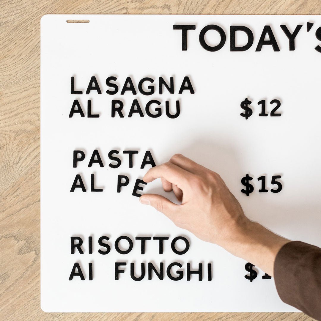
Choosing style over readability is a big one. A menu board can be beautiful and completely unreadable at the same time. Tiny letters, low contrast, cramming too many items onto one board. All of these look fine up close and fall apart the moment a customer stands at the counter trying to work out what a flat white costs.
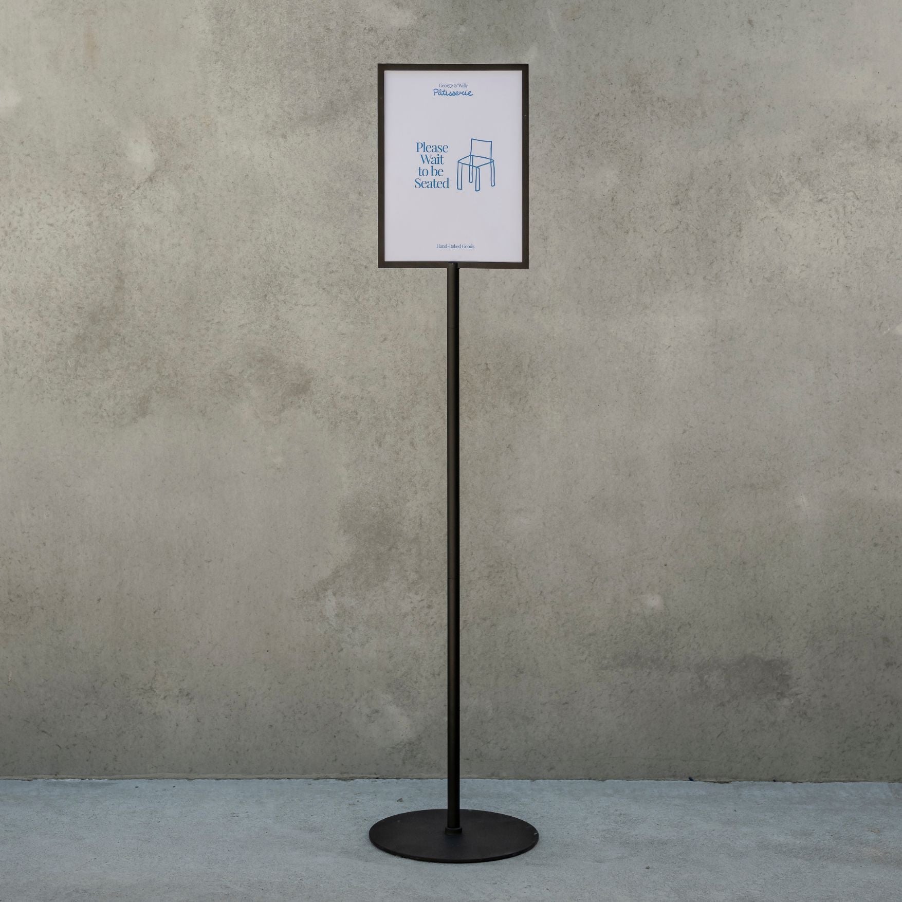
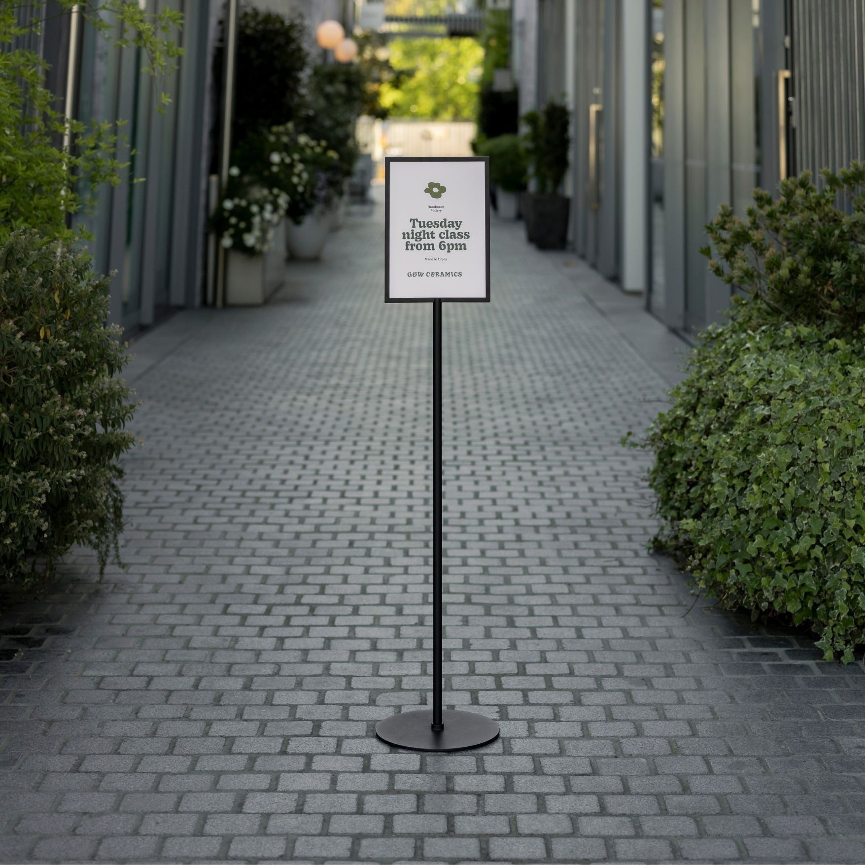
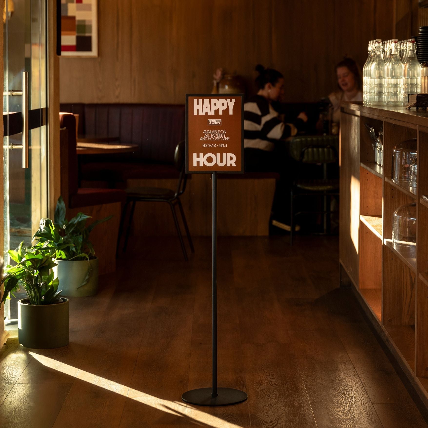
Not thinking about placement before buying is another. Where exactly is the board going? How far away will customers be standing when they read it? These questions need to be answered before you choose a board, not after it arrives. A board that looks generously sized in a product photo can feel tiny once it's mounted three metres from the counter.
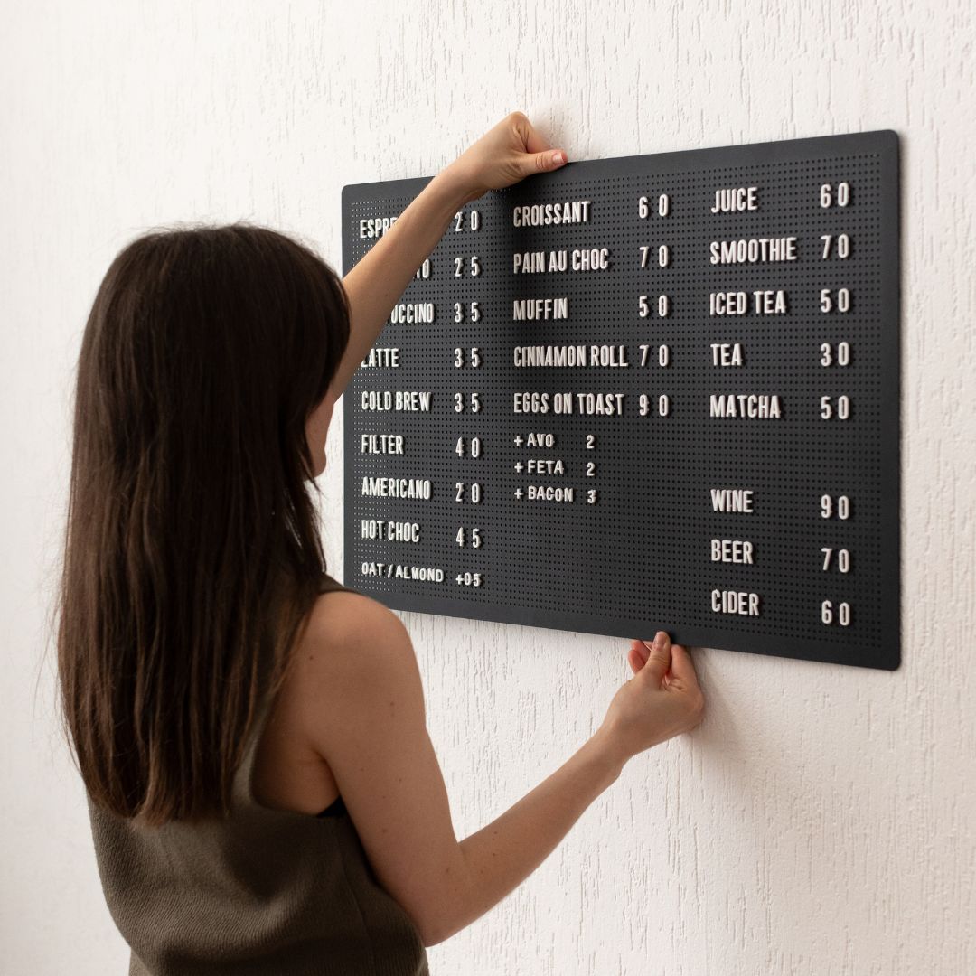
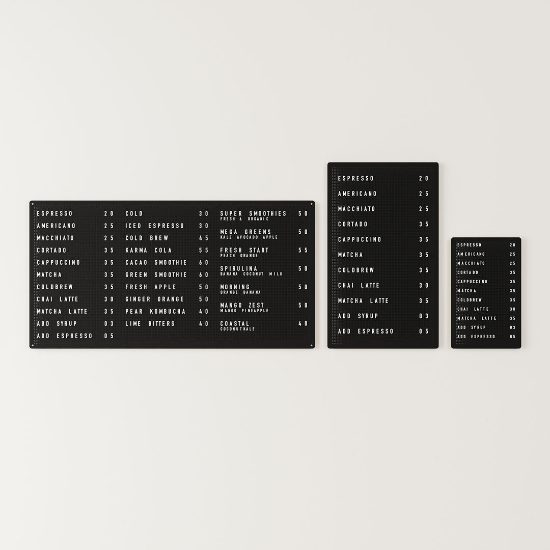
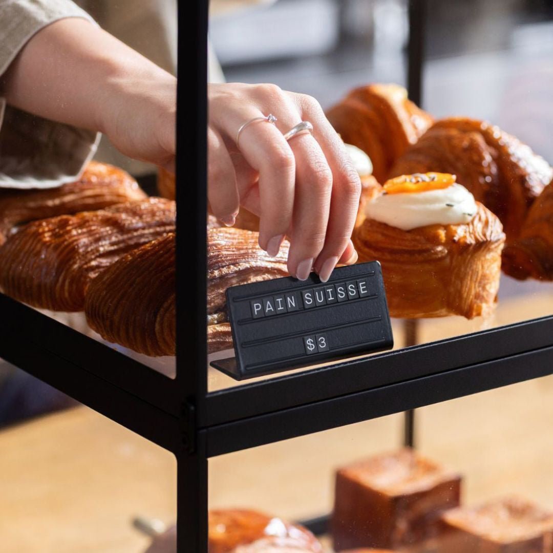
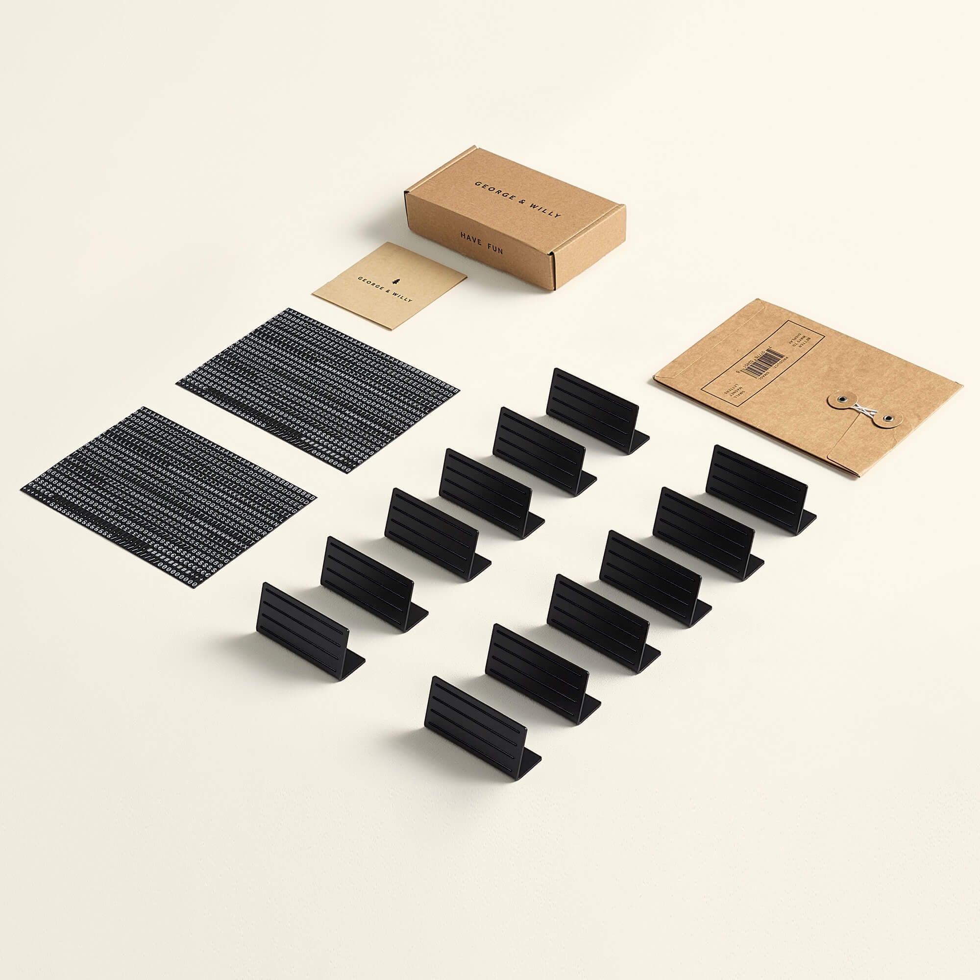
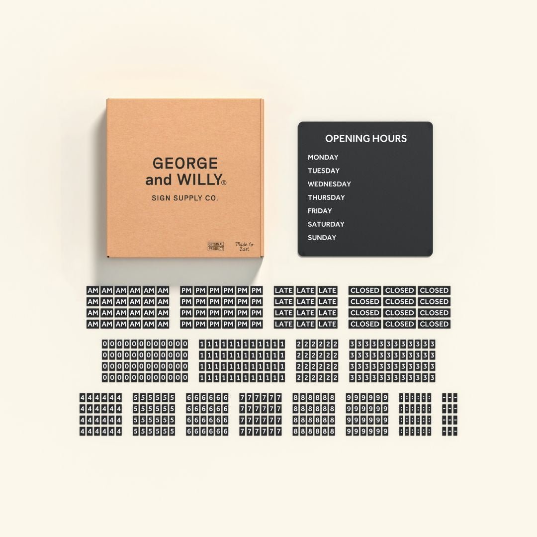
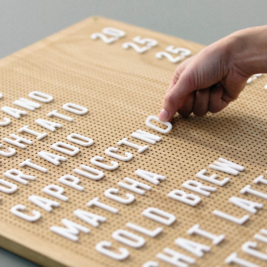
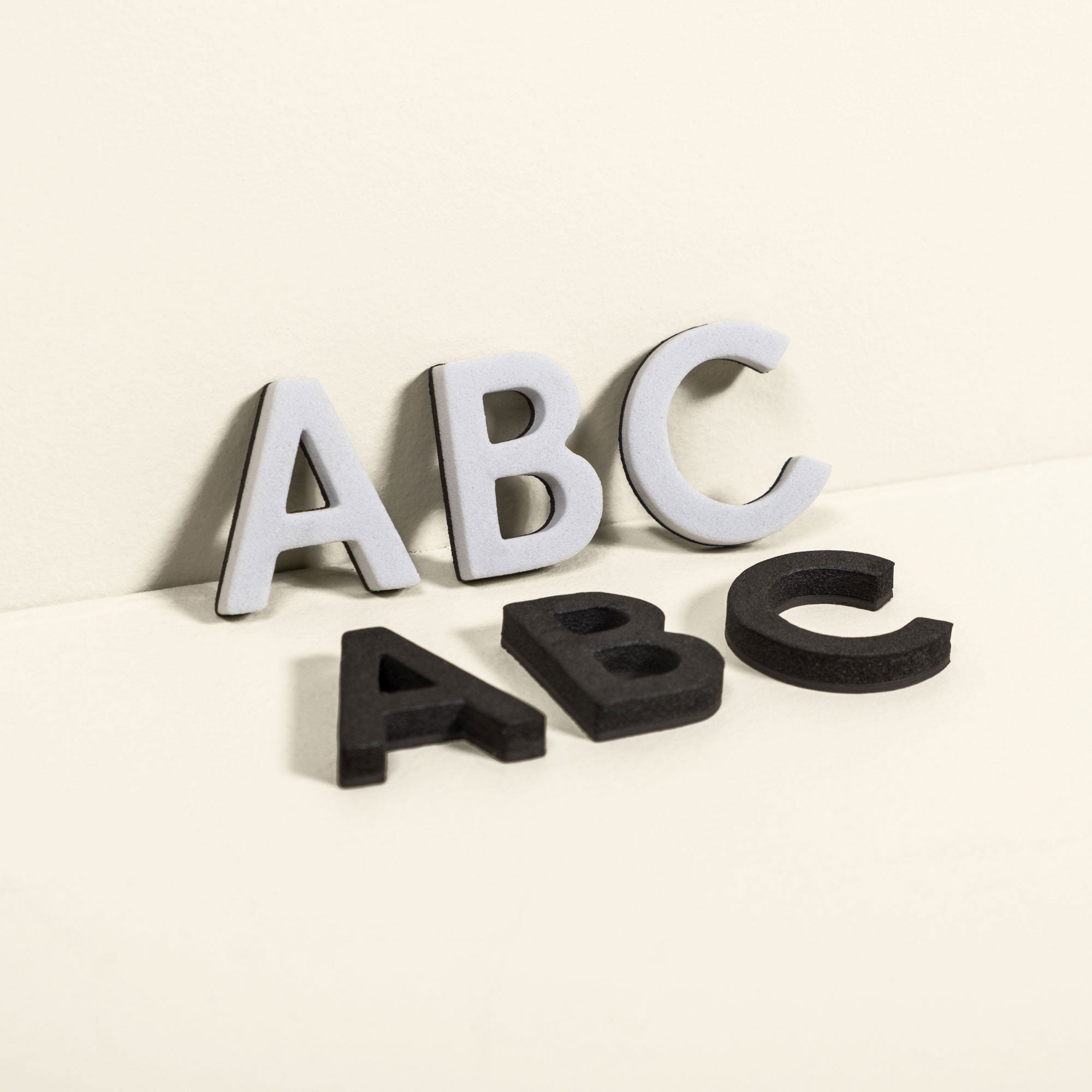
And underestimating how many items they want to display. This one catches people out more than almost anything else. You think you have a simple menu. Then you sit down and write it all out, titles, items, descriptions, prices, dietary notes, and suddenly you need three times the letters you thought. We try to supply generous letter sets with each board but it's worth doing a proper menu audit before you buy.
The stick-it-on-the-wall test
This is the single most practical piece of advice we give, and almost nobody does it.
Before you commit to a letter size, write your menu items on a piece of paper in roughly the size you're considering, stick it up on the wall where the board will actually go, and stand where a customer would stand. Can you read it? Can someone with average vision read it without squinting? Would you be comfortable if a queue of five people were trying to read it at once?
If the answer is no, you need bigger letters or a bigger board.
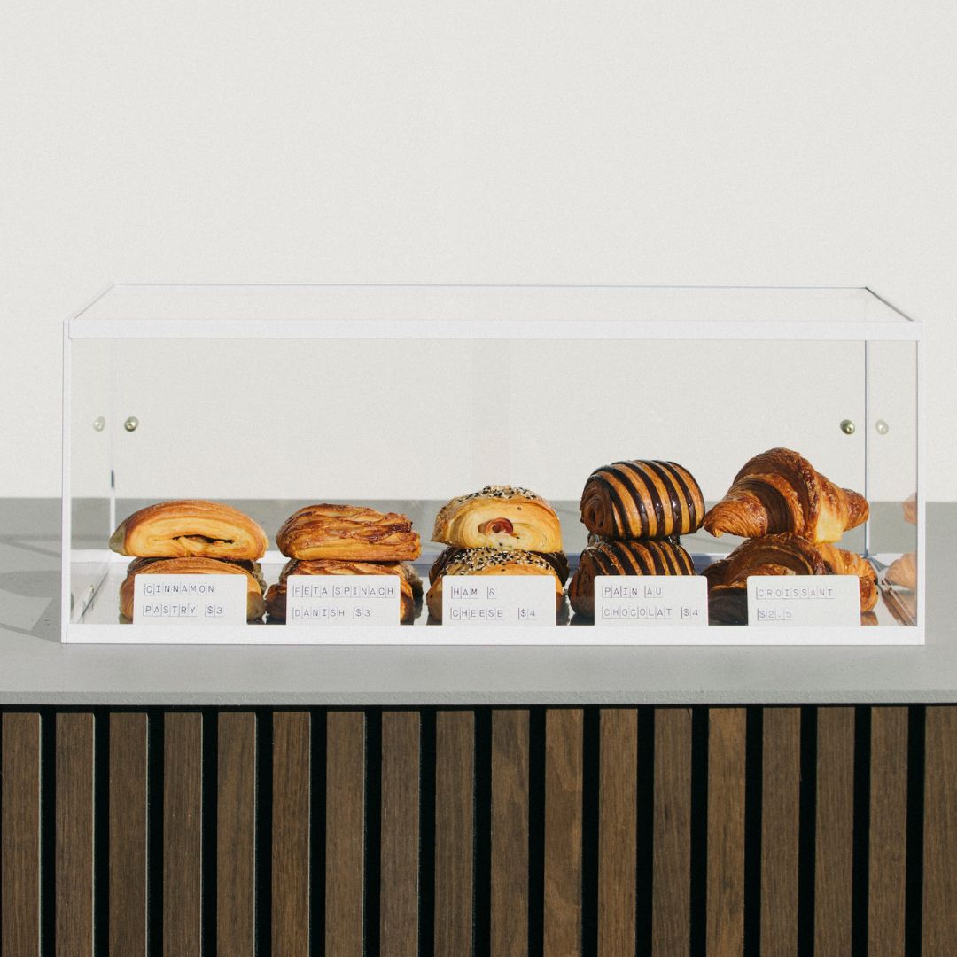
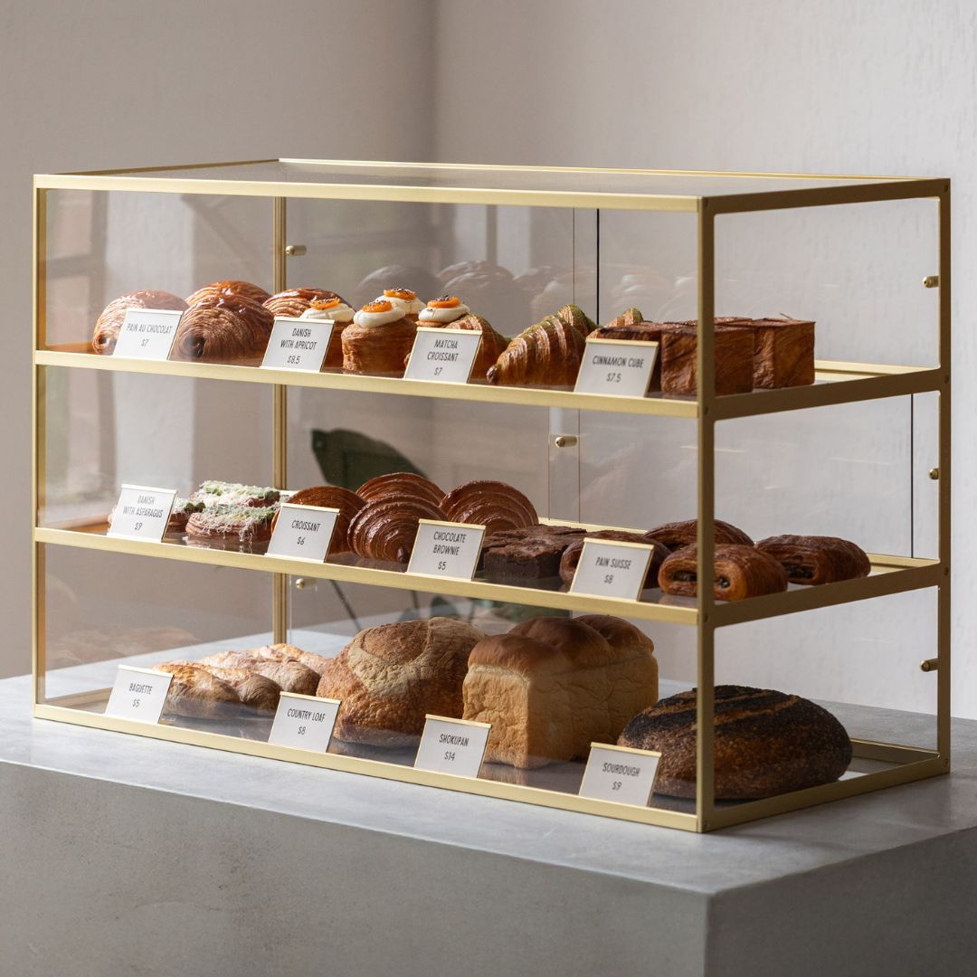
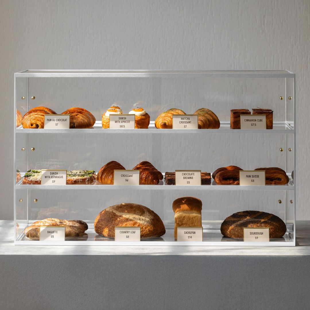
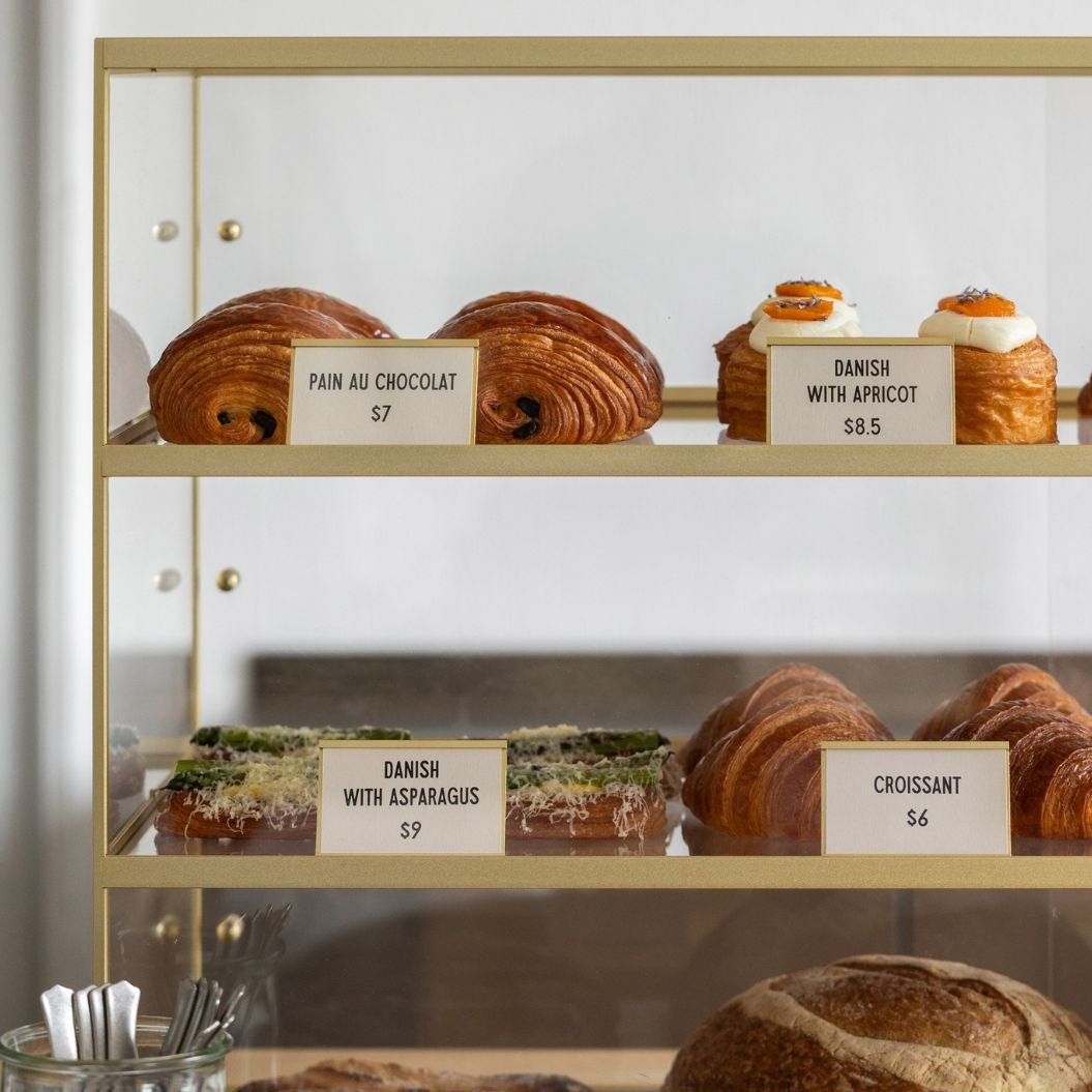
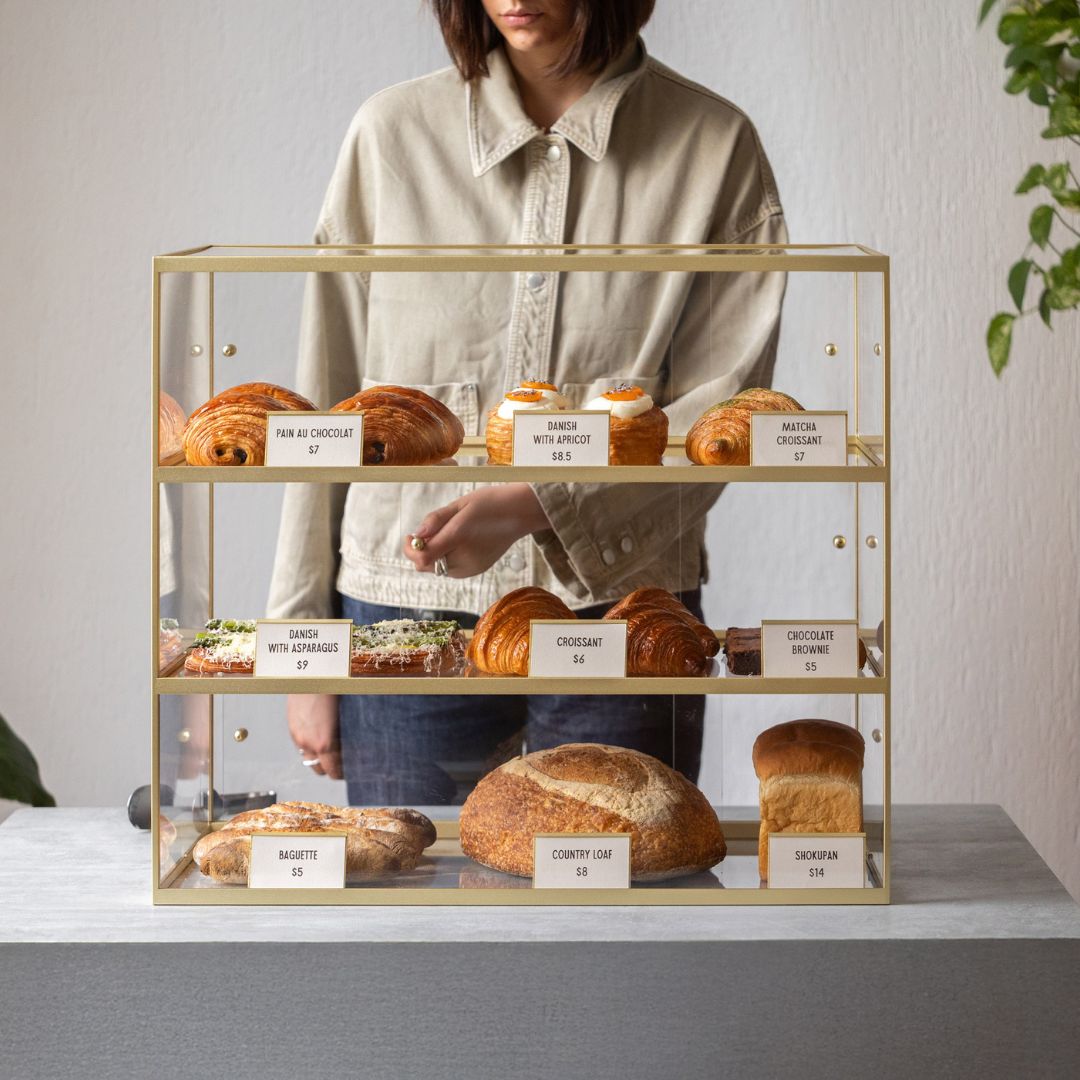
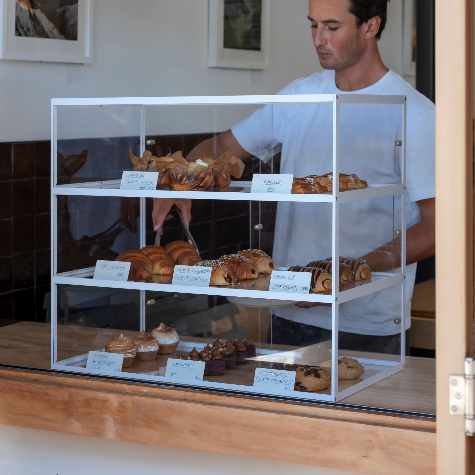
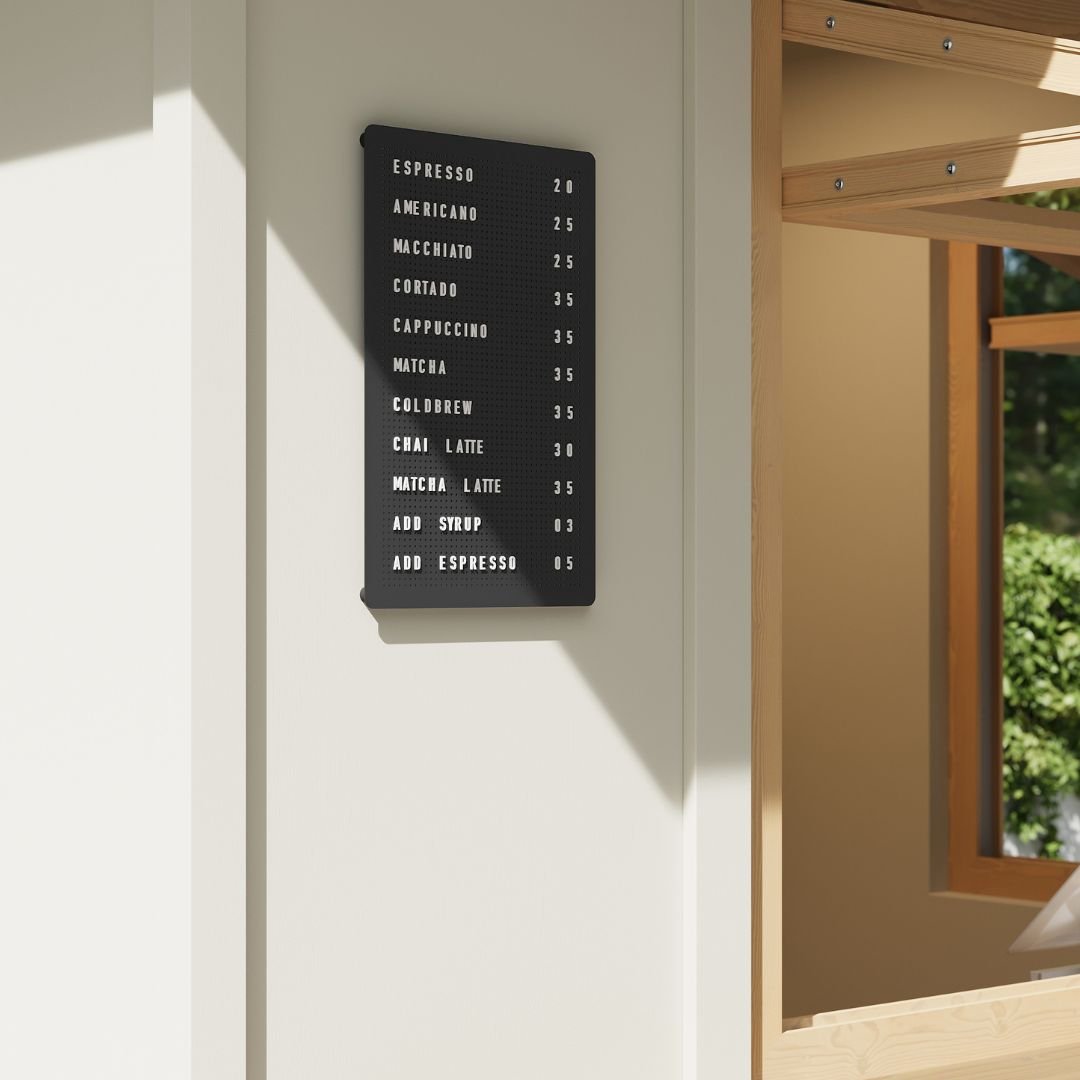
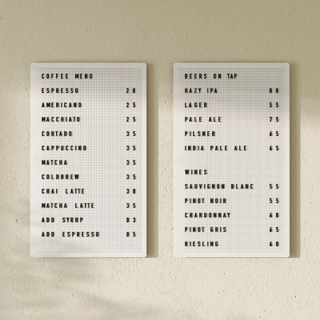
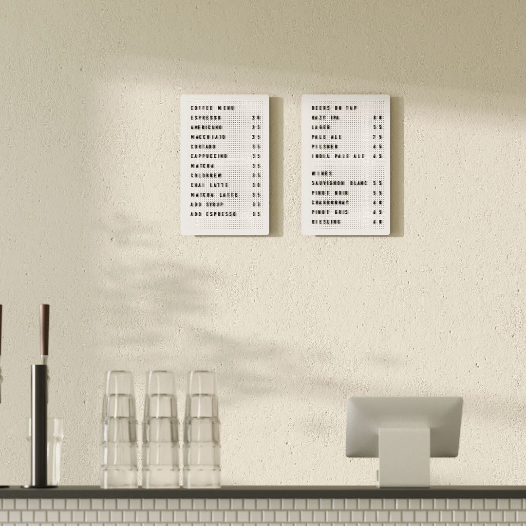
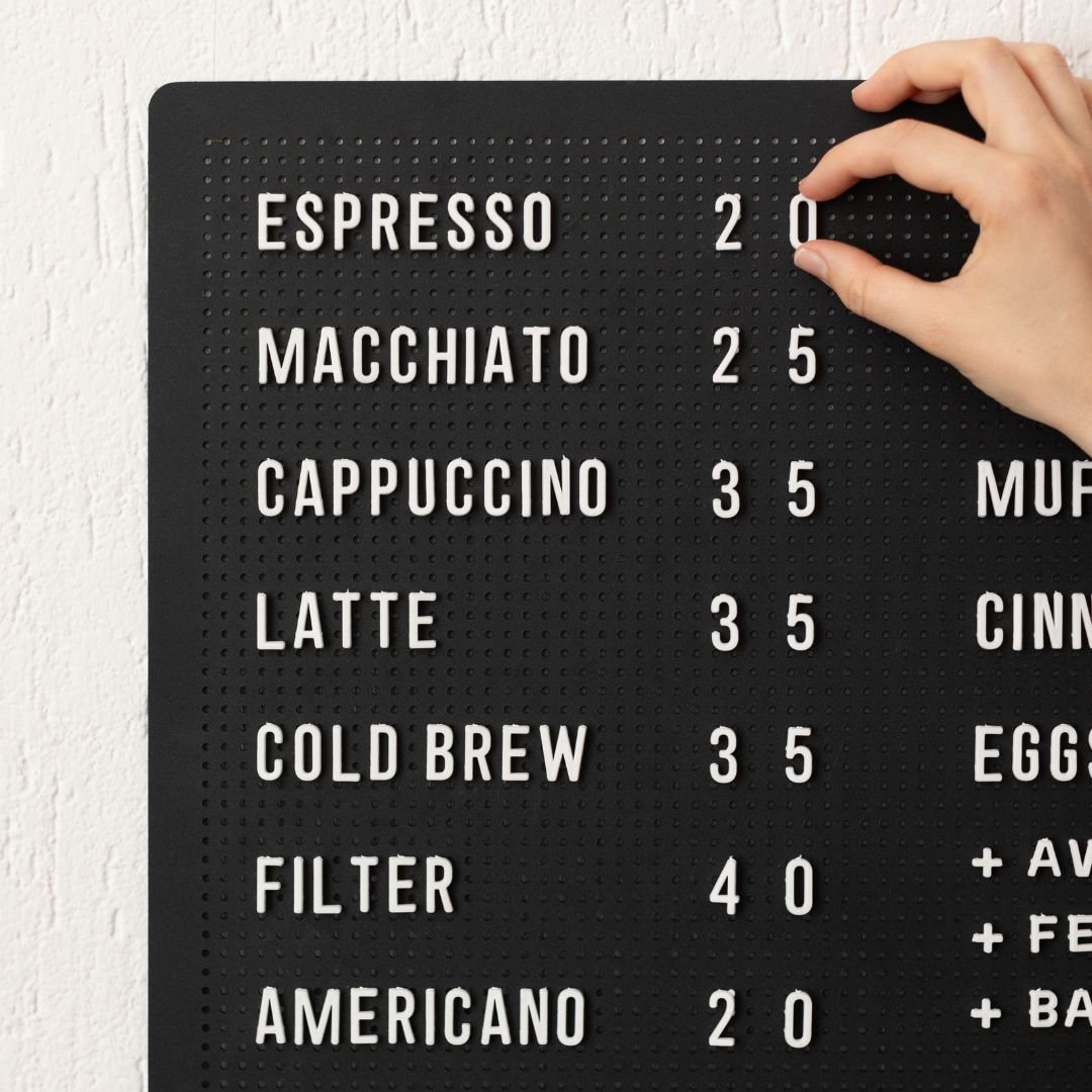
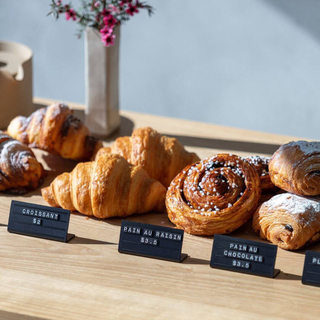
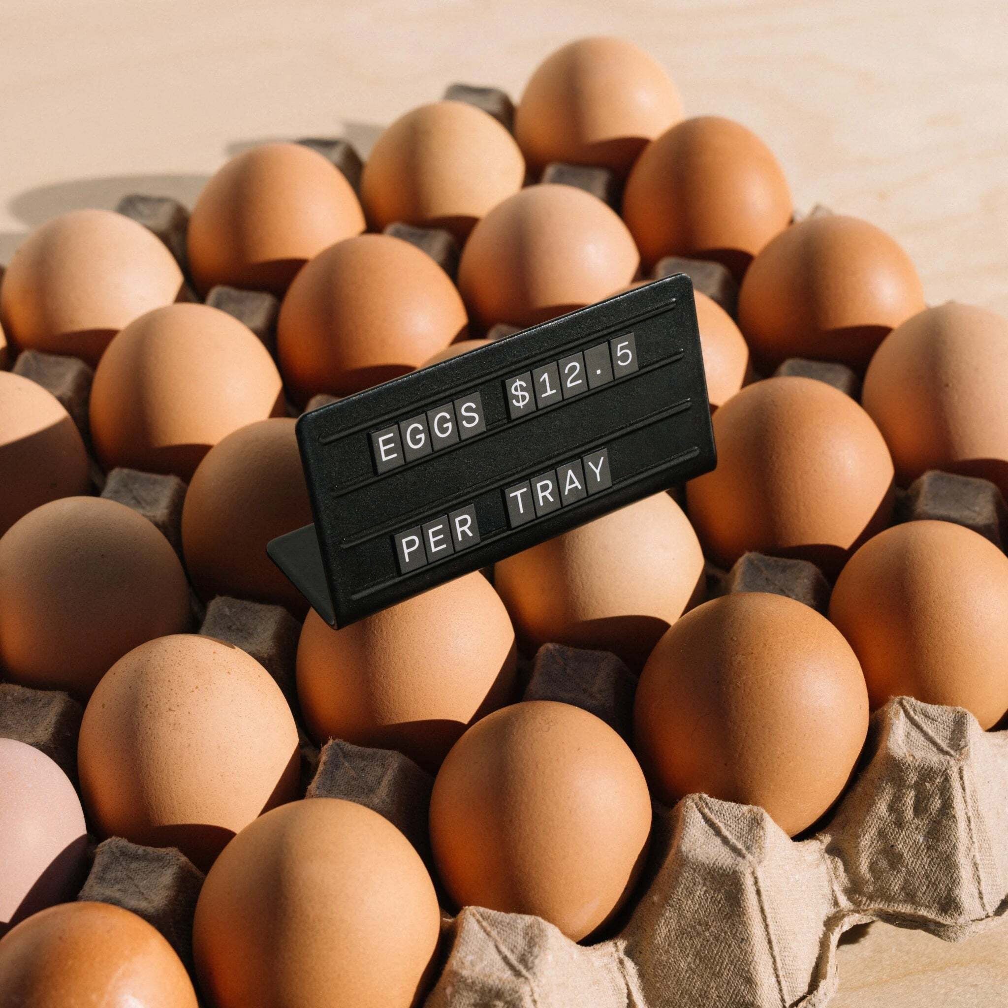
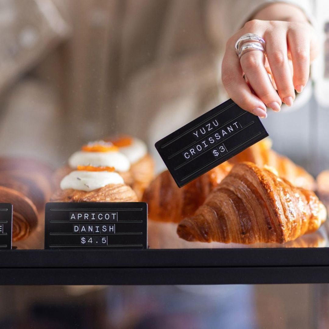
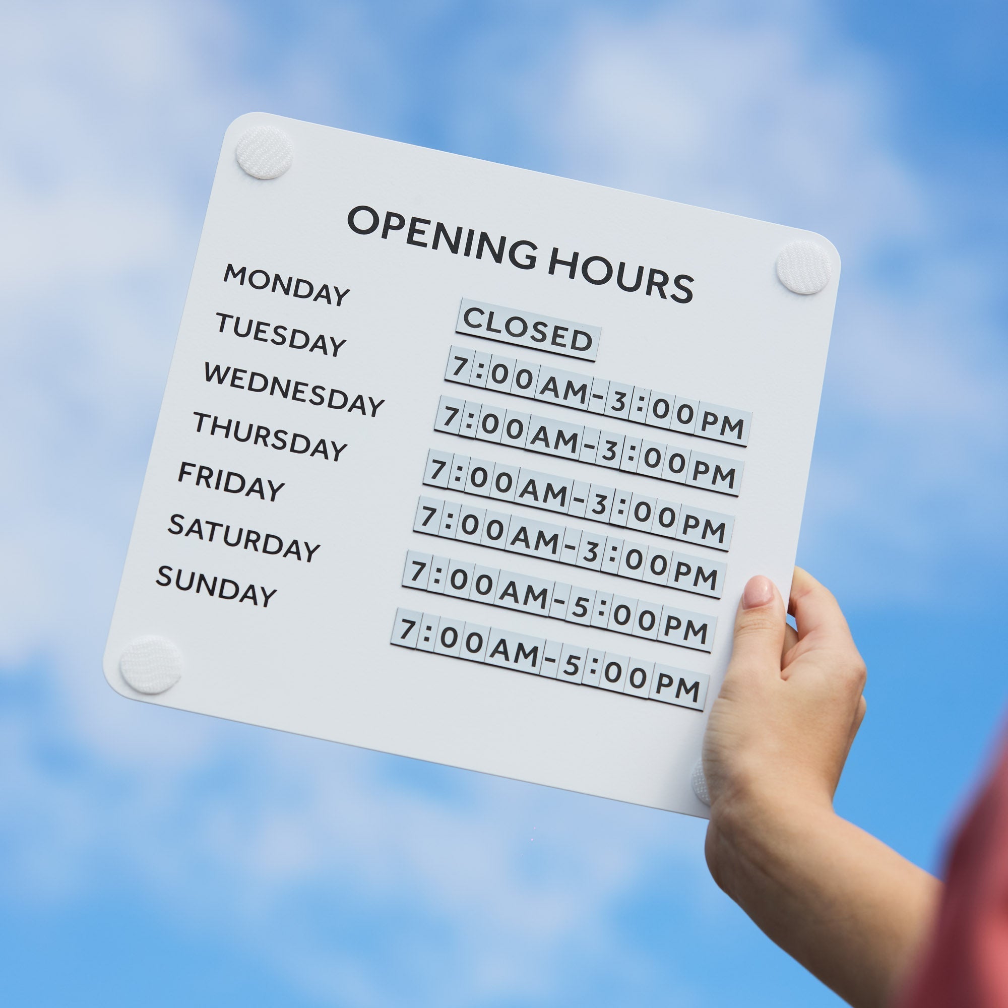
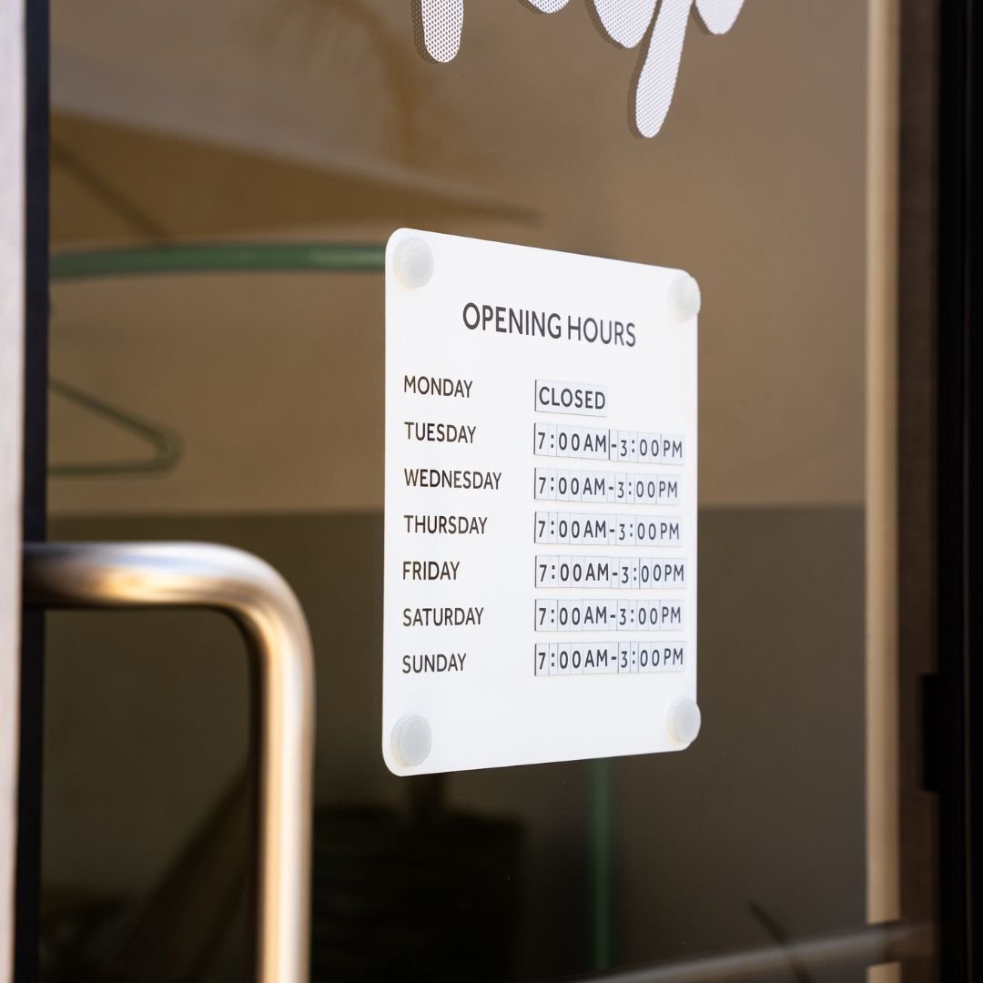
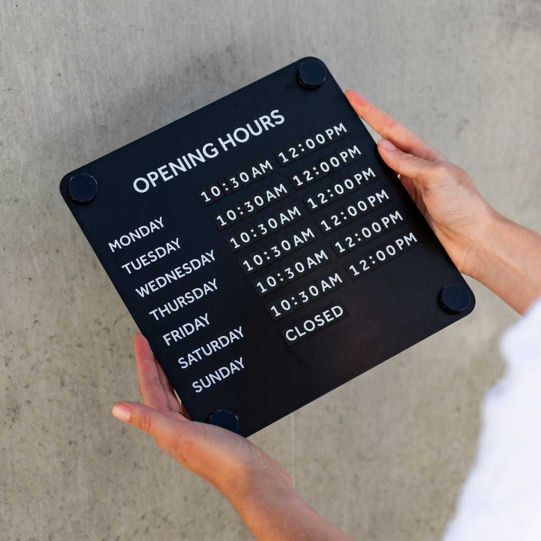
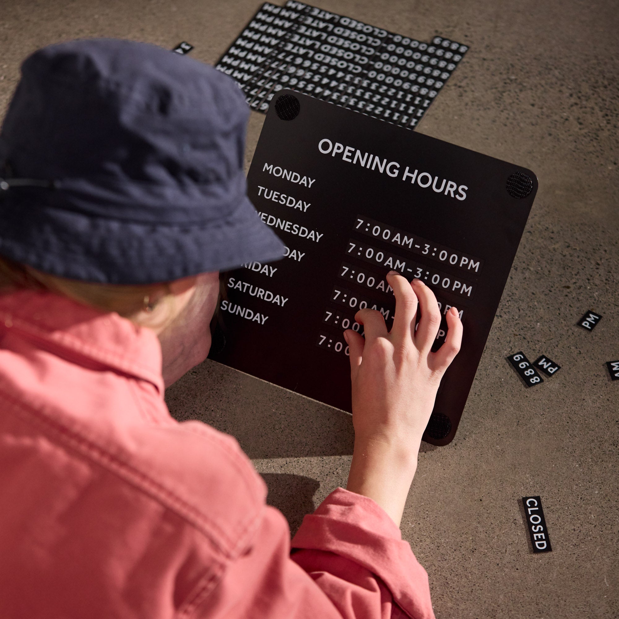
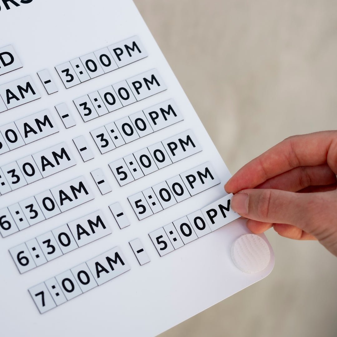
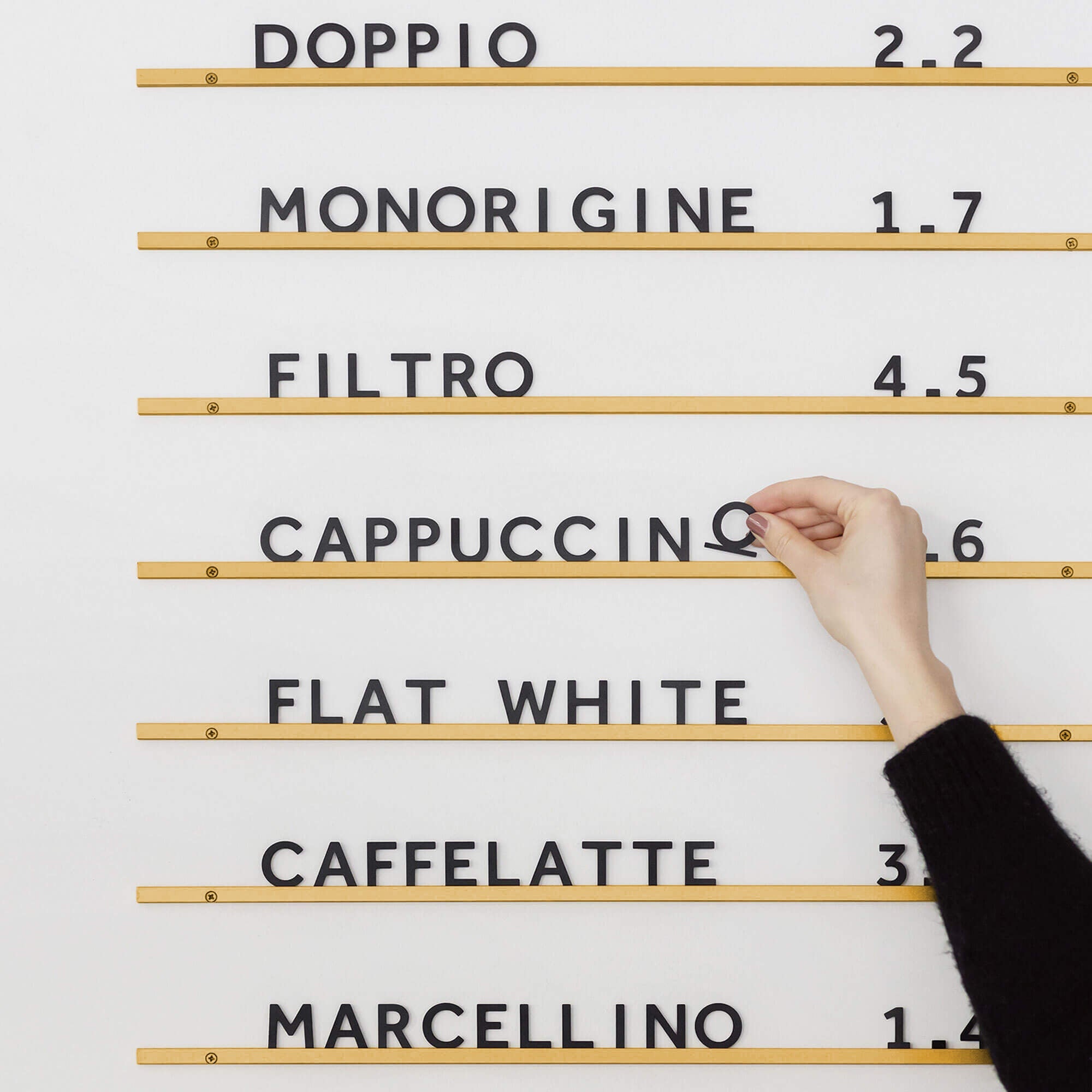
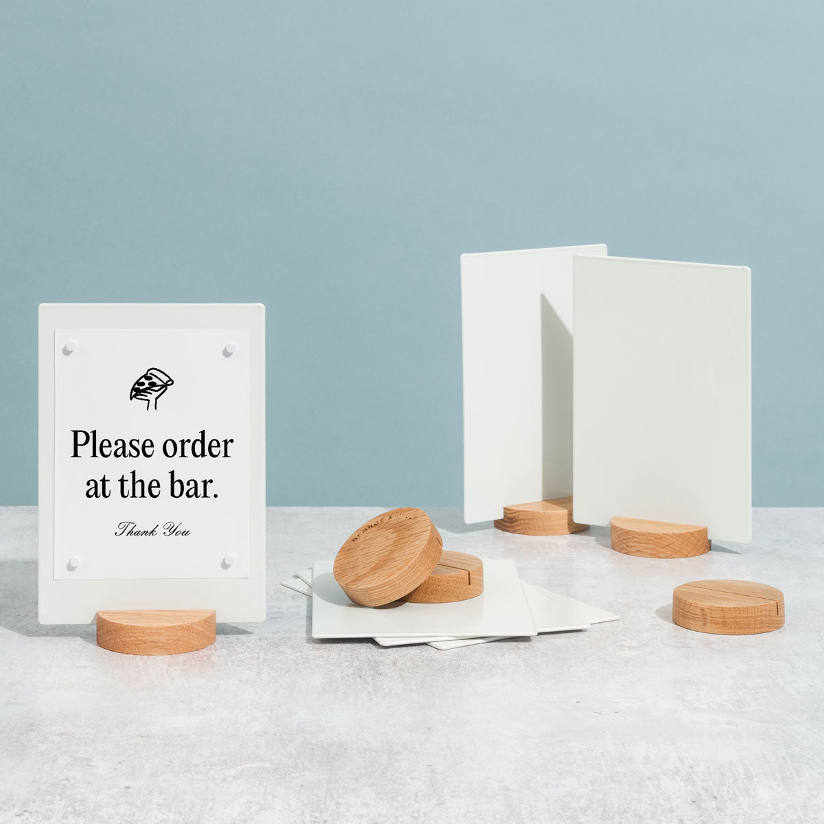
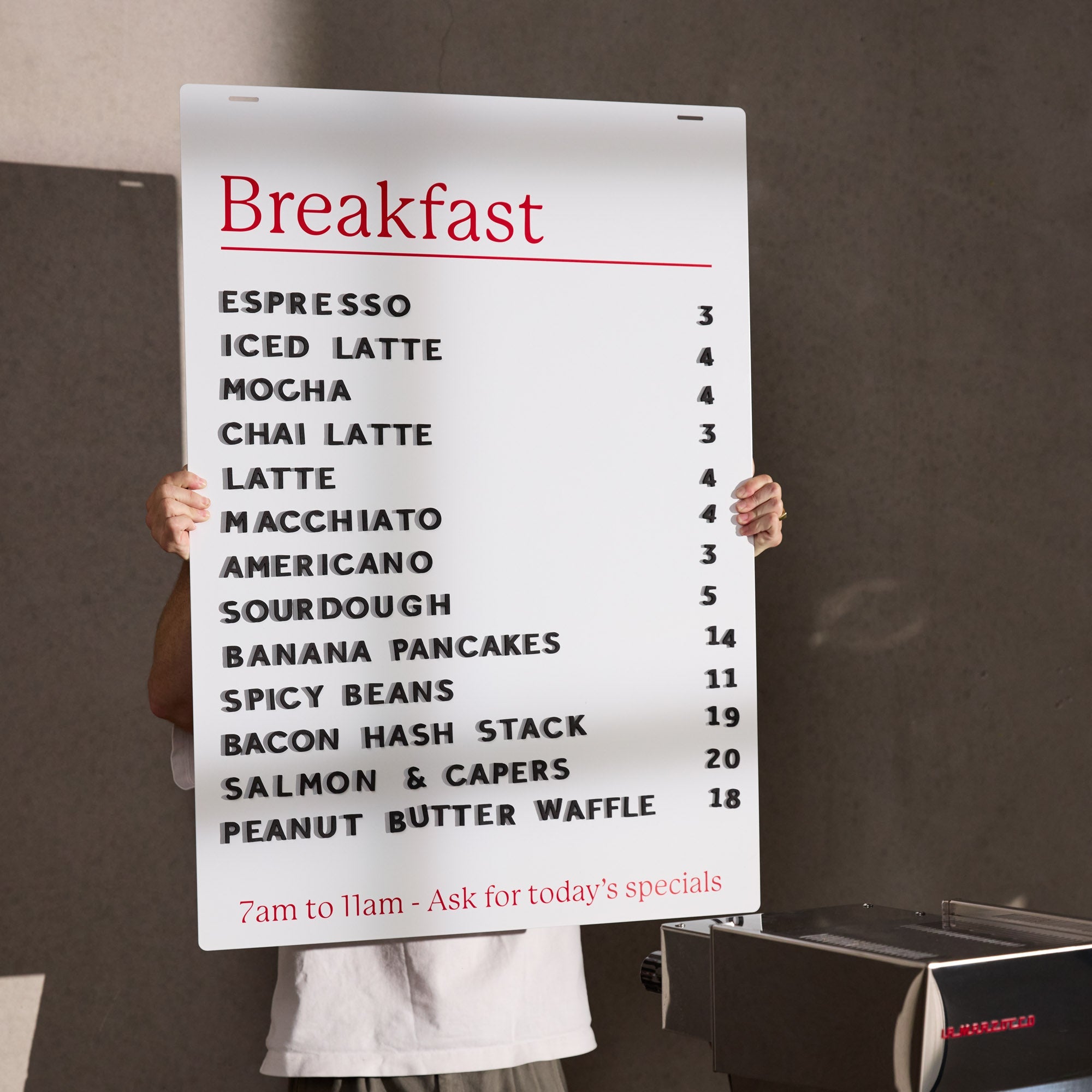
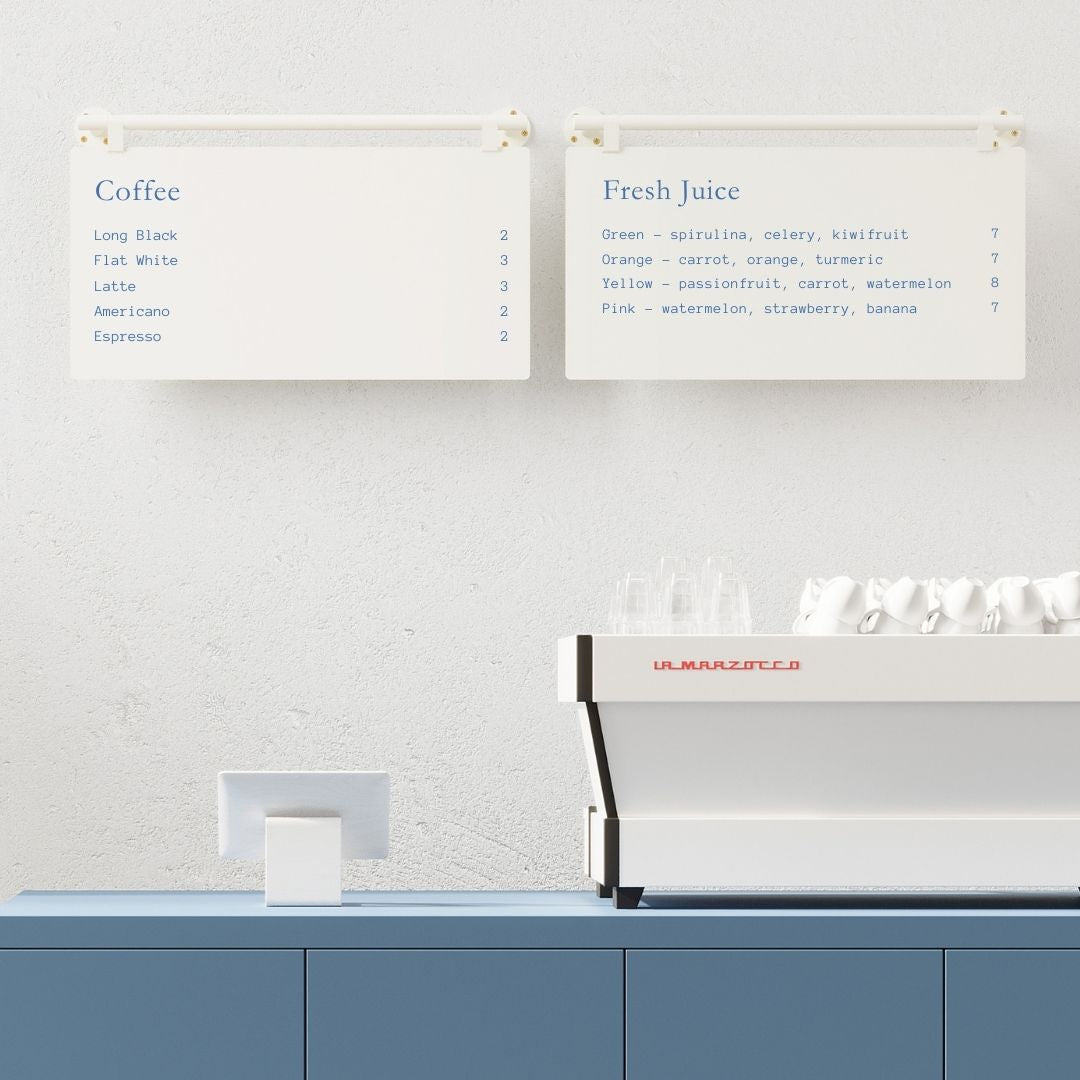
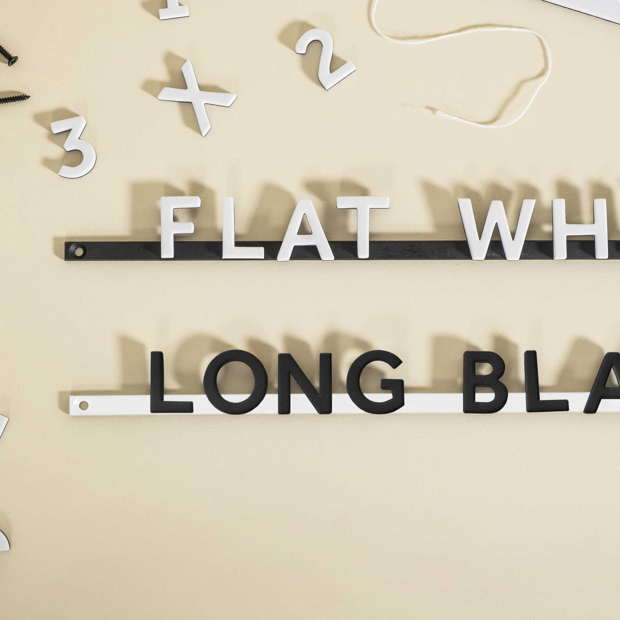
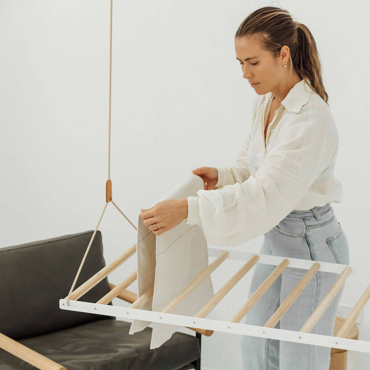
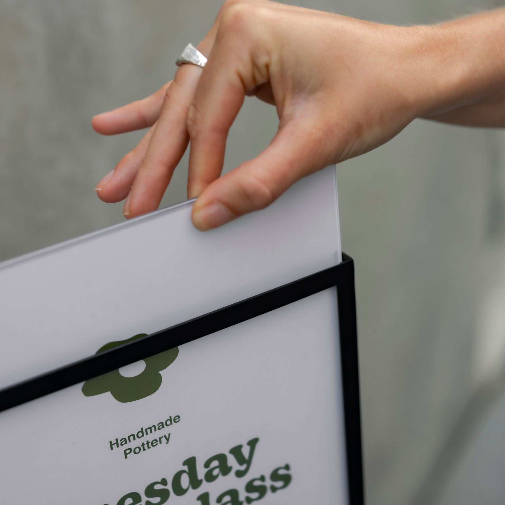
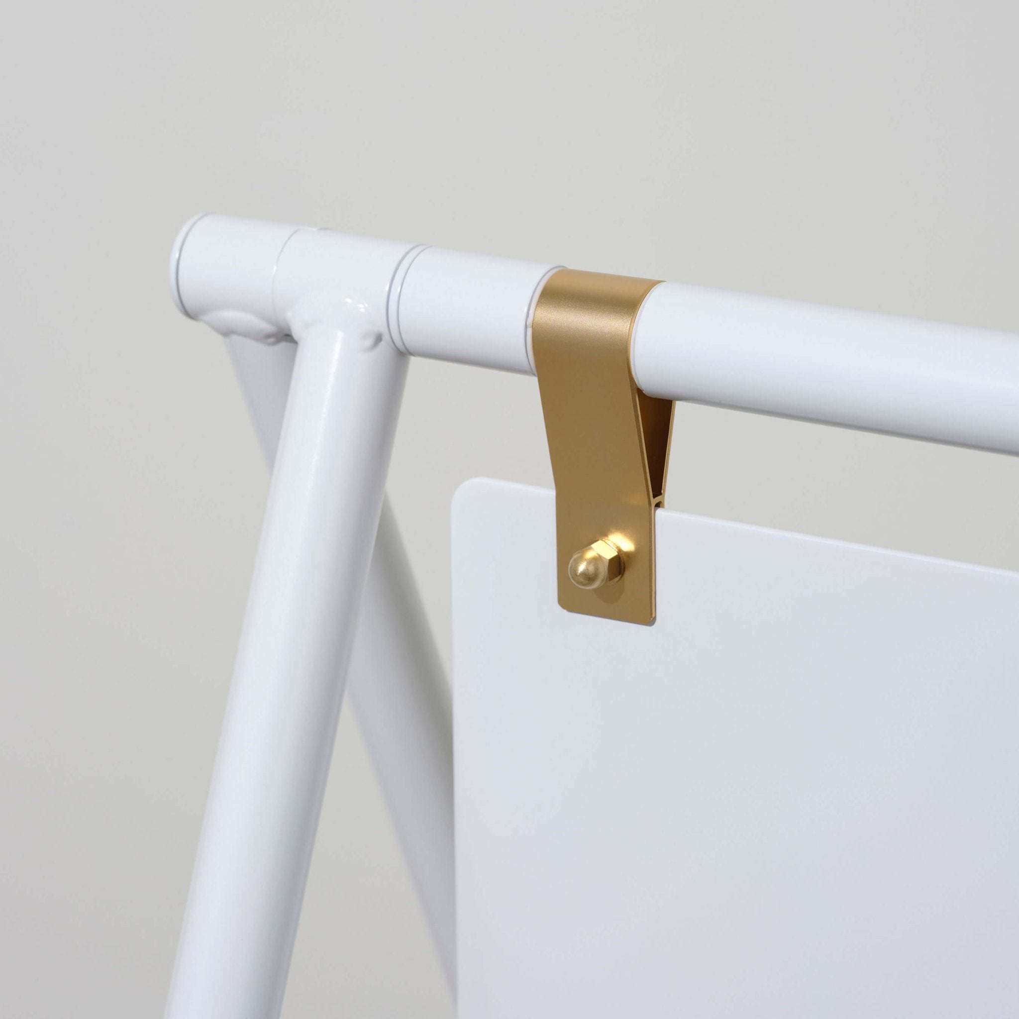
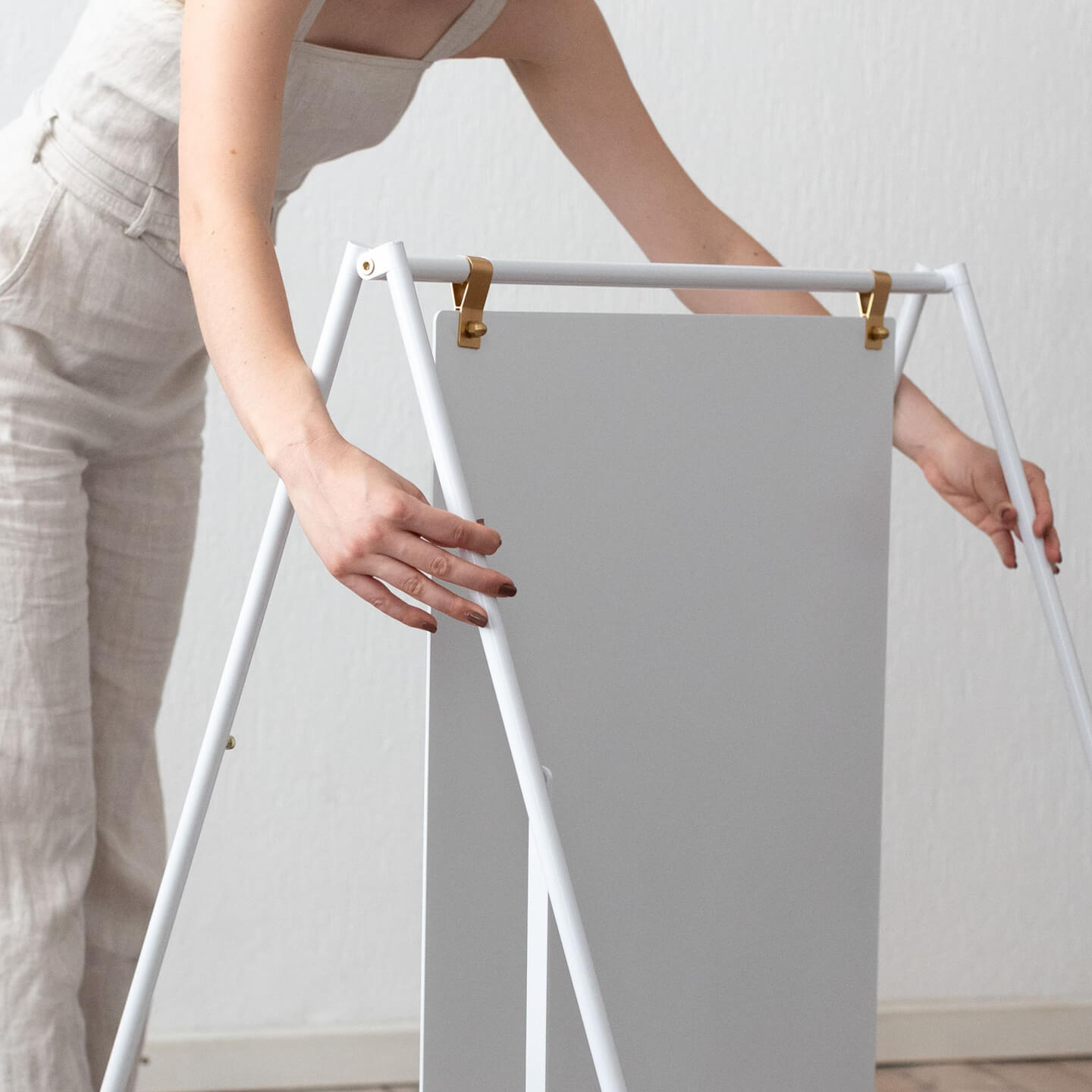
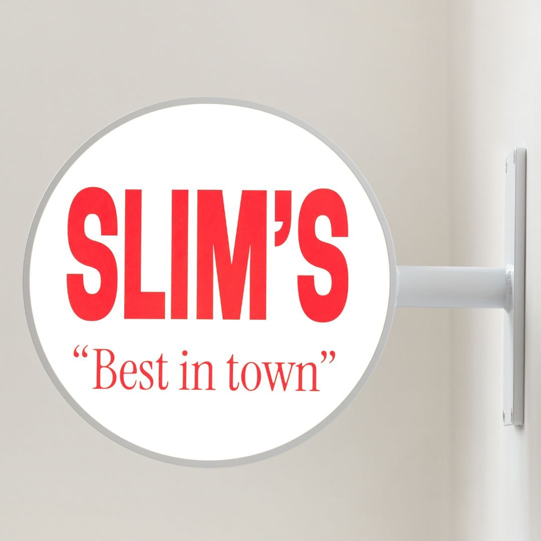
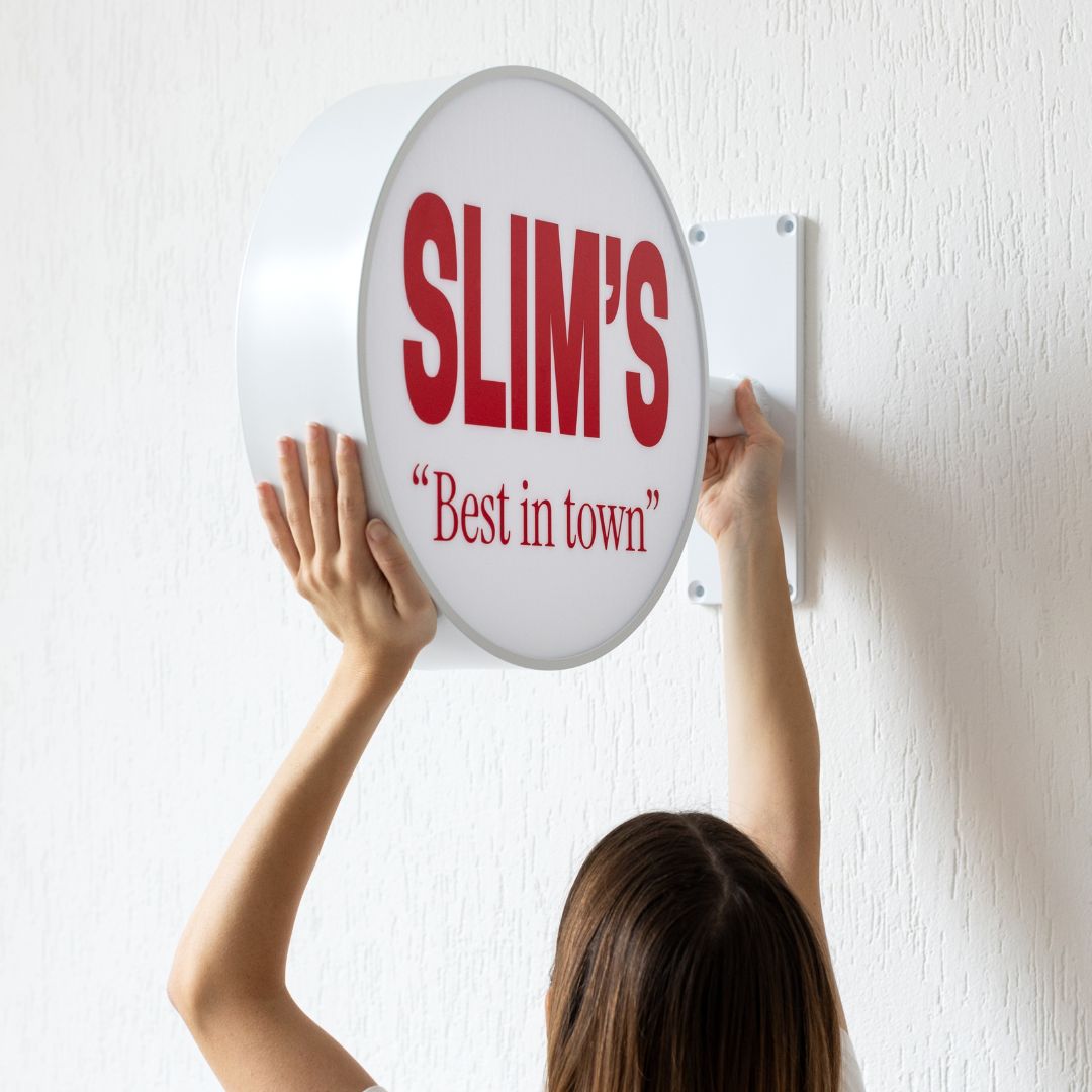
Our peg letter boards have pre-spaced holes, so the spacing is done for you. With our magnetic letter menu boards you have full flexibility, which means you can experiment. Pack items tighter to fit more, or leave breathing room to make things easier to scan. We generally recommend leaving some breathing space. A menu board crammed wall-to-wall with text is exhausting to read, no matter how good the content is.
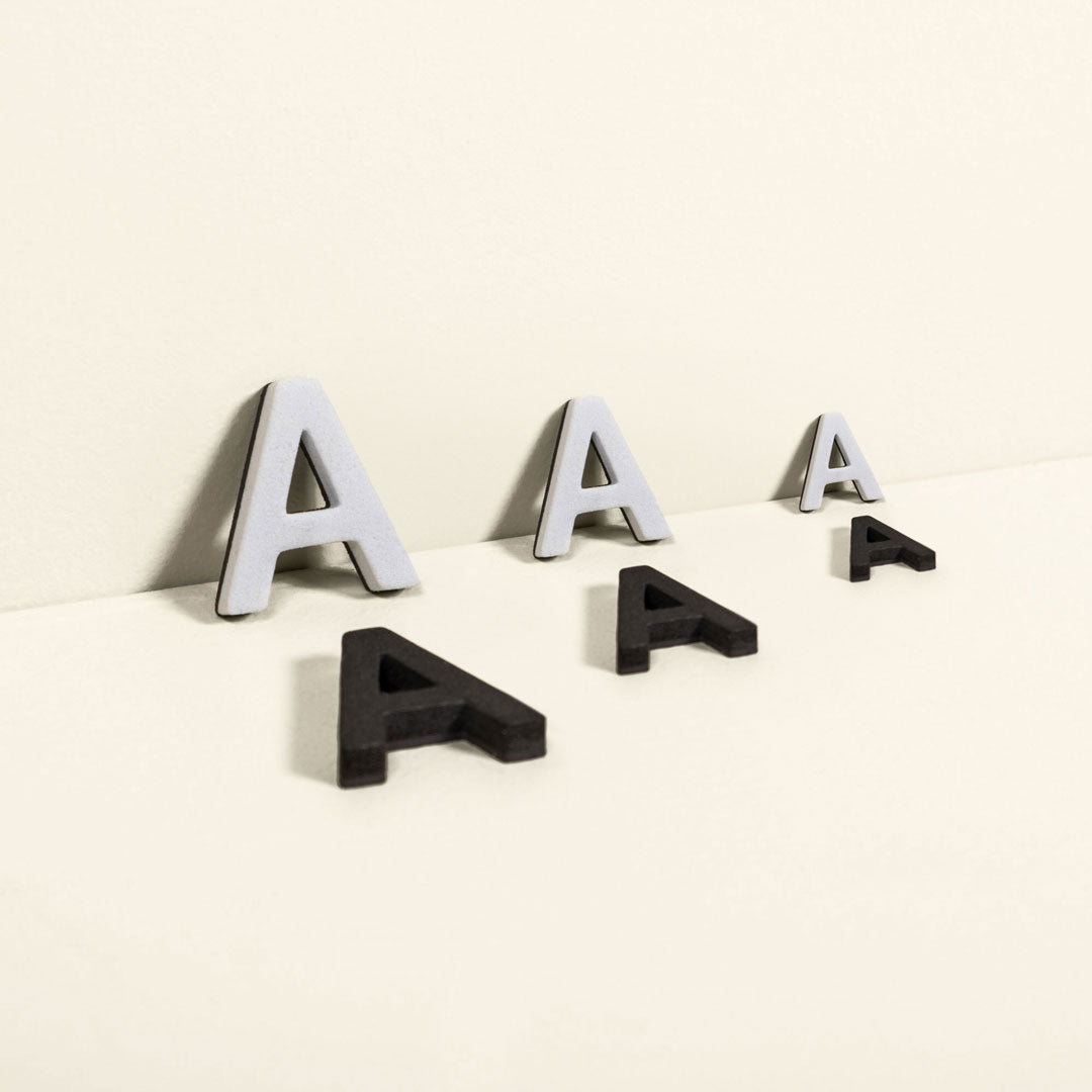
A practical tip: use two letter sizes. Larger letters for section titles and headings, smaller letters for item names, descriptions, and prices. It creates visual hierarchy that makes your menu scannable in seconds rather than minutes.

The boards that work and what suits what
Here's a breakdown of the main options and the situations they tend to work best in.
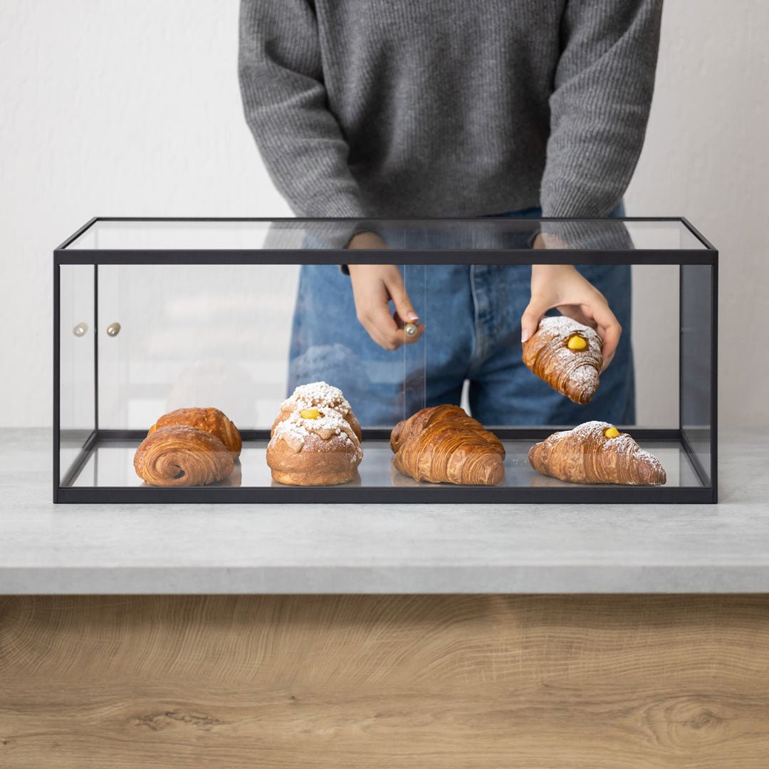
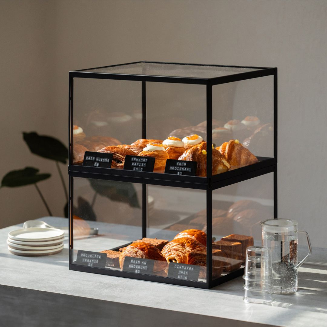
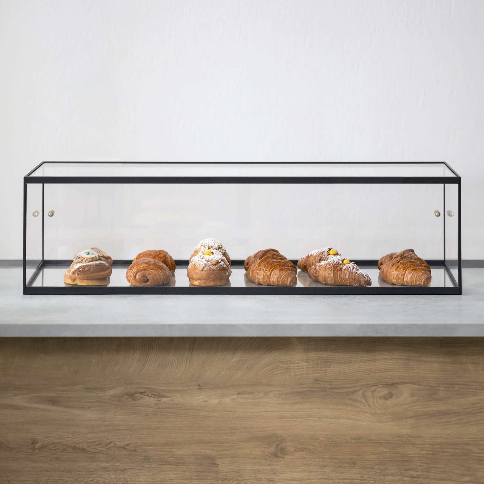
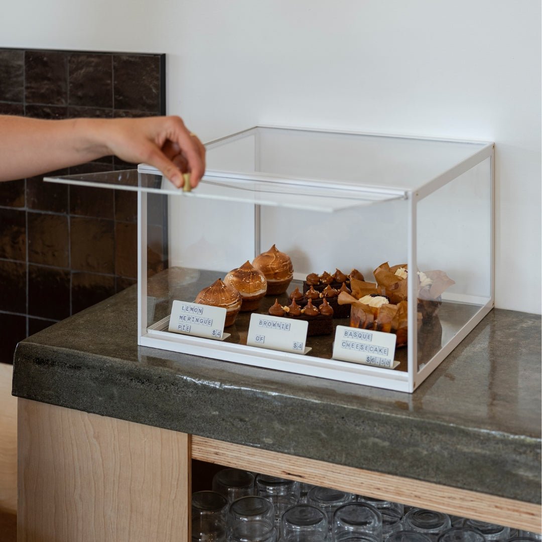
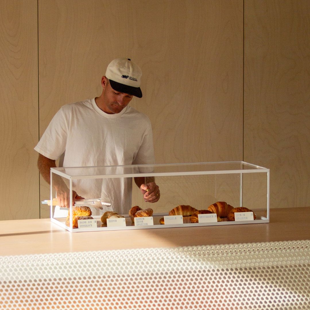
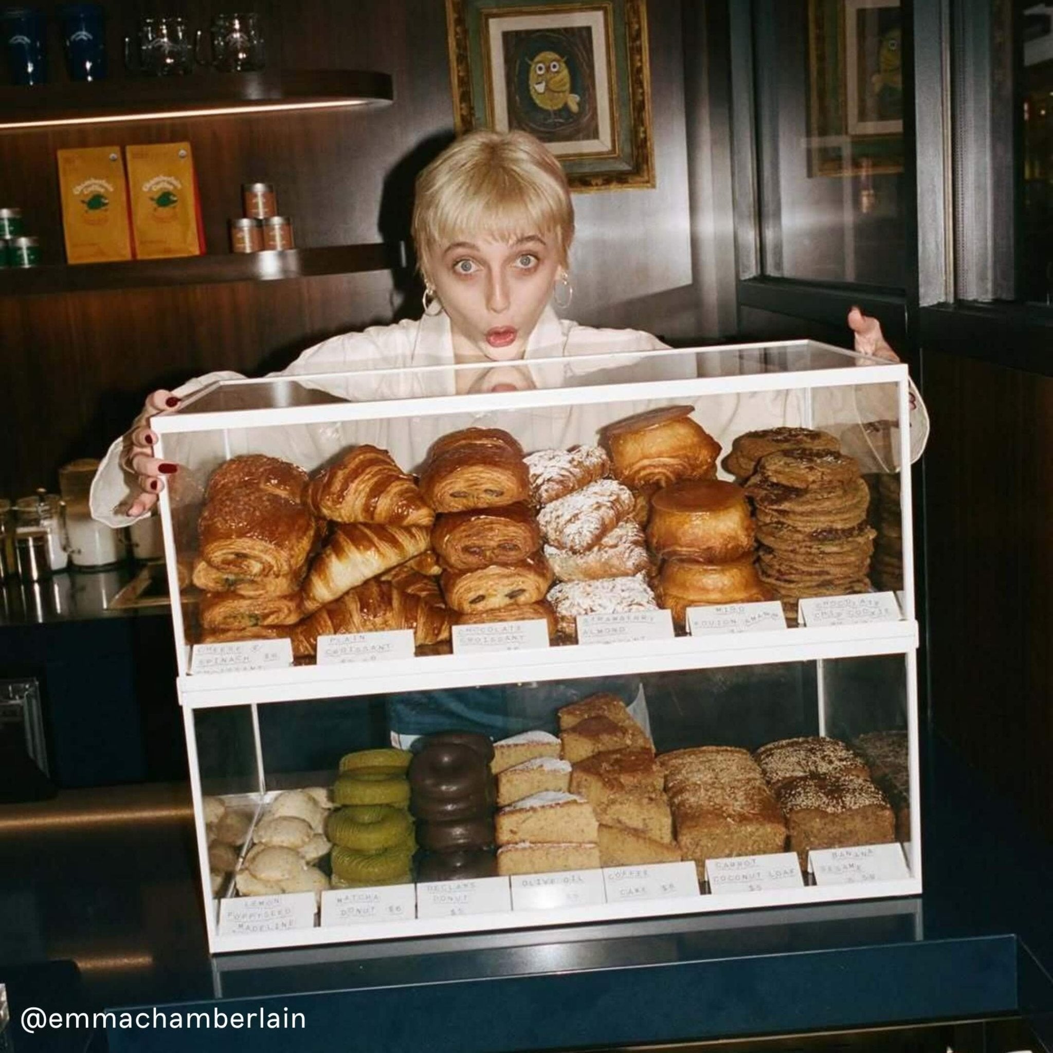
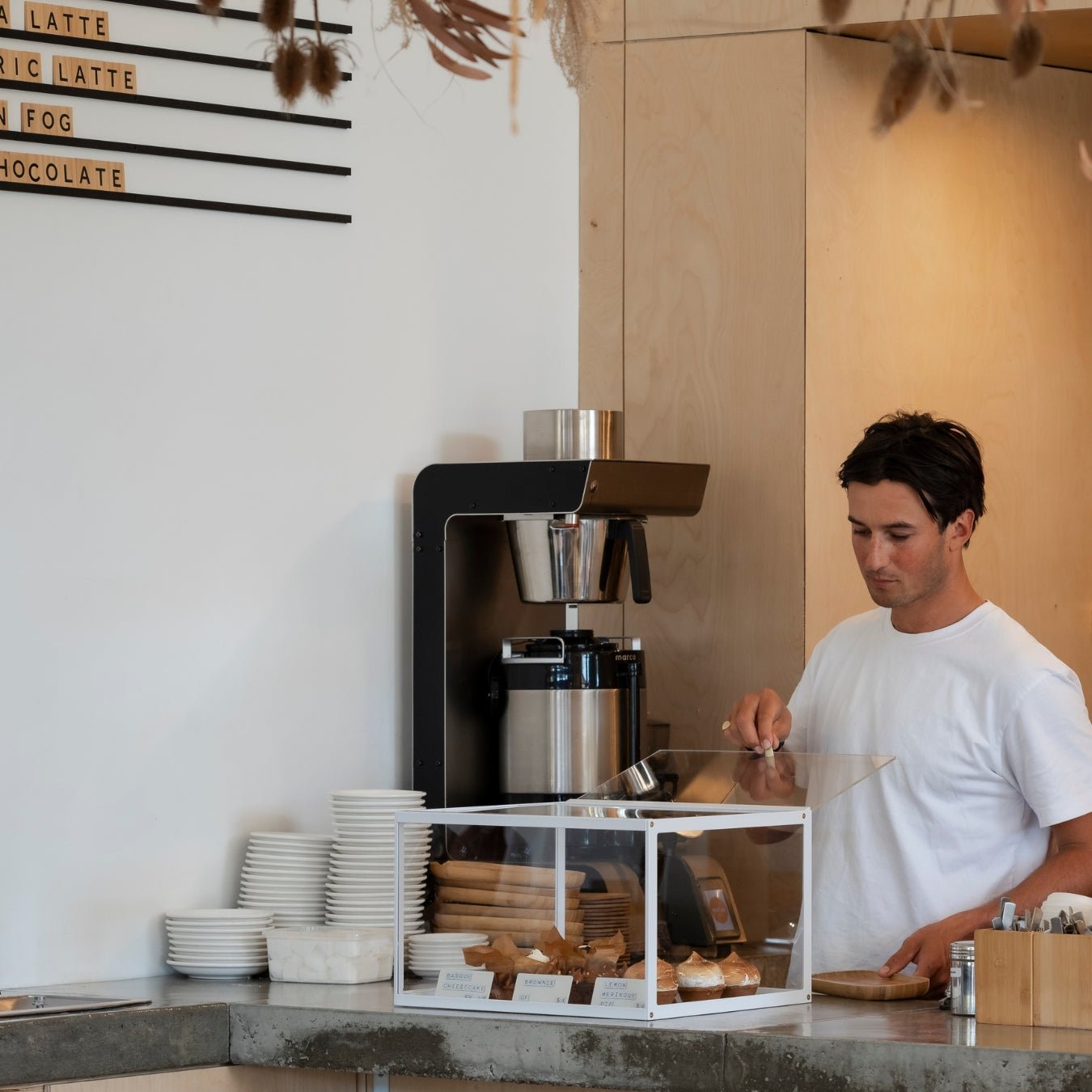
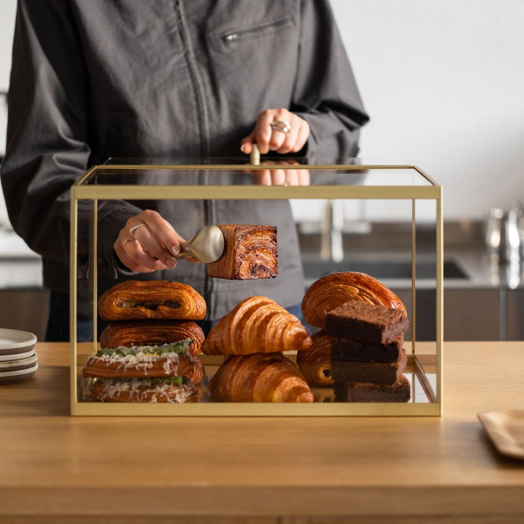
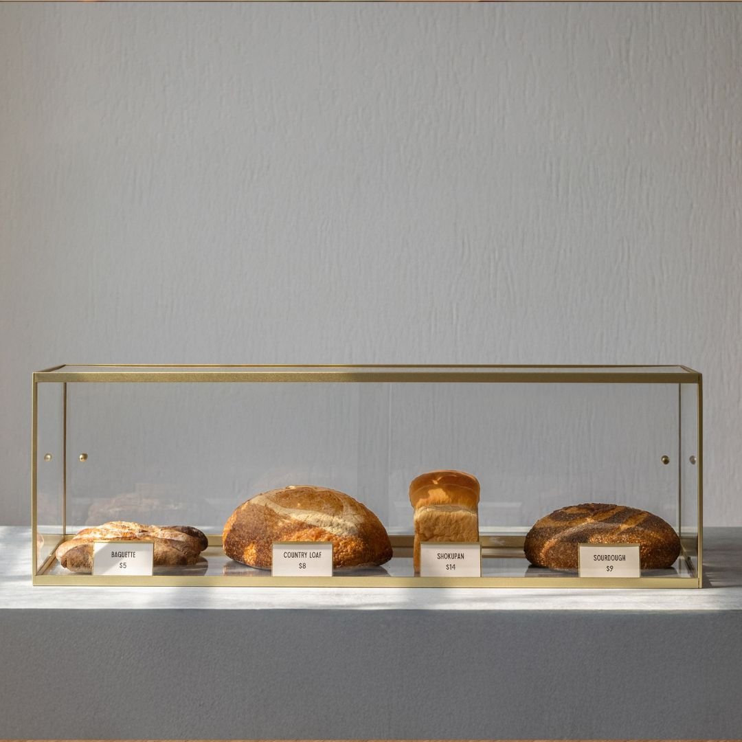
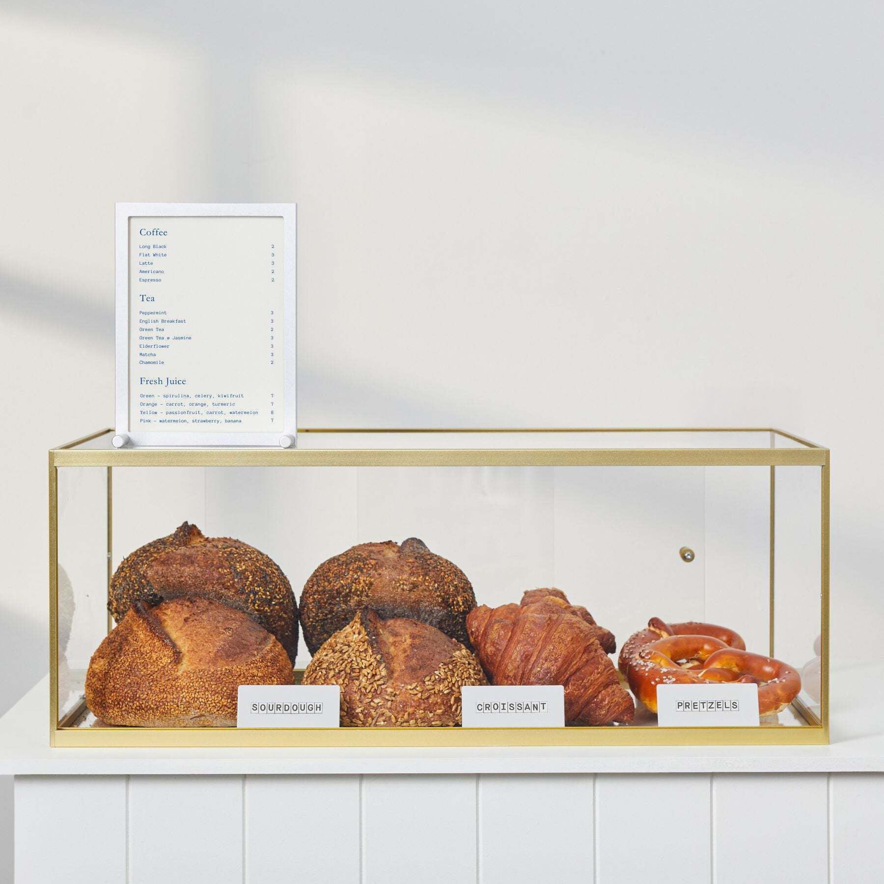
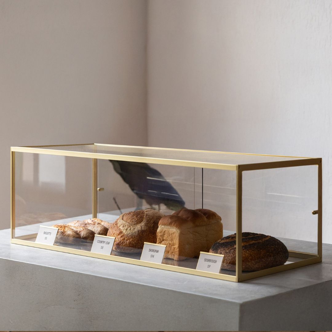
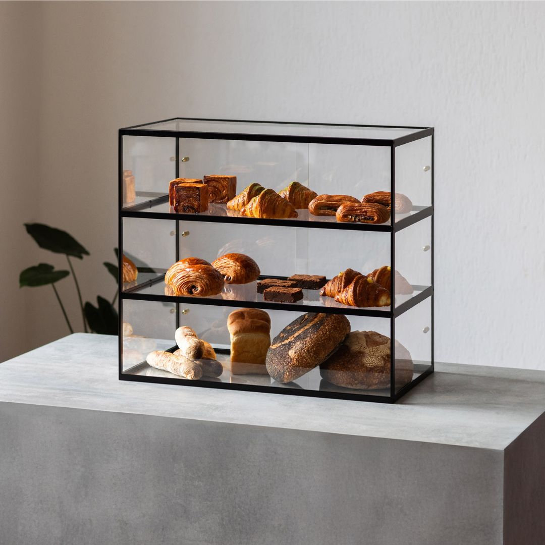
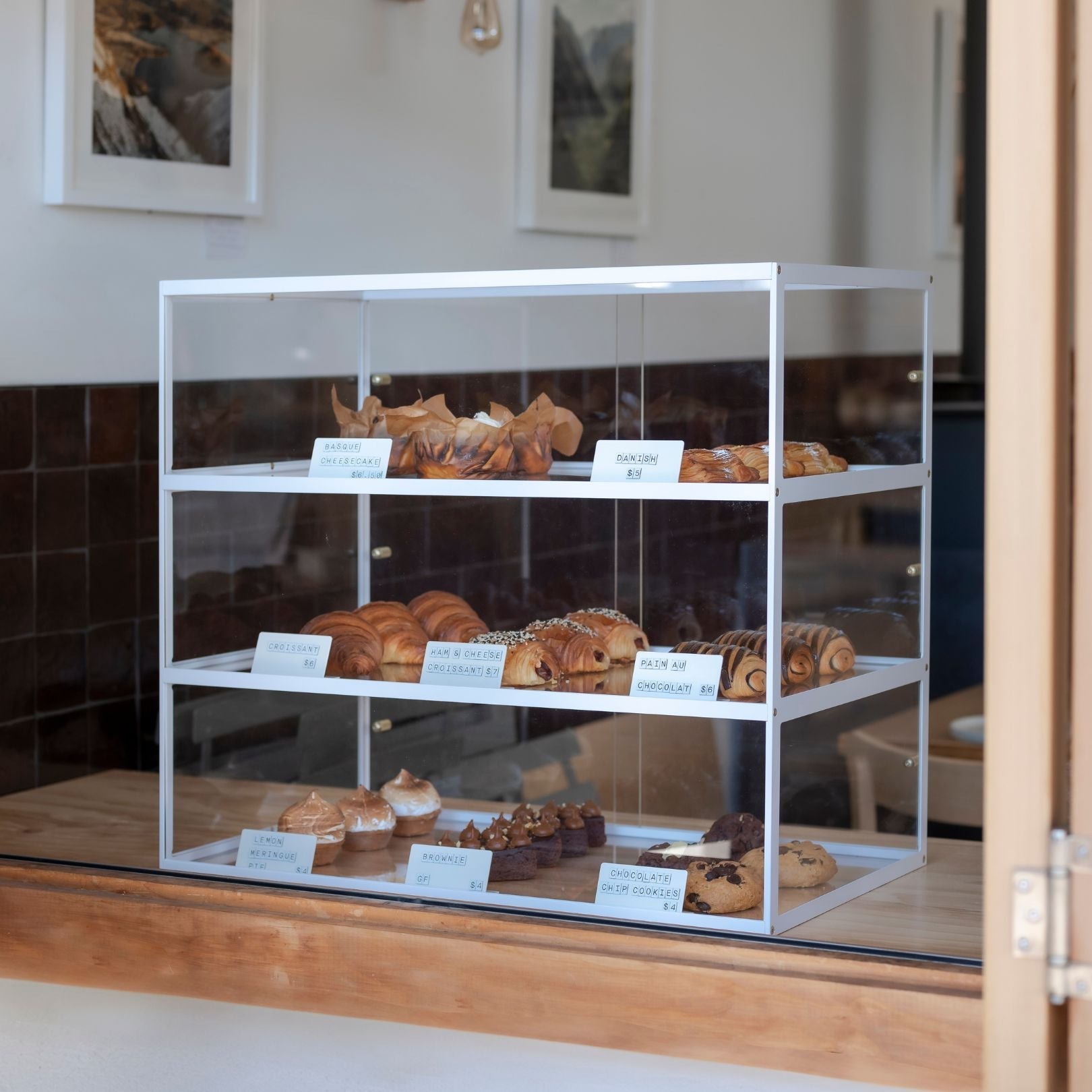
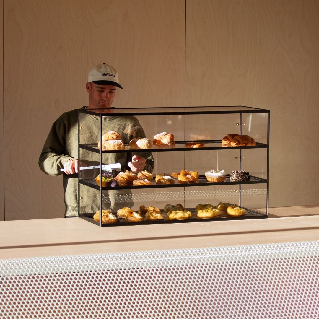
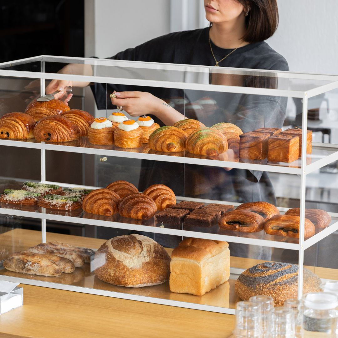
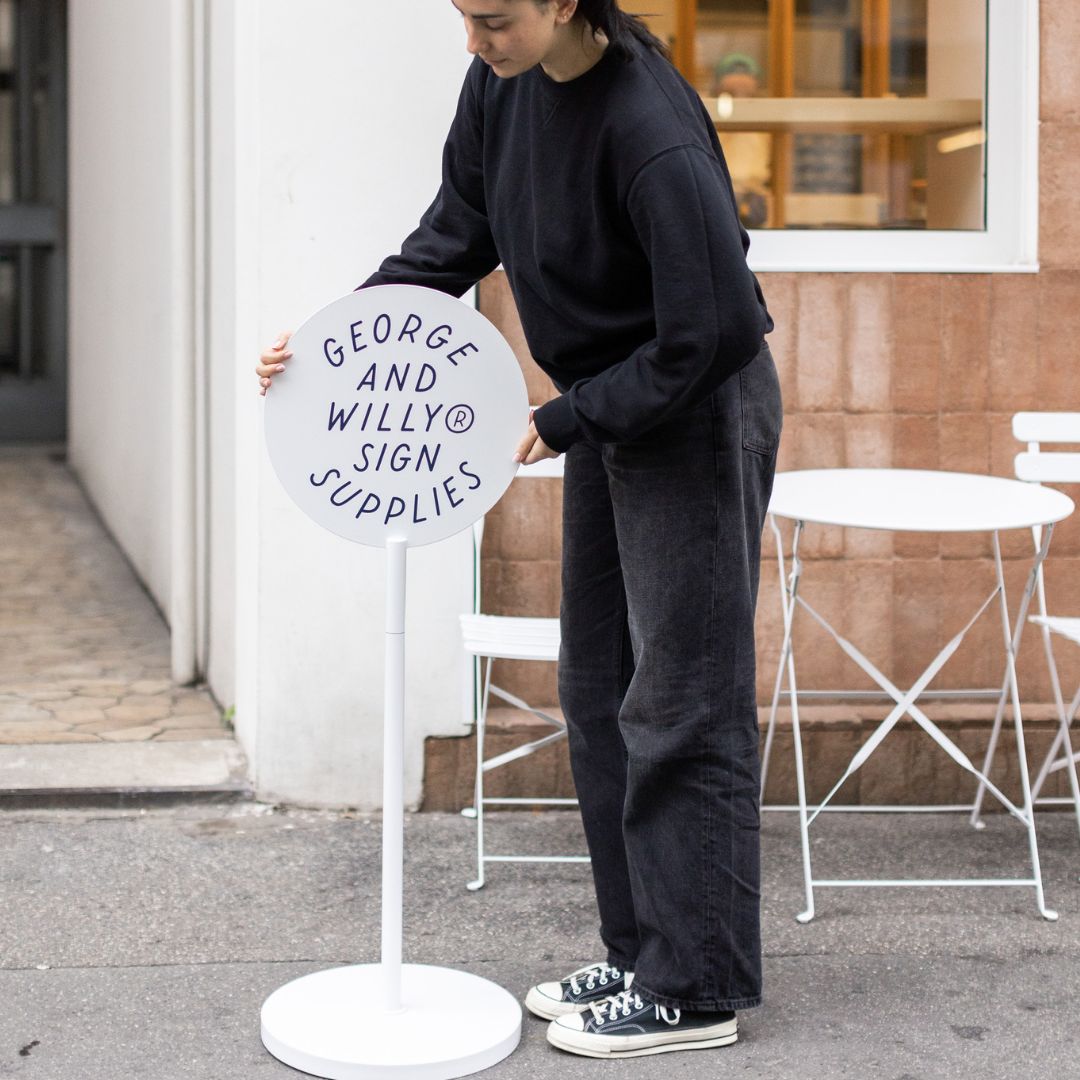
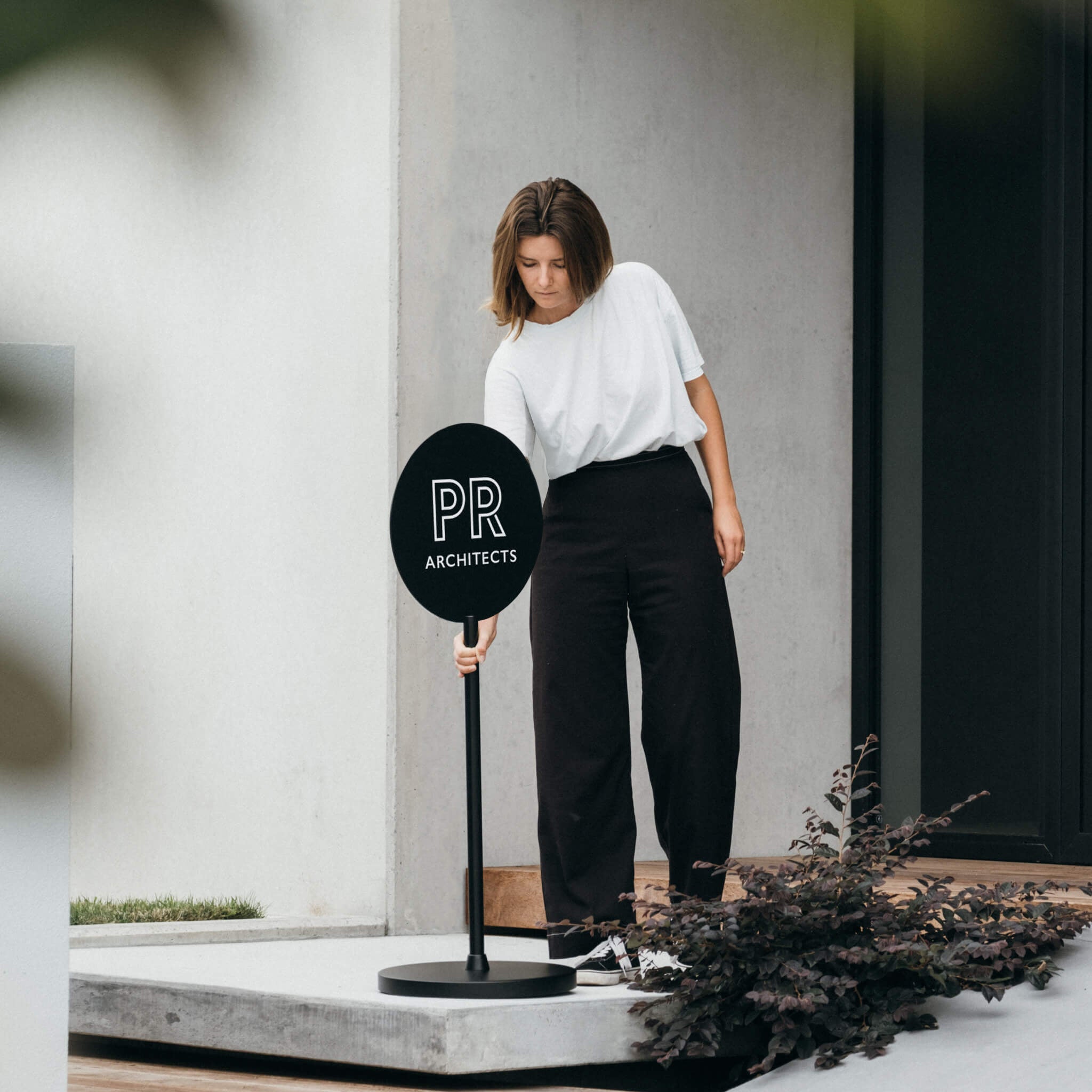
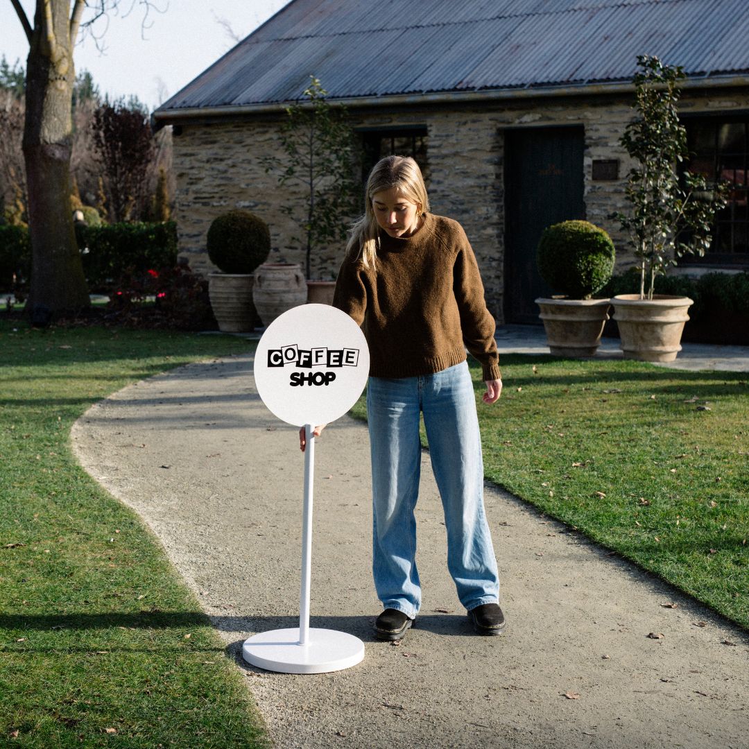
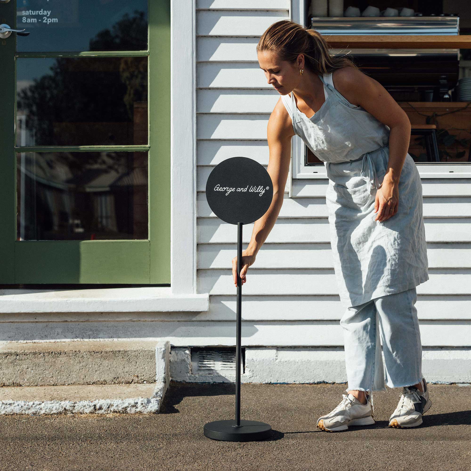
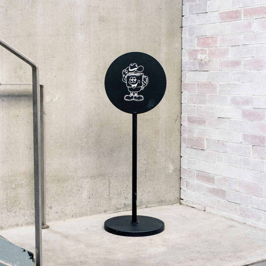
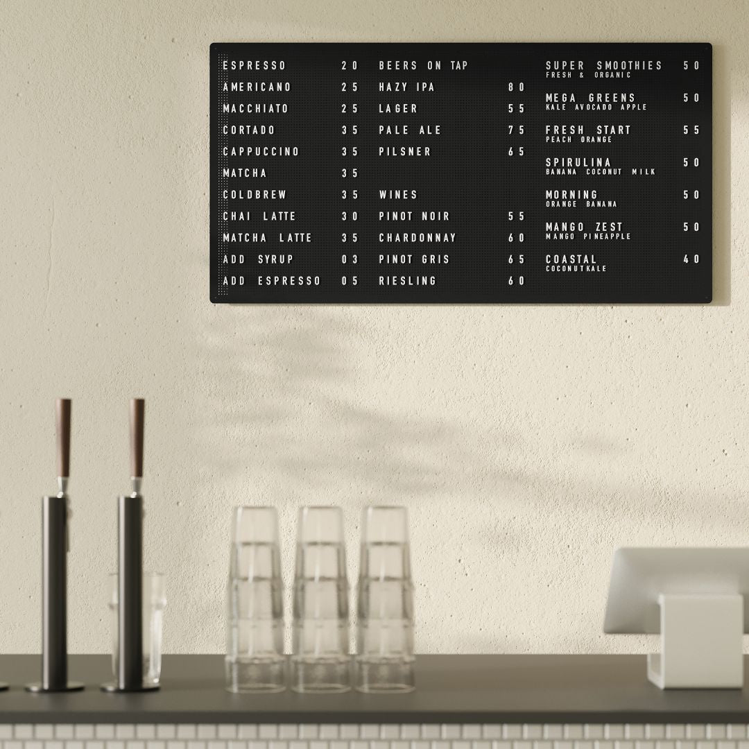
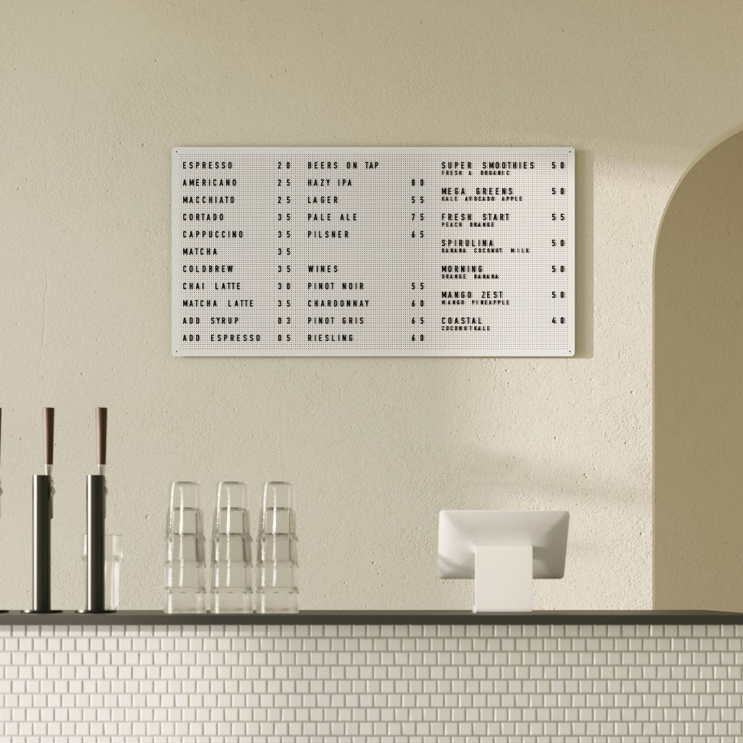
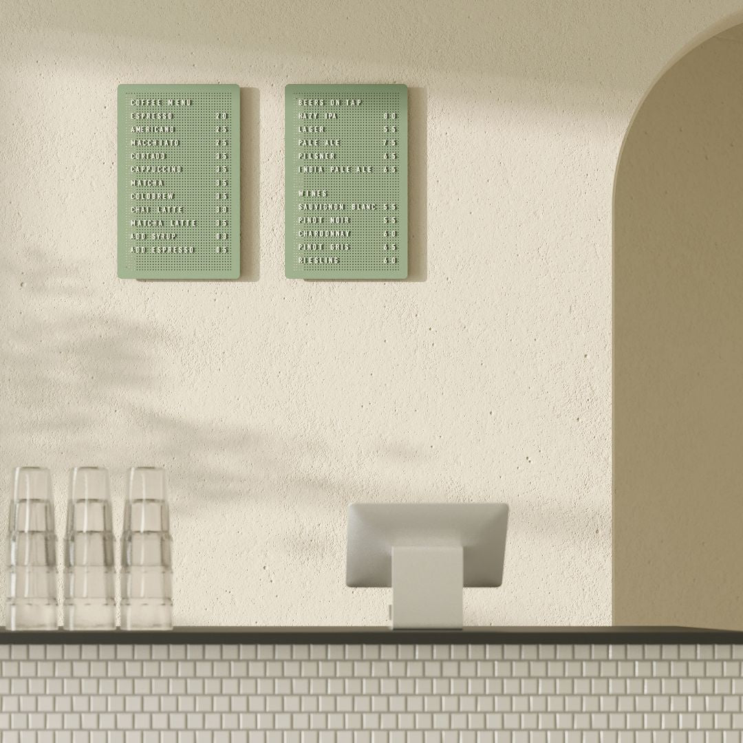
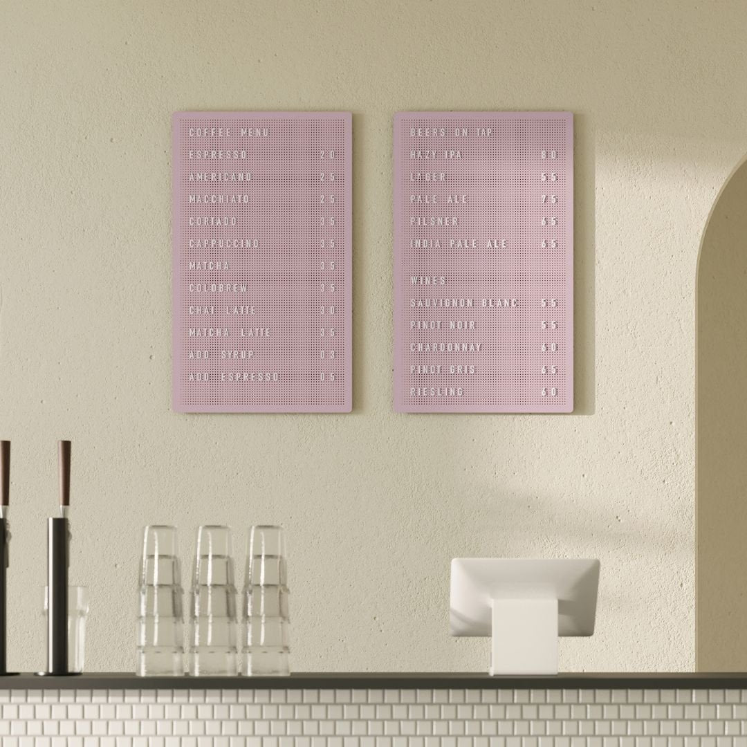
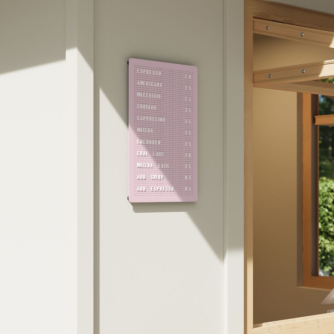
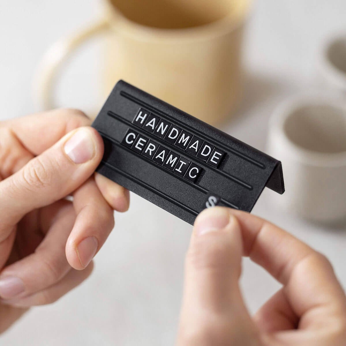
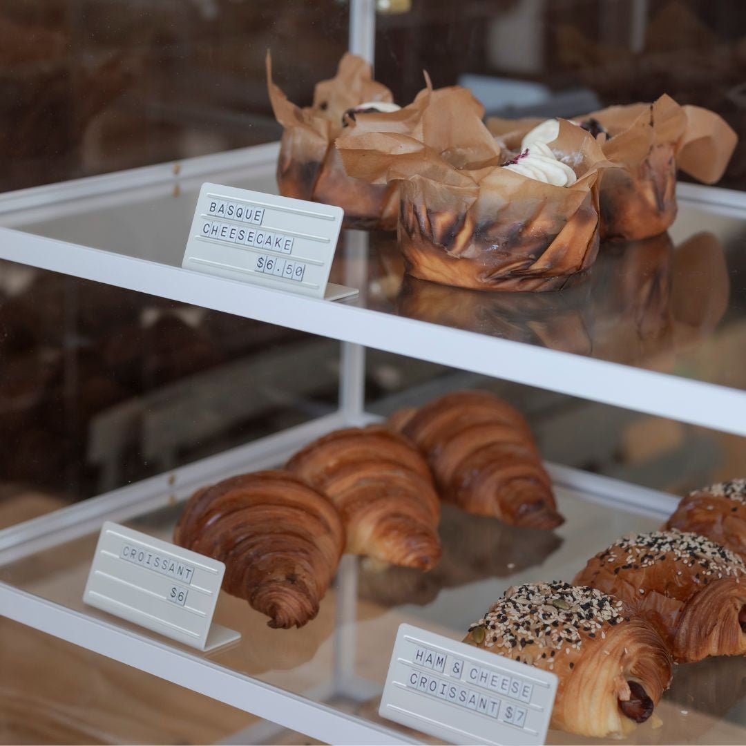
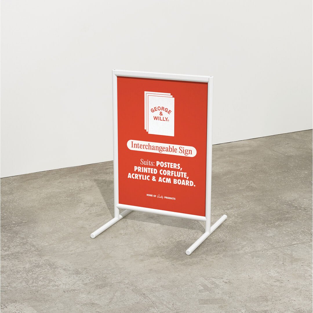
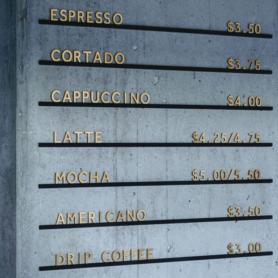
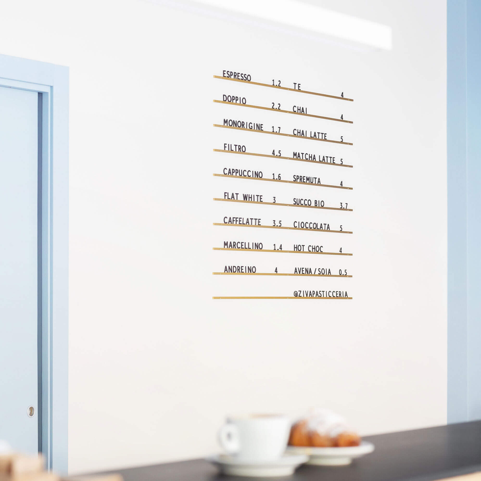
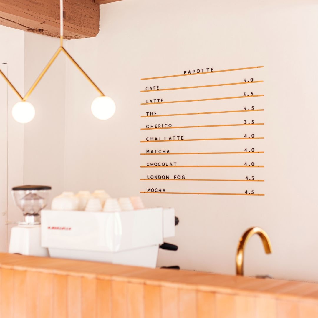
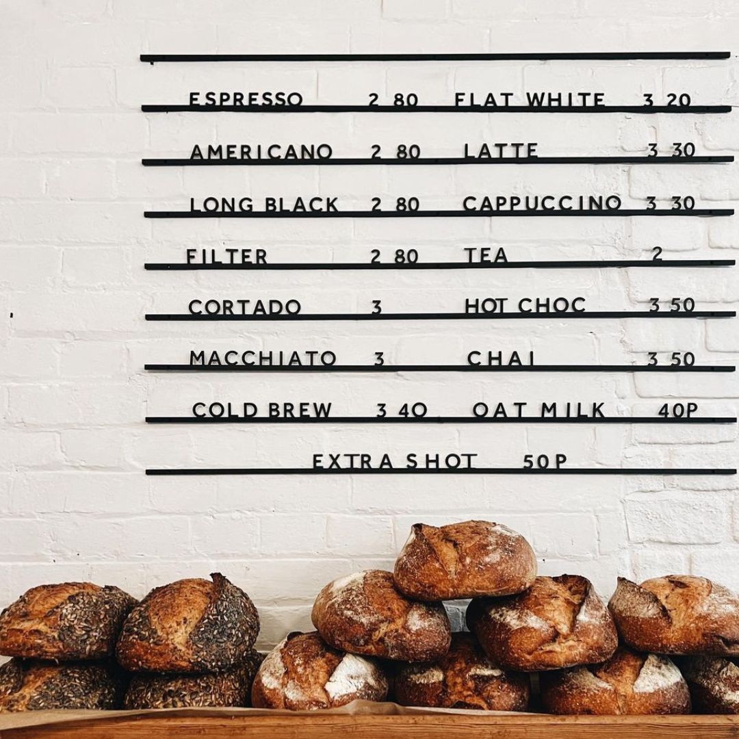
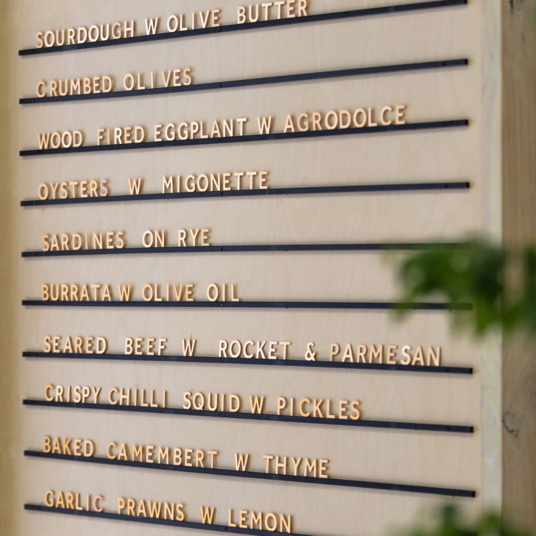
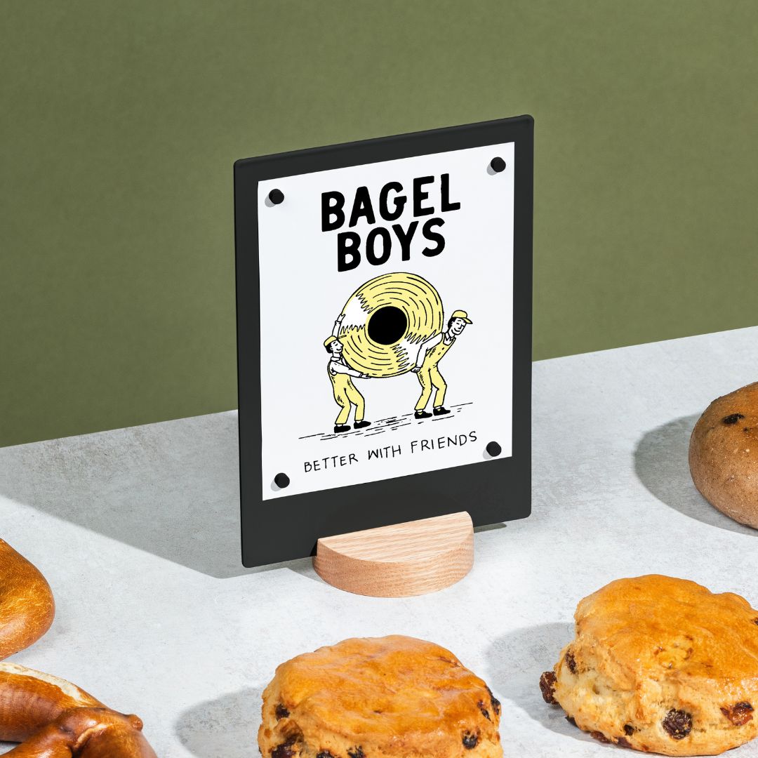
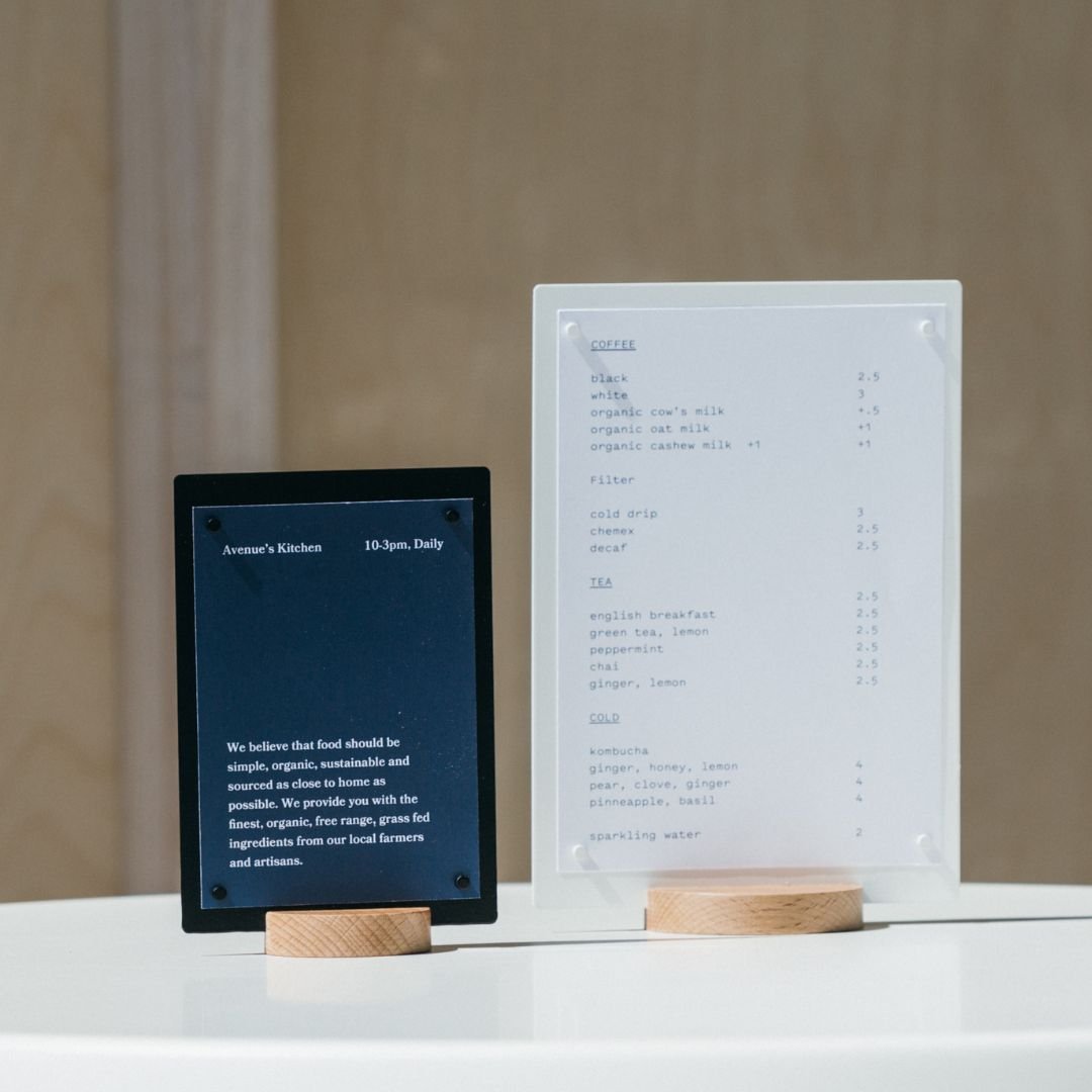
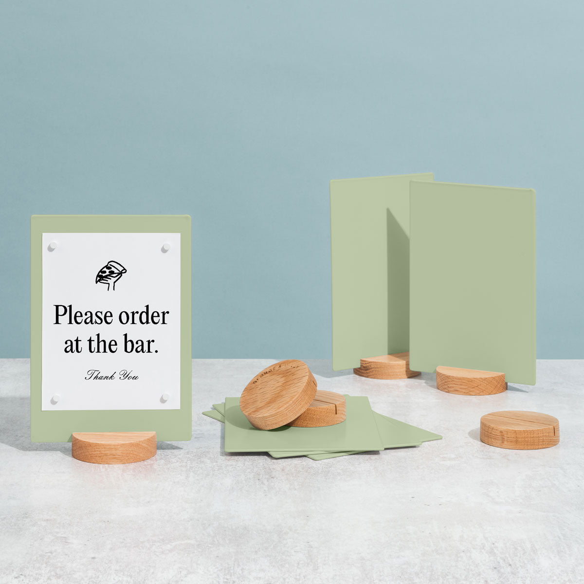
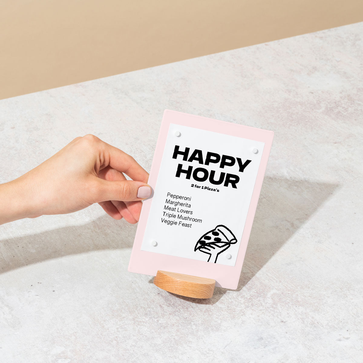
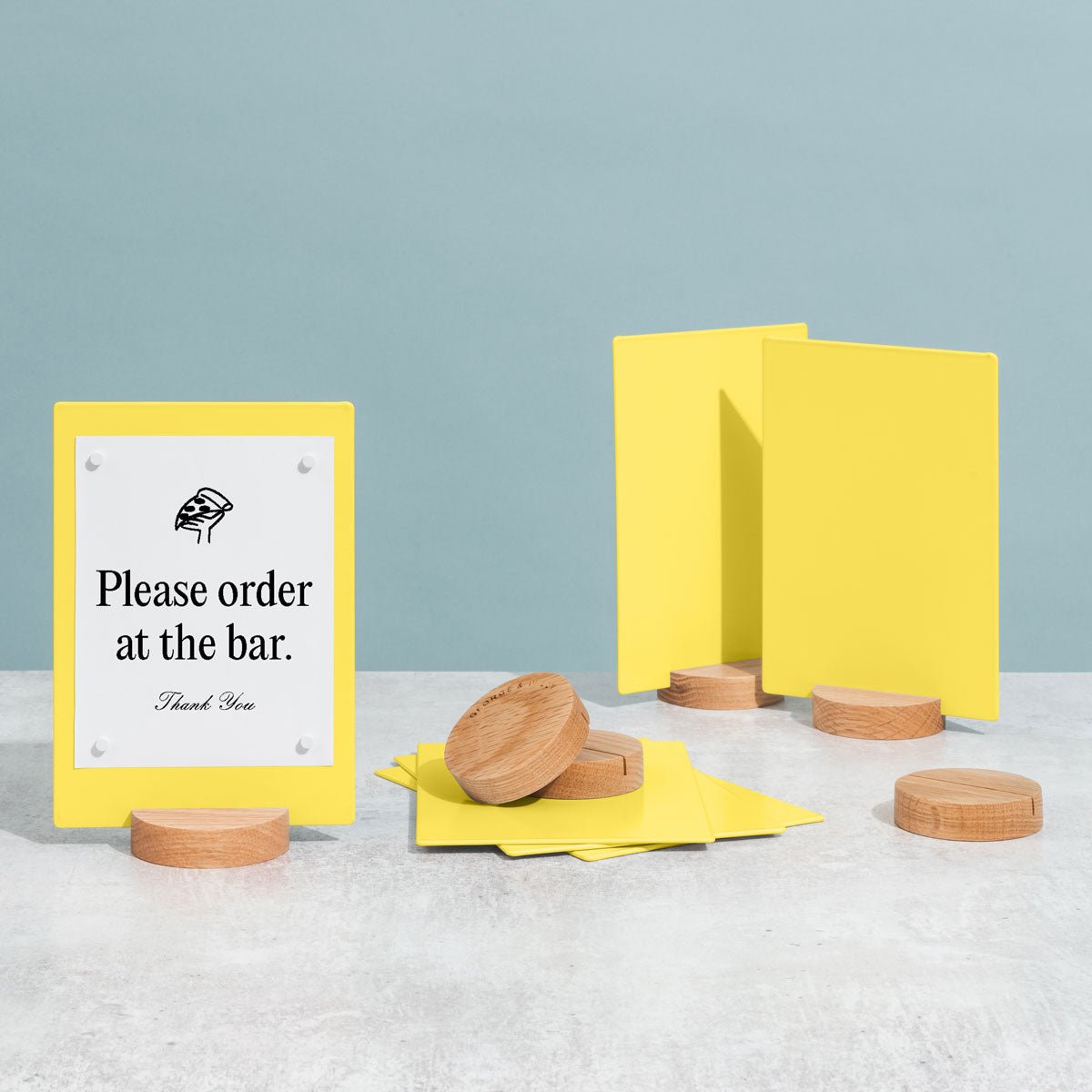
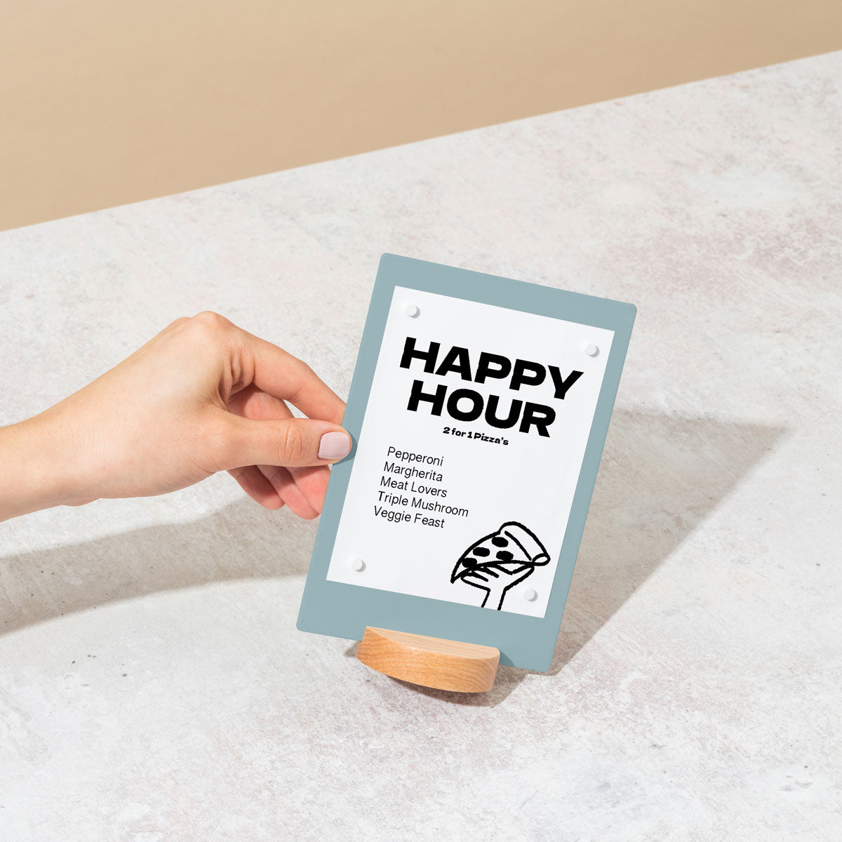
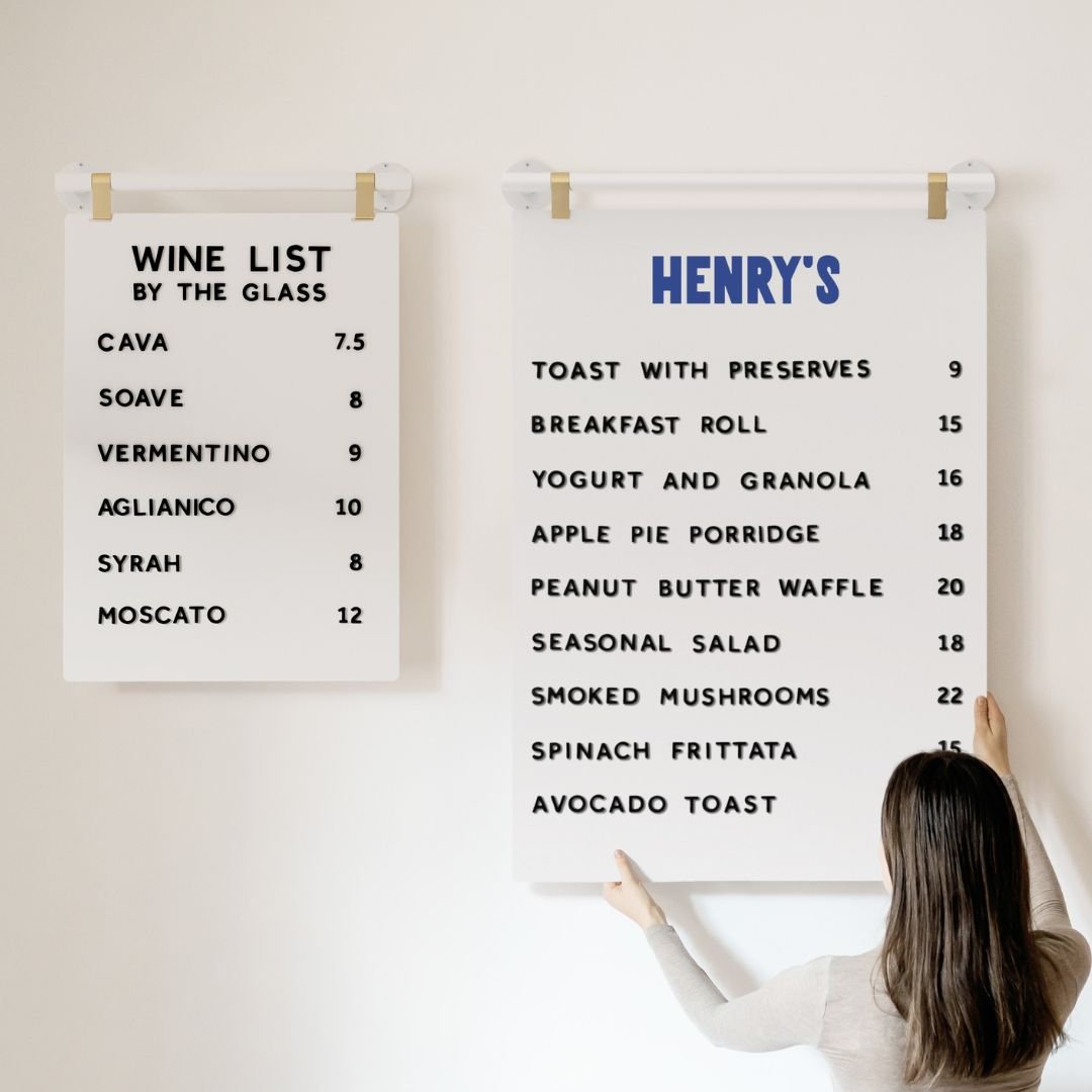
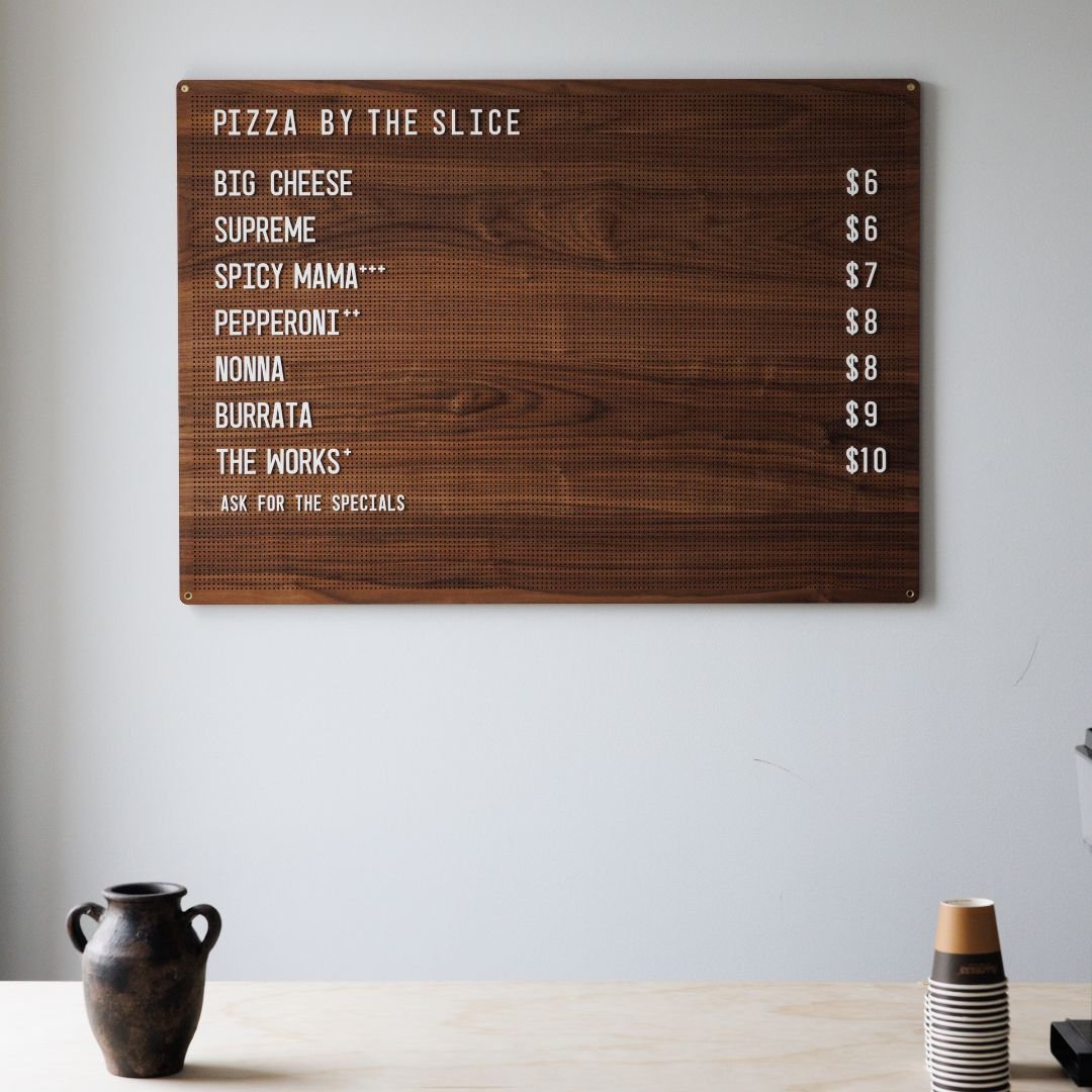
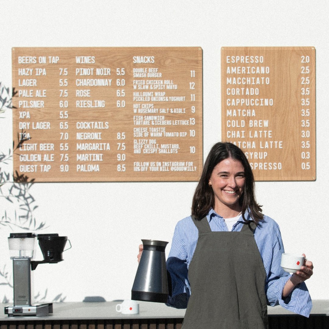
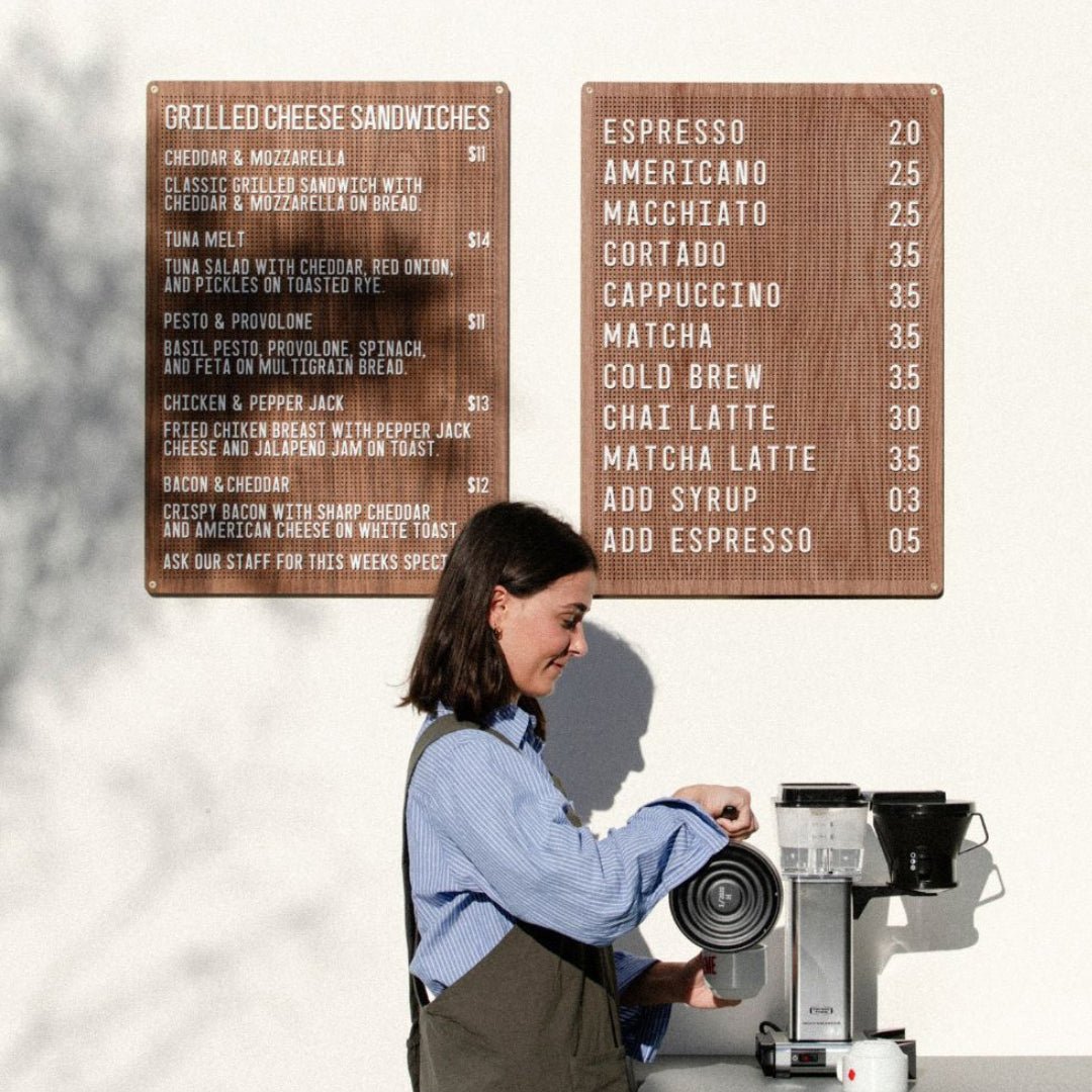
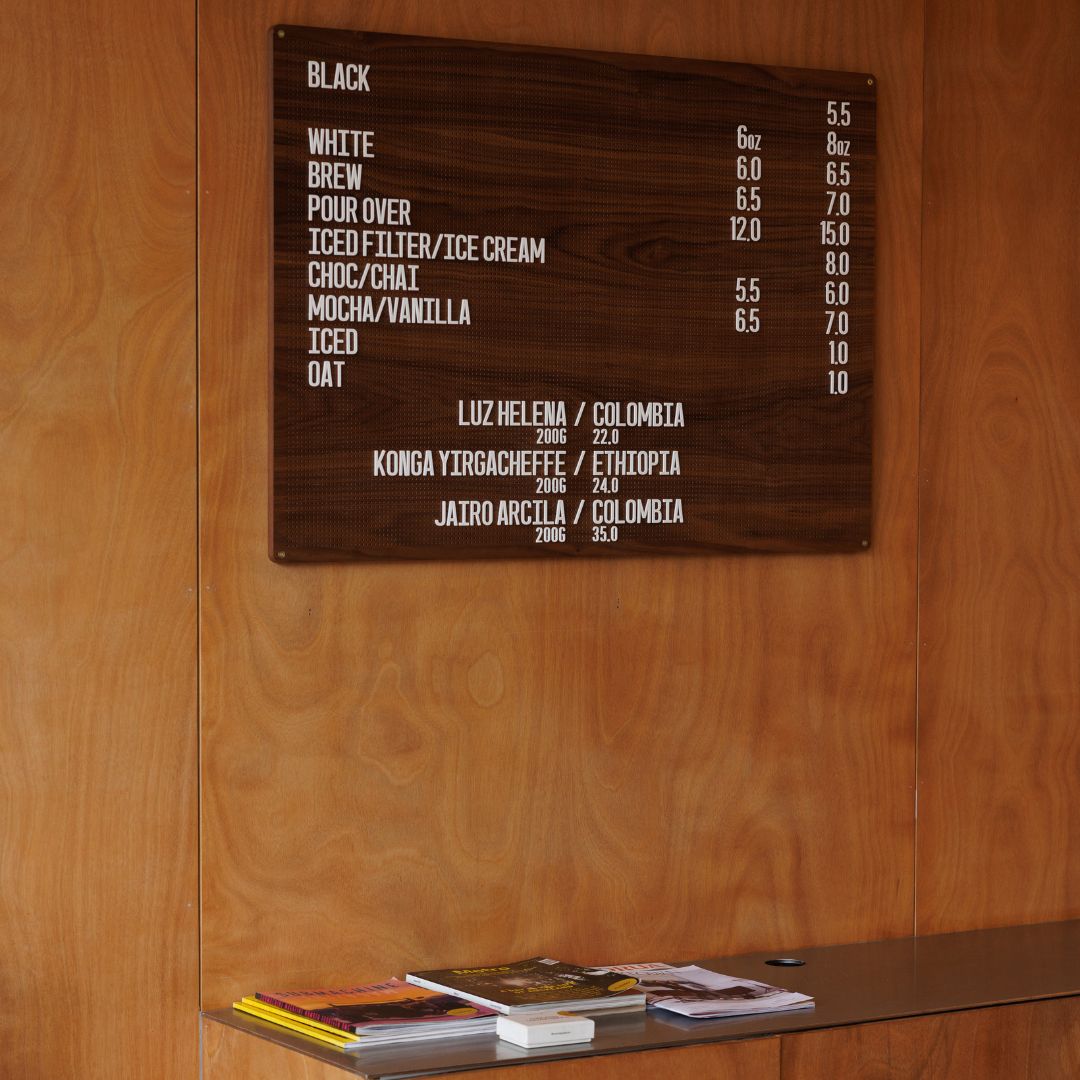
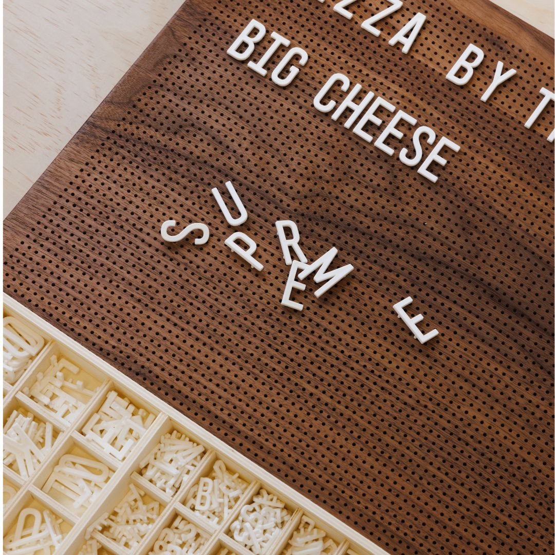
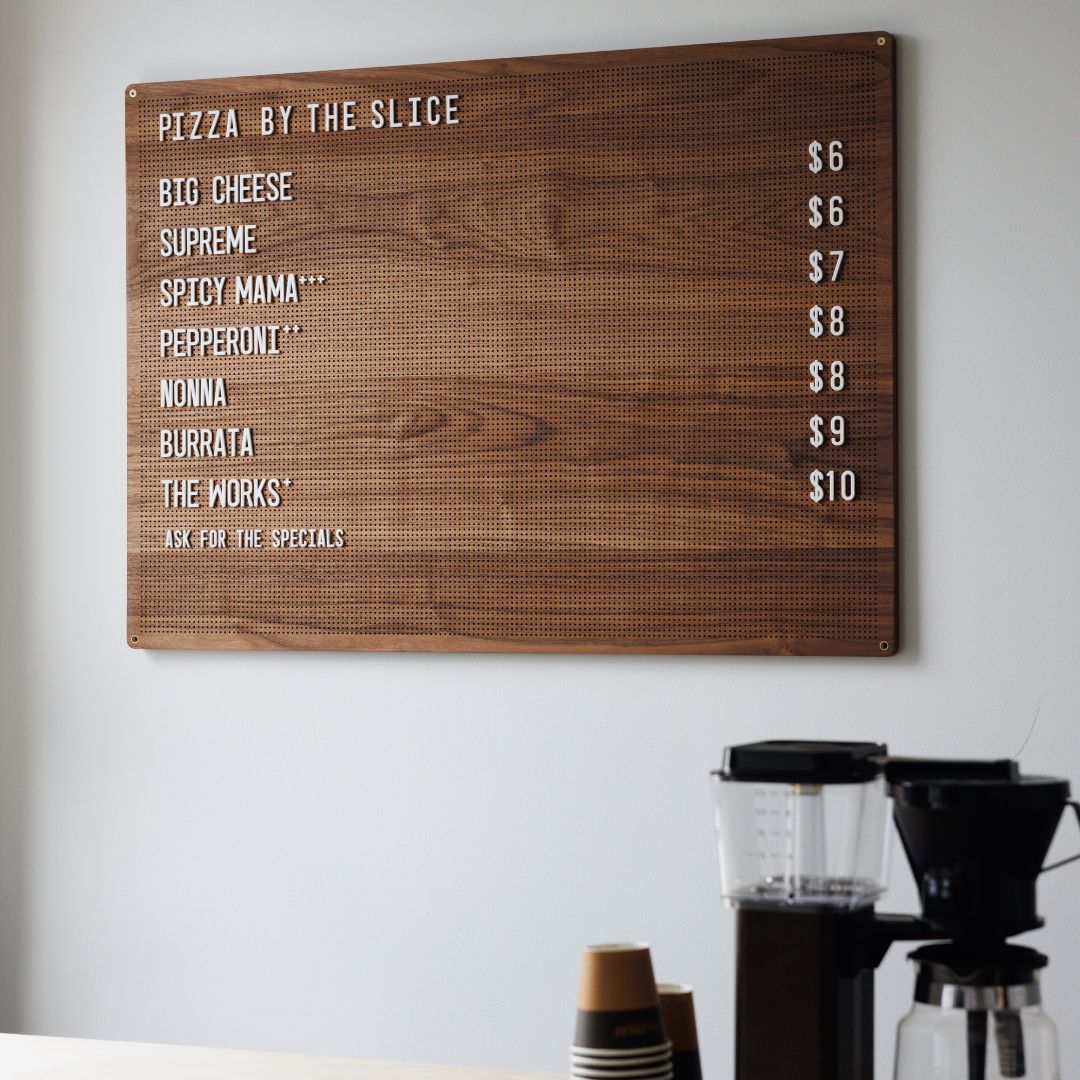
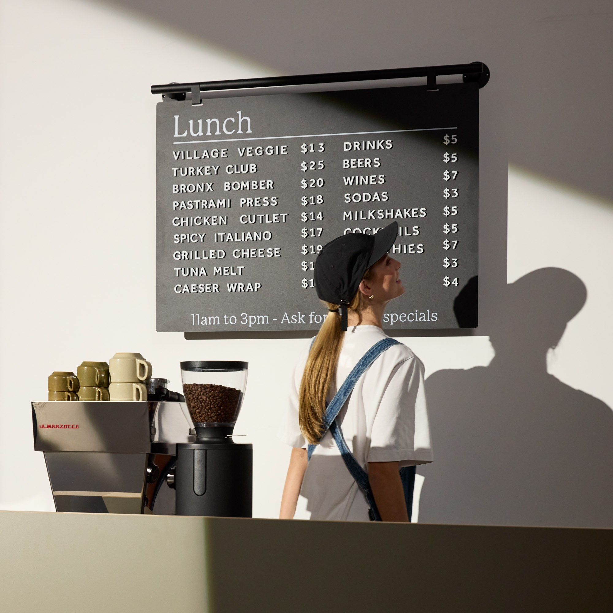
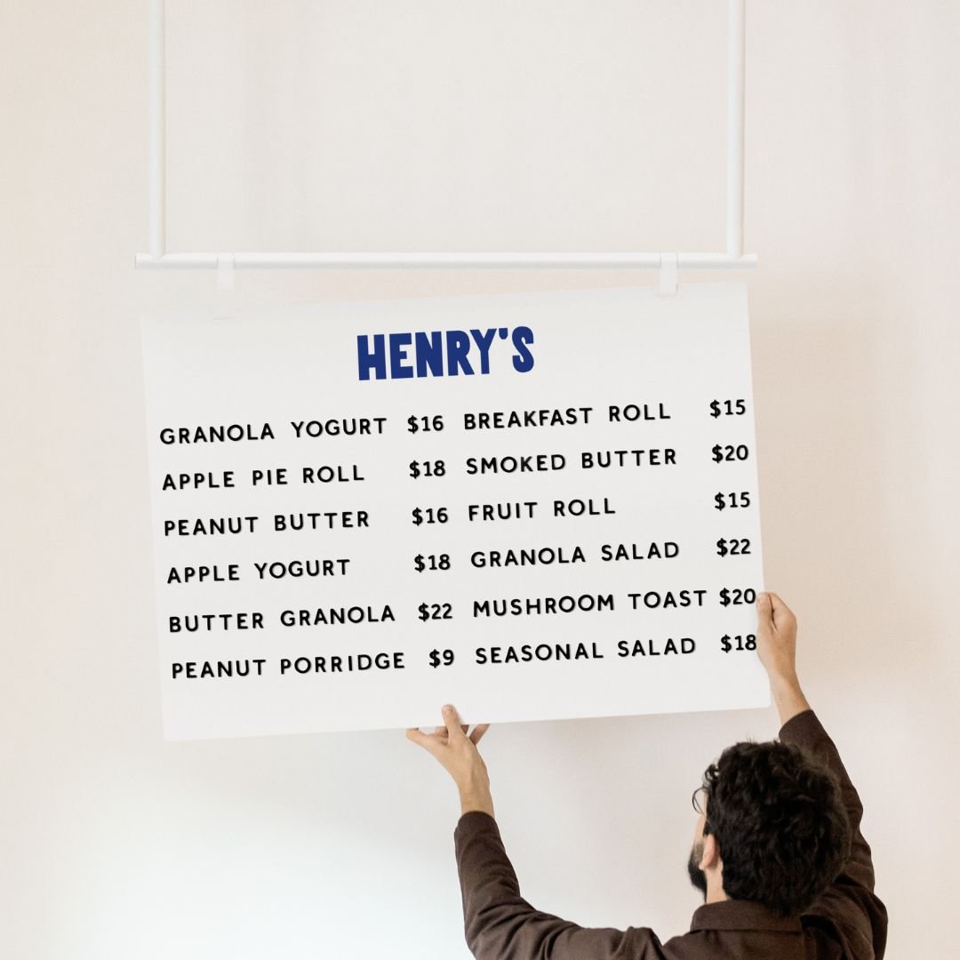
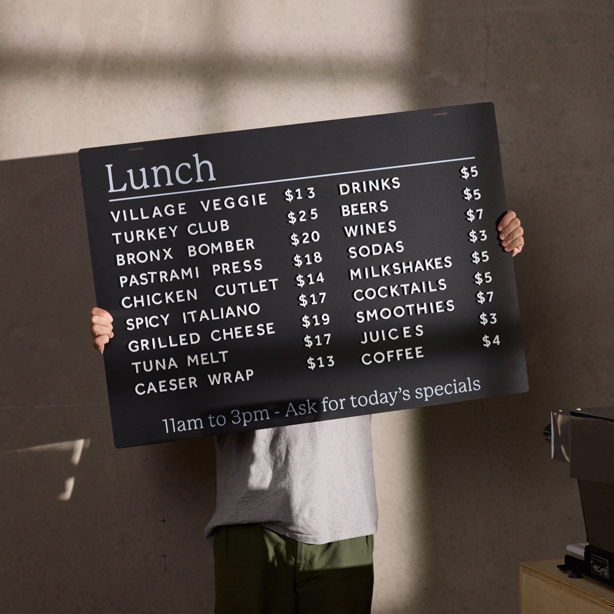
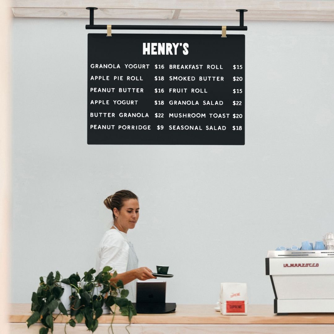
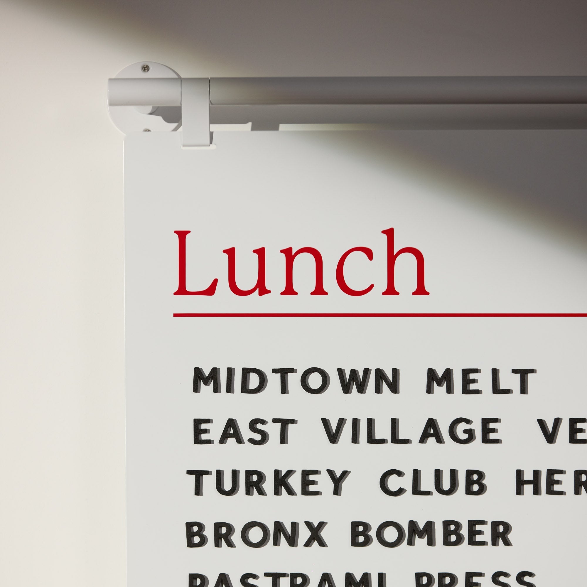
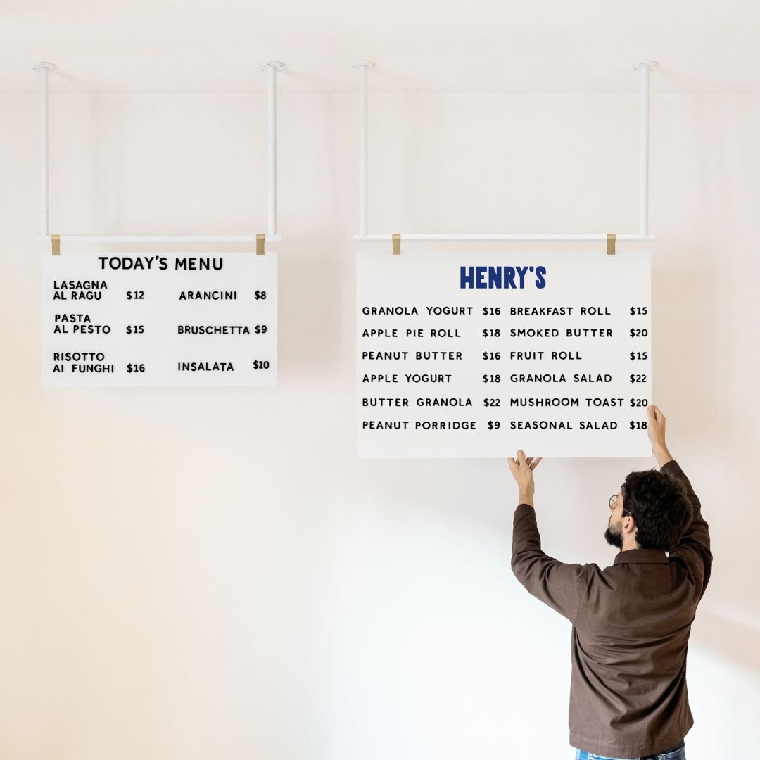
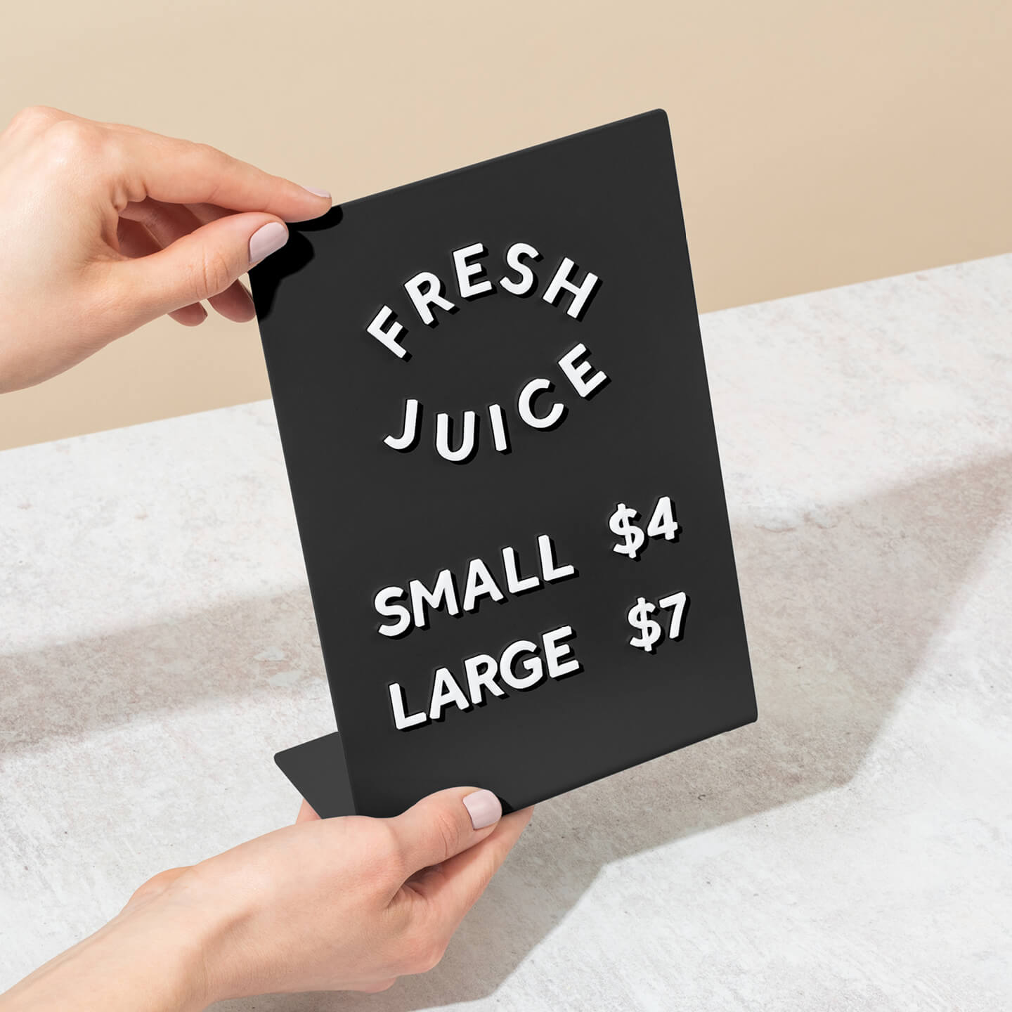
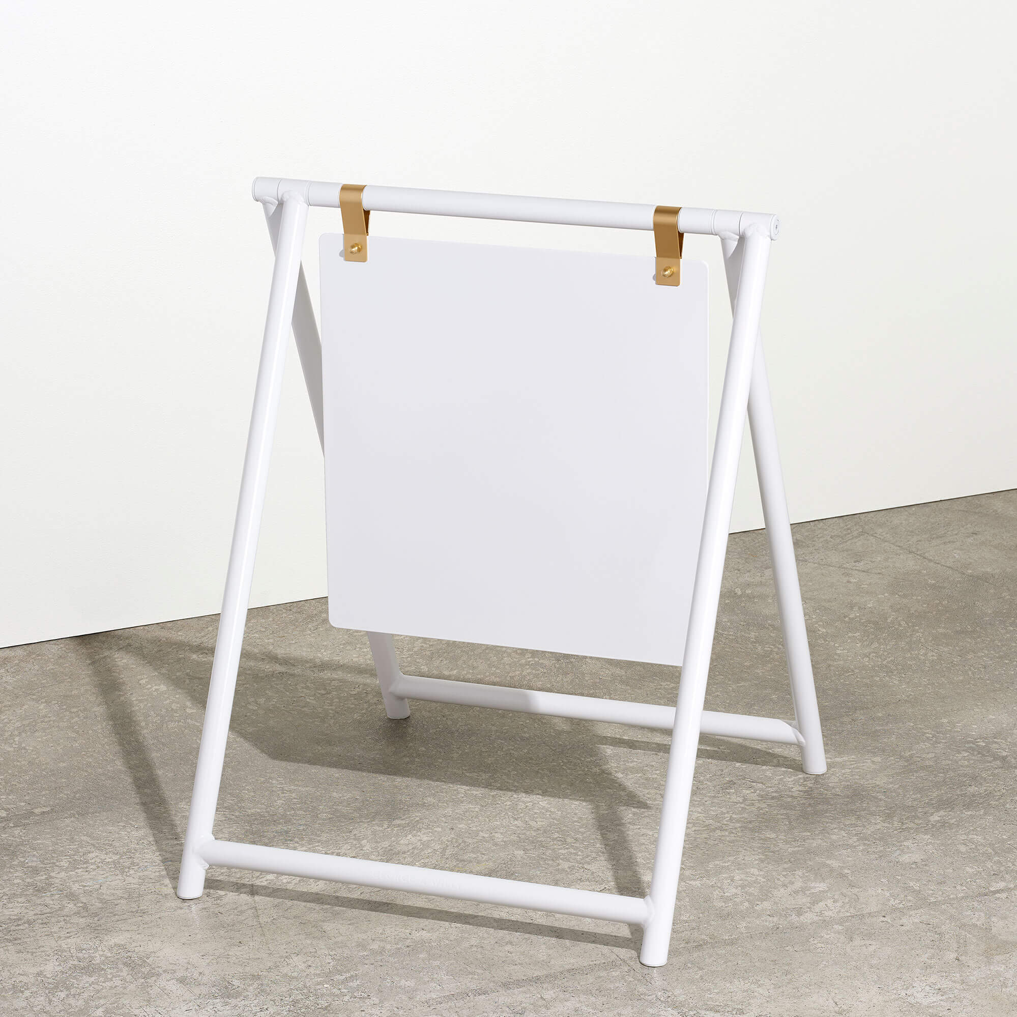
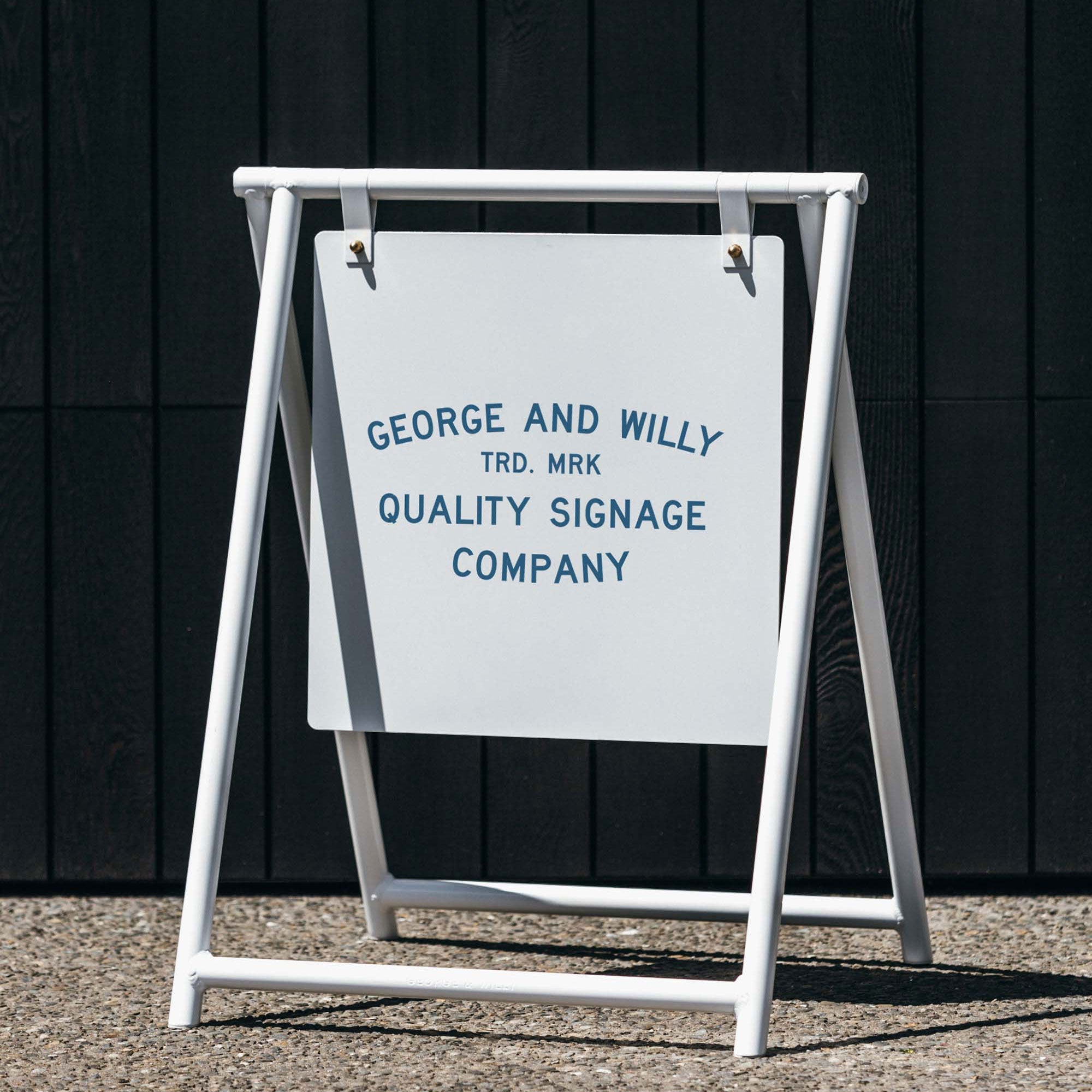
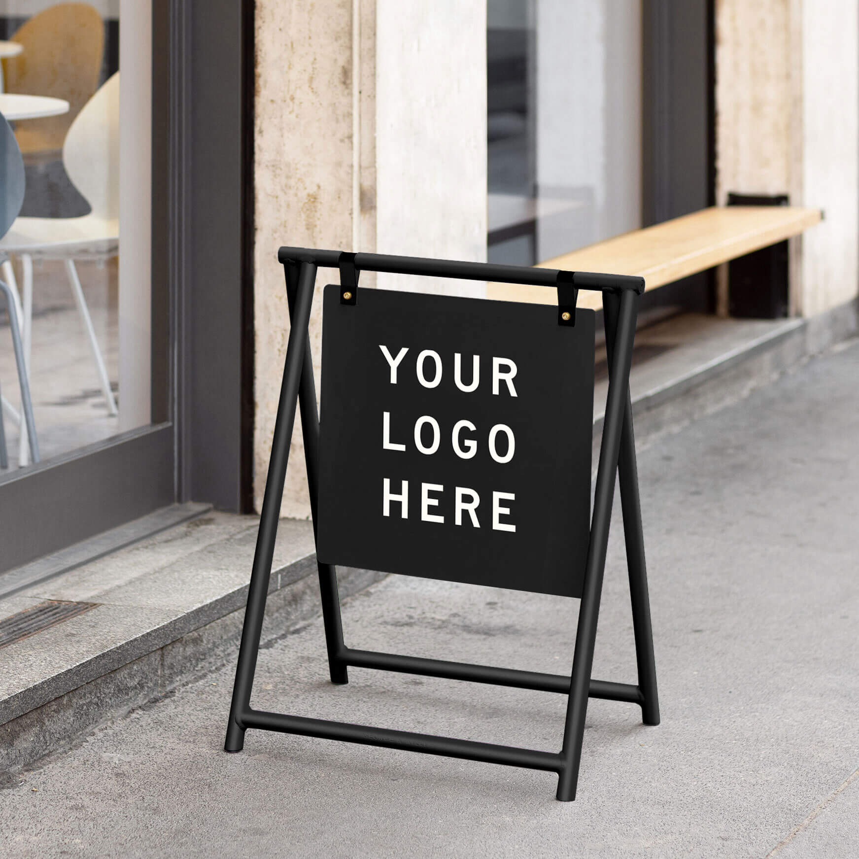
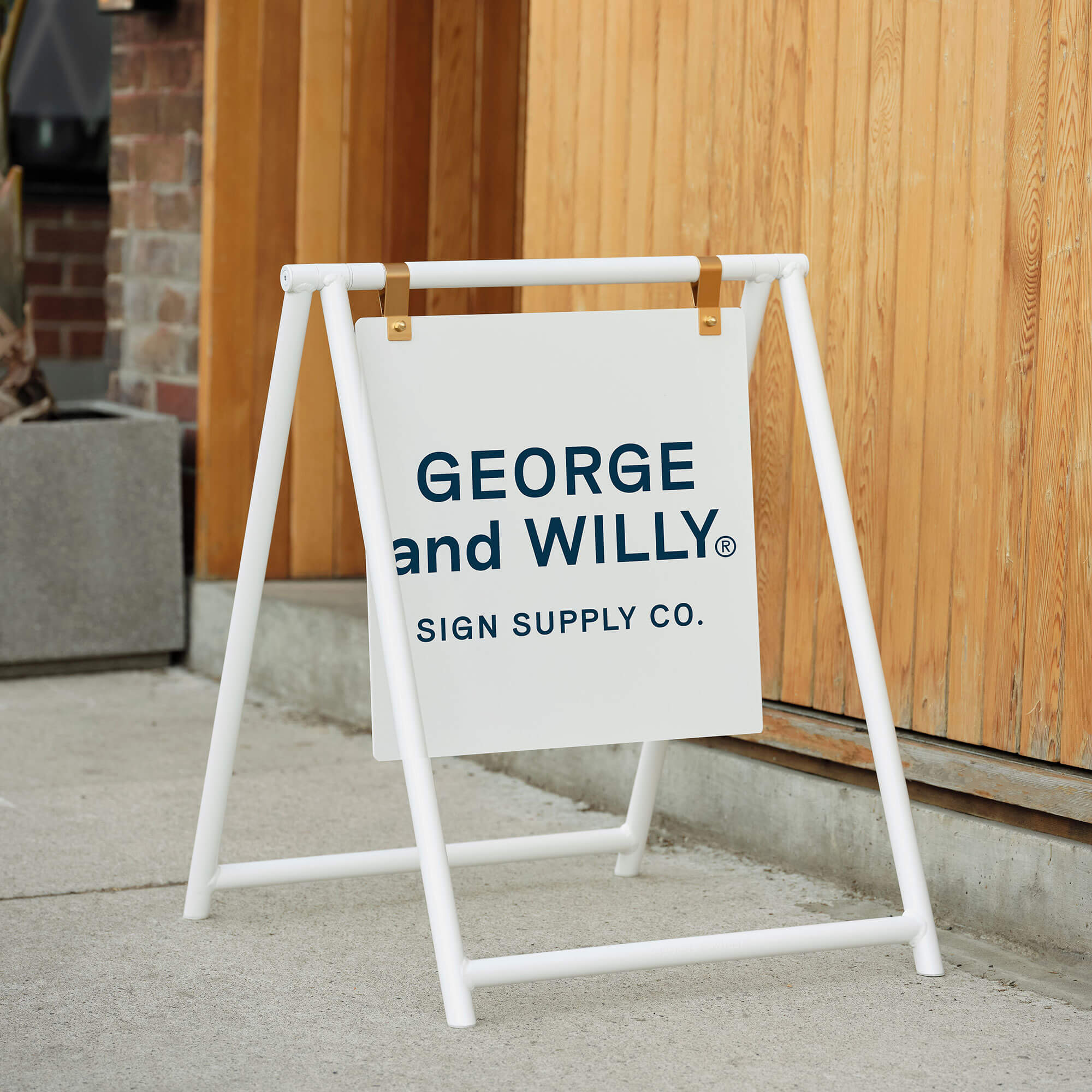
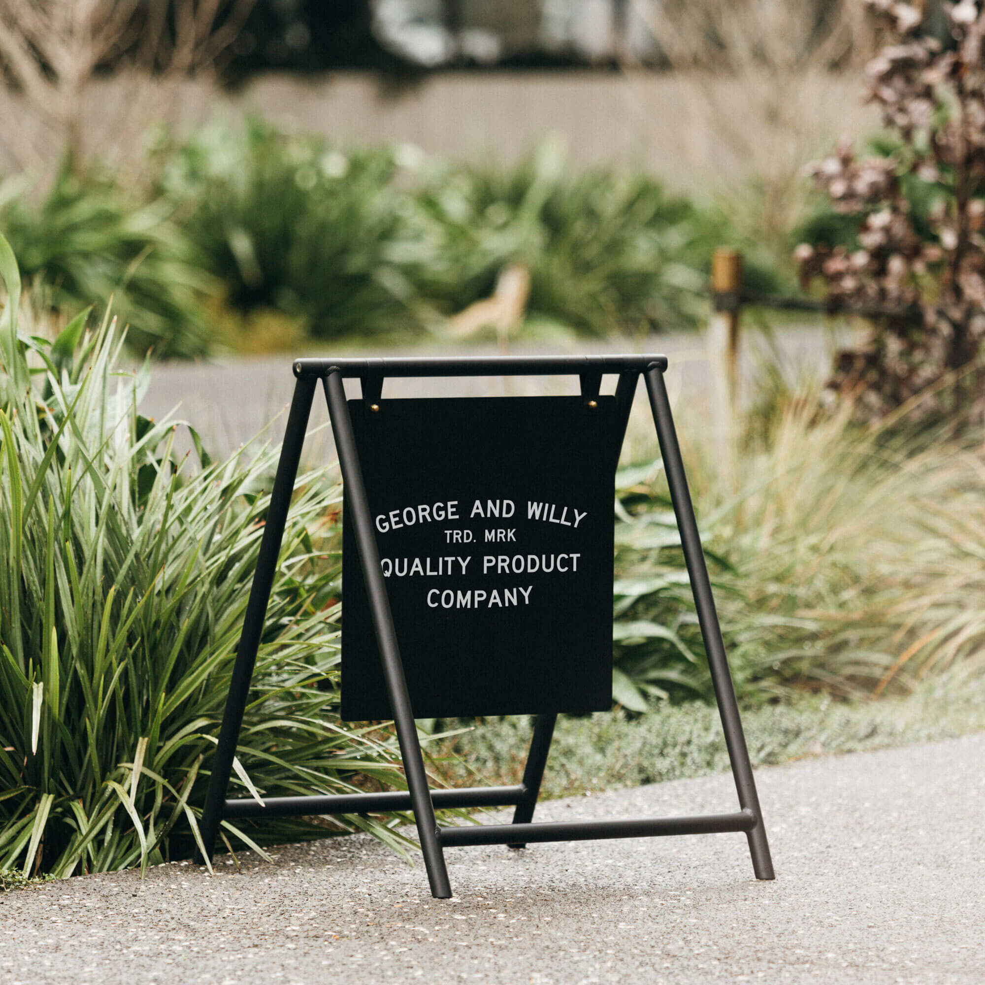
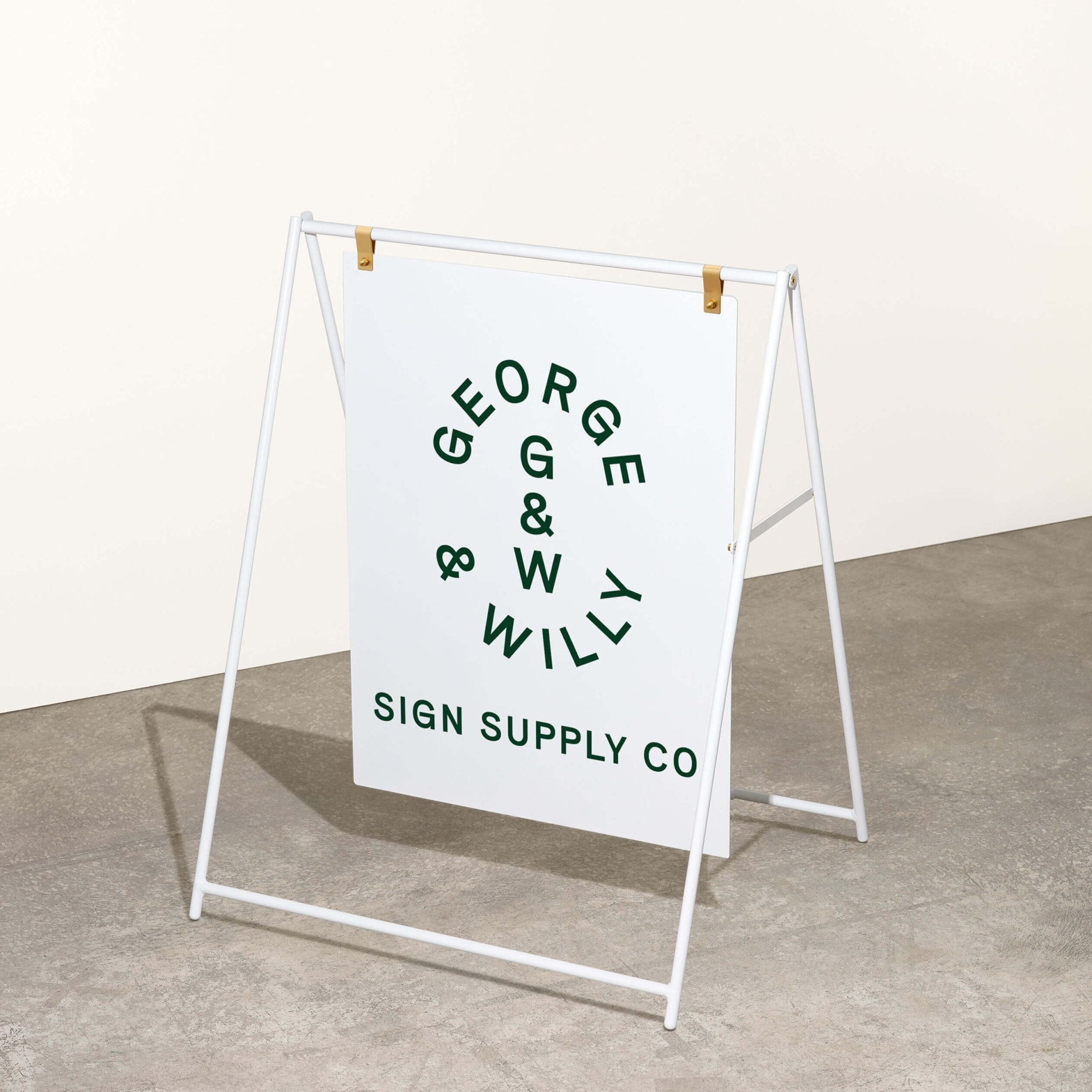
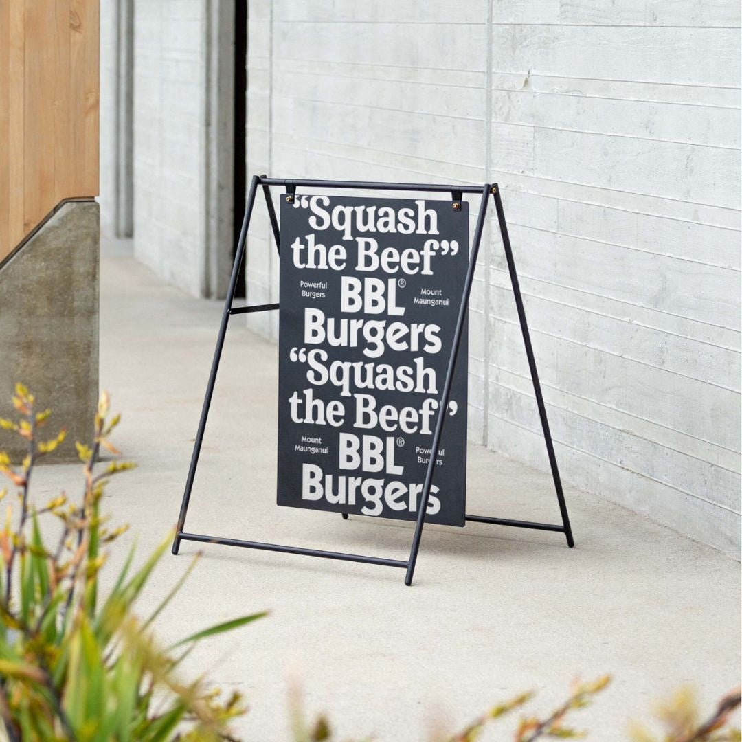
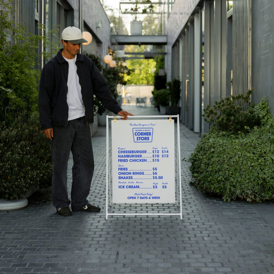
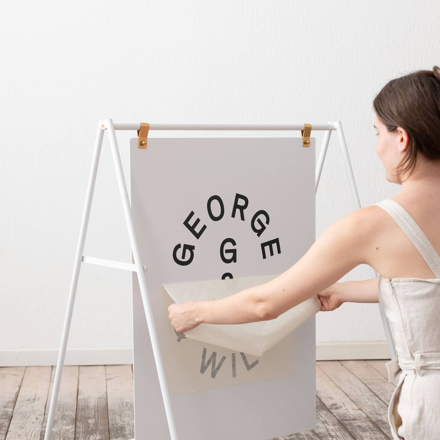
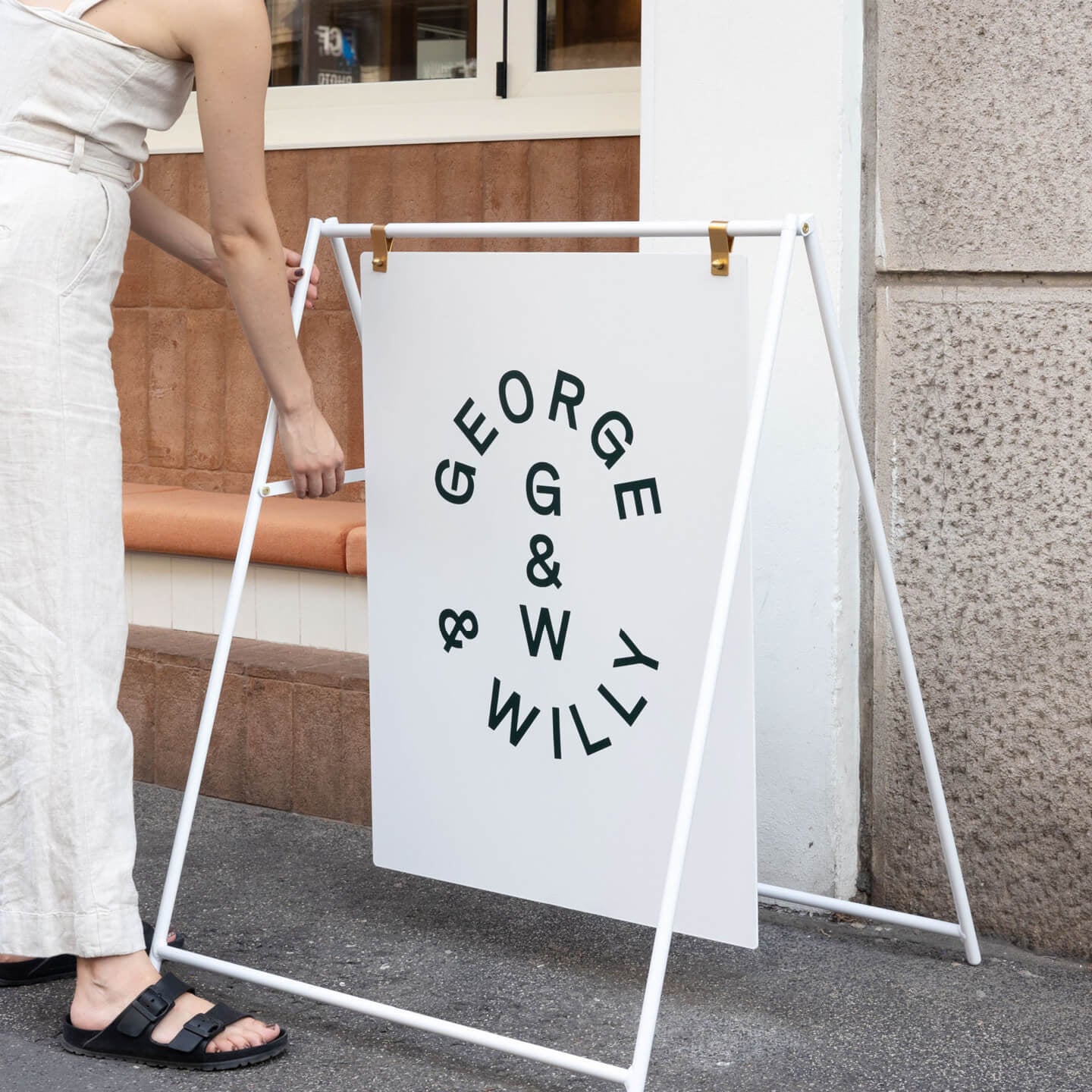
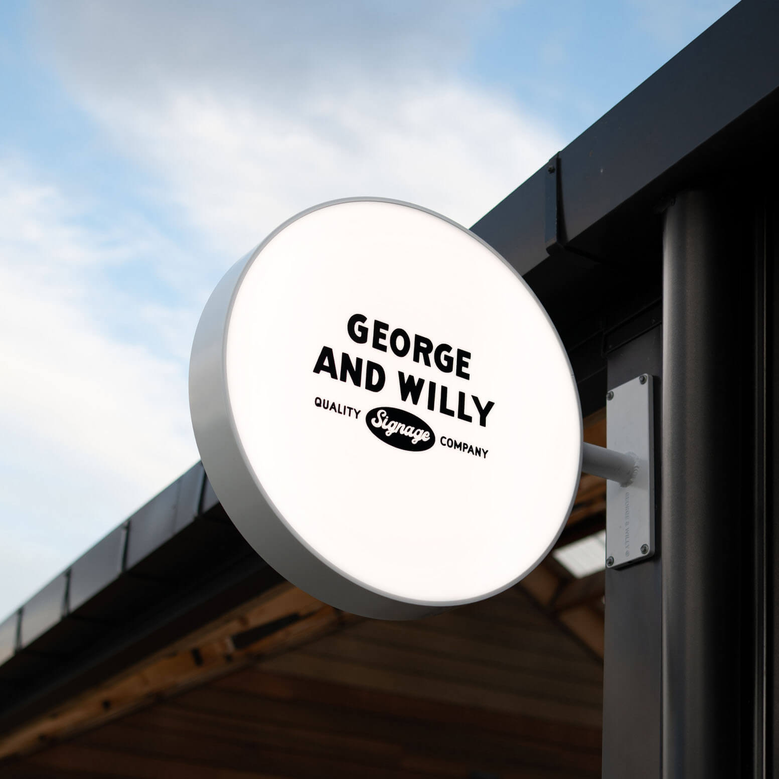
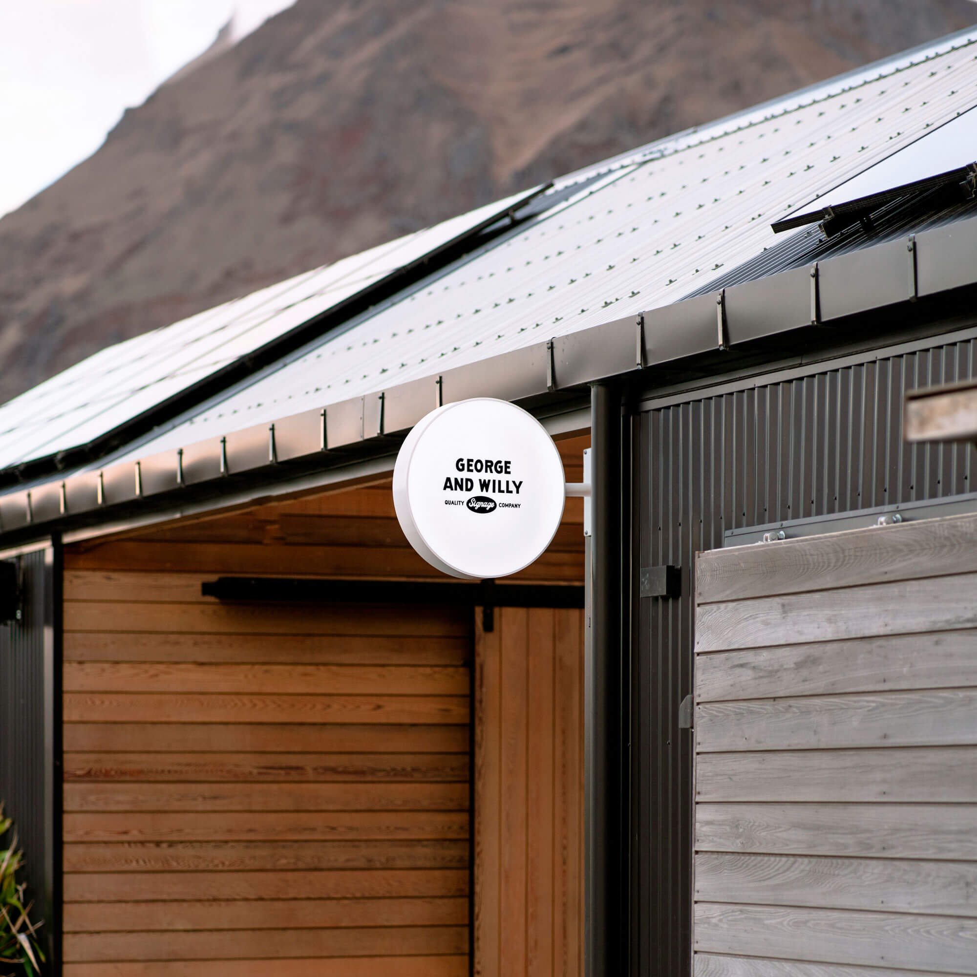
Peg Letter Boards are our most popular product for good reason. They have an approachable, almost playful quality that works beautifully in cafés, brunch spots, delis, and casual dining. The letters simply peg into pre-set holes, spacing is consistent, and updating is easy. Pull out the old letters, pop in new ones.
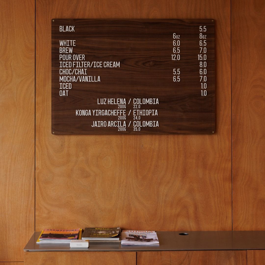
Our Wooden Peg Letter Board is quickly becoming a customer favourite. The warm timber finish brings that same tactile, natural quality that chalkboards have always offered, just in a much tidier, more polished form. It's a brilliant choice for spaces that want warmth without the mess.
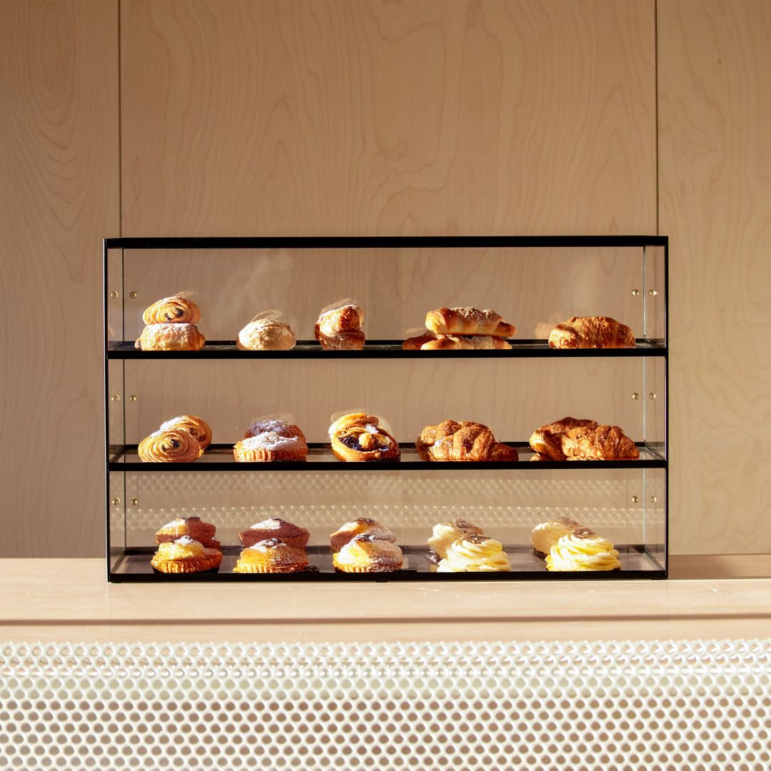
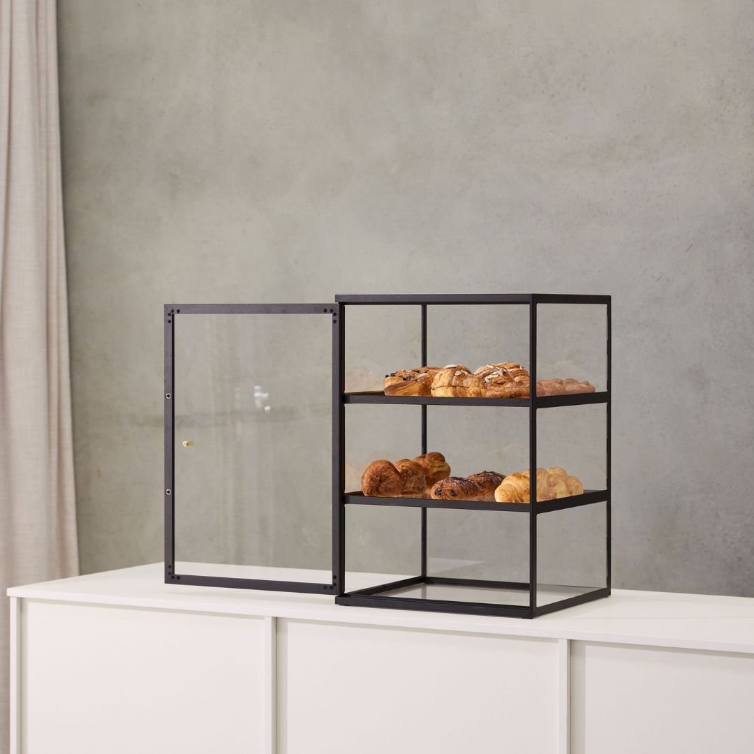
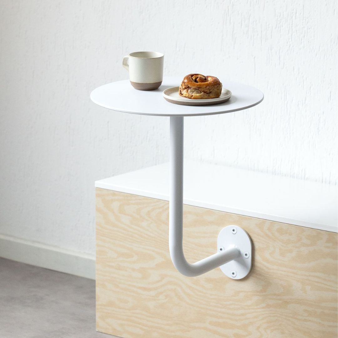
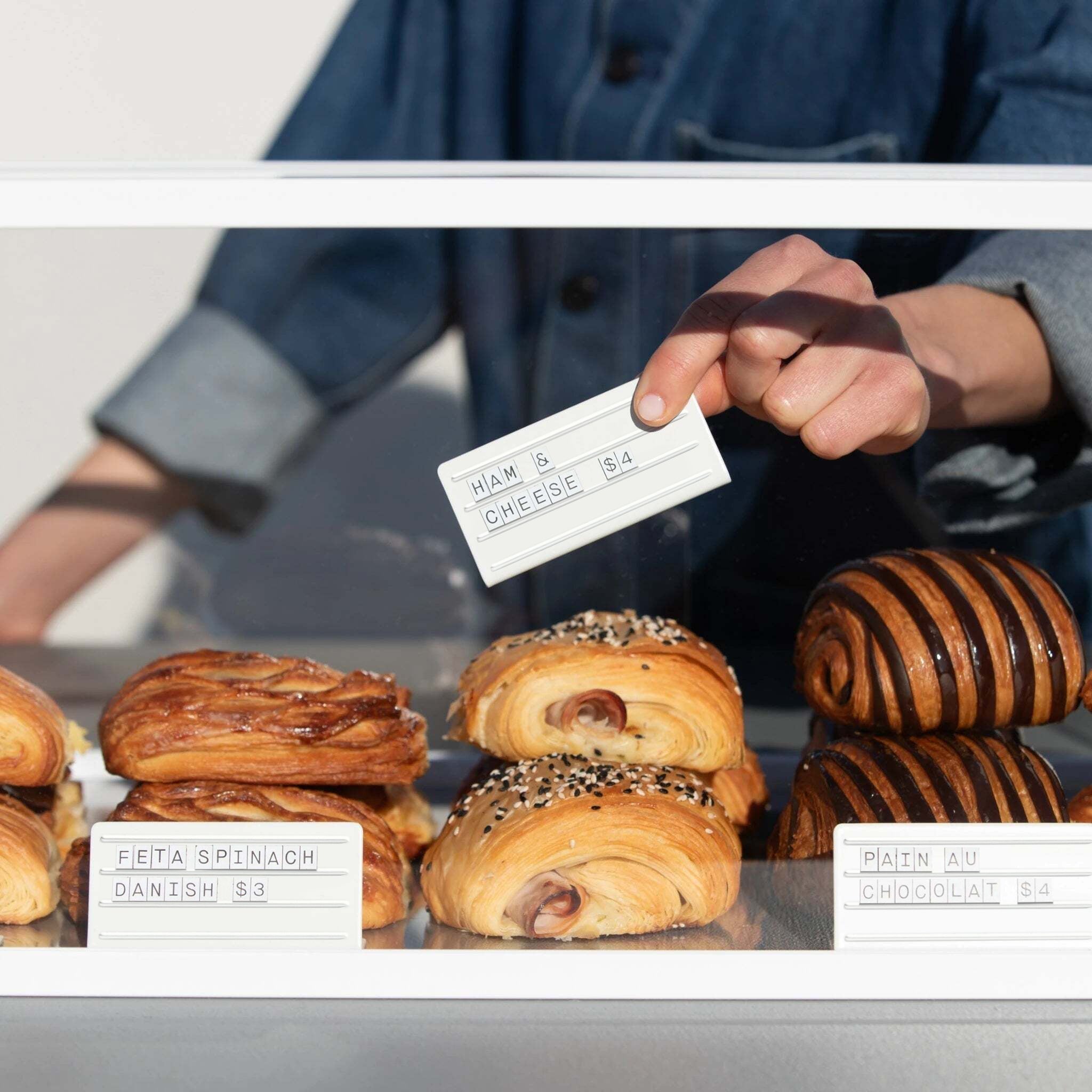
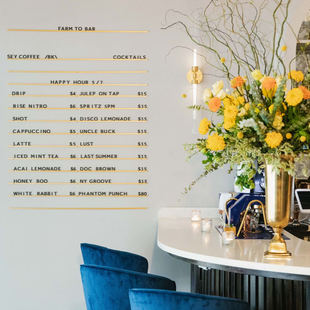
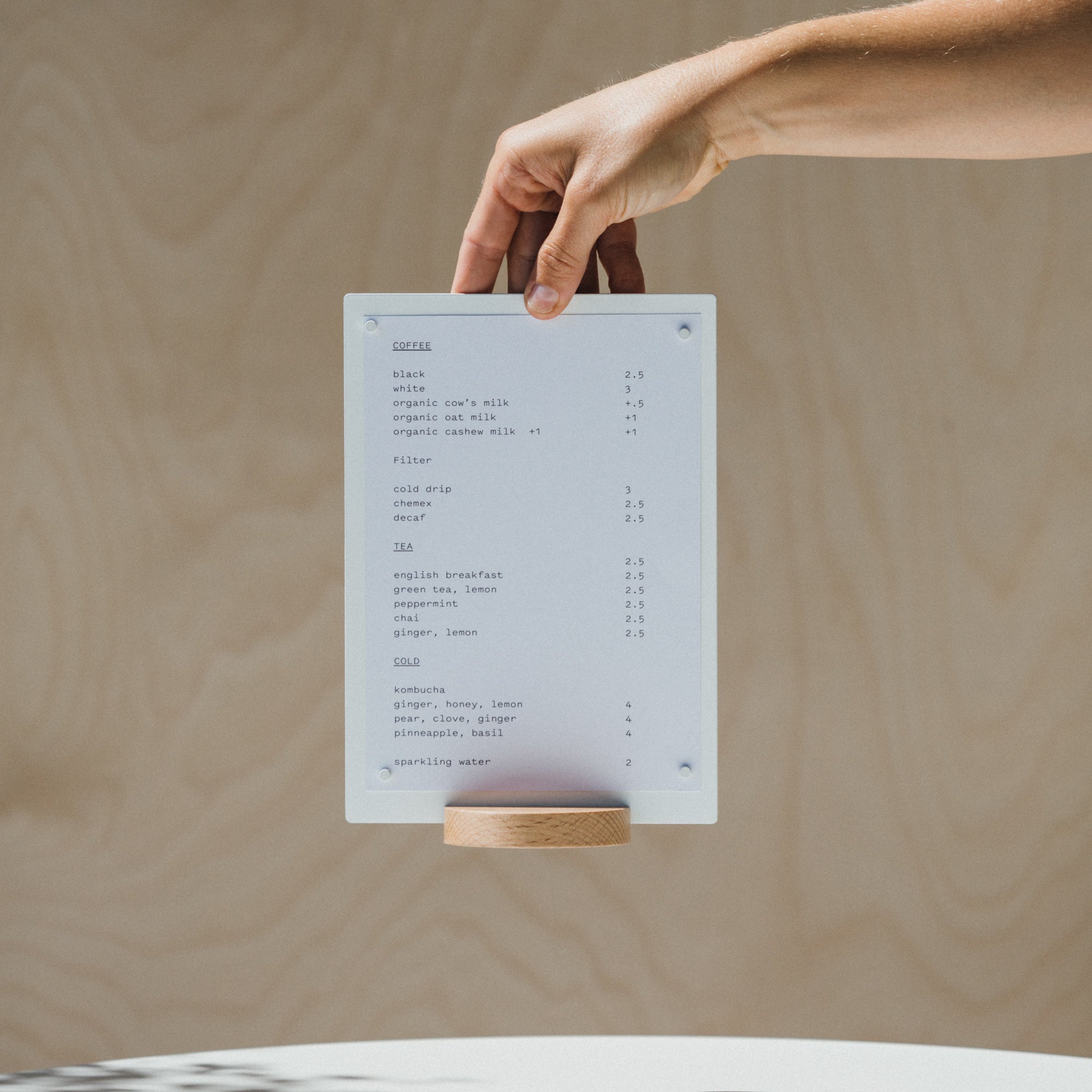
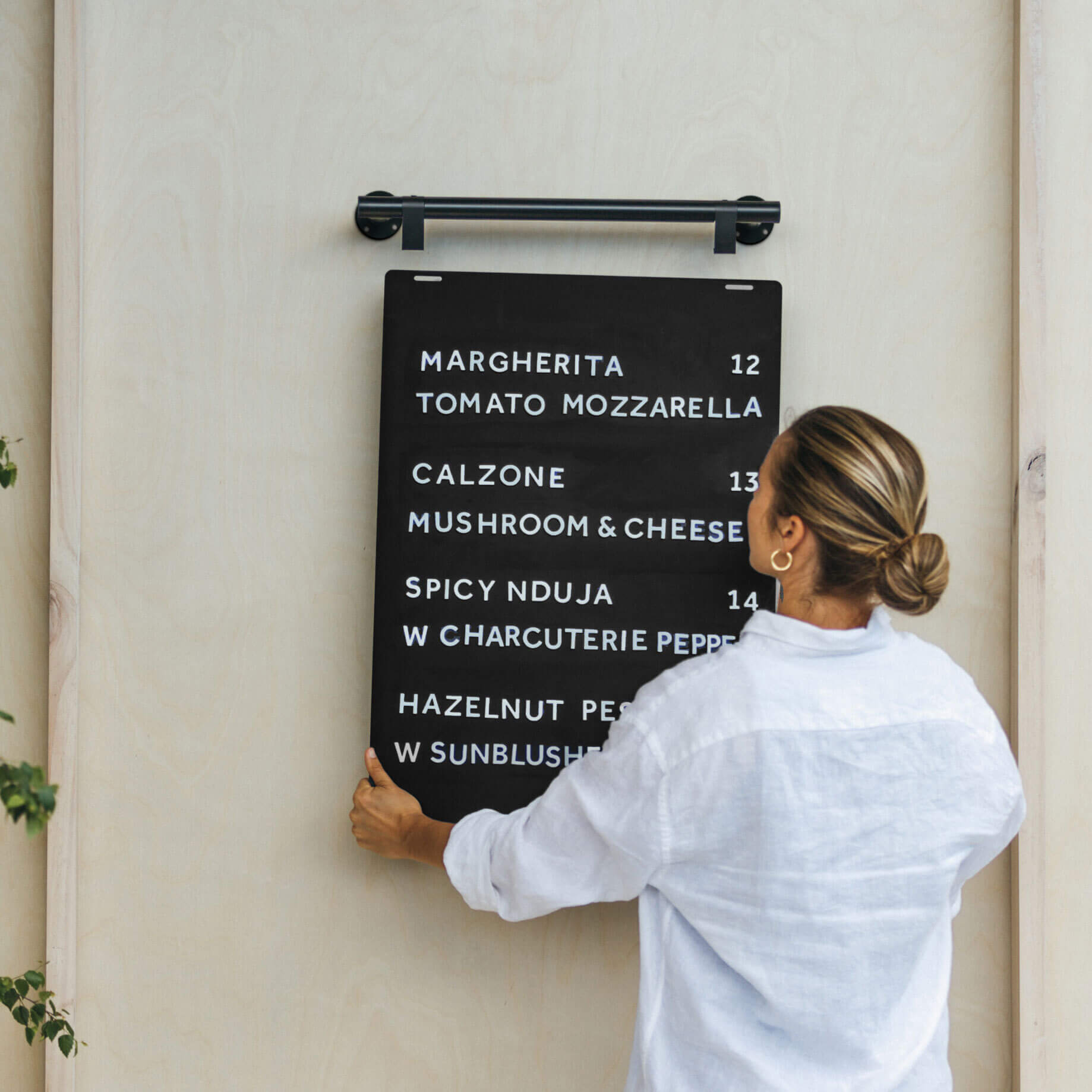
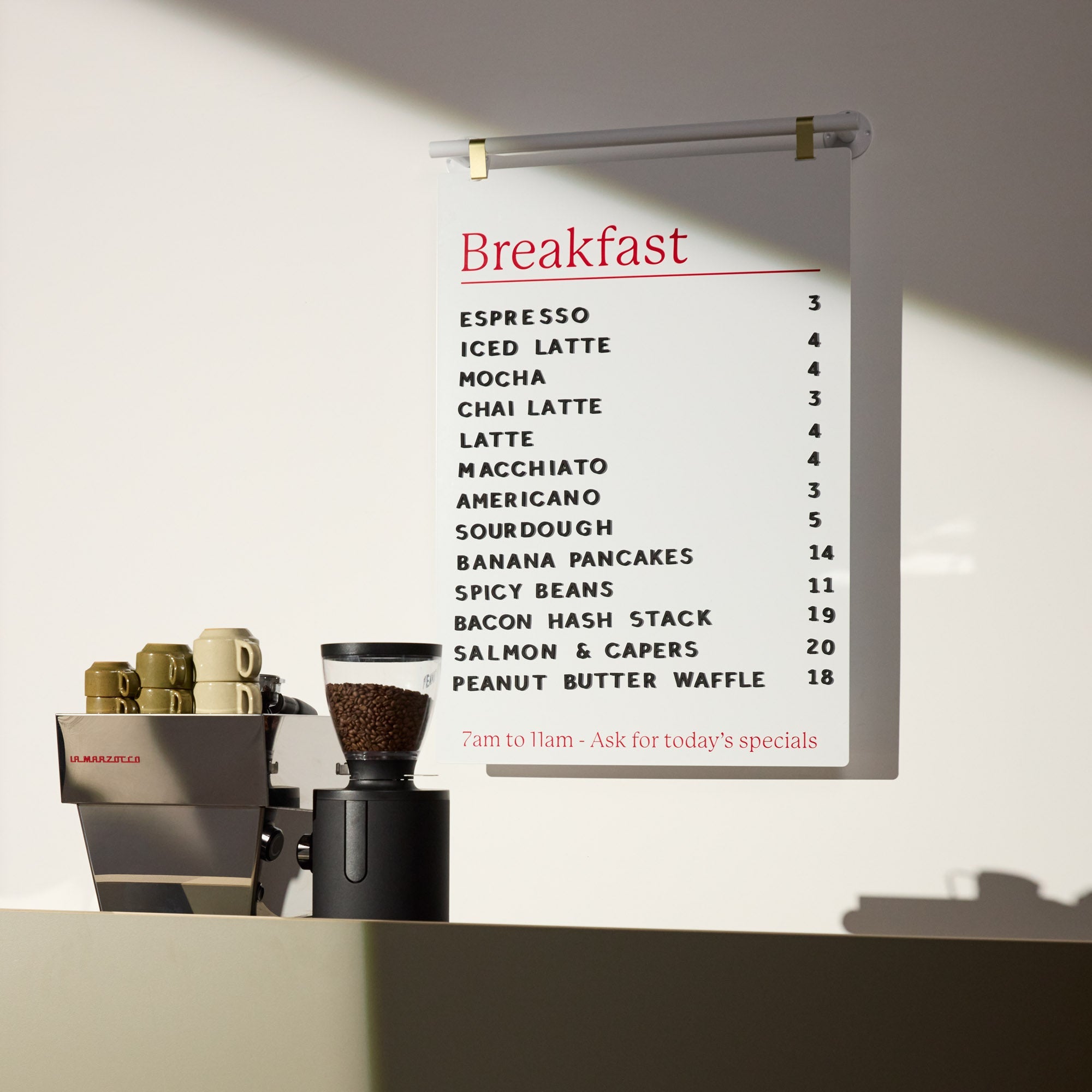
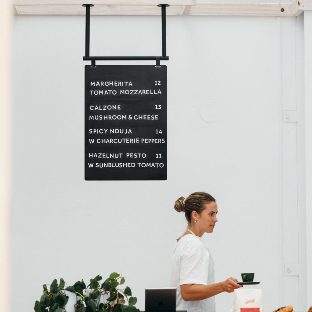
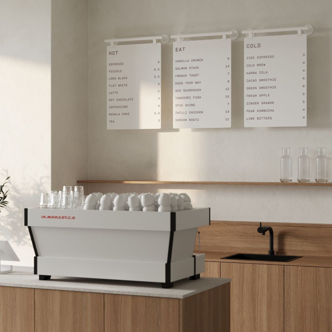
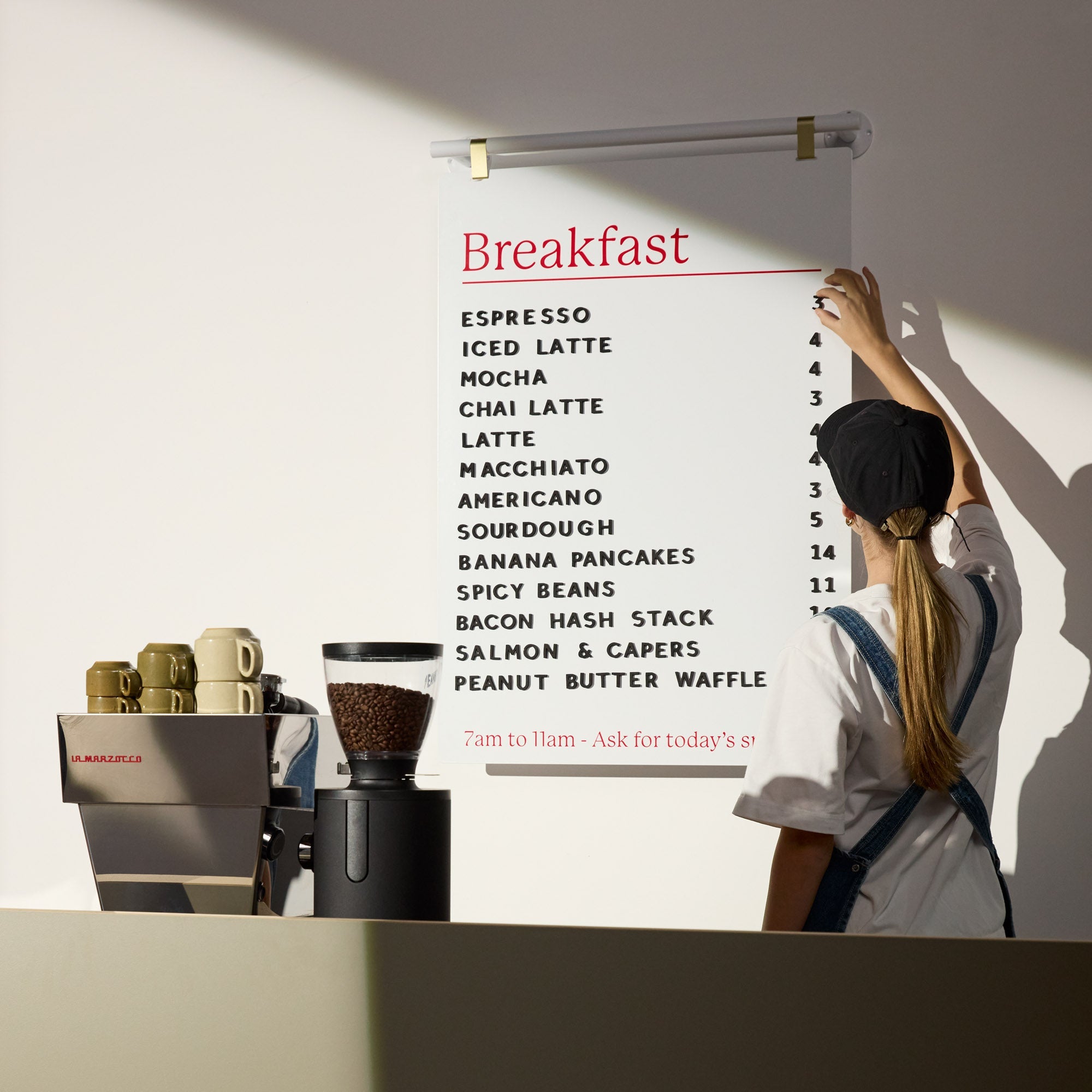
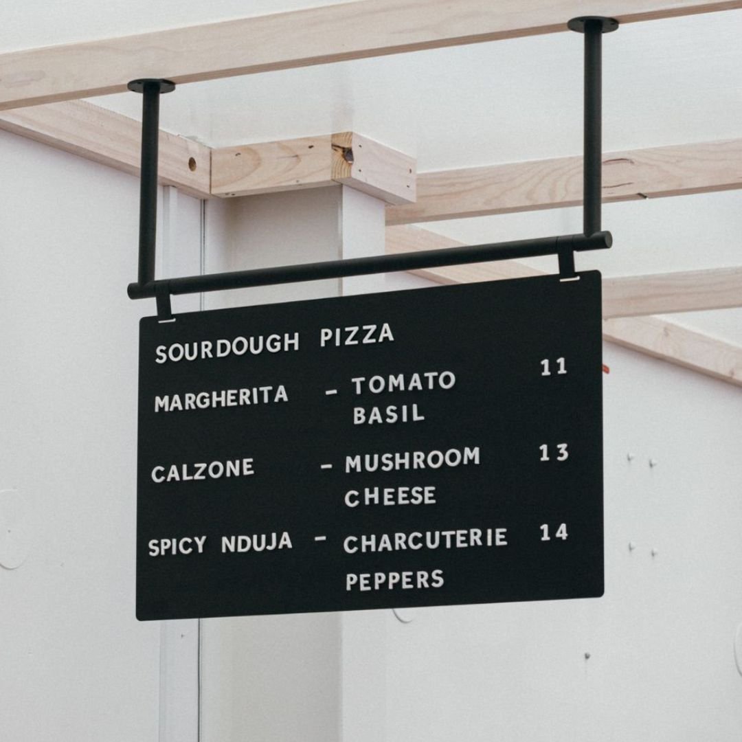
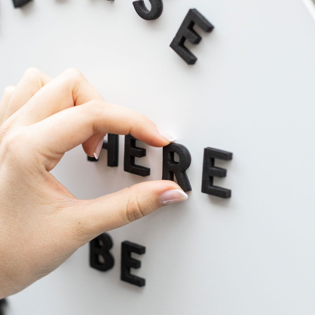
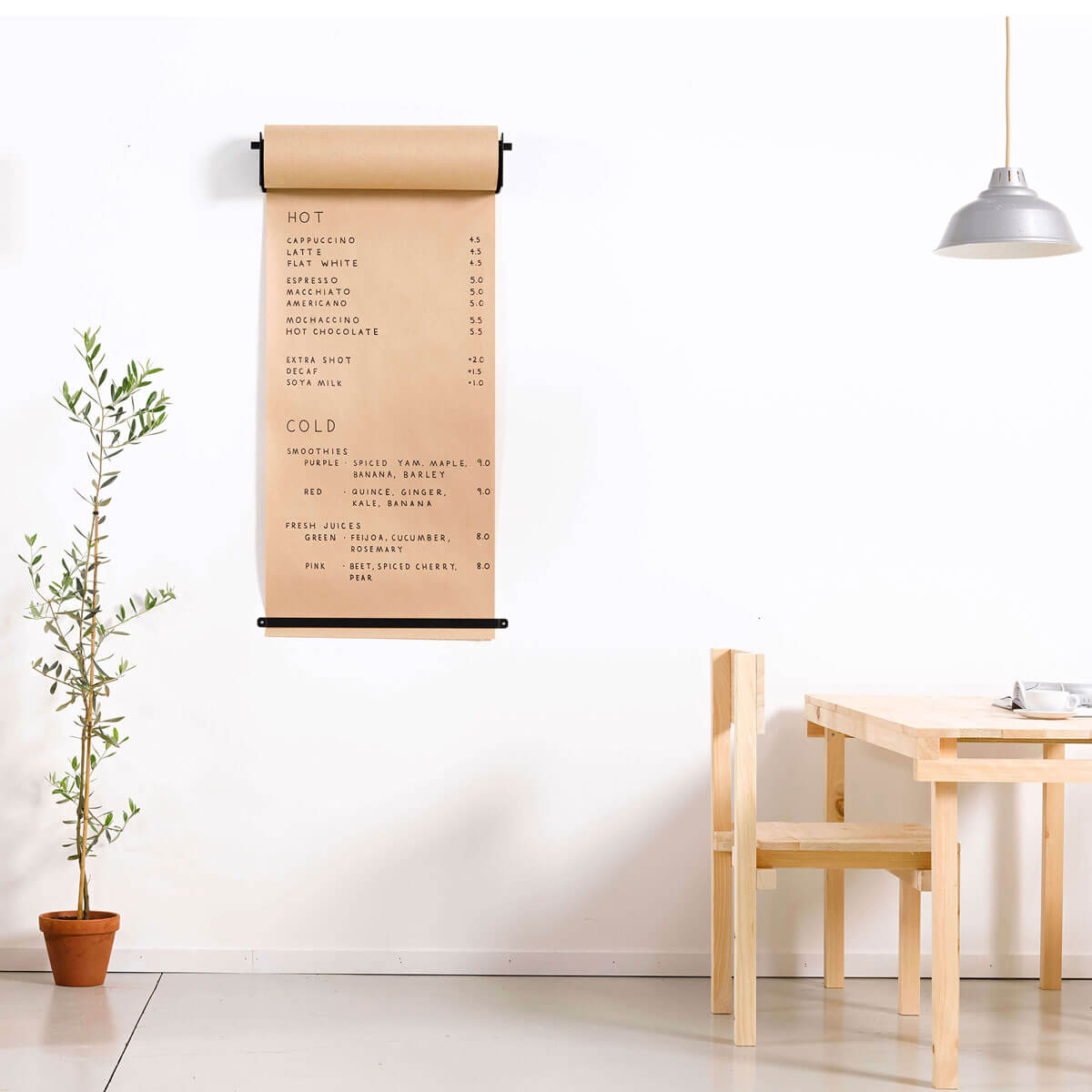
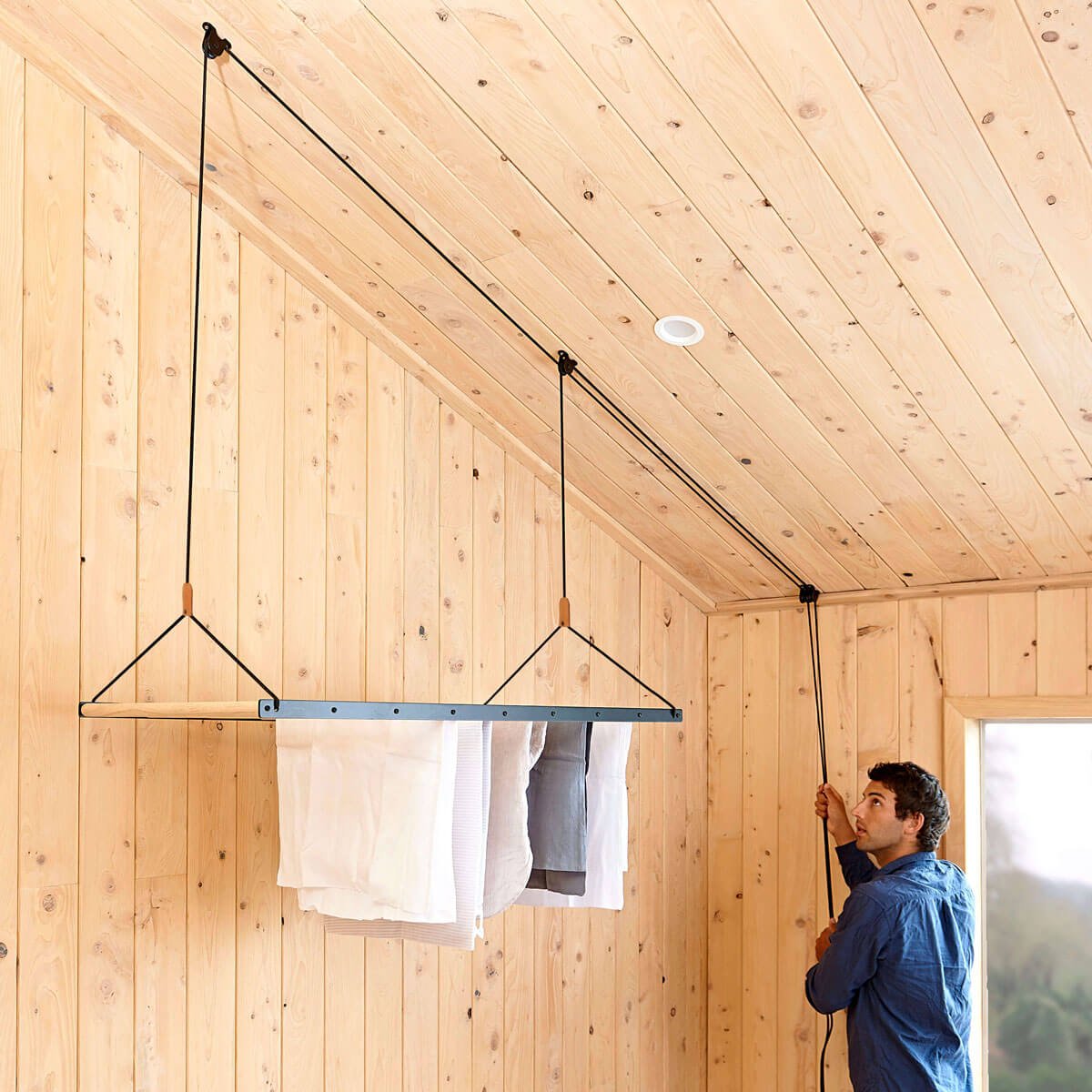
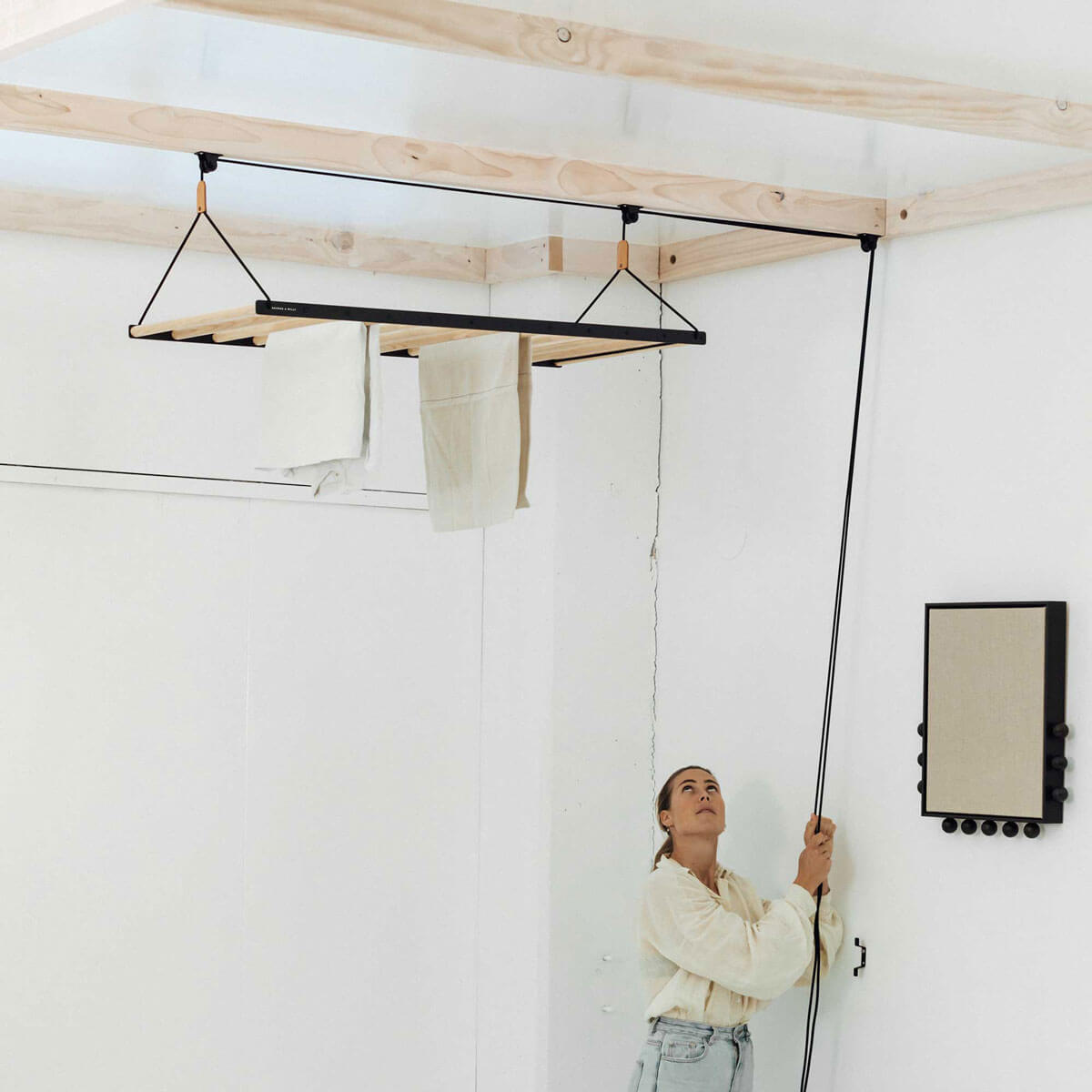
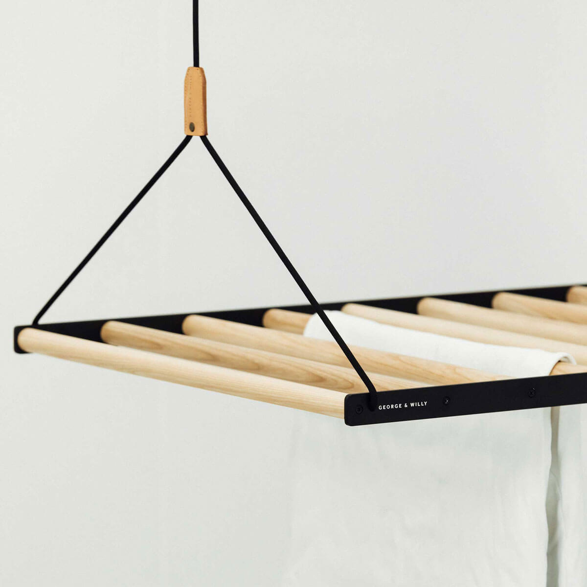
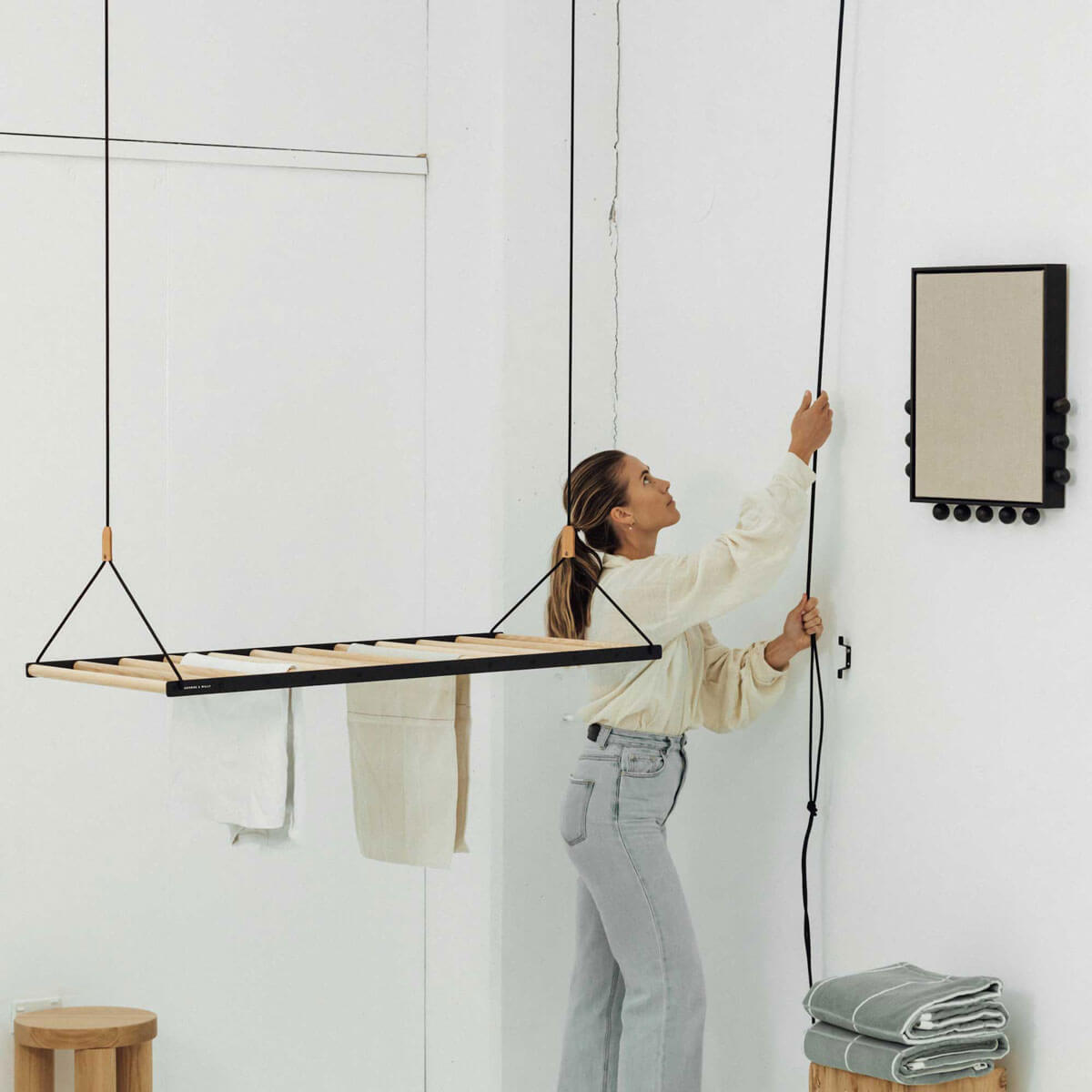
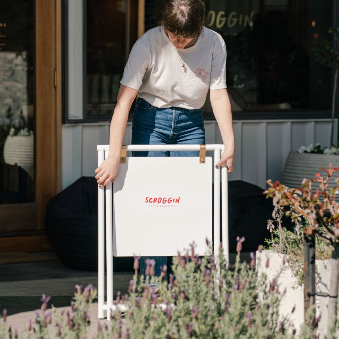
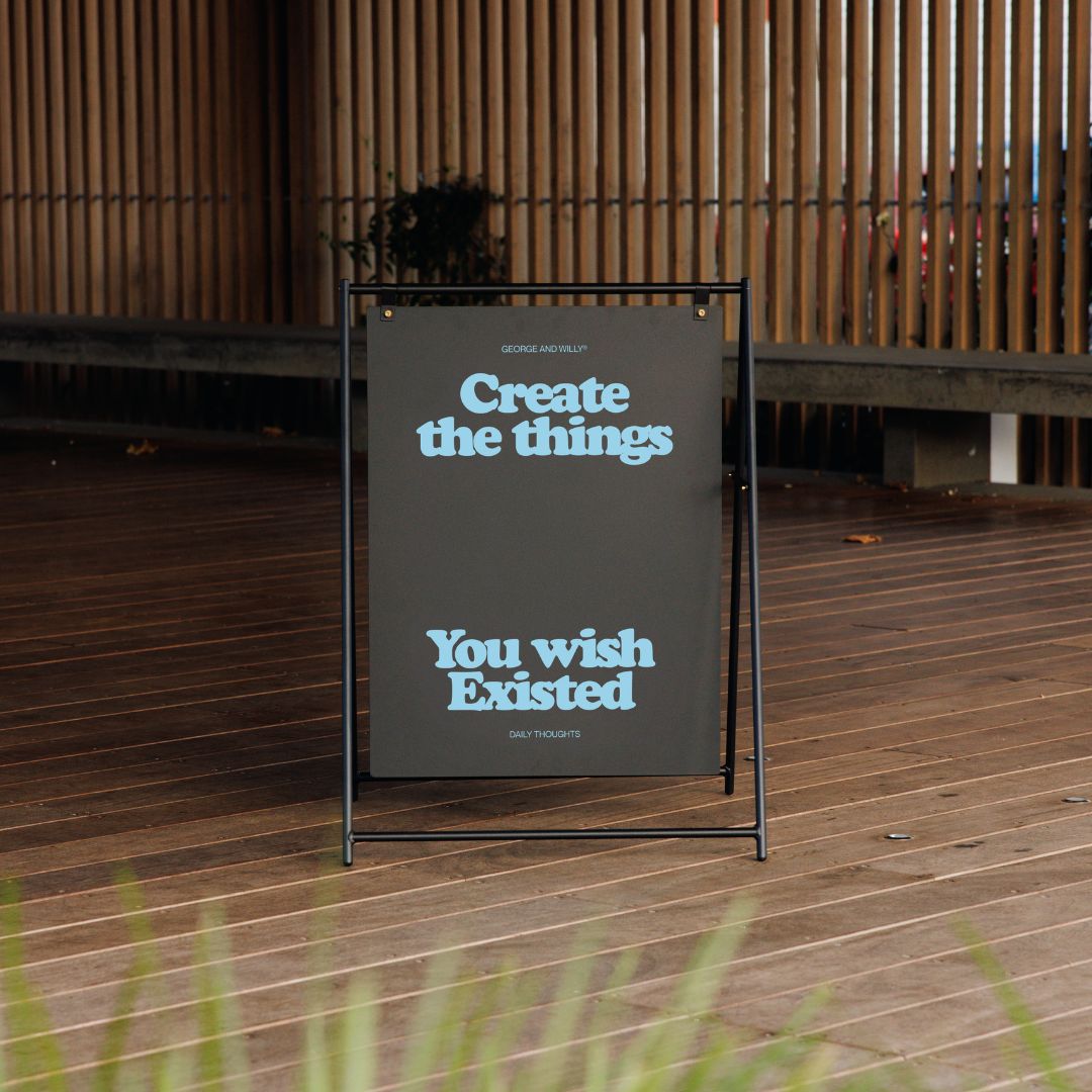
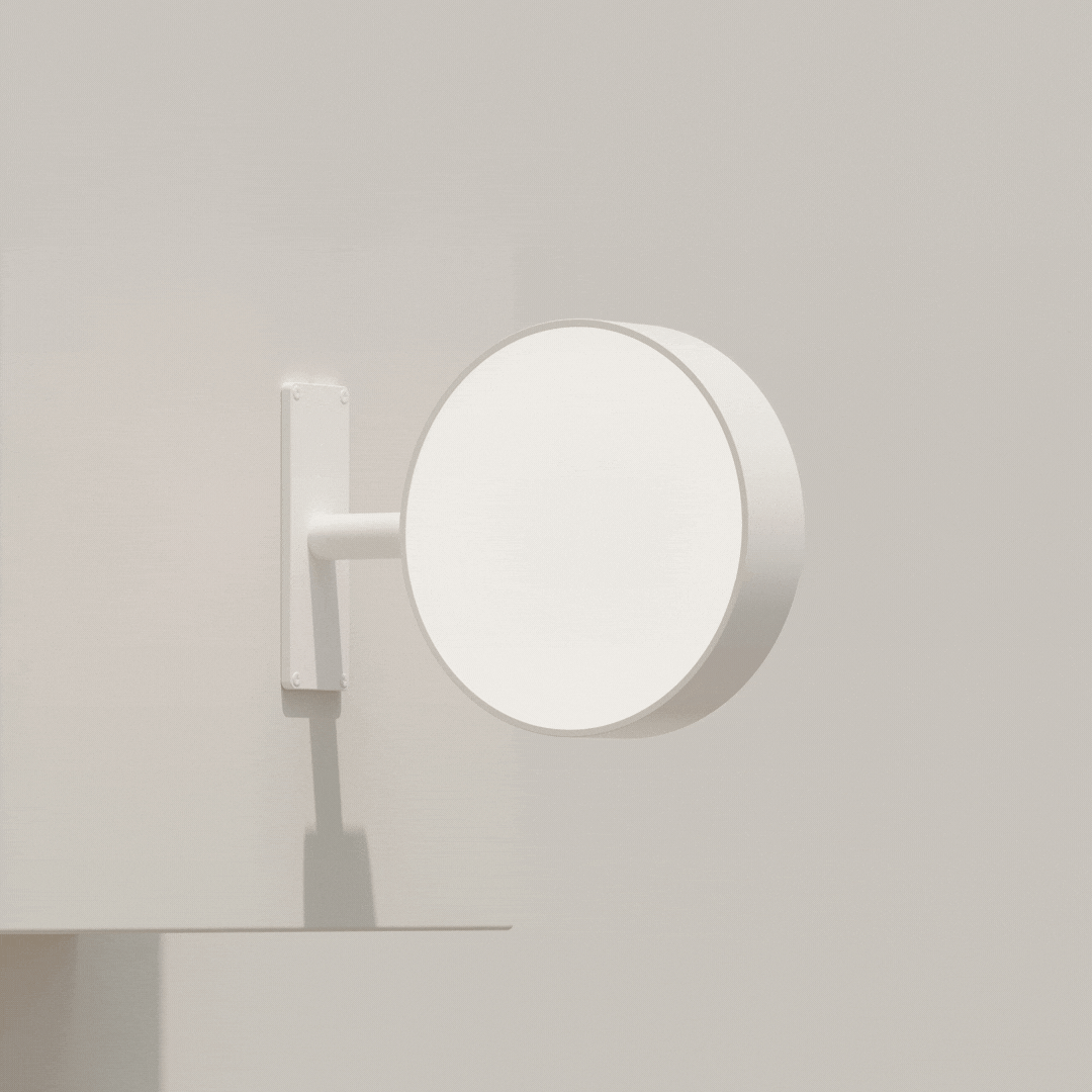
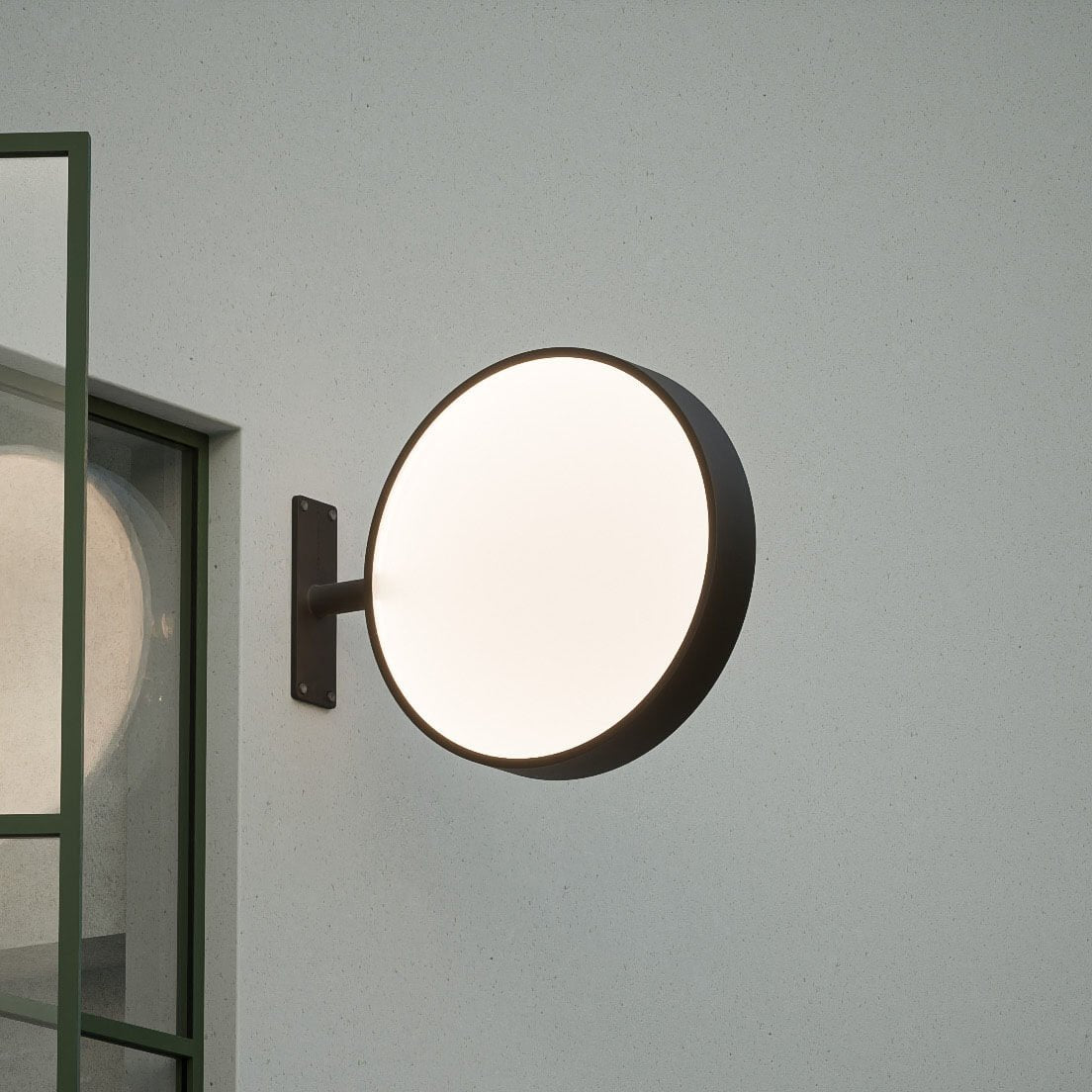
Hanging and ceiling menu boards with magnetic letters are perfect for cafés and restaurants where wall space is limited, or where you want the menu to feel like part of the architecture rather than something bolted to the wall. Suspended behind a counter, a hanging menu board has a considered, professional quality that elevates the whole space. Updating is quick too, no pegs, just move letters around directly on the board surface.
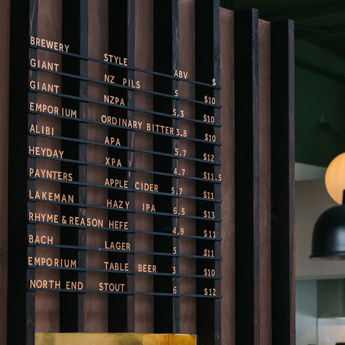
Rail menus are a slightly different animal. We see them used most often in office spaces and corporate canteens, where the display needs to be clear, functional, and updated frequently. Less about atmosphere, more about clarity and practicality.
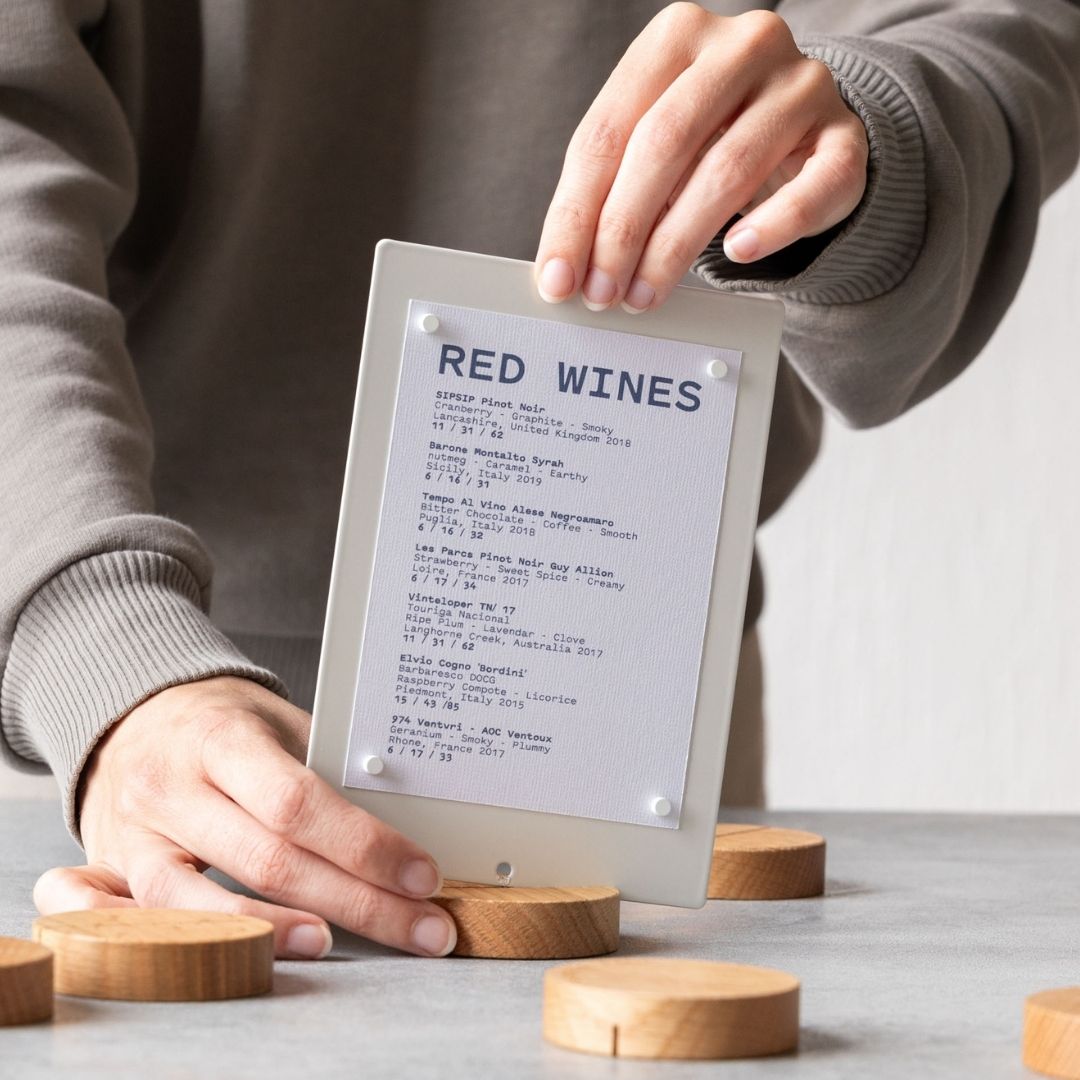
One thing worth noting: we don't find that the type of food business dictates the type of board as much as people might expect. A wine bar and a burger joint might both land on the same wooden peg letter board because the aesthetic suits both spaces. What matters more is the overall vibe you're going for, your wall dimensions, and how often you're likely to update your menu.

The chalkboard question
Chalkboards have had a long run in hospitality. The handwritten aesthetic signals warmth, personality, and a sense that someone cares. We genuinely like them.
But there are real practical problems. Updating a chalkboard properly takes time and skill. And if you don't clean the surface thoroughly between changes, you're left with a ghost menu. A faint shadow of last week's specials haunting this week's. It looks unprofessional and it's hard to read.
The hospitality spaces we work with are increasingly moving towards tidier, more considered visuals. Not sterile, just intentional.
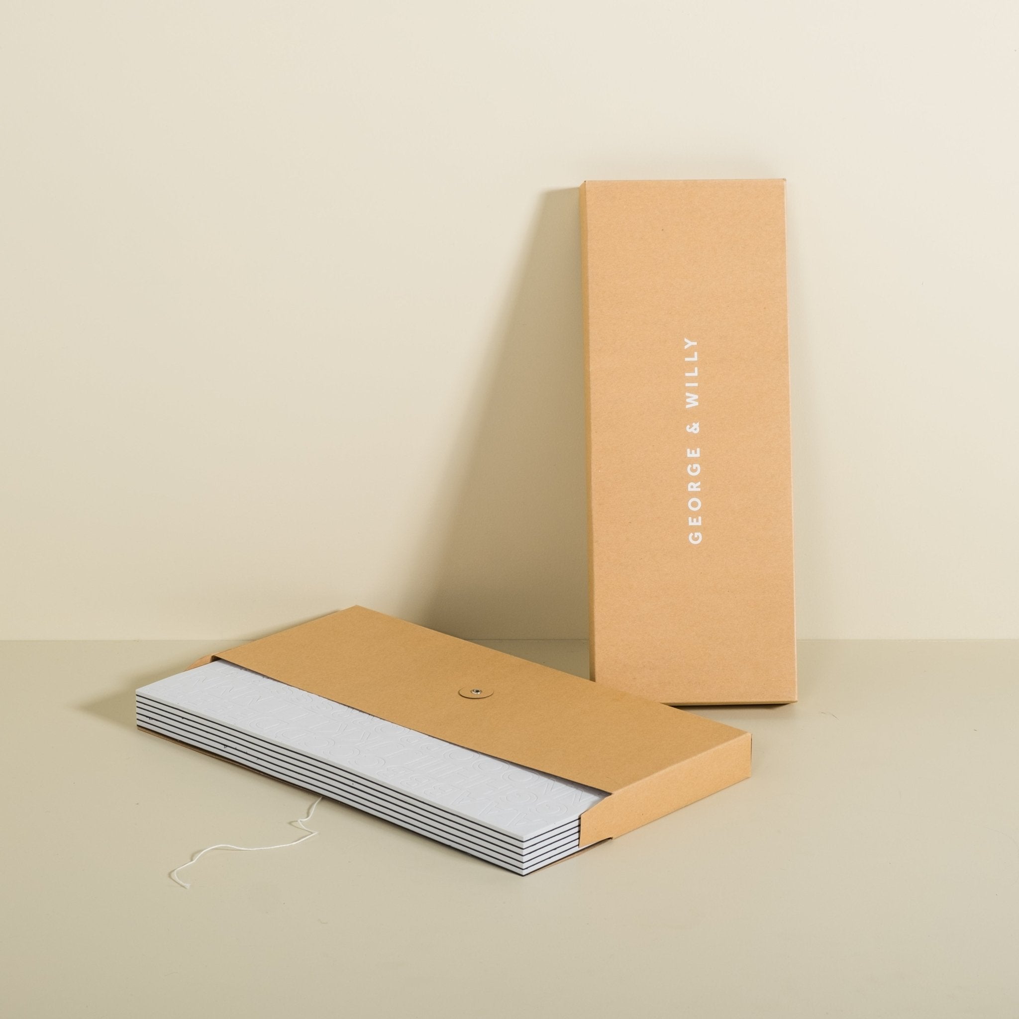
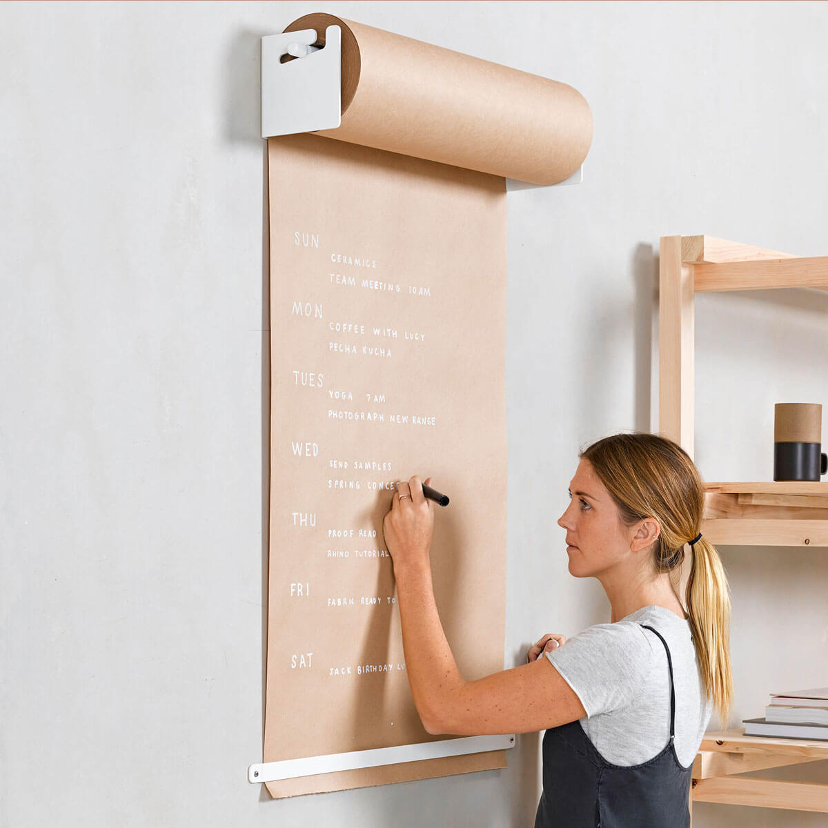
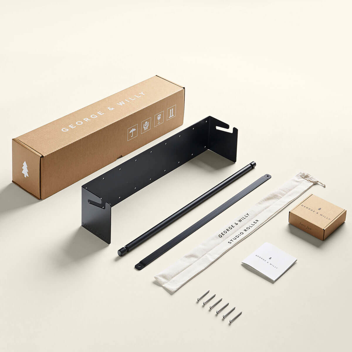
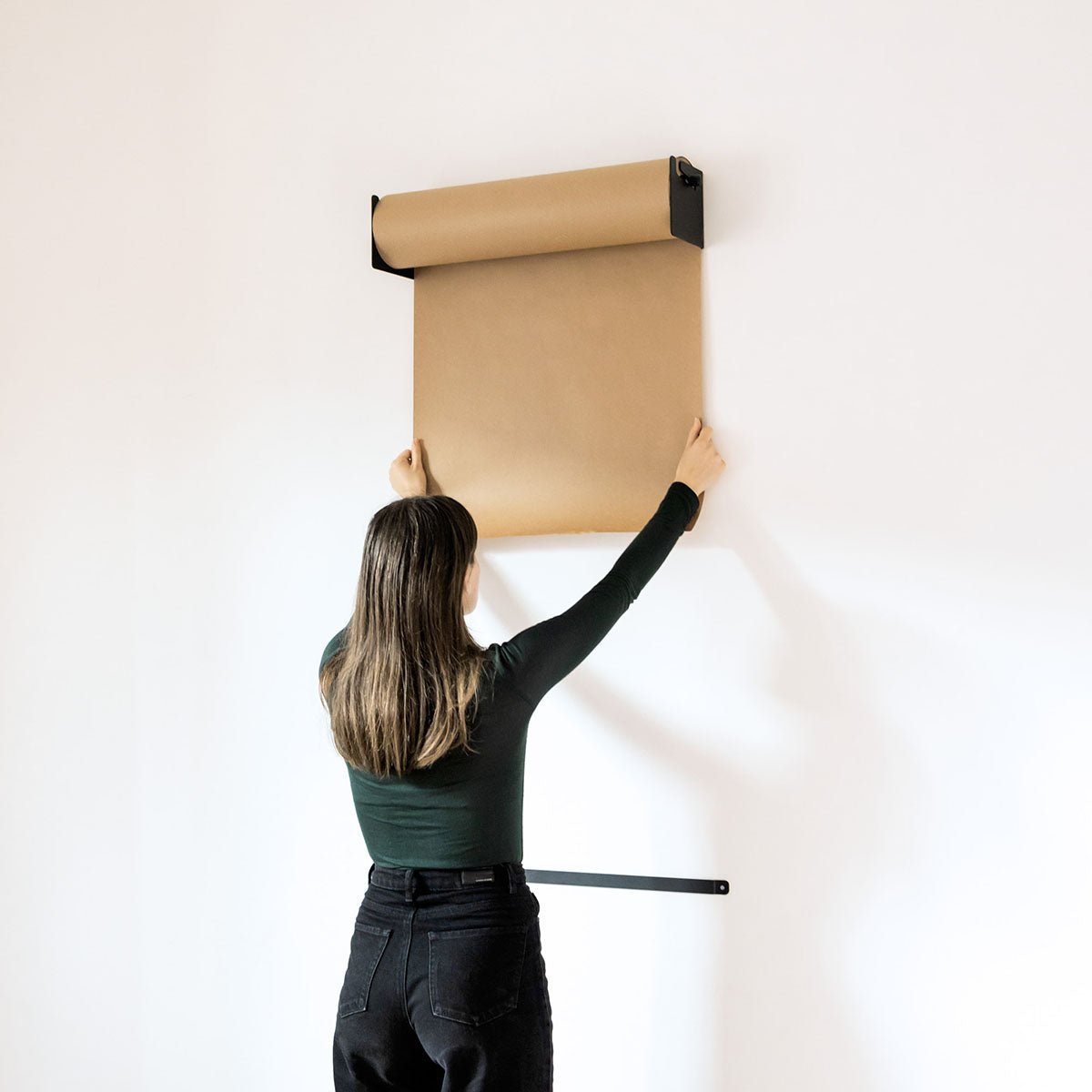
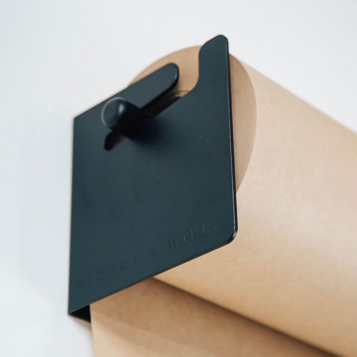
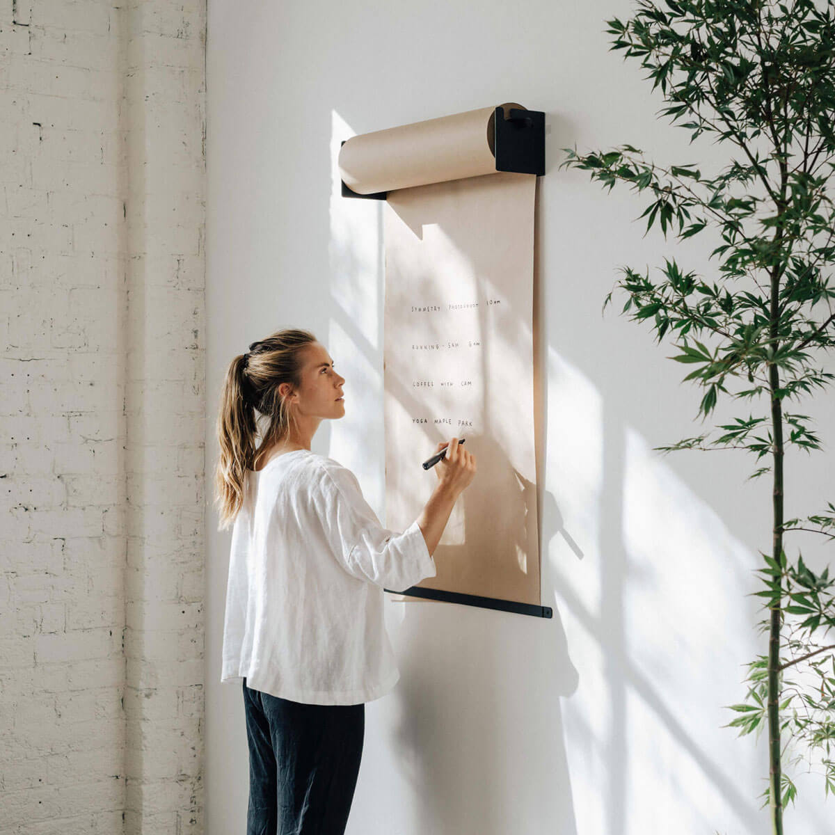
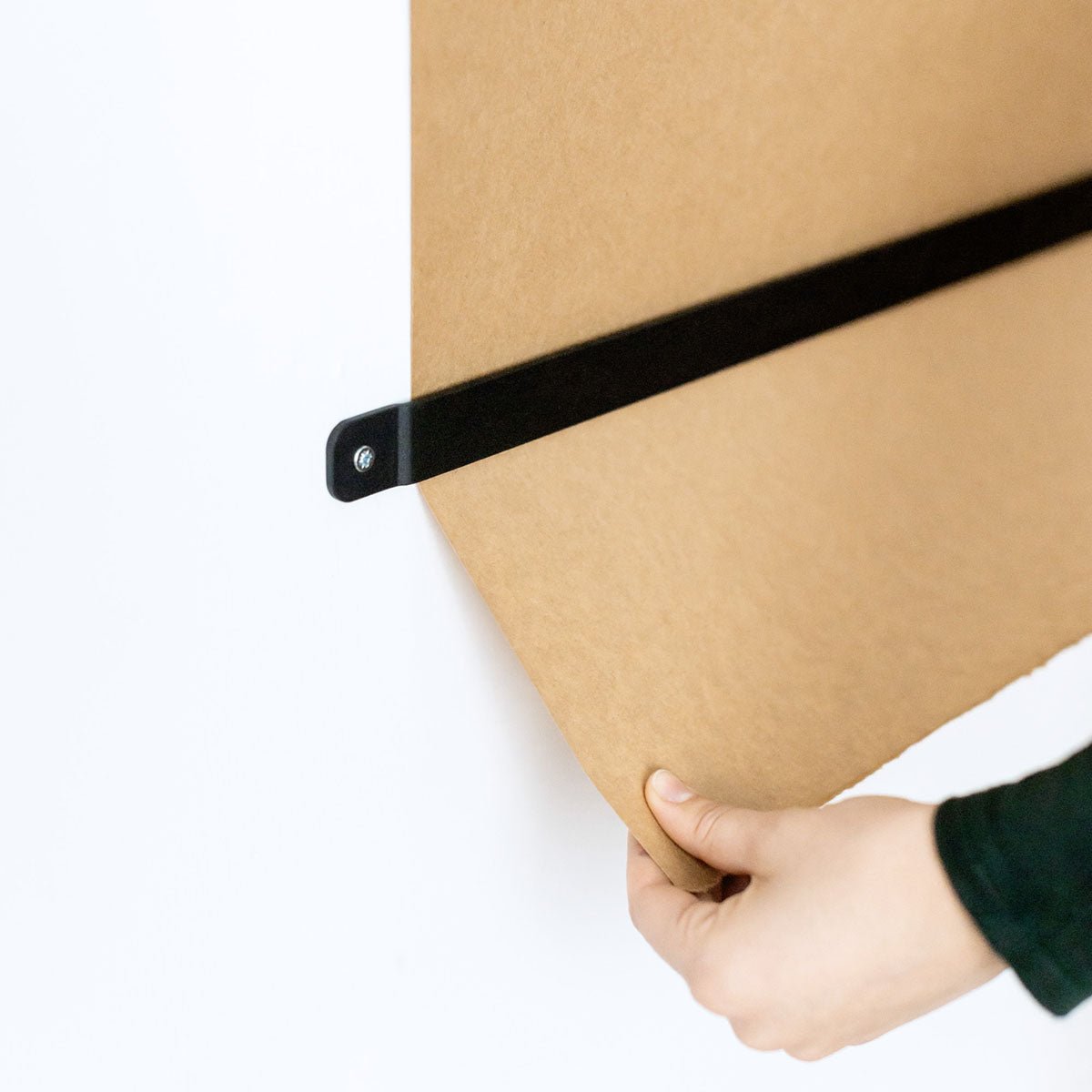
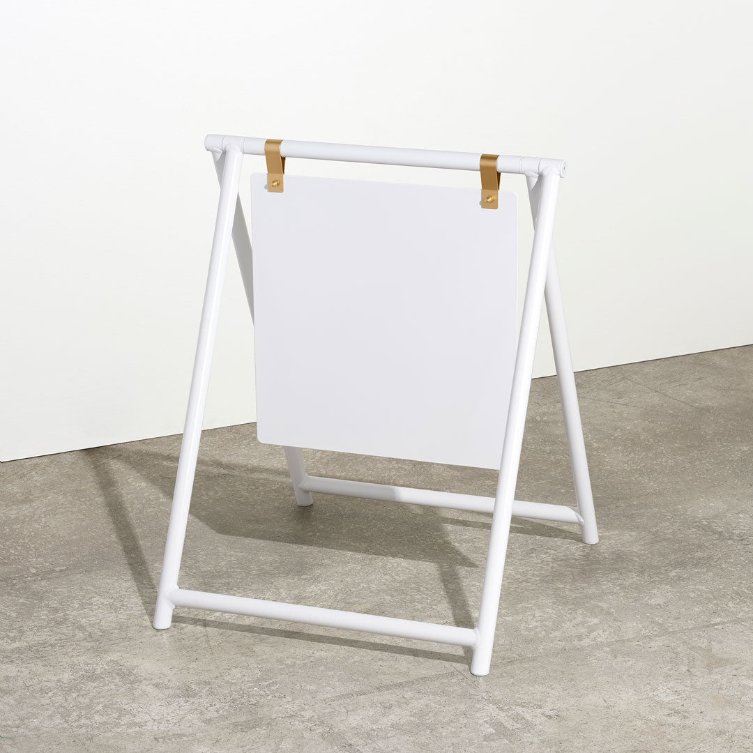
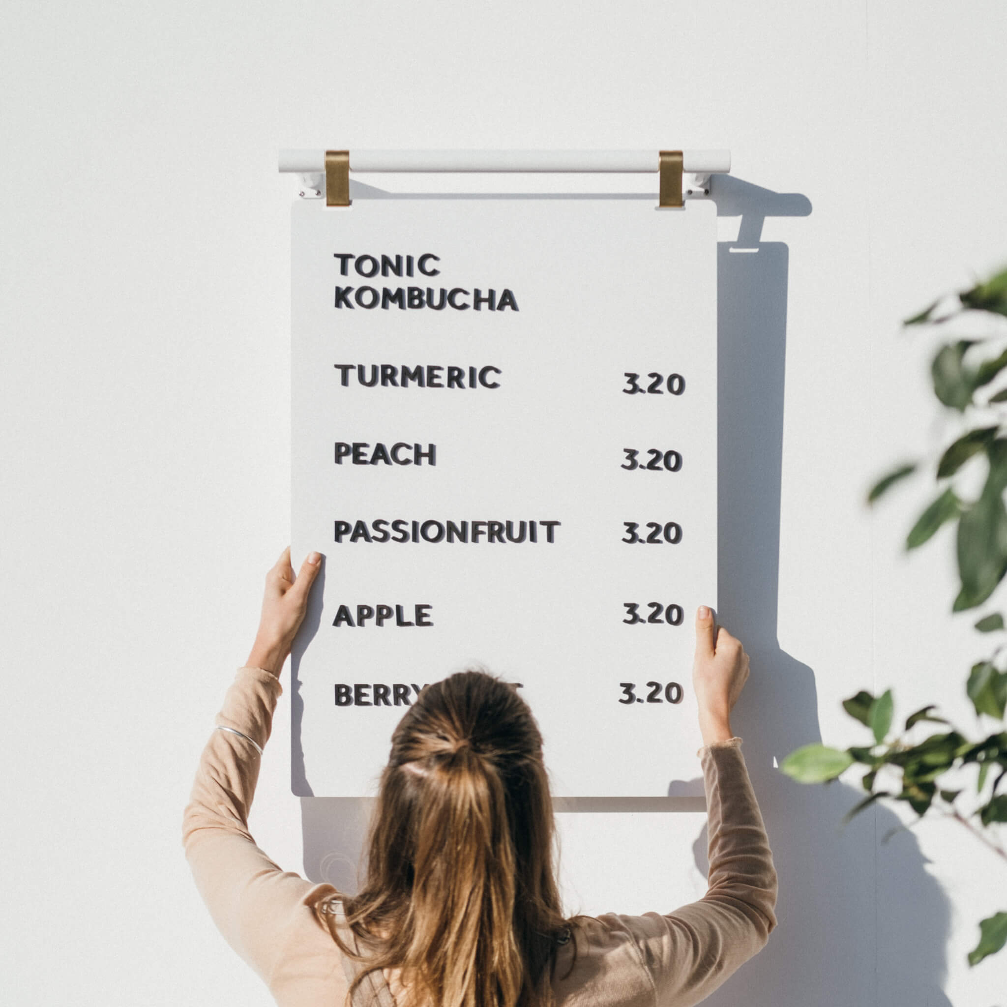
If you love the handwritten quality of a chalkboard, our Studio Roller is worth a look. It's a wall-mounted kraft paper roll dispenser. You write your menu by hand on the paper, and when it's time to change it, you simply tear it off and start fresh. Same warmth, zero ghost menu, and the result looks genuinely beautiful in the right space.
If it's the natural material feel you're after, our wooden letter boards give you that timber warmth without any of the chalk mess.

Digital vs. physical
Digital menu boards make sense in certain contexts. Fast food chains, large venues where prices change in real time and drive-throughs.
But for a small restaurant? We'd push back.
Think about the difference between reading a book and reading off your phone. One feels considered and easy. The other is a screen among a hundred other screens. We're all so surrounded by digital in our daily lives, and there's something genuinely refreshing about walking into a space and seeing something tangible and physical on the wall. A physical menu board gives your space something a digital display simply can't: presence. It feels intentional. It doesn't require a power socket, doesn't need software updates, doesn't crash, and doesn't make your café look like an airport departure lounge.
A well-chosen physical menu board is just as easy to update as a digital screen, and it looks significantly better doing it.
What to spend
Quality menu boards aren't the cheapest option on the market. We're upfront about that. But here's our honest perspective on why it's worth spending properly.
Think about how many times a day every customer in your restaurant looks at your menu board. It might be the single most-viewed object in your entire business. And yet we regularly see restaurants with boards where the paint is chipping, the letters are fading, or the material is starting to peel. Boards that were bought on the cheap and are now actively making the space look worse.
Buying quality once is almost always a better value than buying cheap twice. Our products come with a two-year warranty, but the reality is they're built to last well beyond that.
If there's one area of your restaurant fit-out where we'd tell you to spend properly, this is it.
How to choose the right board for your space
Rather than guessing, here's a practical process.
Measure your wall. Not just the wall area, but the specific spot where the board will go. How wide? How high will it be mounted? Is there anything on either side limiting the width?
Write out your full menu. Not a rough version, the actual menu, with all section titles, item names, descriptions if you use them, and prices. Count the characters. This is the only way to know whether a given board and letter set will fit your needs.
Do the stick-it-on-the-wall test before you commit to a letter size.
Look at the board in context. Our Instagram and Pinterest are full of real installations in real spaces, cafés, restaurants, studios, and wine bars. Have a scroll until you find a space that feels similar to yours and see what board they're using. Seeing a product in situ is so much more useful than imagining it from a product page.
And think about how often you'll update it. If your menu changes daily, peg or magnetic boards are your friends. Even a relatively stable menu benefits from the flexibility to tweak prices, run specials, or update seasonal dishes, so updateability is almost always worth having.

The bottom line
A great menu board isn't just a functional display. It's part of the atmosphere you're building. It's often the first thing a customer consciously reads in your space, and it shapes their impression of the whole experience before they've ordered a thing.
Get the size right. Choose letters you can actually read from a customer distance. Don't underestimate how many items you have. And if you're tempted by a cheaper option, remember: you'll probably end up buying it twice.
Take the time to look at menu boards in spaces you admire, measure your wall properly, write out your real menu, and find something that fits both your practical needs and the character of your space. Done right, it's one of the best investments you'll make in your fit-out.
Browse the full menu board collection at georgeandwilly.com, or follow along on Instagram and Pinterest to see our products in real spaces.