


Ever walked into a large building and felt instantly lost? We all have. That feeling of confusion, of not knowing whether to turn left or right, is exactly what a great interior wayfinding signage system is designed to prevent. More than just a collection of signs, wayfinding is the art and science of guiding people through a physical space, making their journey intuitive, stress free, and efficient.
This guide explores every facet of interior wayfinding, from the big picture strategy to the tiny details that make a sign effective. Whether you’re outfitting a new café, managing a corporate office, or designing a hospital, understanding these principles will help you create a space that feels welcoming and easy to navigate from the moment someone steps inside.
The Foundations of a Smart Wayfinding System
Before a single sign goes on the wall, a lot of thought goes into the “why” and “how” of navigation. A truly effective wayfinding system is built on a solid strategic foundation.
What is a Wayfinding System?
A wayfinding system is the complete collection of tools used to orient people and guide them through an environment. This includes not just physical signs but also architectural cues, lighting, color schemes, and even audible or digital information. The goal is to create a cohesive experience where every element works together, helping visitors build a mental map of the space so they can move through it with confidence.
The Wayfinding Design Strategy
A wayfinding design strategy is the master plan for navigation. It’s the conceptual blueprint that answers key questions before any design work begins. The strategy defines:
Information Hierarchy: Deciding what information is most important and when to show it. For example, a sign at the main entrance should point to major zones, not every single room. This prevents overwhelming visitors with too much information at once.
Nomenclature: Establishing consistent names for everything. Is it the “Cardiology Department” or the “Heart Center”? A good strategy picks one term and uses it everywhere, from building directories to directional signs, to eliminate confusion.
Zoning: Breaking down large, complex spaces into smaller, more manageable areas. This is often done with color coding (the Blue Zone), thematic names (the Mountain Wing), or logical numbering, making the environment easier to understand.
Placement Logic: Creating rules for where signs should go. A common rule is to place a sign at every key decision point, like a hallway intersection, to guide users before they have a chance to make a wrong turn.
A solid strategy ensures that the entire system is logical and user focused, transforming a potentially confusing maze into a clear path.
The Wayfinding Signage Design Process
Bringing a strategy to life involves a structured interior wayfinding signage design process. Professionals typically follow these key stages:
Needs Assessment: This is the research phase. Designers analyze the space, study floor plans, and consult with stakeholders (like facility managers and staff) to understand user journeys and identify common points of confusion.
Strategy Development: Based on the research, the master plan is created. This involves setting clear objectives, like reducing the time it takes for visitors to find their destination.
Design and Content Development: Here, the visual identity of the signs is created. This includes choosing legible typography, a clear color palette, and intuitive icons. A detailed message schedule is also developed, specifying the exact text for every single sign.
Implementation: The signs are fabricated and installed. This stage requires precision to ensure signs are mounted at the correct height and location for maximum visibility and accessibility.
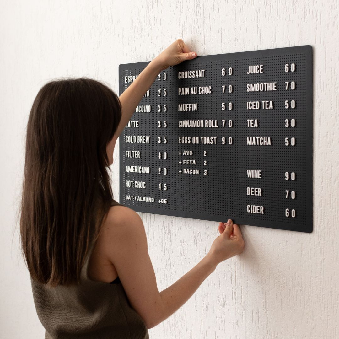
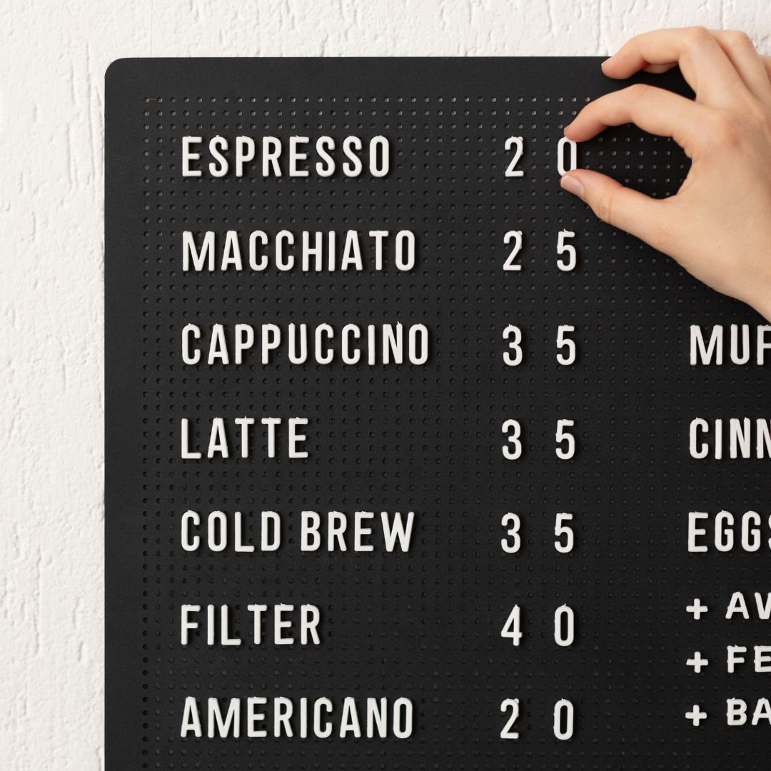
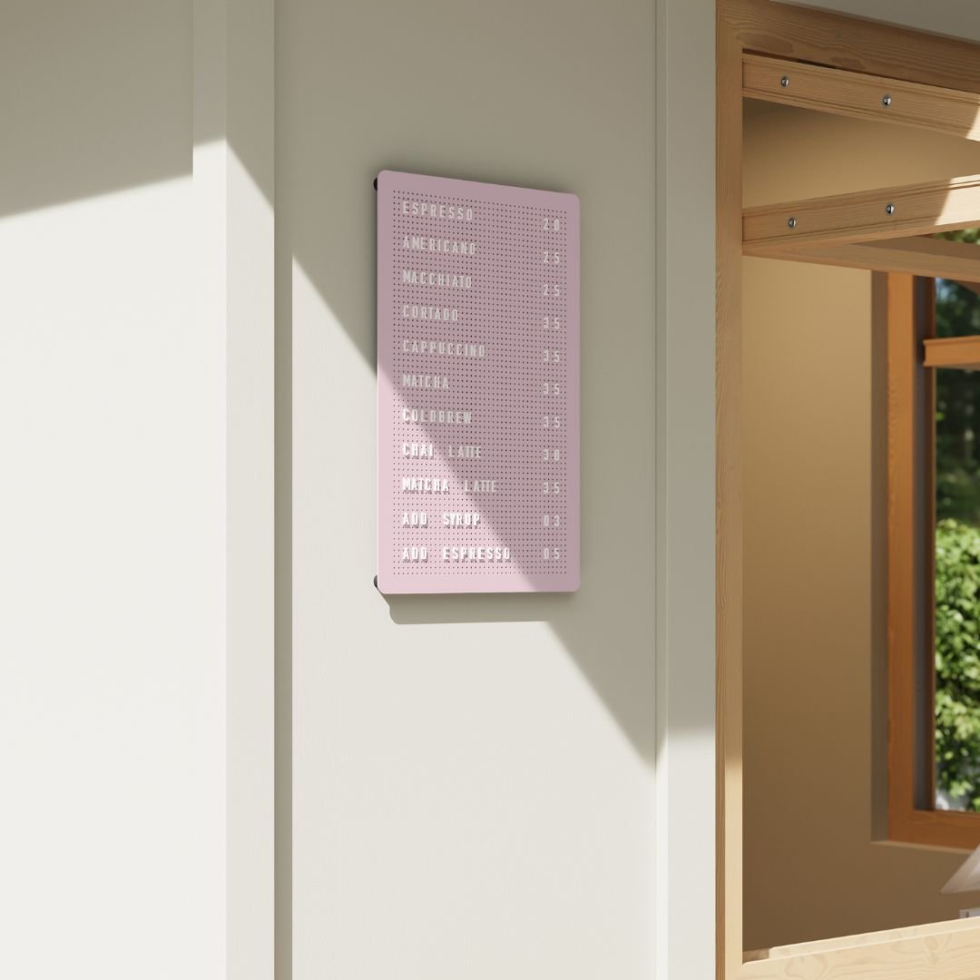
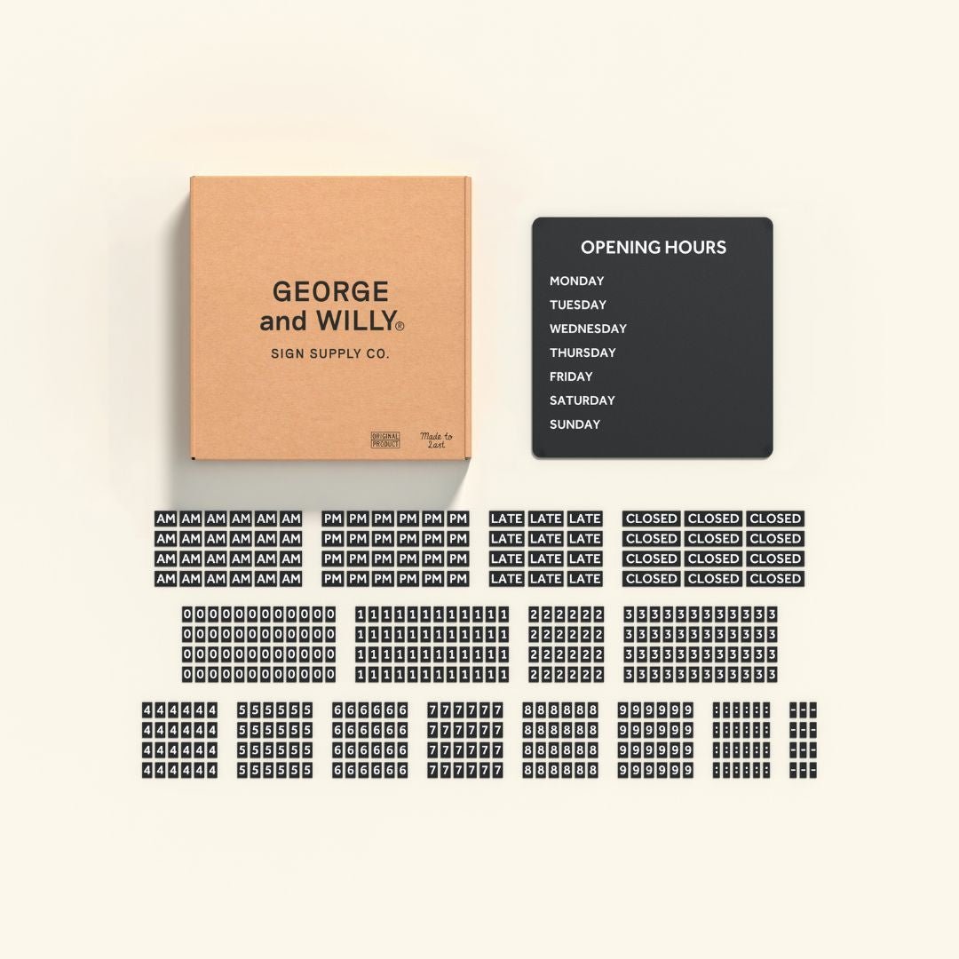
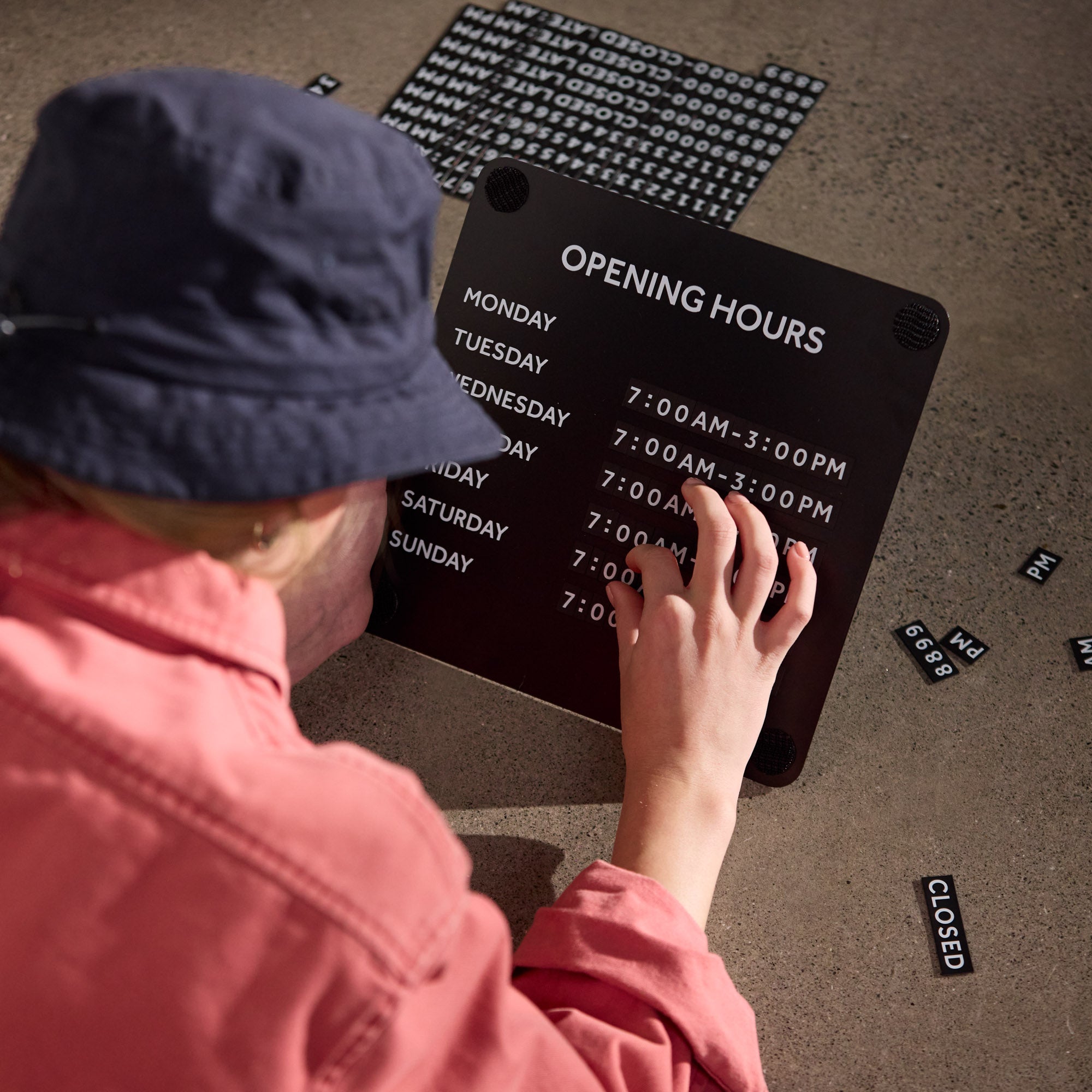
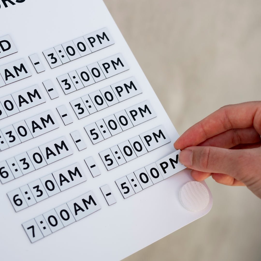
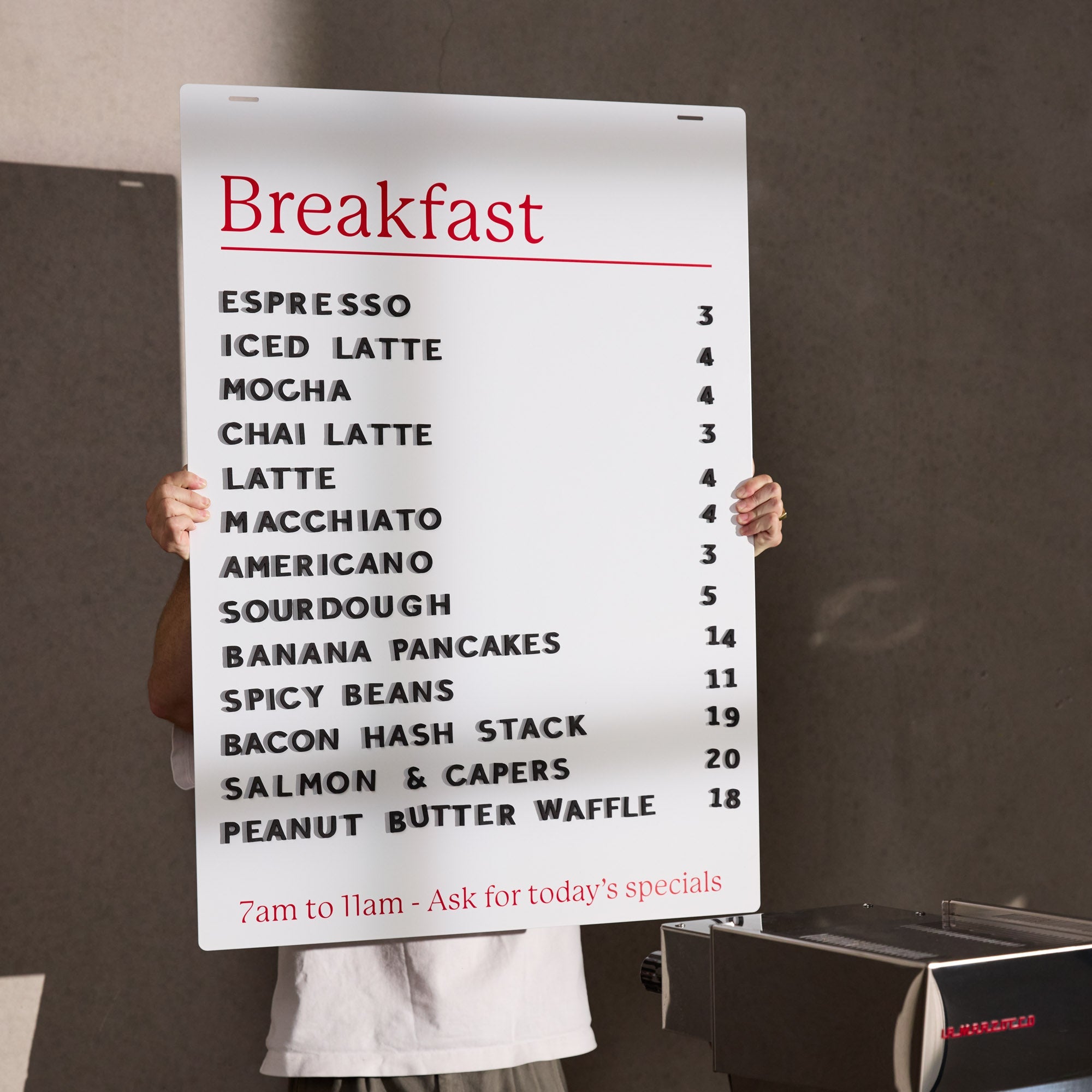
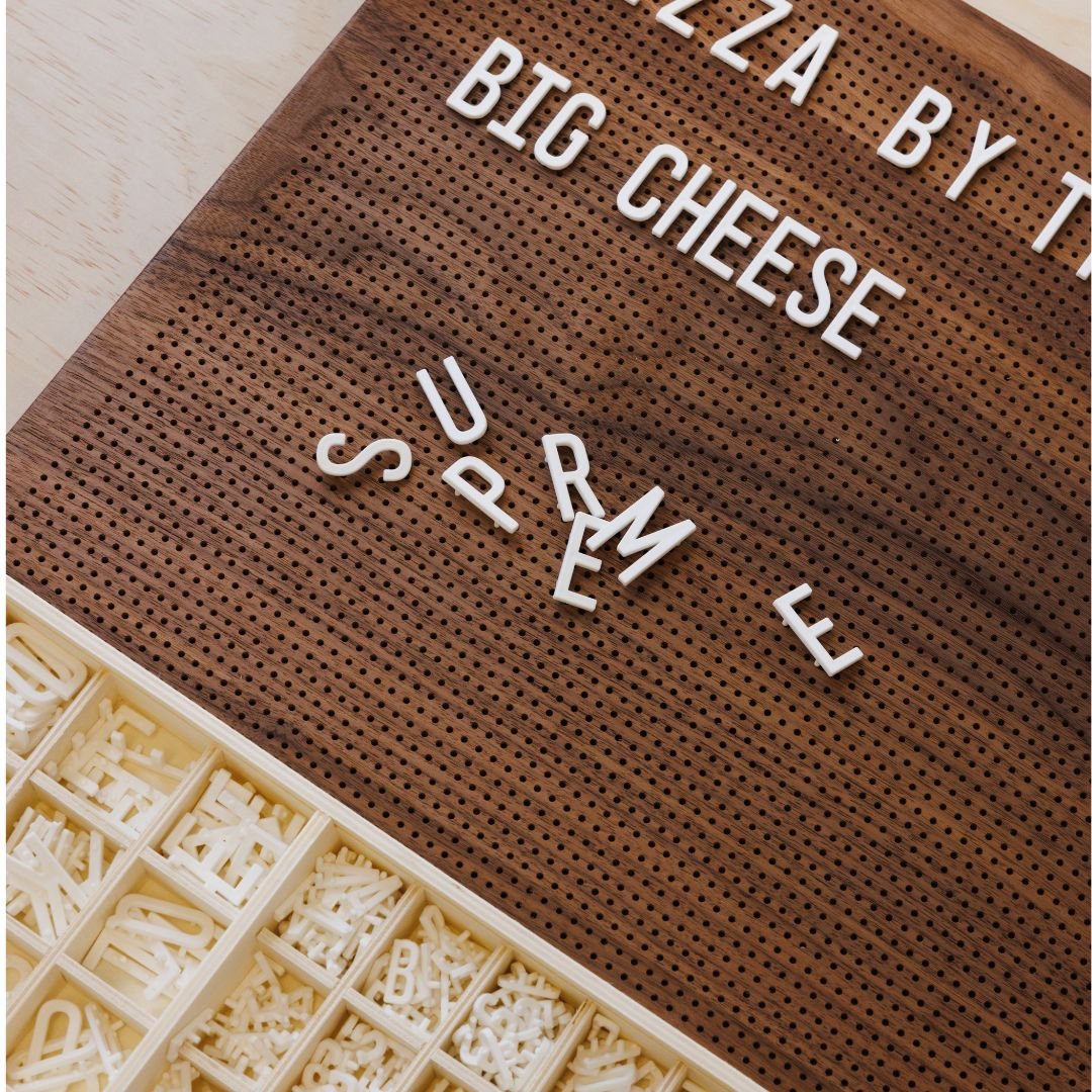
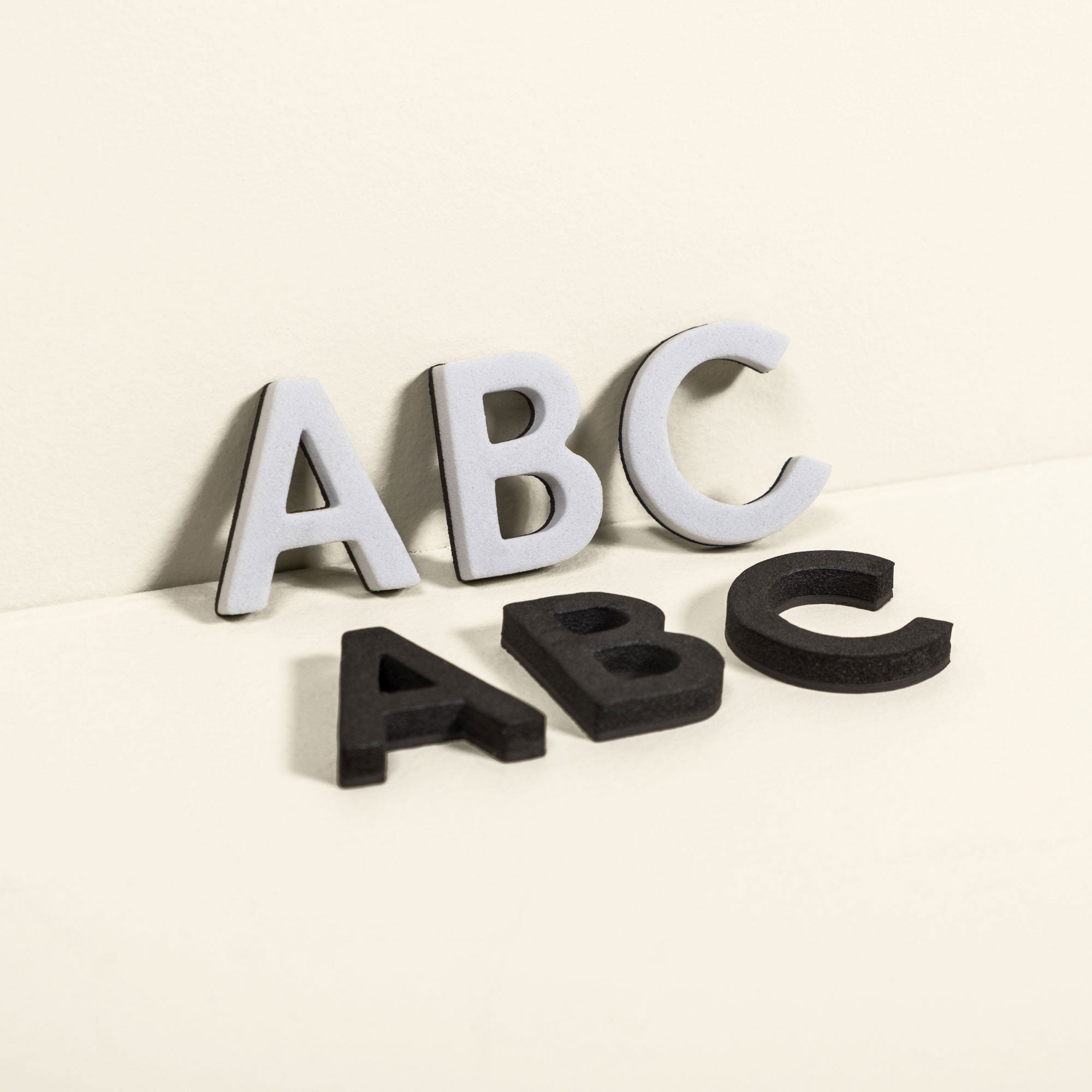
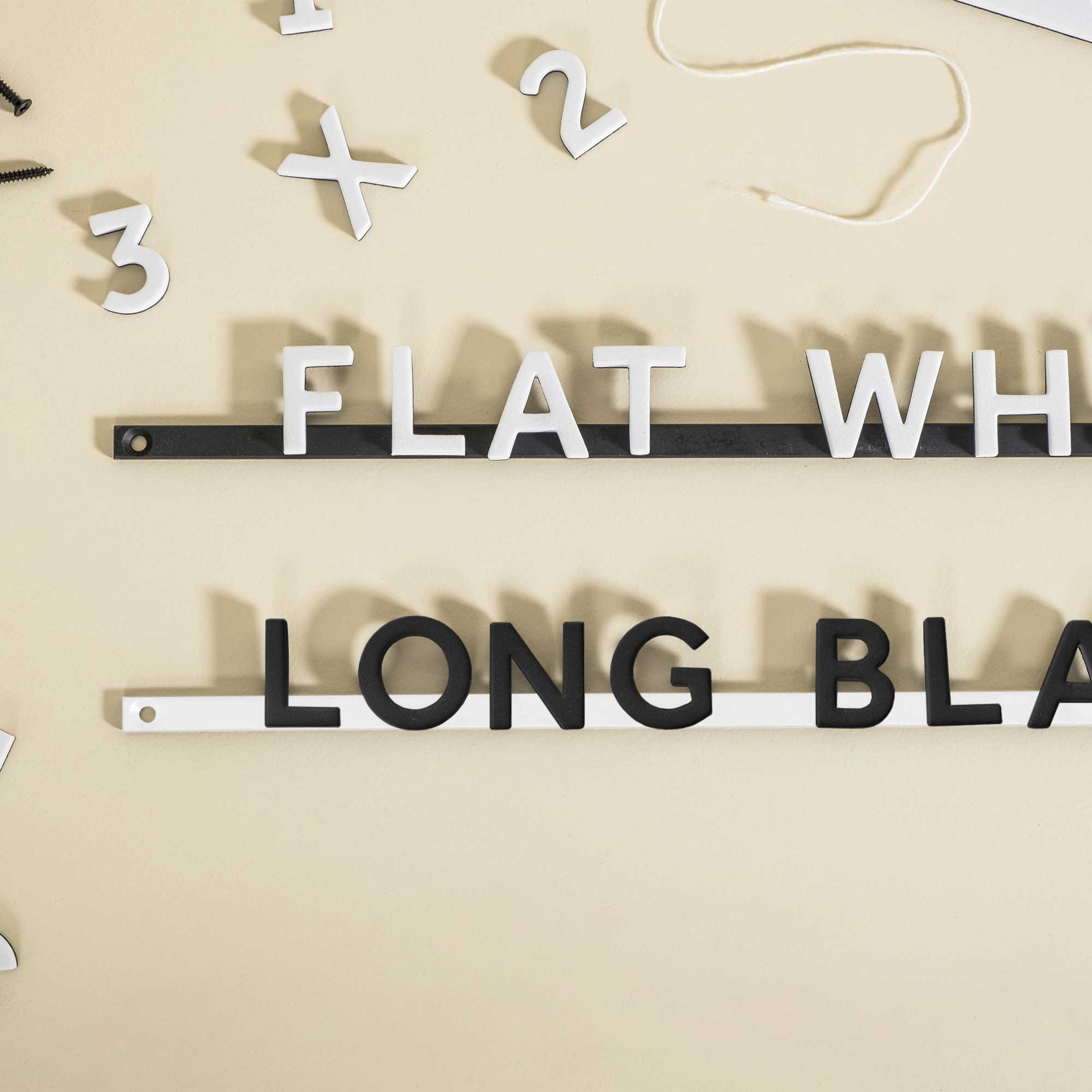
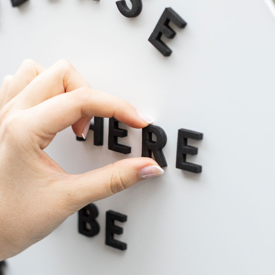
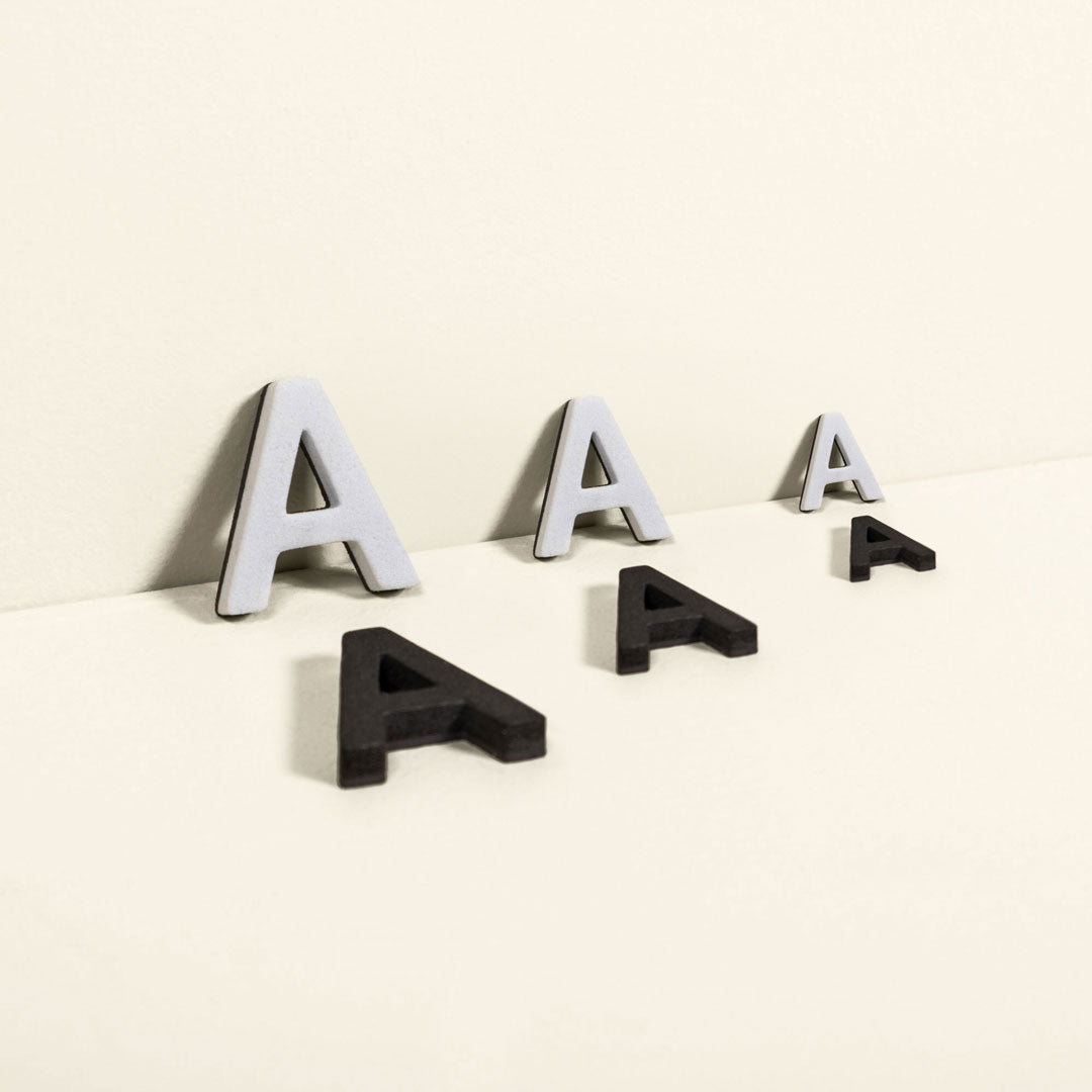
Evaluation and Maintenance: After installation, the system is tested. Designers observe how people use the space and gather feedback to make any necessary adjustments. A long term plan is also put in place for updating and maintaining the signage. For changeable displays, keep spare character sets like Extra Menu Board Letters on hand to streamline updates.
Wayfinding Design Services
For complex projects, many organizations hire a professional wayfinding design service. These specialized firms or environmental graphic designers manage the entire process, from initial research to final installation. They bring expertise in graphic design, architecture, and user psychology to create systems that are not only functional but also aesthetically pleasing and on brand. A wayfinding service ensures that your navigation system is cohesive, compliant with regulations, and truly enhances the user experience.
The Building Blocks: Types of Interior Signs
A complete wayfinding system uses several different types of signs, each with a specific job. Understanding their roles is key to creating a balanced and effective network of information.
Directional Signs
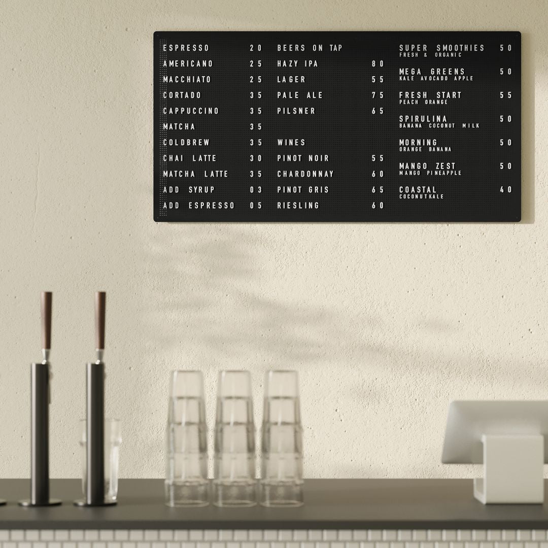
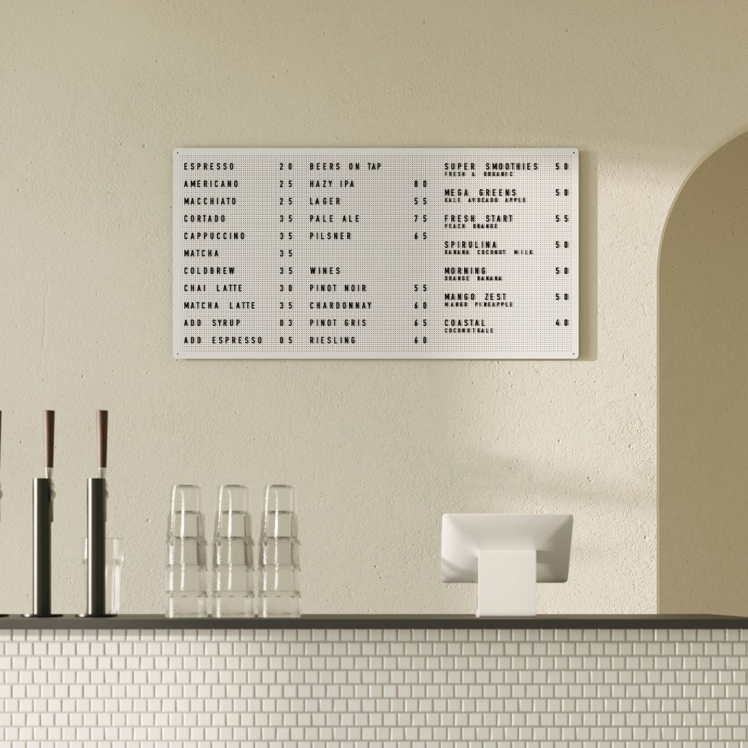
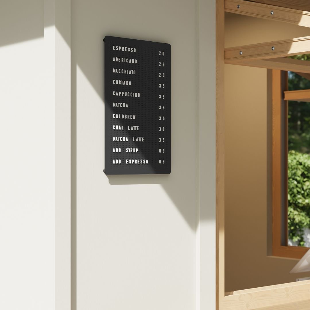
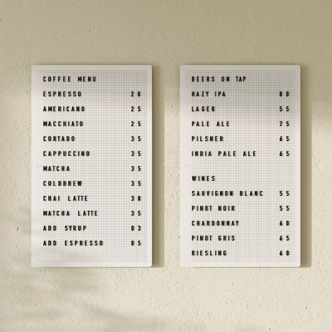
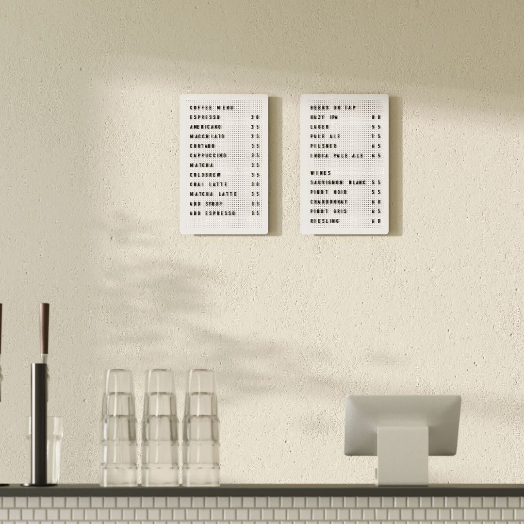
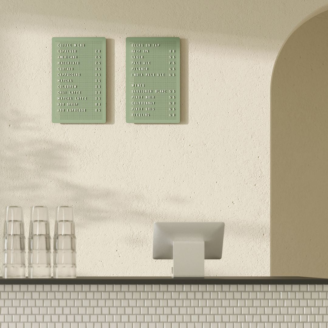
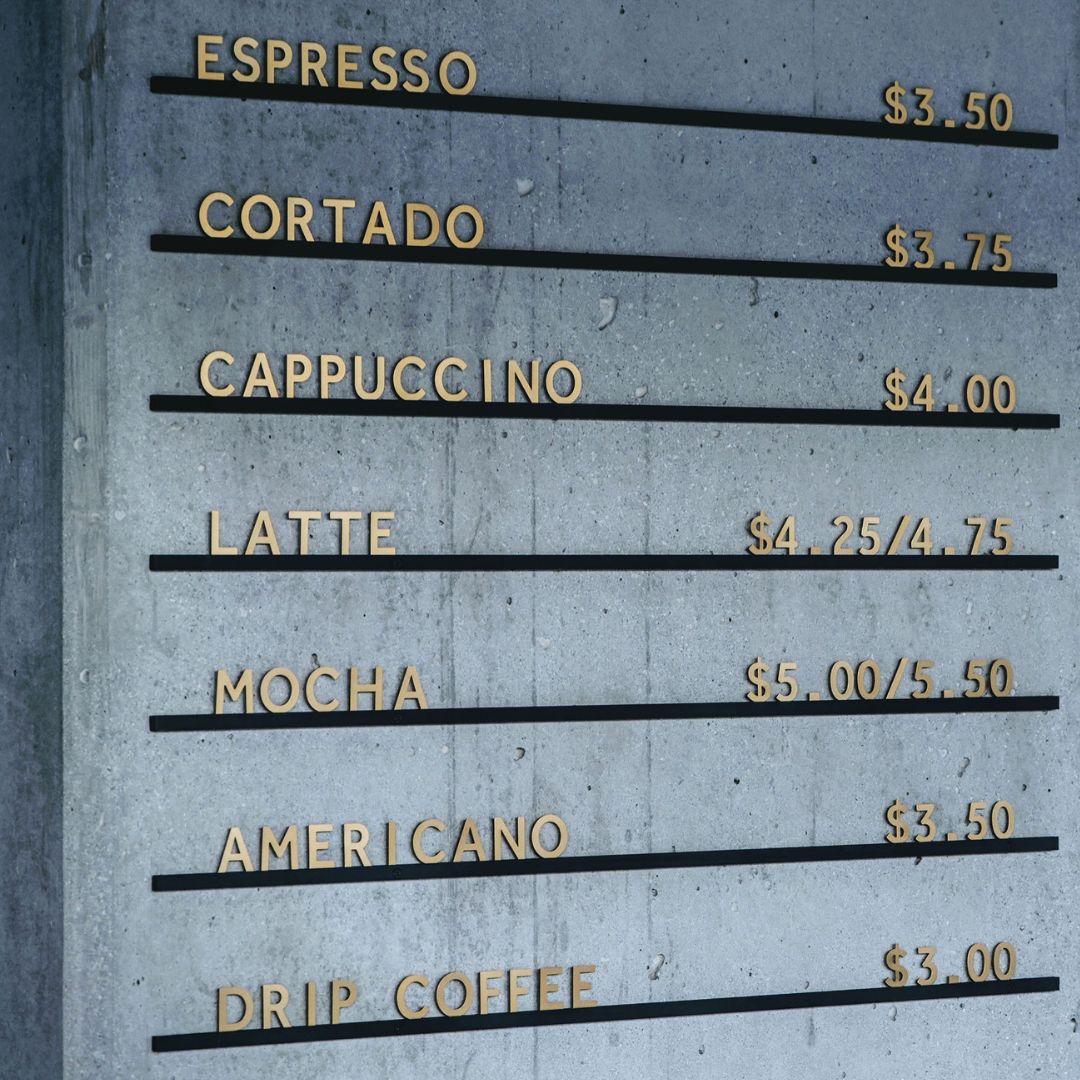
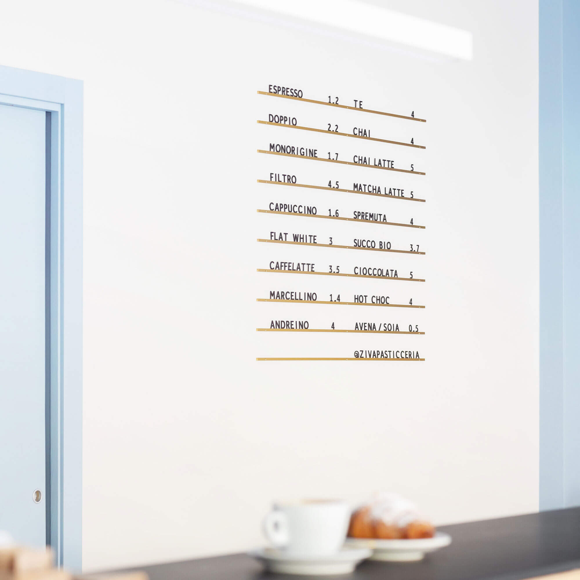
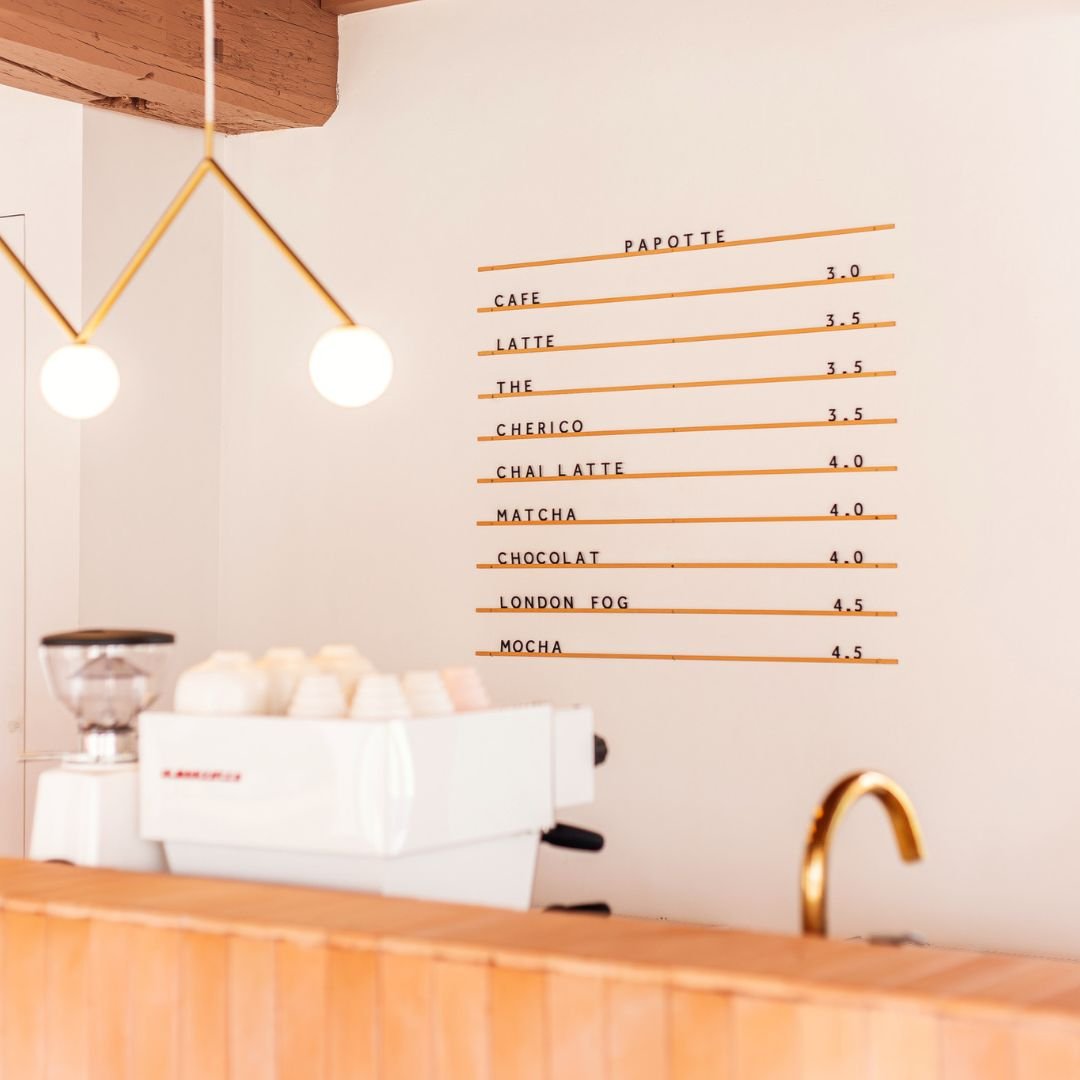
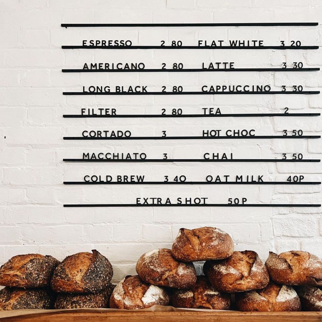
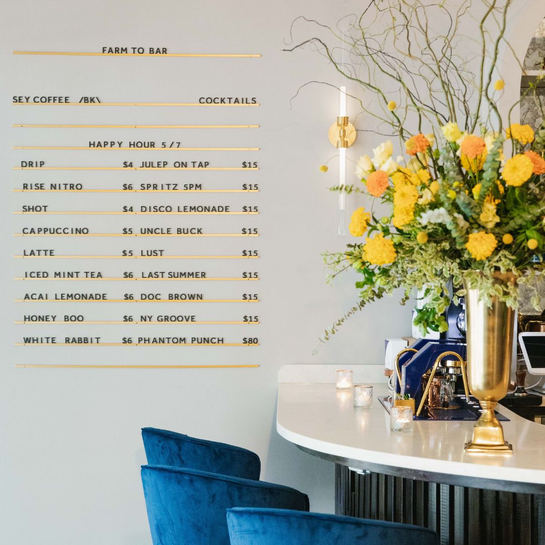
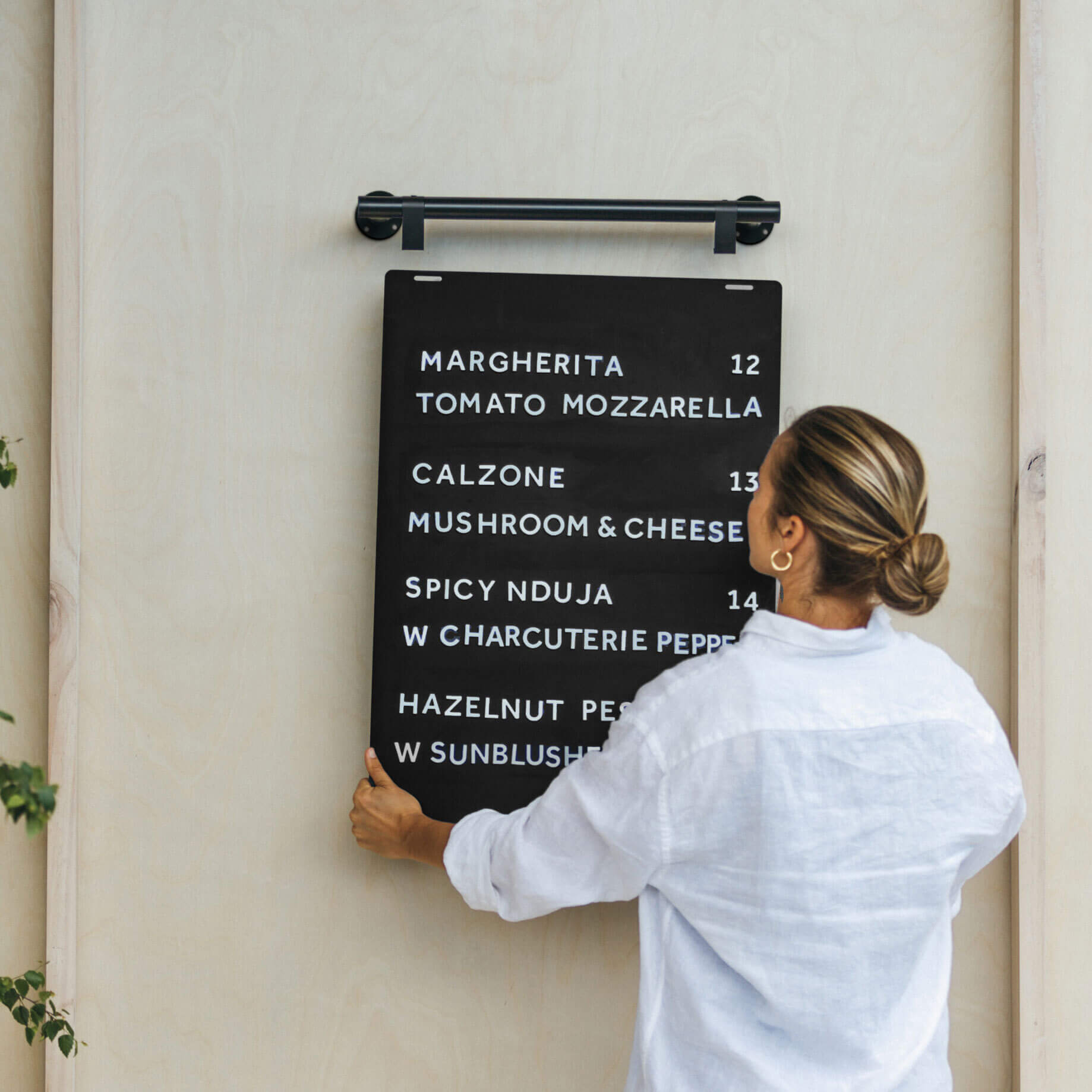
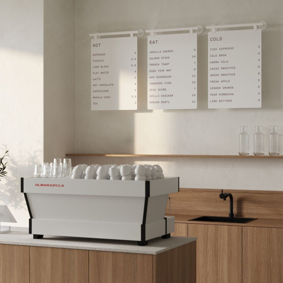
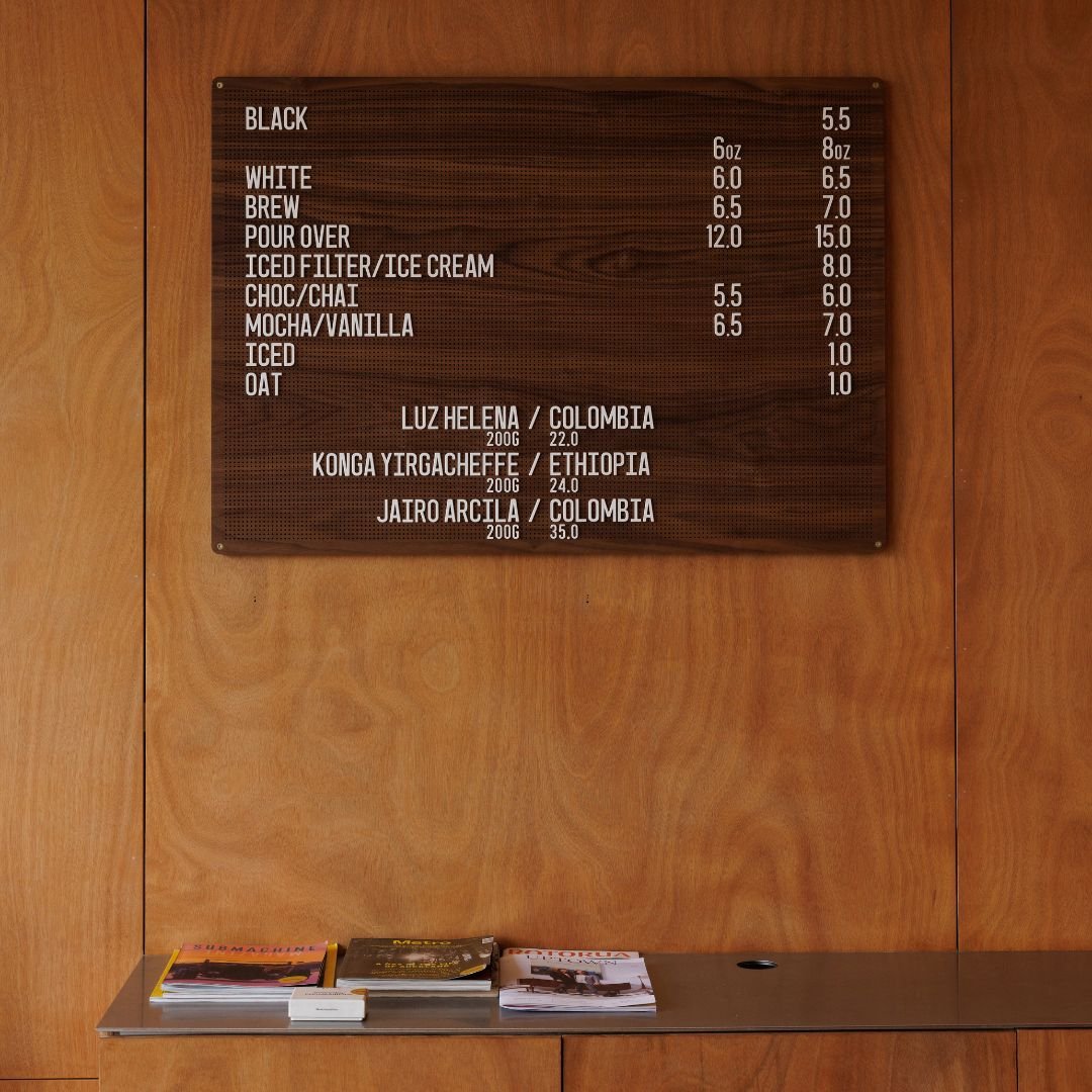
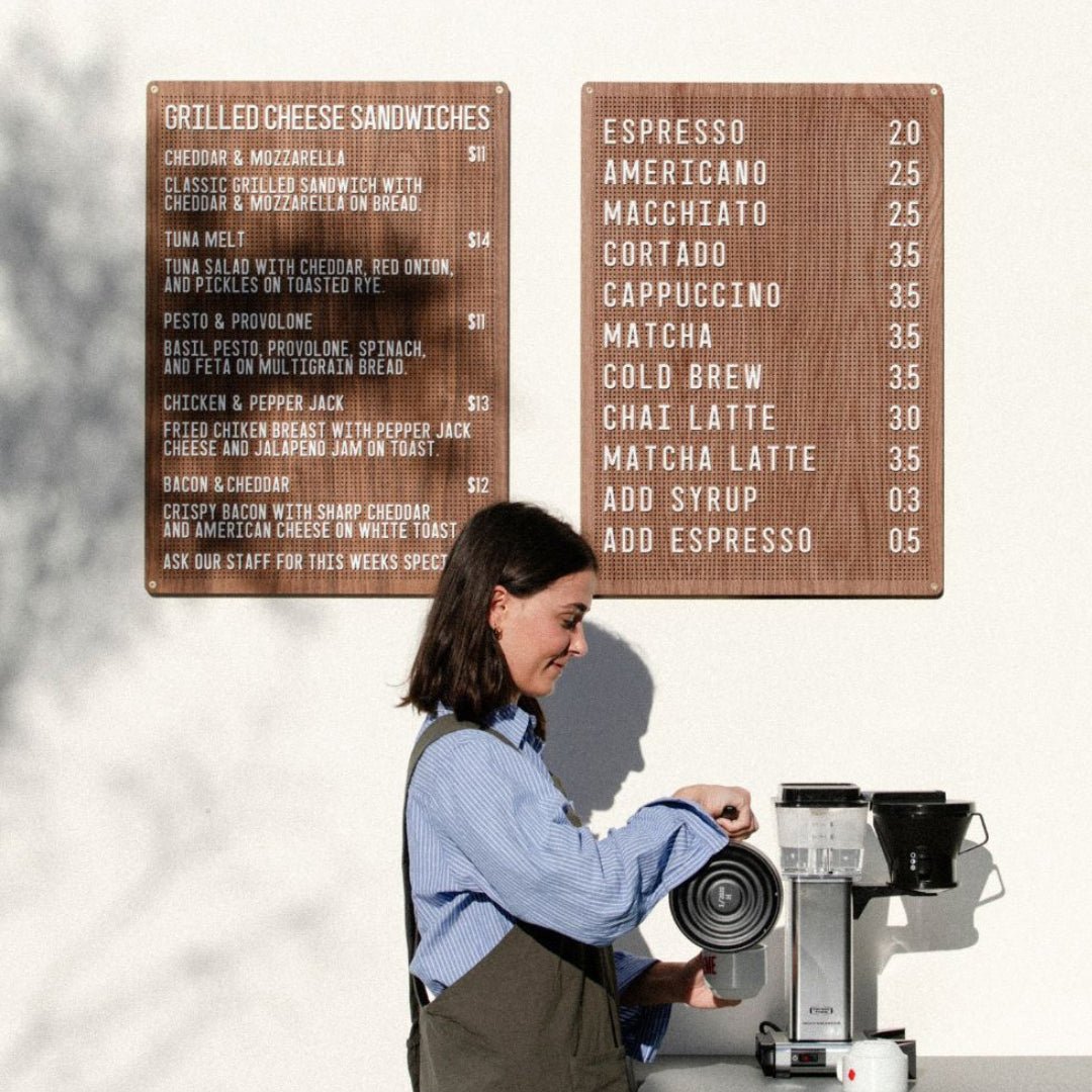
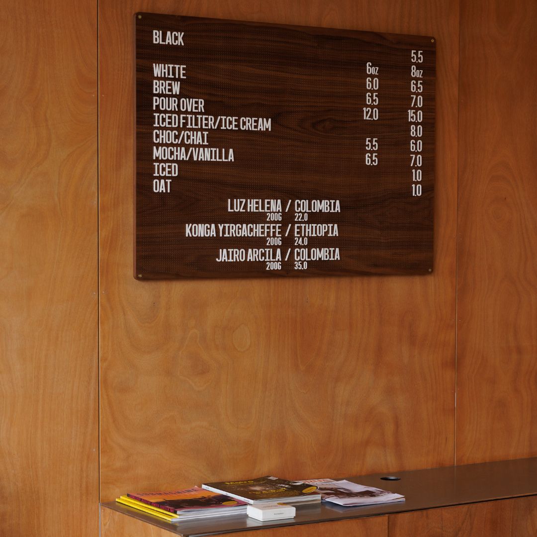
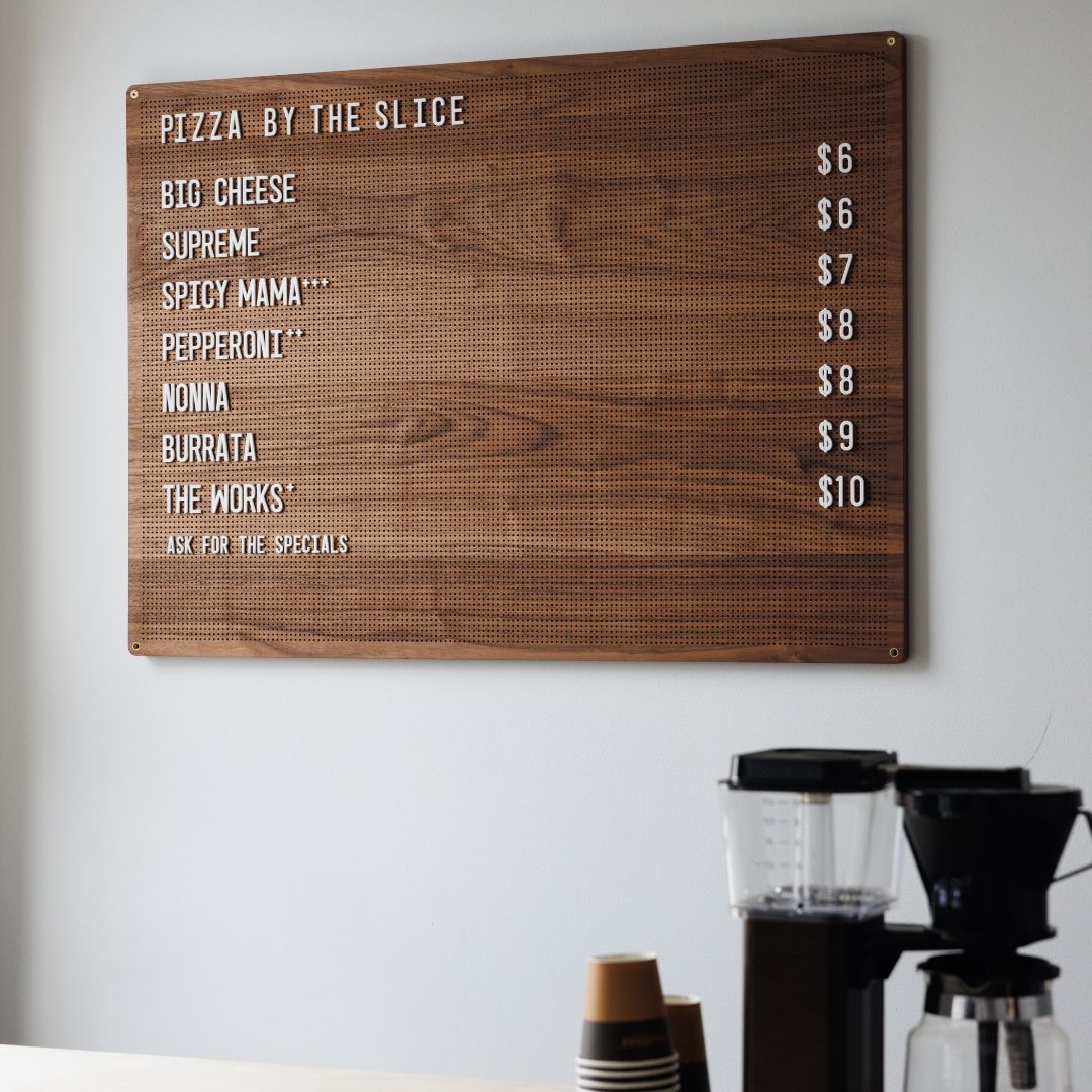
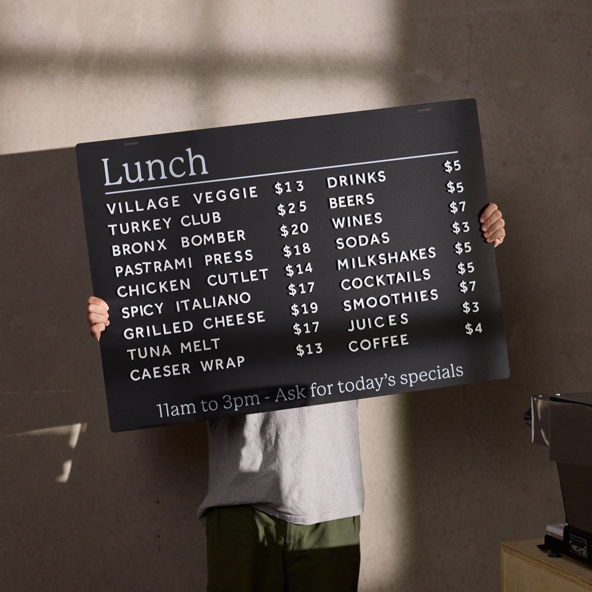
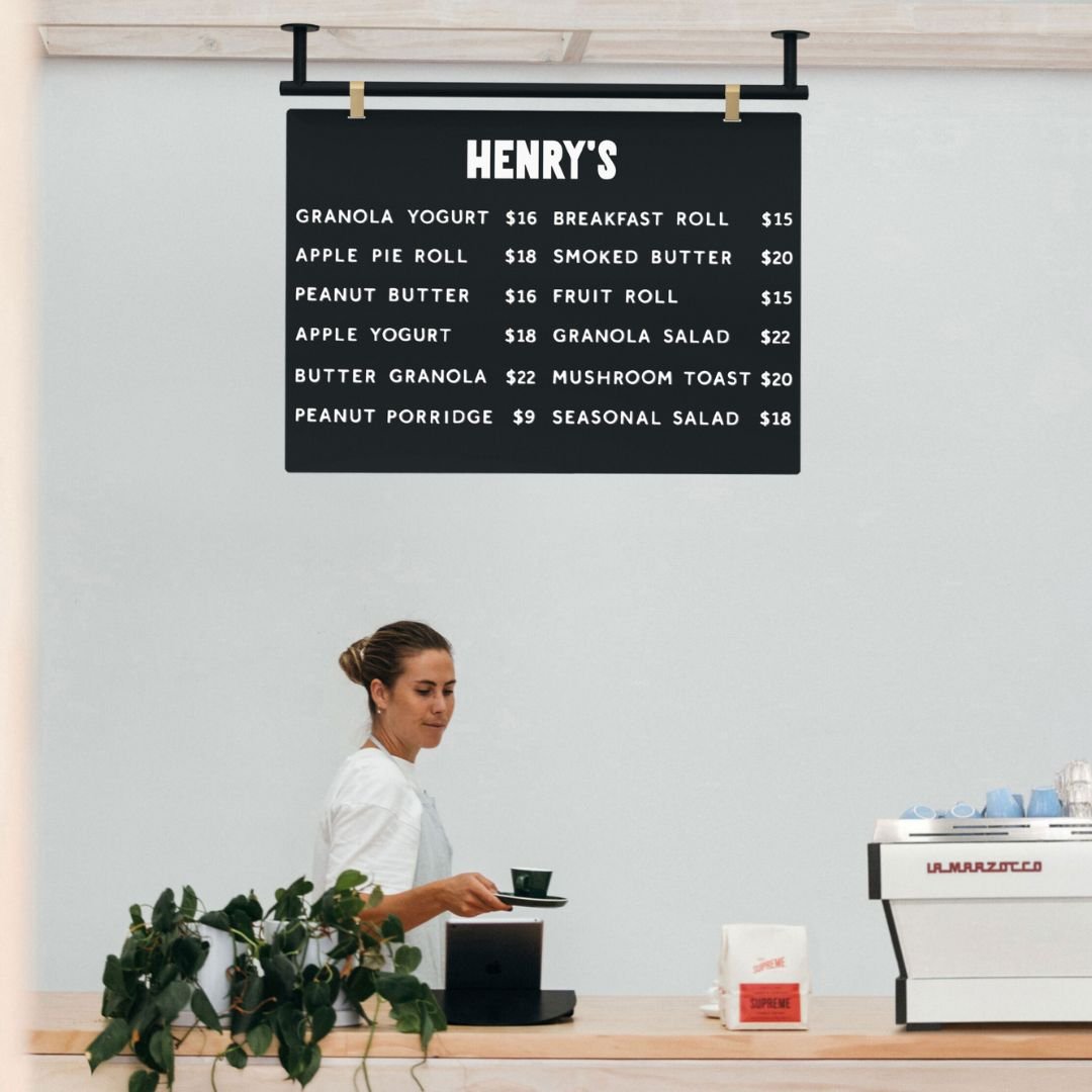
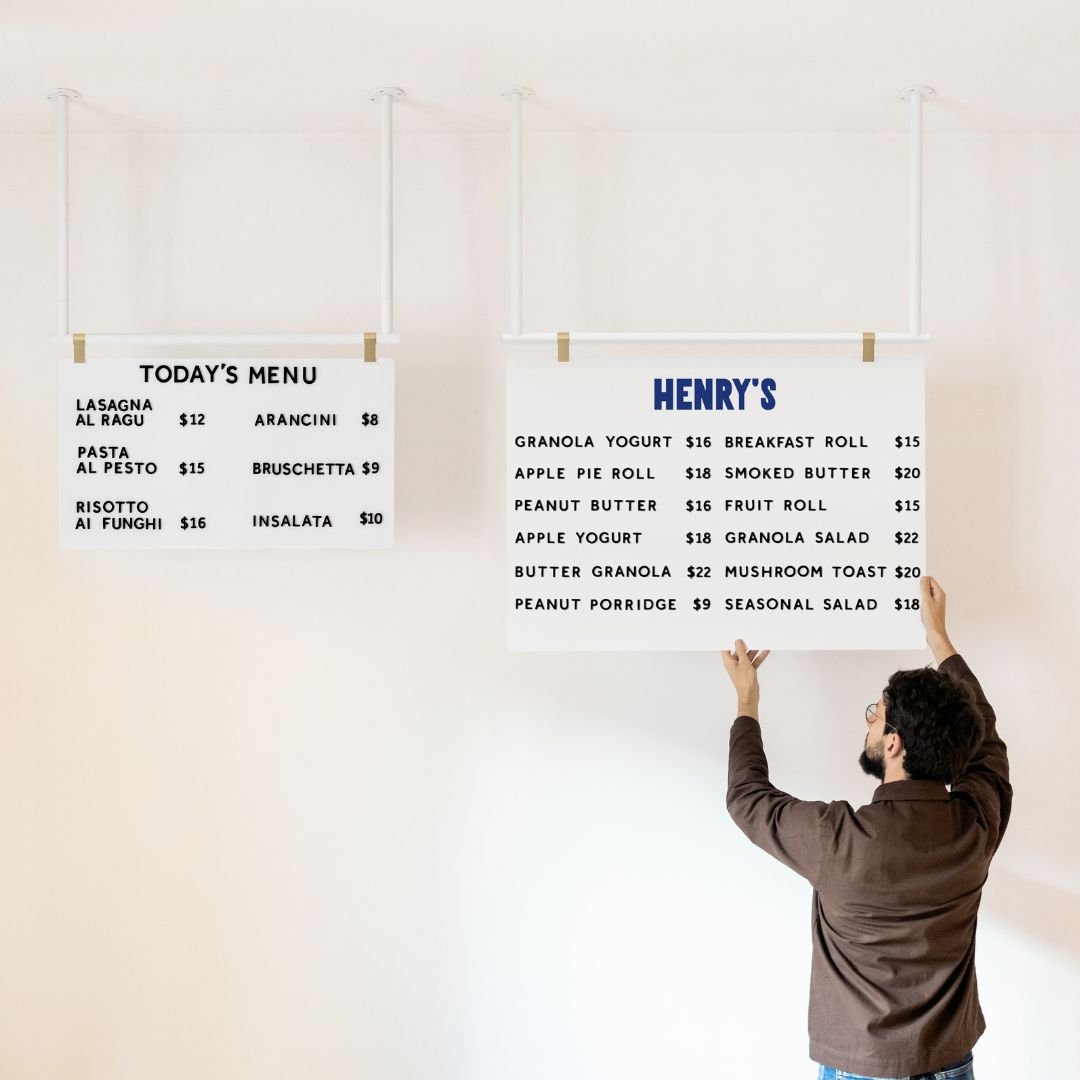
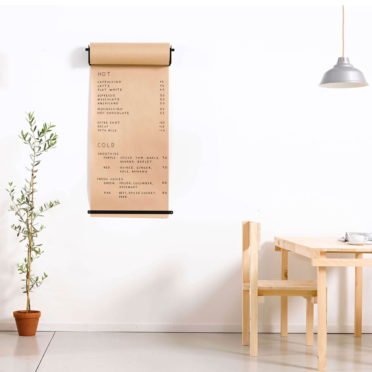
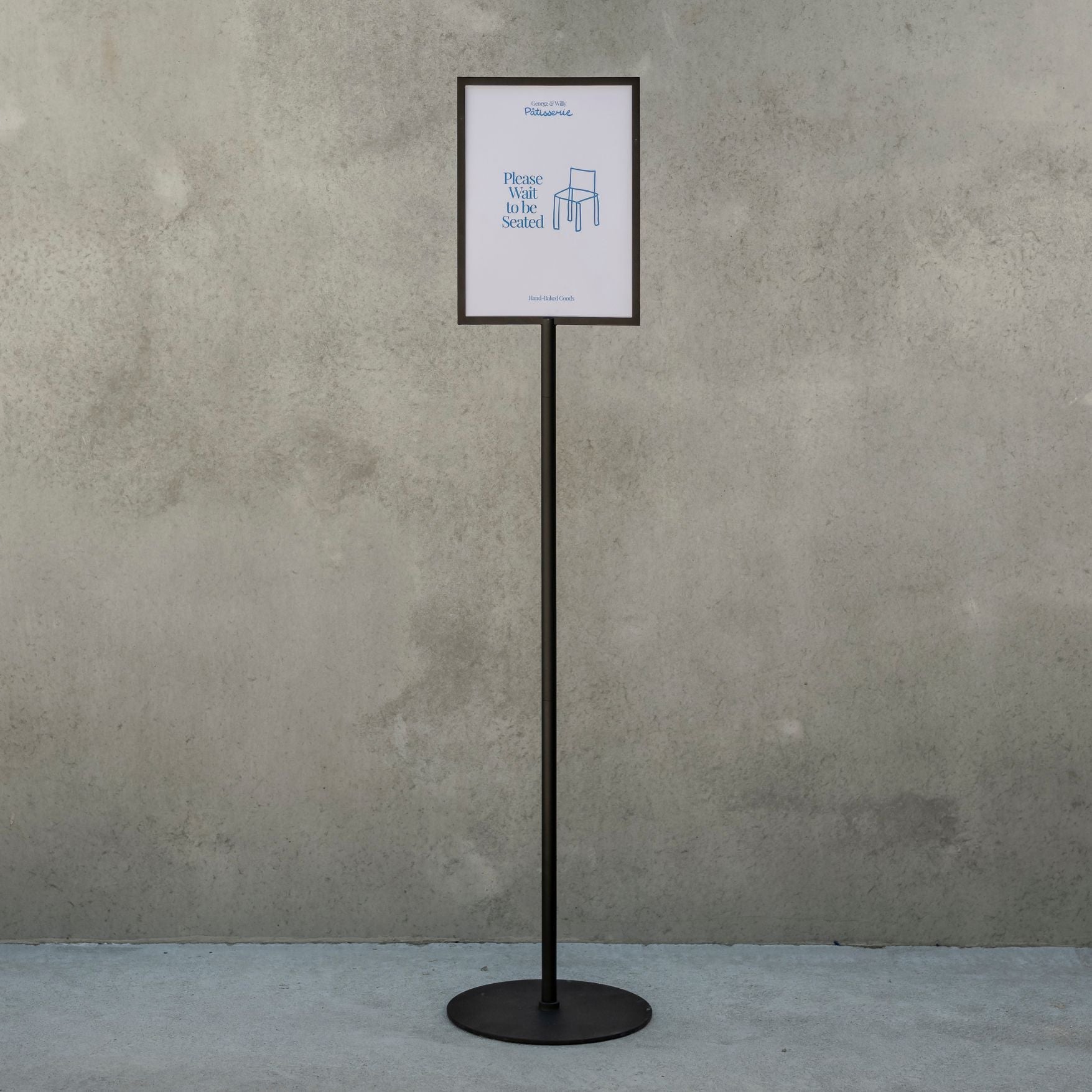
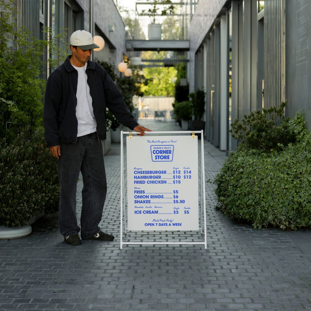
Directional signs are the workhorses of any wayfinding system. They are the arrows and pointers that tell you which way to go. You’ll find them at intersections and along corridors, guiding you toward your destination. For example, a sign in a lobby with an arrow stating “← Elevators | Restrooms →” is a classic directional sign. Overhead displays such as our cafe menu boards can also double as directional signage in retail or hospitality spaces. They are designed for quick glances, using clear text and symbols to provide information without slowing people down.
Identity Signs
An identity sign confirms you’ve arrived. It labels a specific room or area, such as a plaque that reads “Conference Room B” or a sign above a door for the “Human Resources Department.”
A room identification sign is a common type of identity sign. It provides the specific name or number for a room, like “Room 305”. In many public buildings, these signs are required to have raised lettering and Braille to comply with accessibility standards, ensuring everyone can identify the space.
Information Signs
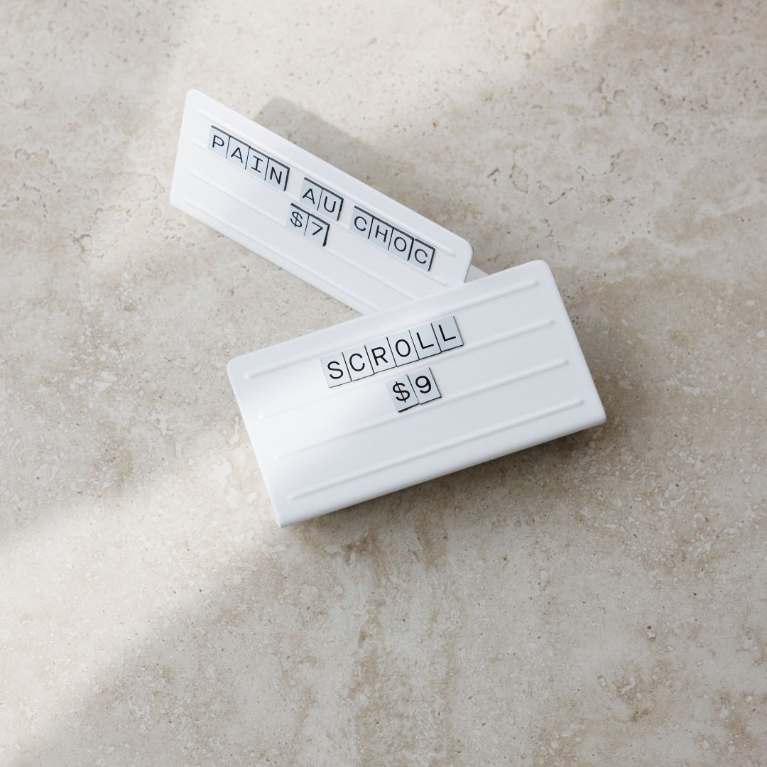
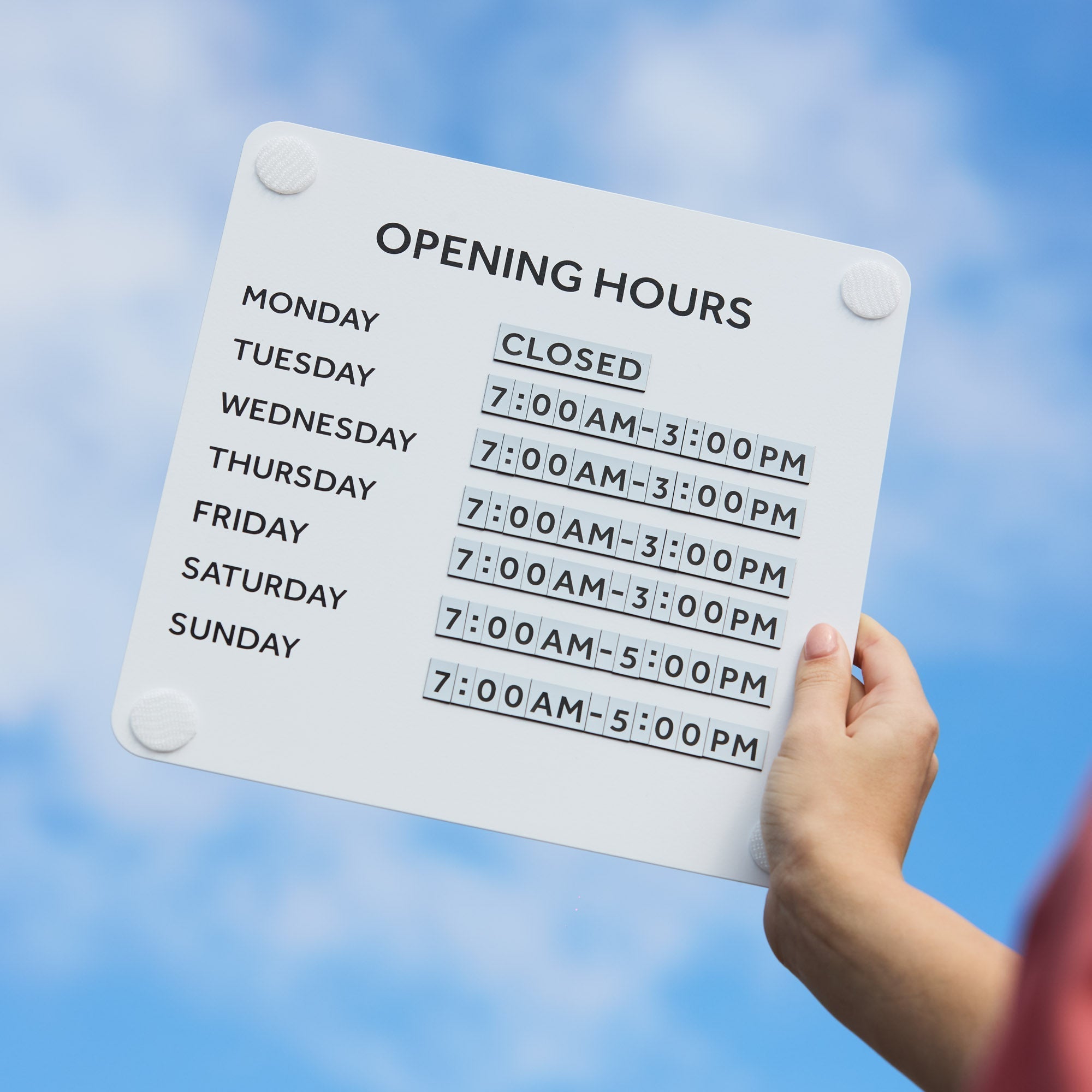
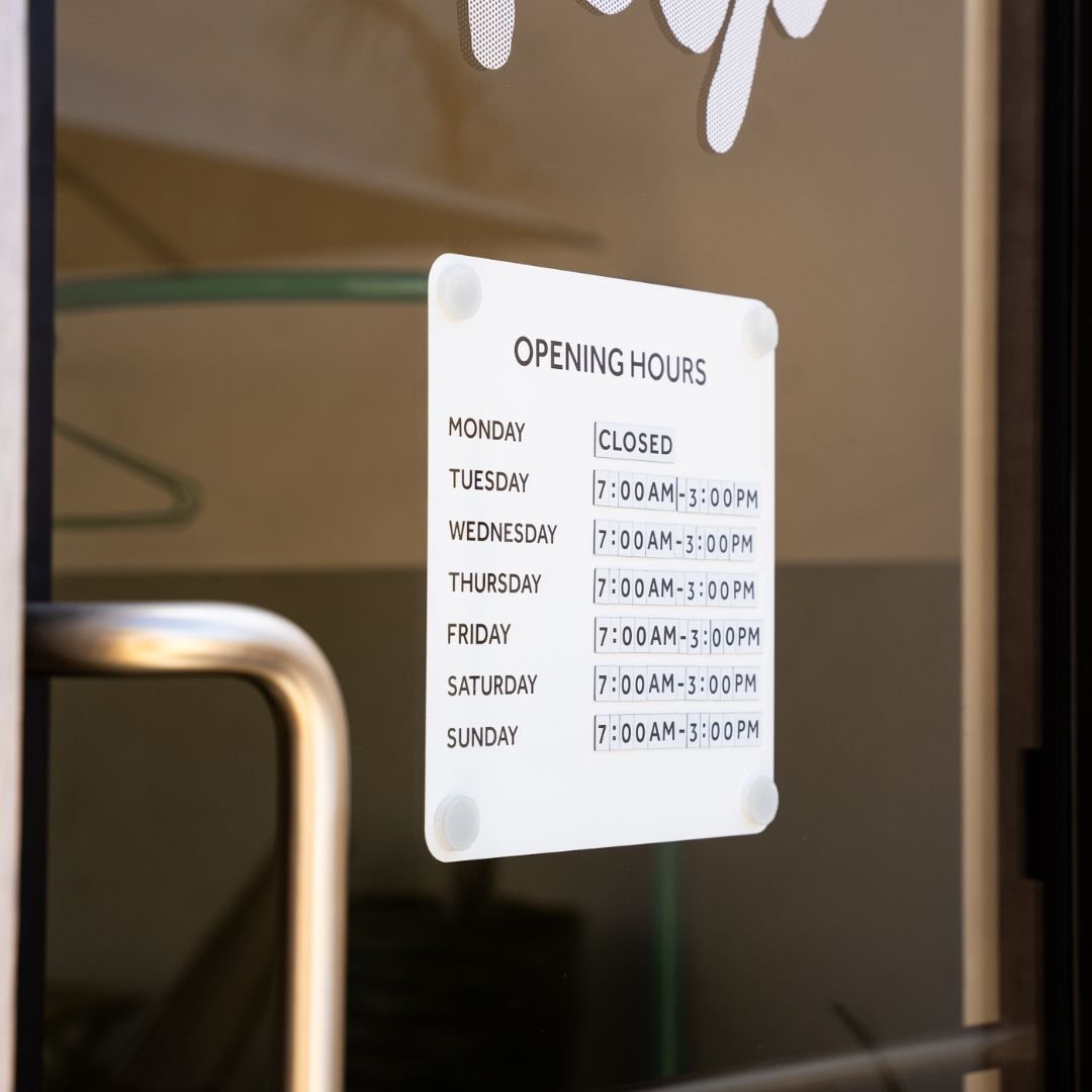
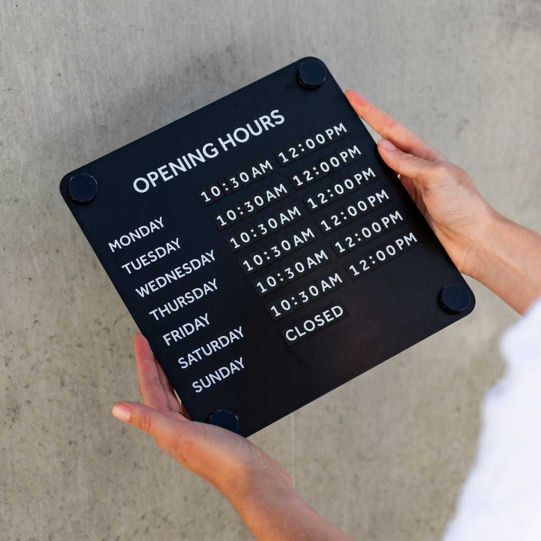
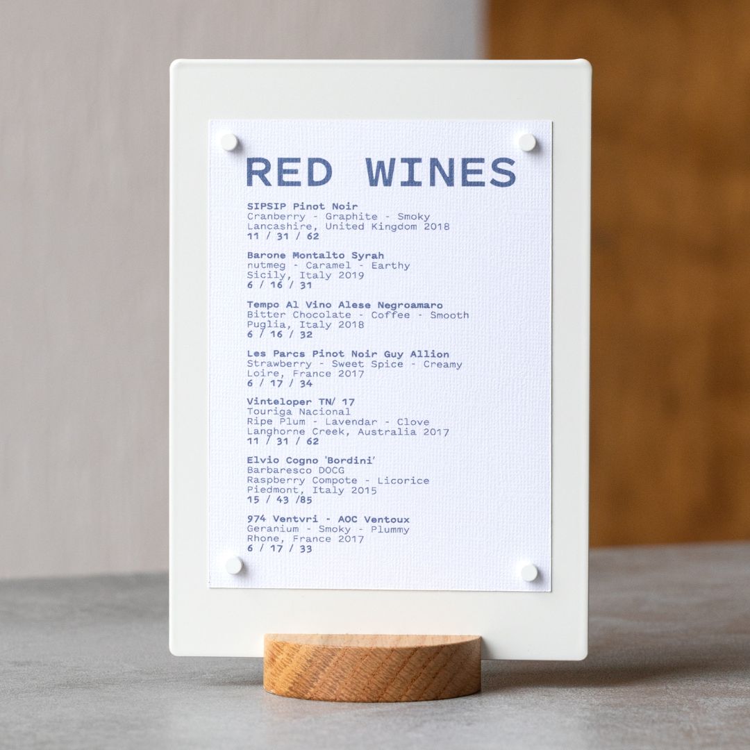
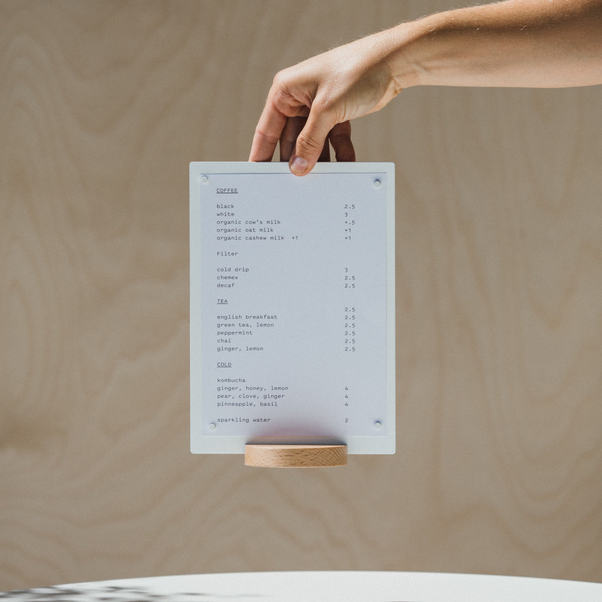
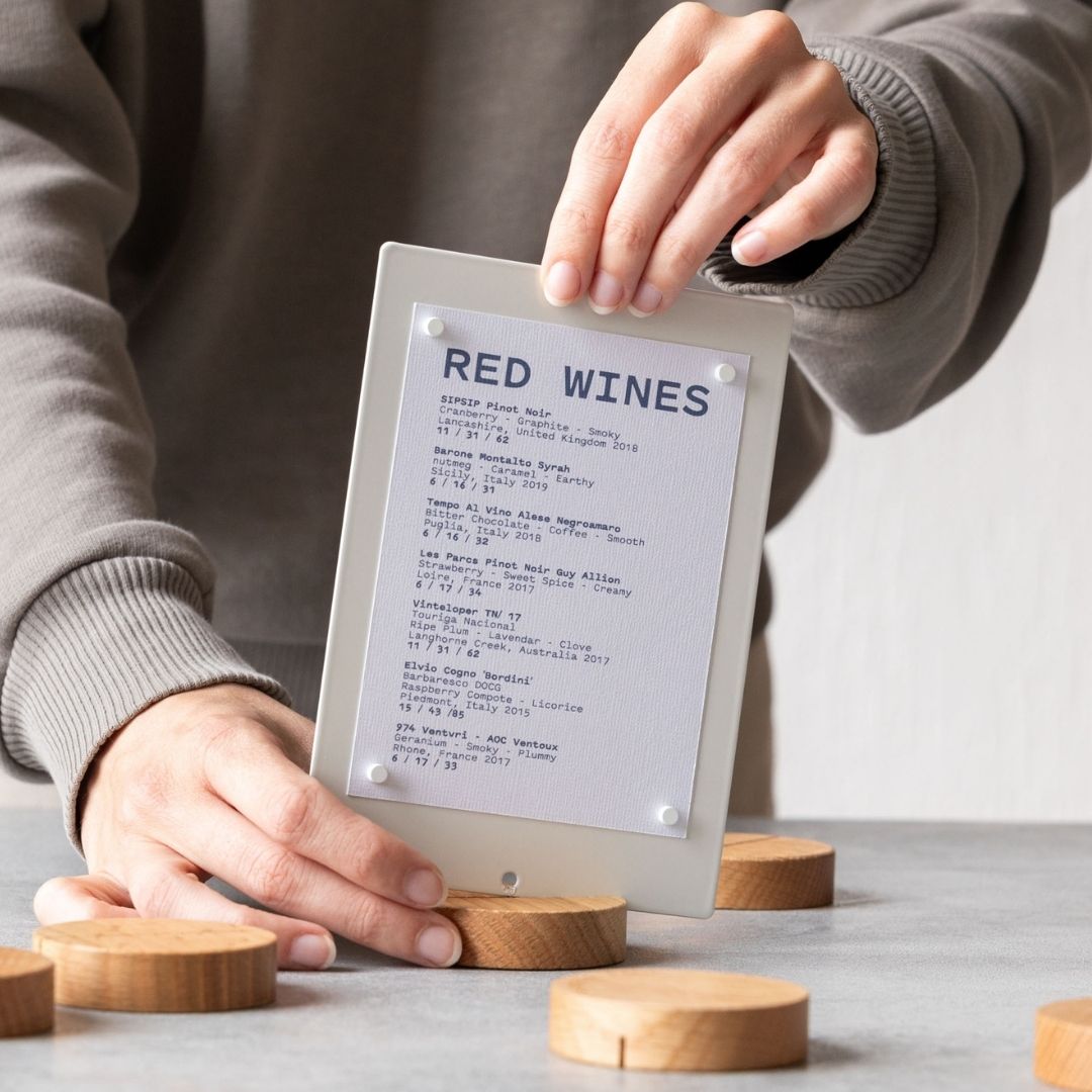
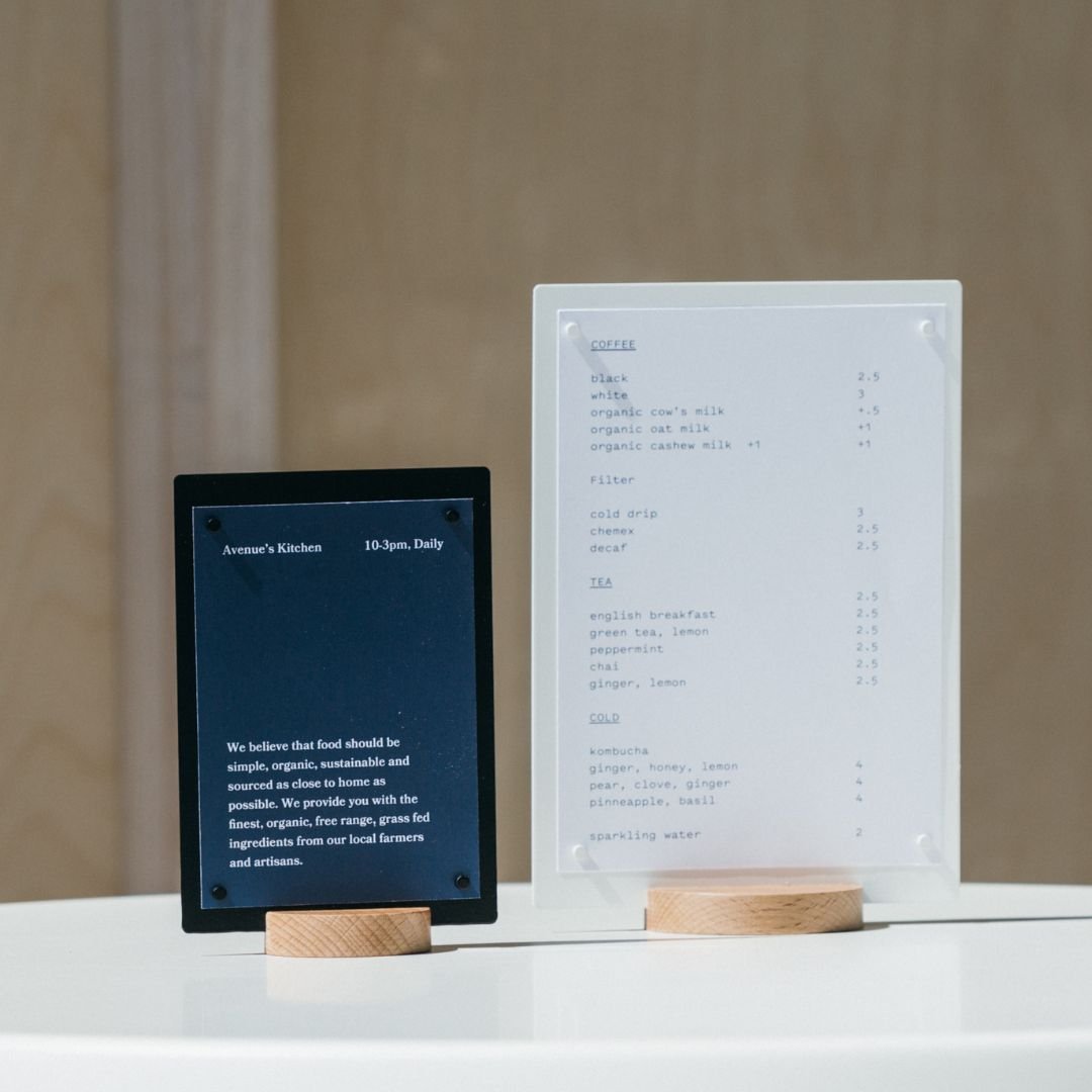
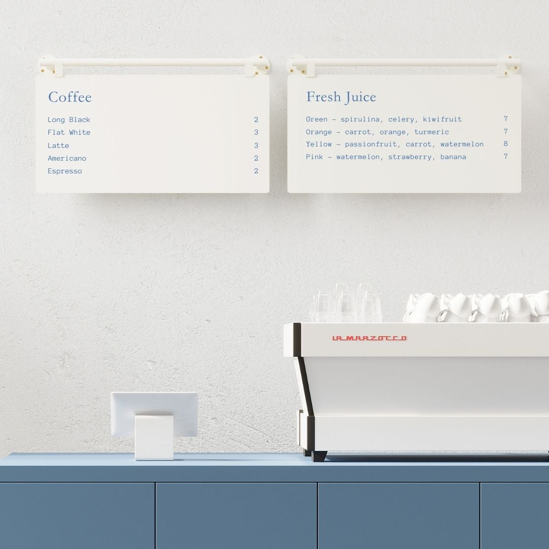
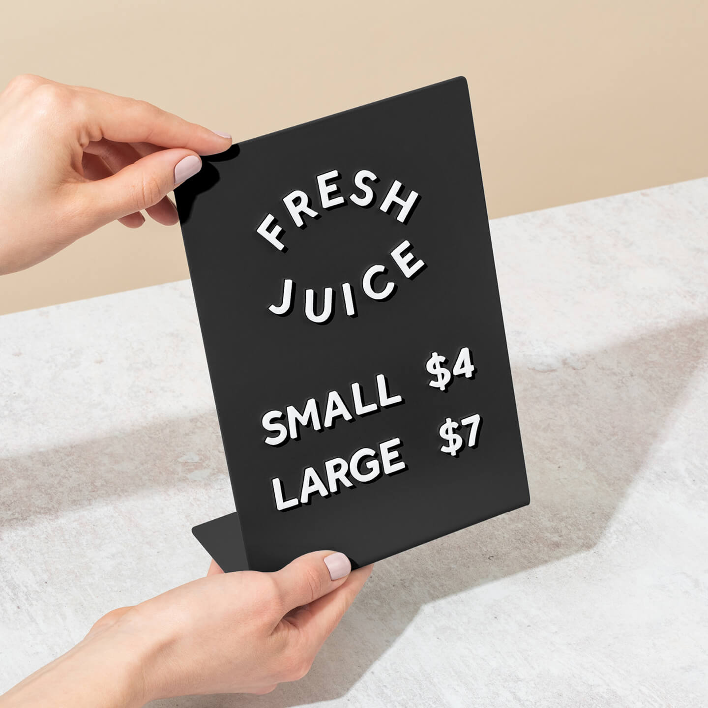
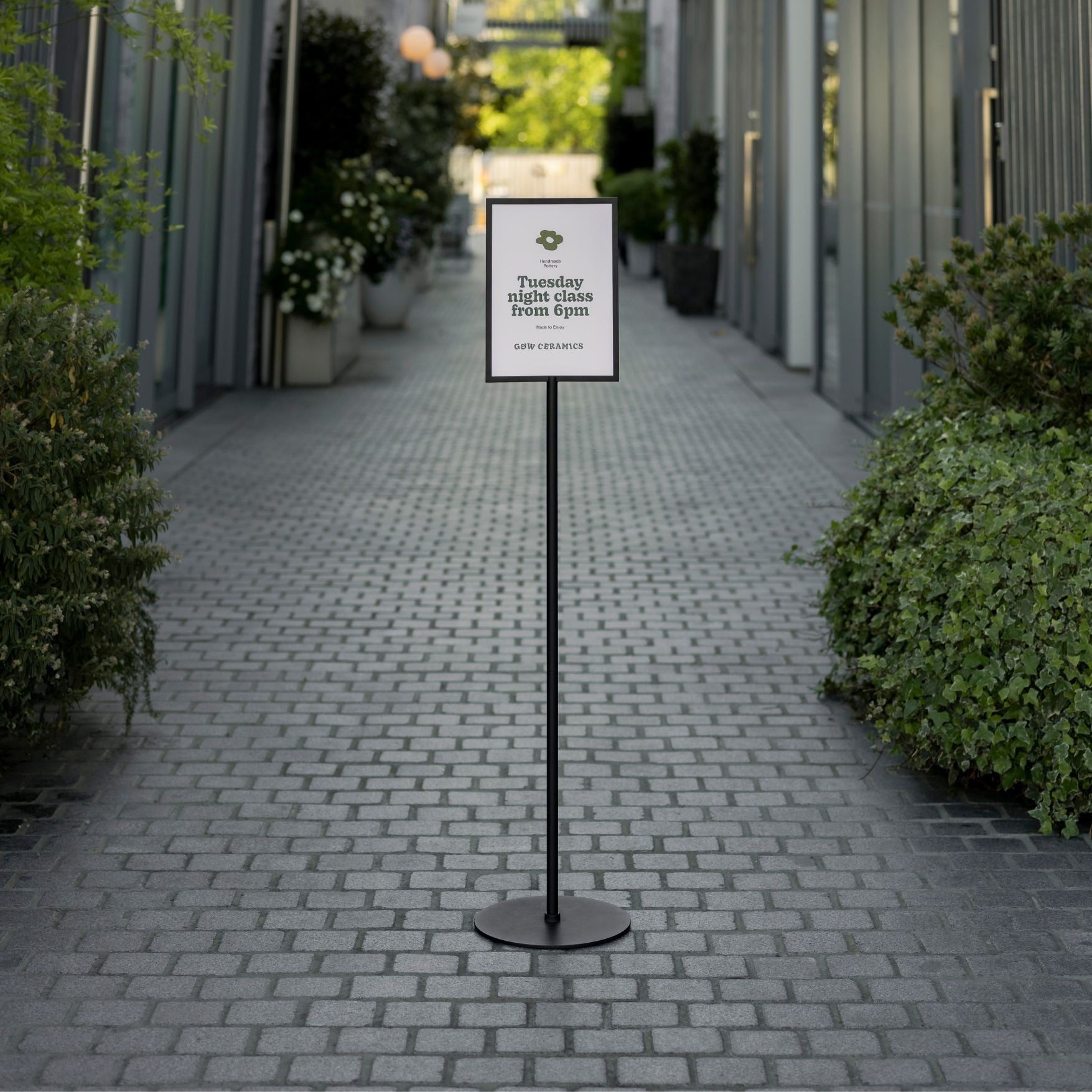
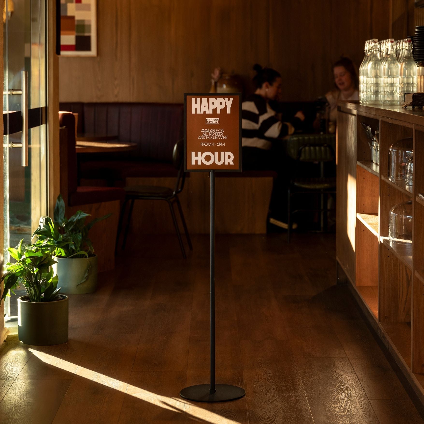
Informational signs provide context and answer questions beyond simple directions. This category includes signs that display hours of operation, facility rules, or Wi-Fi network details. At reception desks or counters, compact displays like tabletop signage keep key information tidy and legible. They give users helpful information that makes their visit smoother.
A directory sign is a key type of informational sign, often found at entrances or in lobbies. It provides a list of multiple destinations within a building, like a mall map with a “You Are Here” dot or a list of companies on each floor of an office tower. A building directory sign, specifically, helps visitors locate the various tenants in a multi occupant facility, acting as a table of contents for the entire building. For flexible setups, a freestanding Menu Stand works well in lobbies and reception areas.
Regulatory Signs
Regulatory signs communicate rules and safety requirements. These are the signs that say “No Smoking,” “Authorized Personnel Only,” or “Fire Exit.” They are essential for managing behavior, ensuring compliance with laws, and keeping everyone safe. Their design is often standardized for immediate recognition, using bold colors and universal symbols to convey their message clearly.
Key Design Principles for Effective Signage
Great interior wayfinding signage isn’t just about what the signs say; it’s about how they say it. Several design elements work together to create a system that is both functional and visually appealing.
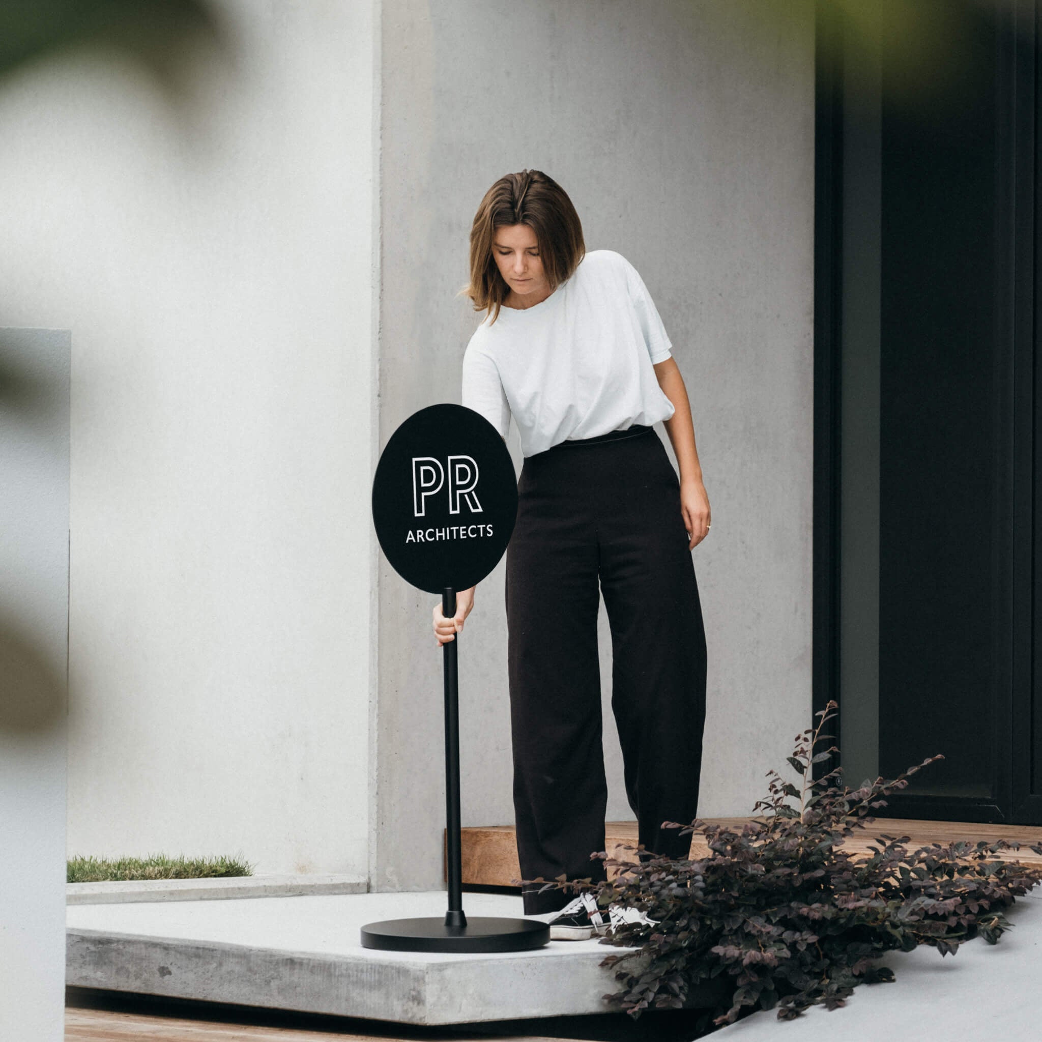
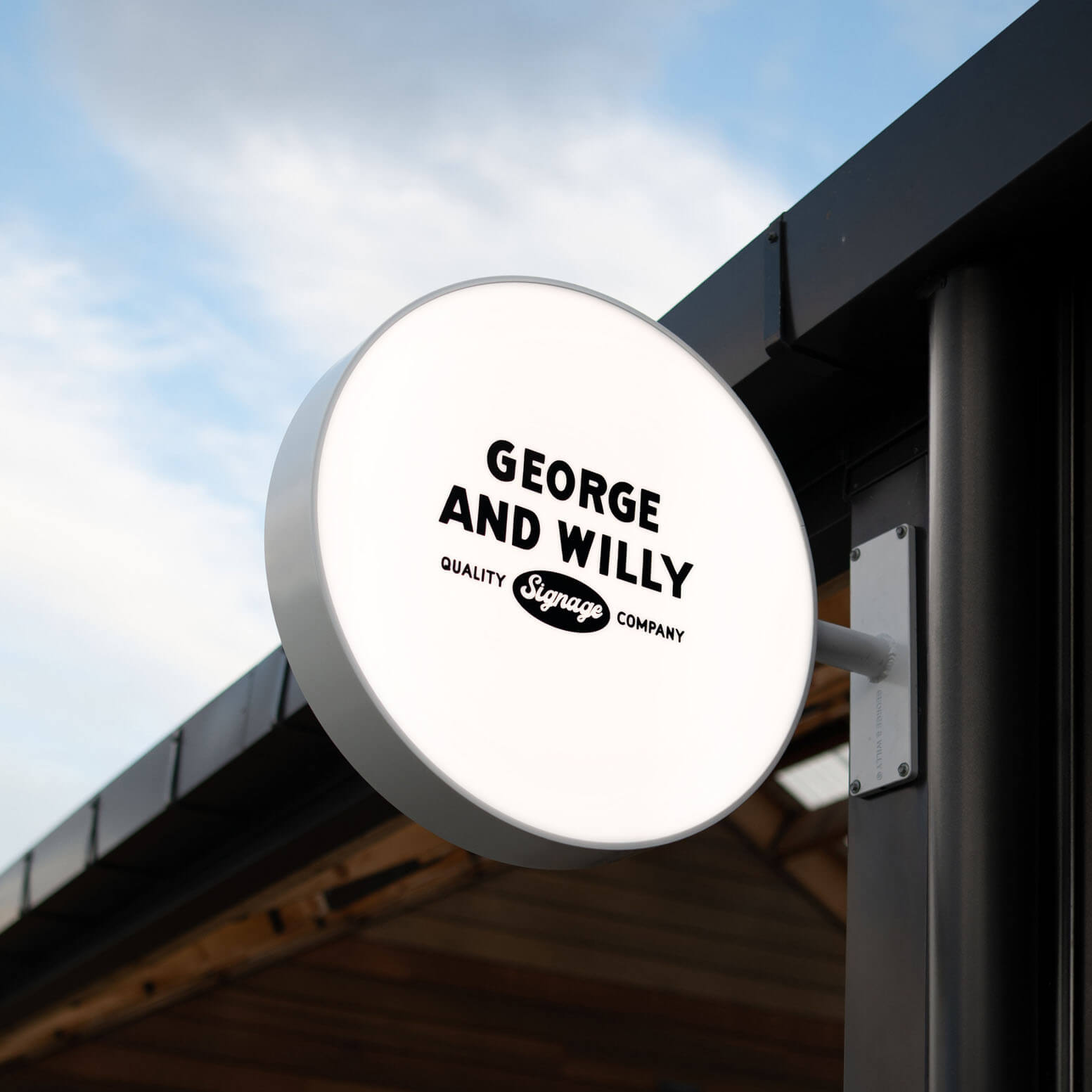
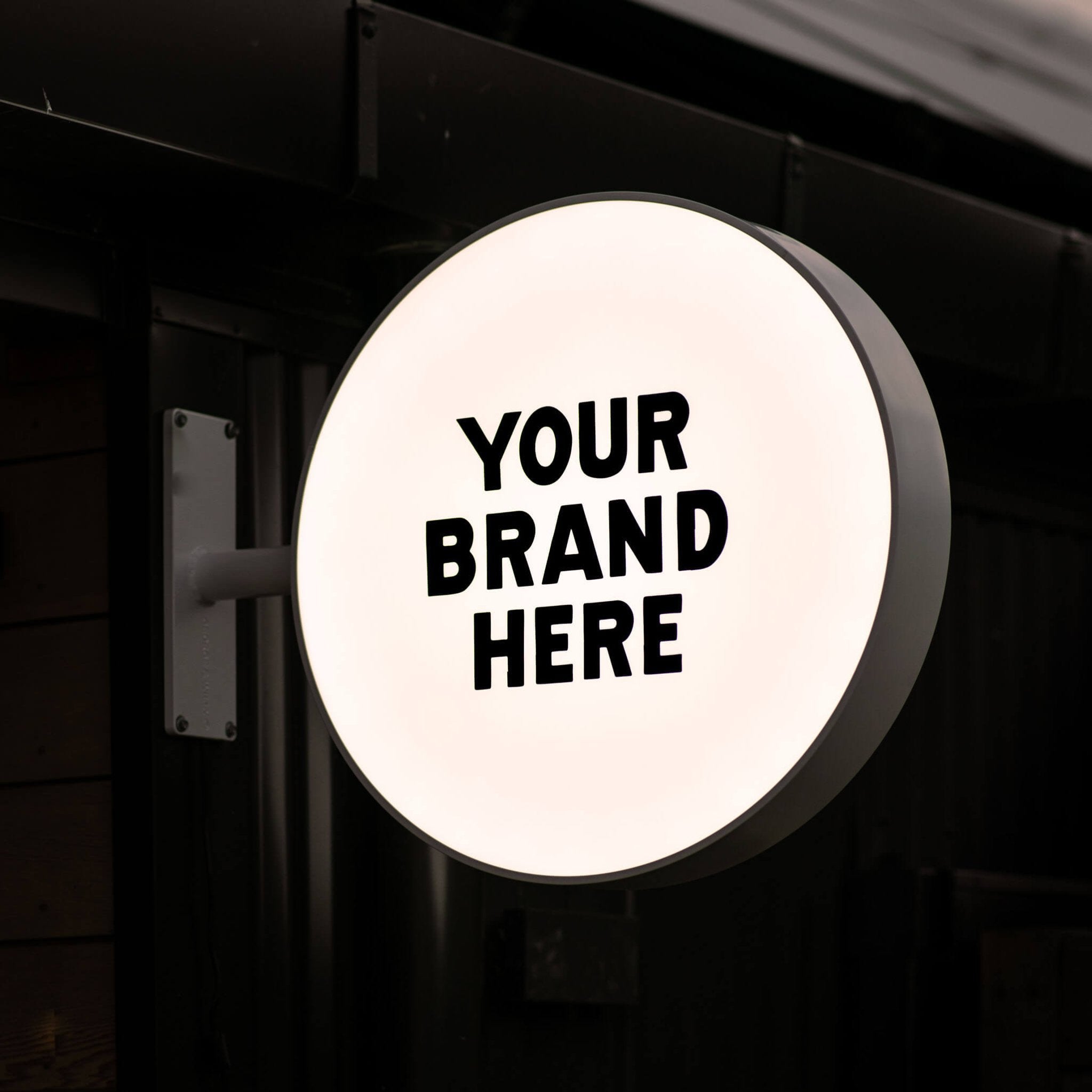
Branding in Wayfinding
Your signage is an extension of your brand. Branding in wayfinding means incorporating your organization’s visual identity (colors, fonts, and logos) into the navigational elements. This creates a cohesive and immersive experience. For example, a boutique hotel might use elegant, custom icons that reflect its interior design. When people feel comfortable and oriented, their overall impression of the brand improves. In fact, research shows that when people are happy and not lost, they are more likely to stay longer and spend more.
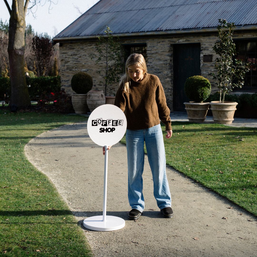
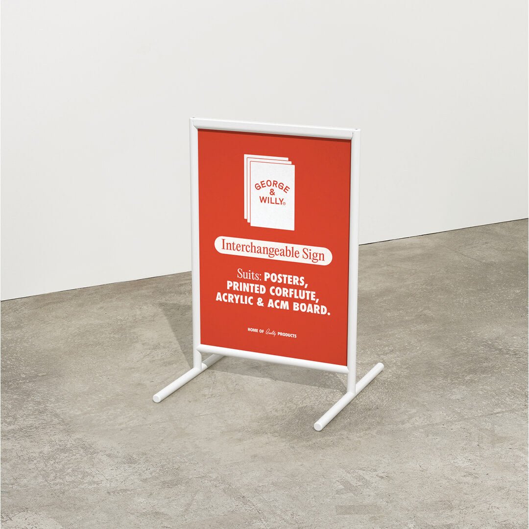
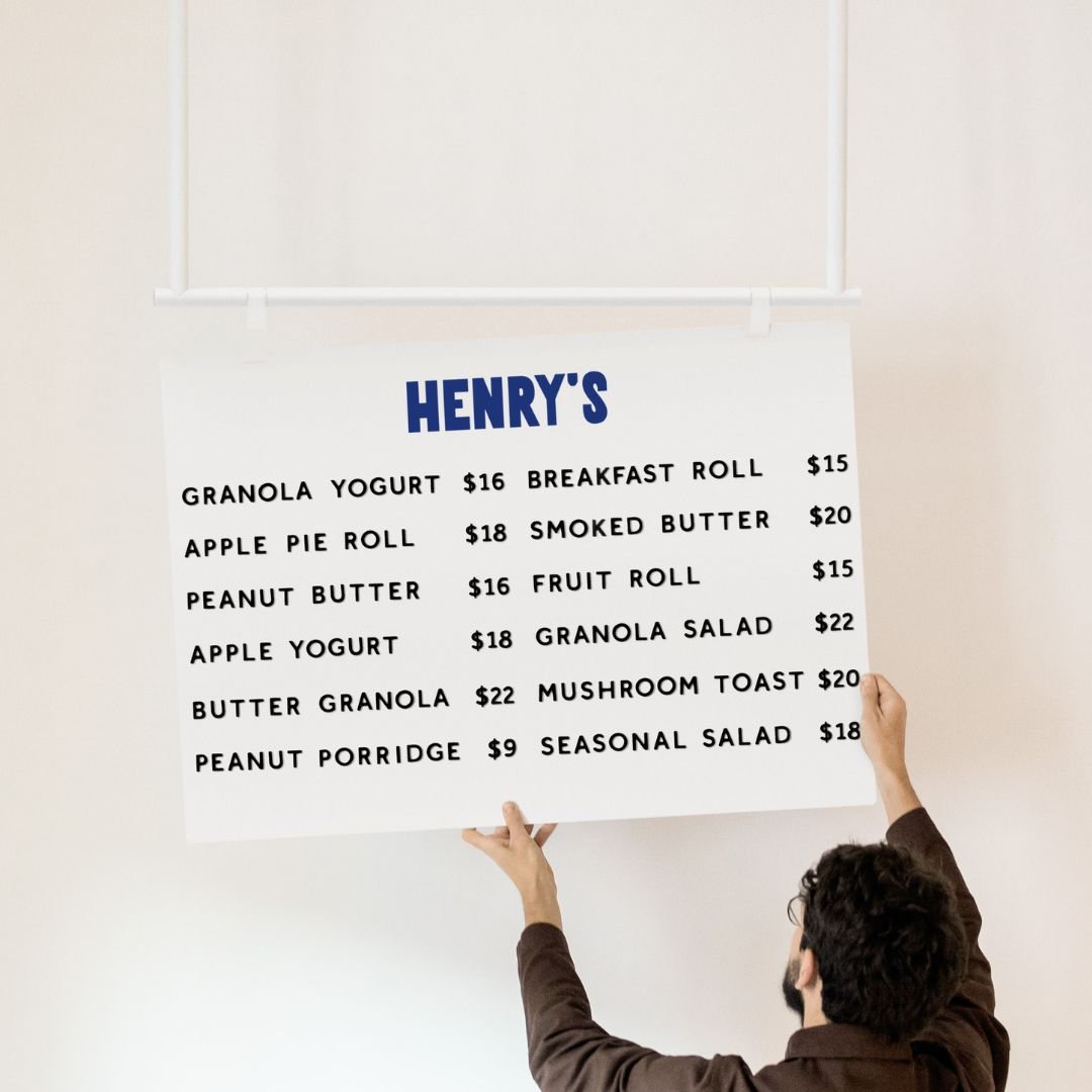
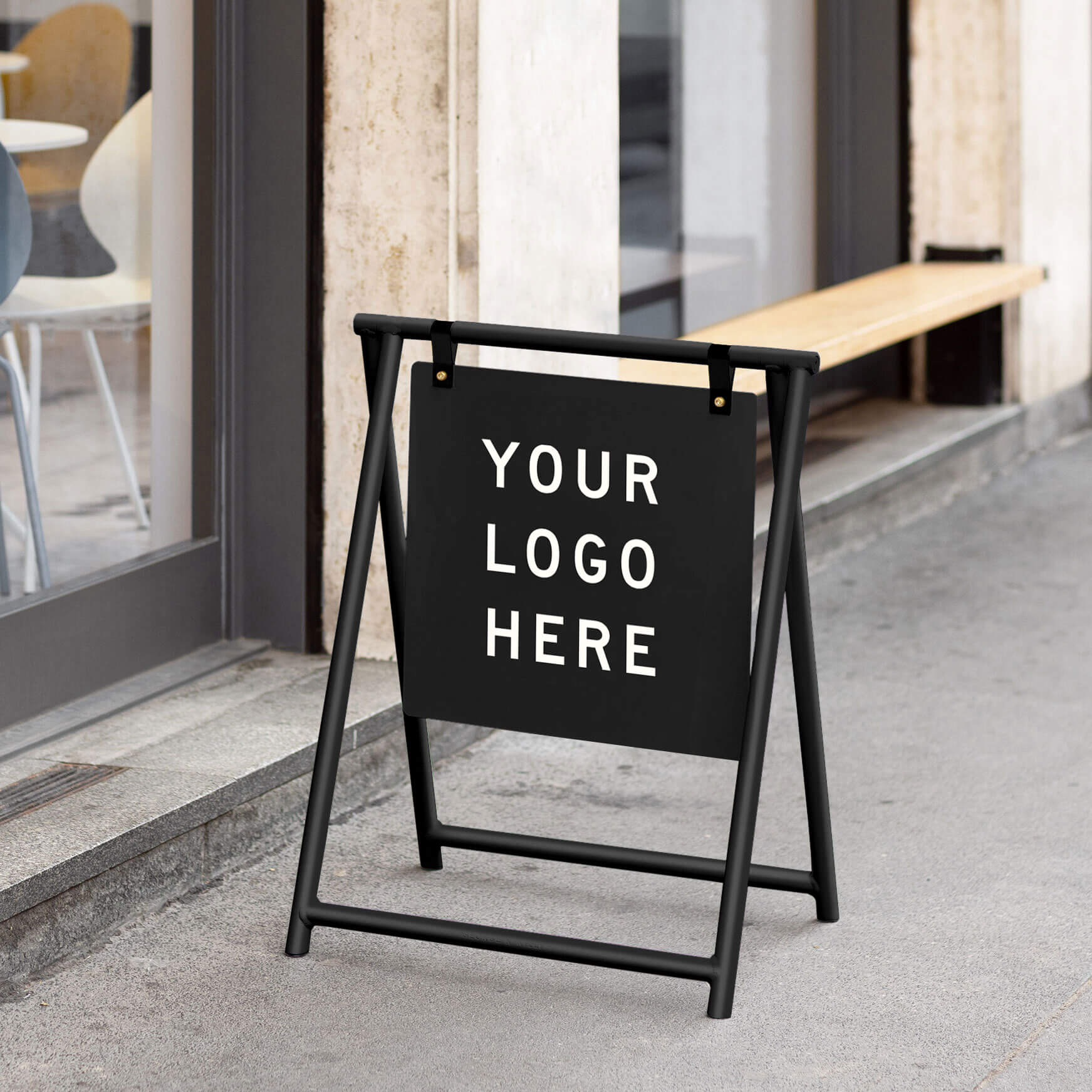
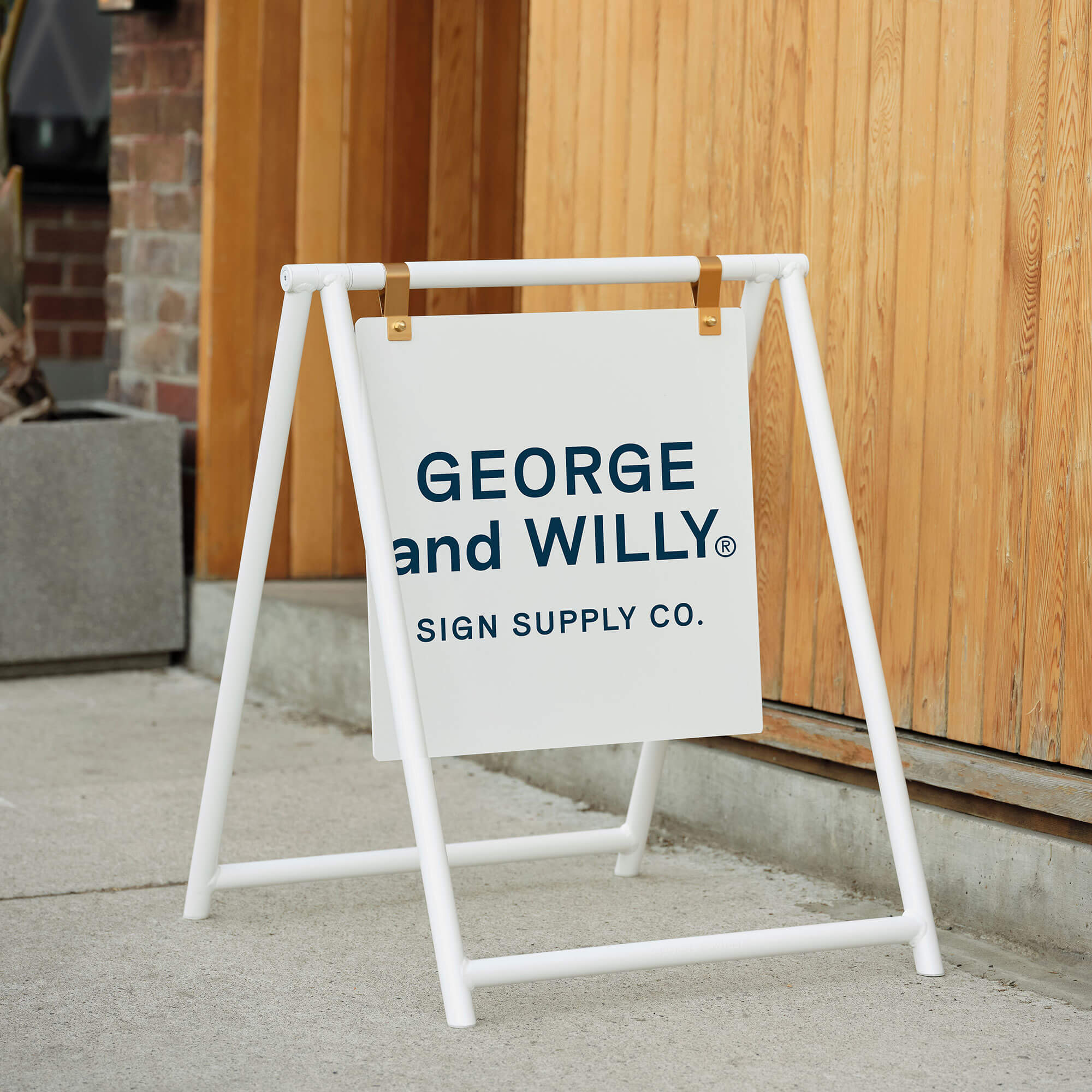
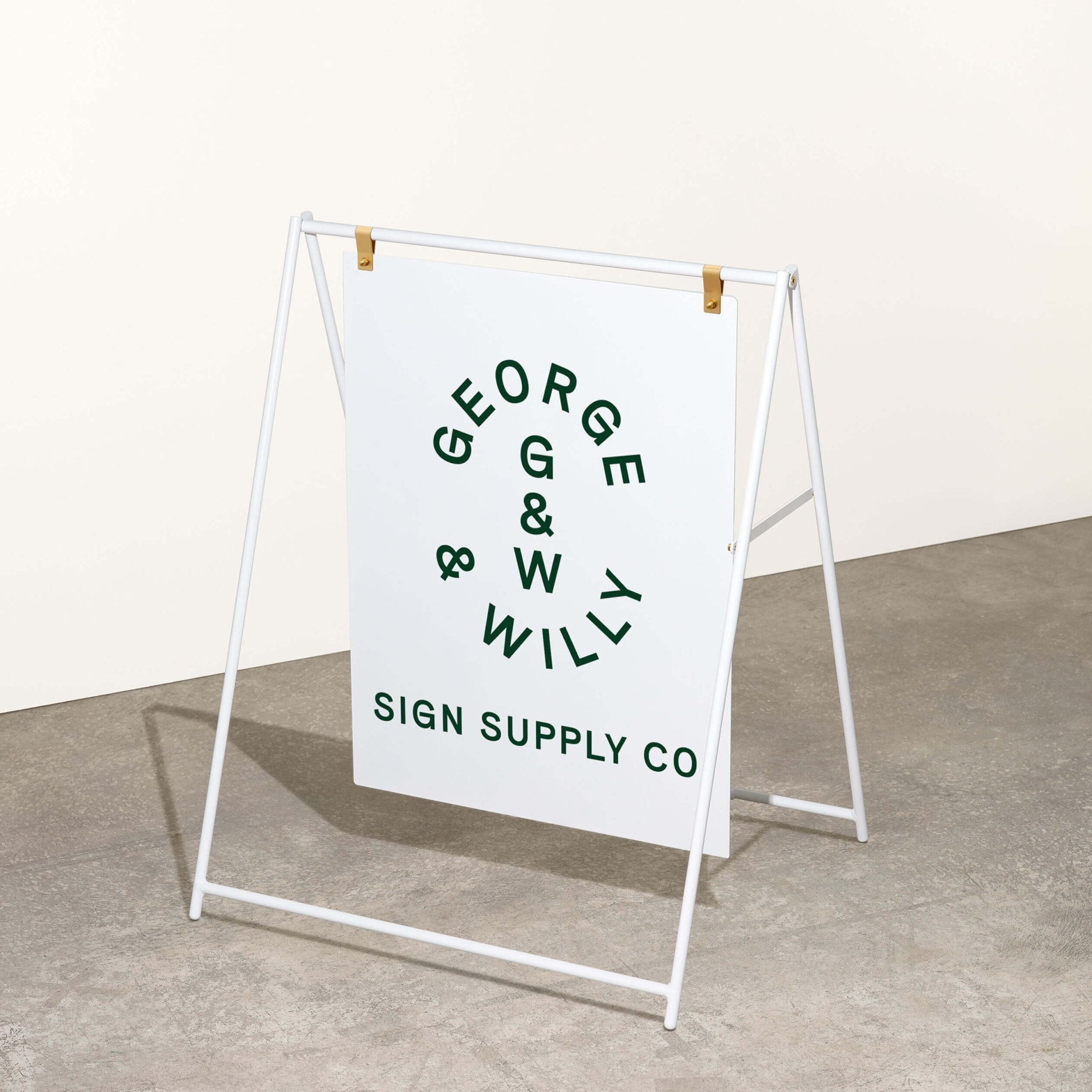
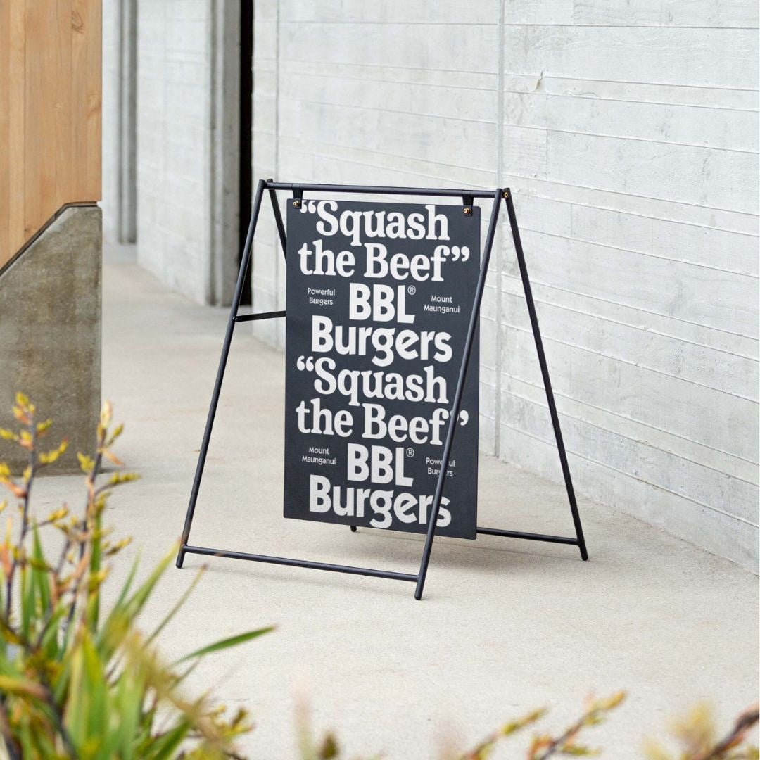
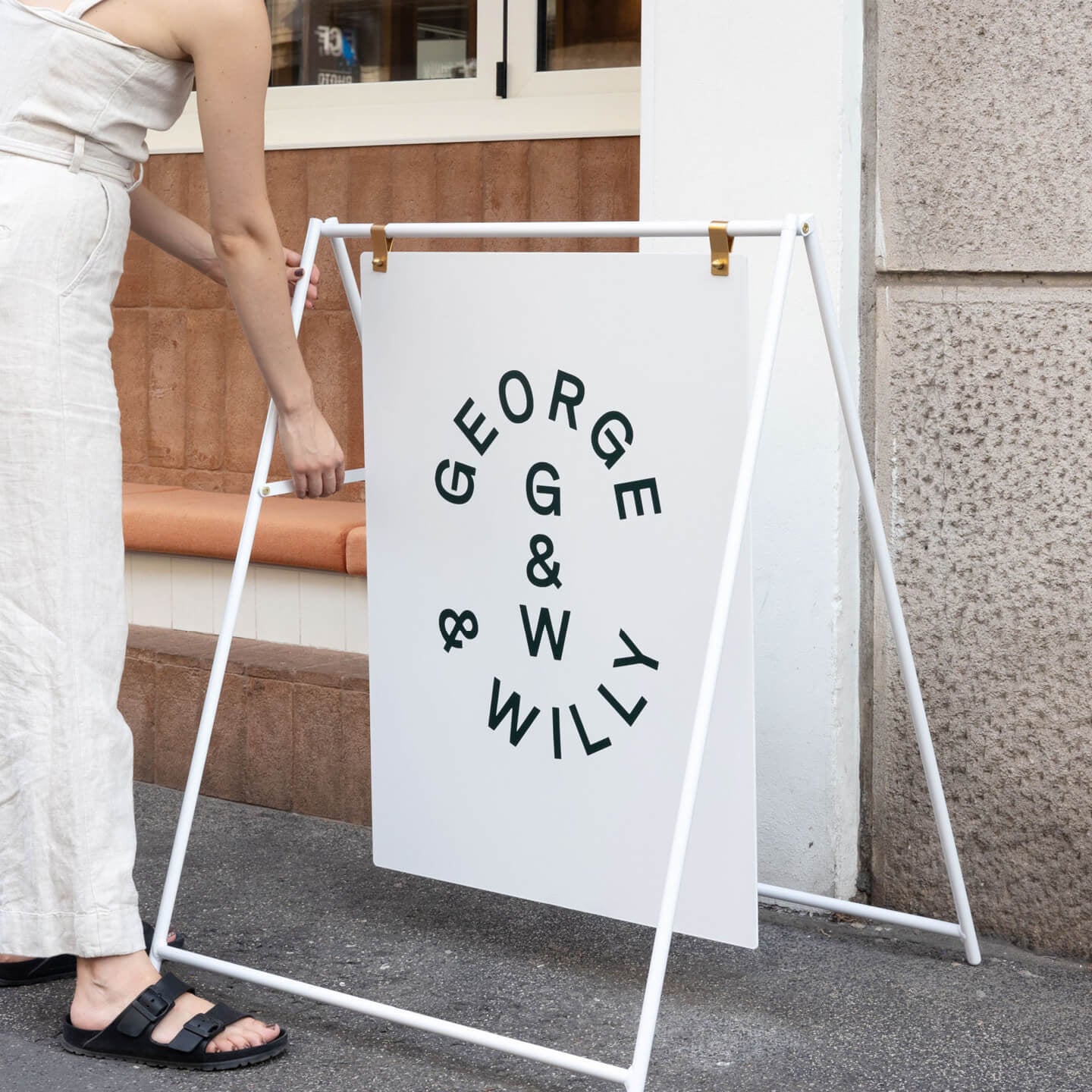
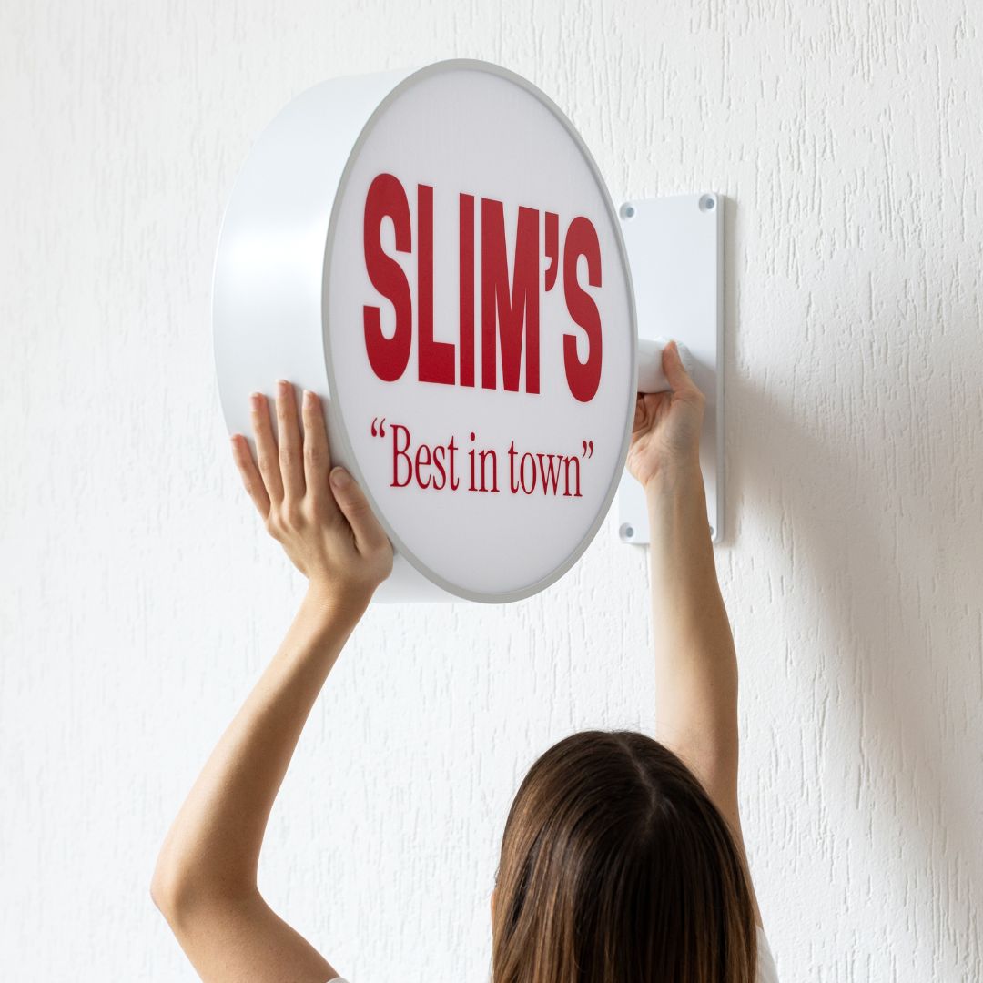
Many businesses, from independent cafés to creative studios, prefer a clean, minimalist aesthetic. For them, sourcing beautifully crafted, unbranded signs—like the Table Top Sign—provides the perfect canvas. Companies like George & Willy offer timeless signage that can be customized locally with a brand’s own vinyl decals, achieving a high end look without the long lead times of custom fabrication.
Wayfinding Symbols and Labeling
Symbols and labels are the language of wayfinding.
Symbols (or pictograms) are powerful because they transcend language barriers. Universal icons for restrooms, elevators, and food are instantly recognizable to people from all over the world.
Labeling refers to the text on the signs. The key here is consistency. Using the same clear, simple term for a location across all signs and maps is crucial for avoiding confusion.
Together, clear symbols and consistent labeling ensure that messages are understood quickly and without ambiguity.
The Role of Color and Pattern
Color and patterns are fantastic tools for creating intuitive shortcuts in navigation. Many large facilities use color coding to distinguish between different zones, floors, or routes. You might be told to “follow the green line to the pharmacy” in a hospital, which reduces cognitive load because your brain can easily track the color. Repeating a specific pattern or graphic can also act like a breadcrumb trail, reassuring visitors they are on the right path.
Integration with the Environment
The most sophisticated wayfinding systems feel like a natural part of the building itself.
Architectural Feature Integration: This practice uses a building’s own elements as navigational cues. A prominent atrium, a unique staircase, or a distinct lighting feature can serve as a central landmark that helps orient visitors. Instead of cluttering walls with signs, the architecture itself does the guiding.
Landmark and Art Integration: Similarly, incorporating memorable features like sculptures, murals, or large art installations can create helpful anchor points. People are more likely to remember “turn left at the big red statue” than a generic hallway number.
Wayfinding Lighting Design: Good lighting ensures that signs are visible in all conditions, day or night. This includes using illuminated signs in dim areas and designing lighting that highlights key pathways or decision points. Sometimes, light itself can become the guide, with features like illuminated strips on the floor leading the way.
Interior Wayfinding Signage in Different Environments
The specific needs for interior wayfinding signage can vary dramatically depending on the type of space.
Corporate Office Interior Wayfinding Signage
In a busy office, clear navigation is the unseen hero of productivity. Employees waste a surprising amount of time searching for meeting rooms or colleagues in poorly signed buildings. An effective system of corporate office interior wayfinding signage, including directories, room numbers, and departmental signs, helps everyone move around efficiently. Good signage also makes a great first impression on clients and visitors, reflecting a company’s professionalism and attention to detail. In fact, one study found that 79% of people believe a company’s signage reflects the quality of its products or services.
For modern workspaces that value both function and form, minimalist displays like a restaurant menu or professional door signs can enhance the office aesthetic while keeping everyone oriented. Explore a collection of office friendly options at George & Willy.
Interior Hospitality Wayfinding Signage
In hospitality, the guest experience is everything. From hotels to restaurants, interior hospitality wayfinding signage acts as a silent concierge, guiding guests effortlessly. Clear directions to the lobby, elevators, pool, and guest rooms reduce stress and create a welcoming atmosphere. The signage should be both functional and on brand, matching the venue’s decor and ambiance. A seamless navigational experience helps guests feel cared for, which can directly impact satisfaction scores and encourage repeat visits.
Interior Healthcare Wayfinding Signage
Hospitals are notoriously complex and stressful environments. For patients and their families, getting lost can lead to missed appointments and increased anxiety. It’s a common problem, with studies showing that nearly one third of first time hospital visitors get lost. Effective interior healthcare wayfinding signage is therefore essential. Systems often use color coded zones, clear directories, and universally recognized icons to simplify navigation. By making it easy for people to find their way, hospitals can improve the patient experience, increase operational efficiency, and create a calmer, more reassuring atmosphere.
Interior Education Wayfinding Signage
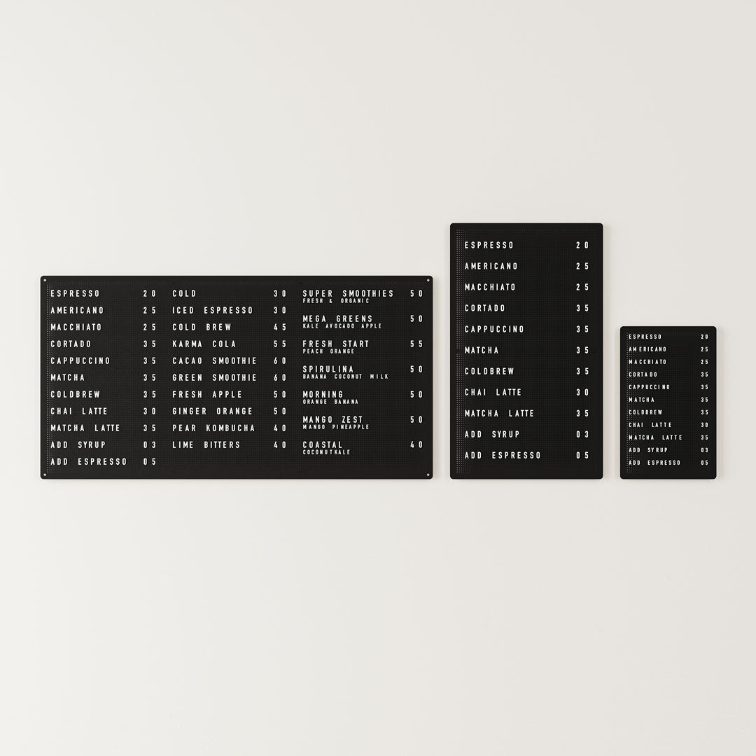
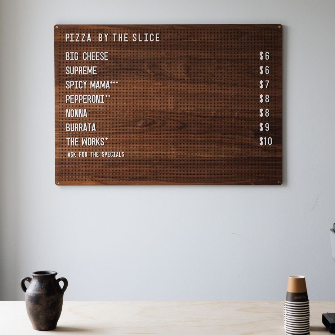
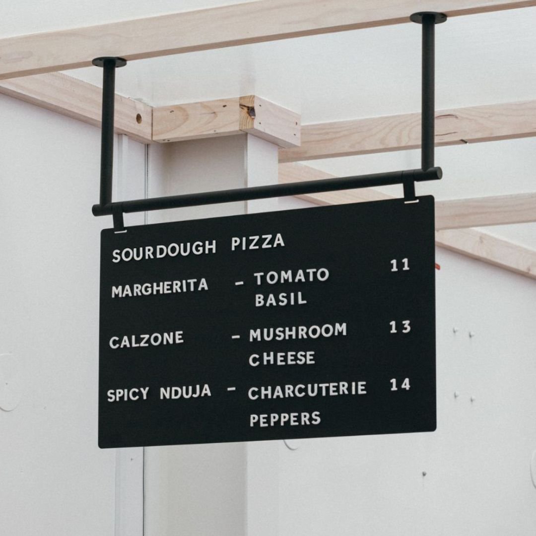
University campuses and large schools can be overwhelming, especially for new students and visitors. A system of interior education wayfinding signage is crucial for helping everyone navigate classrooms, lecture halls, libraries, and administrative offices. Clear building directories, directional signs, and well marked room numbers reduce confusion and help students get to their classes on time. For frequently changing schedules, a Rail Menu Board makes it easy to post daily room assignments or event notices. Good wayfinding contributes to a welcoming campus environment, making a positive first impression that can last for years.
Accessibility is Non Negotiable
A truly successful wayfinding system is one that everyone can use, regardless of their physical abilities. This is where ADA compliance becomes critical.
An ADA wayfinding sign is any sign designed to meet the standards of the Americans with Disabilities Act. For permanent rooms and spaces, these regulations mandate specific features to assist people with visual impairments. Key requirements include:
Raised Lettering: Characters must be tactile, raised at least 1/32 of an inch.
Grade 2 Braille: Braille translation must be located directly below the corresponding text.
High Contrast: There must be a significant color contrast between the text and the background for maximum legibility.
Non Glare Finish: Signs should have a matte or non glare finish to prevent reflections from obscuring the text.
Mounting Location: Signs must be mounted at a consistent height and location, typically on the latch side of the door, so they can be easily found by touch.
It’s important to note that not all signs need to be ADA compliant. Directional signs, temporary signs, and building directories are generally exempt from the tactile requirements. However, any sign identifying a permanent space like a restroom, office, or exit must comply. Non compliance can result in significant fines, underscoring the importance of creating an accessible environment for all.
Conclusion: Guiding People with Purpose
Effective interior wayfinding signage is so much more than arrows on a wall. It is a thoughtful blend of strategy, psychology, and design that transforms a complex space into an intuitive and welcoming environment. By focusing on clarity, consistency, and the user’s journey, you can create a system that not only helps people find their way but also enhances their overall experience and positively reflects on your brand.
Whether you’re starting from scratch or looking to improve your current space, investing in well designed signage is an investment in your customers, employees, and visitors. For businesses seeking a cohesive and design forward approach, exploring a curated collection of signs and displays can be the perfect first step. Find inspiration for your space at George & Willy.
Frequently Asked Questions
1. What is the main goal of interior wayfinding signage?
The primary goal is to help people navigate an unfamiliar indoor environment with ease and confidence. It aims to reduce confusion, save time, and create a positive, stress free experience by providing clear and timely information at every step of a person’s journey.
2. What are the four main types of wayfinding signs?
The four core types are:
Identification Signs: Label a specific location (e.g., “Conference Room A”).
Directional Signs: Provide directions with arrows to guide people.
Informational Signs: Offer supplemental information like maps, directories, or hours.
Regulatory Signs: Communicate rules, safety regulations, and legal requirements.
3. How can I improve wayfinding in my small business?
Start with the basics. Ensure you have a clear sign at your entrance, such as a door sign visible from the door or window. Use a simple, easy to read directory if you have multiple areas. Place directional signs at key decision points (like where a customer has to turn). Make sure restrooms and exits are clearly marked. Consistency in font, color, and style across all signs will make your space feel more professional and easier to navigate.
4. Is Braille required on all interior signs?
No, not all signs require Braille. According to ADA standards in the U.S., Braille and tactile letters are required on signs that identify permanent rooms and spaces, such as room numbers, restroom signs, and exit signs. Signs that are purely directional (with arrows), informational (like directories), or temporary are generally not required to have Braille.
5. Why is branding important in wayfinding?
Branding in wayfinding helps create a cohesive and memorable experience. By using your brand’s colors, fonts, and tone of voice in your signage, you reinforce your identity and make the environment feel unique and intentional. This attention to detail can improve a visitor’s perception of your business and the quality of your services.
6. What makes a wayfinding symbol effective?
An effective symbol is simple, clean, and instantly recognizable. It should communicate its meaning without needing text and across different cultures. Using standardized, universally understood symbols (like those for restrooms or accessibility) is always a best practice.
7. Can good interior wayfinding signage improve business?
Absolutely. In a retail or hospitality setting, a well signed environment encourages customers to explore, stay longer, and spend more. In an office, it improves employee efficiency and makes a professional impression on clients. In healthcare, it reduces patient stress and prevents missed appointments. Good wayfinding directly contributes to a better user experience, which in turn boosts satisfaction, loyalty, and your bottom line.
8. What’s the first step in creating a wayfinding system?
The first step is always research and strategy. Before you design or buy any signs, you need to understand how people move through your space, where they get confused, and what their destinations are. Walk through your building from a visitor’s perspective and map out the key decision points. This will form the foundation for a logical and effective signage plan.