


Your entrance is your first handshake. Thoughtful storefront signs help strangers spot you from a distance, understand what you offer, and feel confident stepping inside. The right hardware plus clear messaging can lift foot traffic, improve wayfinding, and keep your brand looking sharp through every season. If you update prices or promos often, modern storefront signs that change quickly save time and money while keeping your curbside presence fresh.
Below, find the essentials on picking, designing, and caring for storefront signs that work as hard as your team.
Top 10 Storefront Signs to Boost Curb Appeal
Next up, explore ten storefront metal sign types designed to instantly elevate curb appeal and turn passersby into paying customers. Grouped together because they address visibility from multiple angles: brand identity, promotion, lighting, and creative presentation. These options work in concert to grab attention and communicate value at a glance. Use this section to pinpoint quick wins and longer-term upgrades that match your space, budget, and brand personality.
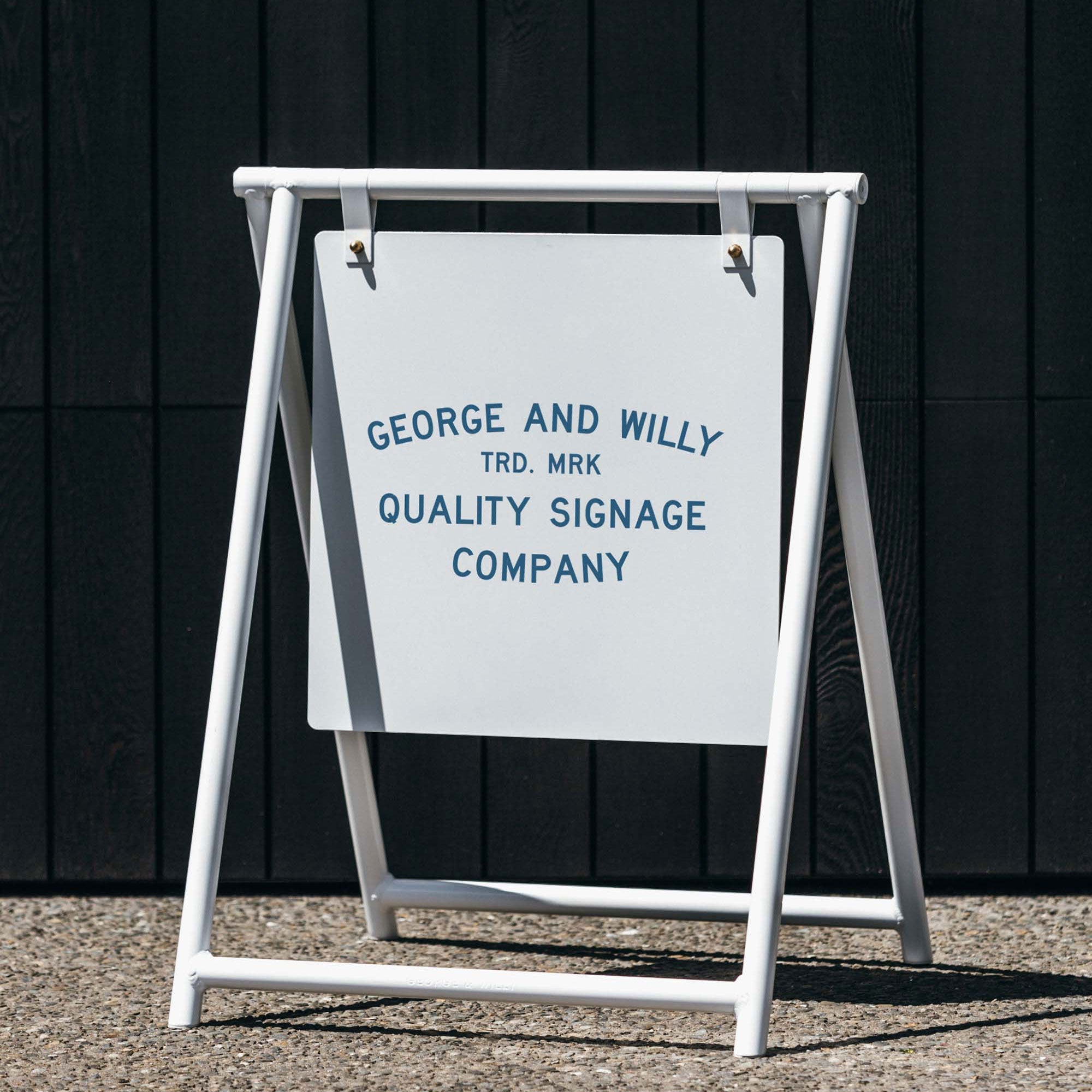
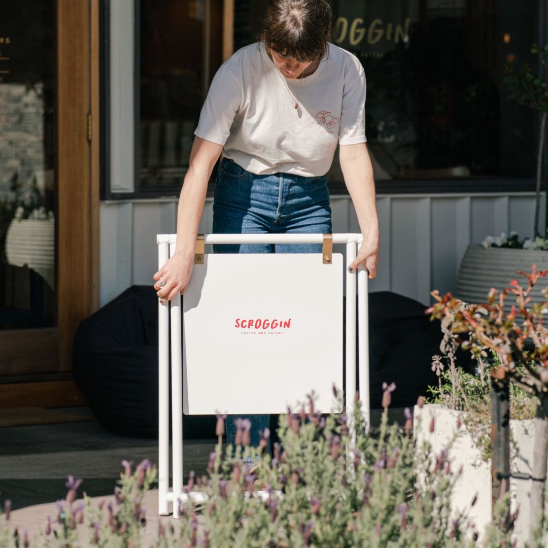
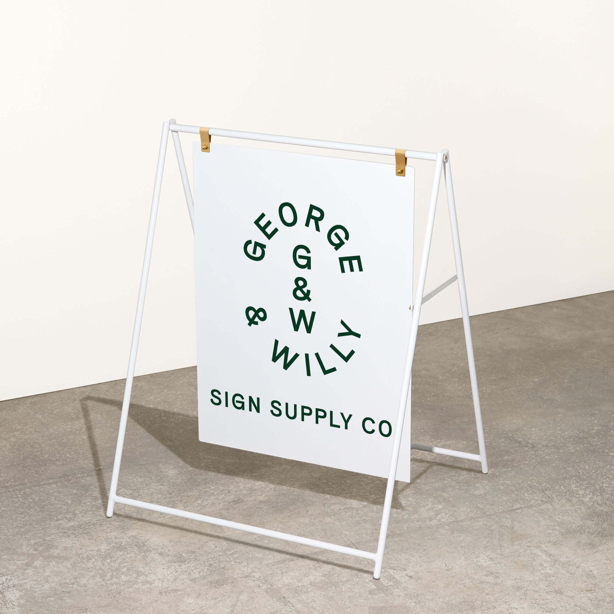
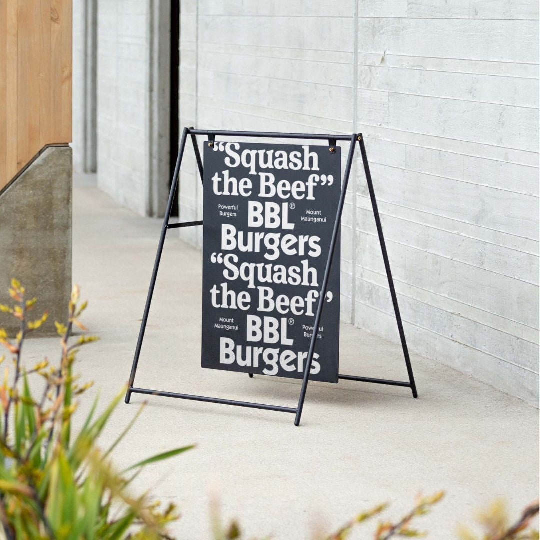
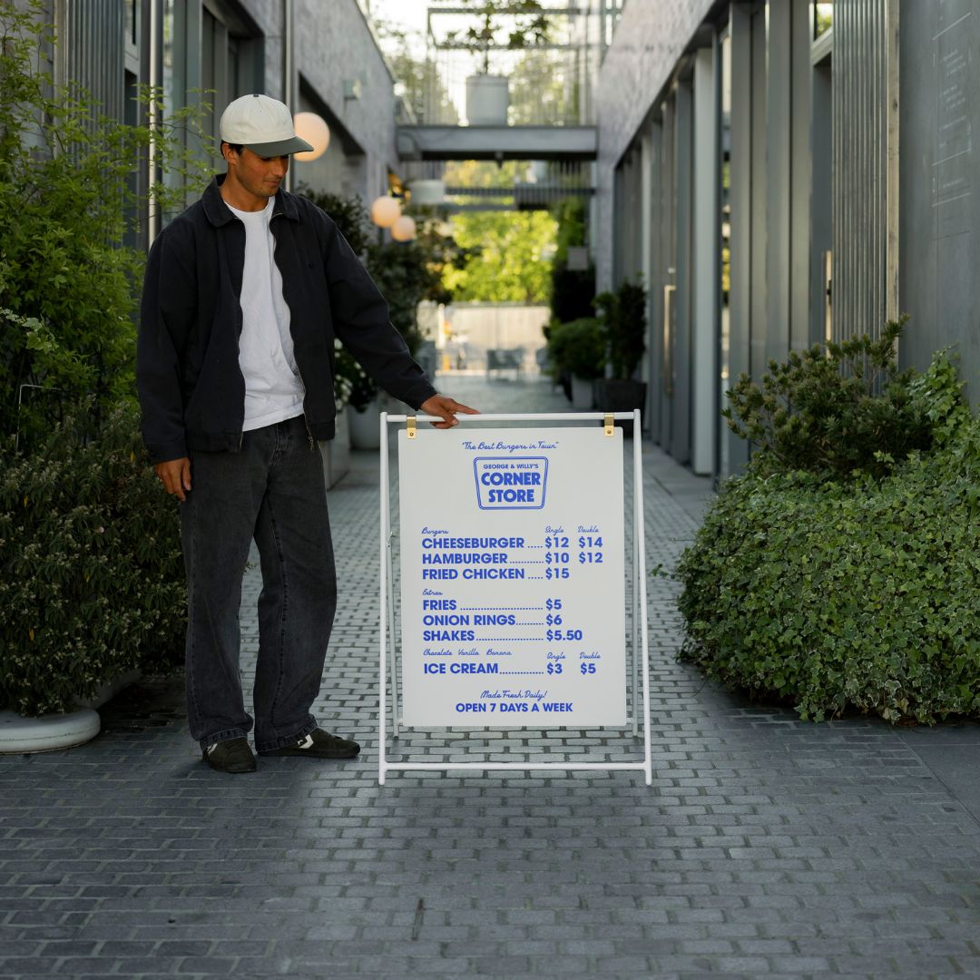
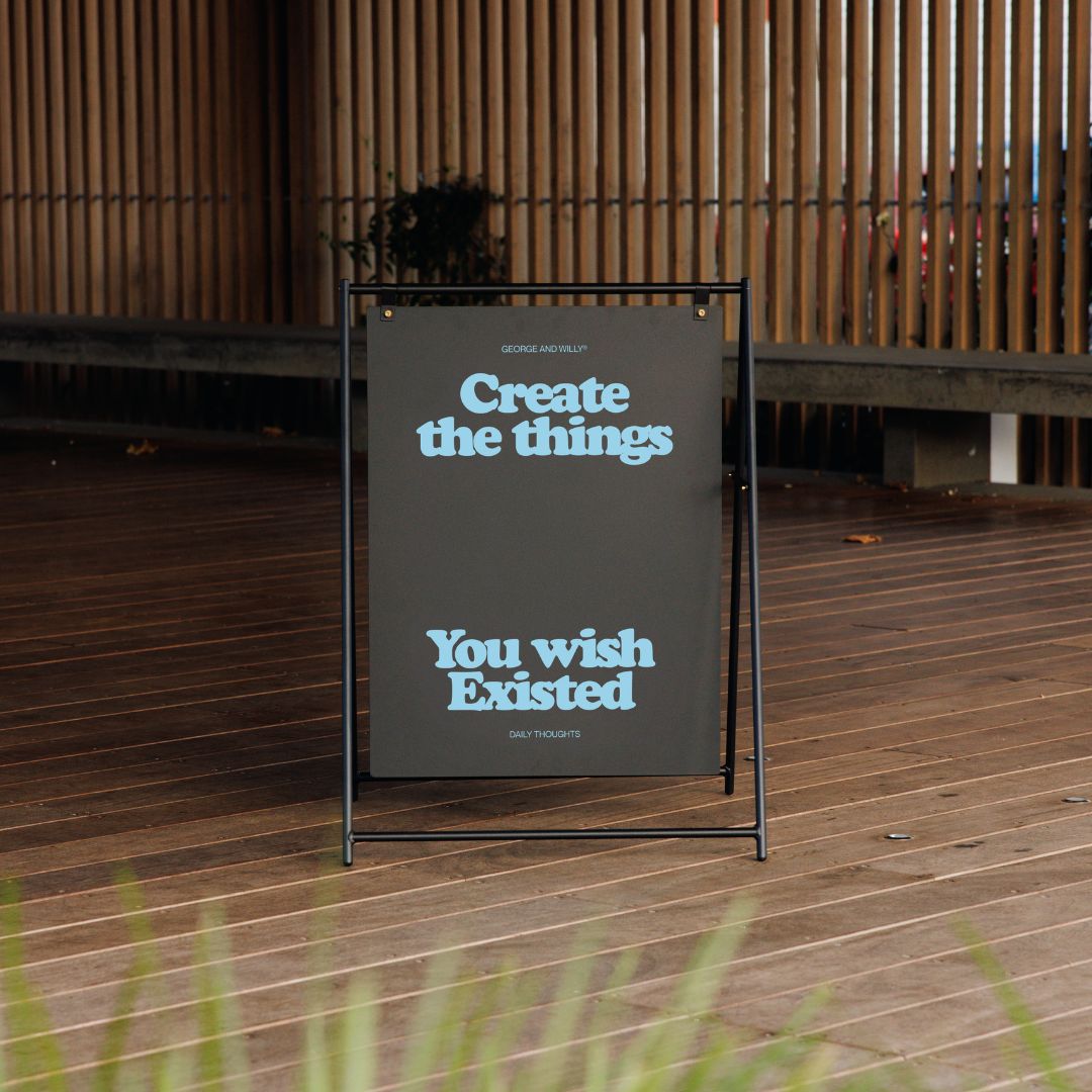
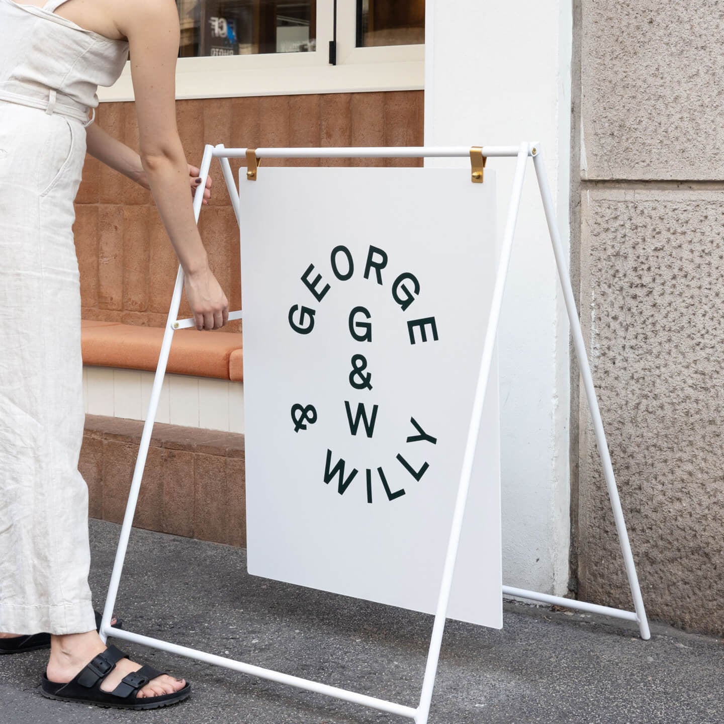
1. Use A-frames to drive foot traffic and supplement permanent signage
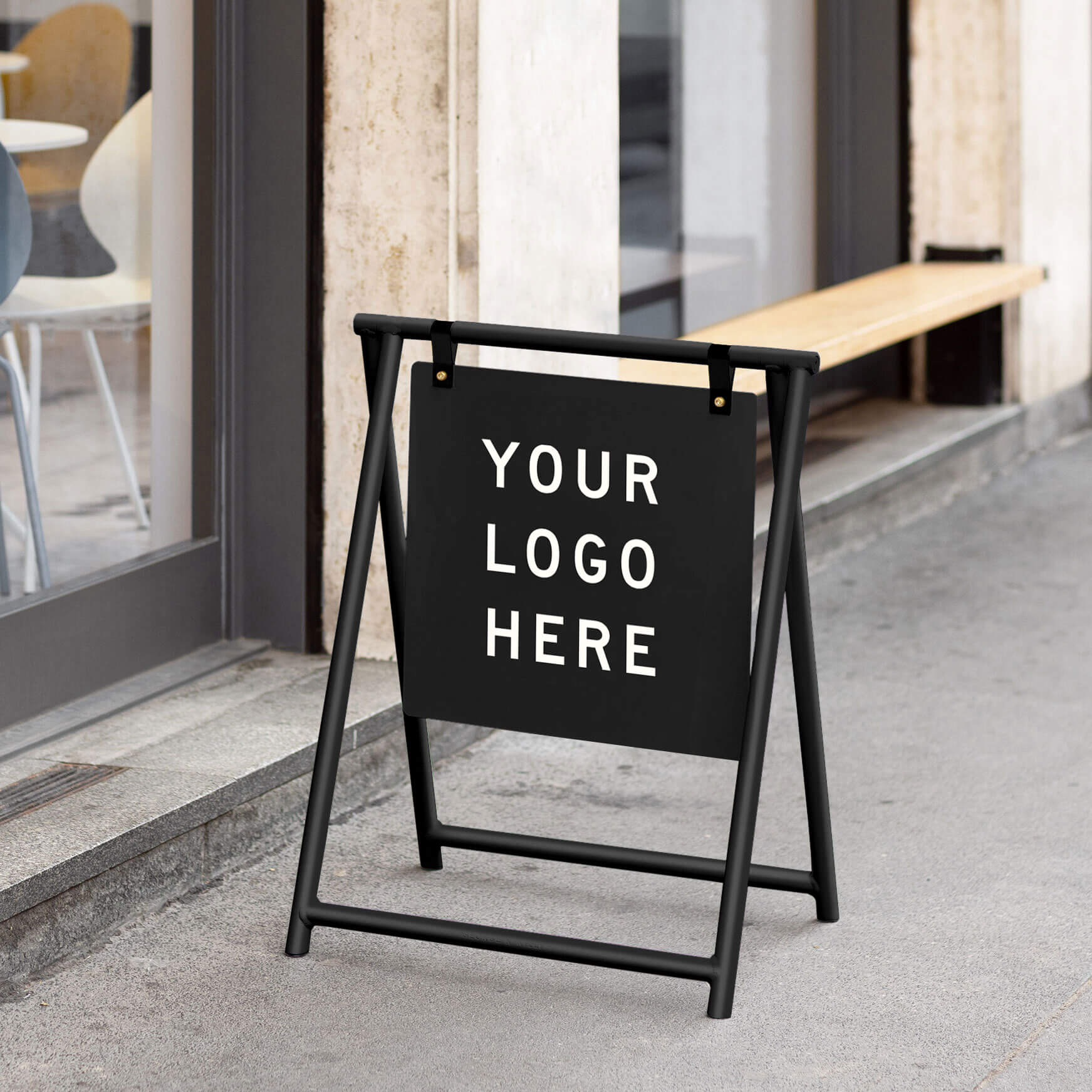
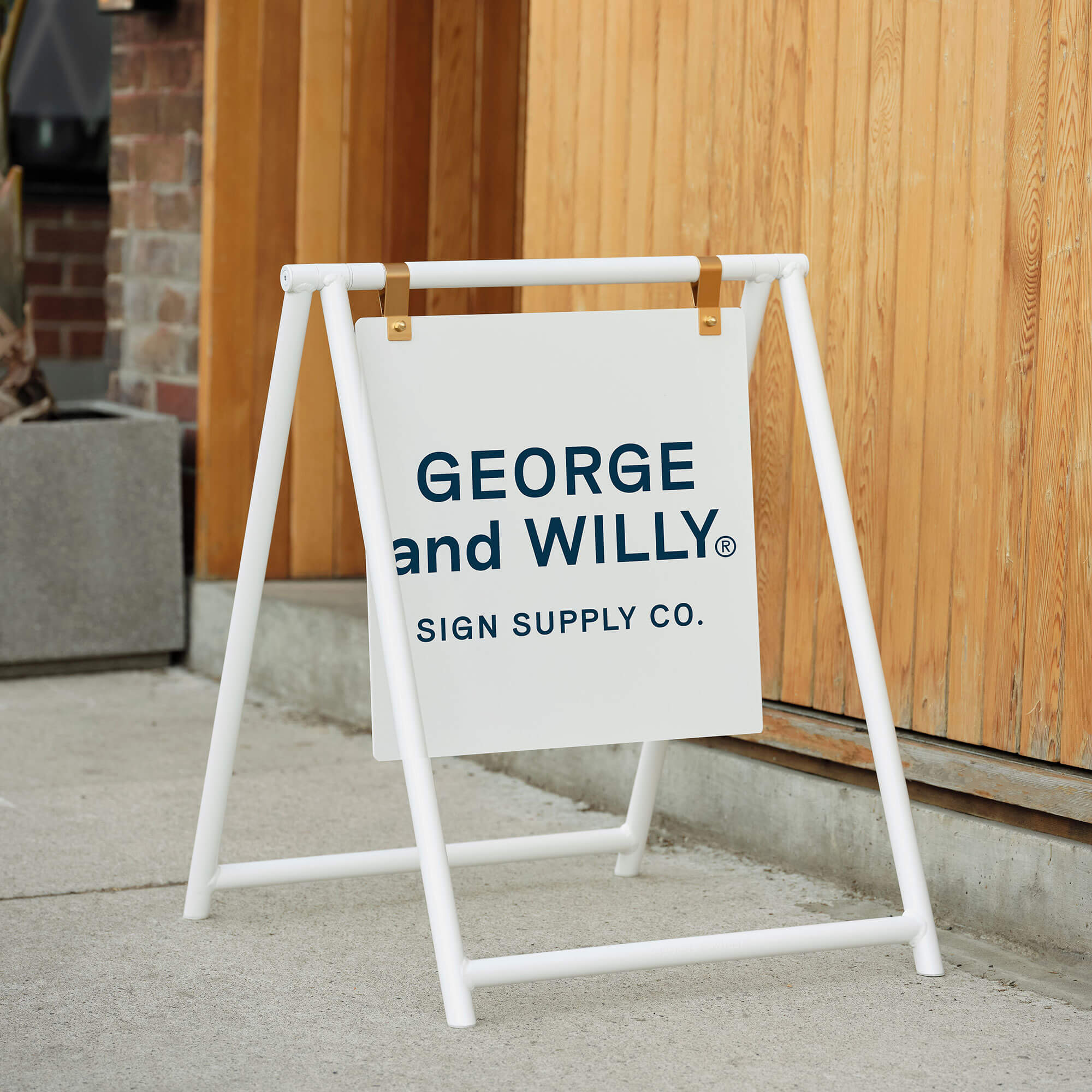
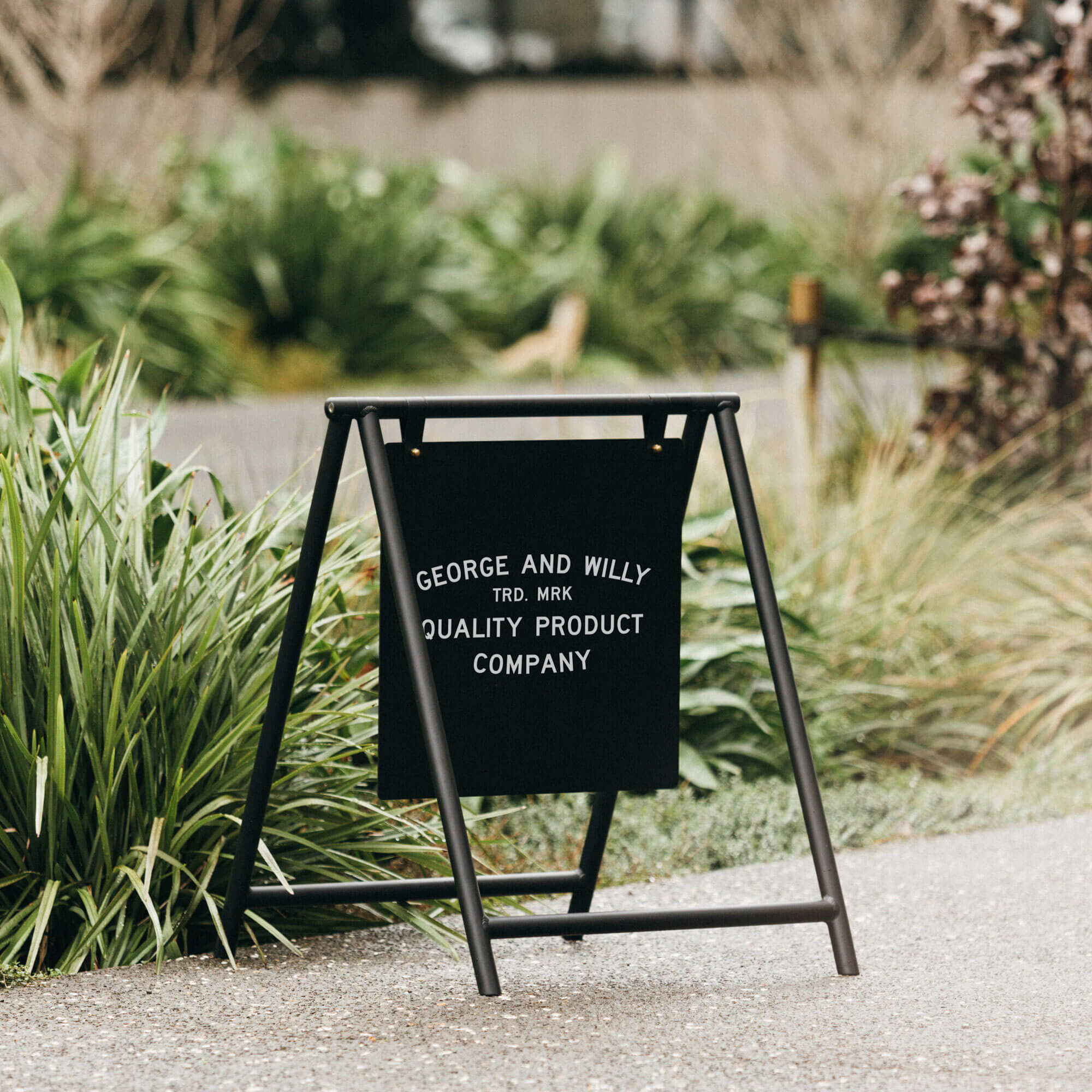
An A-frame (sandwich board) is a portable, double-sided sign made of two hinged panels you place just outside your entrance. Set it at the curb or property line so it complements your fascia or blade sign with daily offers, menus, or time-sensitive callouts.
Why it lifts curb appeal: Positioned perpendicular to the sidewalk, an A-frame intercepts passersby within 10 to 30 feet, even with parked cars, trees, or awnings in the mix. Bold, concise copy on two faces boosts pick-up from both directions, while weatherworthy finishes keep brand cues crisp through showers and scuffs.
Options & variants: Finish/colors: black, white, walnut, clear coat; sizes/orientations: 18×24, 22×28, 24×36 portrait; illumination: clip-on battery LEDs, reflective vinyl; materials: powder-coated aluminum or steel, hardwood, HDPE; quick-change: slide-in inserts, magnetic panels, tiles; graphics: local vinyl/etch; rating: outdoor.
Implementation tips
Use high contrast; keep headlines short; size letters ~1 inch per 10 feet of viewing.
Place visibly without blocking access; maintain a 36-inch clear path; angle slightly toward the dominant foot flow.
Check bylaws for portable signage, illumination, and hours; confirm ADA clearances and weatherproofing.
Coordinate type/colors with window and menu boards; plan local decals; request quick dispatch and a 2‑year warranty.
2. Use 3D channel letters to promote your company’s name, products or services
3D channel letters are fabricated, dimensional characters or logos with aluminum returns and acrylic faces, typically LED‑lit. Mount via concealed studs, a raceway, or a backer panel above the entry, canopy, or parapet for a polished identity read.
Why it lifts curb appeal: Depth casts natural shadows by day and delivers a clean glow at night, extending visibility across lanes and at oblique angles. Each letter stands proud on textured facades, matches brand colors precisely, and keeps working through rain thanks to efficient, sealed LEDs.
Options & variants: Finishes/colors: PMS matches, brushed or powder-coated; sizes/orientations: 8 to 36 inch heights, stacked or linear; illumination: front, halo, dual, or none; materials: aluminum, stainless, acrylic faces, polycarbonate; quick-change: magnetic taglines/tiles; graphics: local vinyl/etch; rating: UL-listed indoor/outdoor, weather-sealed.
Implementation tips
Prioritize contrast; halo effects read best on darker walls after dark.
Size by distance: ~1-inch stroke per 10 to 15 feet viewing; for two traffic lanes, 8 to 12-inch letters.
Mount baseline 10 to 14 feet; verify anchors, weatherproof power, and clearances; secure permits and meet ADA.
Coordinate with A-frames and menu boards; ship blank for local decals; request fast dispatch and a 2‑year warranty.
3. Use window graphics to promote your mobile app, social media page and more
Window graphics are adhesive or static‑cling films applied to storefront glass (doors, sidelights, and windows) either first surface or reverse-printed second surface. Scale from eye-level bands to full panels and add a CTA with a QR code near the entry for instant engagement.
Why it lifts curb appeal: Your glass is a giant canvas. Clean, high-contrast graphics turn it into a bright invitation that reads fast without blocking visibility. A right-sized QR reduces friction for follows, downloads, and orders, while durable films withstand weather, cleaning, and door swings.
Options & variants: Finishes/colors: gloss, matte, clear, opaque, frosted; sizes/orientations: door badges, eye-level bands, full panels, contour-cut; illumination: none, leverage interior backlighting; materials: removable, polymeric or cast vinyl, static-cling, perforated perf; quick-change: cling panels, poster pockets; graphics: local vinyl/etch; rating: indoor/outdoor.
Implementation tips
Use high contrast; size letters ~1 inch per 10 feet; keep CTAs to 3 to 7 words with a nearby QR.
Mount bands at eye level (48 to 60 inches); maintain sightlines; confirm bylaws and ADA.
Mirror colors and headlines on your A-frame/menu board for a cohesive kit.
Plan graphics locally (ships blank); request fast dispatch and a 2‑year installation warranty.
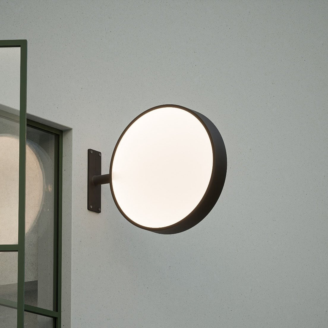
4. Use illumination to brighten up your brand
Illuminated signage bakes light into the sign so your name reads day and night. Consider front‑lit or halo‑lit channel letters, slim lightboxes, projecting blades, or edge‑lit acrylic panels to dial in a modern or warm hospitality vibe.
Why it lifts curb appeal: Light grabs attention and extends sightlines, helping your storefront pop from farther away and at dusk. Consistent color temperature, tuned brightness, and weather-rated housings reinforce professionalism and keep your message clear through rain and glare.
Options & variants: Finishes/colors: matte/satin/gloss powder coat, brushed stainless, patina; sizes/orientations: small to large, horizontal/vertical; illumination: front-, halo-, or dual-lit LEDs; materials: aluminum, acrylic, timber; hardware: snap-frame lightboxes, magnetic letters; graphics: local vinyl or frosted etch; rating: indoor/outdoor, dimmable controls.
Implementation tips
Maximize contrast; size letters ~1 inch per 10 feet of viewing for legibility.
Mount projecting blades 80+ inches above the sidewalk; confirm projection limits, permits, and ADA clearance.
Keep LED color temperature consistent across the kit and align typography with your A-frame/menu board.
Order cabinets/lightboxes to ship blank for local vinyl; request fast dispatch and a 2‑year warranty.
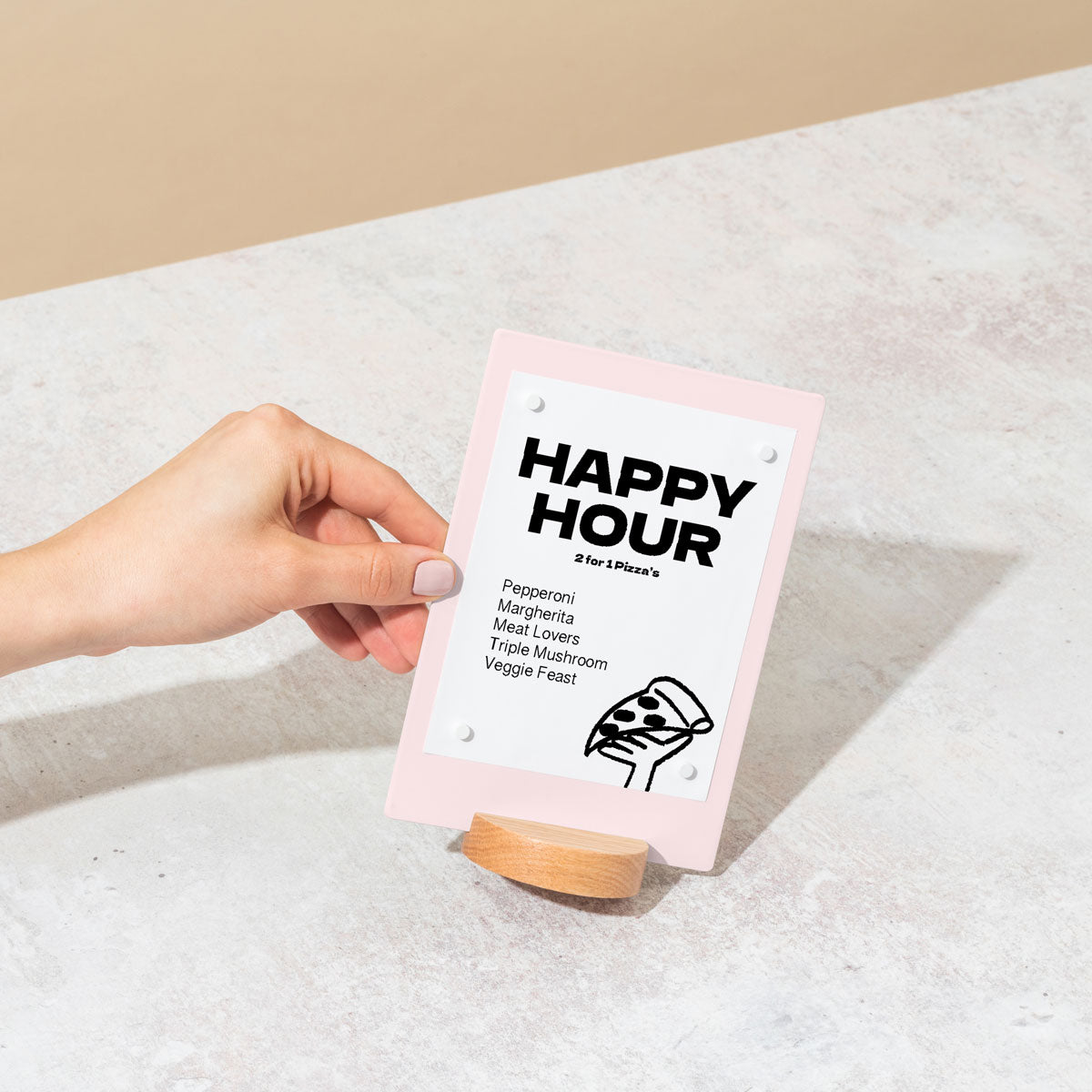
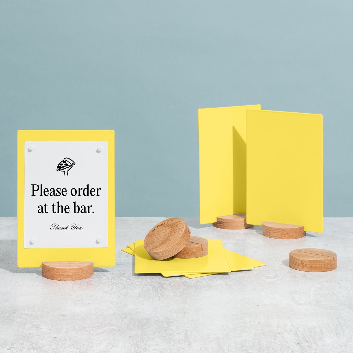
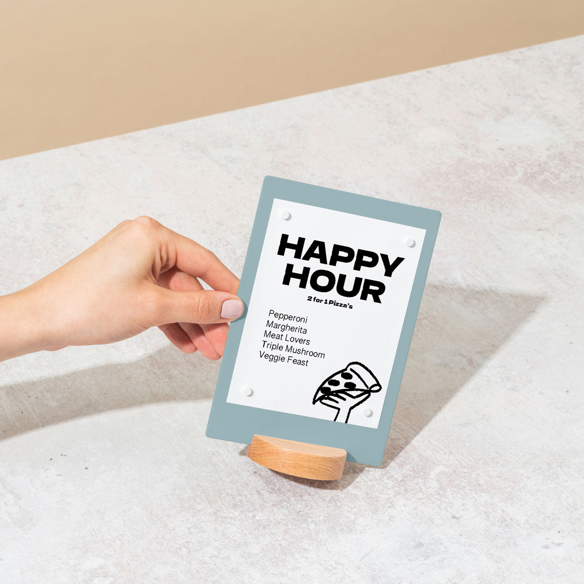
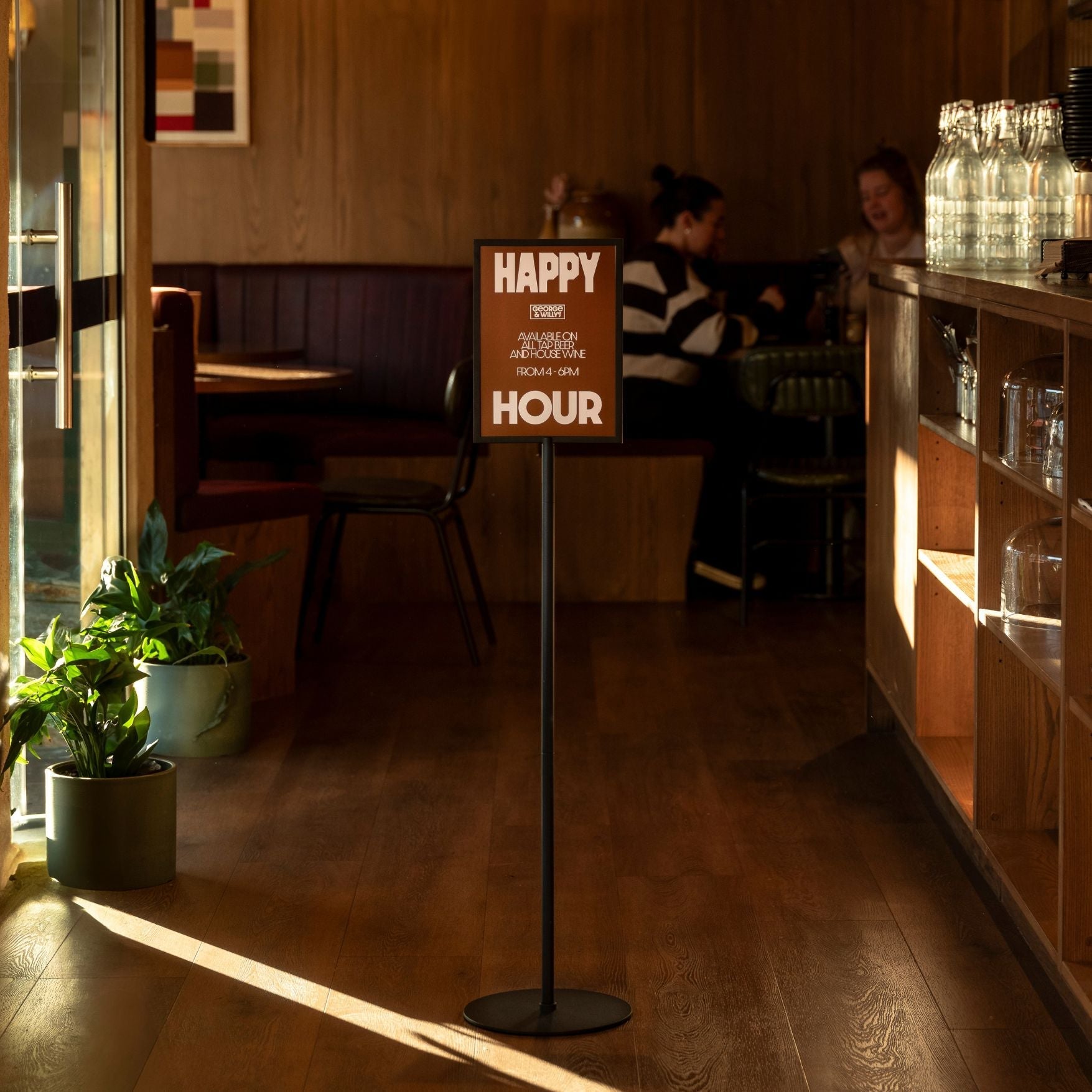
5. Advertise sales, events, business hours and more
Changeable messaging spans door-hour vinyl, window decals or posters, lockable snap‑frame posters or LED lightboxes, plus a sandwich board at the entrance. Mount hours on the primary door and promos at eye level for a refreshable, campaign-forward presence.
Why it lifts curb appeal: Clear signals like “Open Late” or “20% Off Today” spark urgency and convert browsers. High-contrast type in windows grabs attention fast, while an A-frame catches perpendicular sightlines. Rugged, non-glare hardware keeps content readable in sun, rain, and dusk.
Options & variants: Window/door graphics: low-tack vinyl, static cling, perforated film, frosted etch; snap frames: 18×24, 24×36 with non-glare lenses; LED lightboxes; A-frames: powder-coated aluminum/steel; quick-change: magnetic letter tiles, inserts; graphics: local vinyl/etch; rating: outdoor-ready.
Implementation tips
Use high contrast; size letters for 30 to 50 feet (about 3 to 5 inches tall).
Mount door hours 48 to 60 inches high; weight A-frames; keep a 6-foot clear path; confirm bylaws and ADA.
Coordinate window posters, door hours, and A-frame/menu boards into one unified offer.
Plan graphics locally (ships blank); request fast dispatch; choose durable hardware with a 2‑year warranty.
6. Take advantage of all your available signage space
Think of the whole frontage as a system: fascia, windows, doors, transoms, awnings, soffits, and a wall sign for perpendicular read. Combine distance ID (fascia/channel letters), a mid-range window message, and a door confirmation for cafés, boutiques, and specialty retail.
Why it lifts curb appeal: A coordinated hierarchy reclaims dead space and improves first-glance detection. When each surface carries a purpose-built message, sightlines stay clean, readability improves, and durable films and lighting maintain legibility in all conditions.
Options & variants: Finishes/colors: matte, gloss, Pantone matches; sizes/orientations: fascia spans, vertical blades, window bands; illumination: LED halo, edge-lit, goosenecks; materials: powder‑coated aluminum/steel, ACM, acrylic, timber; quick-change: magnetic letters/tiles; graphics: local vinyl/etch; rating: indoor/outdoor.
Implementation tips
Use high contrast; size letters for pedestrians (~1 inch per 10 to 12 feet) and up to 25 feet for drive-bys.
Mount blades 7 to 8 feet above grade; respect projections and property lines; verify bylaws and ADA clearances.
Coordinate fascia, blade, window vinyl, awning, A‑frame, and menu boards for one cohesive read.
Procure hardware that ships blank for local decals; request quick dispatch and a 2‑year warranty.
7. Use color contrast to grab attention
This is a cross‑category design move: pair light lettering on dark fields (or dark on light) to maximize luminance separation. Apply it across fascia panels, blades, window bands/decals, A‑frames, and internally lit boxes for minimal, heritage, or playful storefronts.
Why it lifts curb appeal: Strong light-dark separation increases instant legibility in cluttered streetscapes, reads across the street and at angles, aids color‑vision deficiencies, and stays crisp in daylight or rain with matte finishes, UV‑stable pigments, and smart illumination.
Options & variants: Proven palettes: black/white, white/charcoal, yellow/black, navy/white, cream/green; sizes/orientations: fascia panels, vertical blades, 24×36 A-frames, 6 to 12 inch window bands; illumination: halo/face‑lit letters, LED light boxes; materials: powder‑coated aluminum, acrylic, timber; quick-change tiles; graphics: local vinyl/etch; rating: outdoor.
Implementation tips
Test artwork in grayscale; avoid low-contrast red/green pairings; choose bold sans or simple serif.
Size letters: ~1 inch per 10 feet for pedestrians; 1 inch per 20 to 30 feet for mid‑block views.
Mount for clear sightlines: 8 to 10 feet sidewalk clearance for blades; center fascia; place A-frames without blocking ADA paths.
Confirm bylaws; coordinate the palette across the kit; request fast dispatch and a 2‑year warranty.
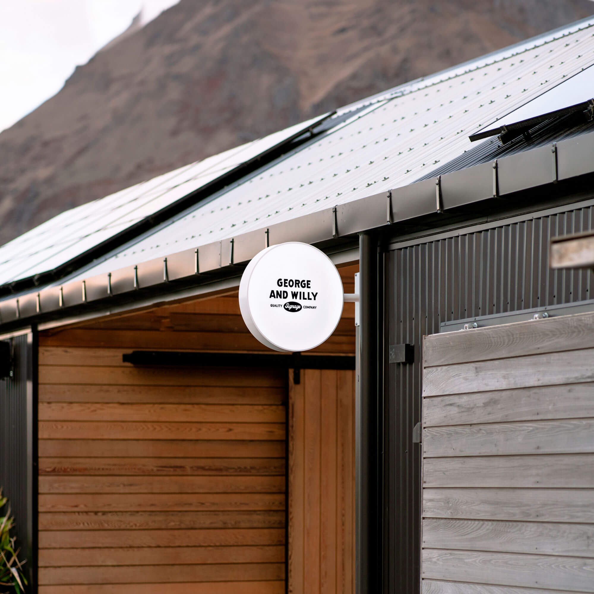
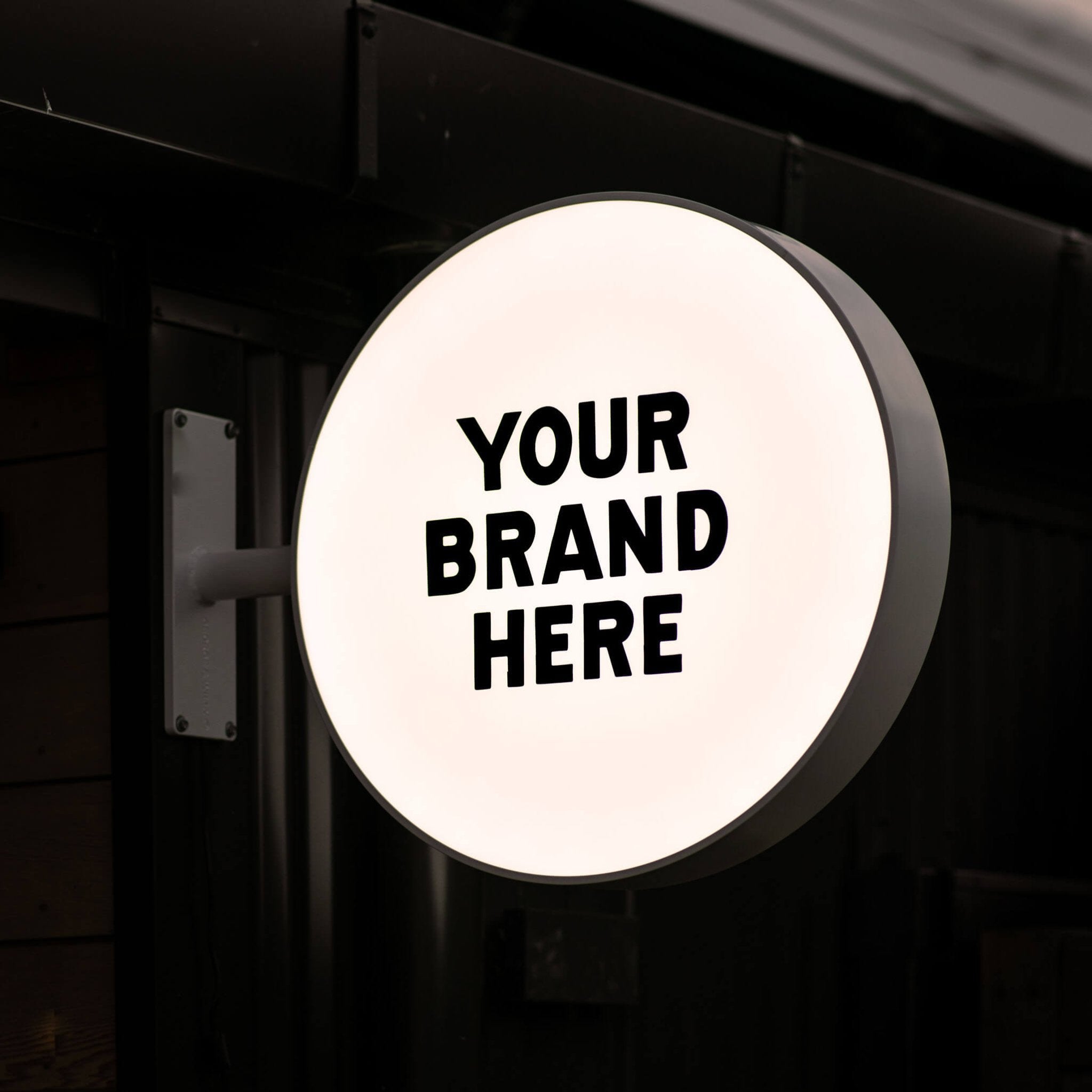
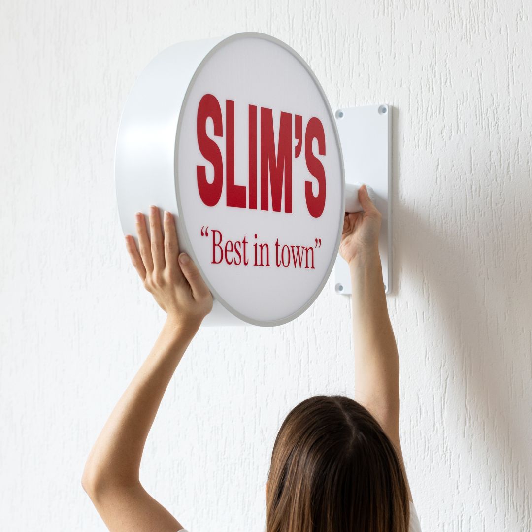
8. Express your brand’s creativity through an attractive logo
Make your logo the hero: dimensional letters or a routed plaque on the fascia, a projecting blade, channel letters, or a lightbox on the canopy. Choose clean, intentional hardware that suits cafés, bars, and boutiques looking for a signature gesture.
Why it lifts curb appeal: Shapes are recognized faster than words, so a well‑scaled mark improves recall at a glance. A projecting logo enhances sightlines; thoughtful lighting extends your reach at dusk; clear space and contrast preserve readability from oblique angles.
Options & variants: Finishes/colors: matte, satin, gloss, anodized, stained wood; sizes/orientations: horizontal fascia, vertical blade; illumination: face‑lit, halo, edge‑lit, or none; materials: powder‑coated aluminum/steel, acrylic, timber; quick‑change: magnetic tiles/rails; graphics: local vinyl/etch; rating: indoor/outdoor.
Implementation tips
Use high contrast and avoid ultra‑thin strokes; size for 30 to 50 feet viewing.
Mount 7 to 9 feet high; keep blade clearance 7 to 8 feet; confirm bylaws and ADA access.
Coordinate with A‑frame and menu boards so the mark anchors the kit.
Plan decals locally; many ship blank; request fast dispatch and a 2‑year warranty.
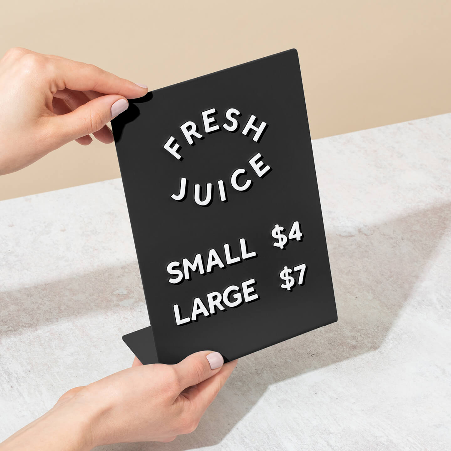
9. Communicate the affordable price of your product or service
A price-forward approach puts value front and center with oversized numerals. Use eye-level window vinyl near the door, a double-sided A-frame at the curb, or a snap-frame/lightbox under the fascia for a clean, minimal read.
Why it lifts curb appeal: Big, high-contrast numbers are processed faster than words. That speed helps passersby grasp your value proposition and step inside. Window and A-frame sightlines support readability in motion, and durable hardware keeps messages crisp through weather and wear.
Options & variants: Window vinyl/static‑cling numerals; A-frames with chalkboard, wet-erase, or poster inserts (18×24, 24×36); LED lightbox; materials: powder‑coated steel, aluminum, acrylic, timber; quick-change: magnetic tiles/letter tracks; graphics: local vinyl/etch; rating: indoor/outdoor.
Implementation tips
Use bold contrast and one clear price; avoid thin scripts that disappear at distance.
Size numerals: ~2 to 3 inches for sidewalk, 4 to 6 inches across‑street, 8 inches for drivers.
Mount for sightlines and safety: window centers 54 to 66 inches; weight A‑frames; keep a 36 to 48 inch ADA path; check bylaws.
Frames often ship blank for local decals, dispatch fast, and carry a 2‑year finish warranty.
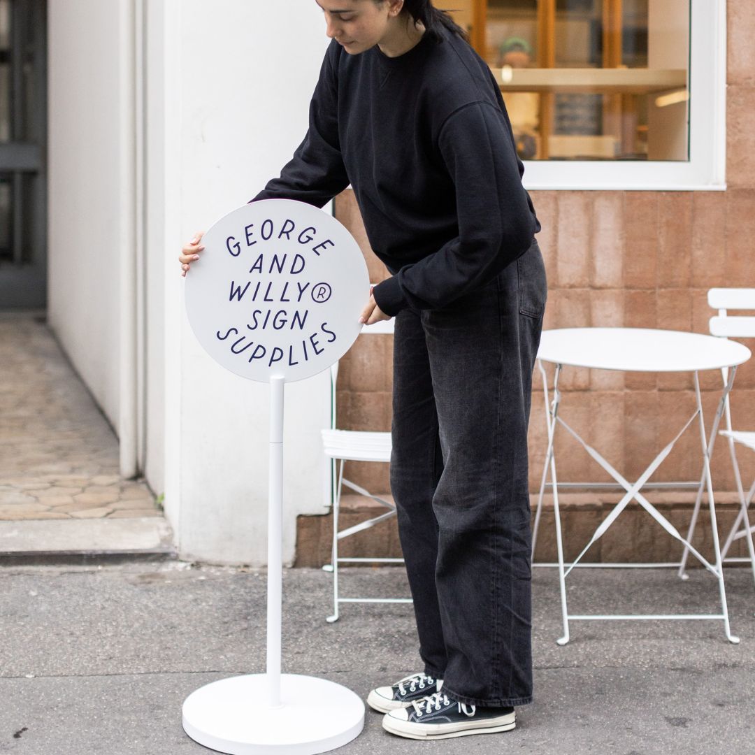
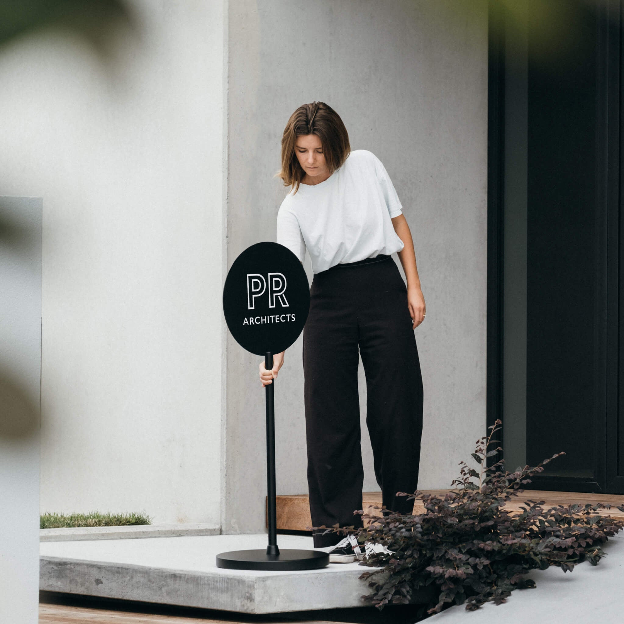
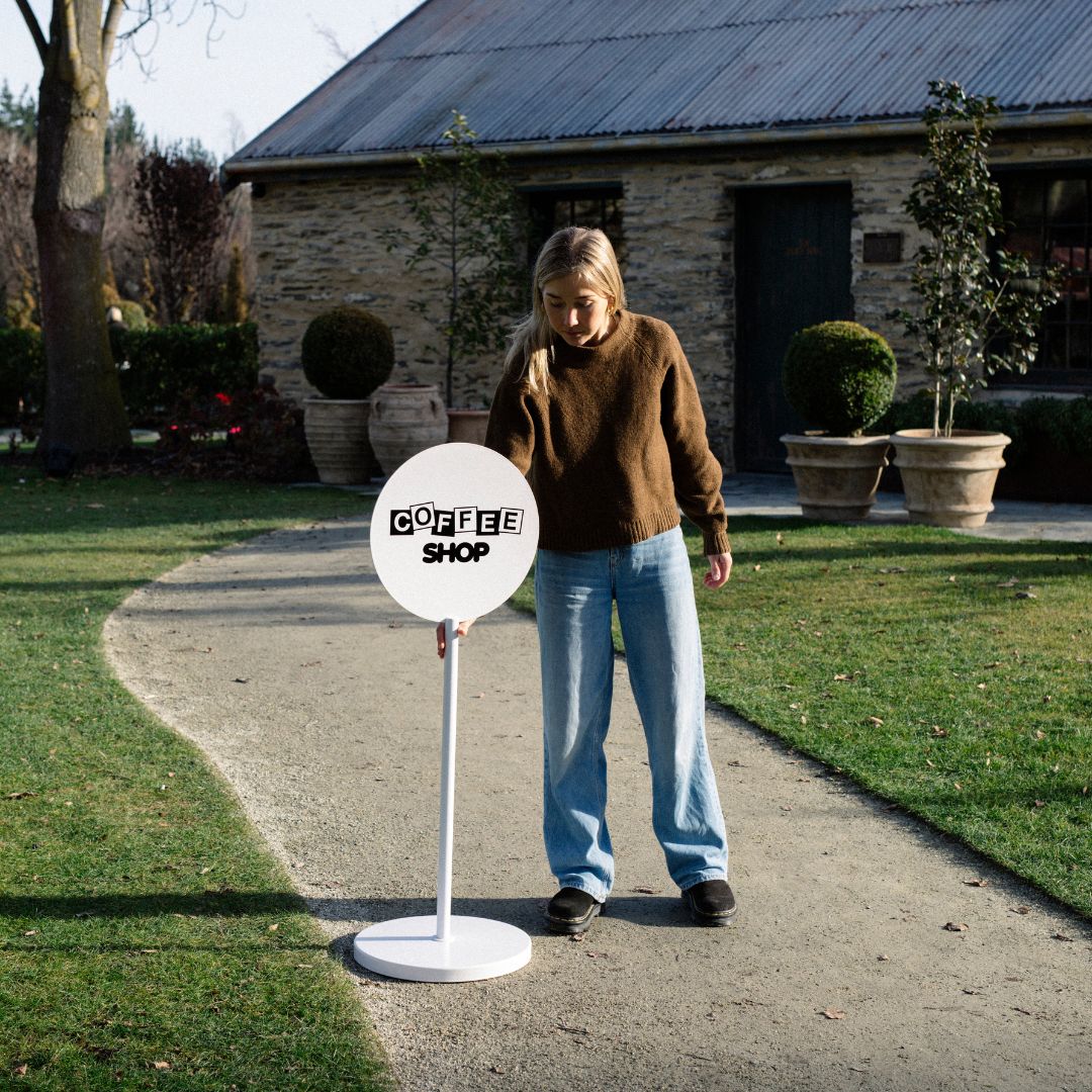
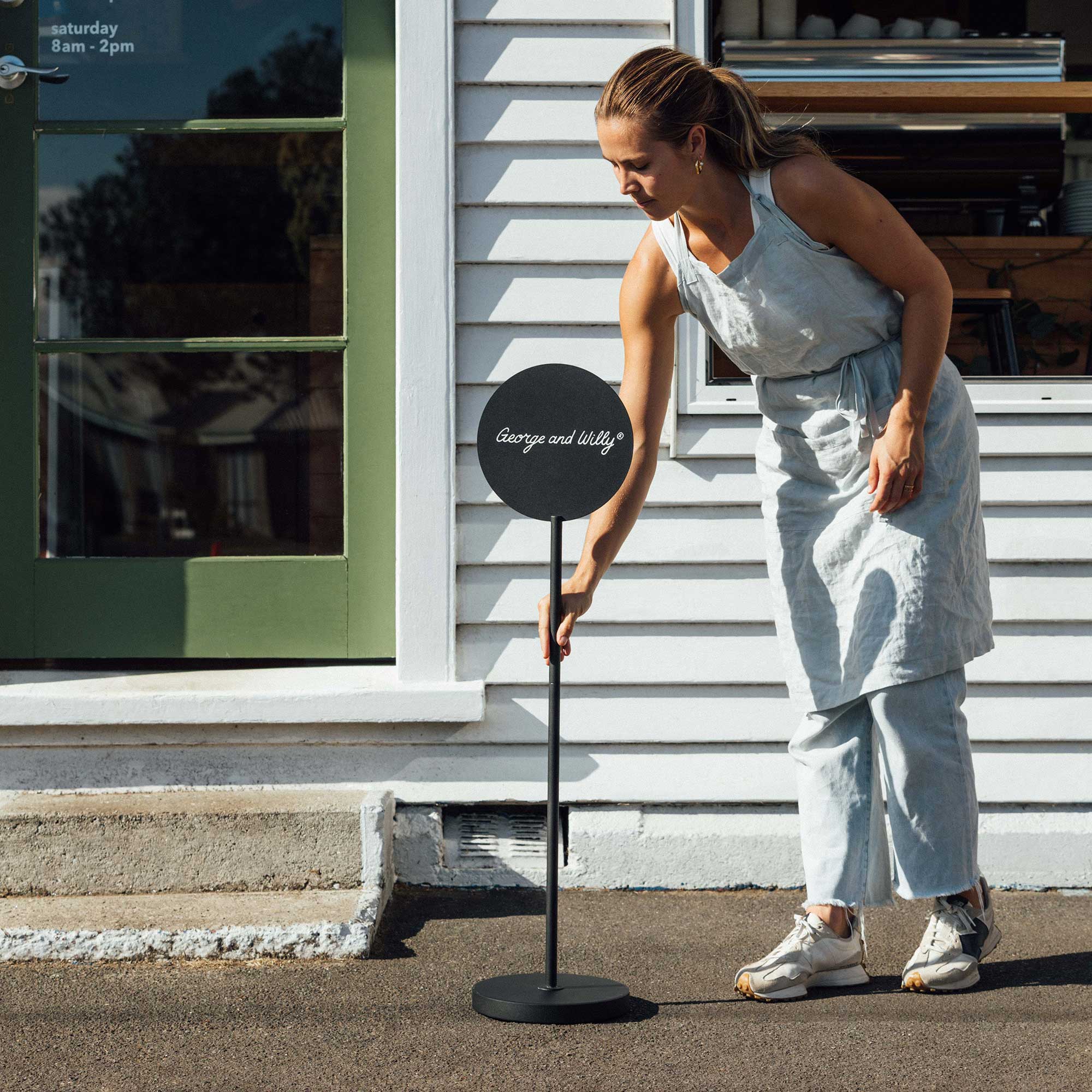
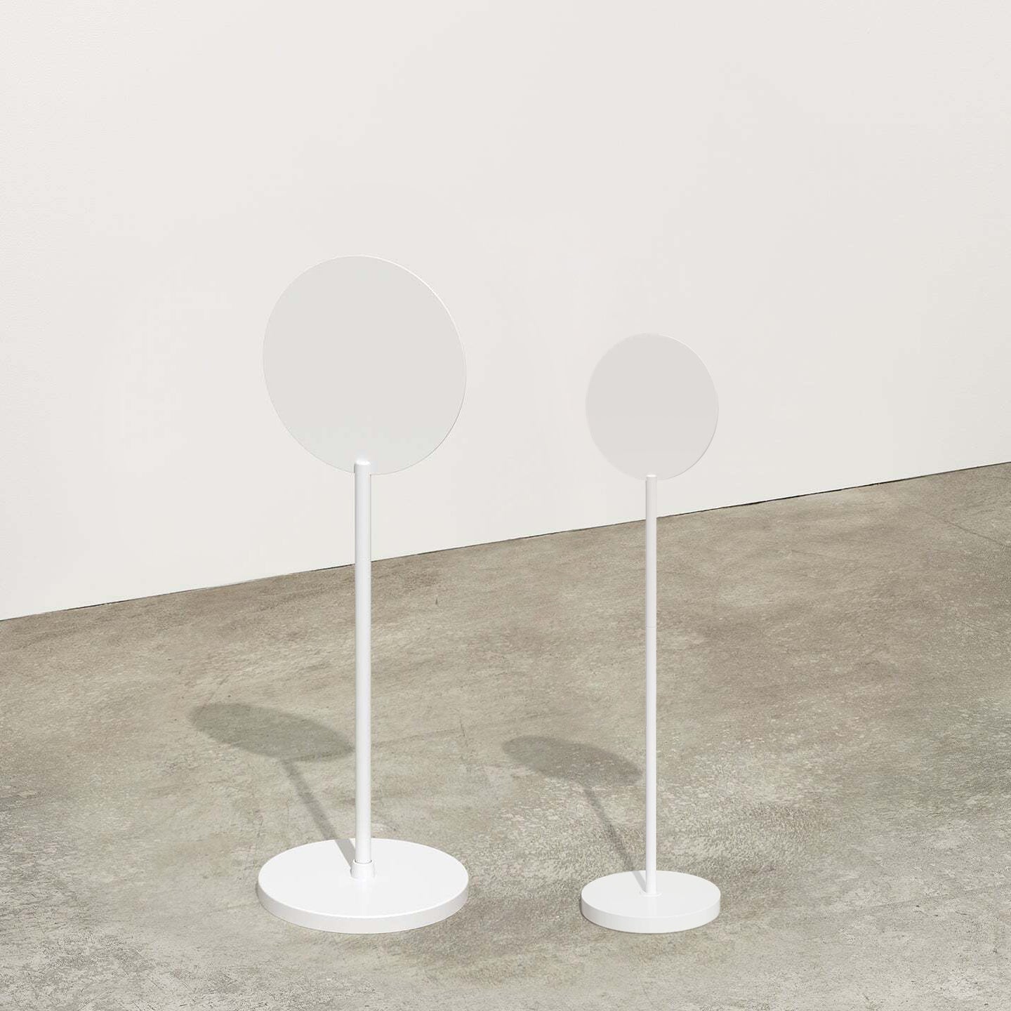
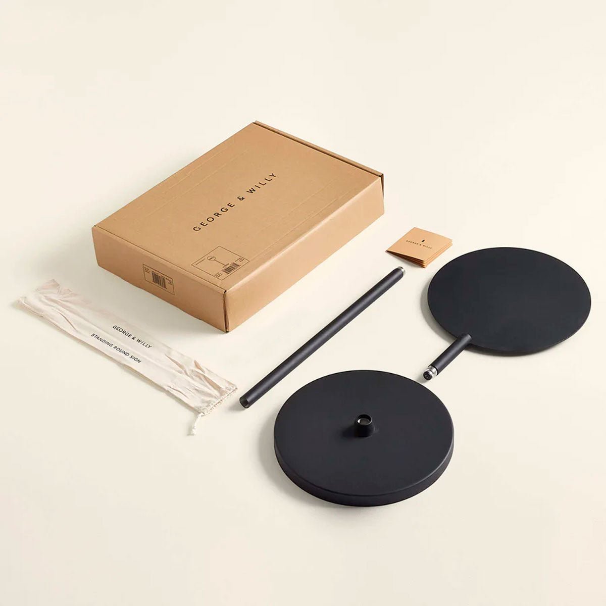
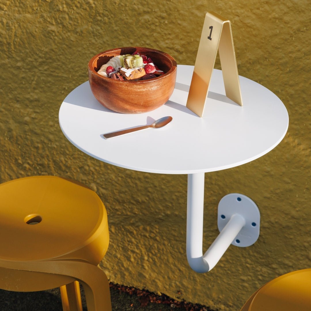
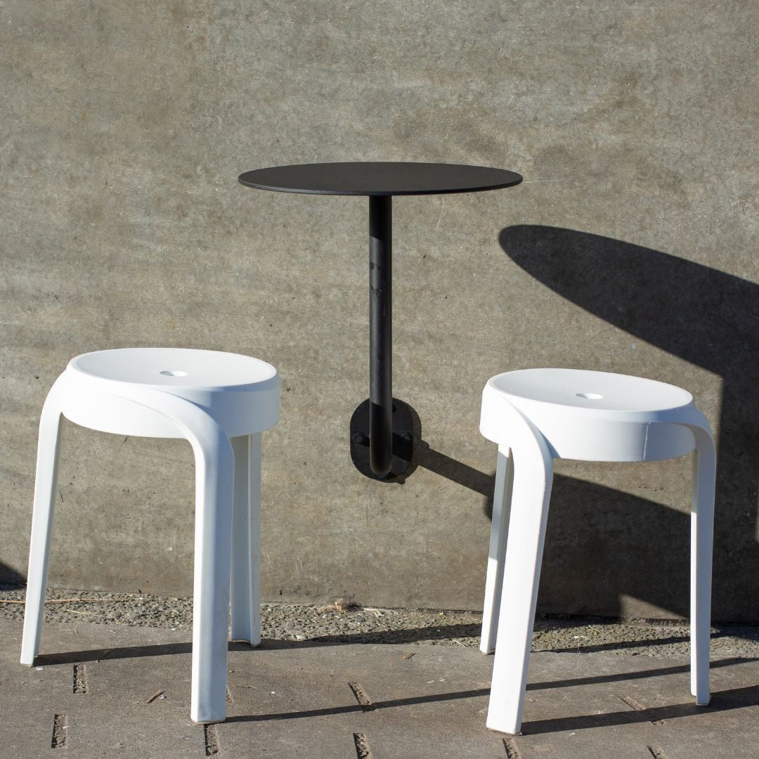
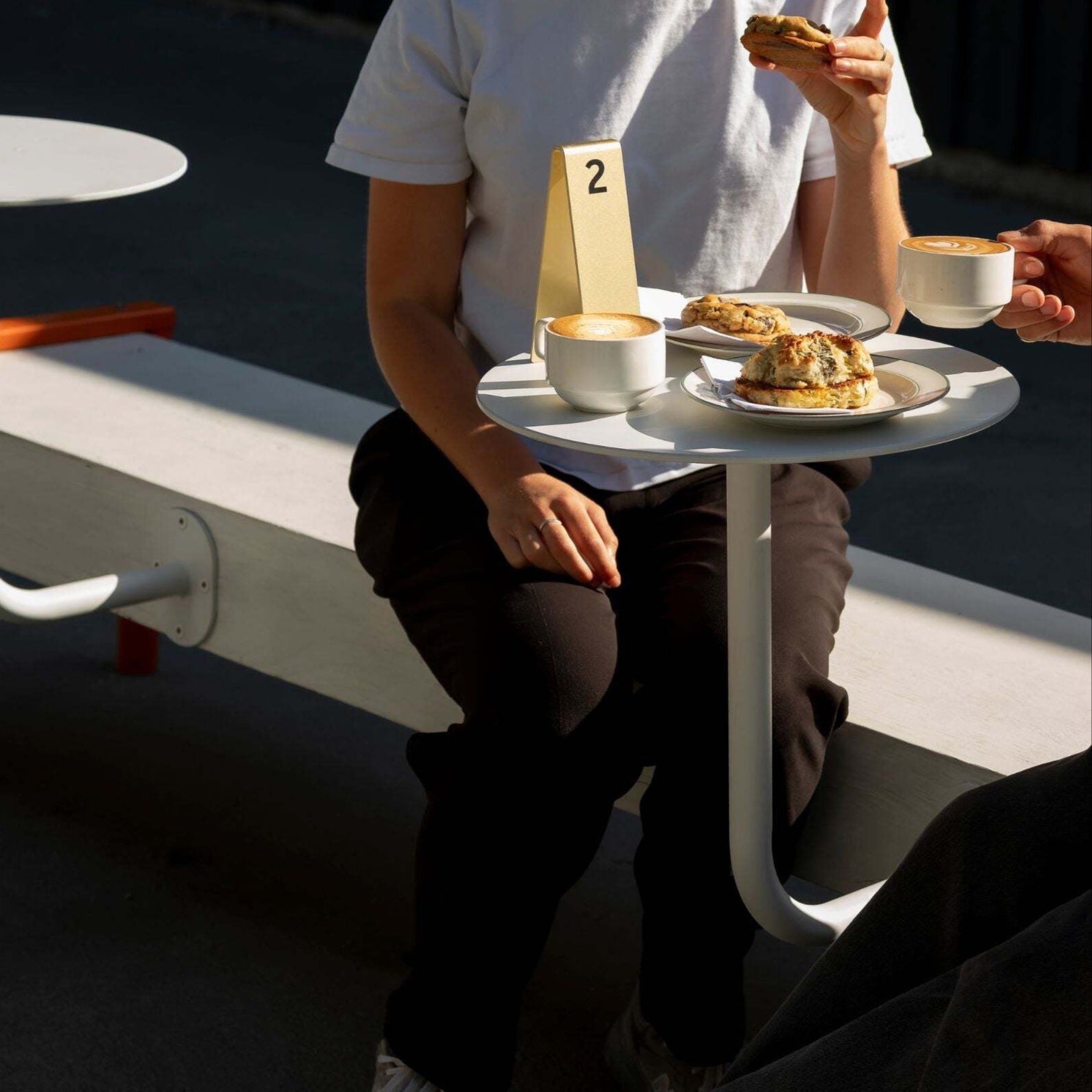
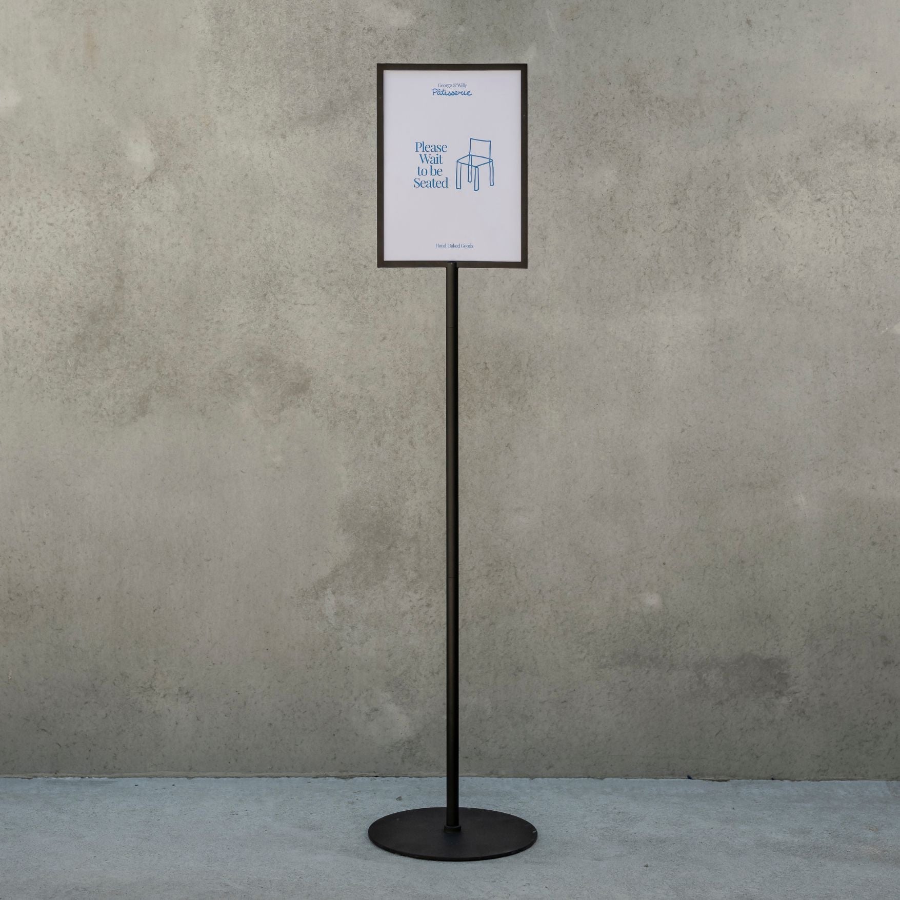
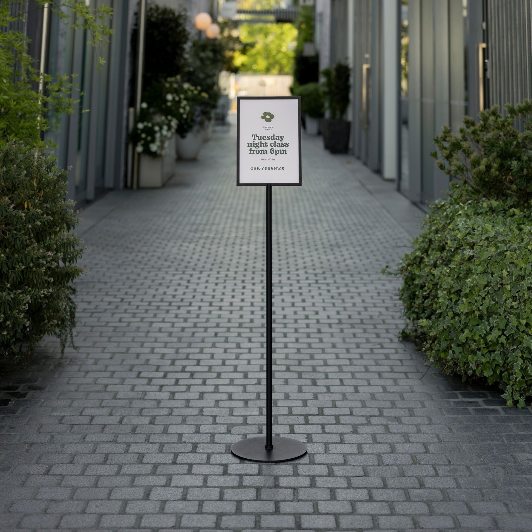
10. Install or upgrade a monument sign
A monument sign is a low-profile, freestanding marker on a base near the sidewalk or driveway, usually double-sided and set perpendicular to traffic. Substantial and architectural, it suits set‑back cafés, retail, boutique hotels, and multi‑tenant sites, often with built‑in illumination.
Why it lifts curb appeal: Placed at the approach, monument signs catch drivers and pedestrians early, improving wayfinding and brand presence. Bold faces and quality construction signal credibility, while lighting maintains legibility day and night to prompt turn‑ins and visits.
Options & variants: Finishes/colors: powder‑coated aluminum, stone, stucco, custom; sizes/orientations: single or double‑sided, low and wide; illumination: internal LEDs, halo letters, ground floods; materials: aluminum/steel, acrylic/polycarbonate, HDU; quick‑change: magnetic tiles/tracks; graphics: local vinyl/etch; rating: outdoor, UV‑stable, anti‑graffiti available.
Implementation tips
Use high contrast; size lettering for 30 to 50 feet and typical approach speeds.
Set overall height 4 to 6 feet; respect sight triangles and setbacks; angle faces toward traffic; maintain ADA access.
Confirm permits, electrical, and underground utilities (call 811); add a photocell or timer for illumination.
Coordinate fonts/colors with storefront, A‑frame, and menus; plan local decals; request fast dispatch and a 2‑year warranty.
How to choose the right storefront sign
Start with your location, your audience, and the way people approach your door. Then match the sign type to the job.
Map your viewing angles
Pedestrian streets need eye level options like blade signs and sidewalk boards.
Car corridors favor larger faces and illuminated options for legibility at speed.
Multi tenant buildings benefit from projecting signs that cut through visual clutter.
Balance form and function
Materials matter. Powder coated aluminum and steel resist rust outdoors and hold finish over time, which keeps storefront signs looking new longer.
Consider weight and storage. An A frame that folds and weighs about 8.8 lb is easy to bring in each night and gentle on staff.
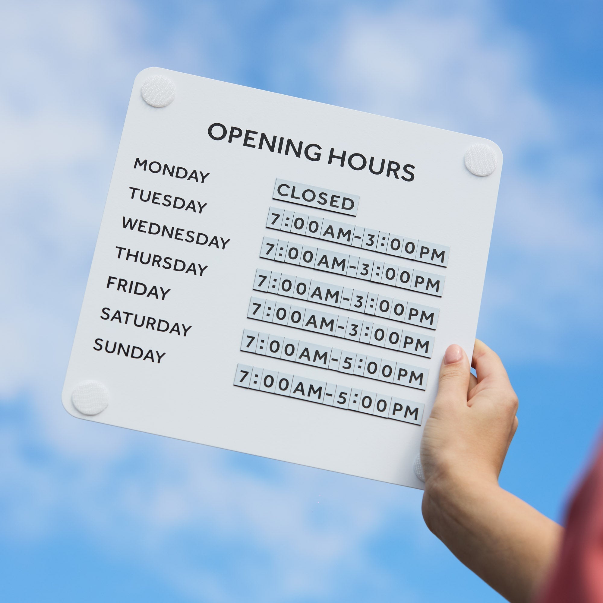
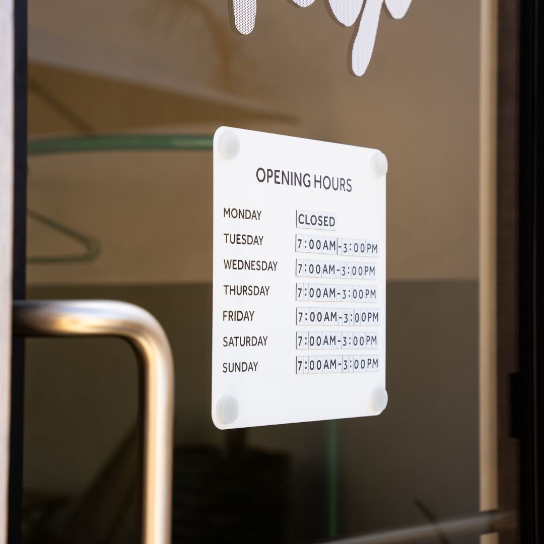
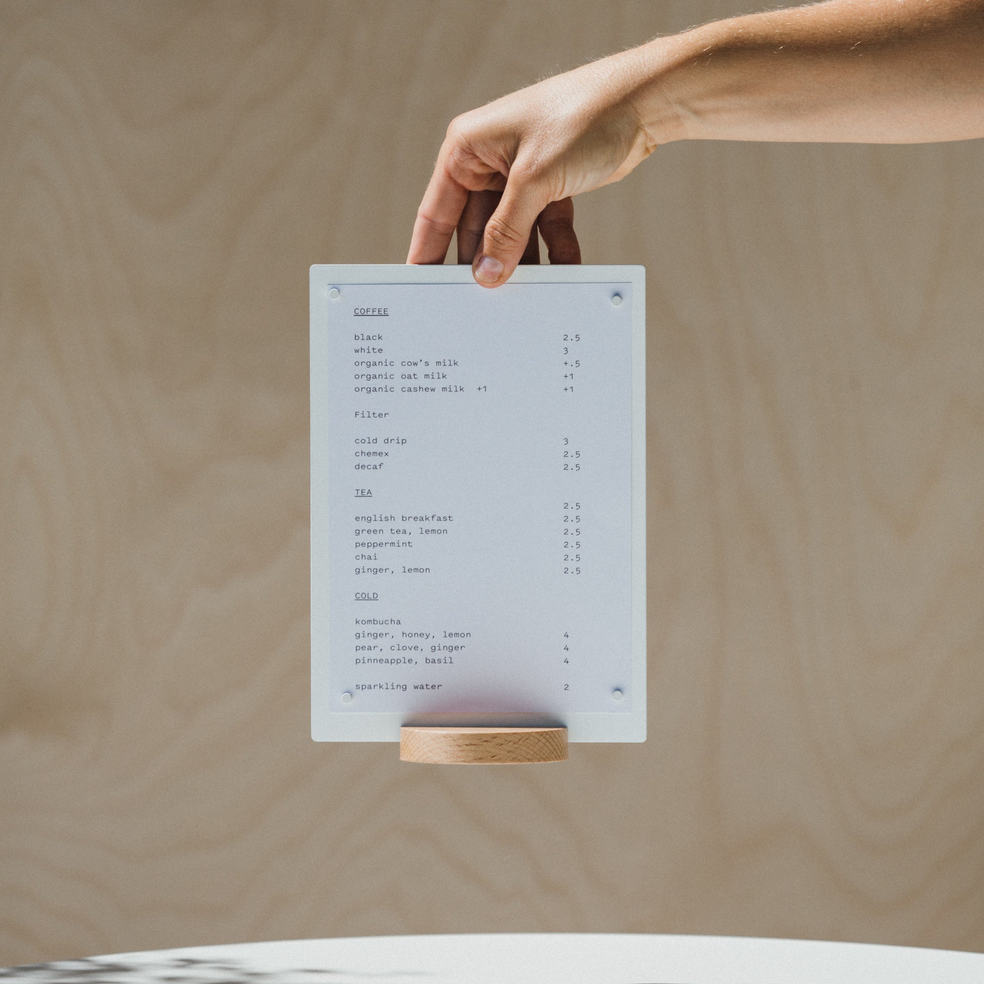
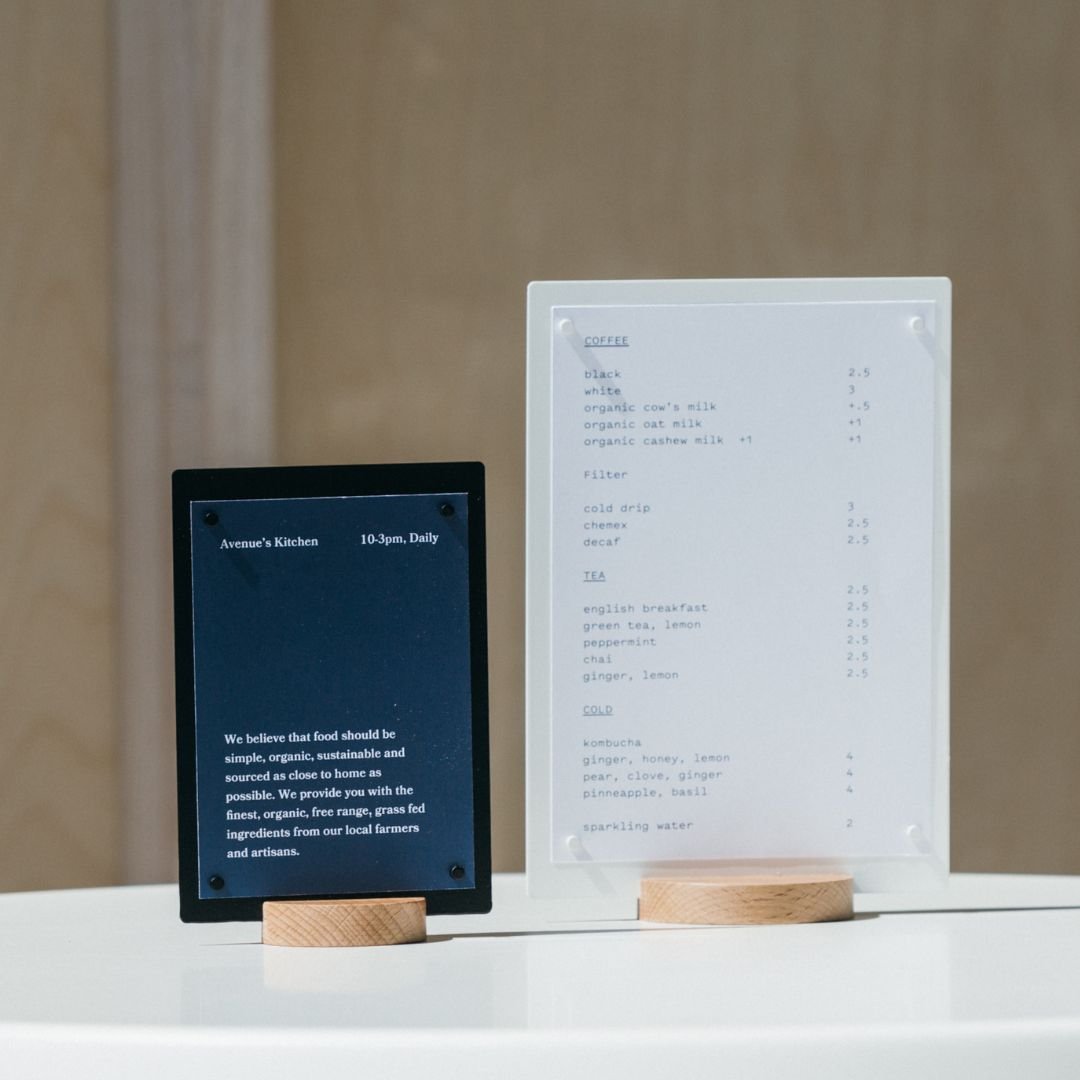
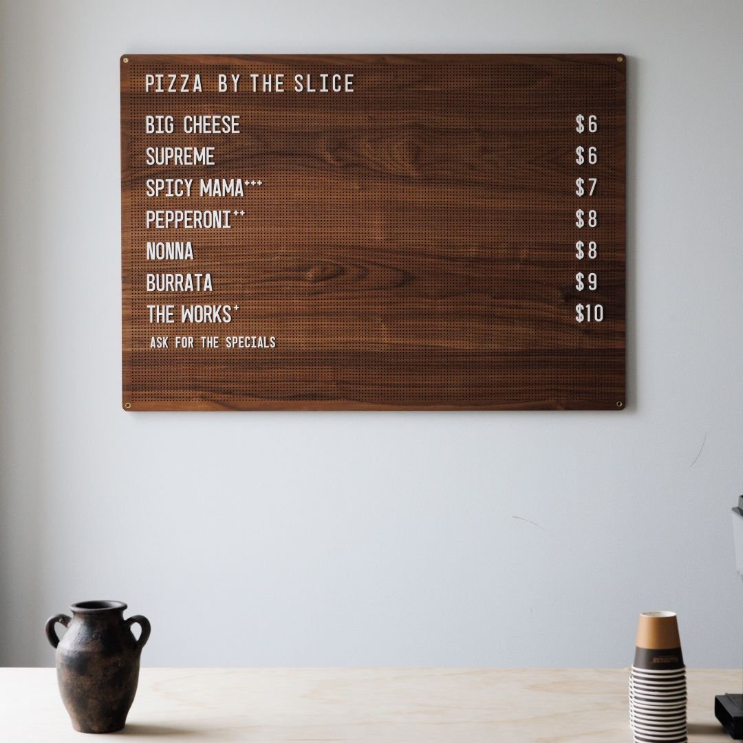
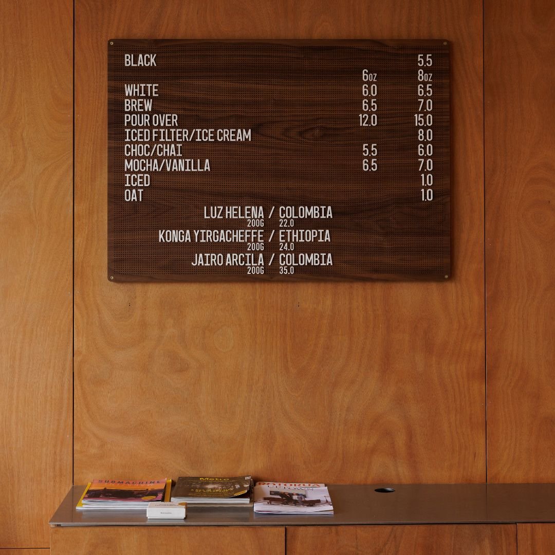
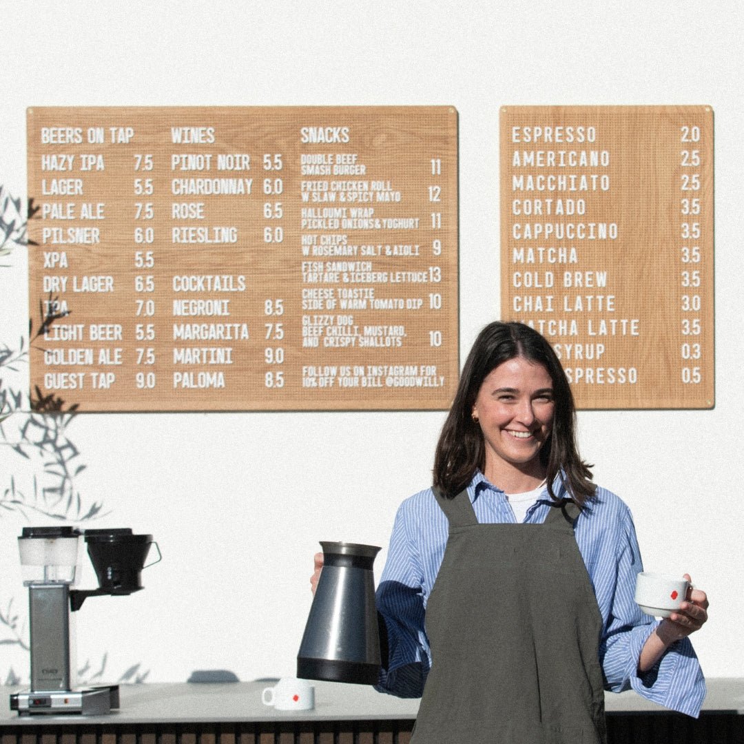
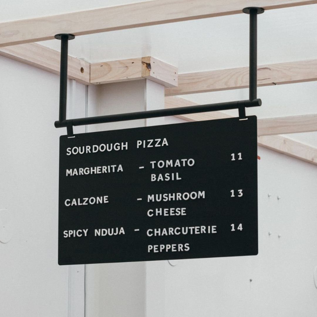
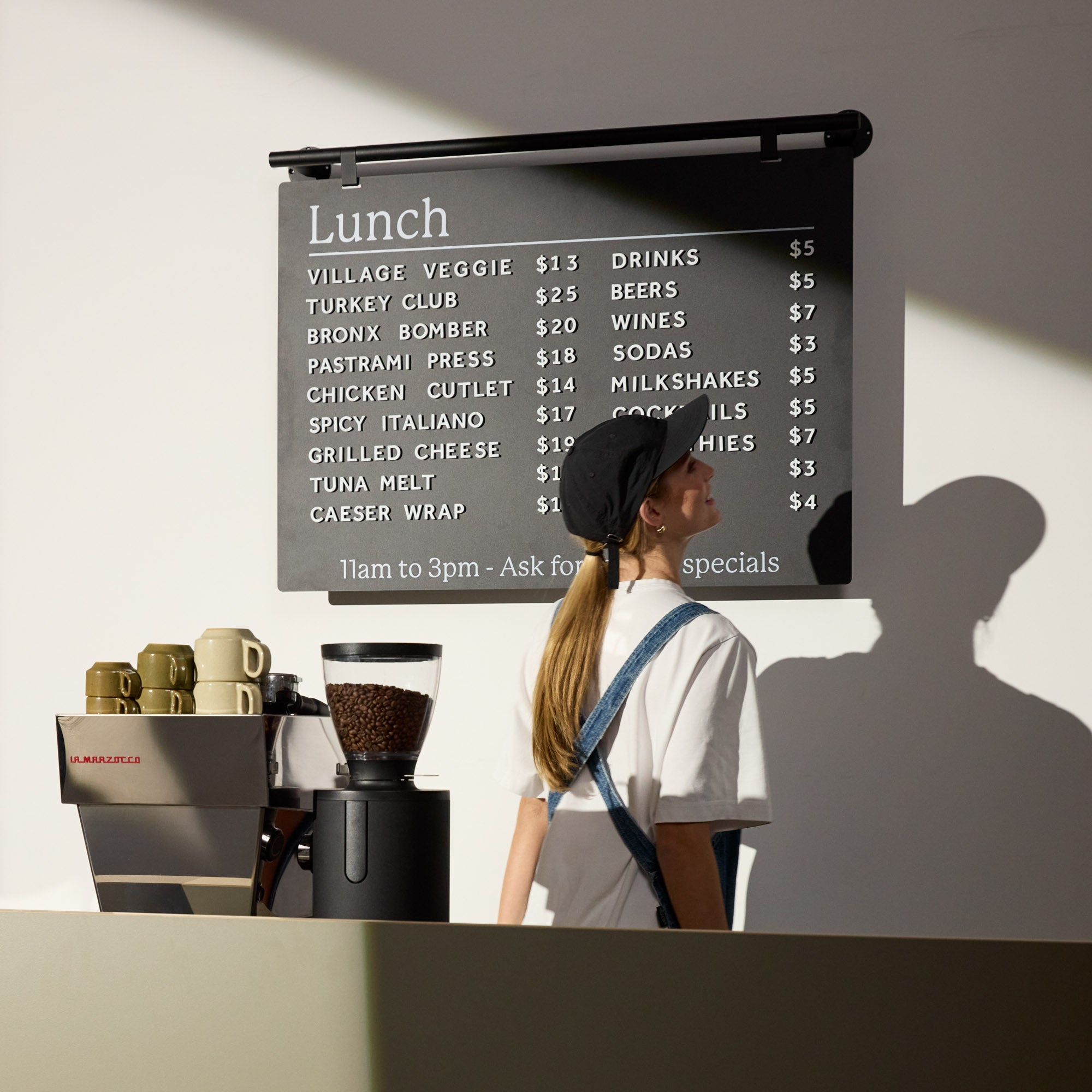
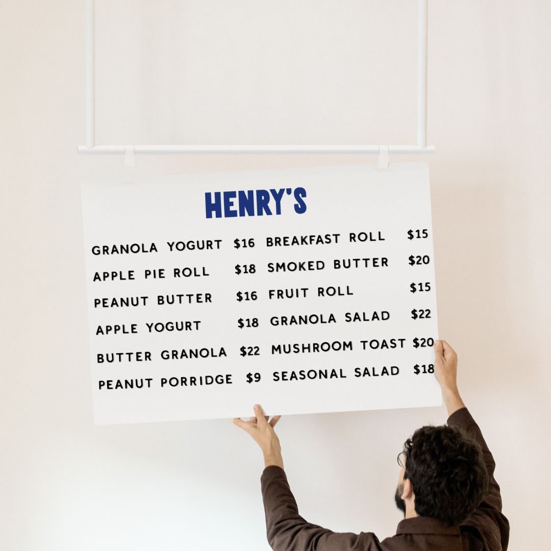
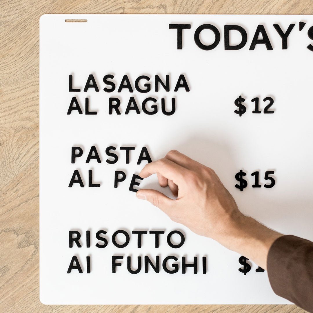
Think about updates. If you change offers weekly, pair an exterior identity sign with interior or entry menu systems that update fast.
Quick selector table
Venue goal |
Good fit |
Why |
|---|---|---|
Catch foot traffic on narrow sidewalks |
Hanging sign and A frame sign |
Projects from facade and meets eyes at walking height |
Announce day specials |
Poster sidewalk sign or table talker near door |
Swap cards or posters without reprinting a full sign |
Night visibility |
Light box sign |
Even illumination increases legibility after dark |
Multi item menu at entry |
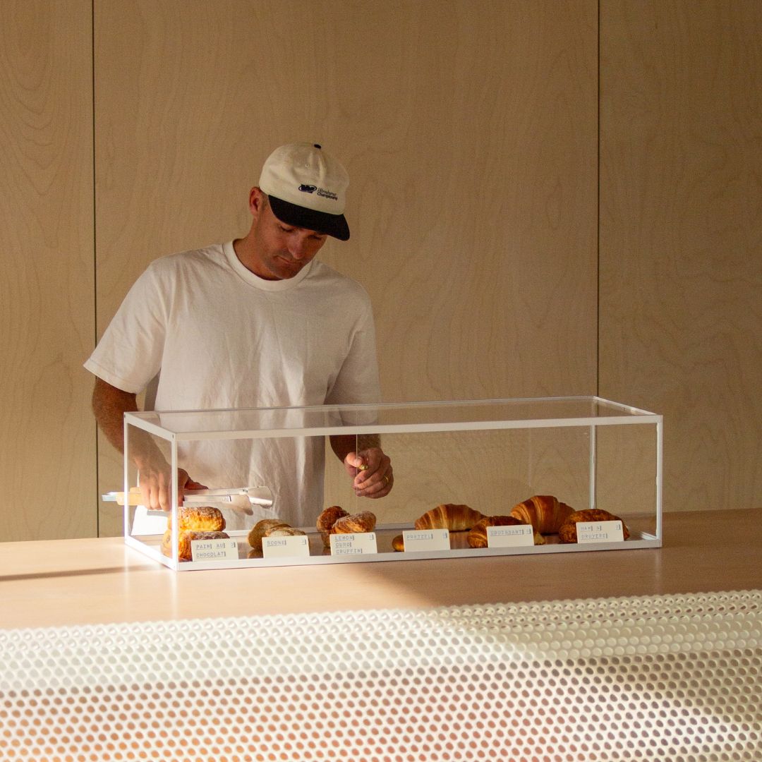
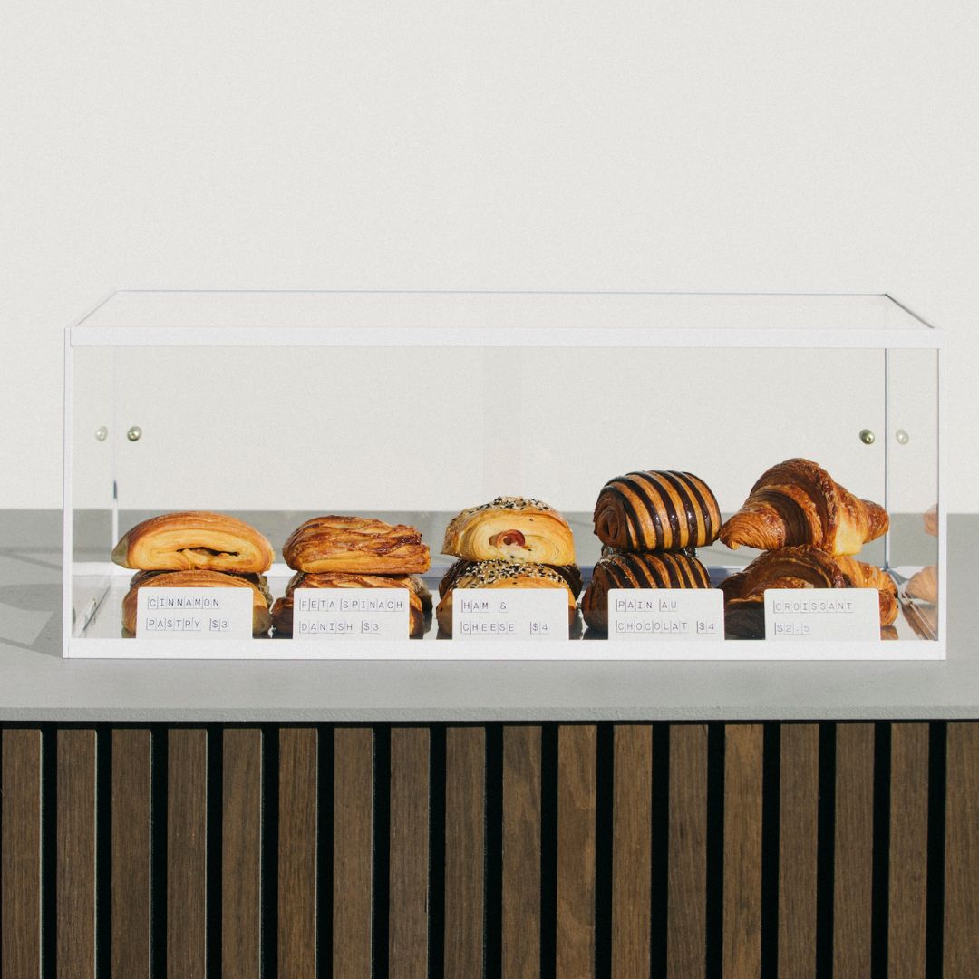
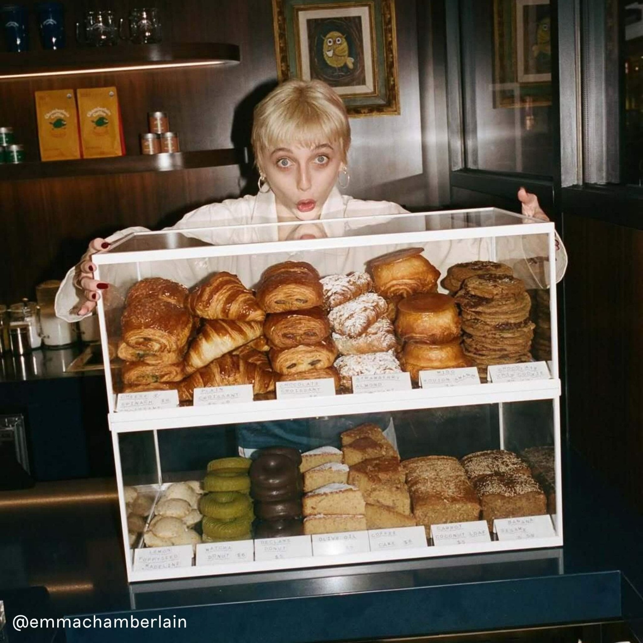
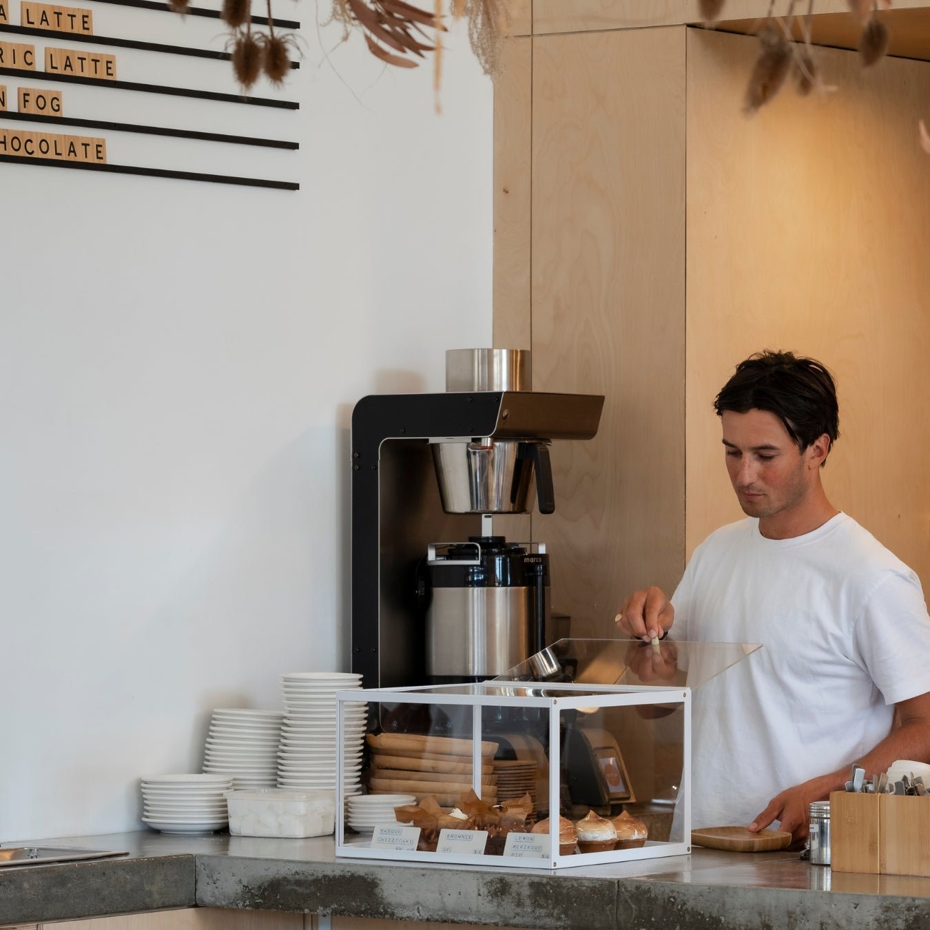
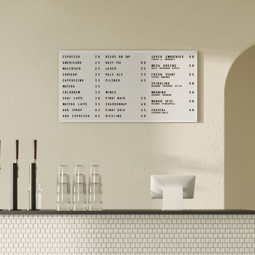
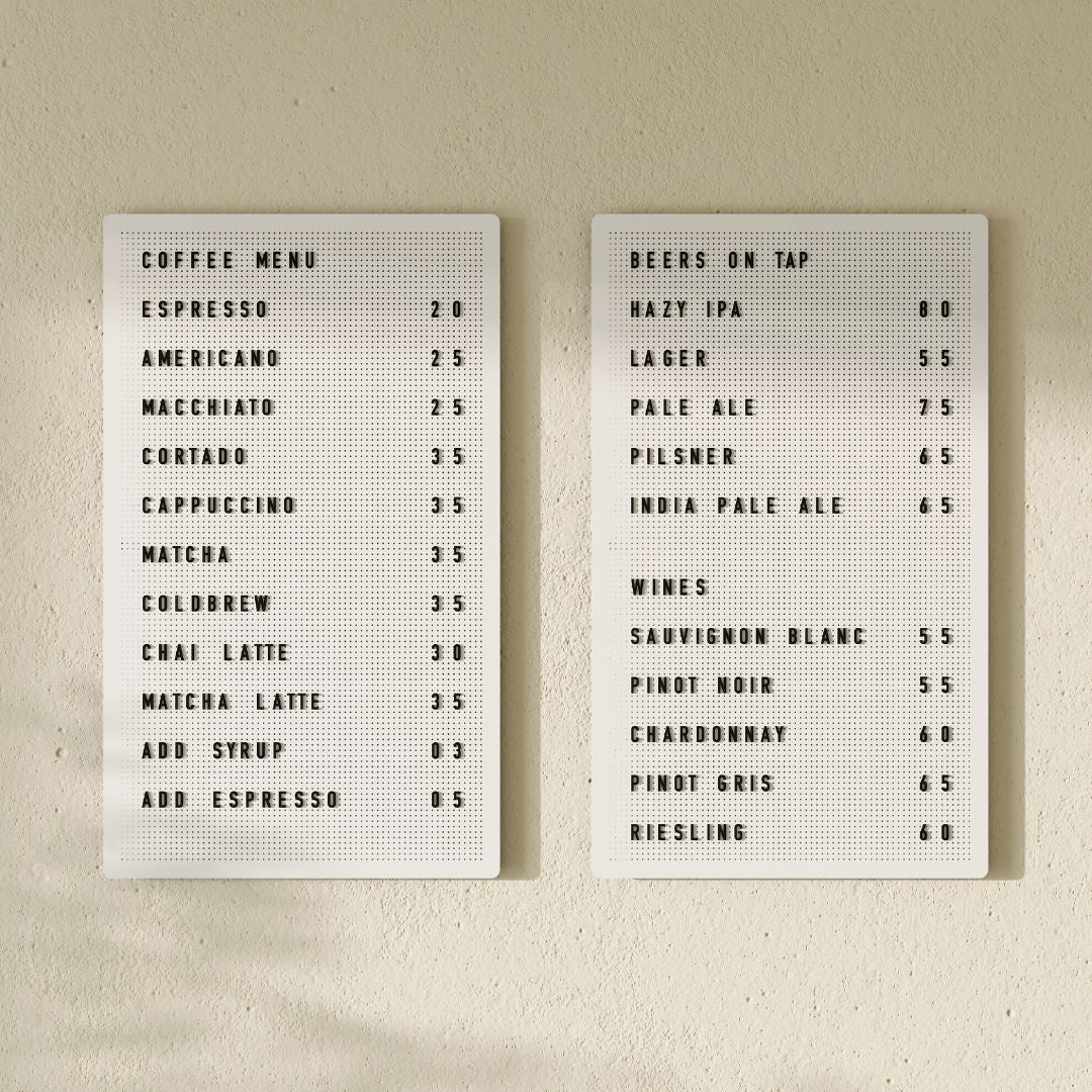
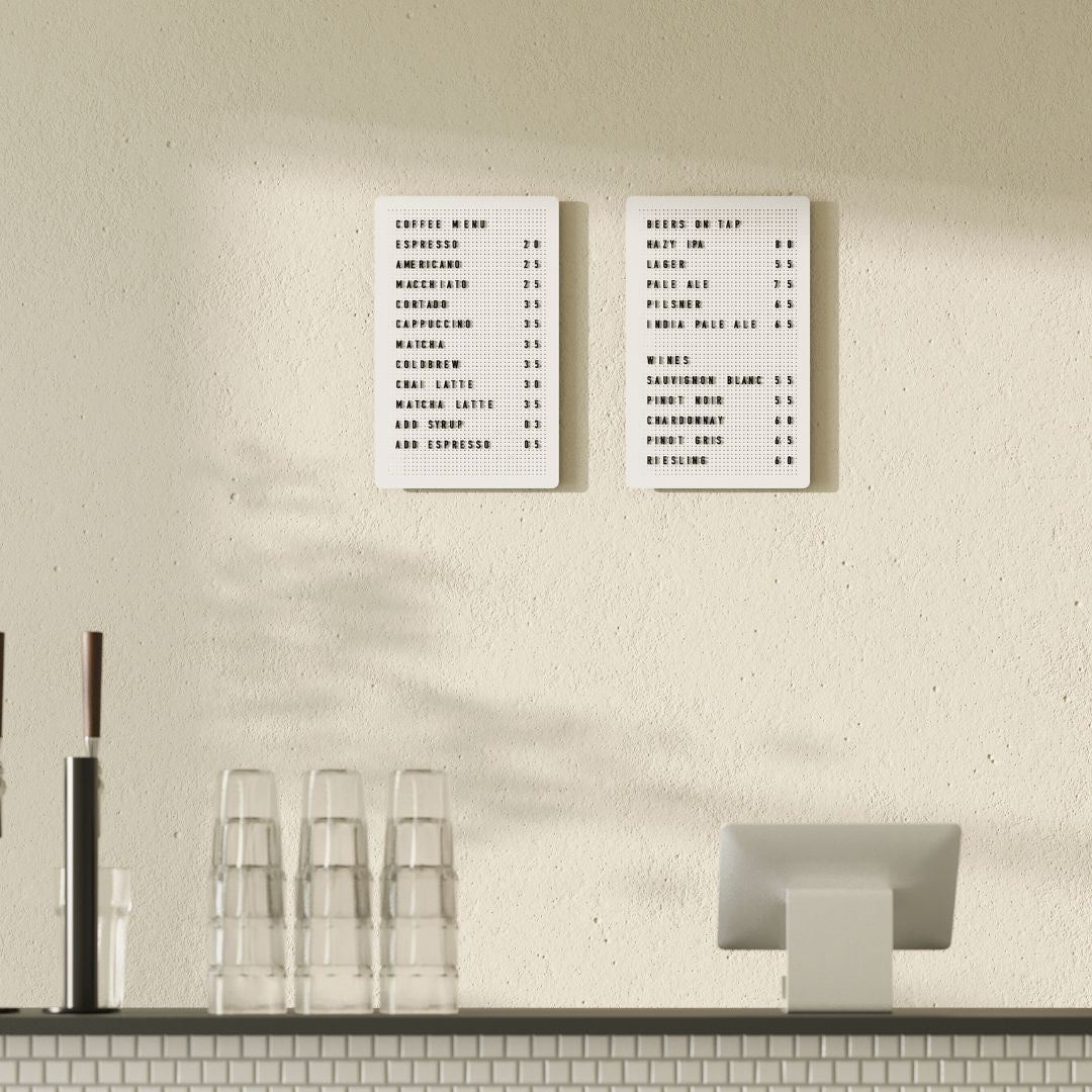
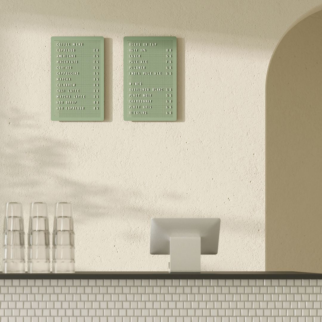
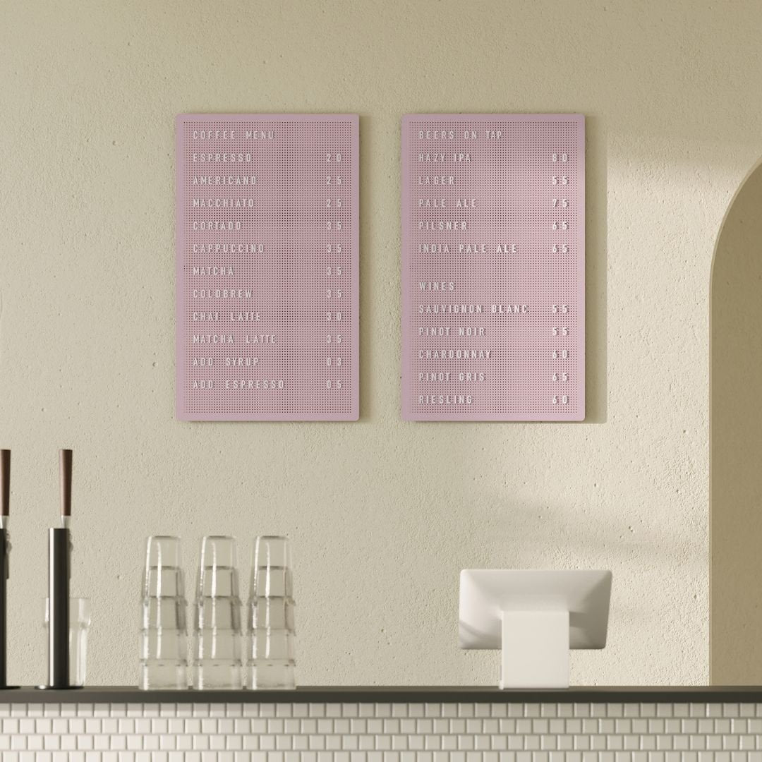
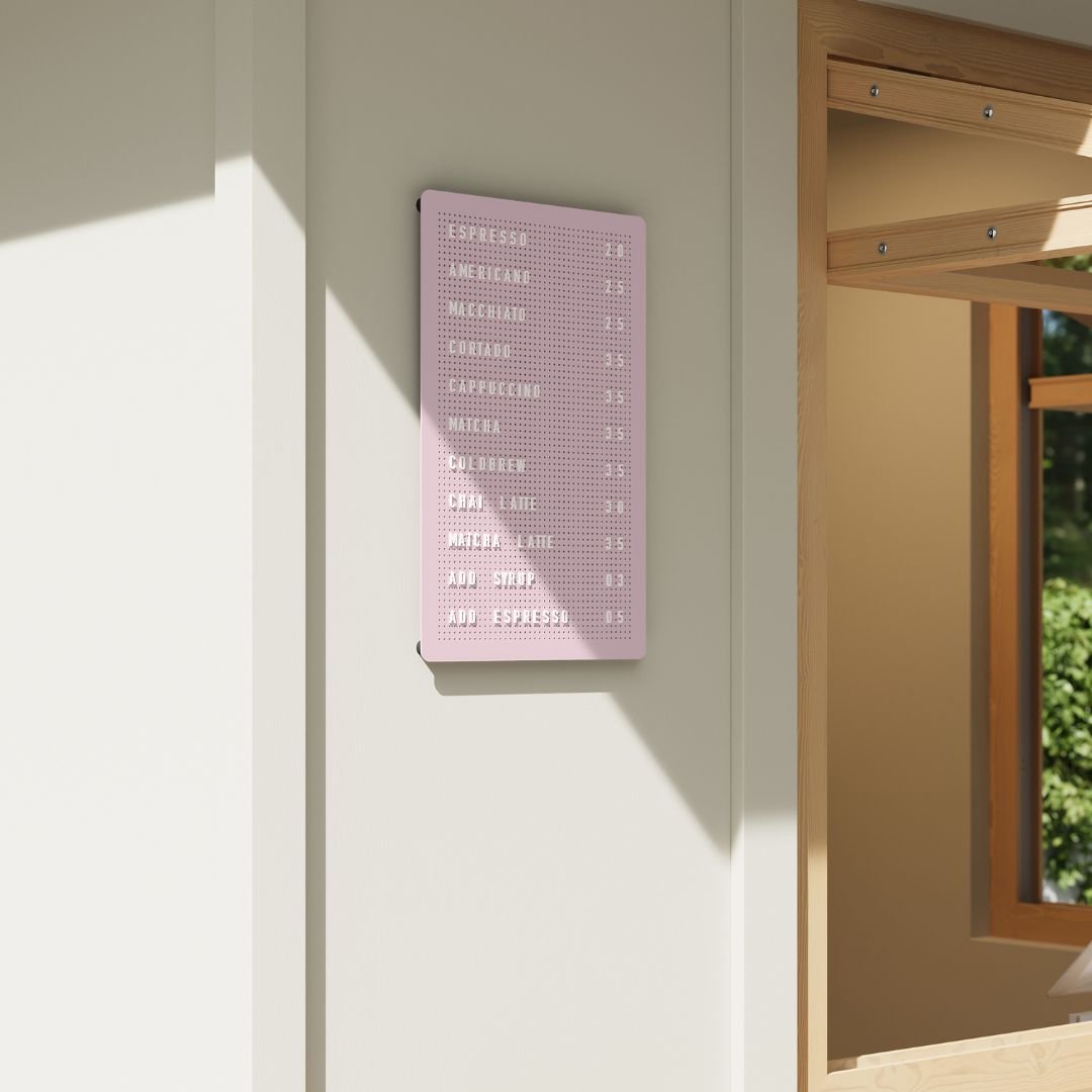
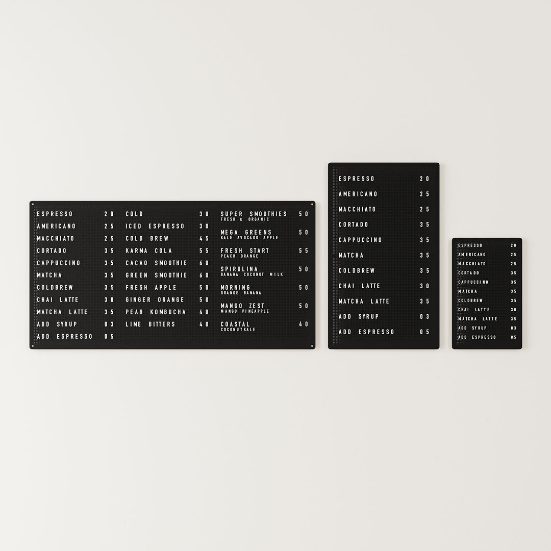
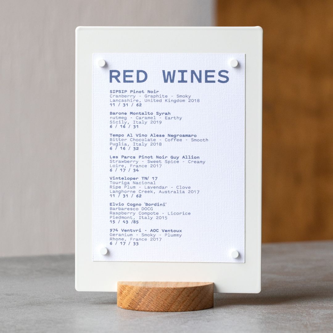
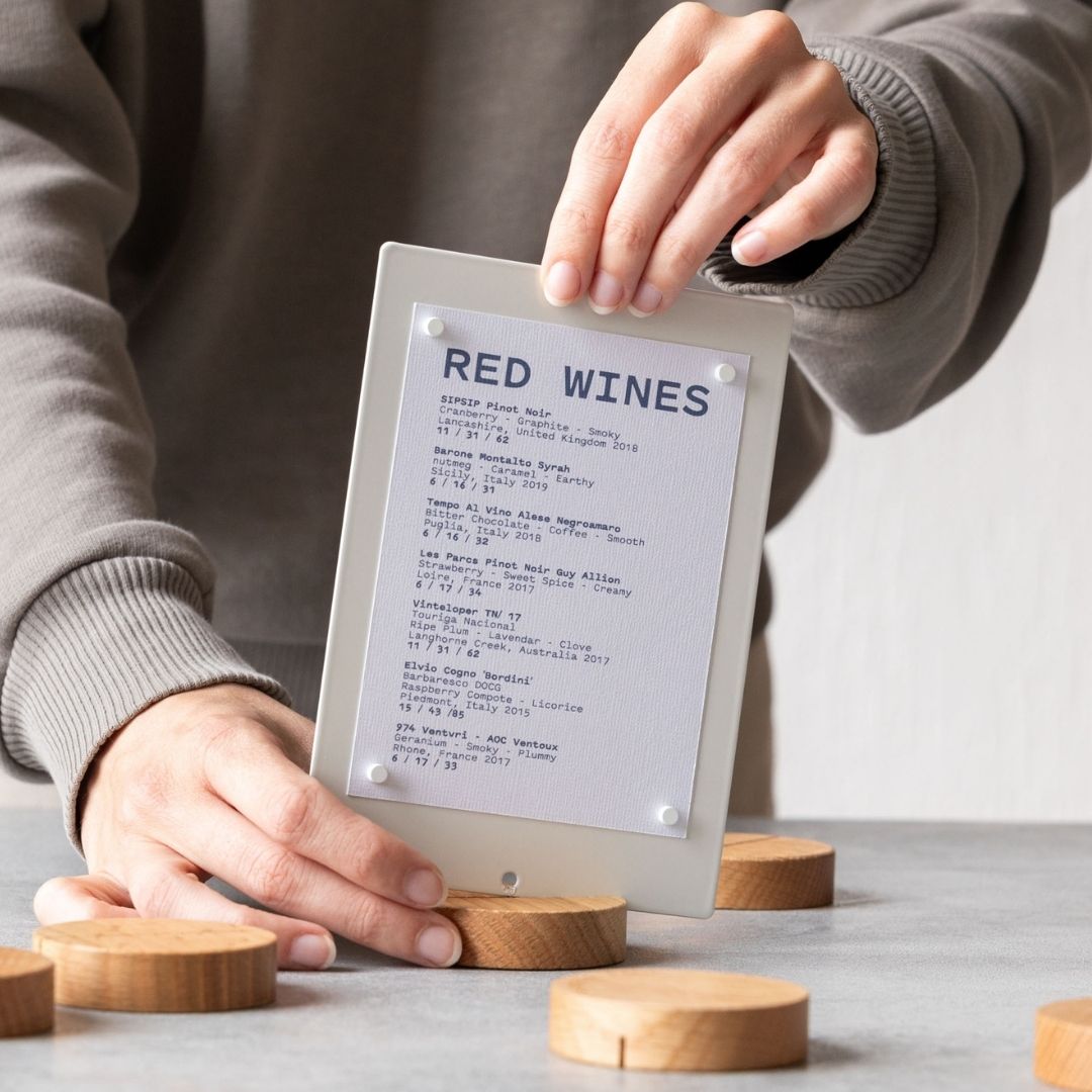
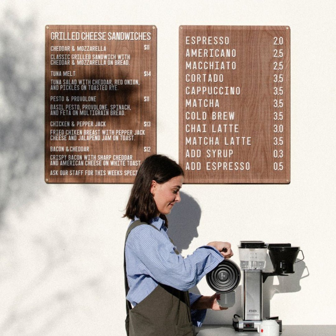
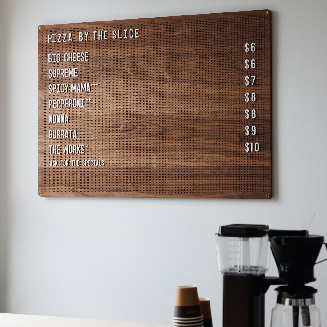
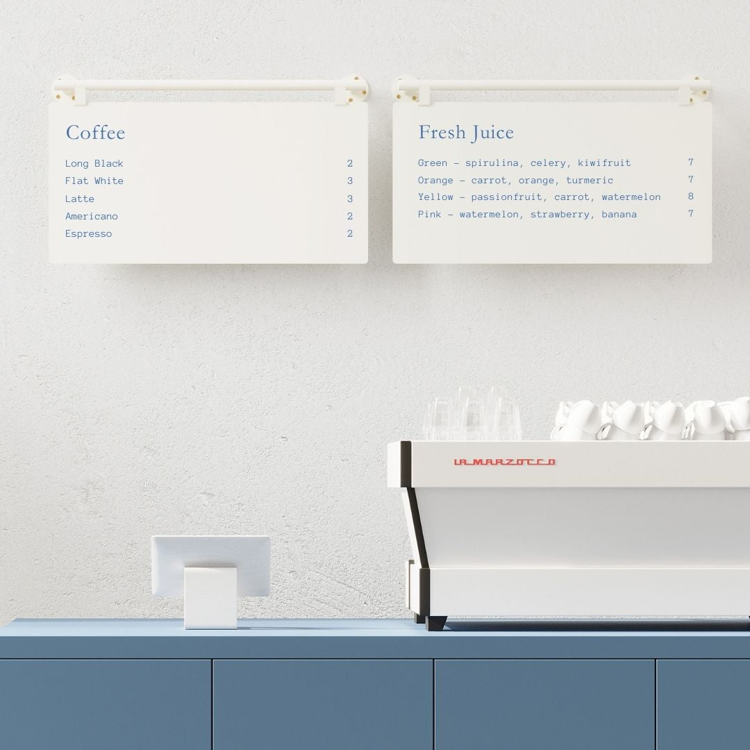
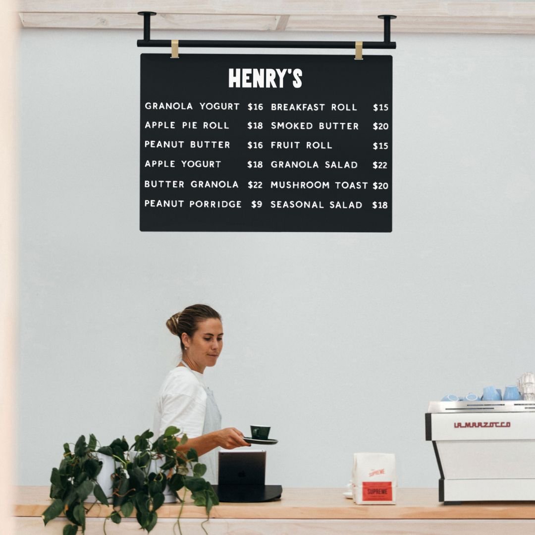
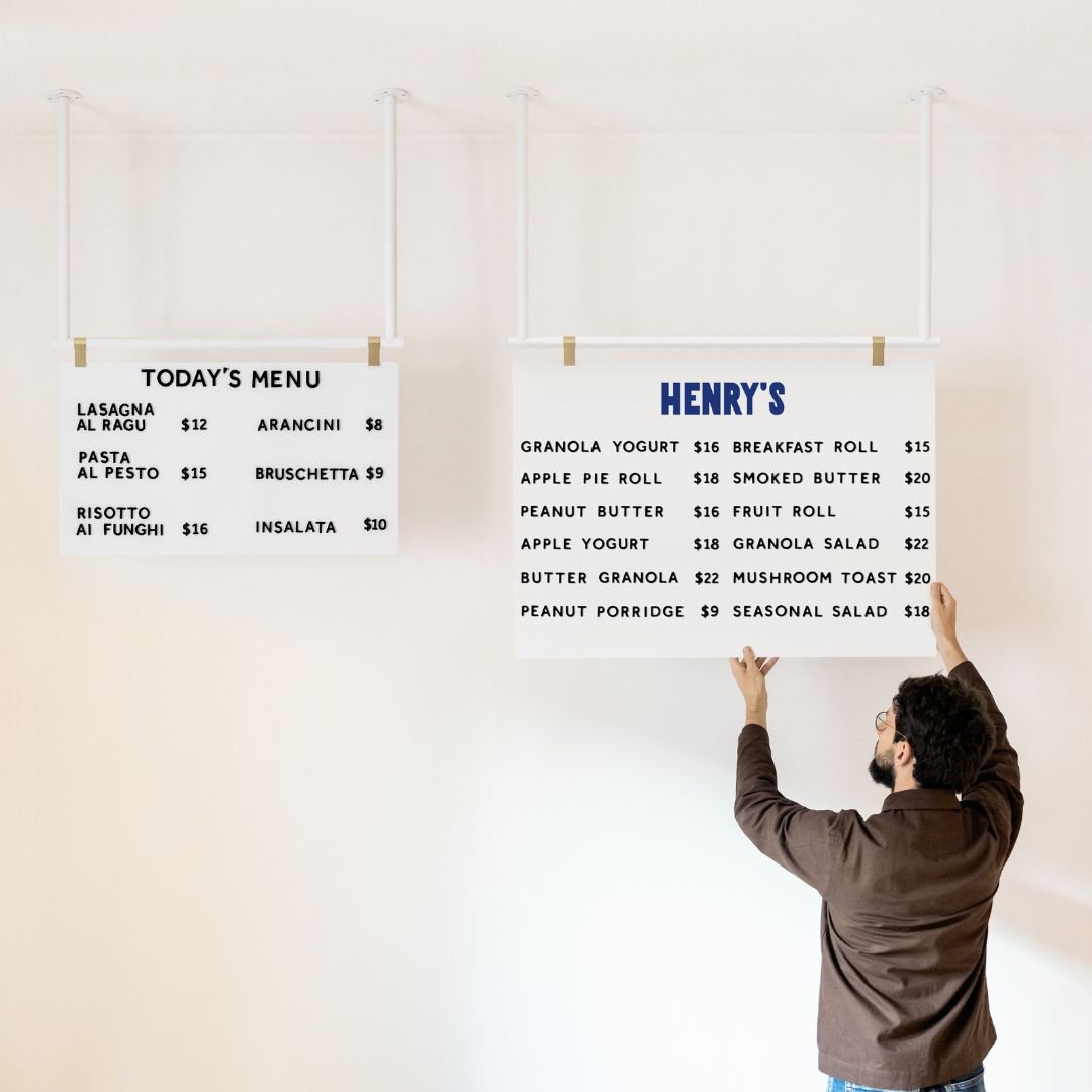
Magnetic or tile menu board inside the window |
Fast updates, tidy typography, consistent brand feel |
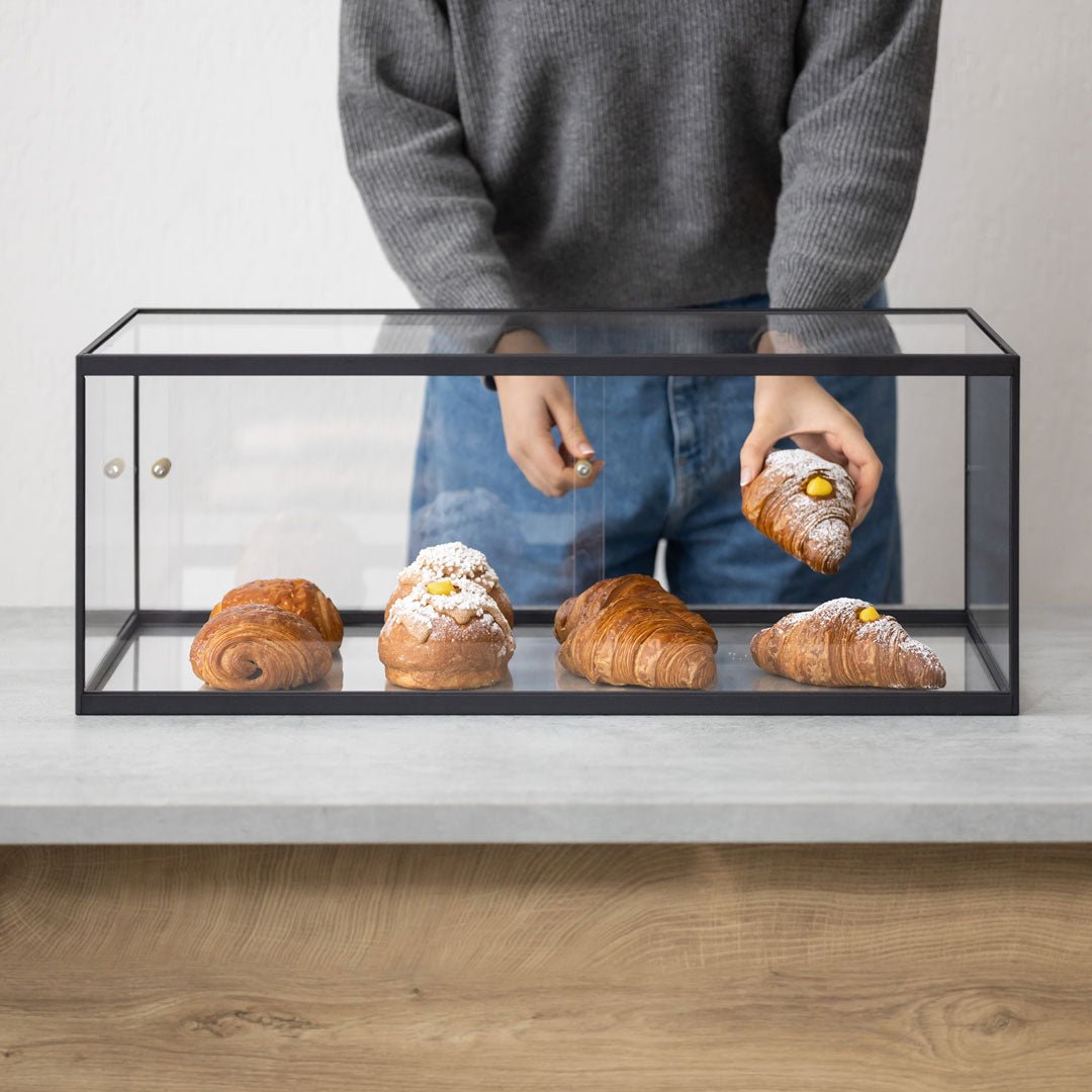
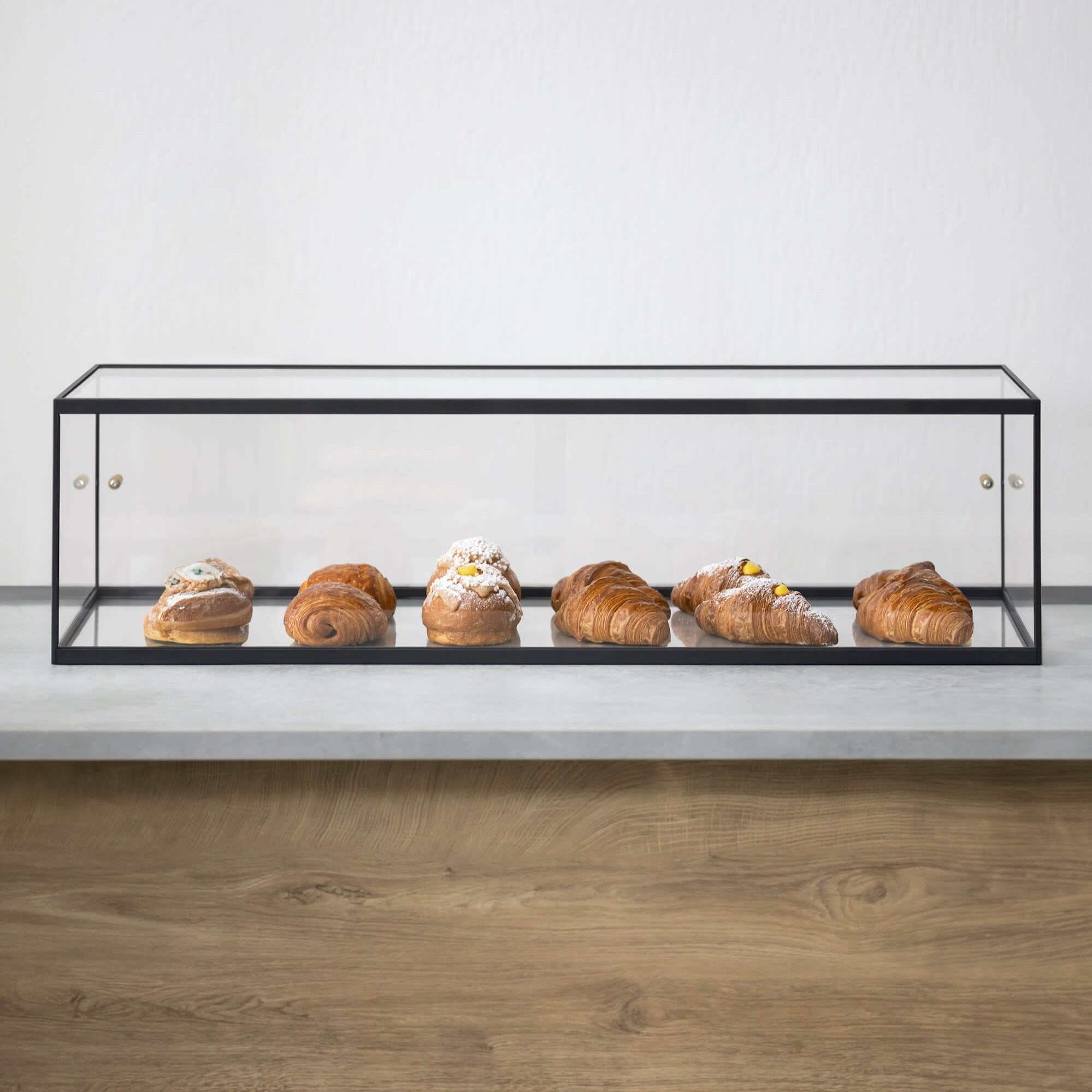
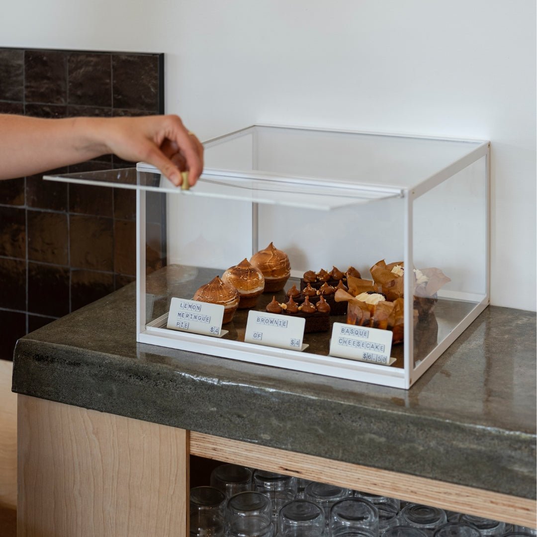
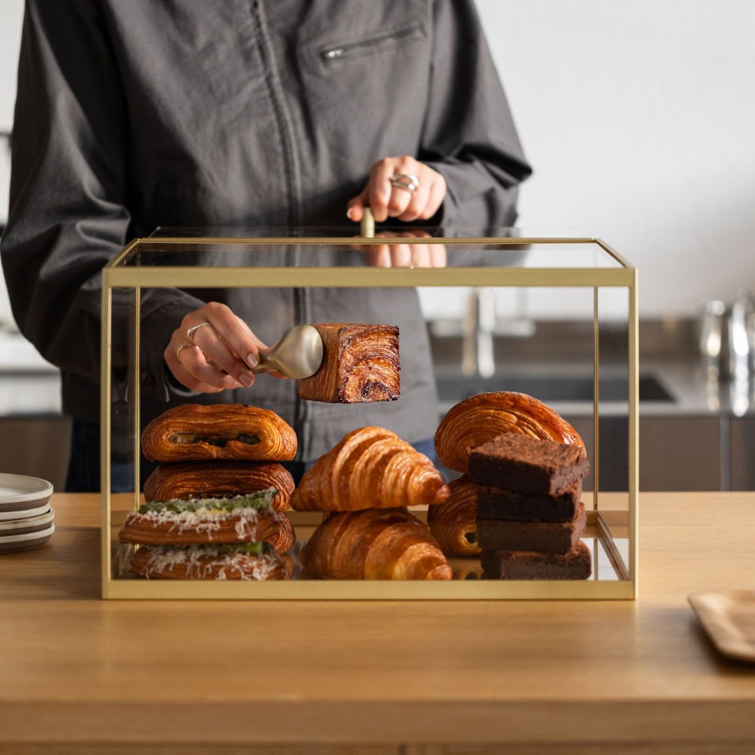
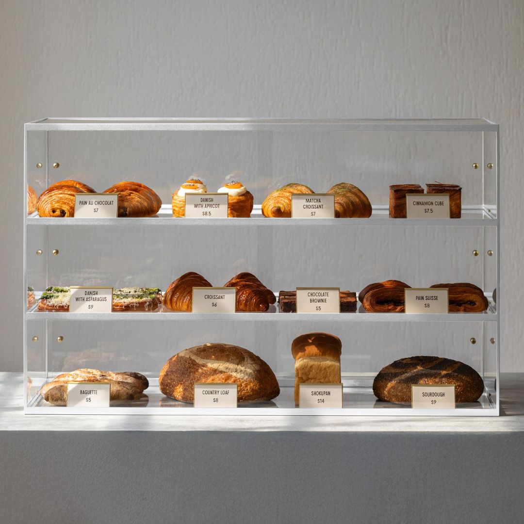
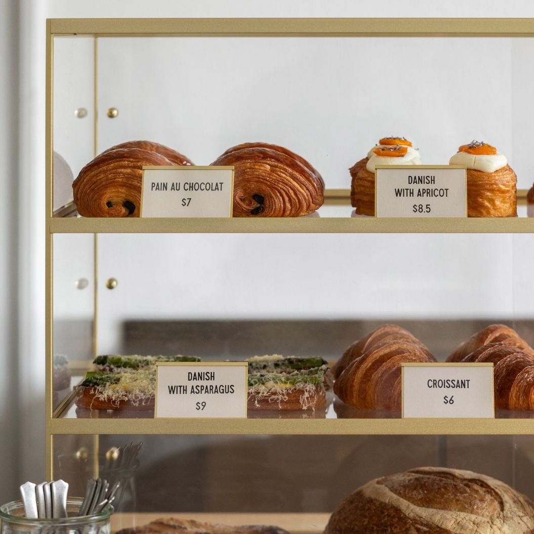
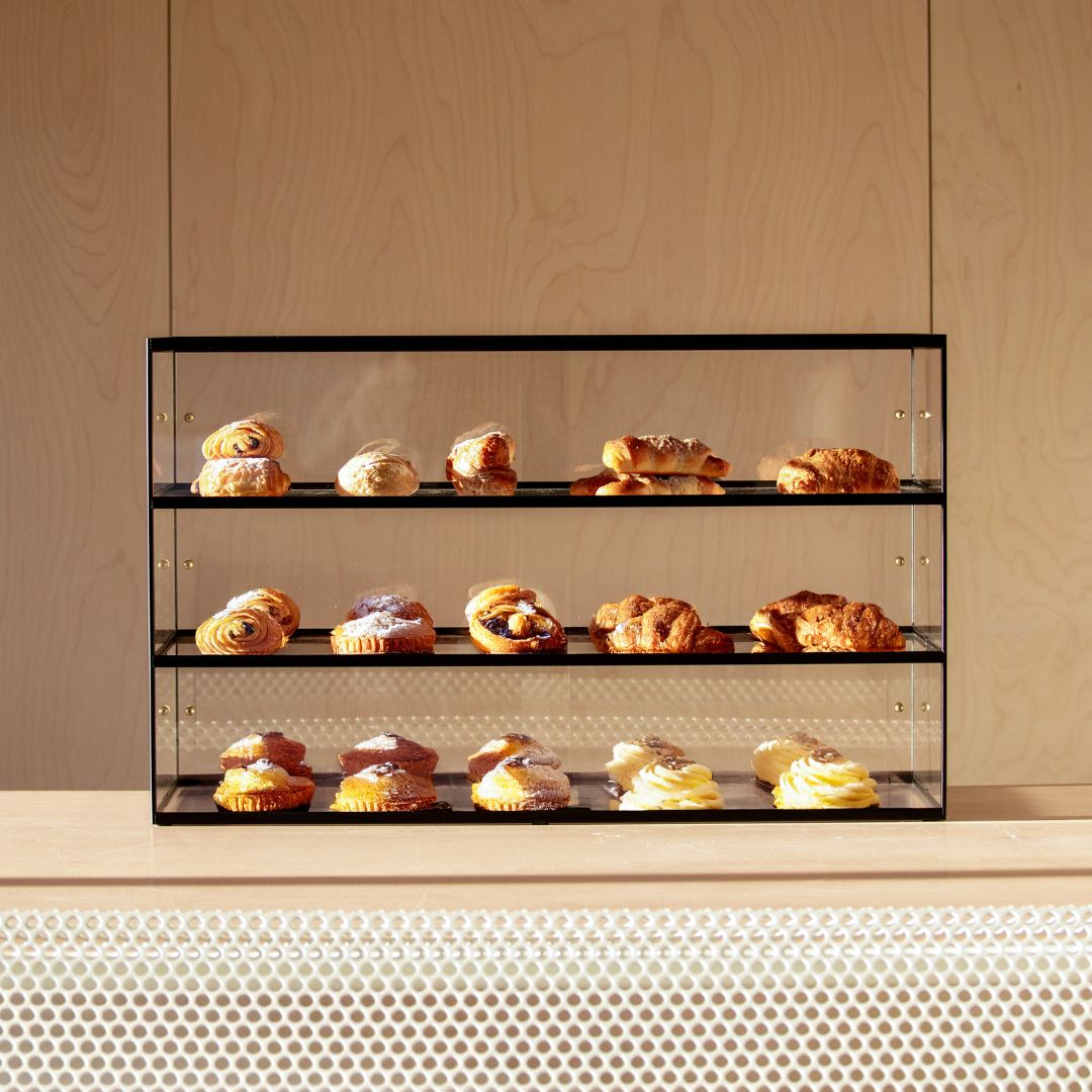
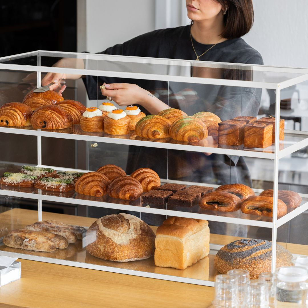
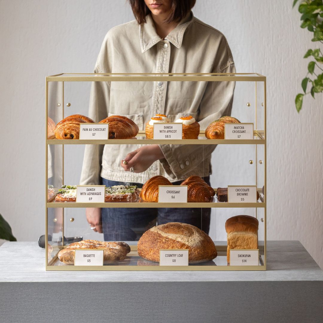
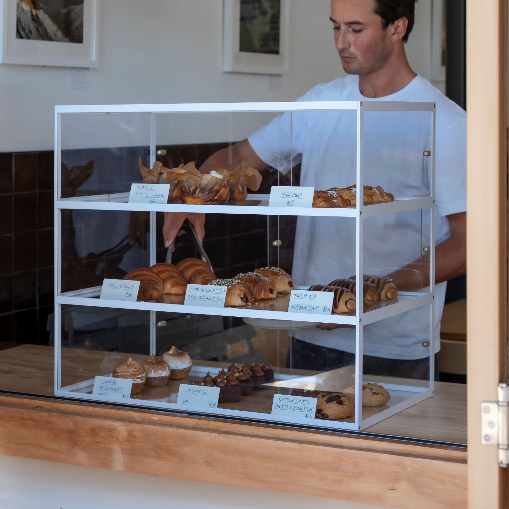
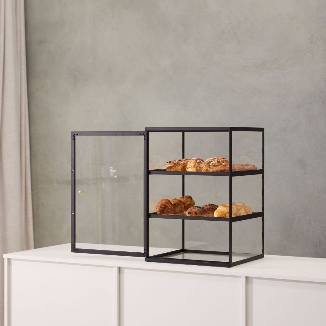
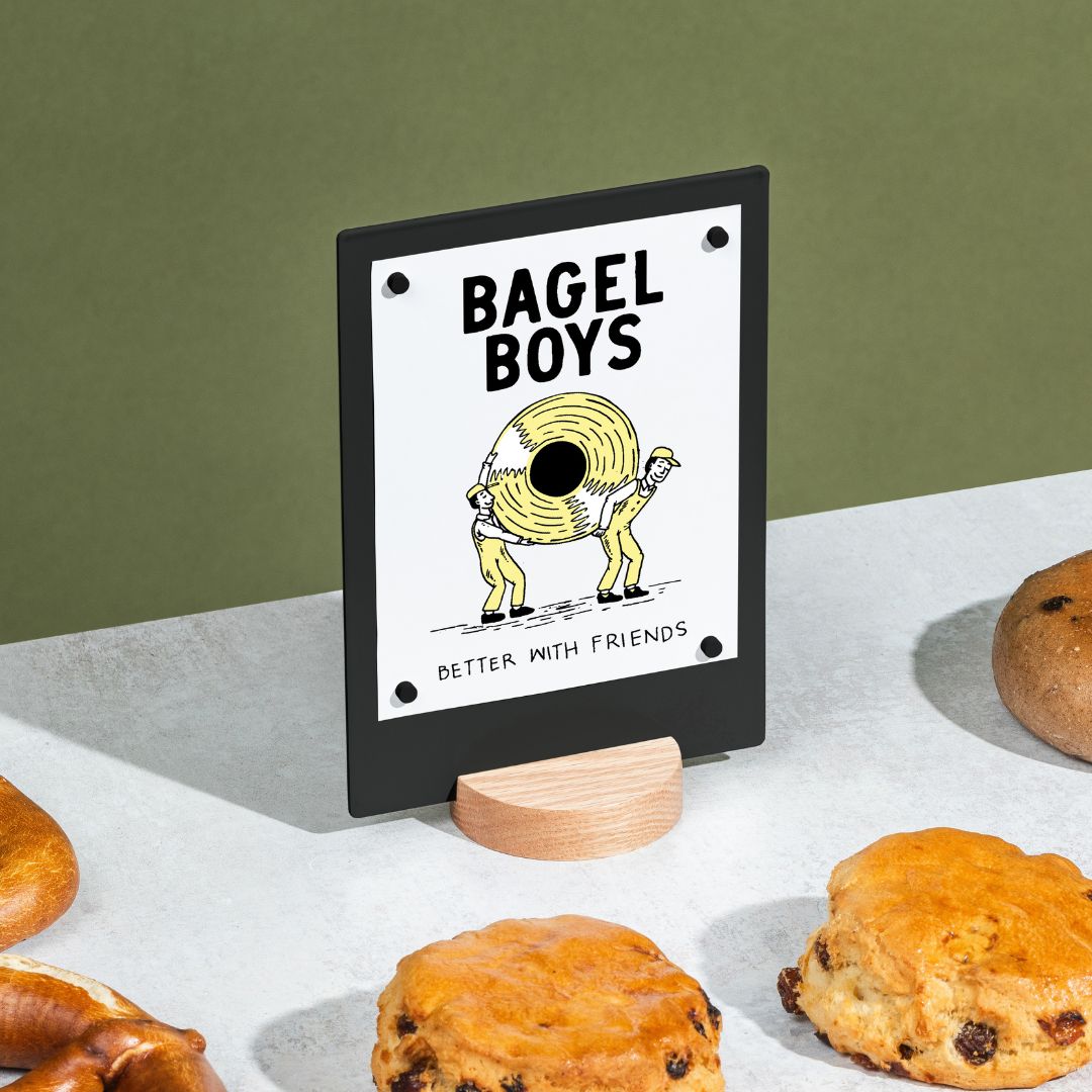
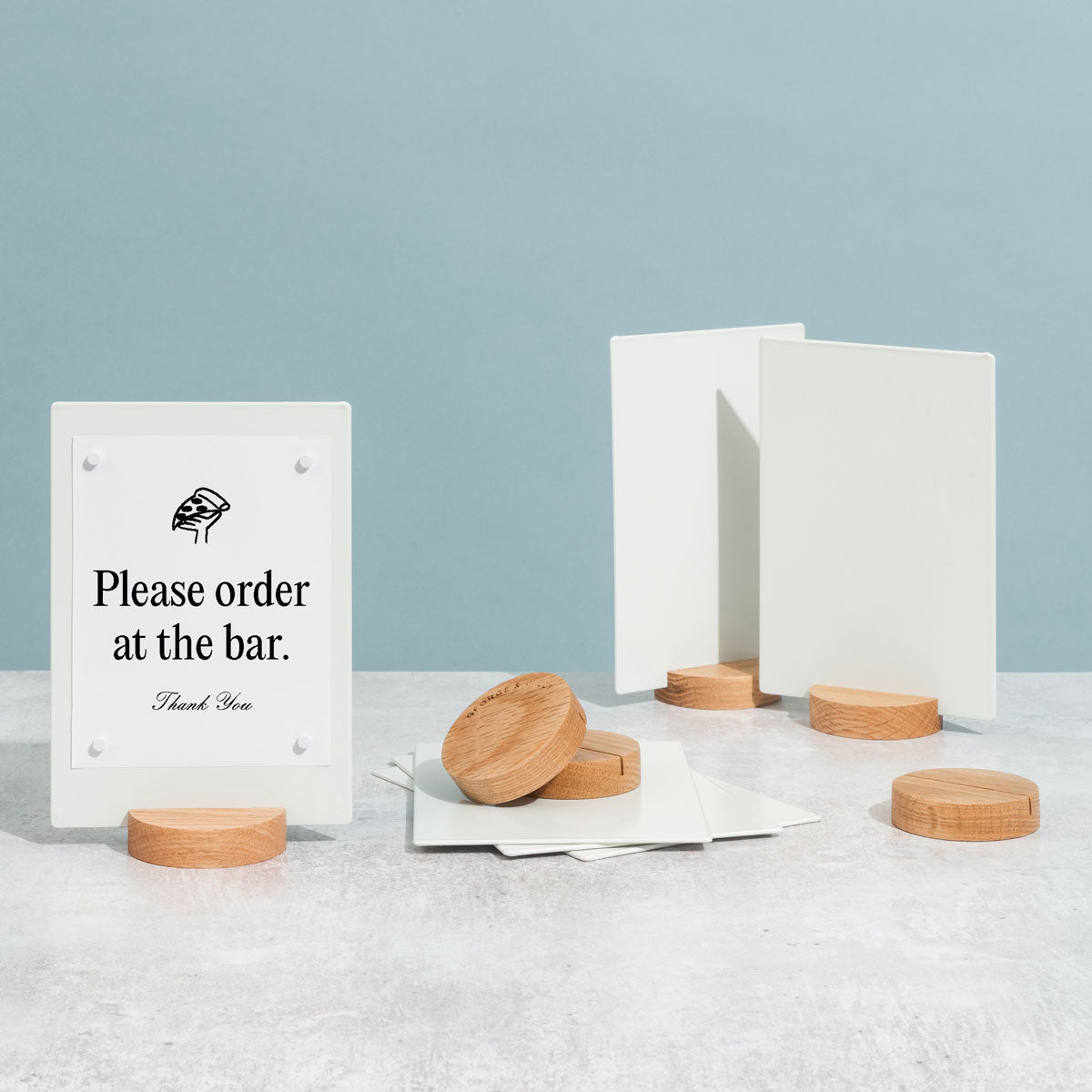
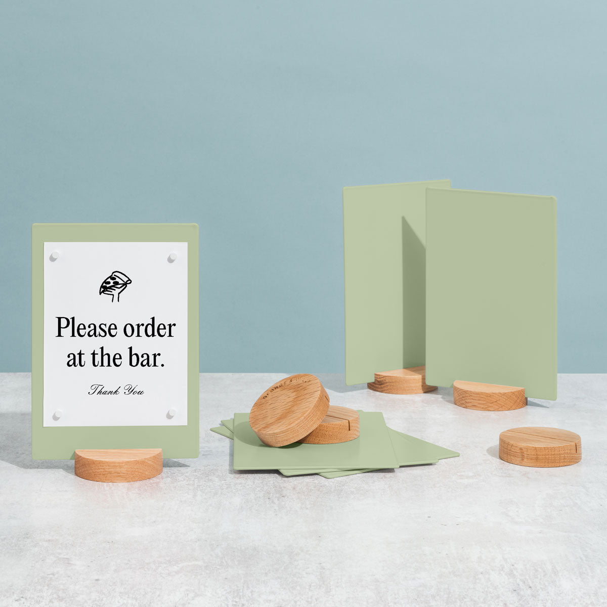
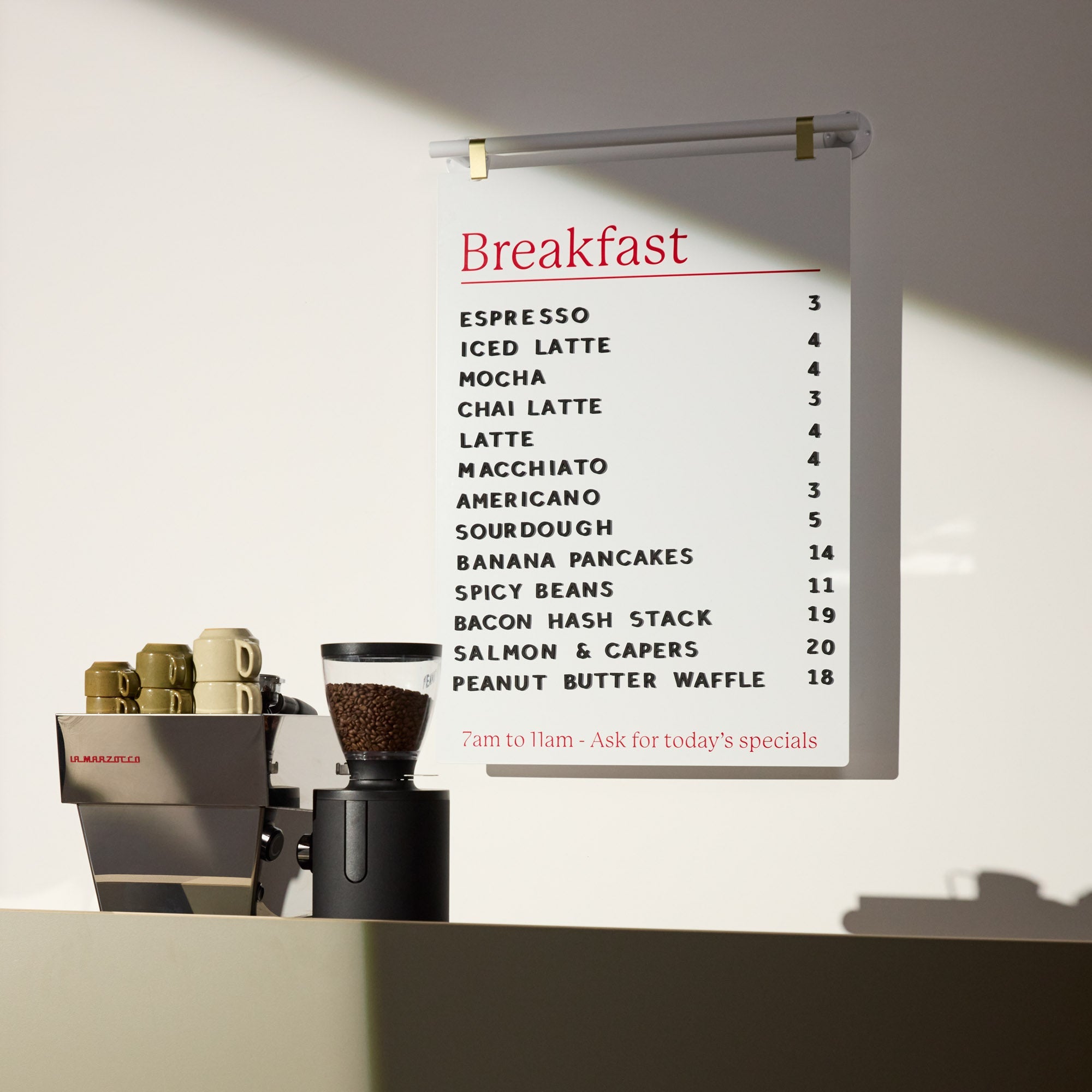
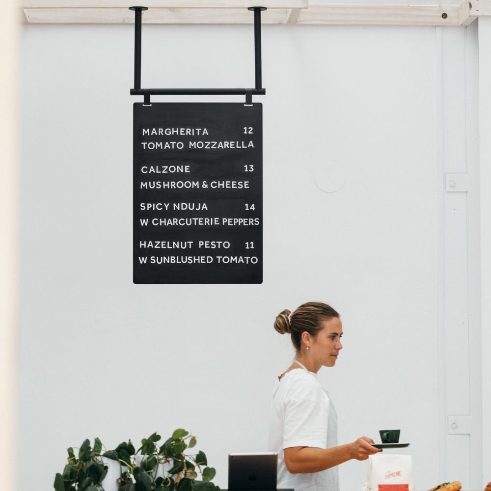
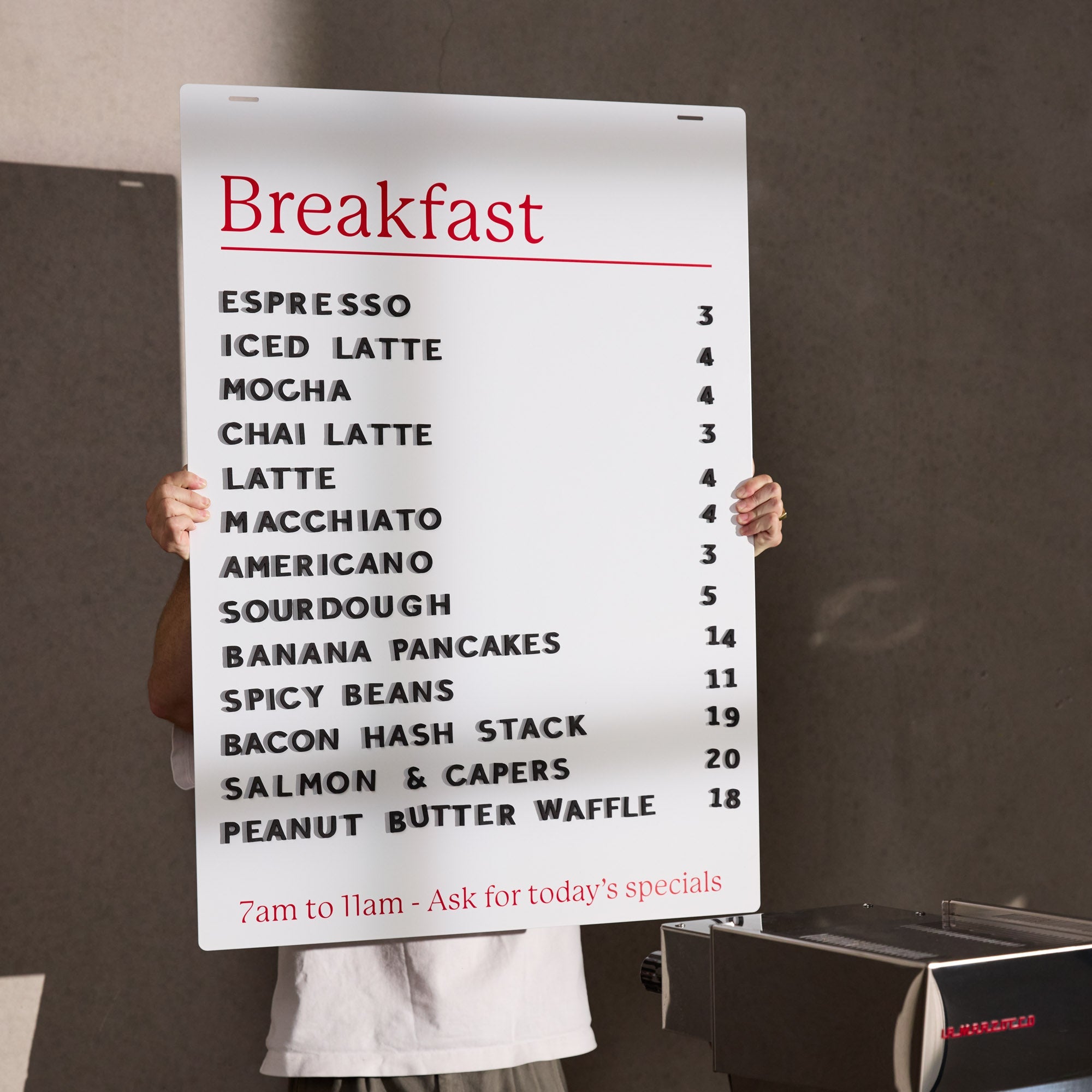
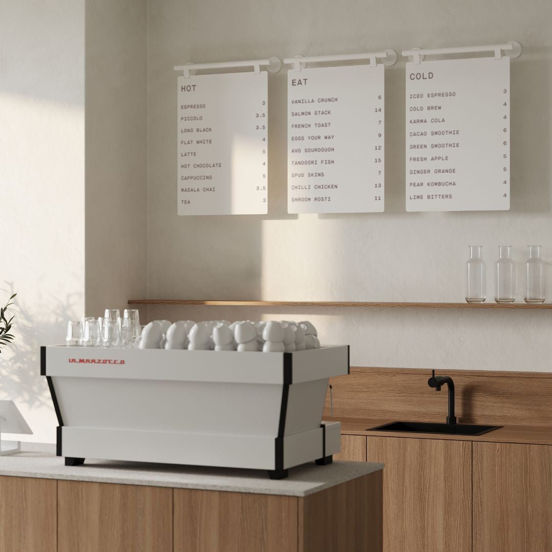
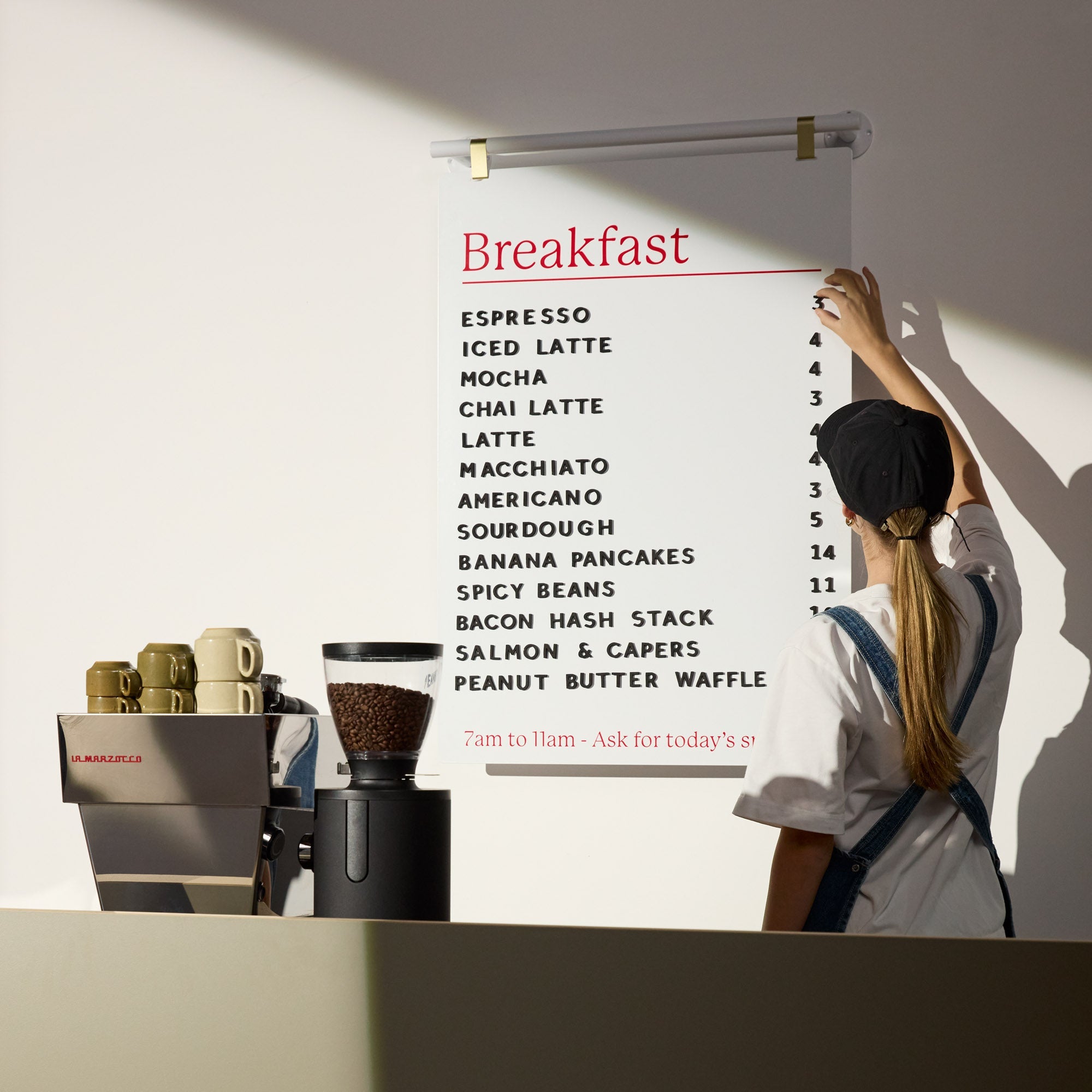
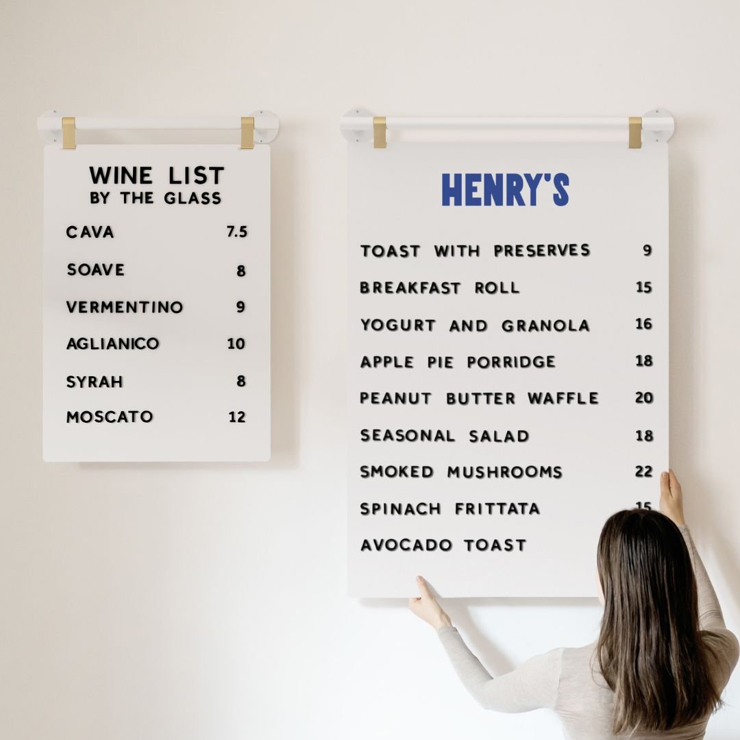
Friendly tip, explore ready made storefront signs and menu displays that suit hospitality and retail at George and Willy.
Design best practices that increase readability and response
Great design turns a nice sign into a useful tool. Keep these rules in play.
Prioritize legibility
Size hierarchy wins. Large primary words first, like Coffee or Bakery, then supporting lines.
High contrast is your friend. Light text on dark or dark on light beats pretty but low contrast palettes.
Simple typefaces read faster at distance. Avoid ultra thin or highly decorative fonts for the main message.
Reduce cognitive load
One job per sign. Identity on the facade, changeable details on a sidewalk or window board.
White space sells clarity. Cramming lines makes storefront signs look noisy and lowers response.
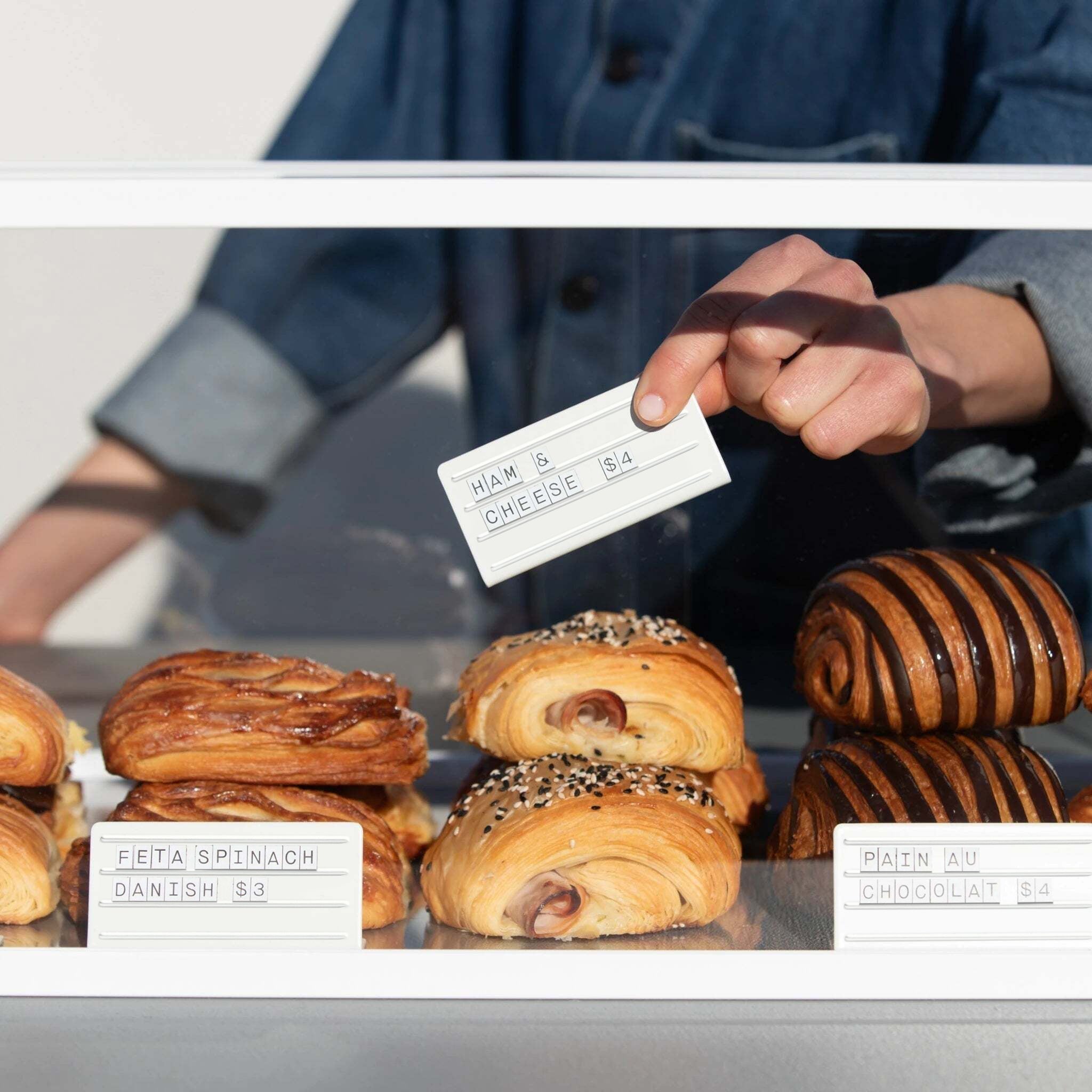
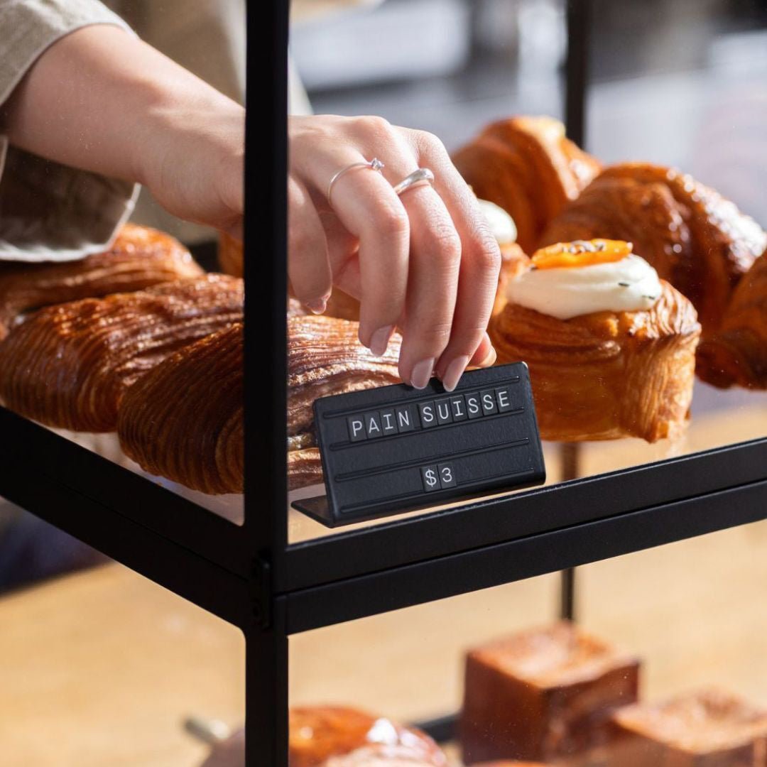
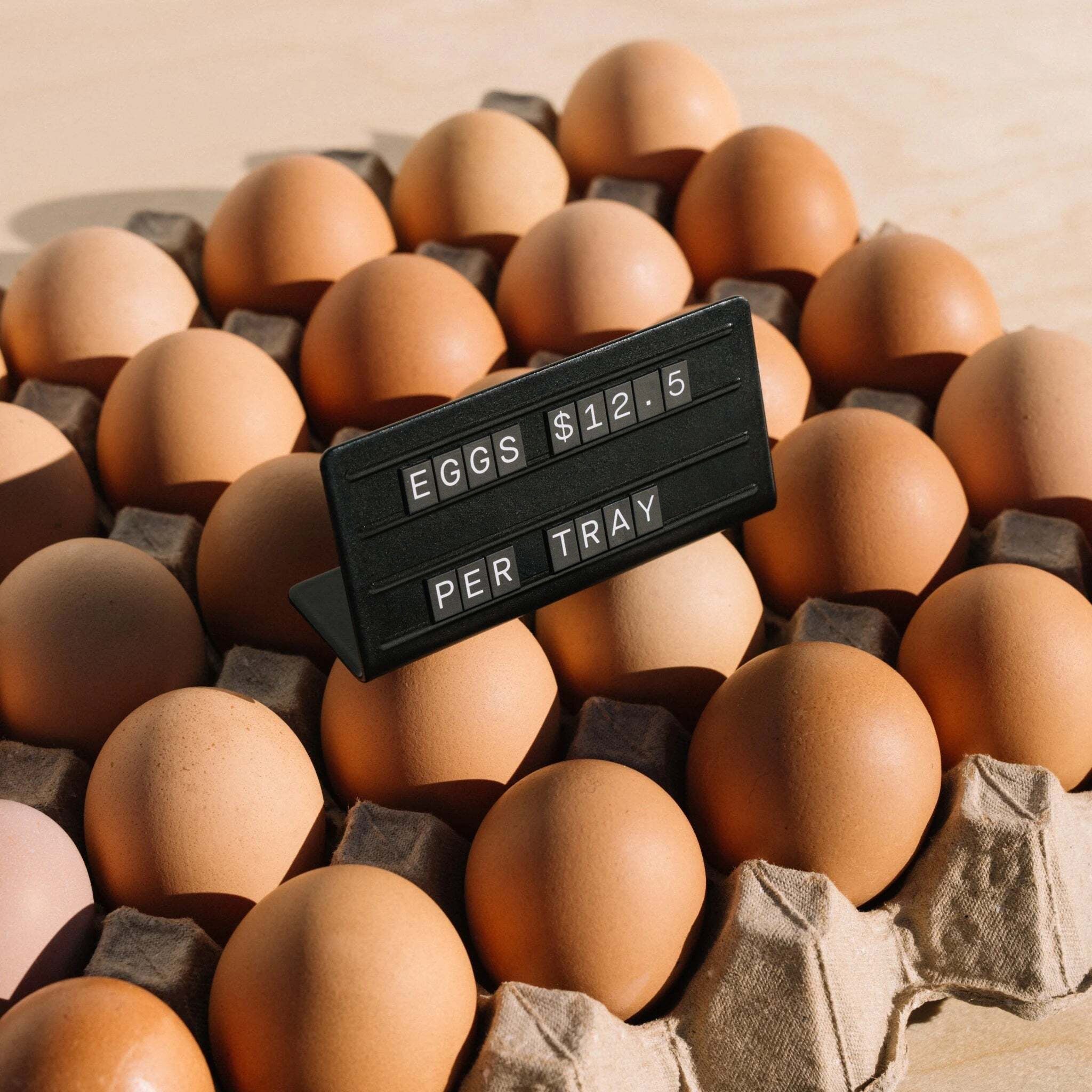
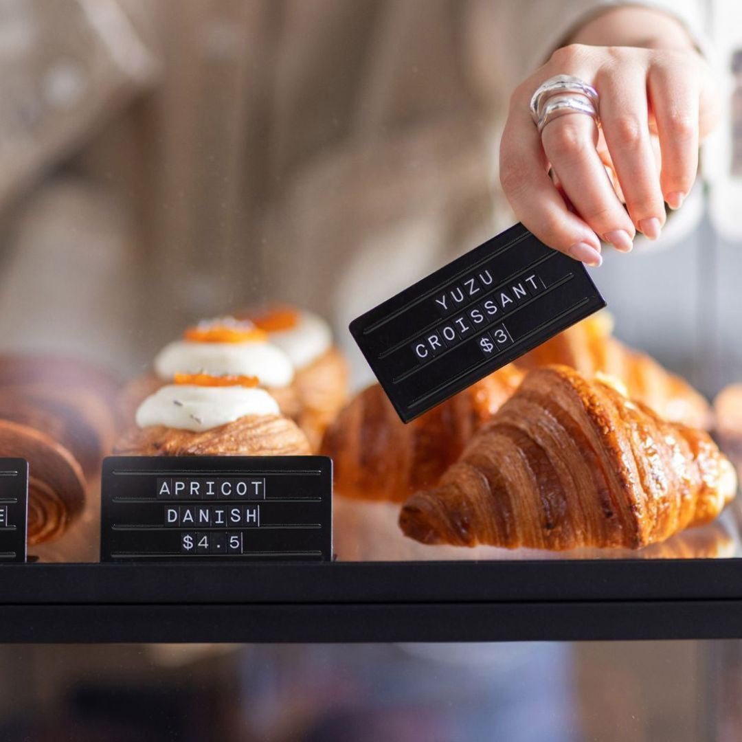
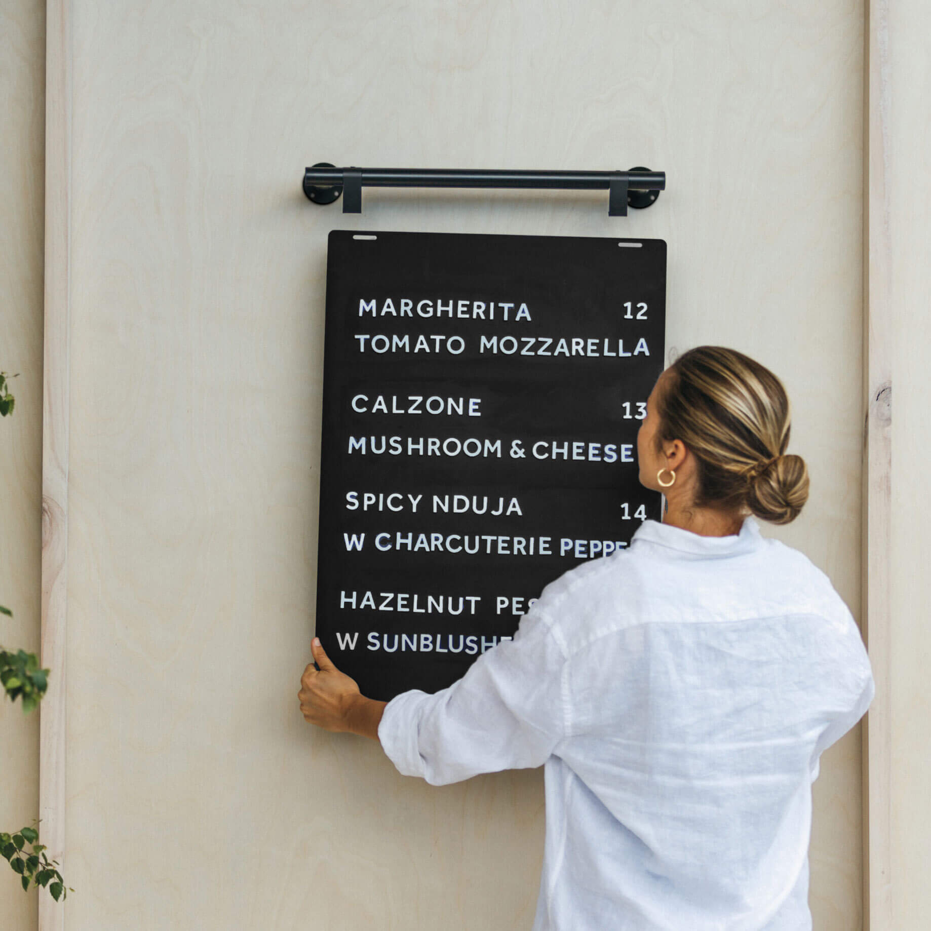
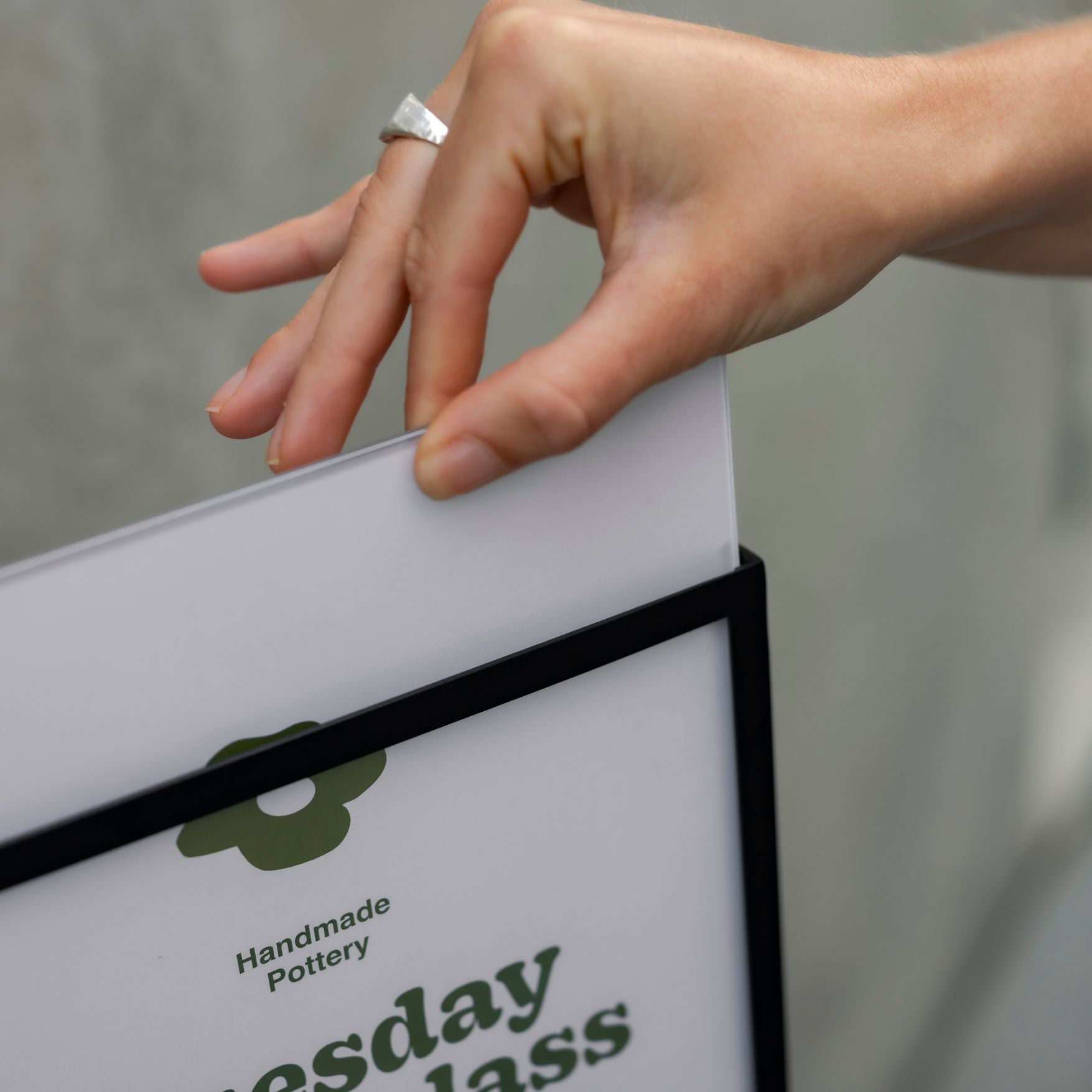
Make updates effortless
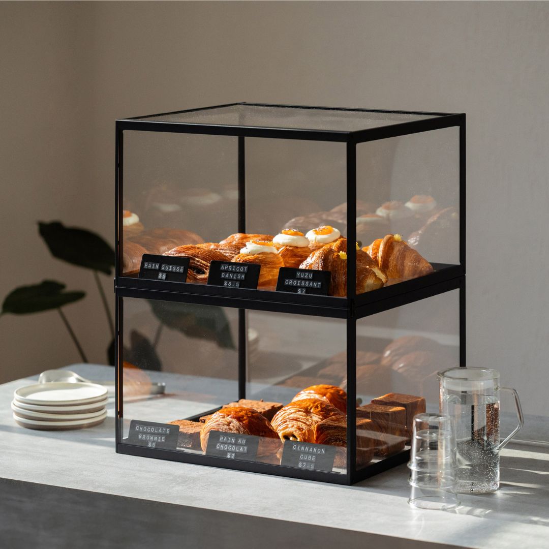
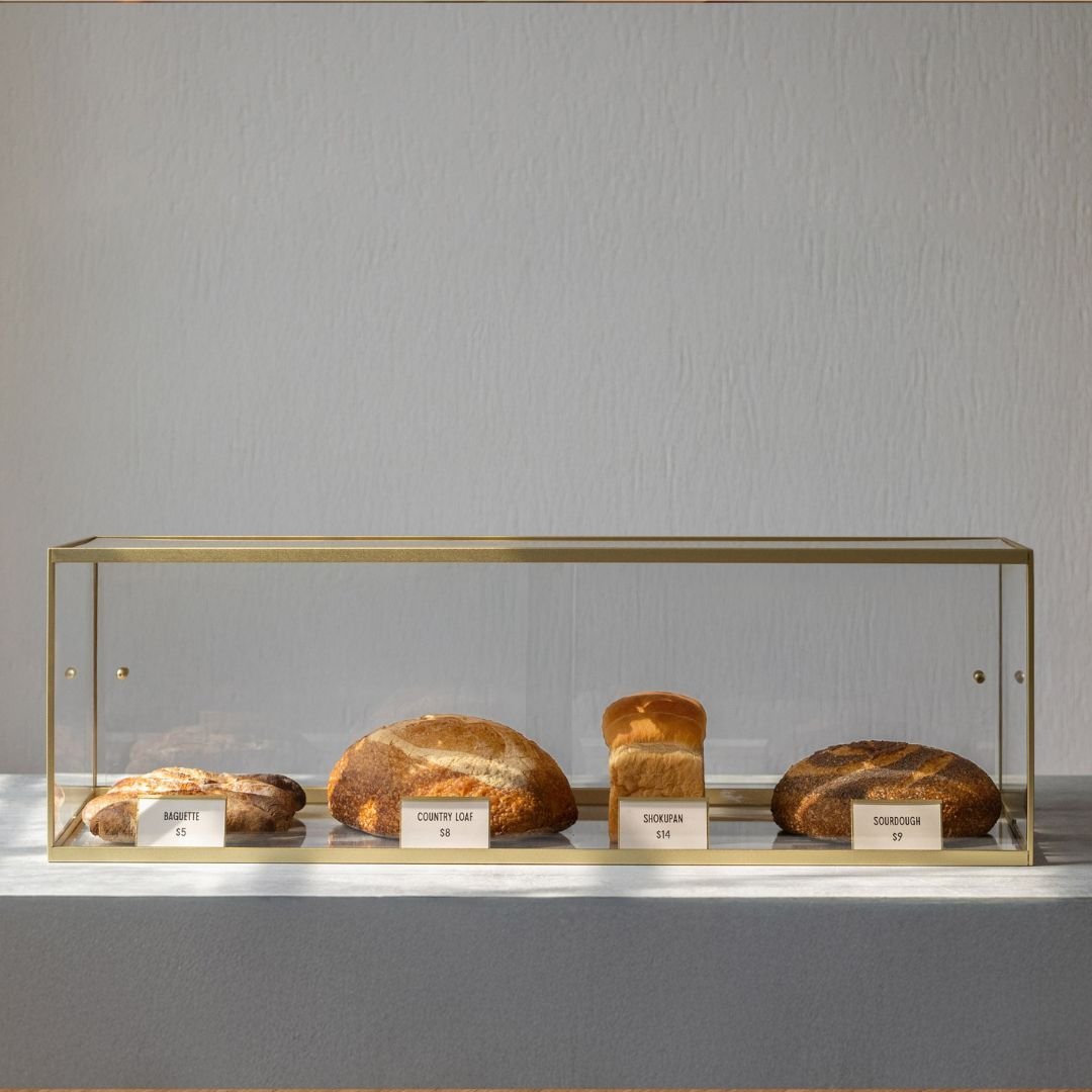
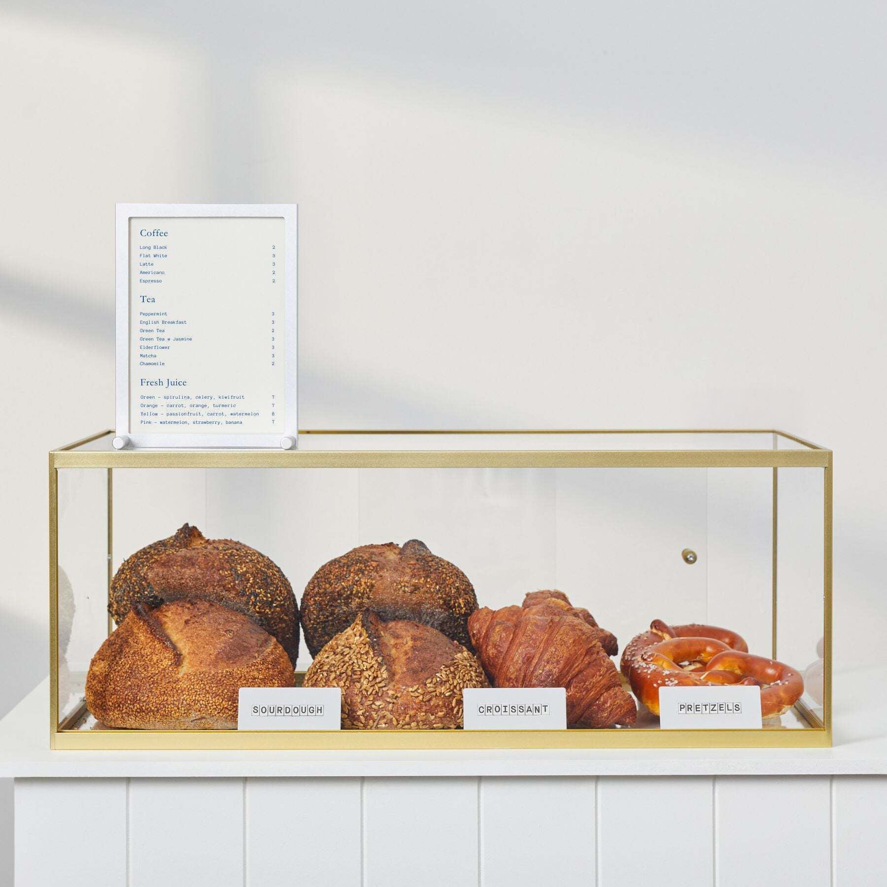
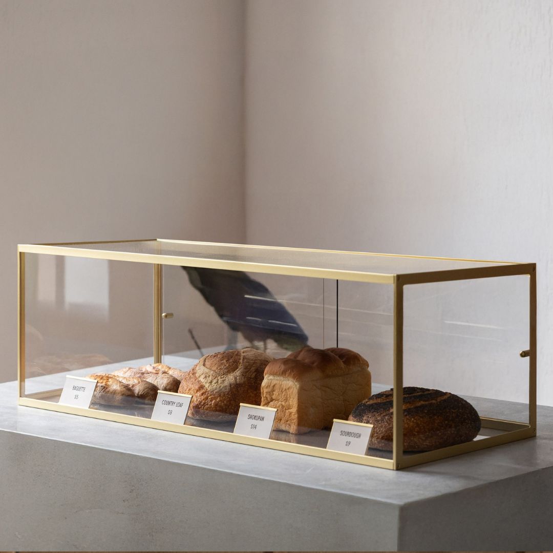
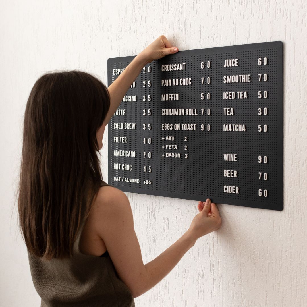
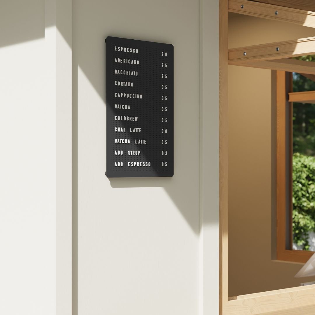
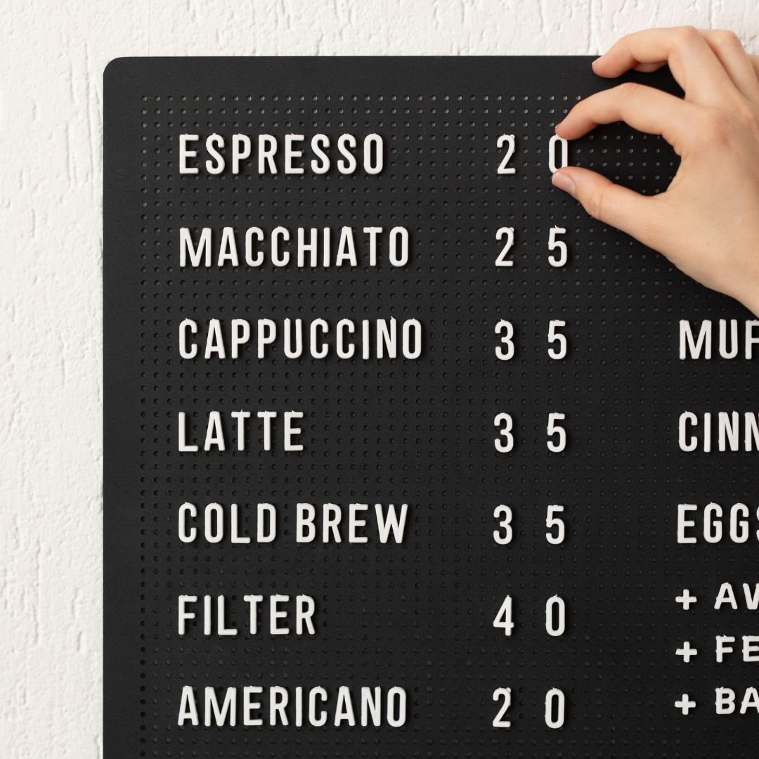
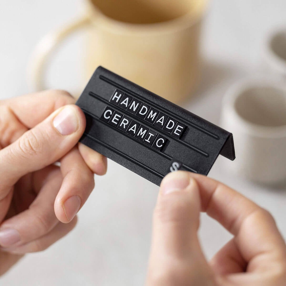
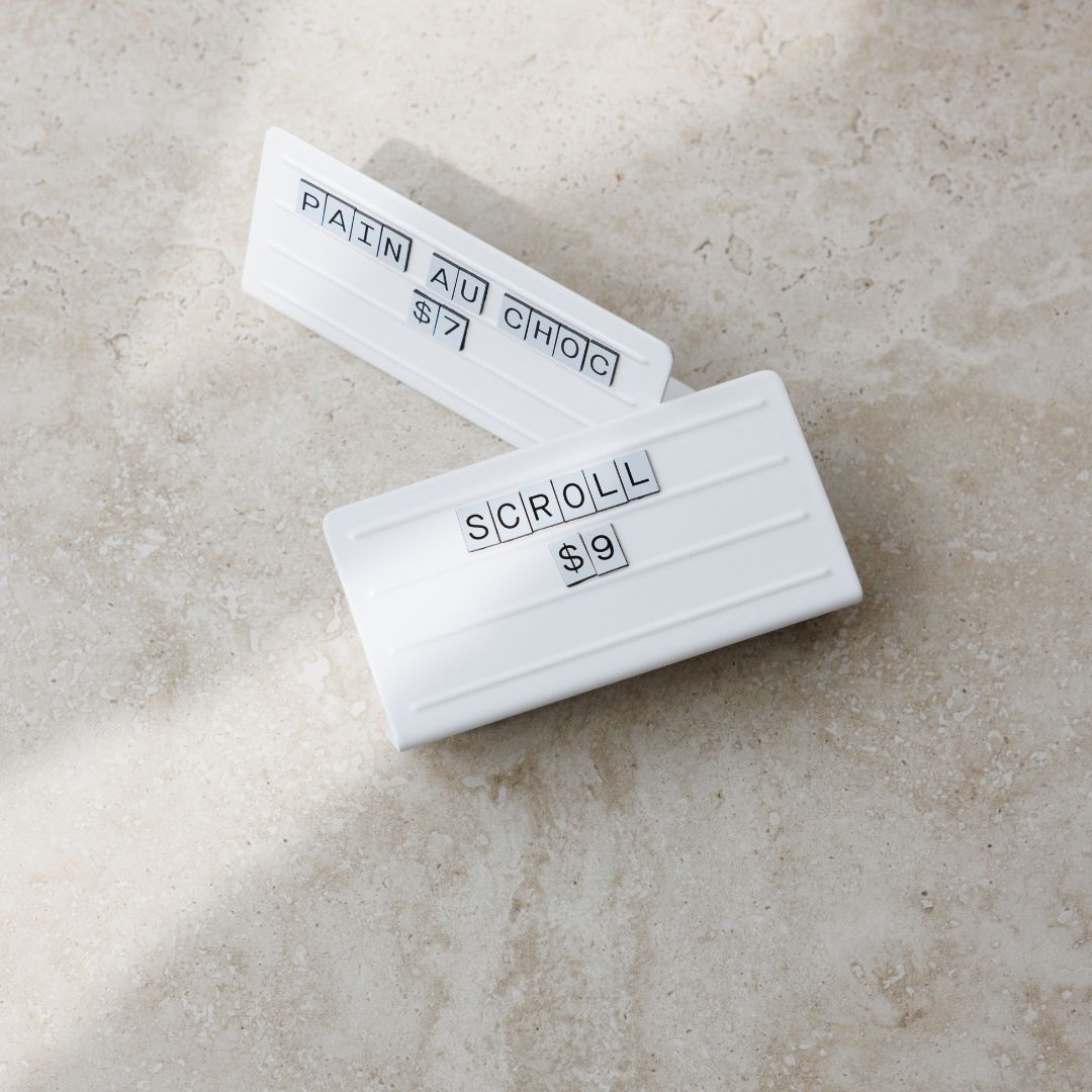
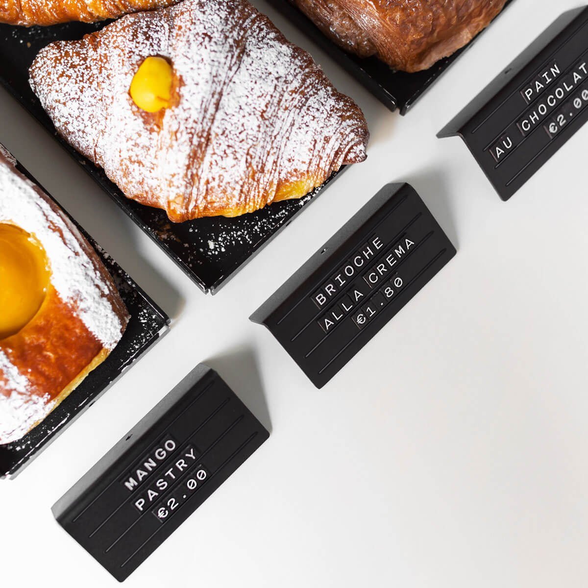
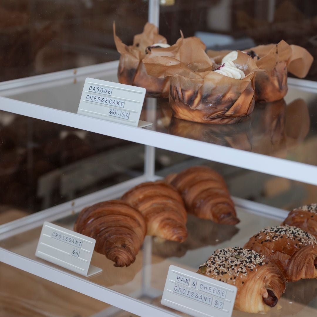
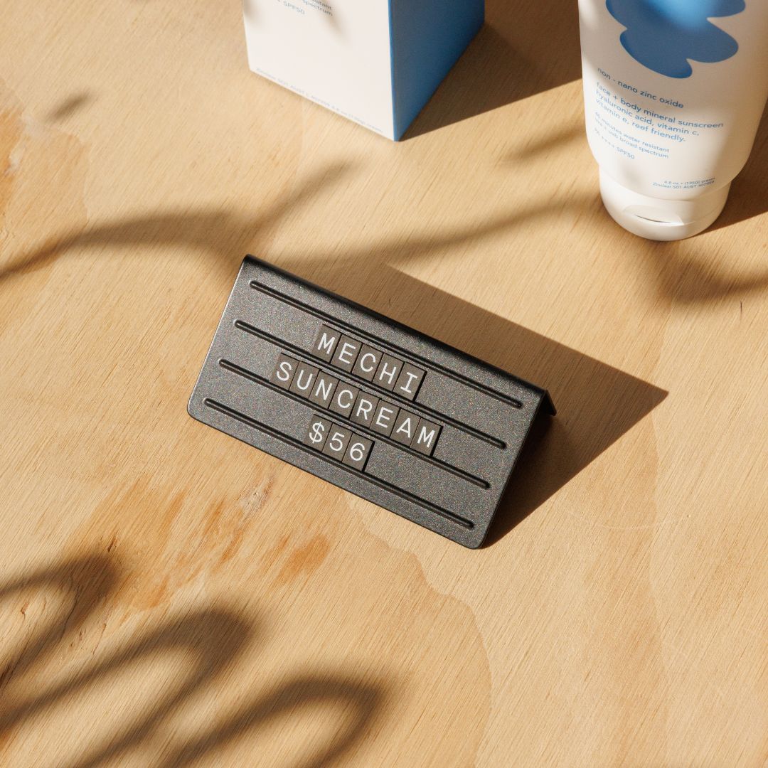
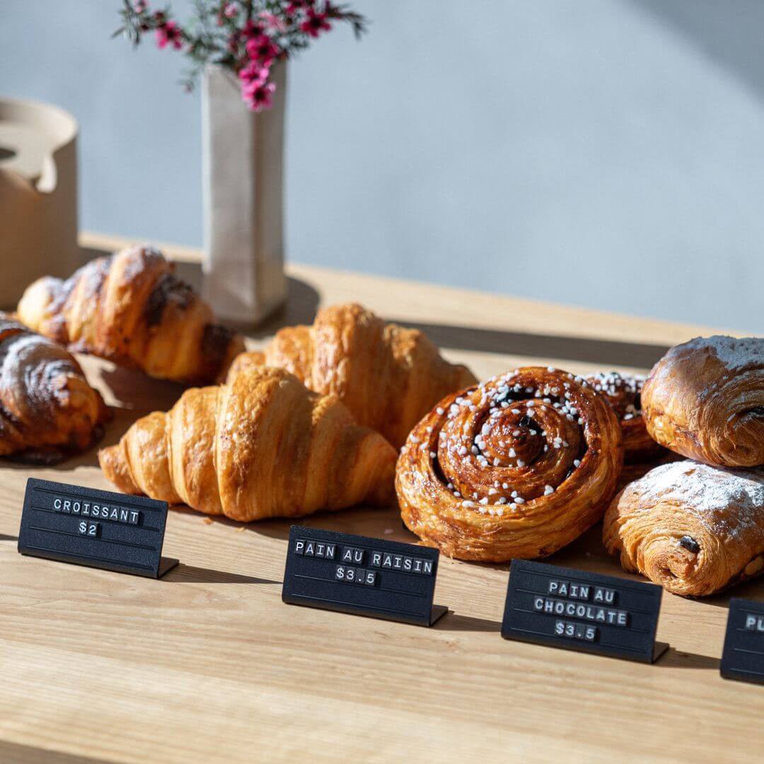
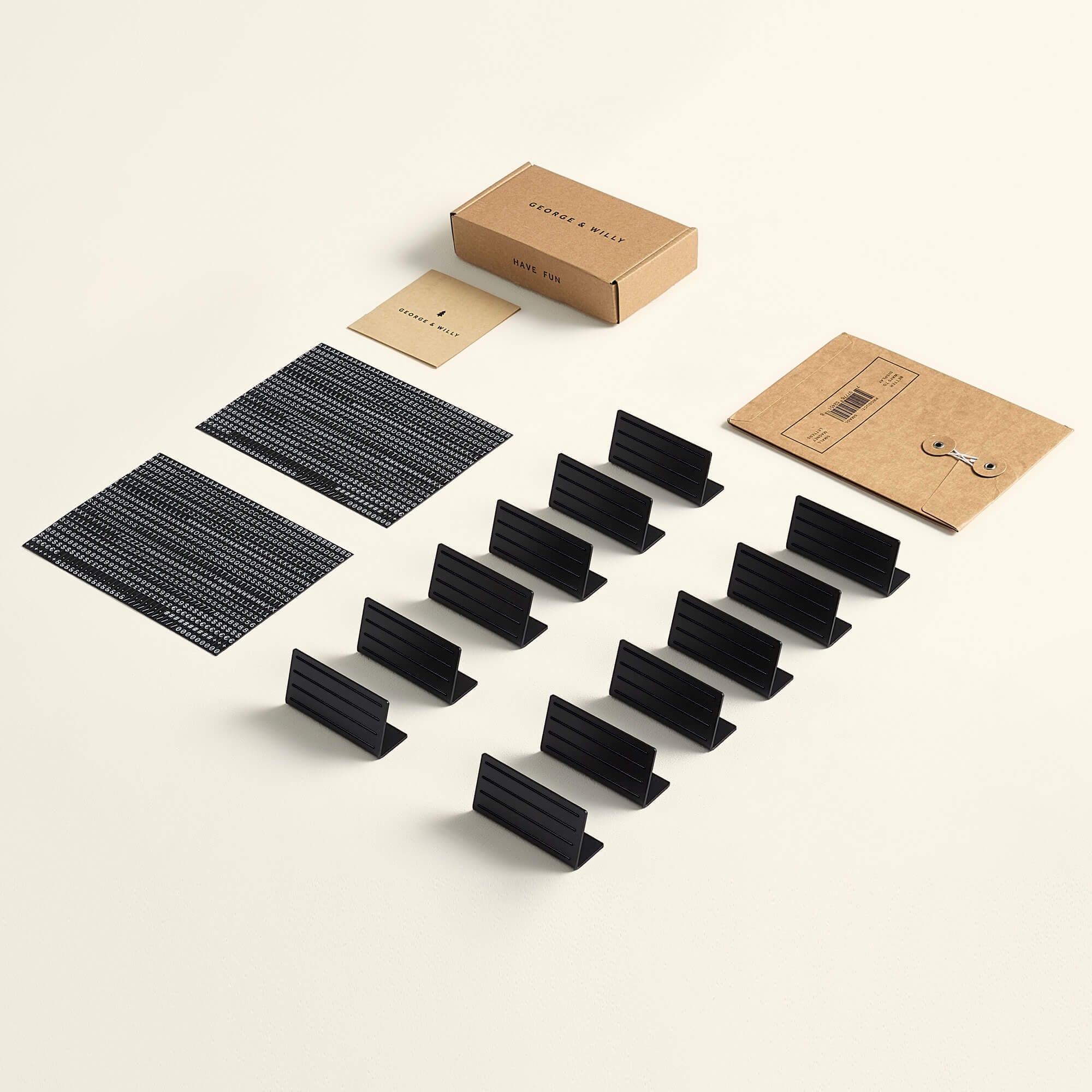
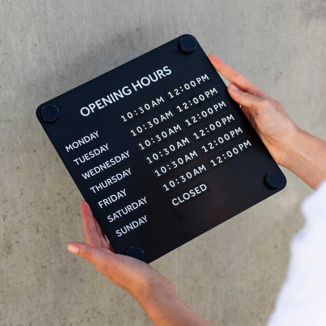
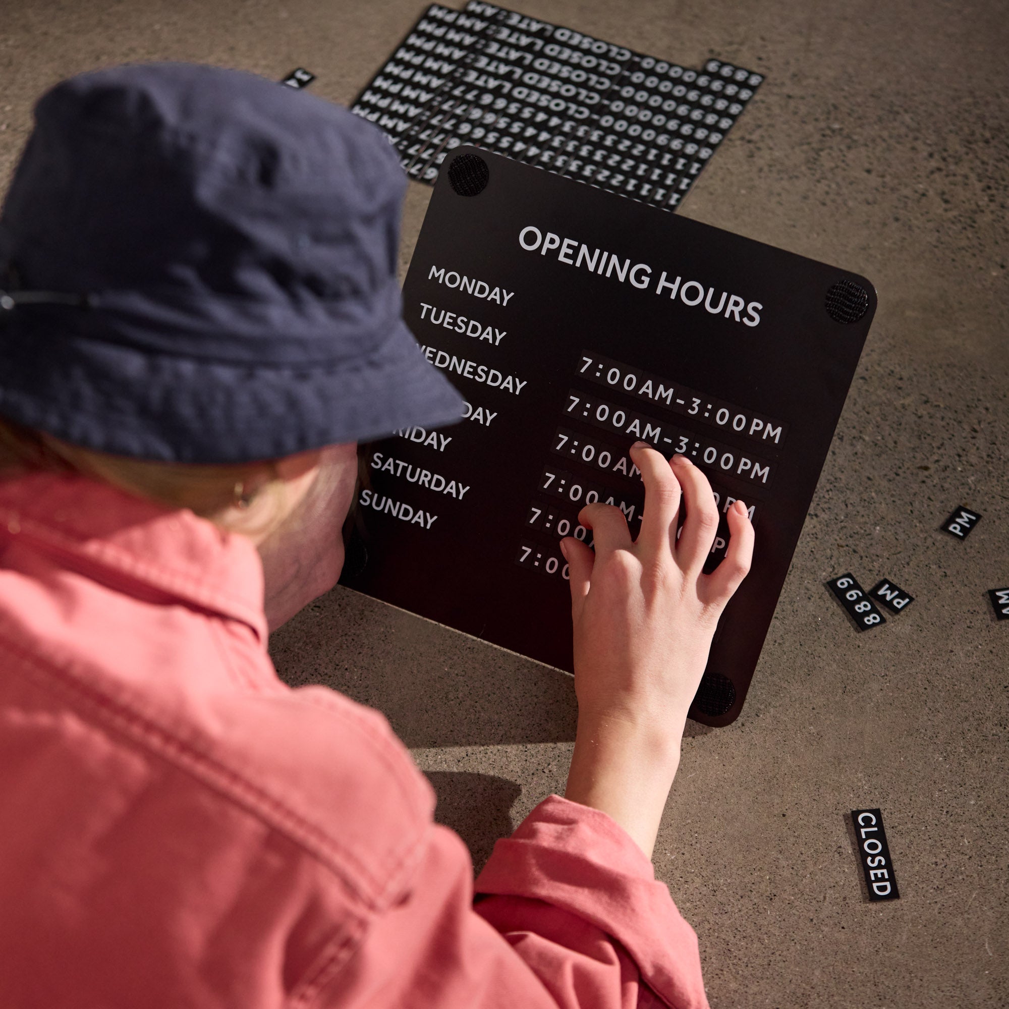
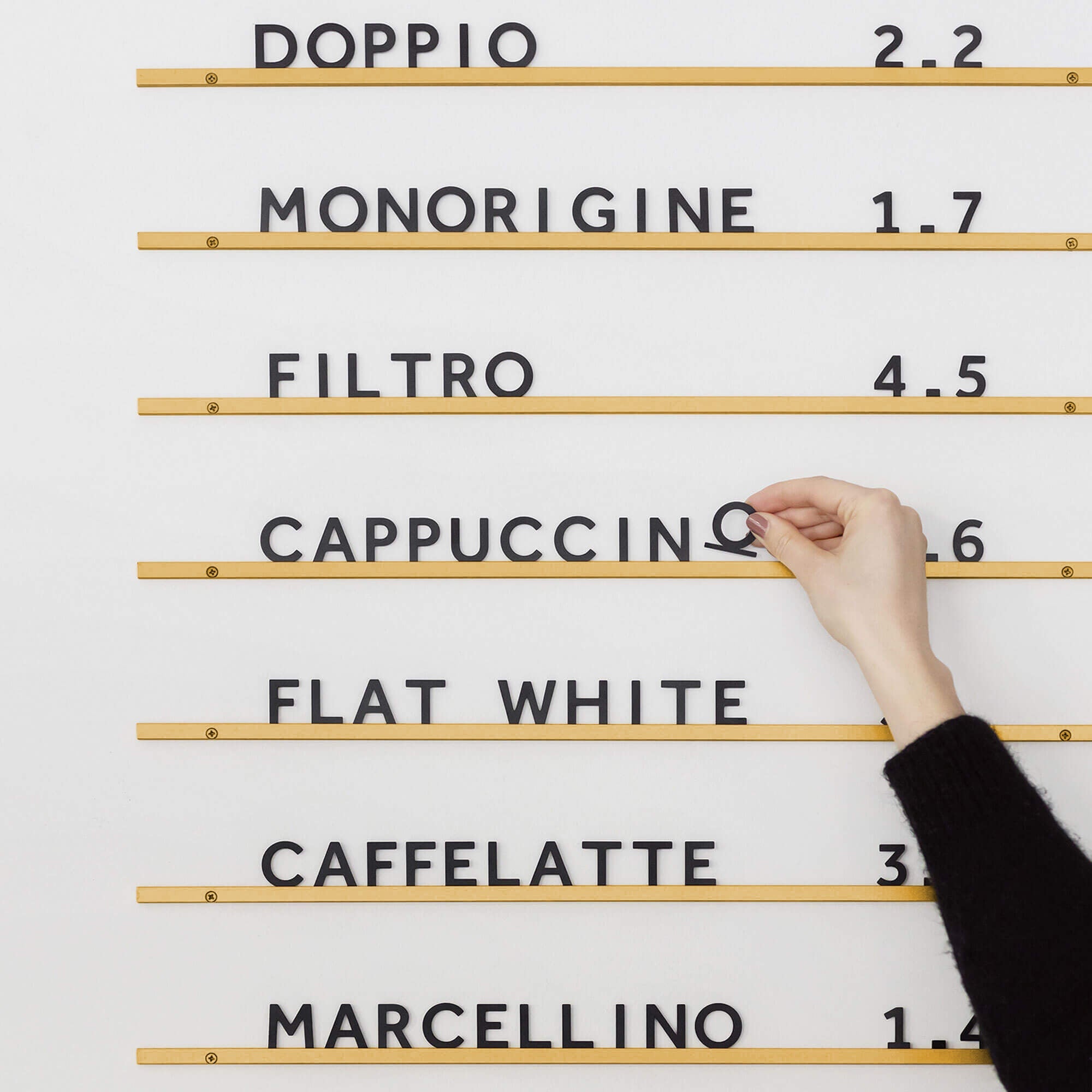
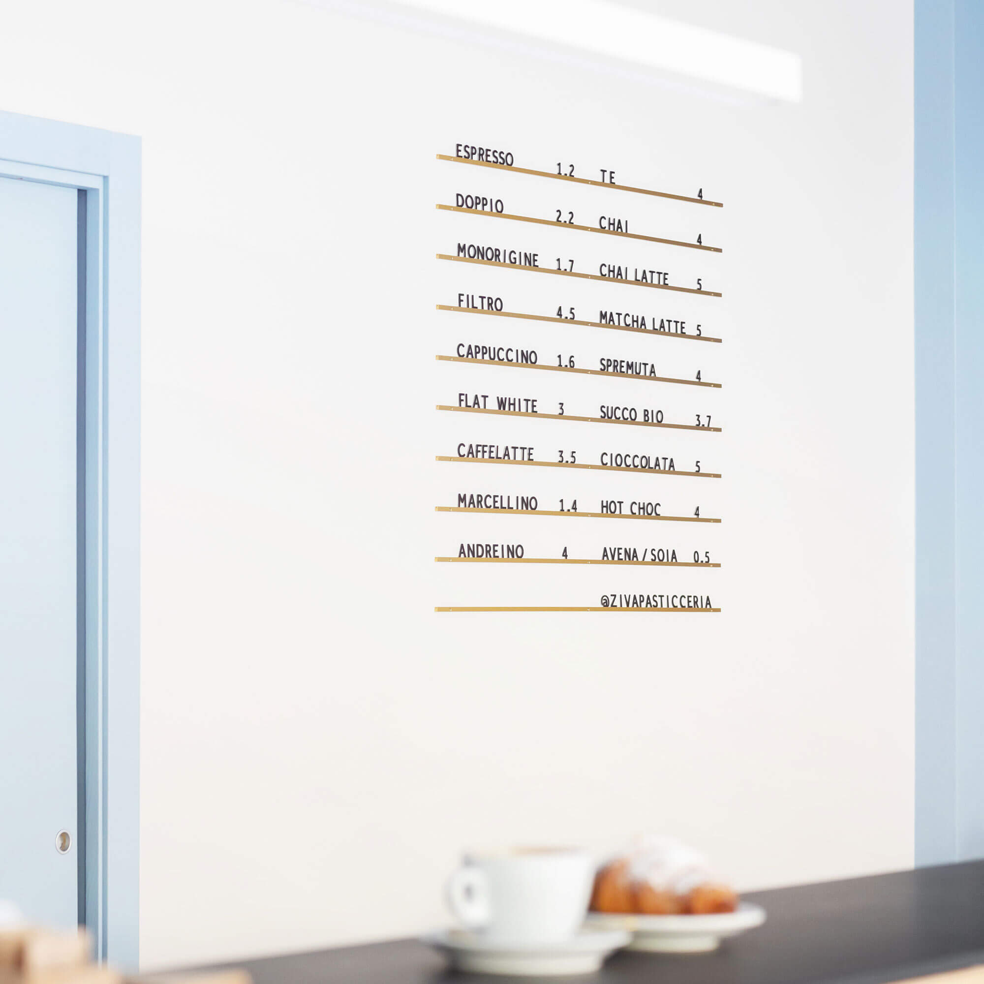
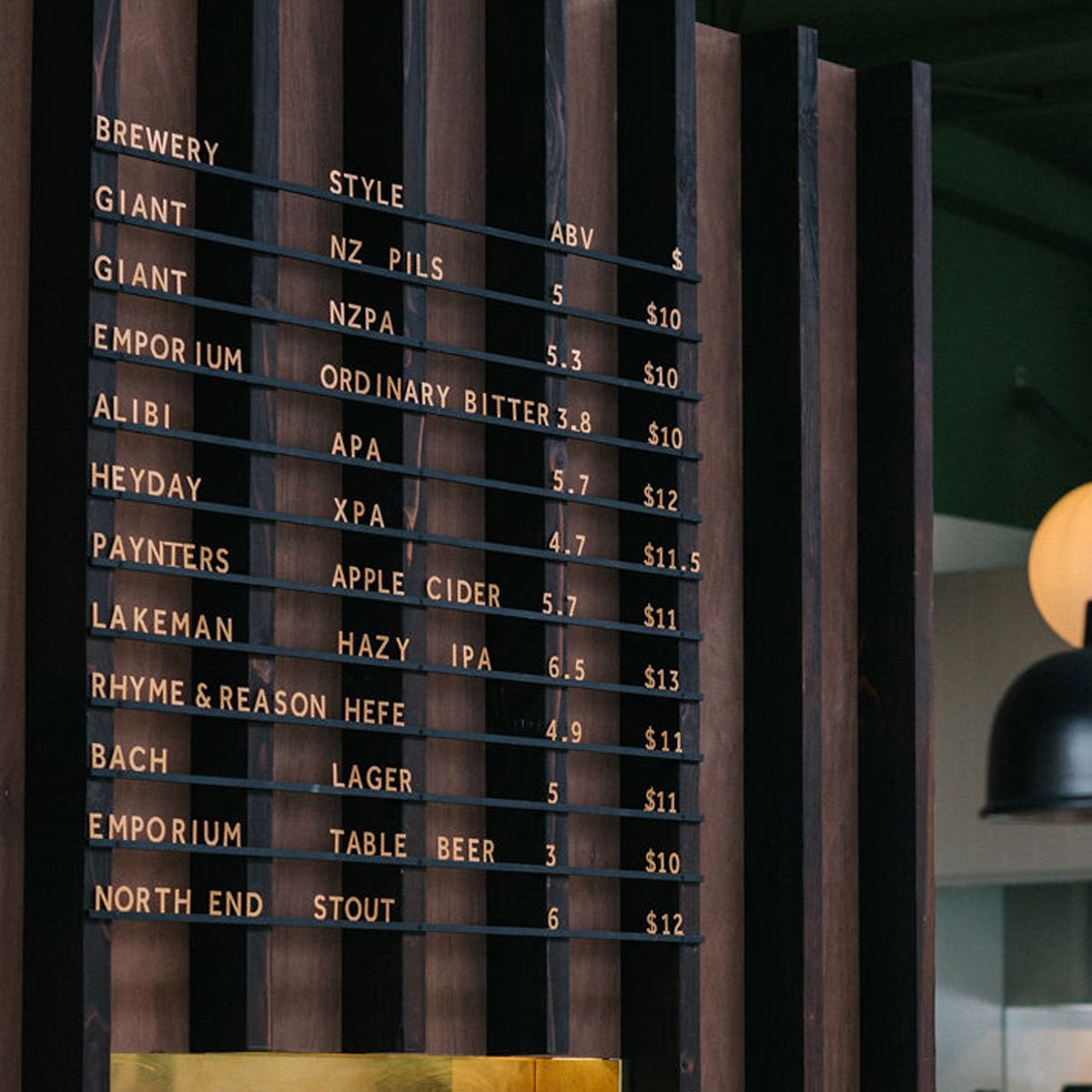
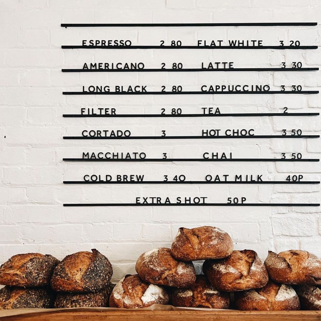
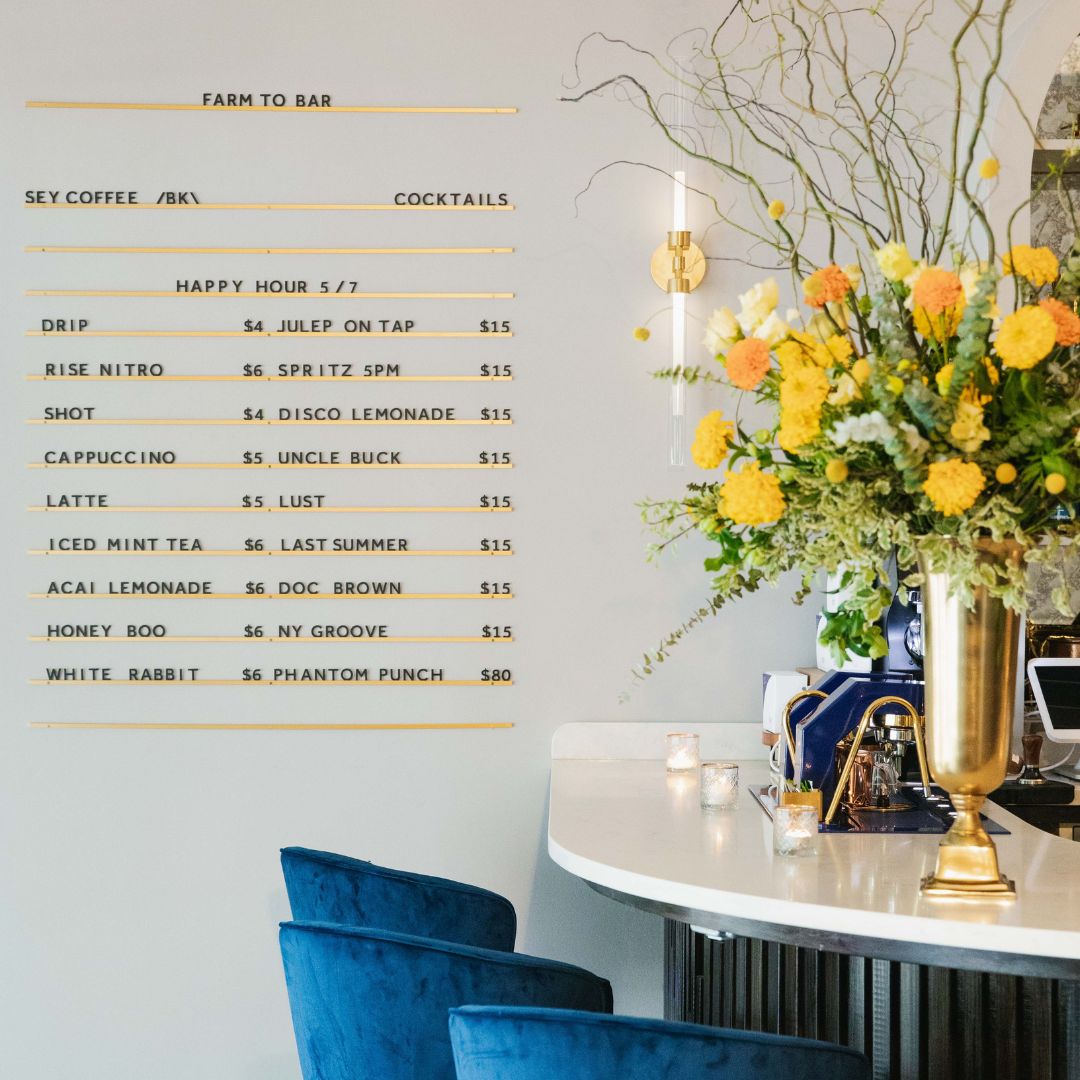
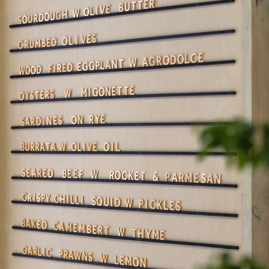
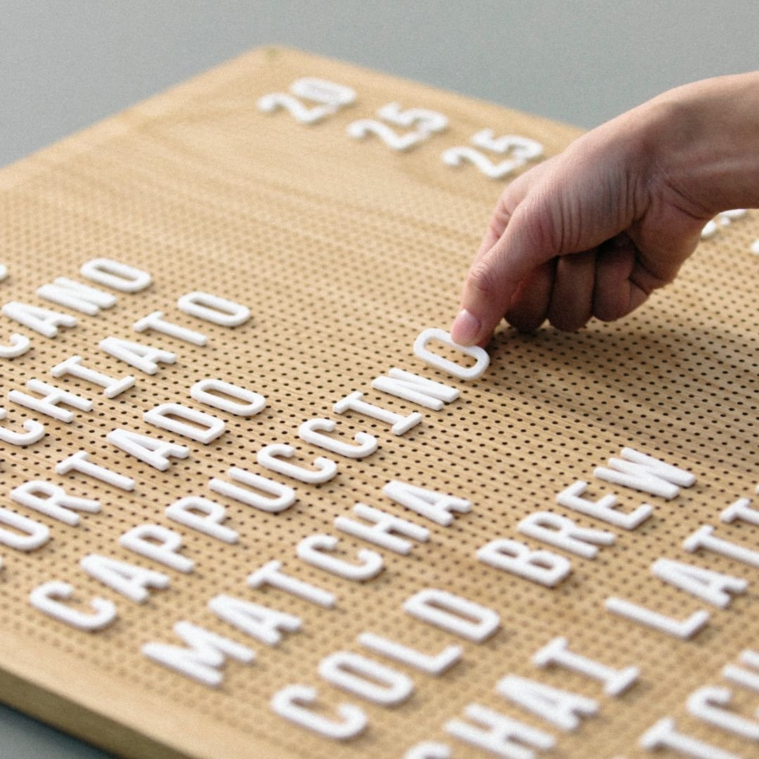
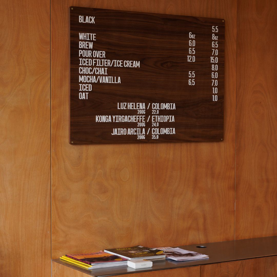
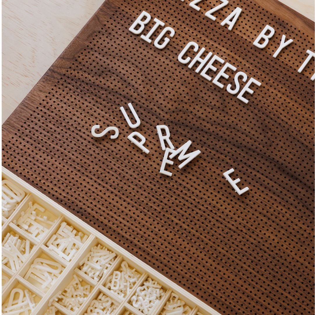
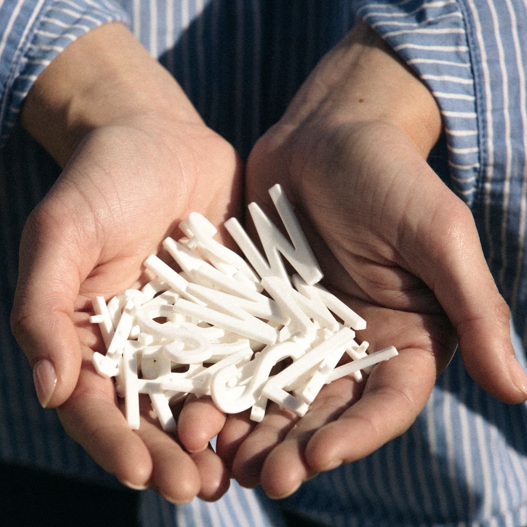
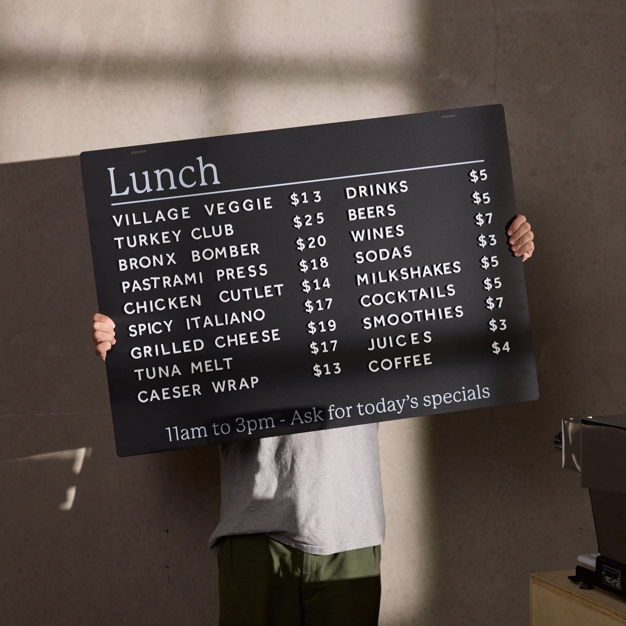
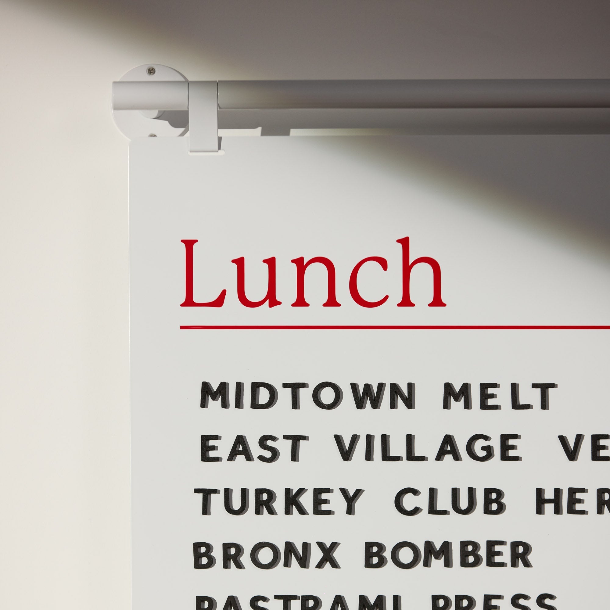
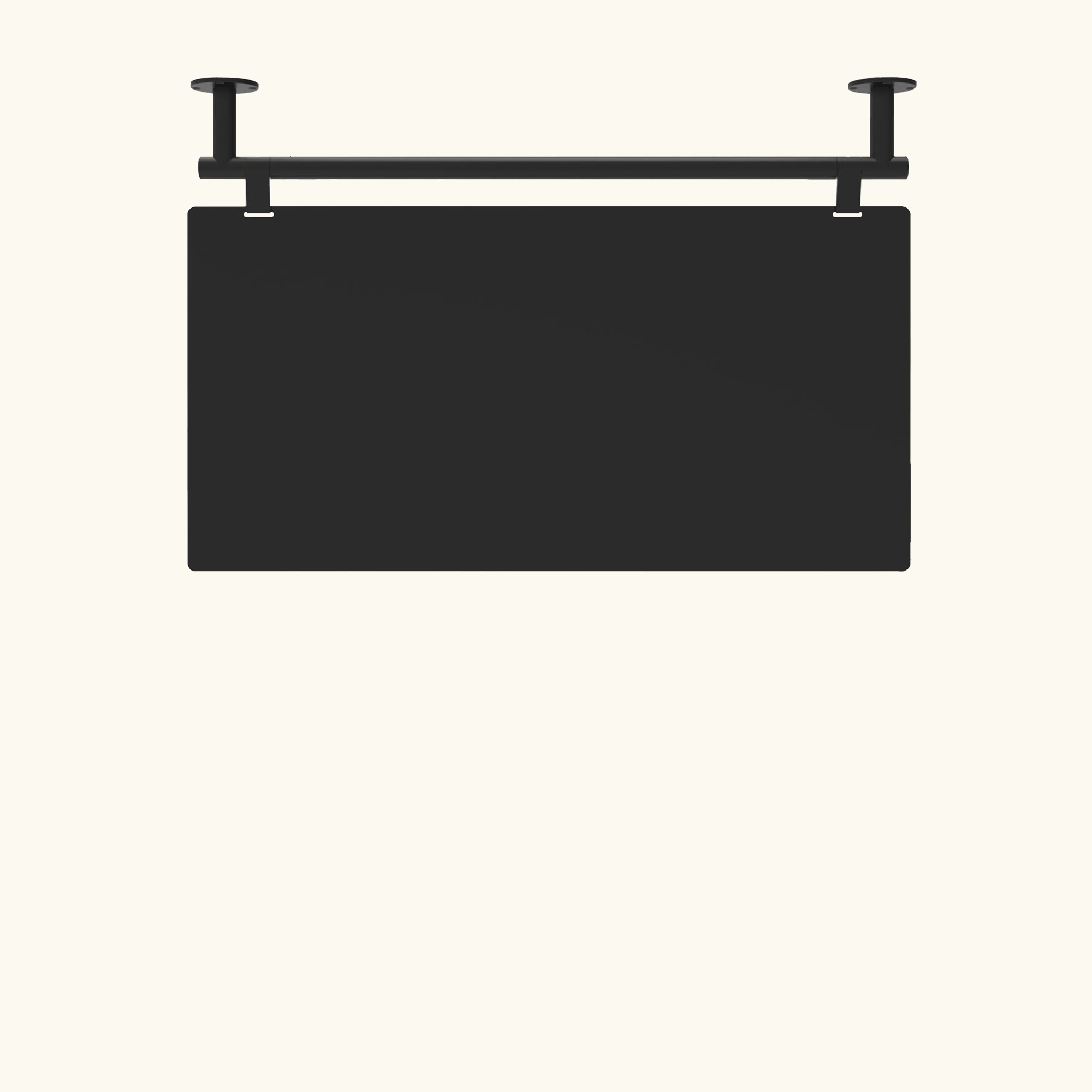
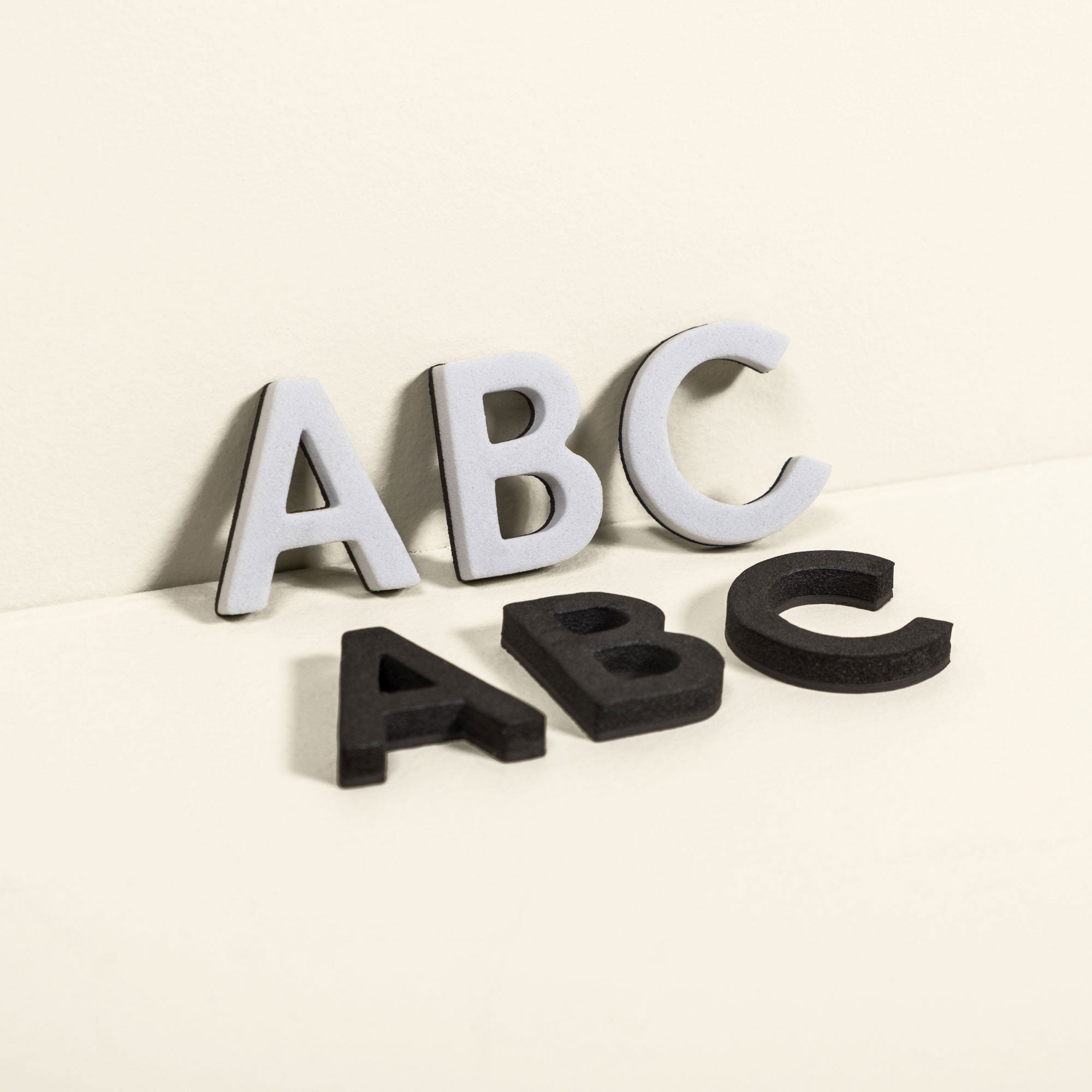
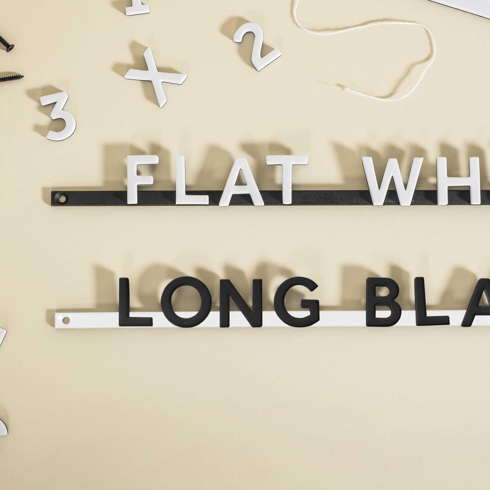
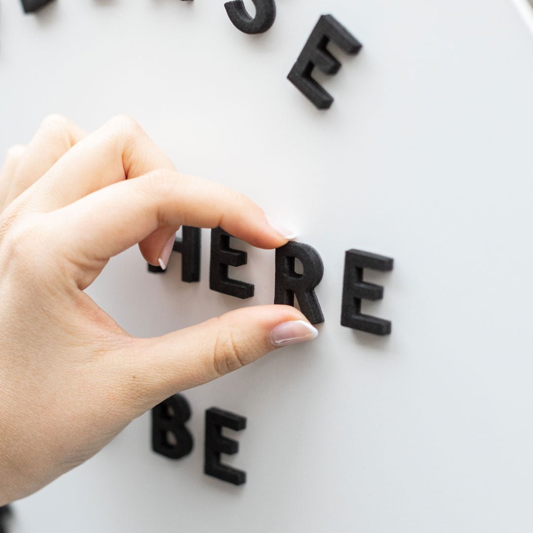
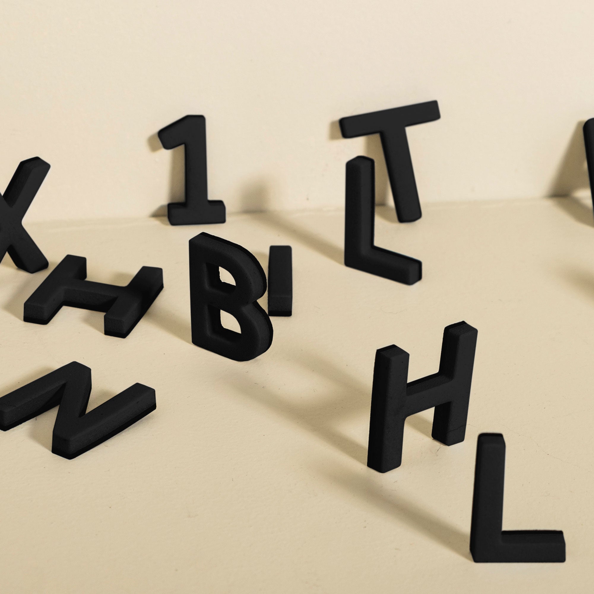
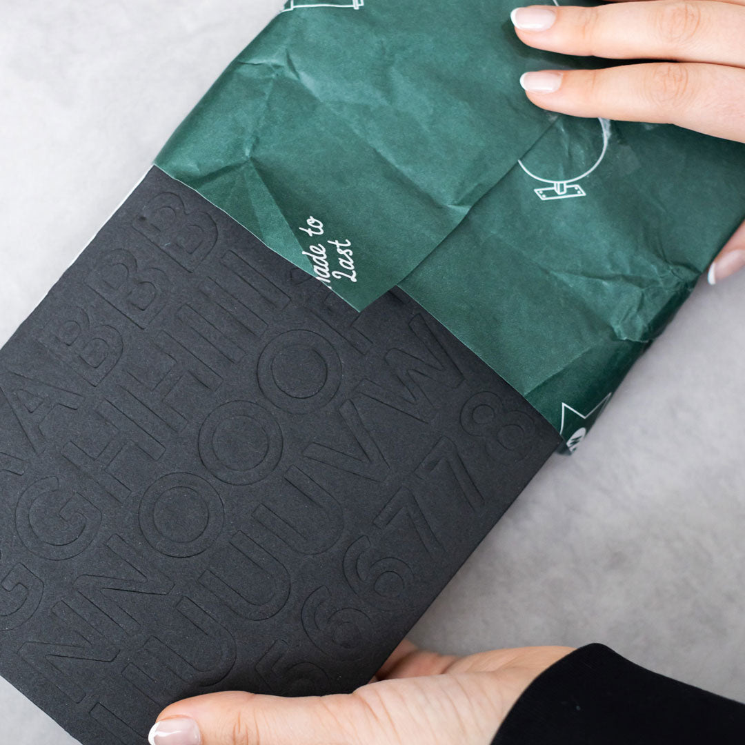
Magnetic letter rails ship with thousands of characters, for example the Magnetic Menu Board includes 10 rails with about 1,032 letters and symbols, so teams can reletter in minutes.
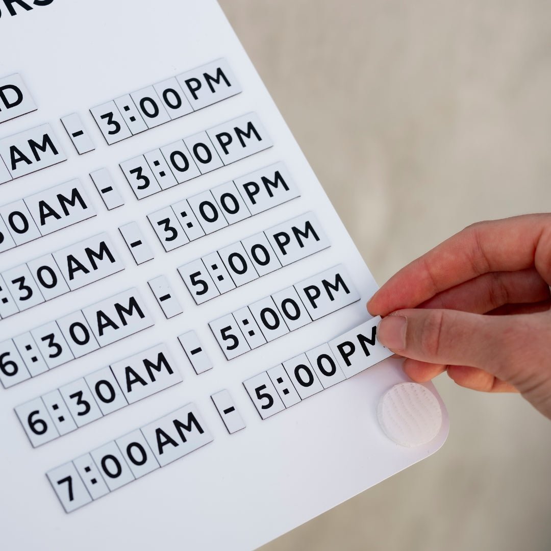
Reversible tiles double utility. A tile board with about 510 tiles that are black on one side and white on the other lets you switch contrast based on lighting.
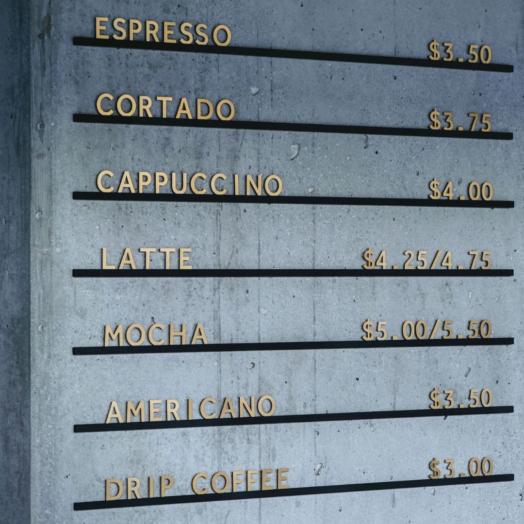
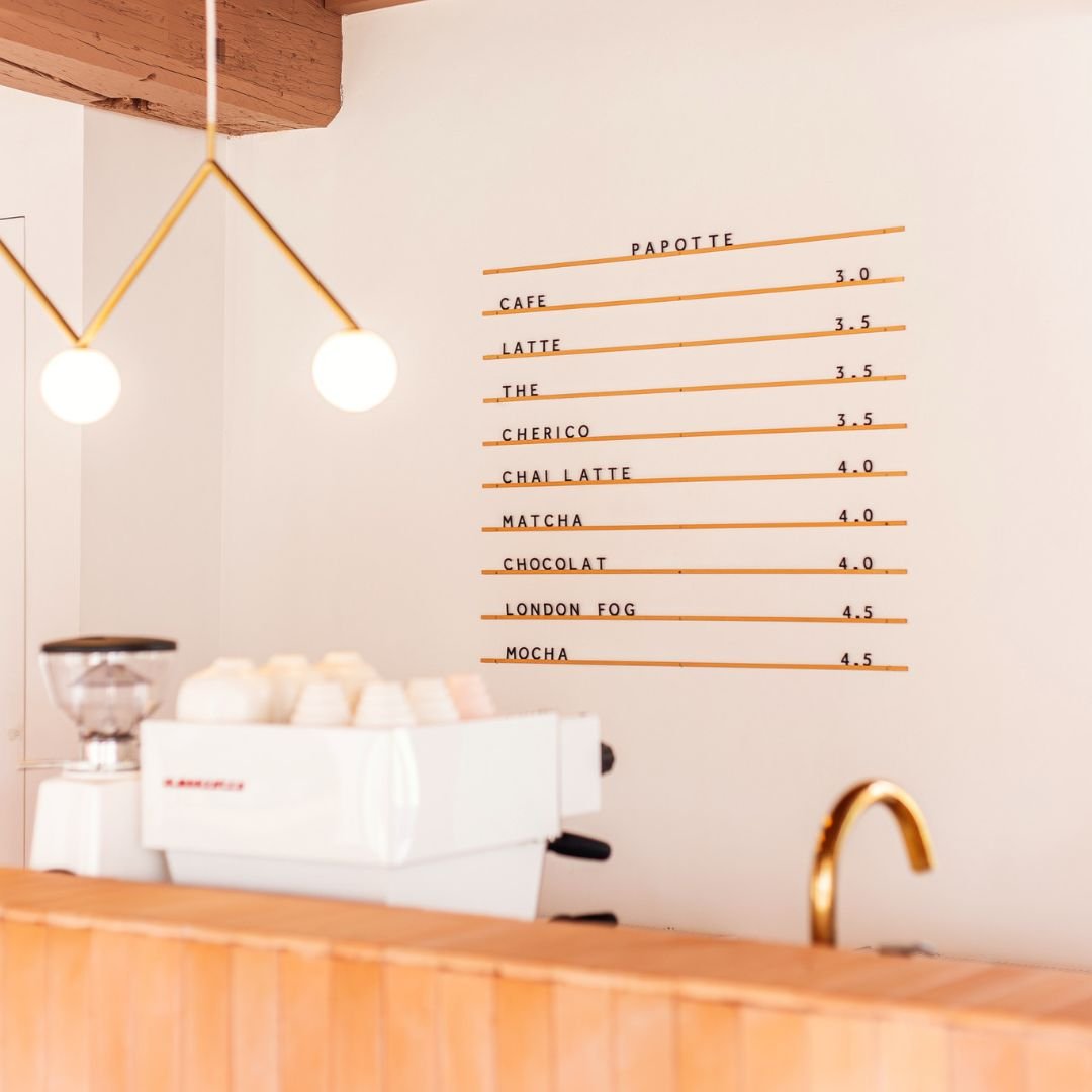
Consistent hardware creates a kit. Matching sidewalk signs, blade signs, and countertop pieces keep the brand cohesive across touchpoints.
Browse modern, change friendly storefront signs and menu systems at George and Willy.
Permits, codes, and approvals, what to know before you buy
Check rules before you drill. Municipal codes often regulate size, projection from the facade, lighting type, and placement of storefront signs.
Most cities require a sign permit for exterior fixtures and illuminated faces. Historic districts may ask for specific materials or mounting methods.
Landlords often have their own criteria on size, color, and drilling locations. Get written approval to avoid delays.
Some carriers will not deliver to PO boxes, and many brands ship DDP in most markets which means duties are included at checkout. Factor delivery timing into your opening schedule.
If you need fast timelines, it helps that many ready made signs ship quickly. Orders from George and Willy typically process in 1 to 2 working days, with express delivery targets of 1 to 5 working days and economy at 3 to 7 working days, depending on region. US orders usually ship from Arizona or South Carolina via UPS, Canada via DHL, the EU and UK from the Netherlands, Australia via AusPost, Direct Freight, or DHL, and New Zealand via NZ Post or DHL. Most markets ship DDP with Norway as DDU.
Installation, maintenance, and longevity
Well installed storefront signs last longer and look better.
Installation basics
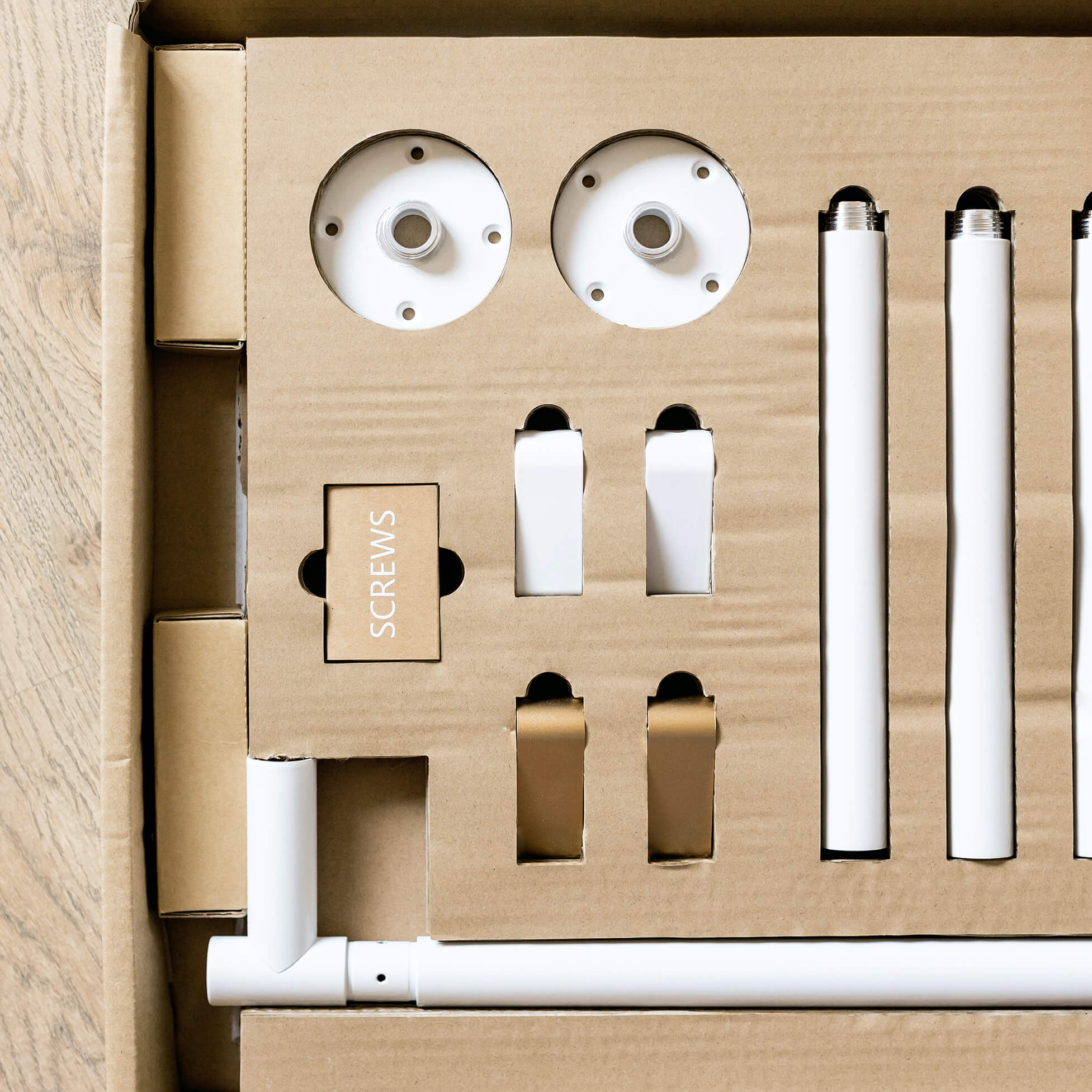
Use the hardware provided with your sign and follow the install guide for your wall type, brick, timber, or stud.
For projecting hardware like blade signs or swing signs, confirm anchor capacity and use appropriate fixings for the substrate.
Avoid electrical work unless licensed. Hire a professional for illuminated signs.
Care tips that preserve finish
Choose powder coated aluminum or steel for outdoor use. These finishes resist rust in the rain and sea air, especially important for coastal sites.
Clean with mild soap and water. Skip abrasive pads that can scuff powder coat.
Bring movable boards inside nightly to reduce wear and extend life.
Real world product notes
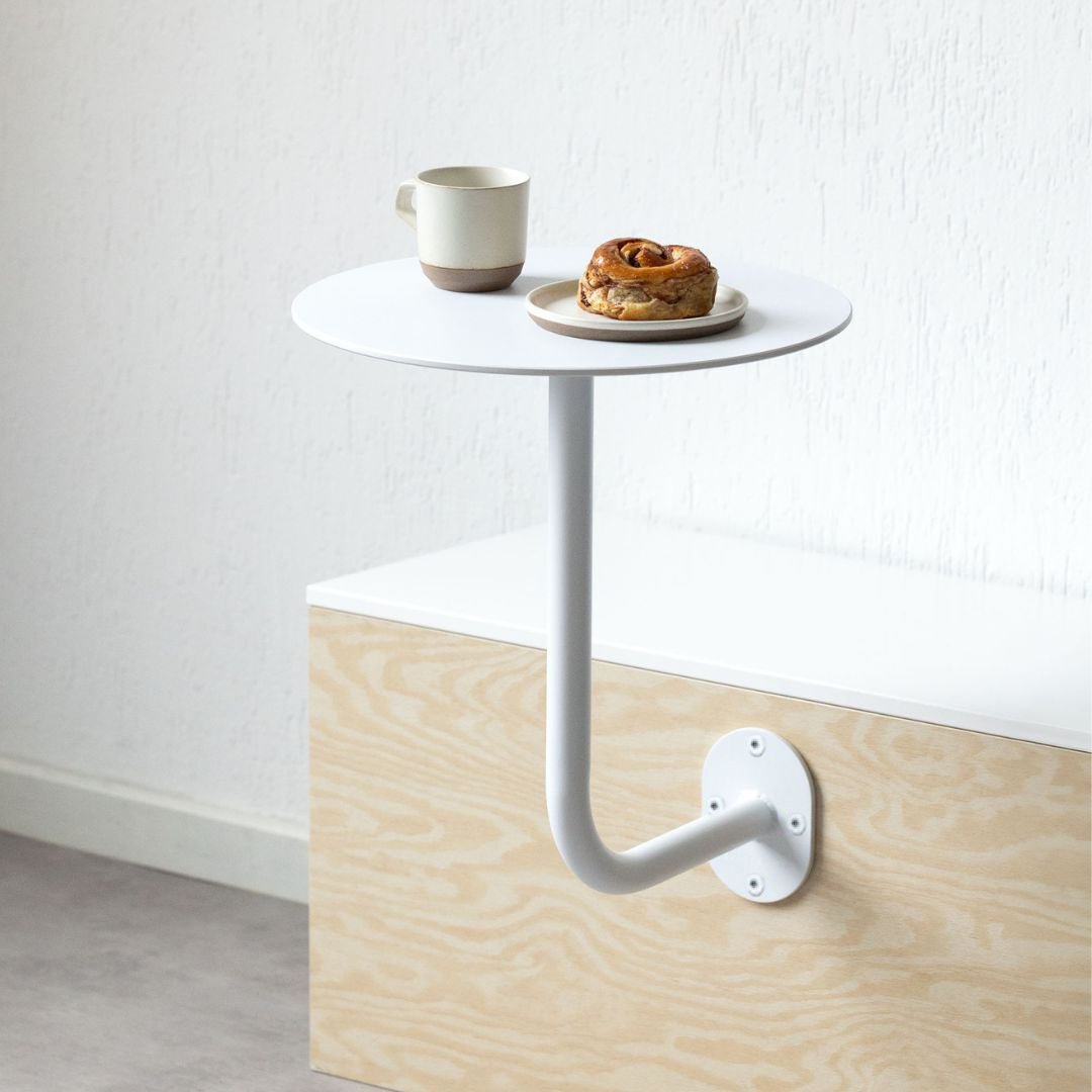
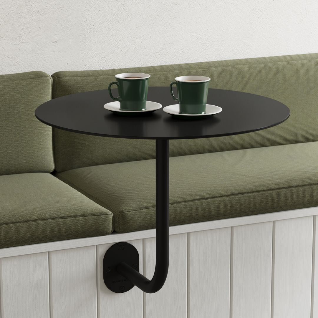
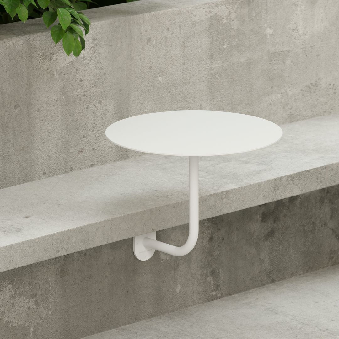
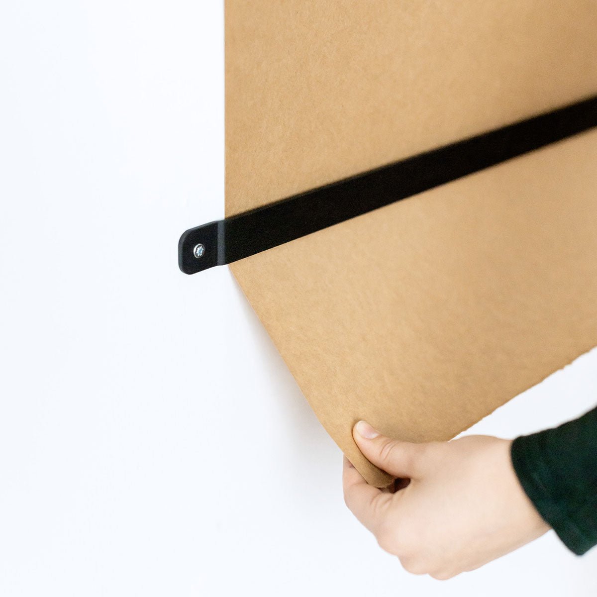
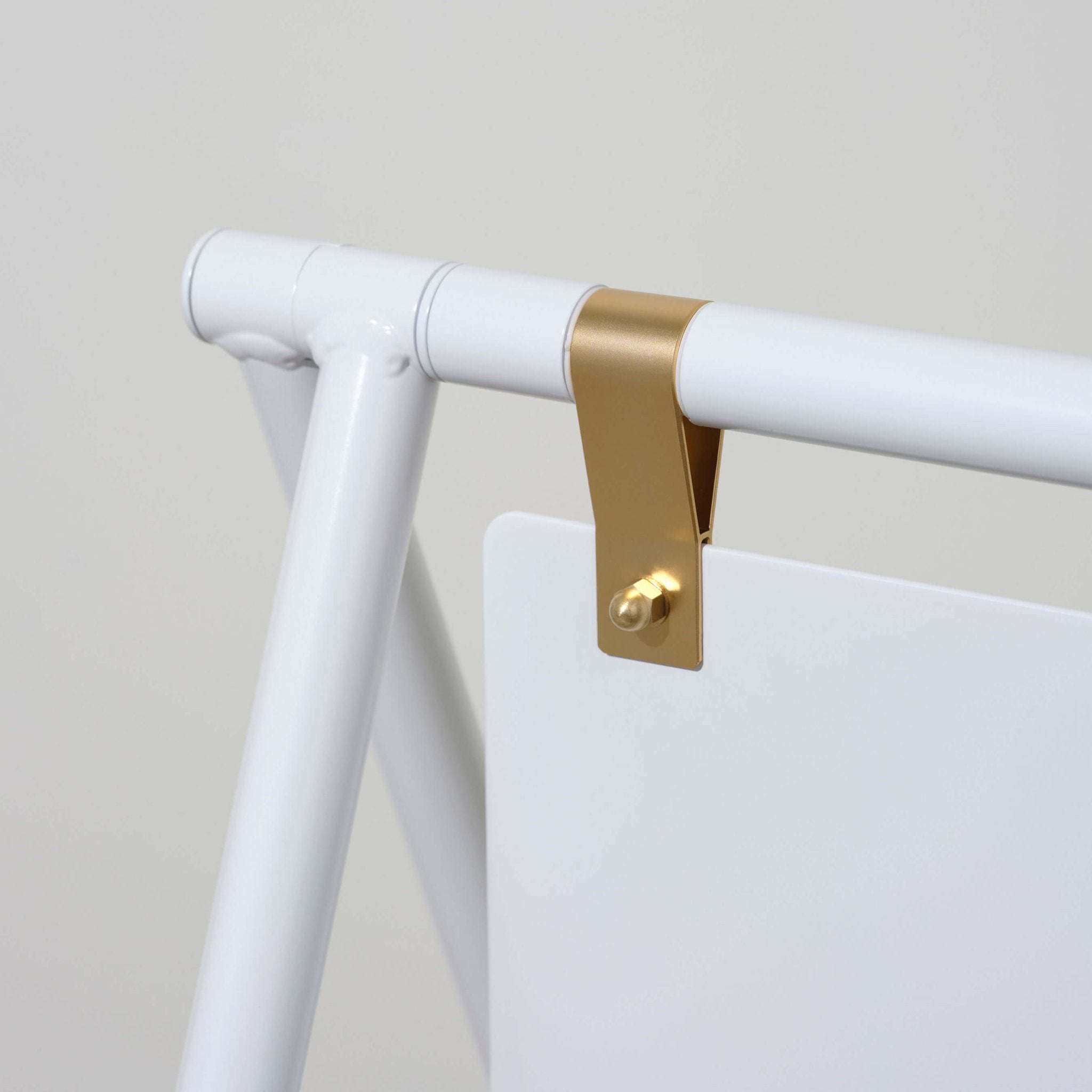
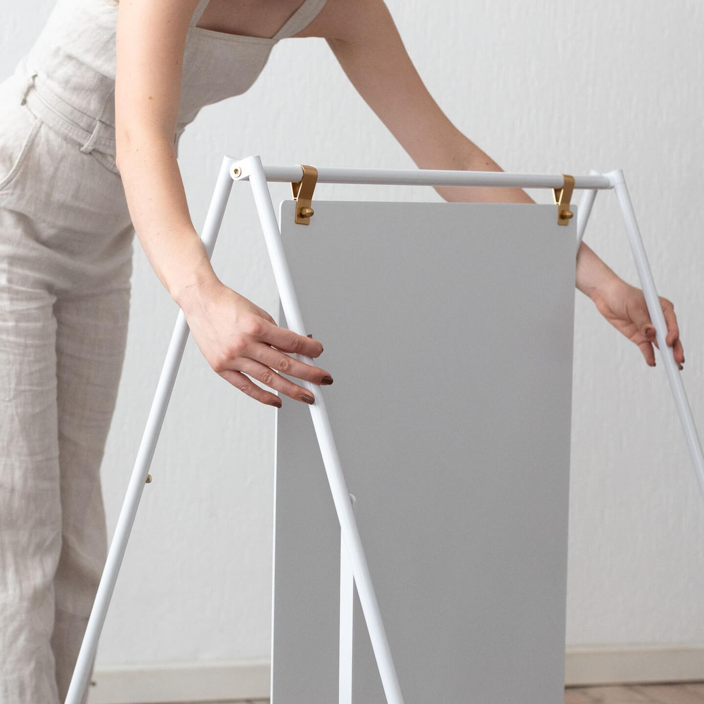
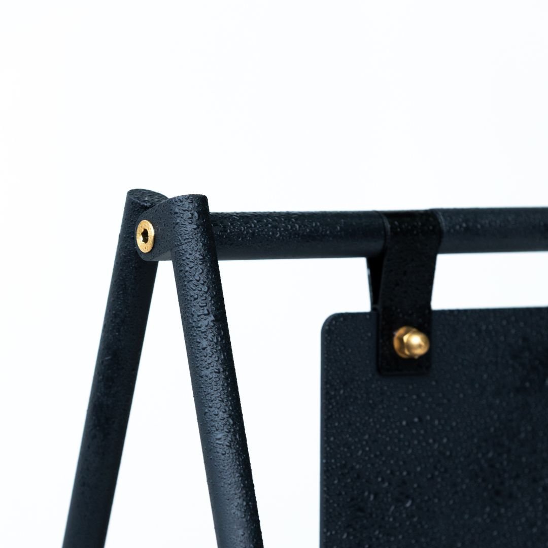
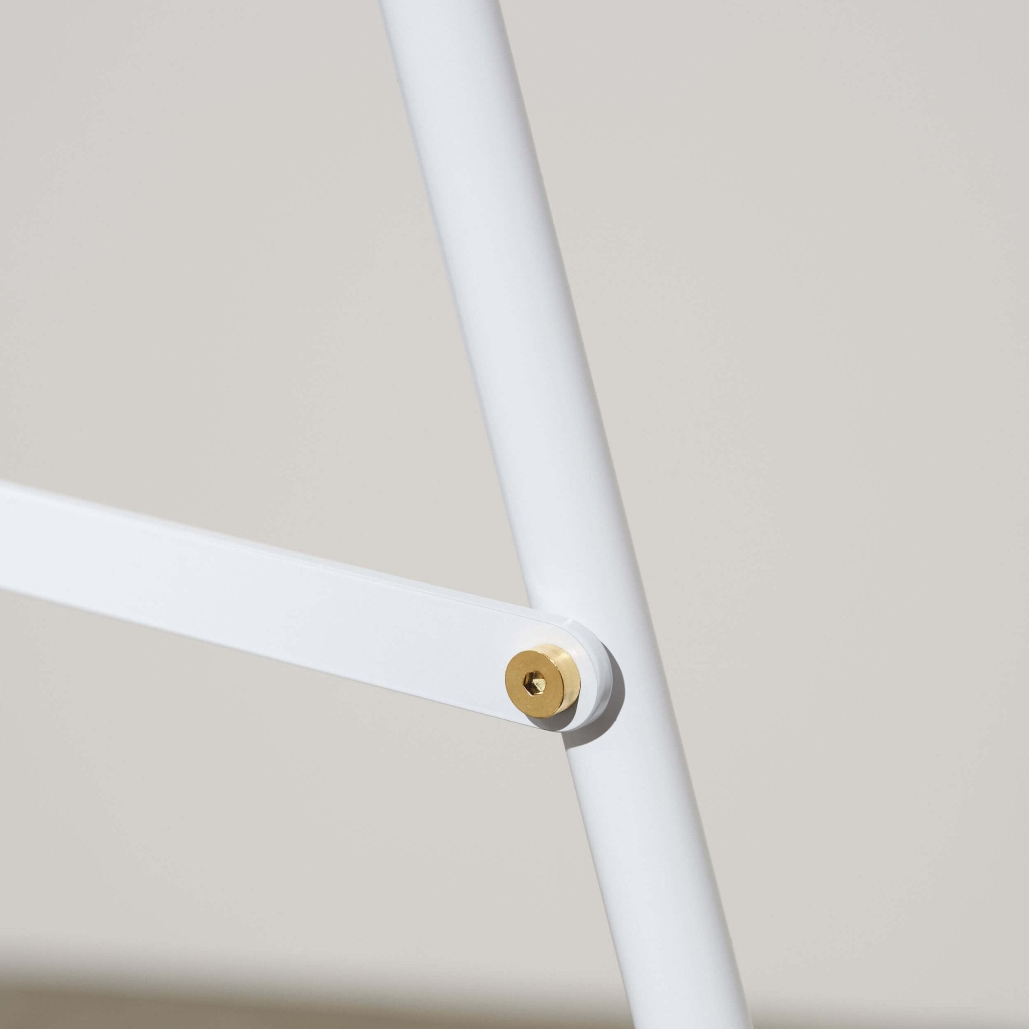
A frame signs from George and Willy include both brass and color matched straps and fold for storage, a small detail that speeds close down.
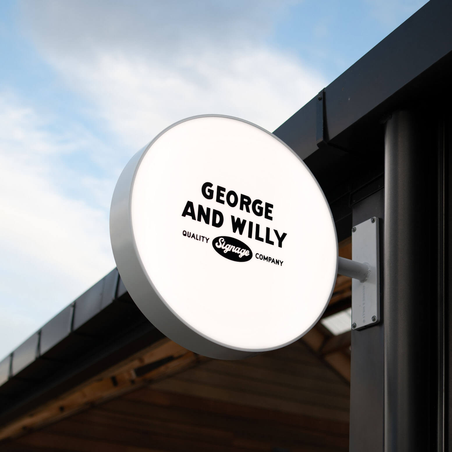
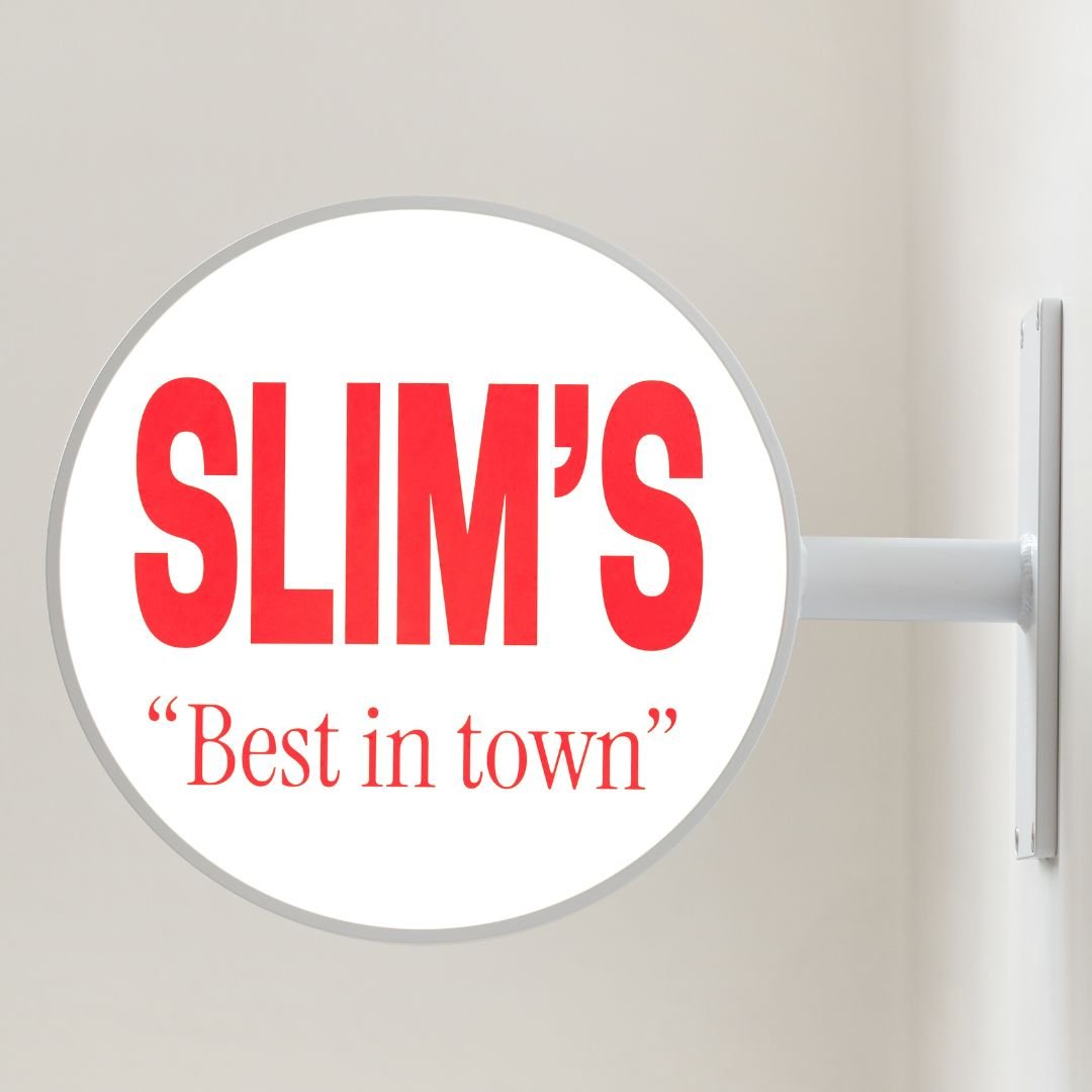
Round or rectangle light box signs provide even lighting, which helps legibility at dusk and in winter.
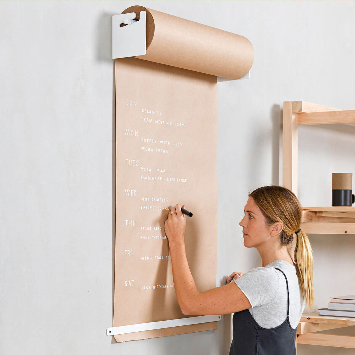
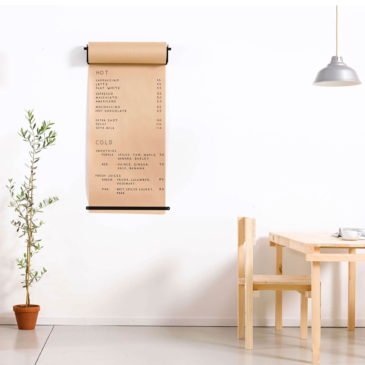
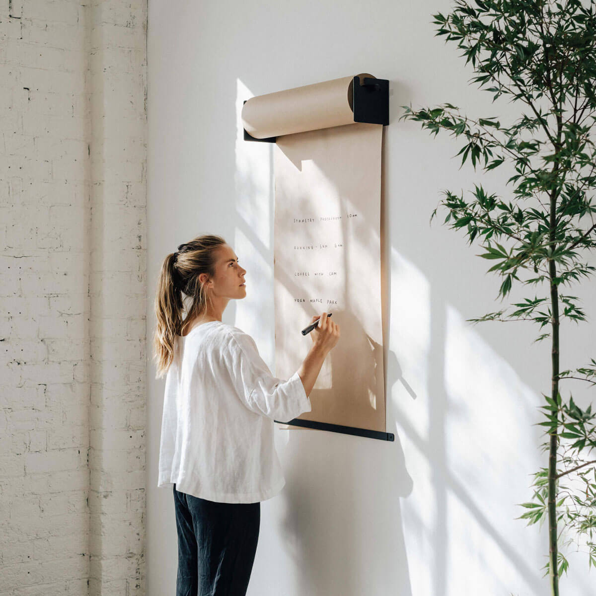
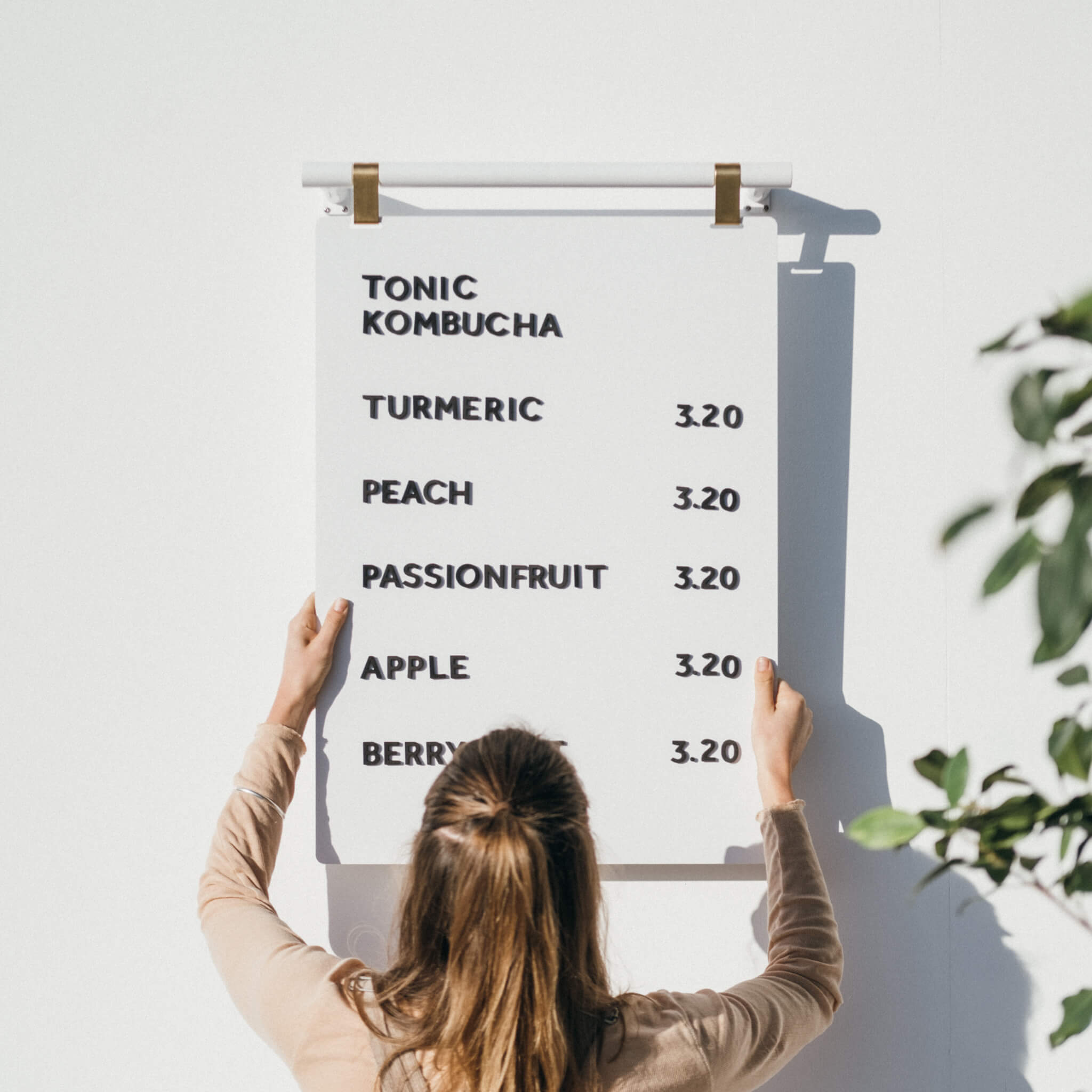
Studio Roller paper holders in 18, 24, or 36 inch widths can mount near the entrance for rotating promos or wayfinding, and the bracket accepts universal rolls up to about 8.7 inches in diameter.
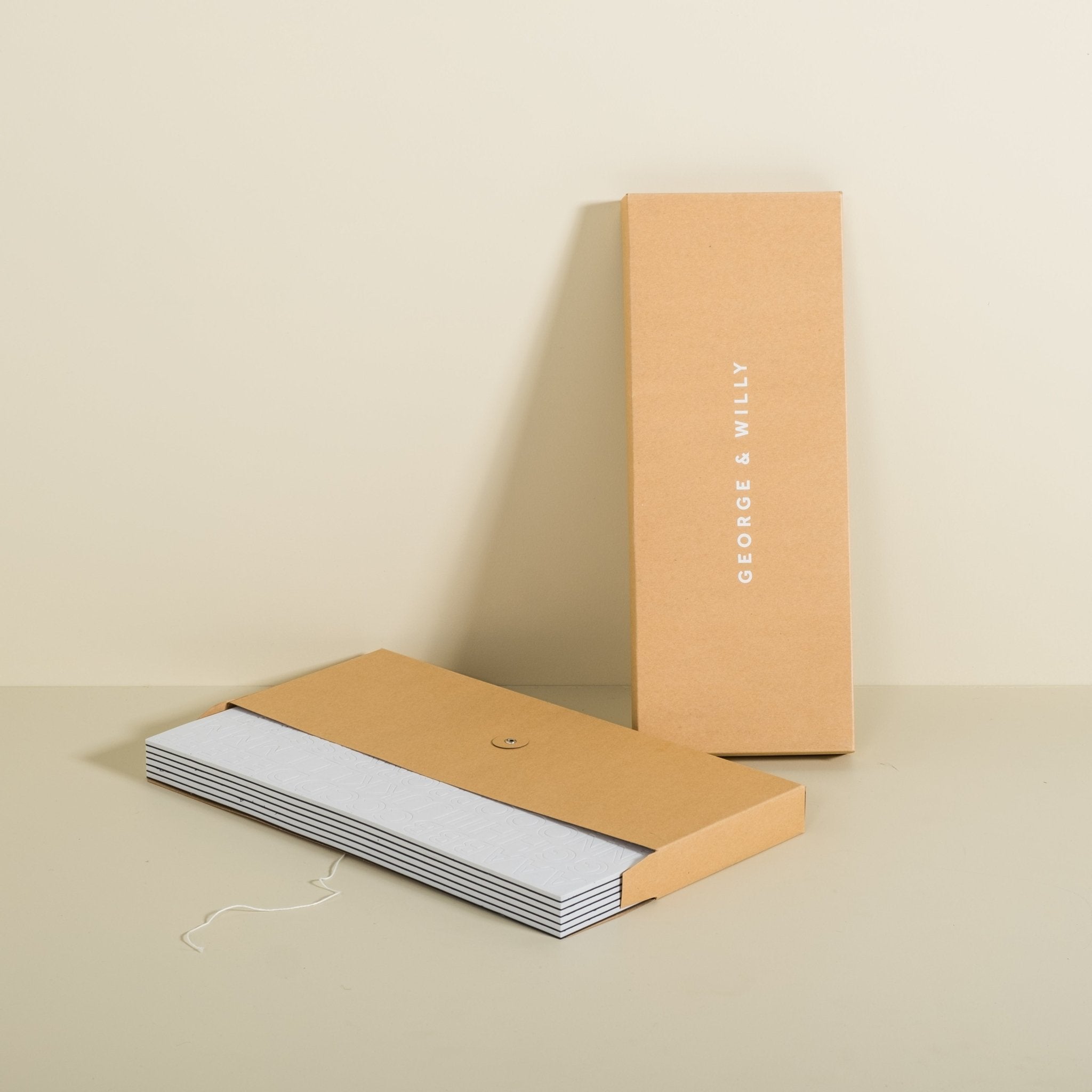
For durable storefront signs that arrive ready to install, visit George and Willy. Free US shipping is available on orders over 400 dollars.
Conclusion and CTA, from consultation and design to installation, get a custom storefront sign that fits your brand
Smart storefront signs do more than decorate a facade. They guide guests in, set expectations, and keep your message clear every day. Choose materials that handle weather, layouts that read fast, and systems that update in seconds. If you want a cohesive kit that covers blade signs, sidewalk boards, light boxes, and changeable menu displays, explore the design led range at George and Willy.
FAQ
What types of storefront signs work best for cafes and coffee bars
Blade signs plus an A frame or poster sidewalk sign are a strong combo. The blade catches eyes along the street and the sidewalk board communicates daily offers. Interior menu boards near the door help guests decide faster.
Can I add my logo to George and Willy storefront signs
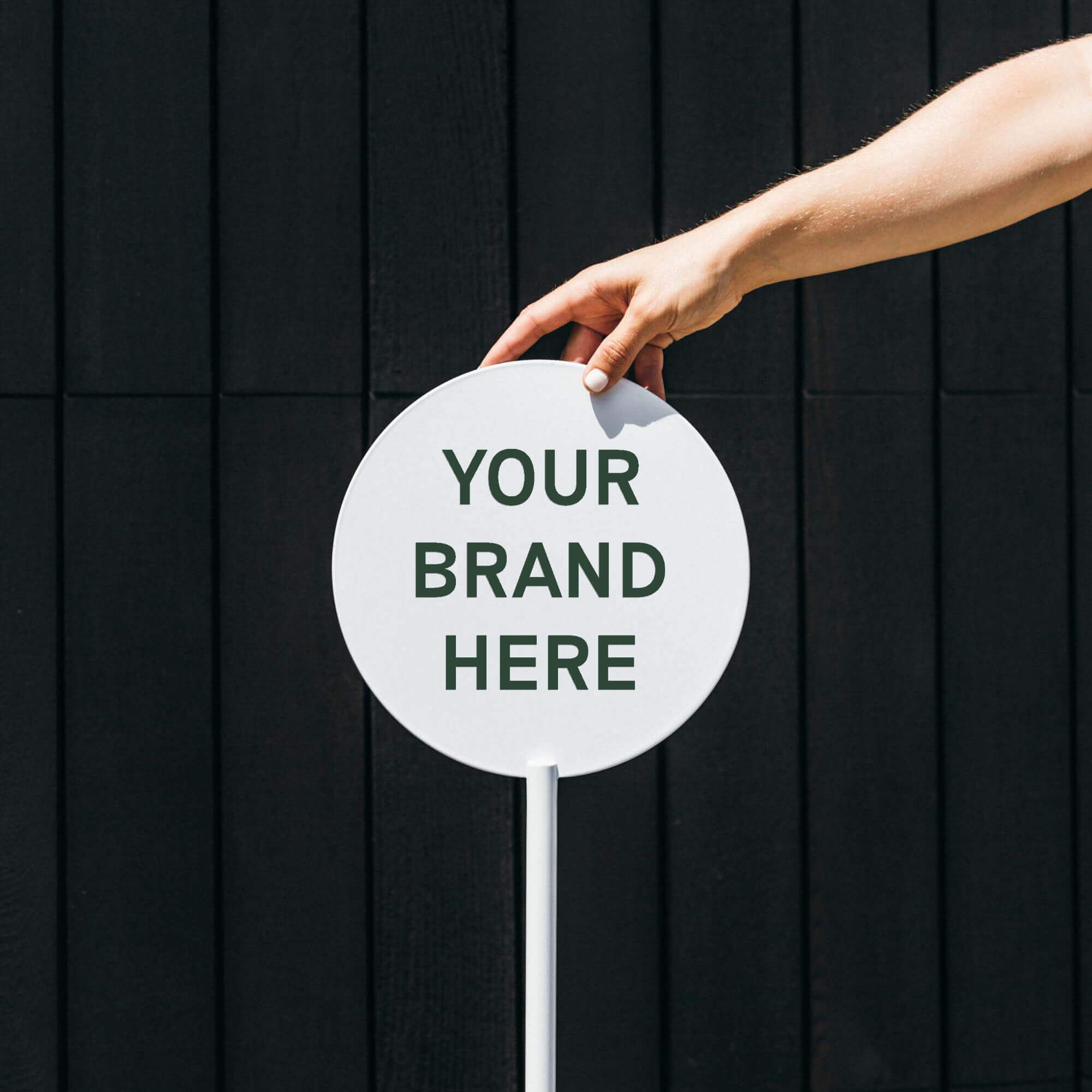
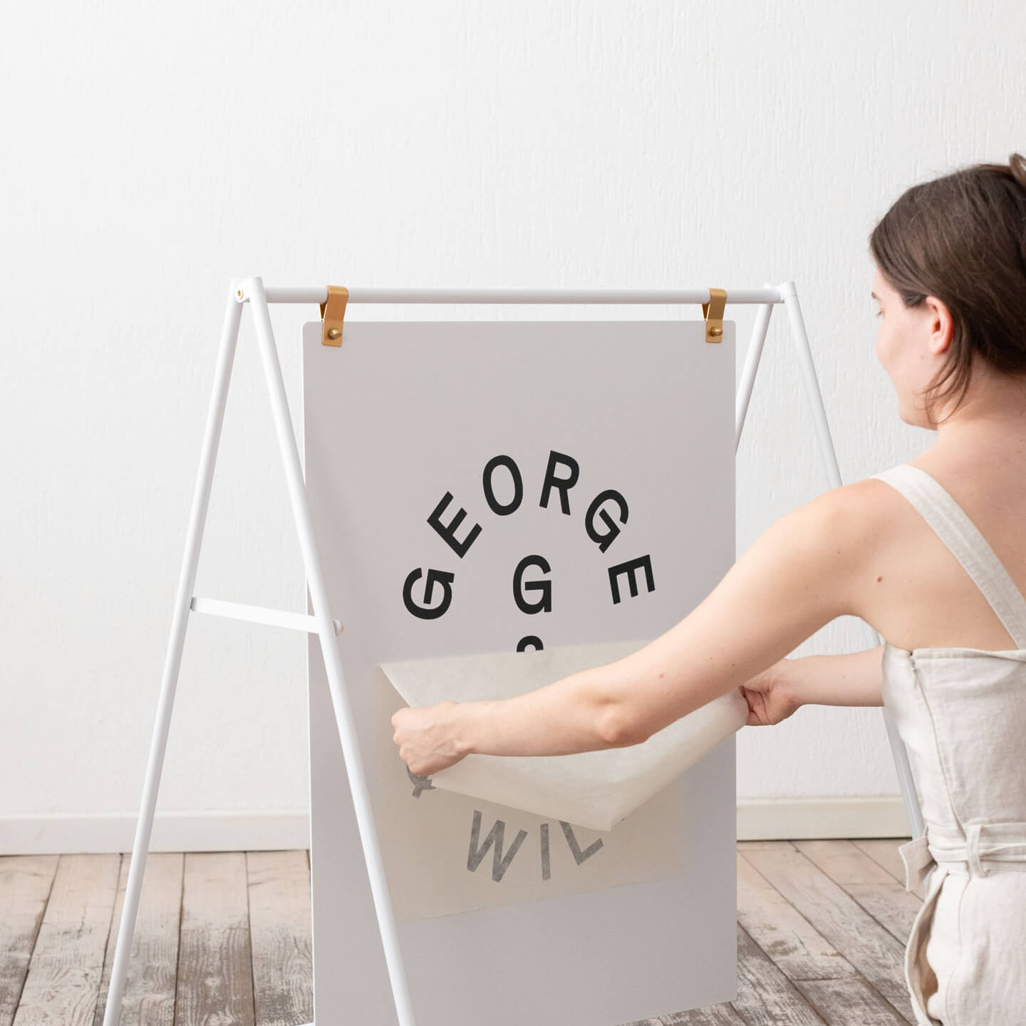
Yes, graphics are added locally. The brand ships signage blank and does not offer custom fabrication or logo application. Most buyers apply vinyl decals through a local signwriter and some arrange powder coating color changes locally.
Are these storefront signs weather resistant
Most exterior products use powder coated aluminum or steel which resist rust outdoors. Stainless details appear in some products for added durability. Bring movable signs inside overnight to maximize longevity.
Do you ship internationally and how quickly can I expect delivery
Yes. Orders typically process in 1 to 2 working days. Express target delivery is 1 to 5 working days and economy is 3 to 7 working days. US orders ship via UPS from Arizona or South Carolina, Canada via DHL, EU and UK from the Netherlands, Australia via AusPost, Direct Freight, or DHL, and New Zealand via NZ Post or DHL. Most markets ship DDP with Norway as DDU.
What warranty and returns apply to storefront signs
There is a 2 year warranty that covers faulty workmanship and materials in normal use. A 100 day change of mind return applies to full price items, while sale items are final sale for change of mind. Faulty or incorrect goods are repaired, replaced, or refunded with return shipping covered.
Can I ship storefront signs to a PO box
No. PO boxes are not supported. Provide a street address for delivery.
What if I need to update pricing or menus often
Choose quick change systems. The Magnetic Menu Board ships with 10 rails and about 1,032 characters so teams can relabel fast. The tile Menu Board includes about 510 reversible tiles and a board of roughly 23.6 by 31.5 inches, which keeps layouts clean and readable.
What payment methods are accepted
Major cards and digital wallets are accepted, including AmEx, Visa, MasterCard, Apple Pay, Google Pay, PayPal, and Shop Pay. The brand is not a US business, so some US banks may add an international transaction fee. Invoicing is available via the order confirmation.