


Great signage is more than just a piece of decoration; it’s a silent salesperson working for you around the clock. This includes everything from a metal sign that catches a passerby’s eye to the small but mighty displays at your checkout. Specifically, countertop signs are compact, strategically placed signs on countertops or service desks that provide crucial information, announce promotions, or guide customers at the point of sale. They are essential for sealing the deal, and a staggering 76% of people admit to visiting a store for the first time simply because its signage caught their eye.
This guide will walk you through the essential strategies for making your signs, especially your tabletop signs, work harder for your business. We’ll cover everything from making a great first impression to ensuring every detail inside your space communicates quality and clarity.
Your First Impression: Getting Customers Through the Door
Before a customer can appreciate your well placed counter signs, you need to get them inside. This is where your exterior signage shines. Think of it as your business’s handshake.
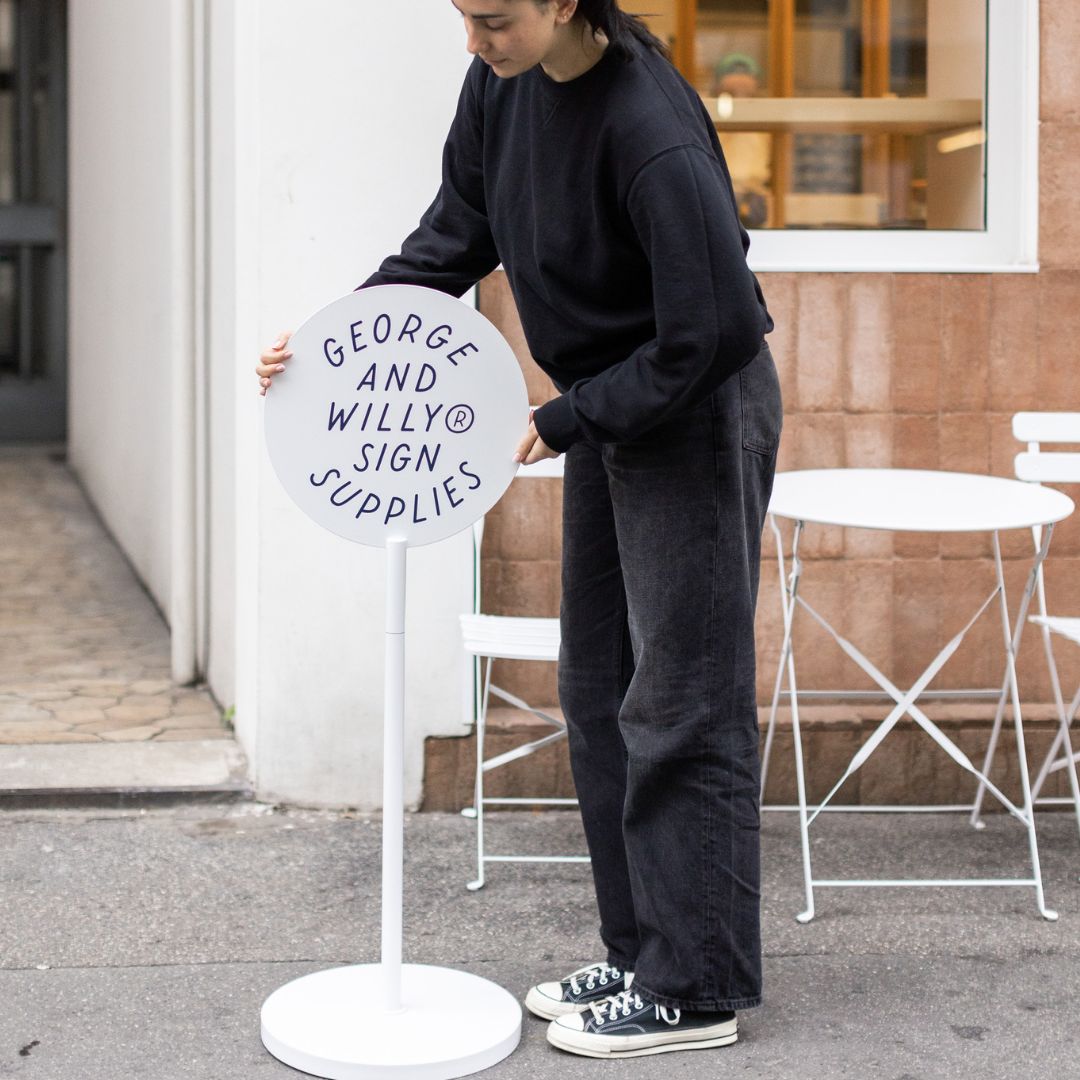
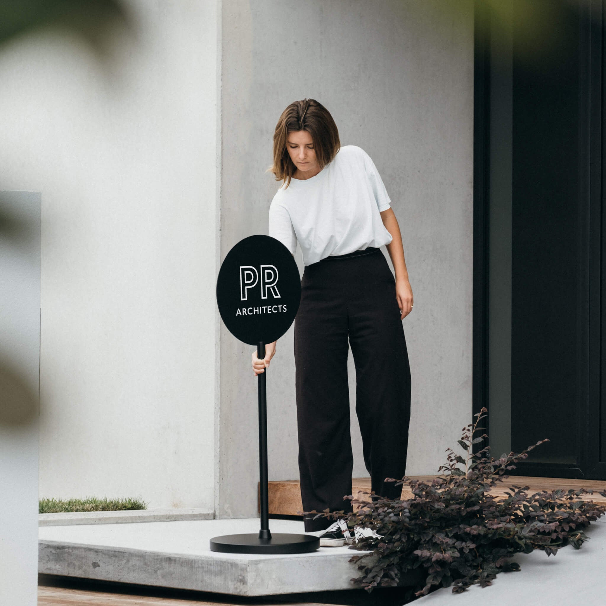
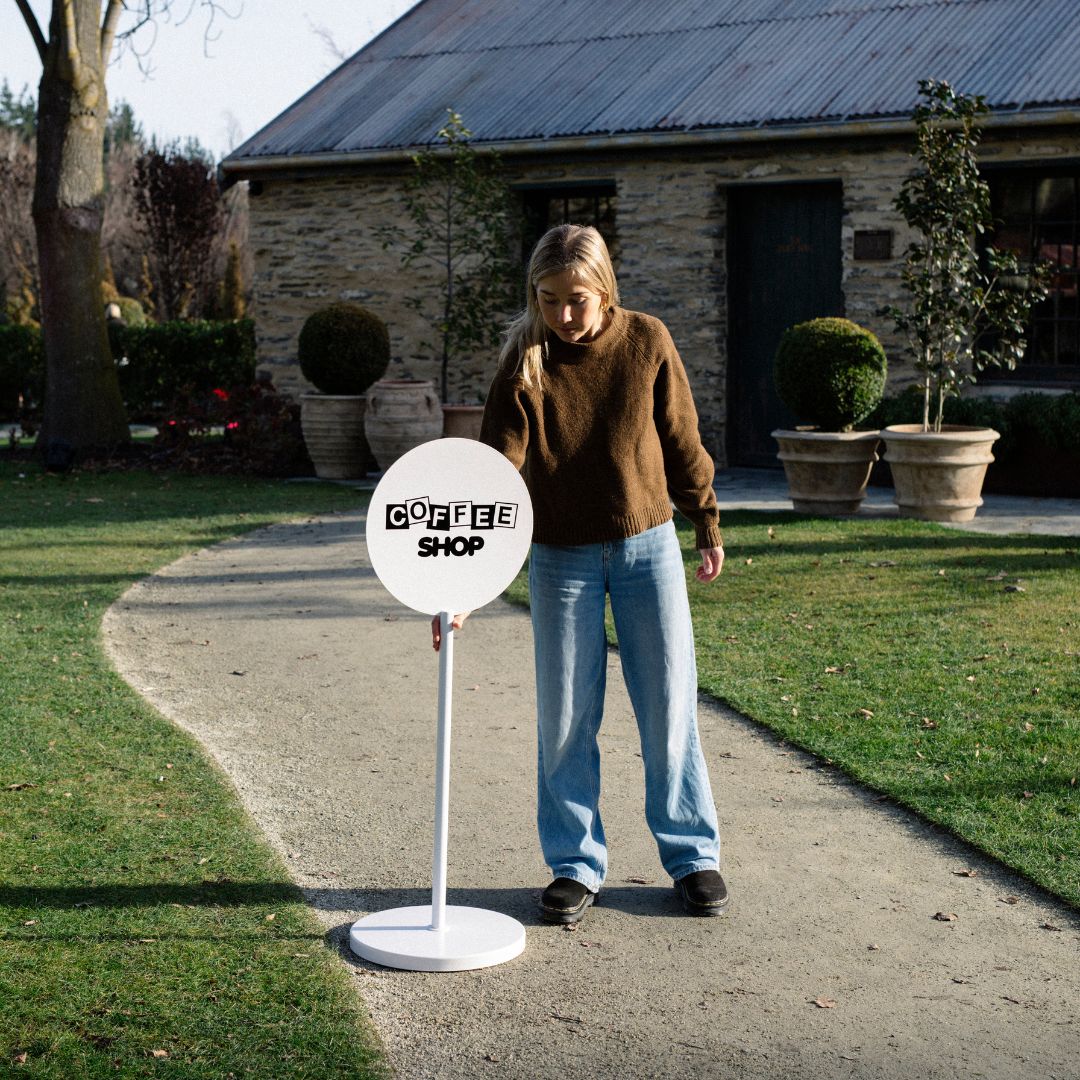
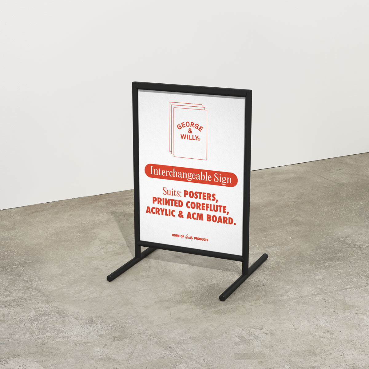
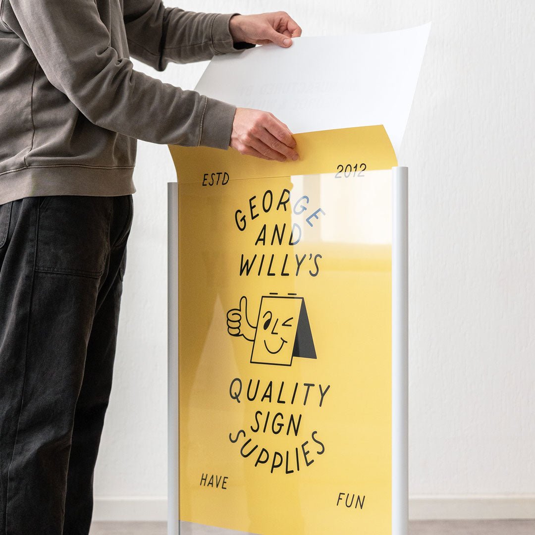
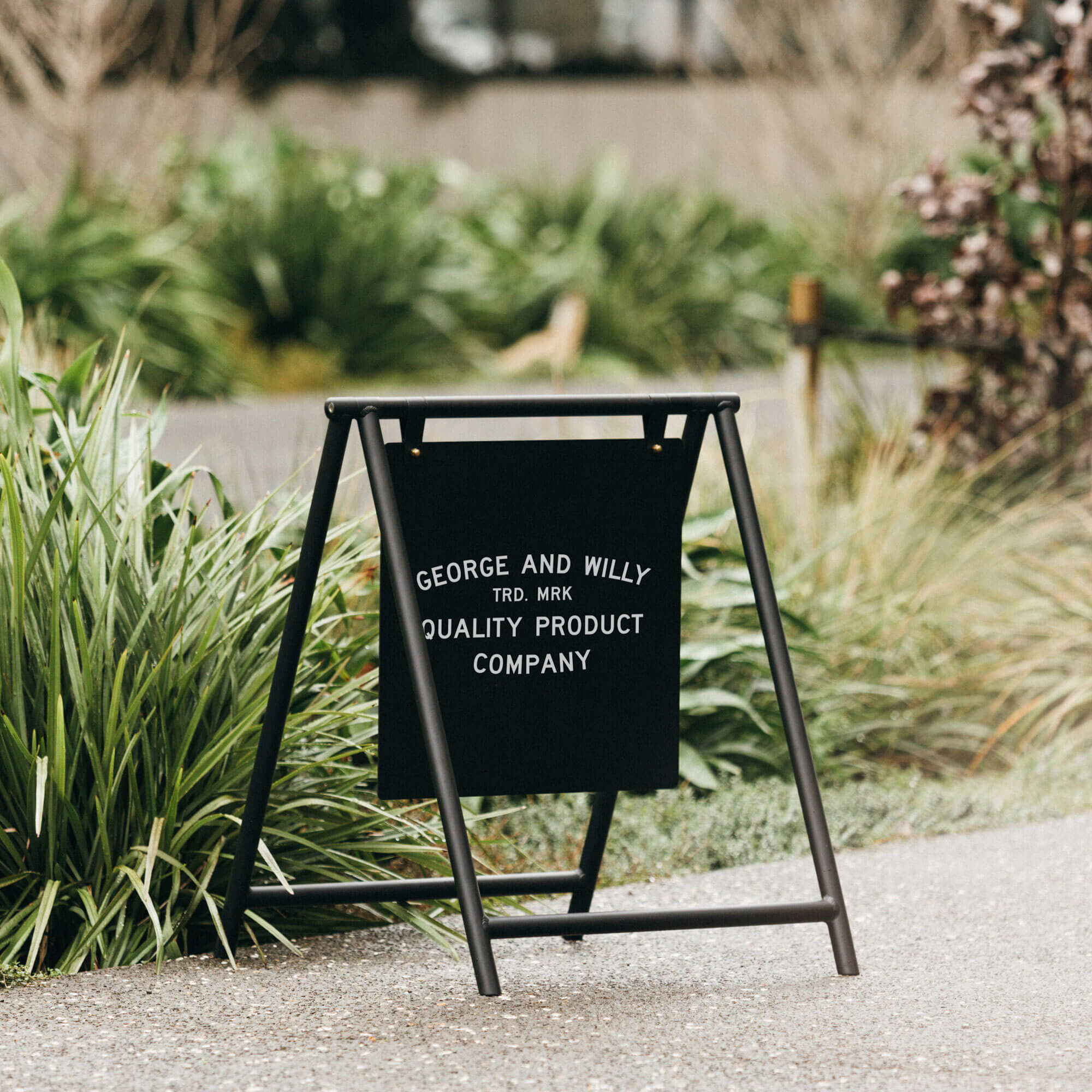
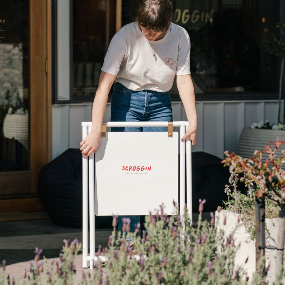
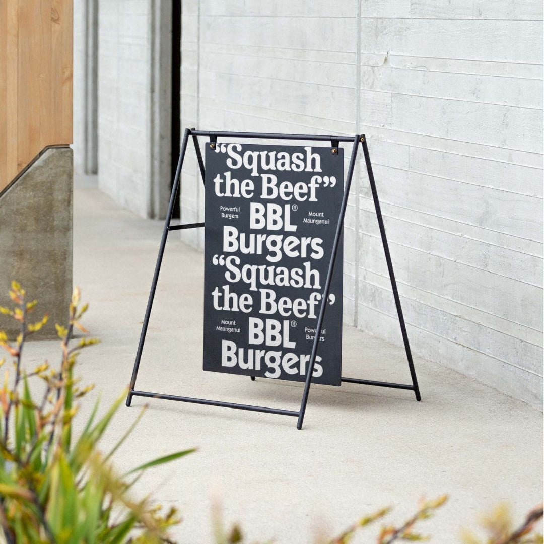
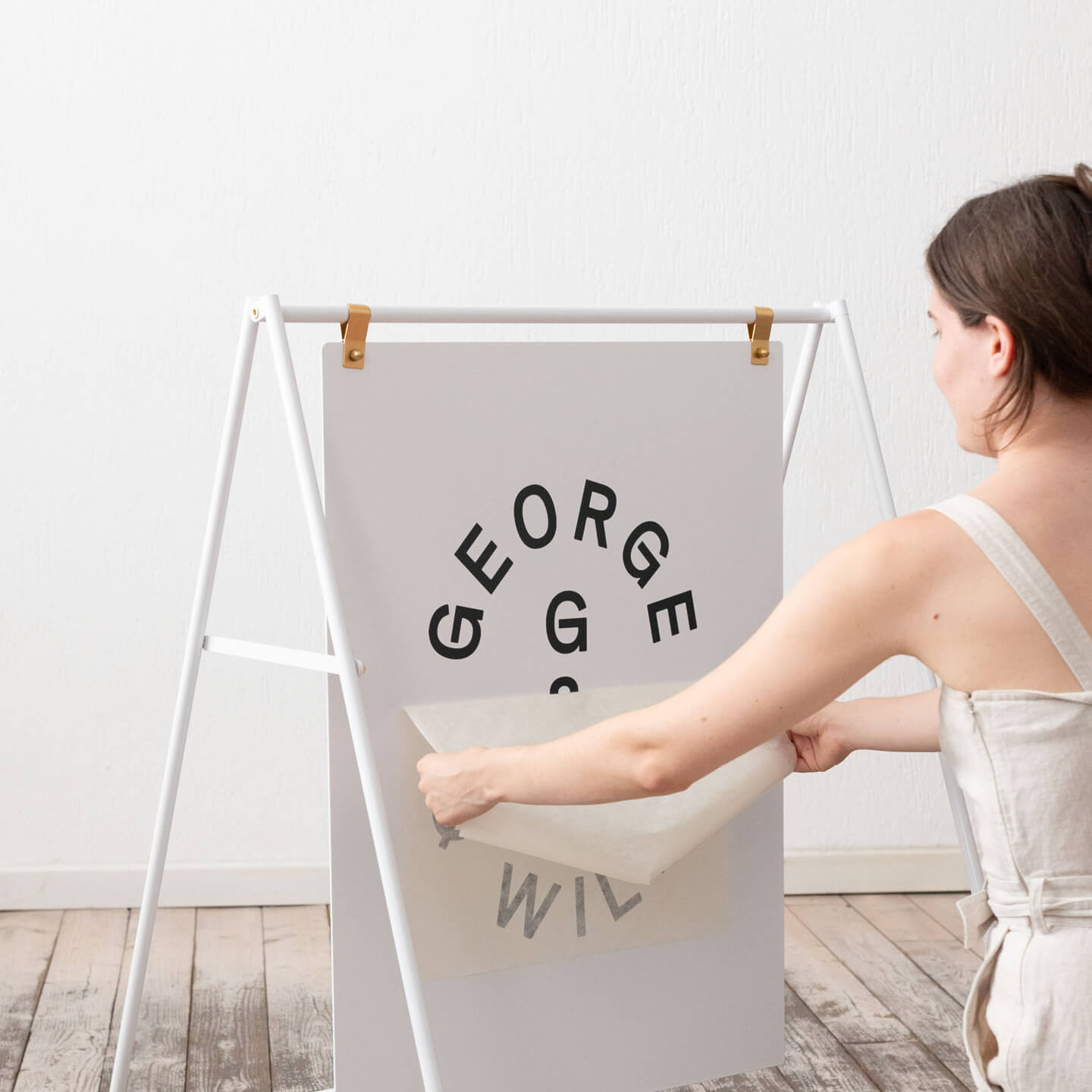
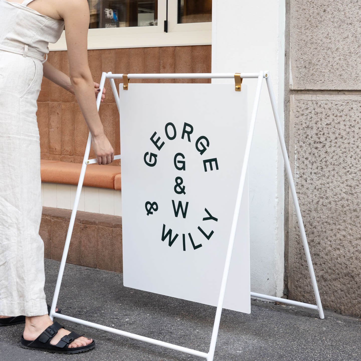
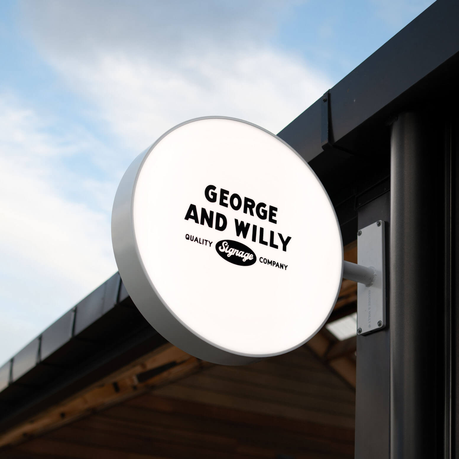
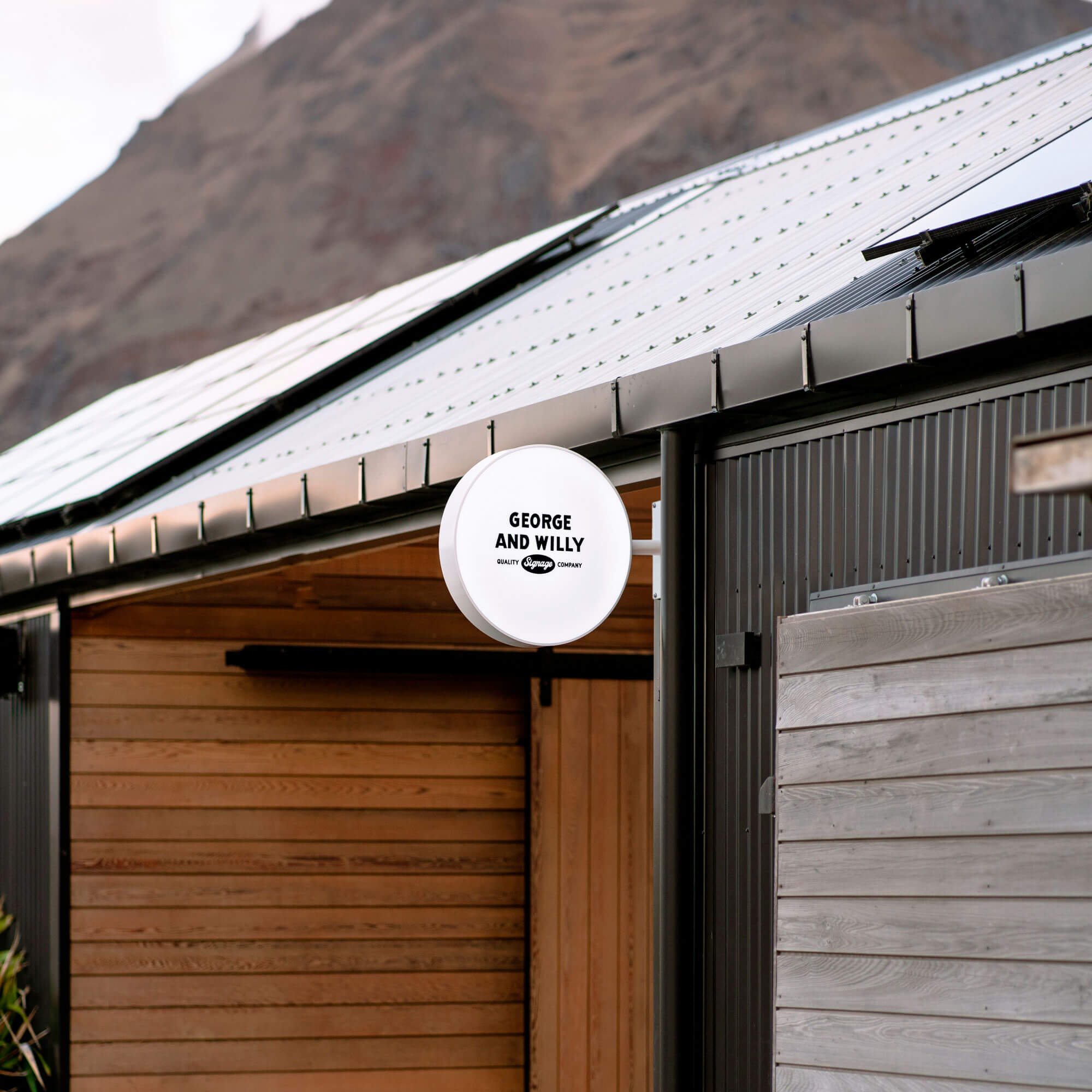
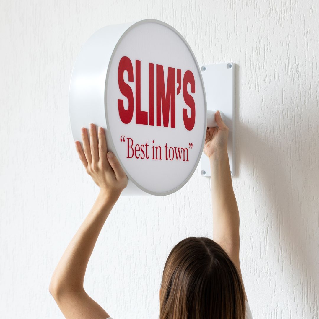
A bold storefront sign (like a Blade Sign) or a witty sidewalk A frame can be a magnet for foot traffic. Consumers expect a small business to have two or three signs around its storefront, so don’t be shy. This initial impression is critical because nearly 79% of consumers believe that a business’s signage reflects the quality of its products or services. A faded, cracked, or misspelled sign can turn people away before they even consider stepping inside. In fact, over half of consumers say they’d be reluctant to enter a store with sloppy or typo ridden signage.
Your goal is to use exterior signs that are readable, well placed, and aligned with your brand’s personality. This sets the stage for a positive experience, leading them right to your front door and eventually, your checkout area where effective counter signs await.
Guiding the Way: Smart Interior Signage
Once customers are inside, the journey continues. Clear wayfinding signage prevents frustration and can significantly impact your sales. One study found that a third of shoppers leave stores empty handed because they couldn’t find what they were looking for.
Effective navigation makes people feel confident and at ease. It also frees up your staff from giving directions so they can focus on helping customers. Here’s how to create an intuitive flow:
-
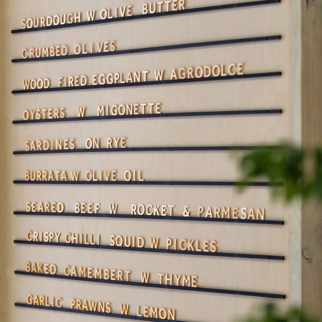
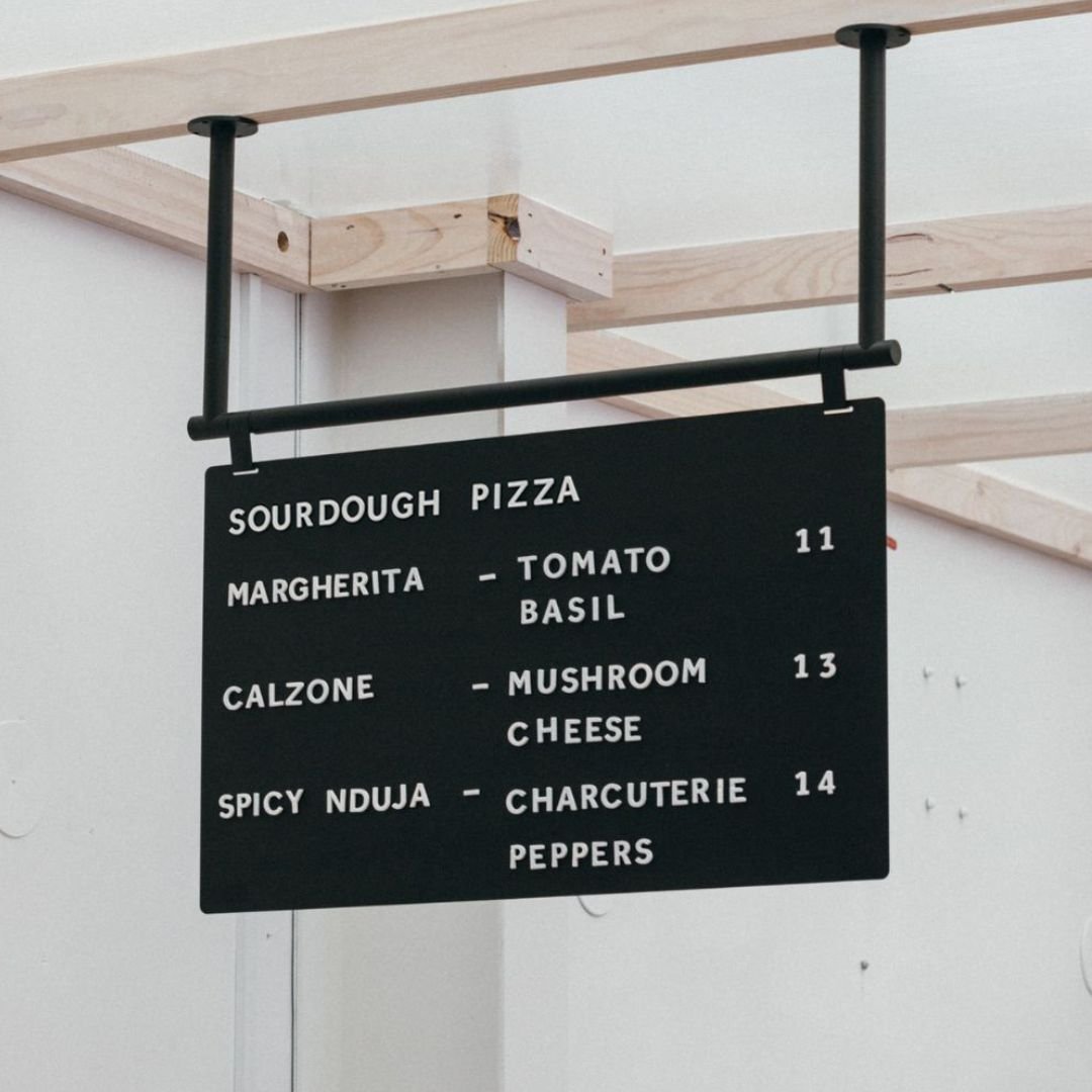
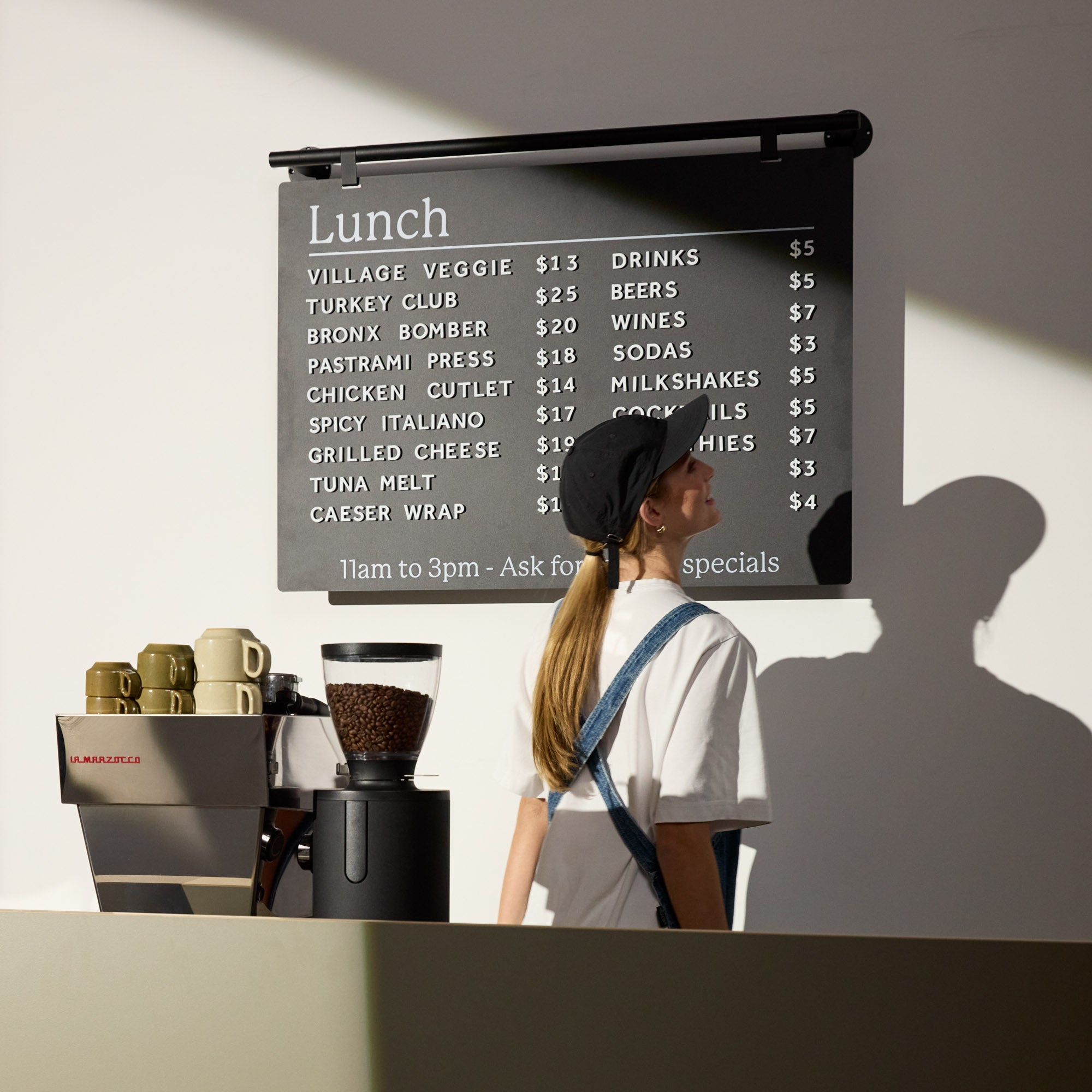
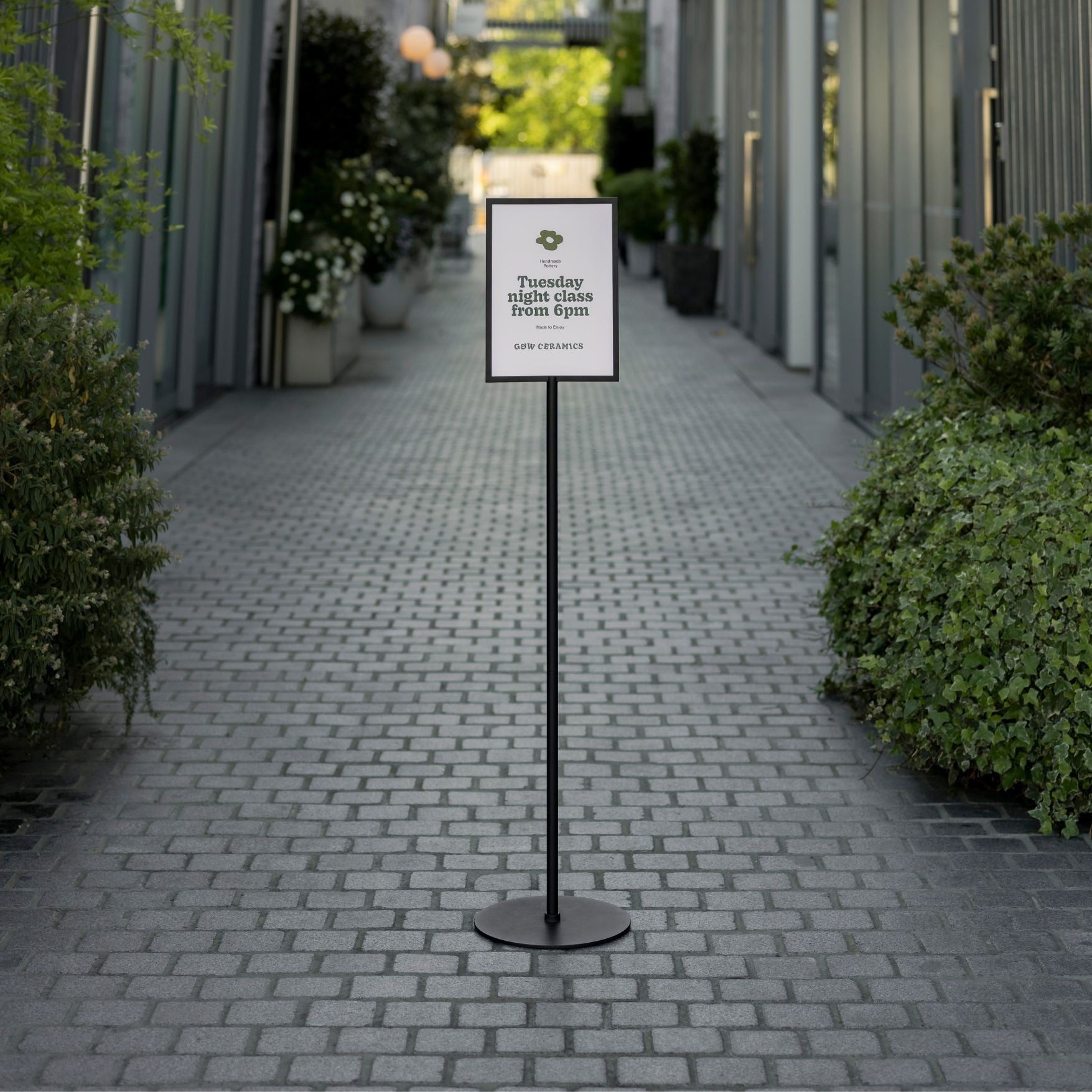
Directional Cues: Use clear aisle markers, overhead department signs (or a Ceiling Menu Board), and arrows to guide shoppers.
-
Strategic Placement: Since about 90% of customers instinctively turn right upon entering a store, placing a key display or sign in this area is a smart move.
-
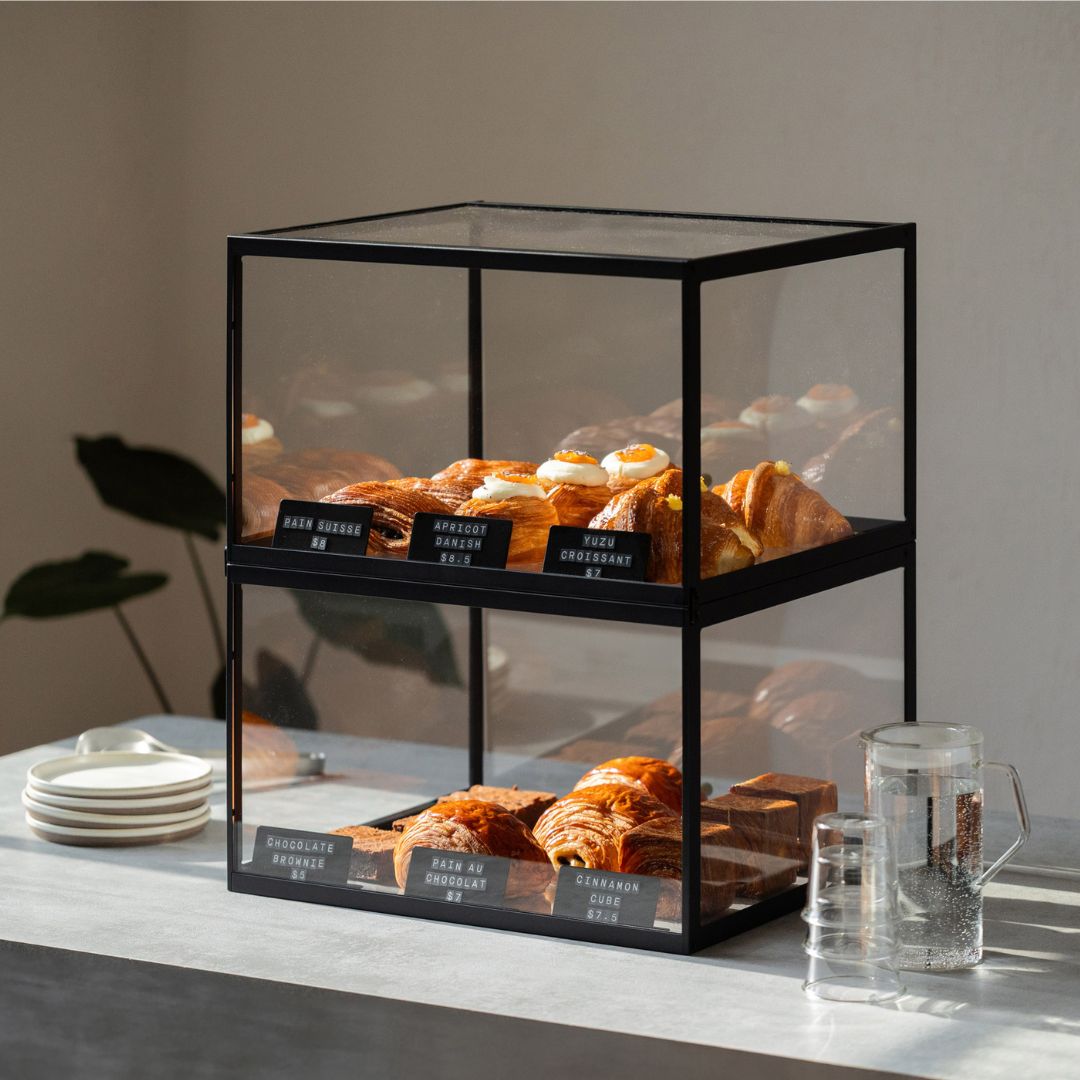
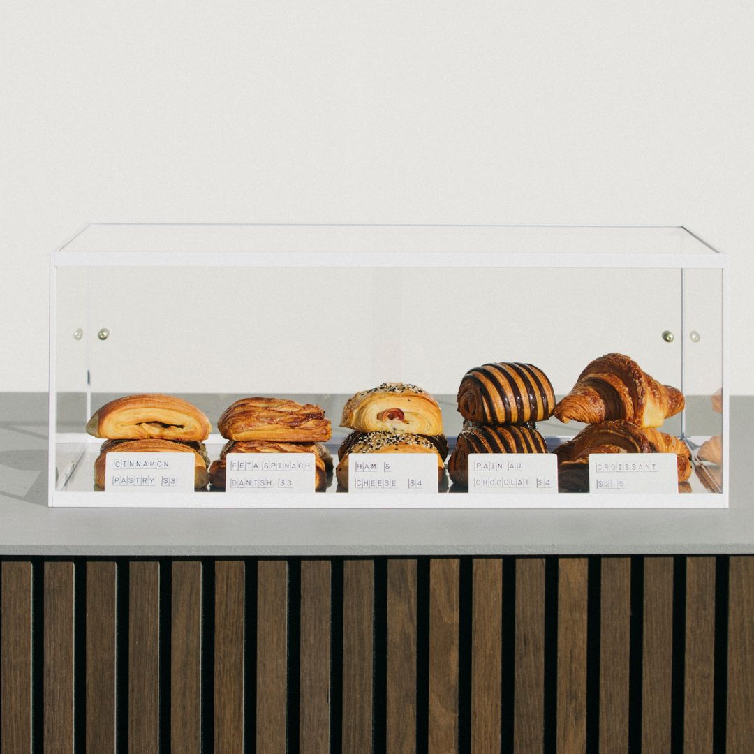
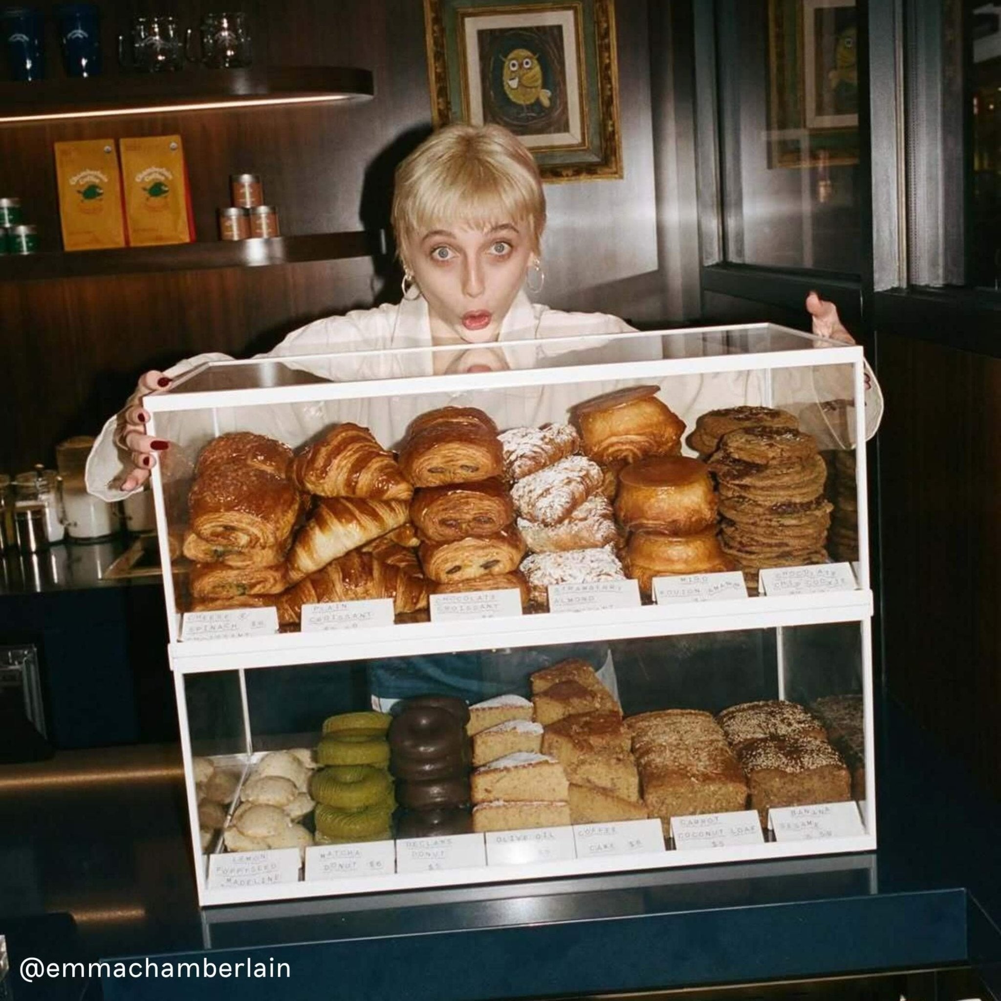
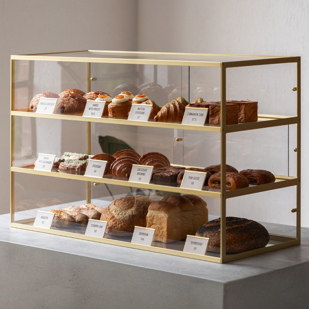
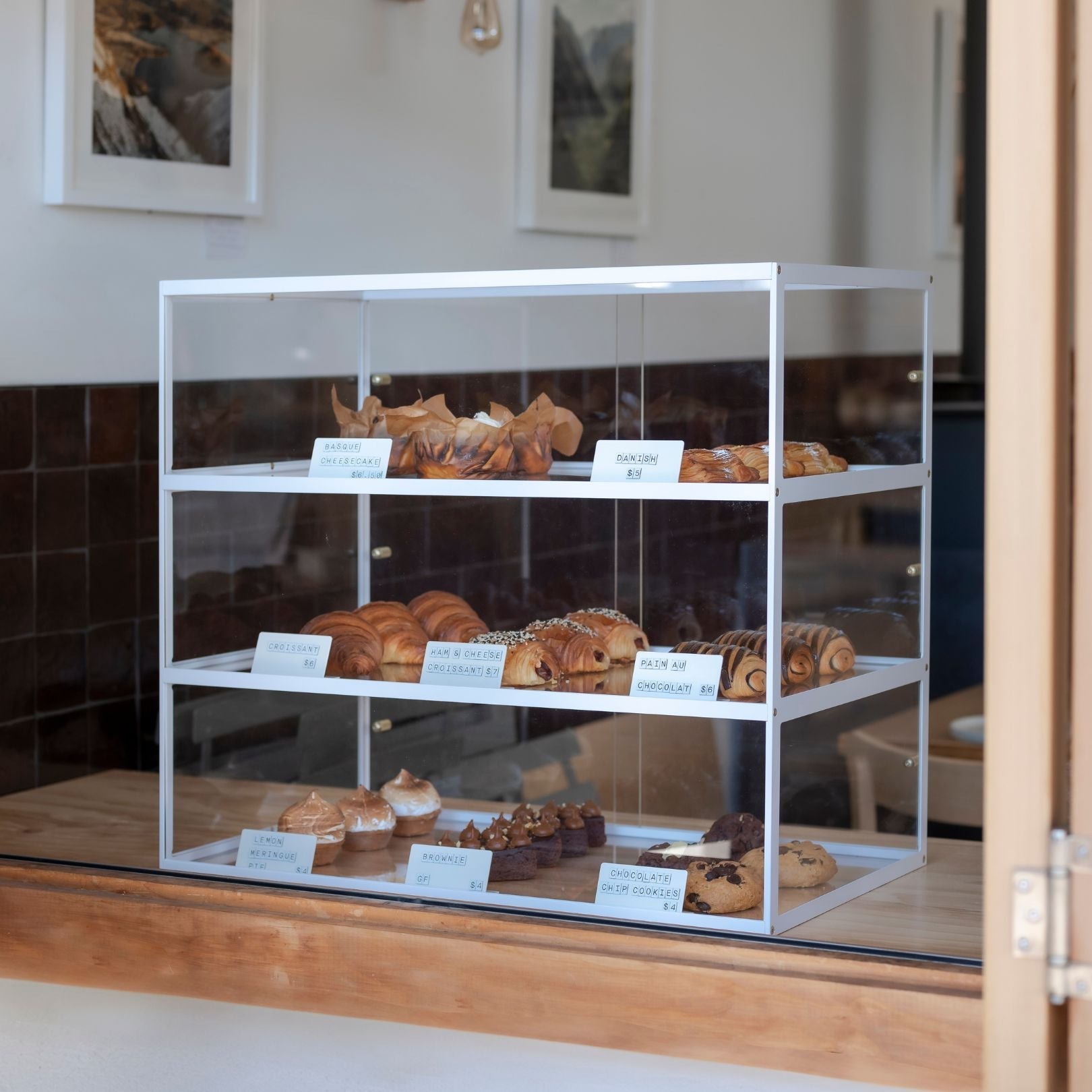
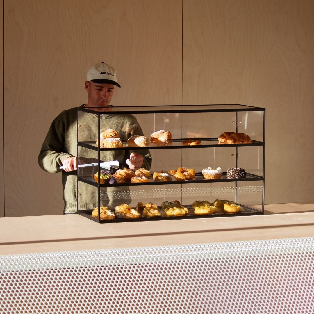
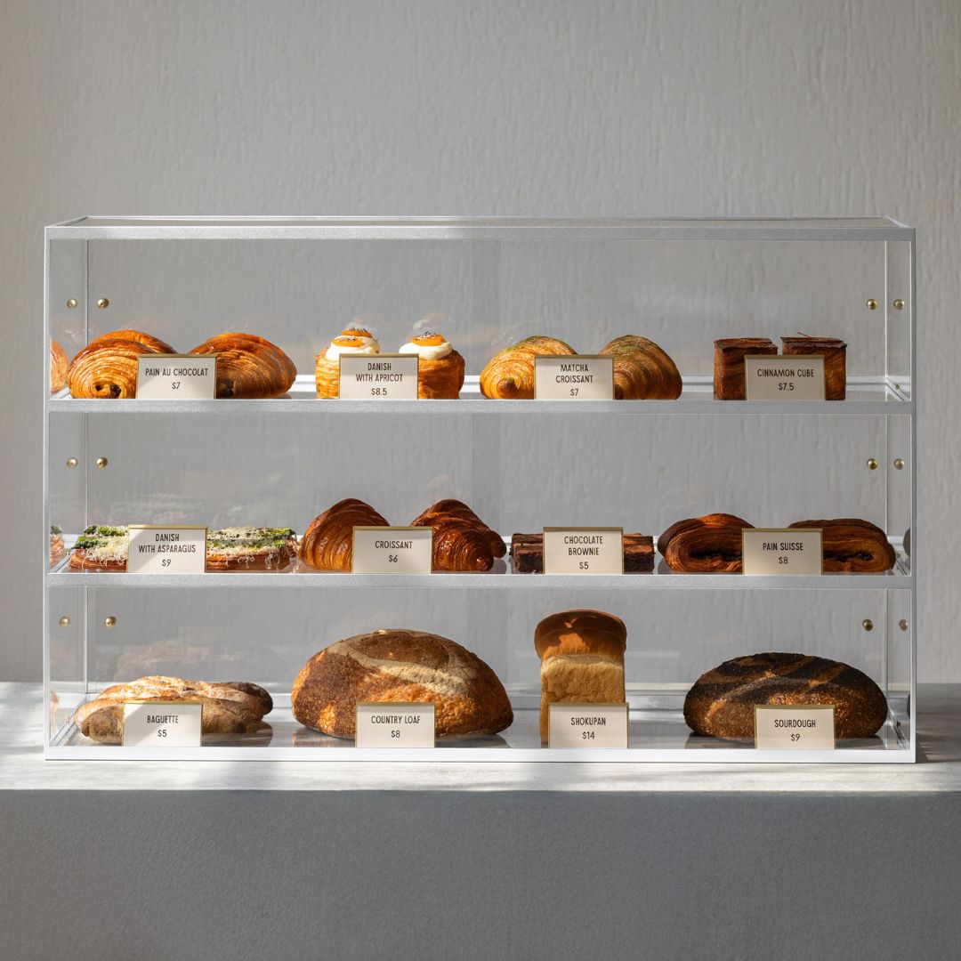
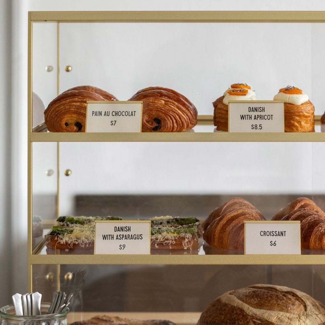
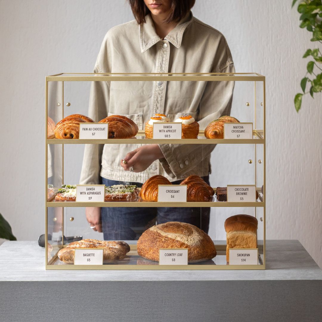
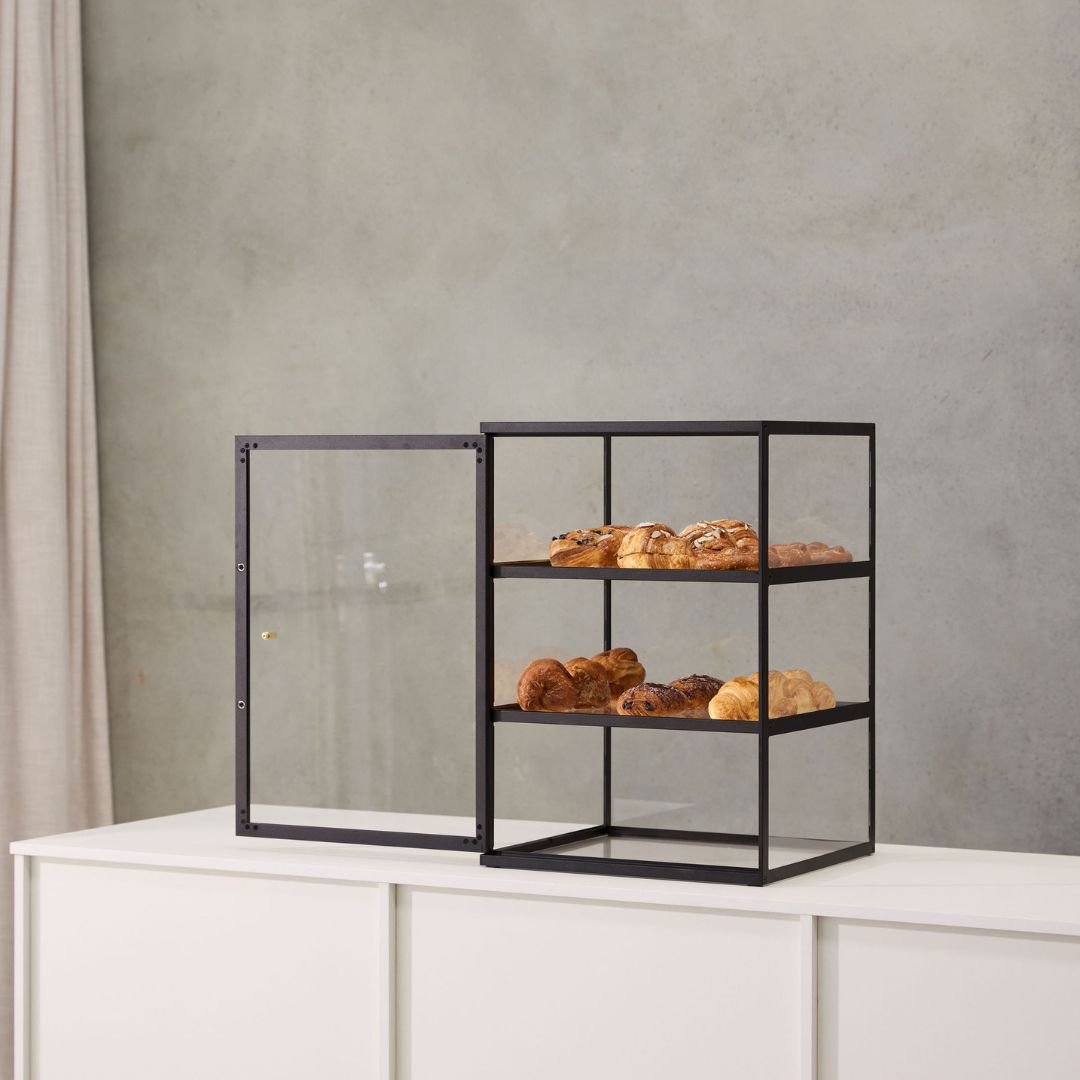
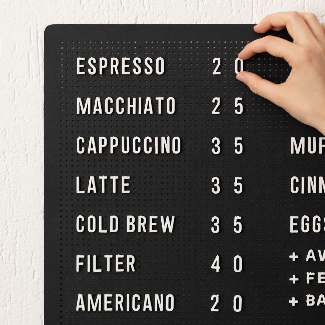
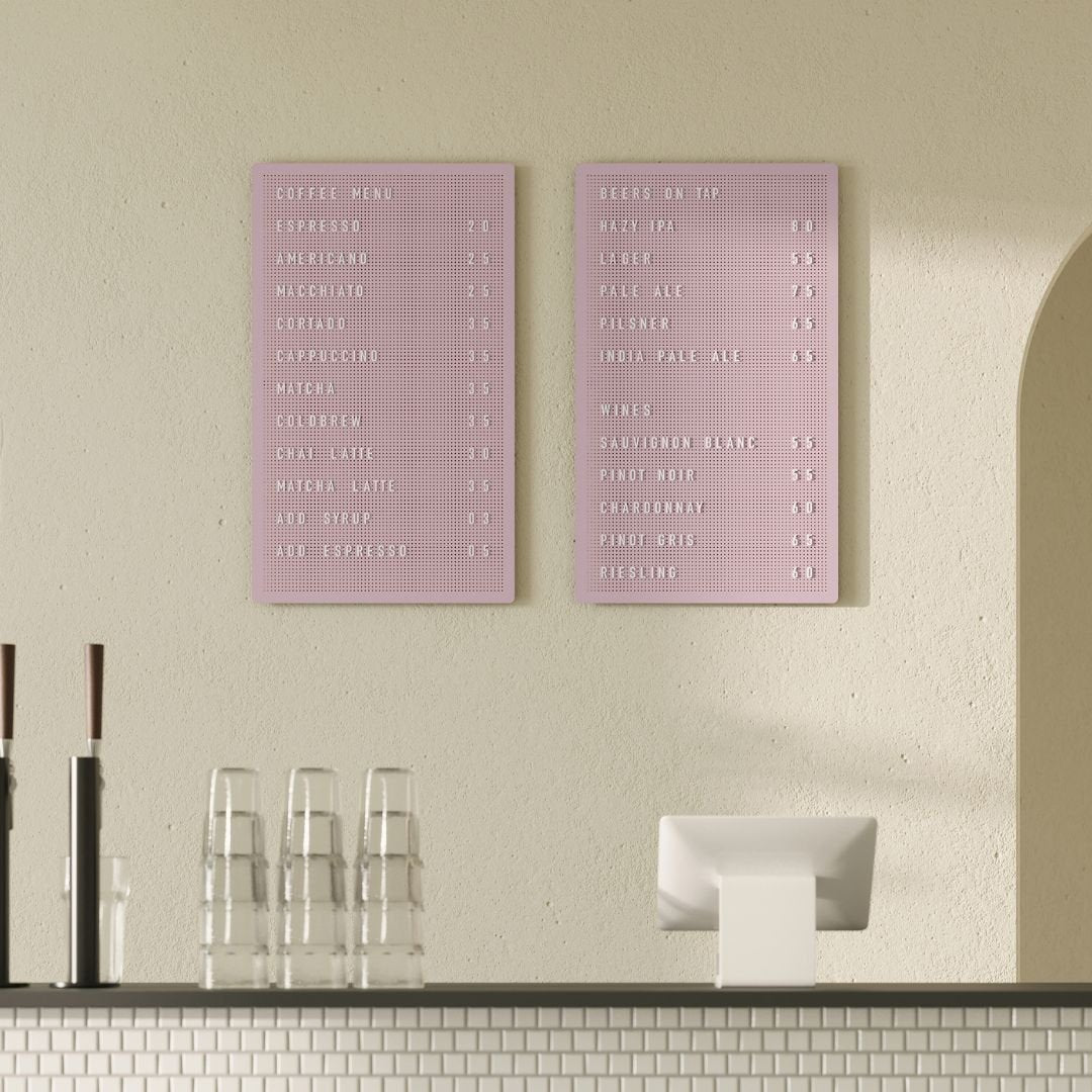
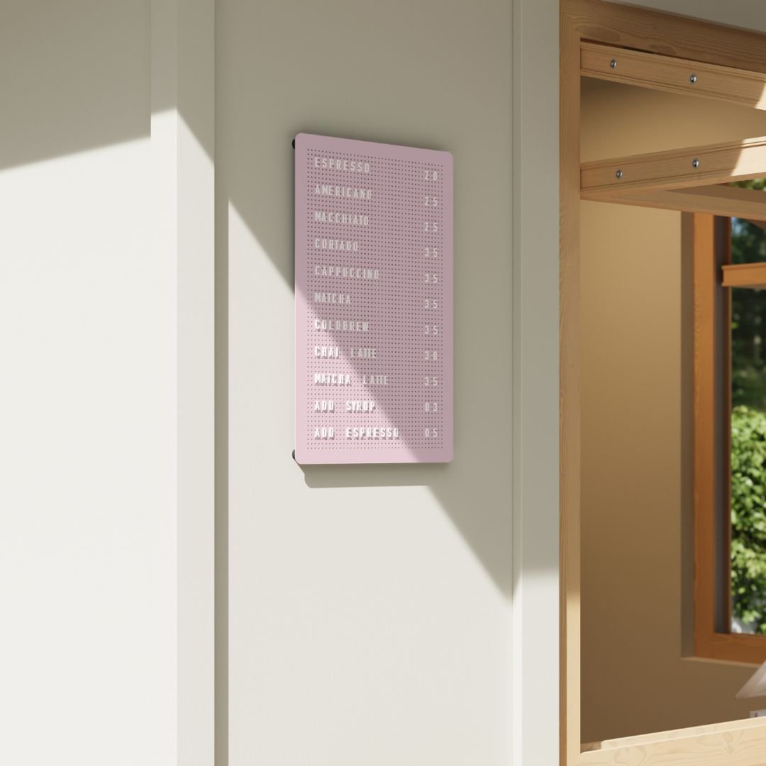
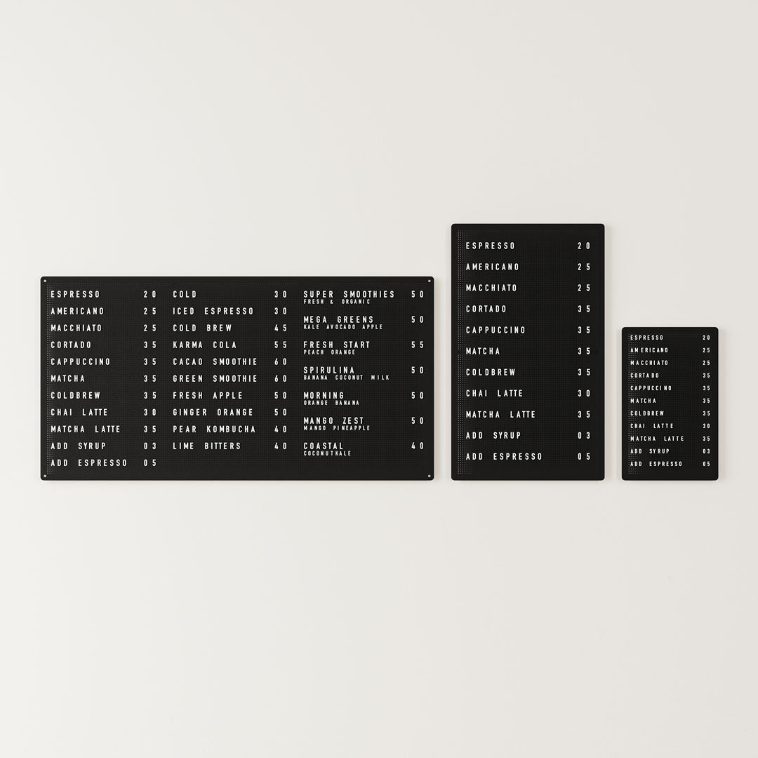
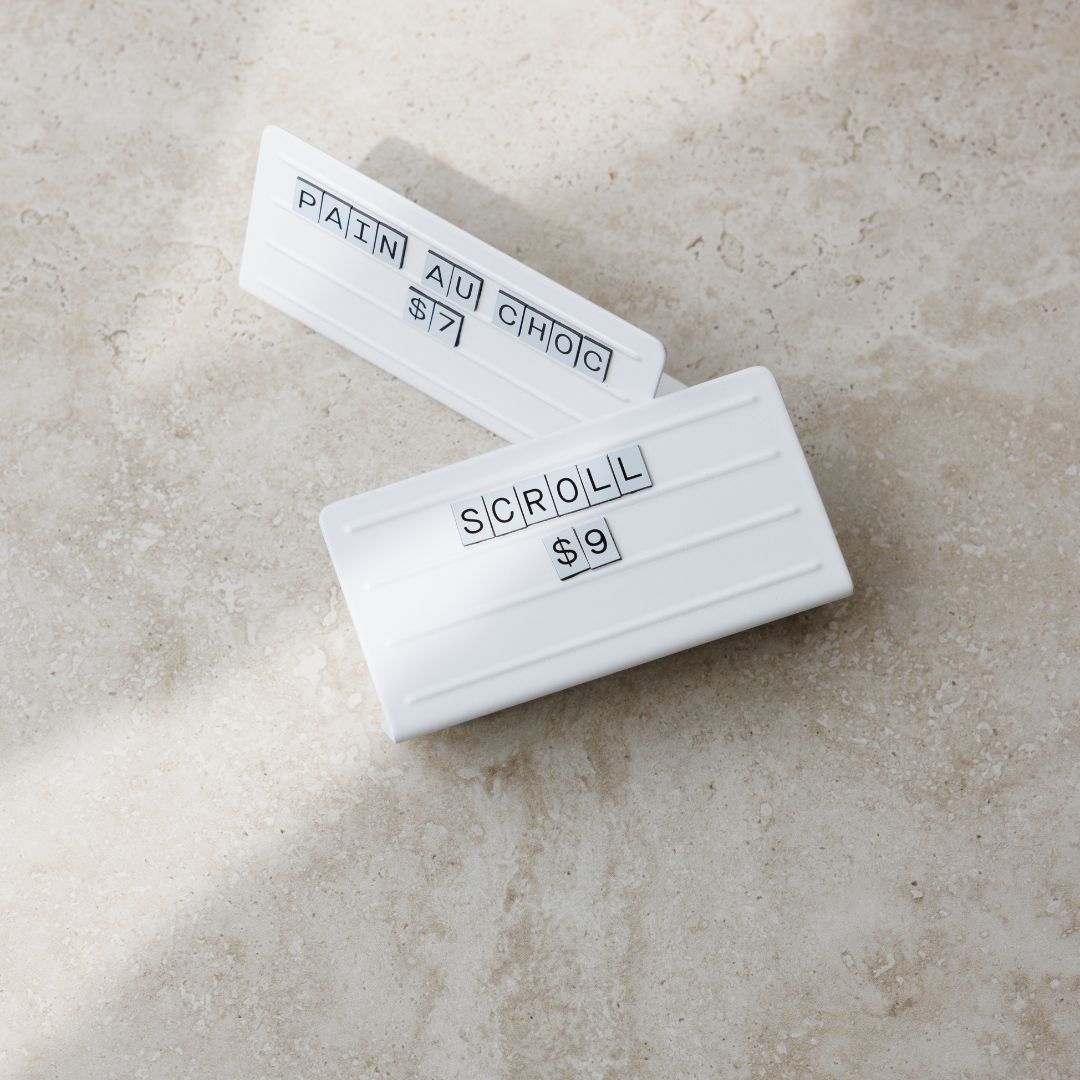
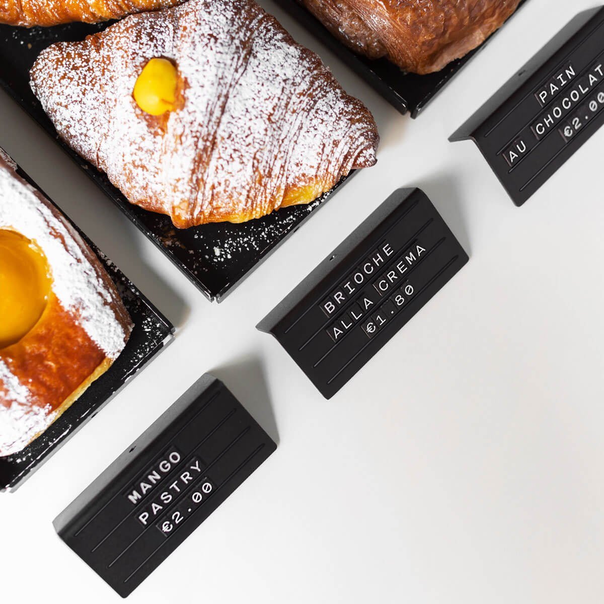
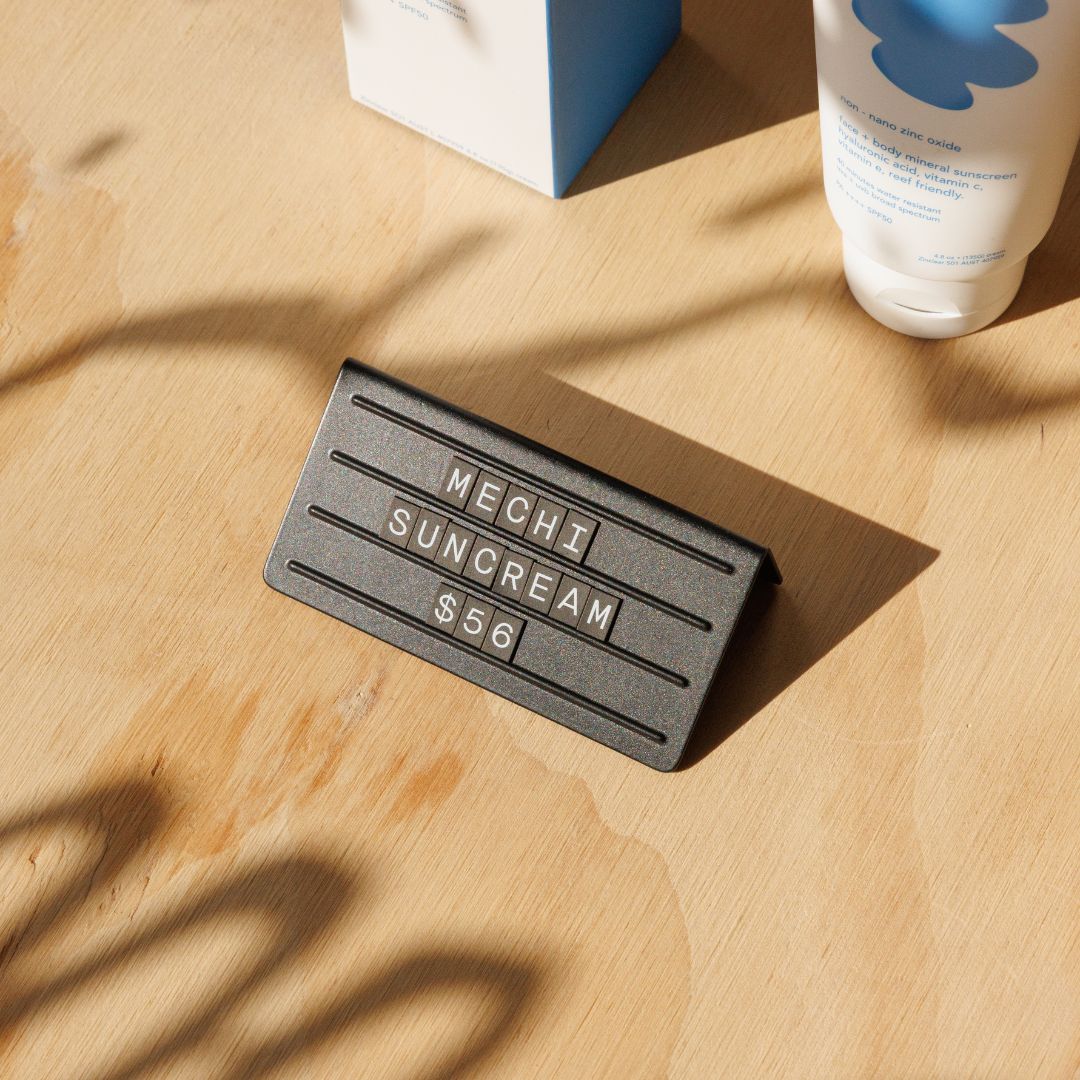
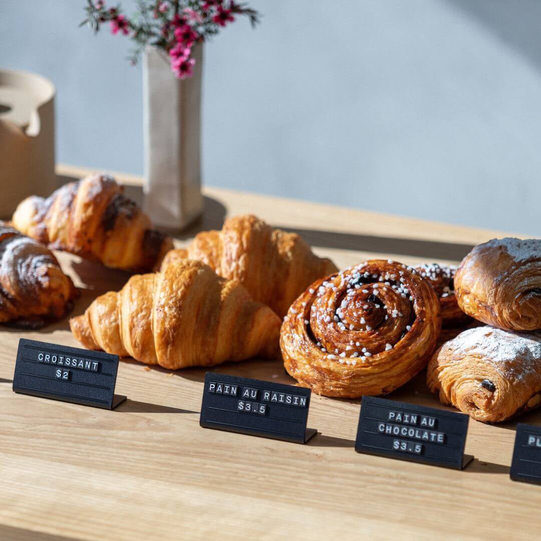
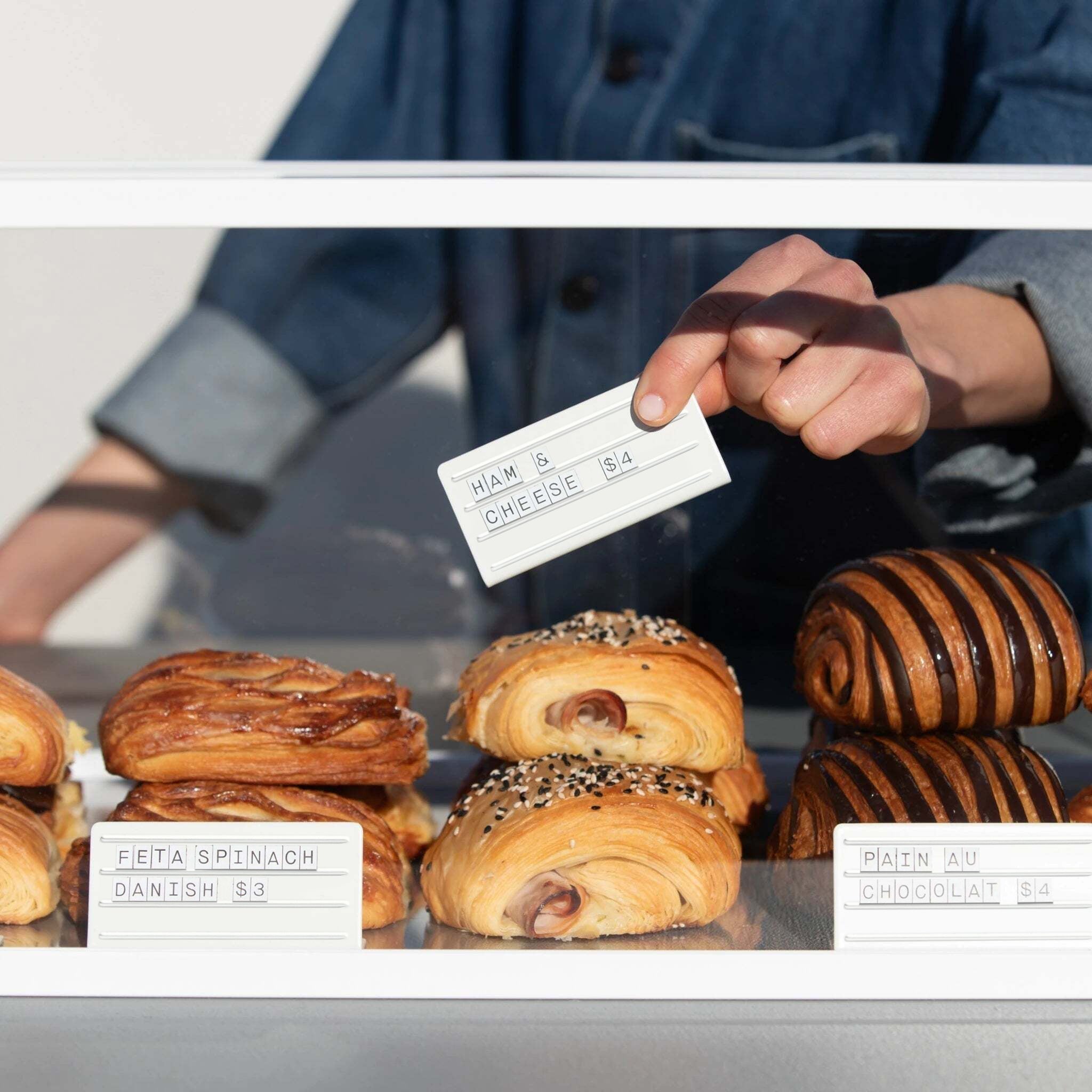
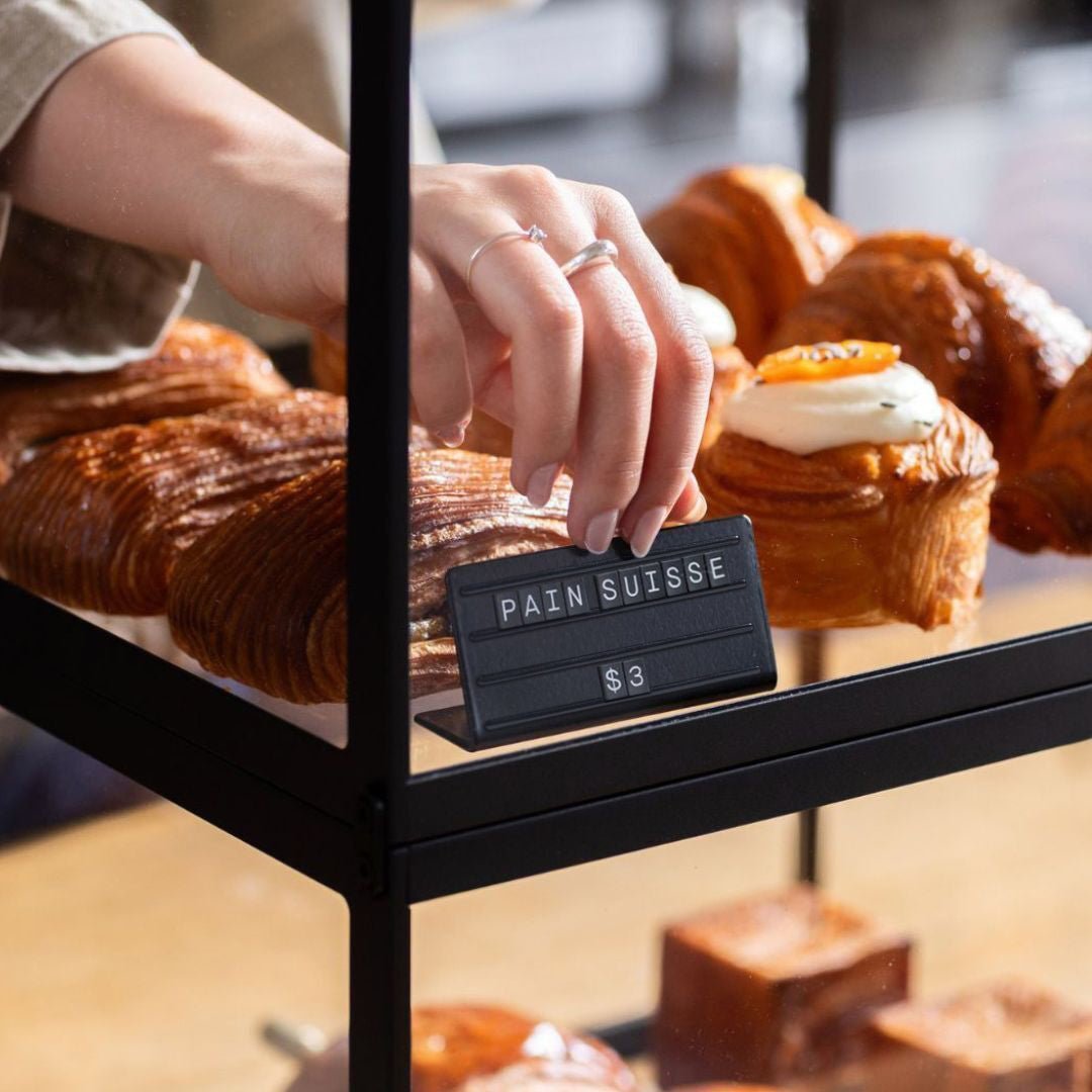
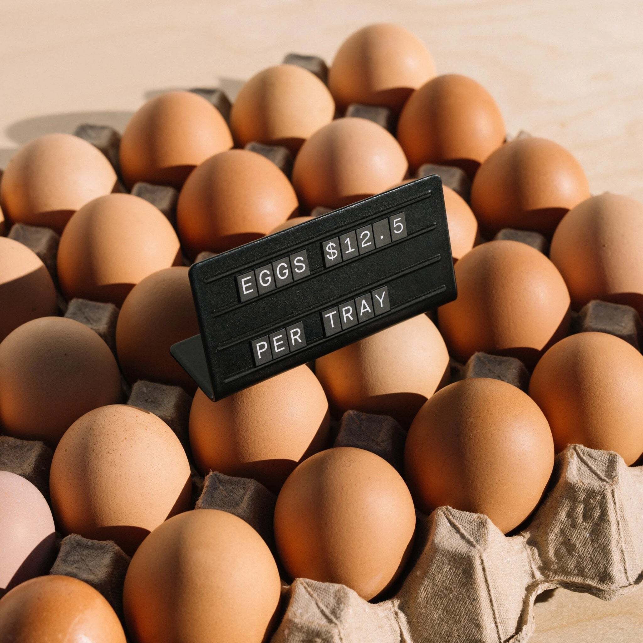
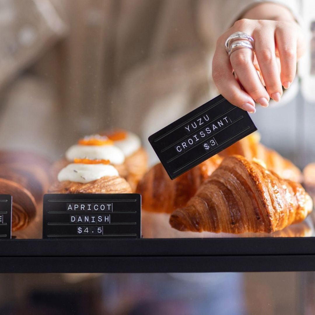
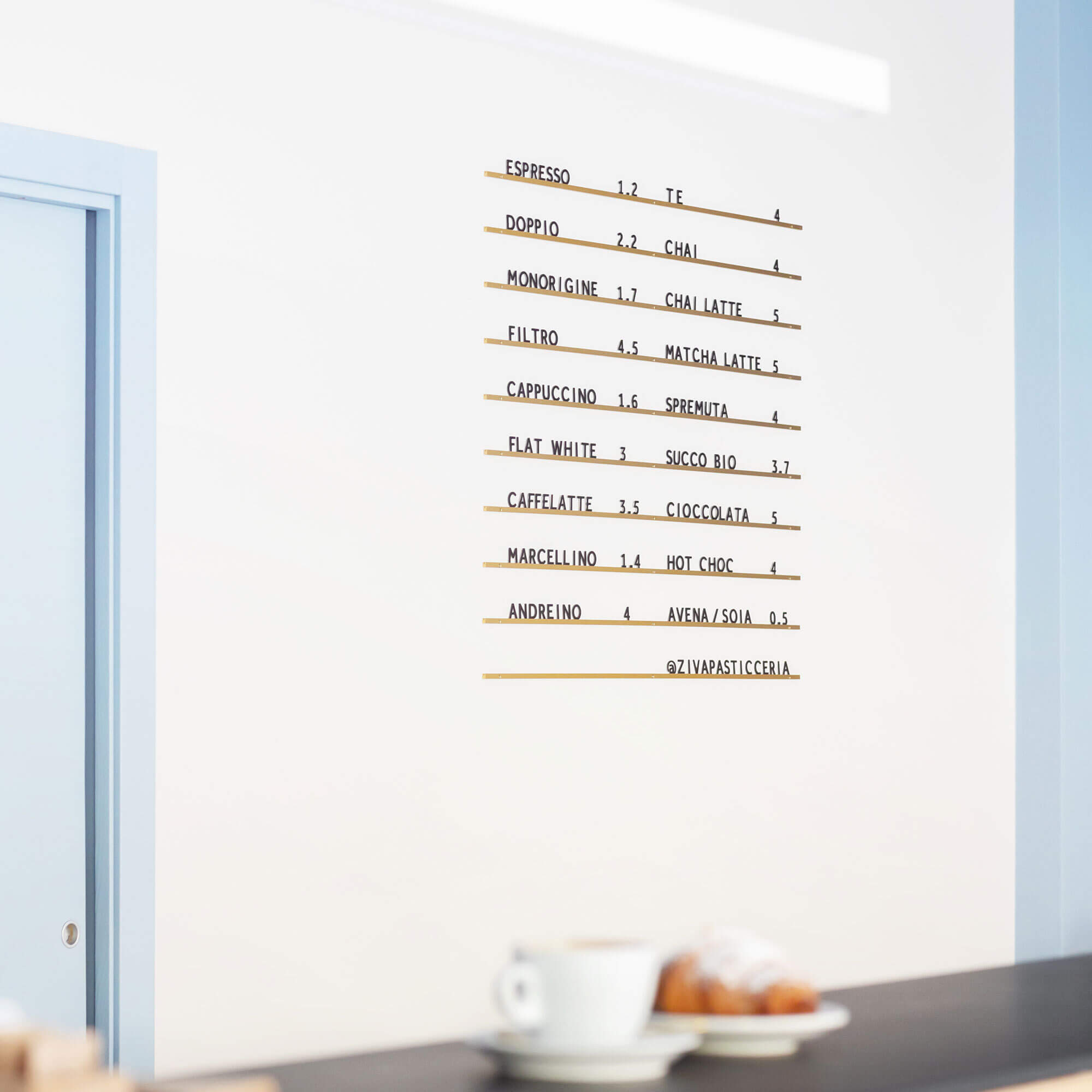
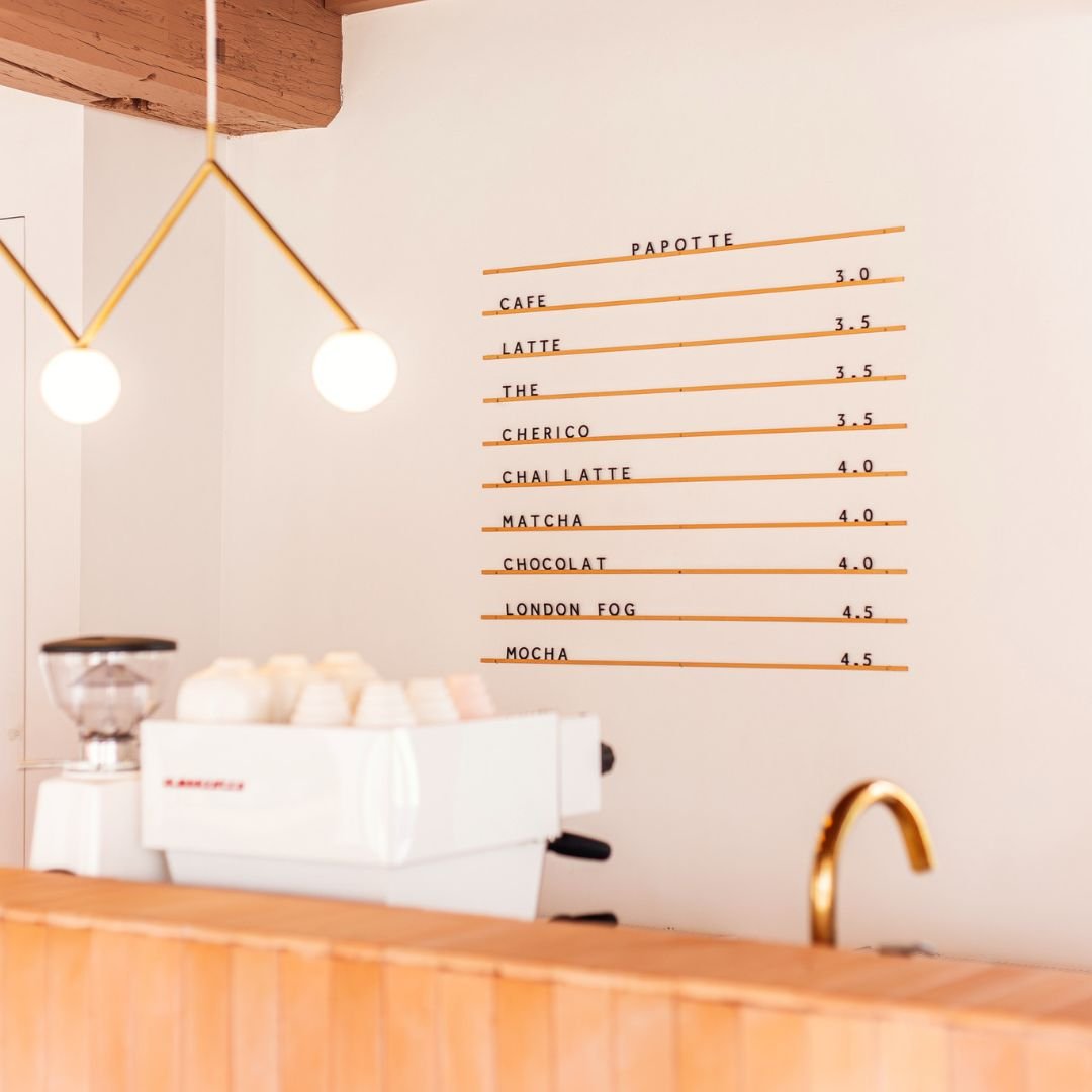
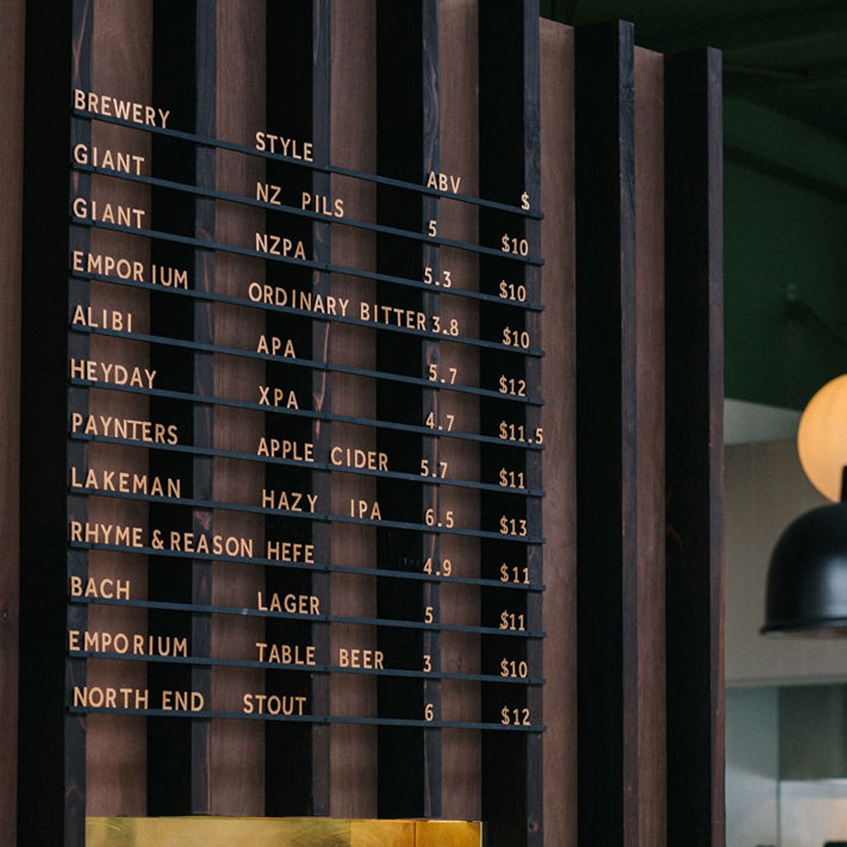
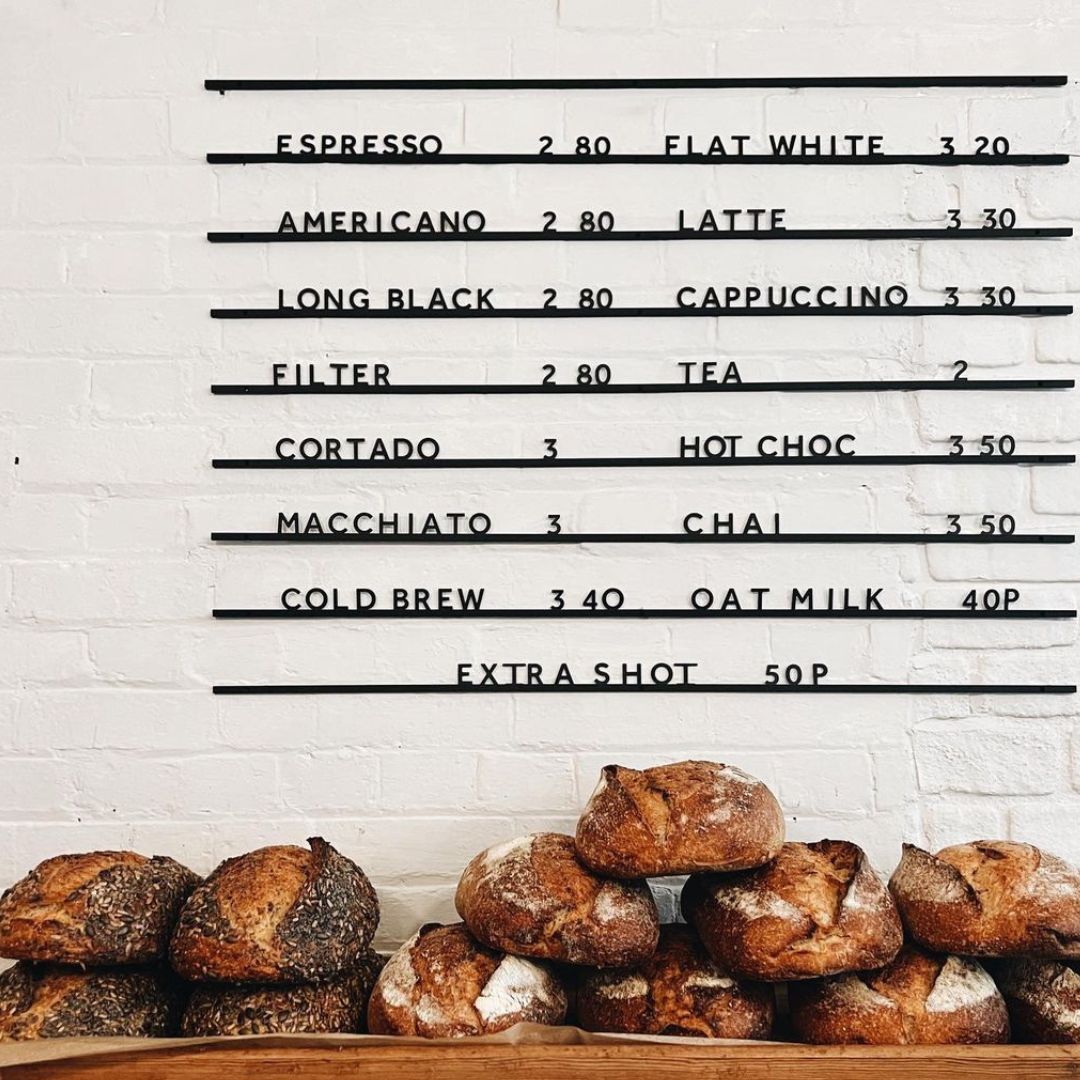
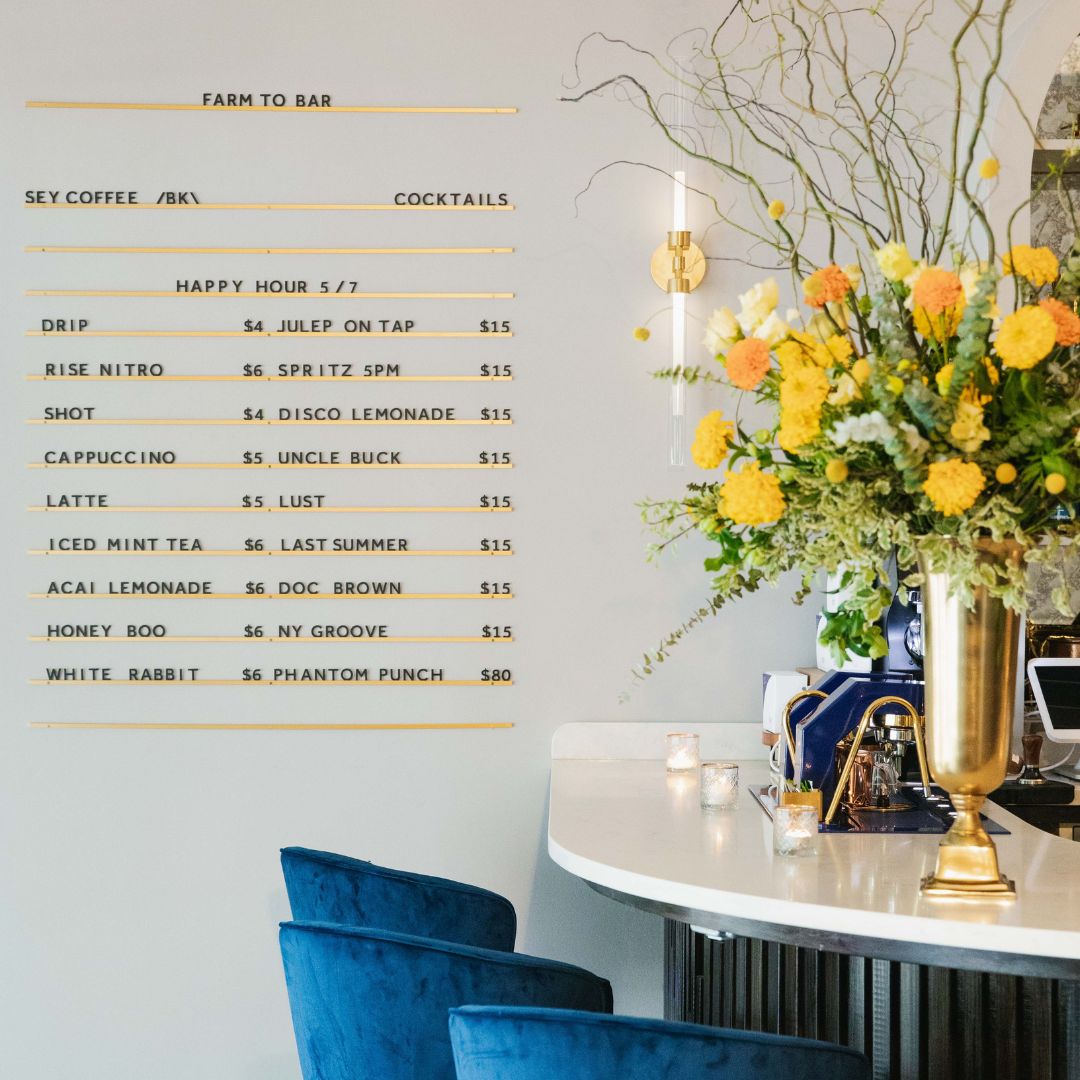
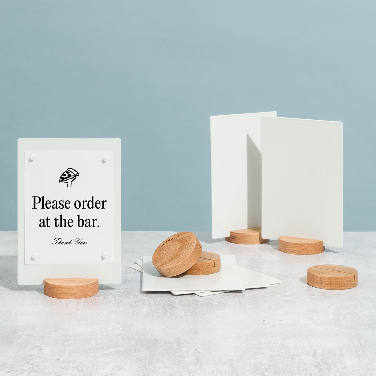
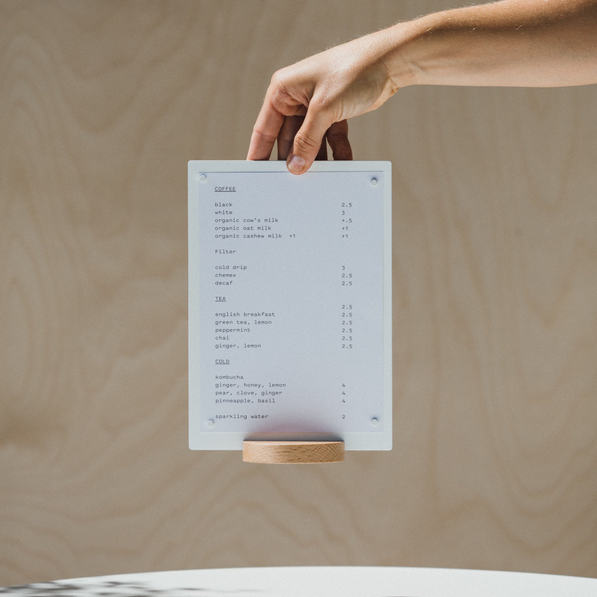
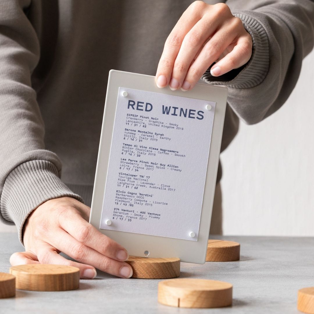
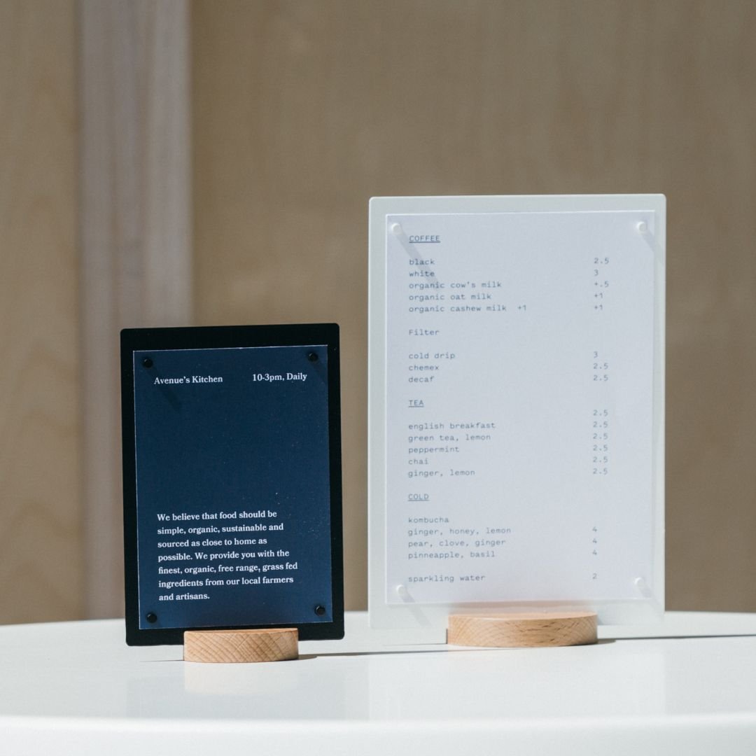
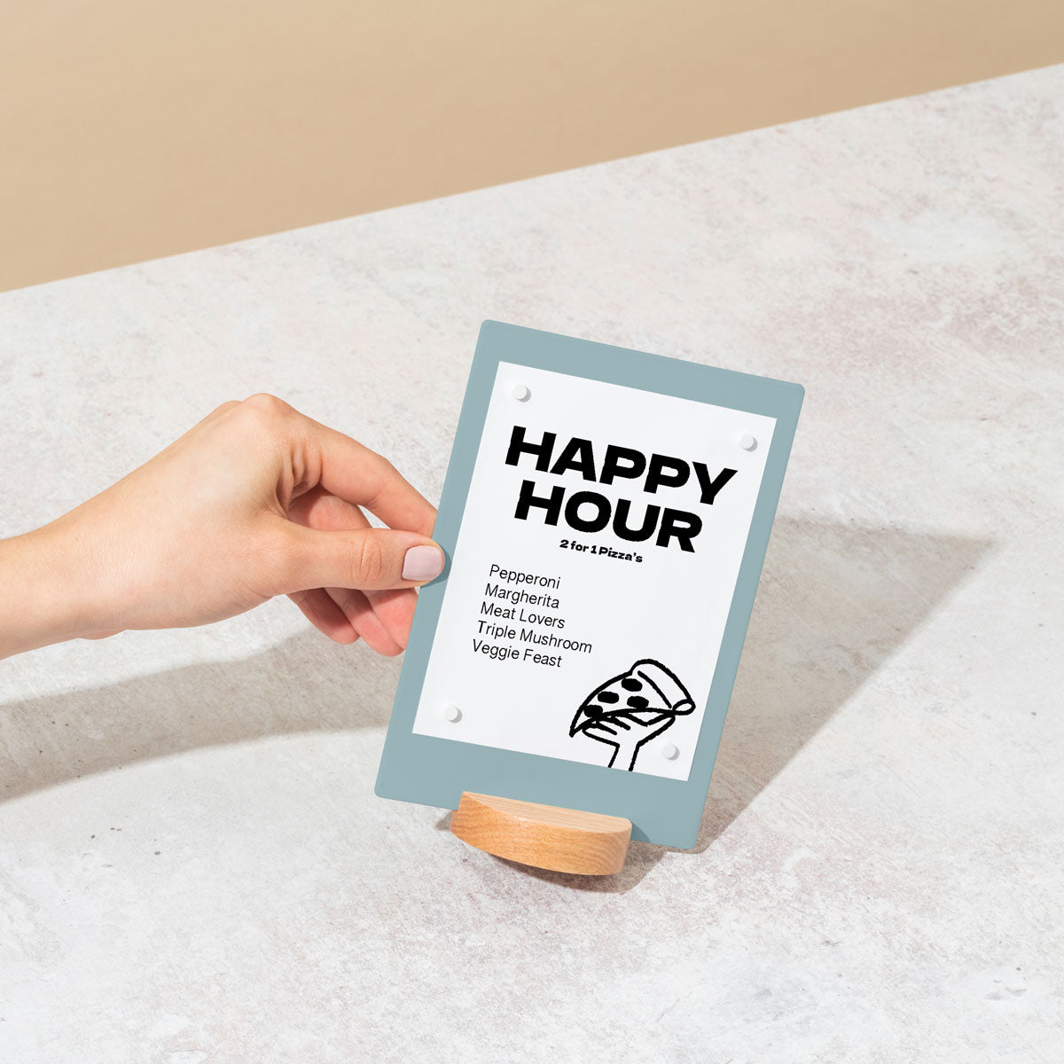
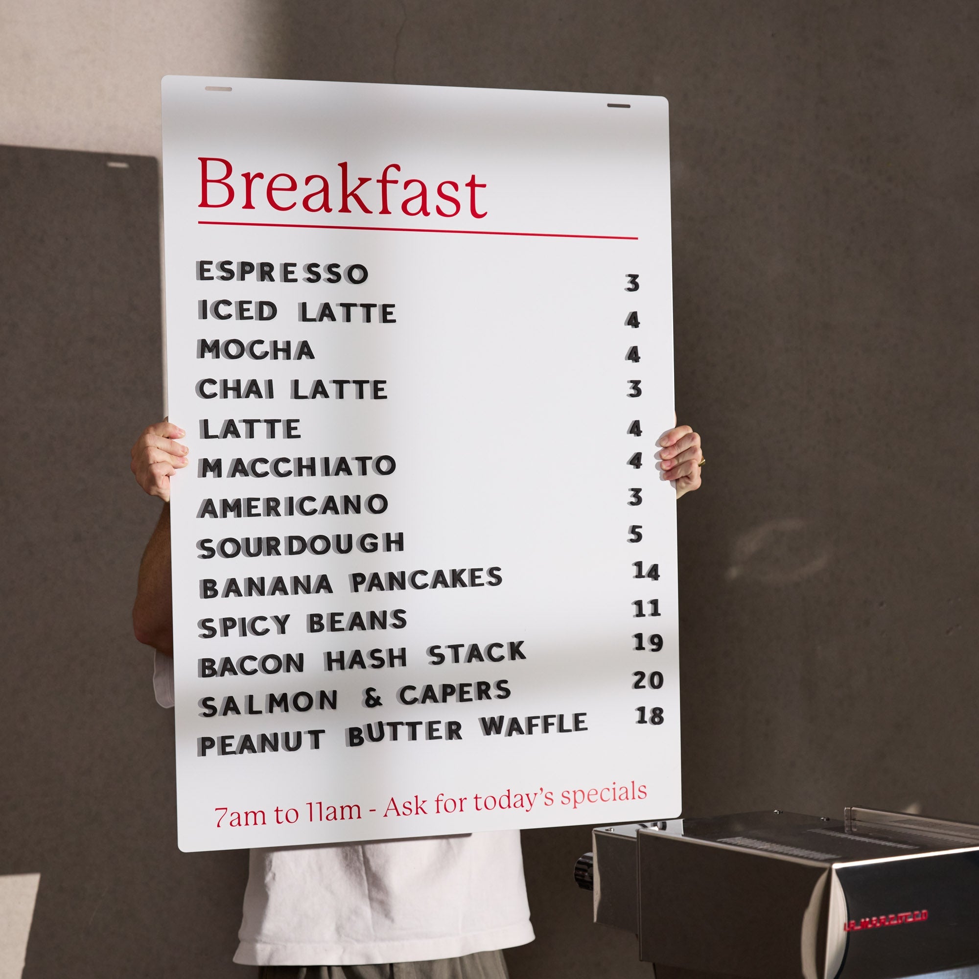
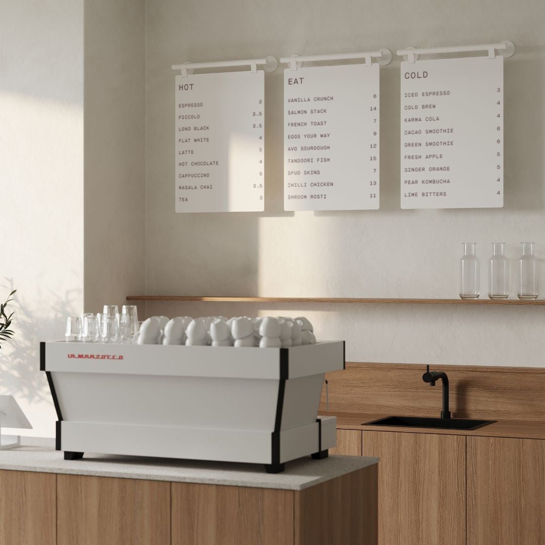
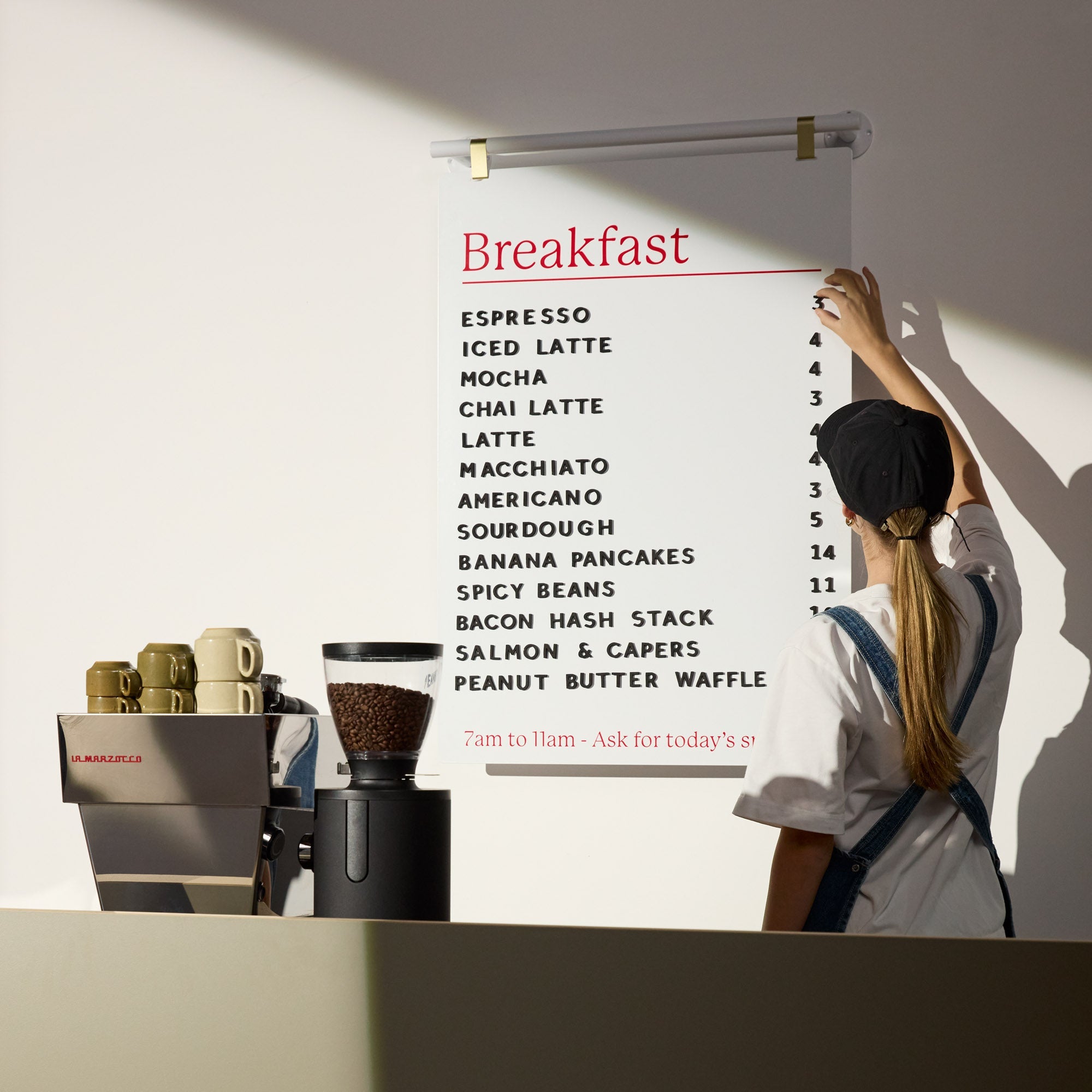
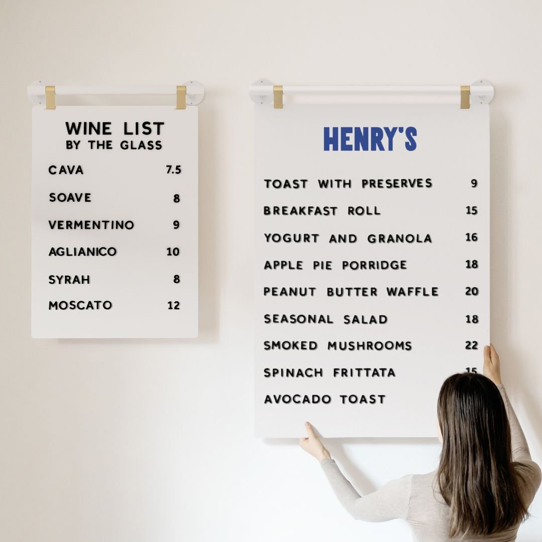
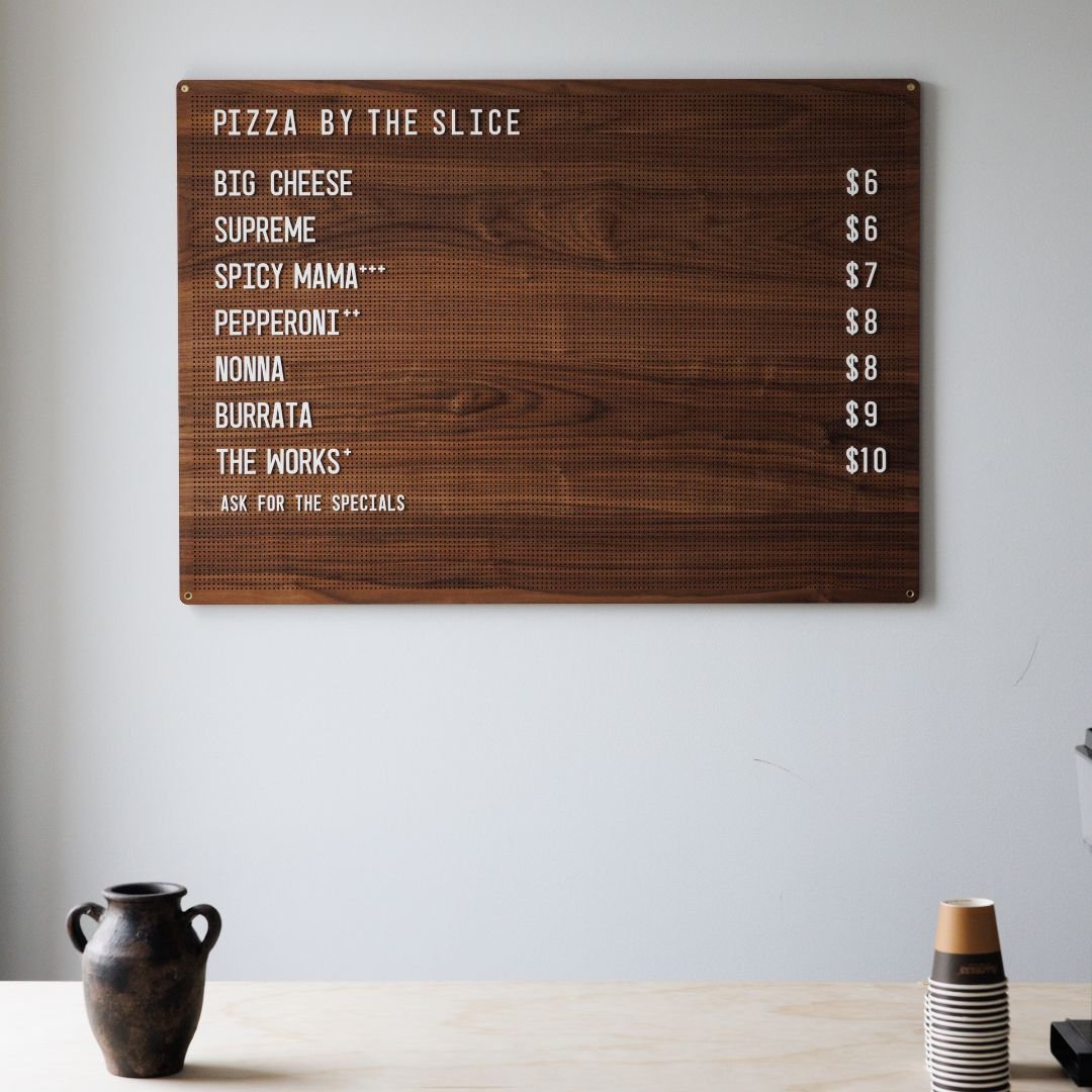
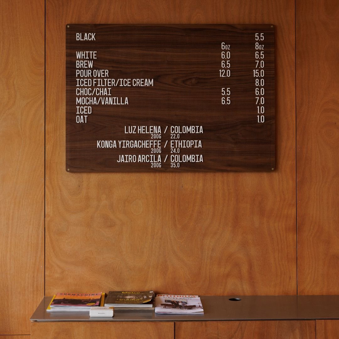
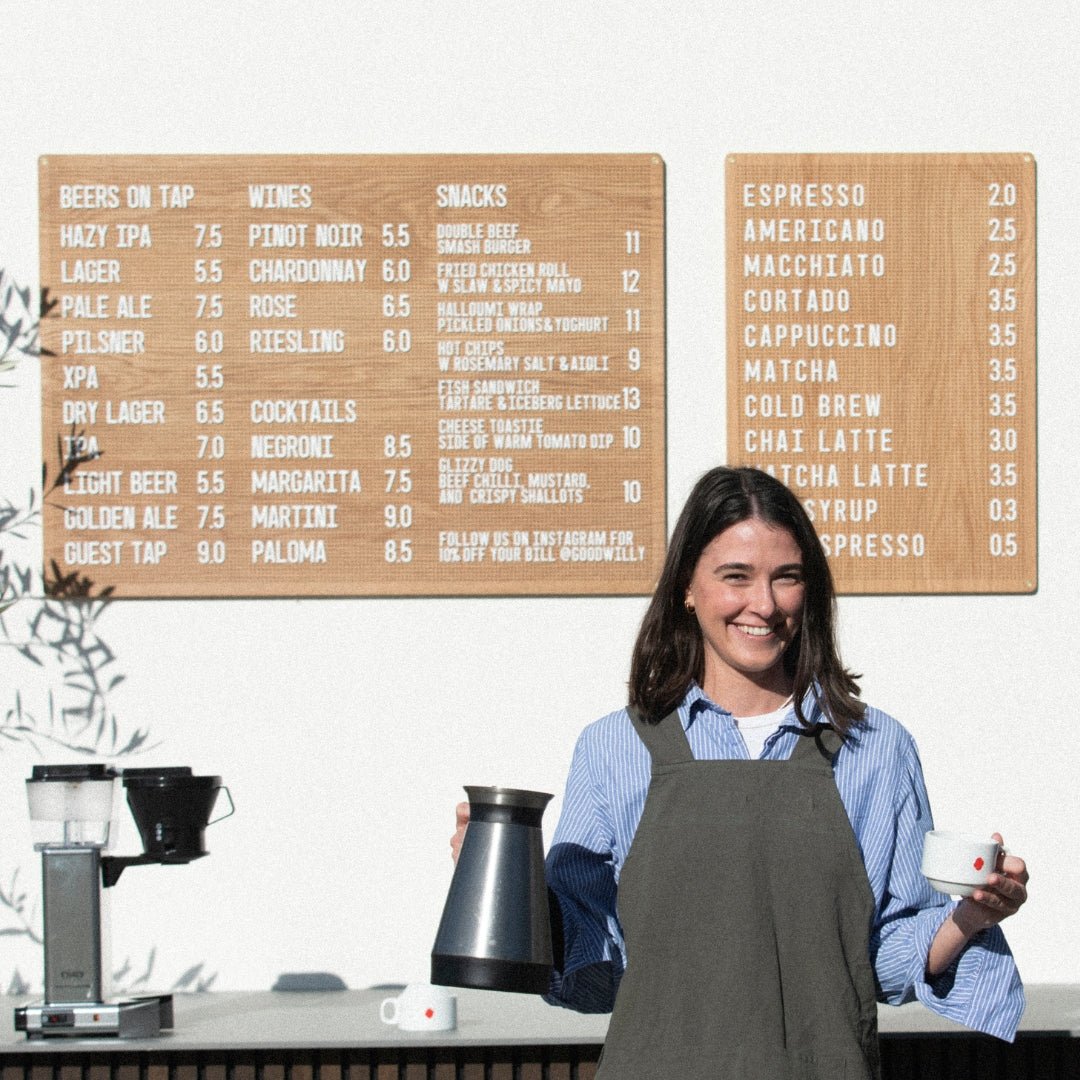
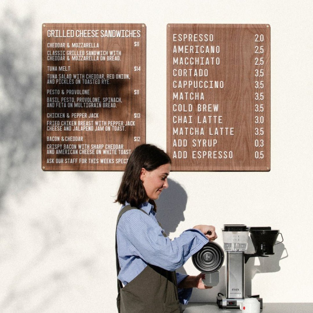
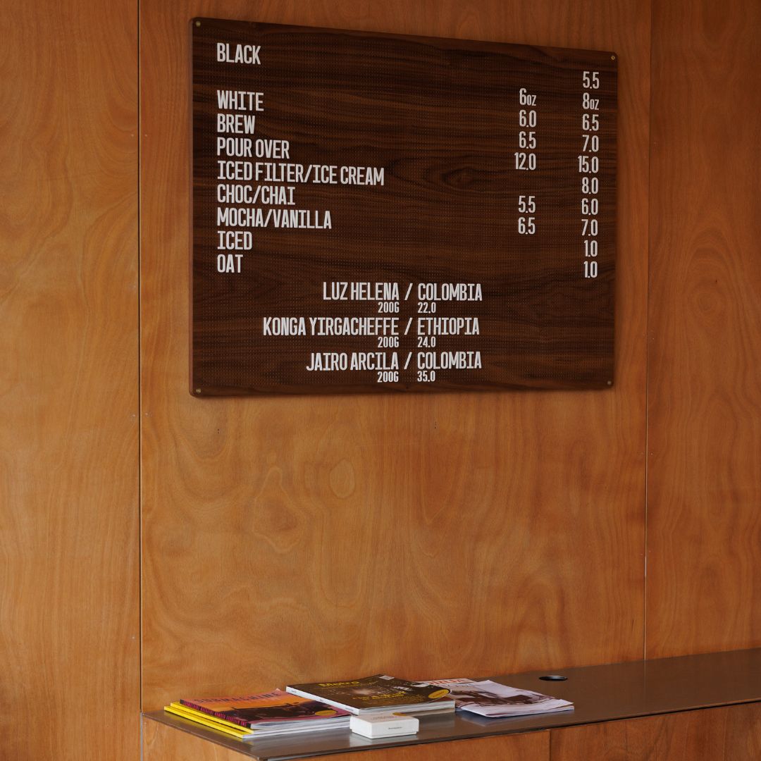
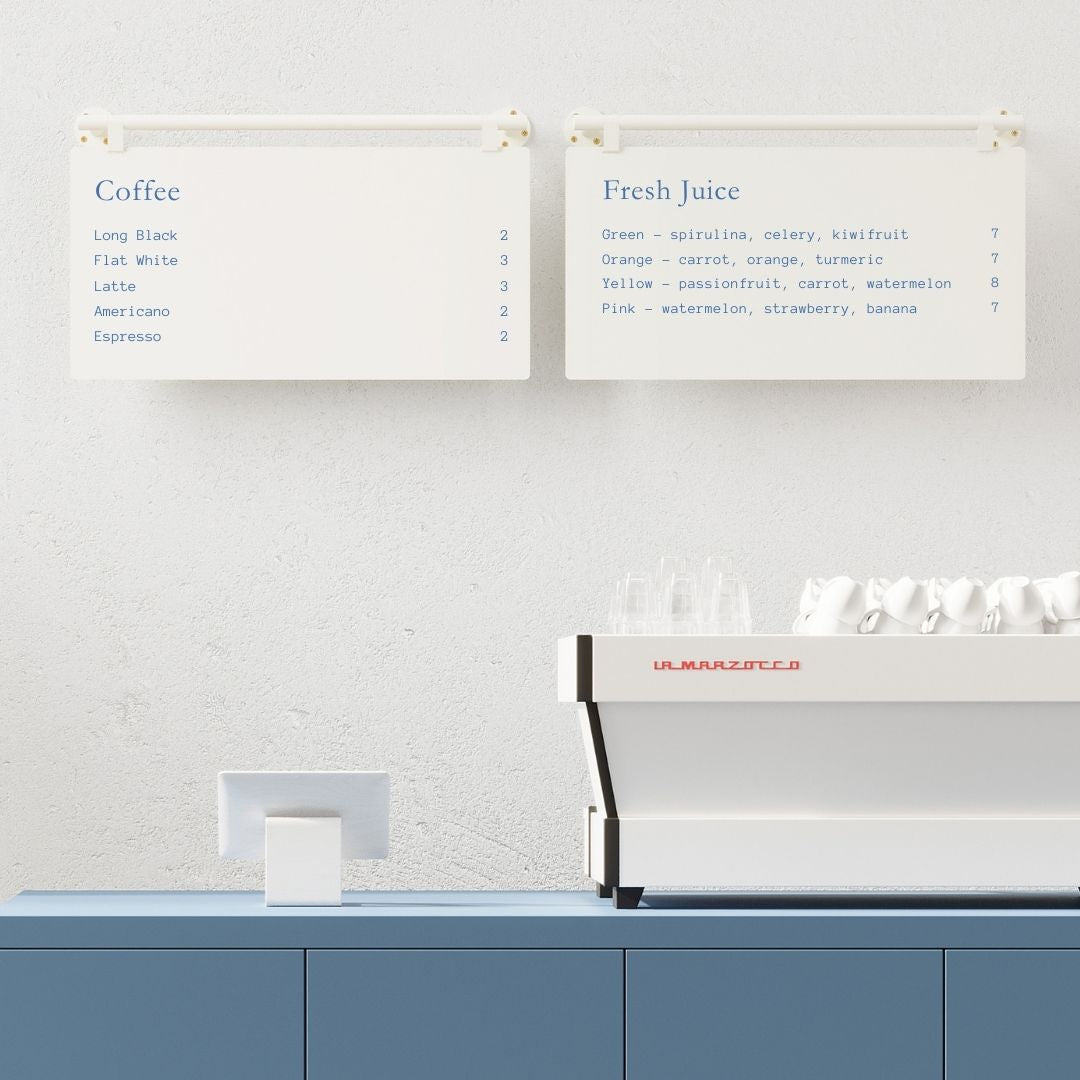
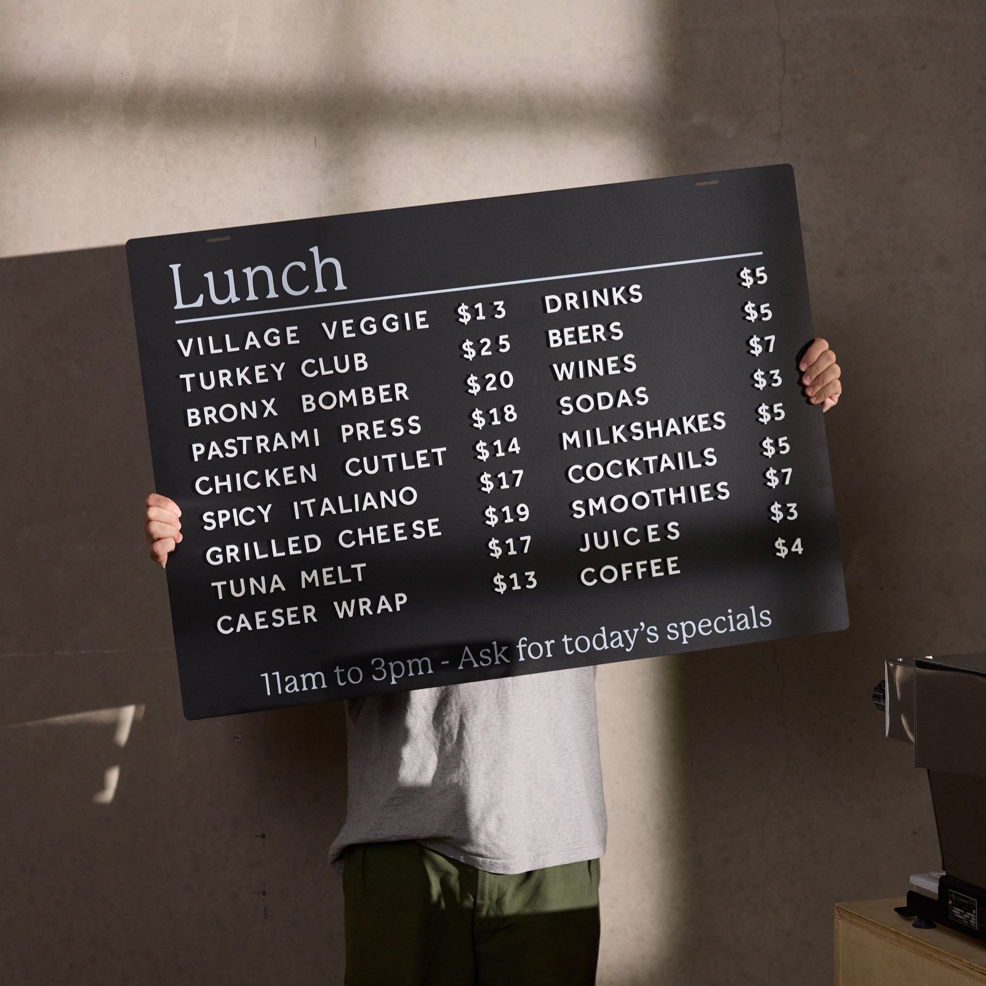
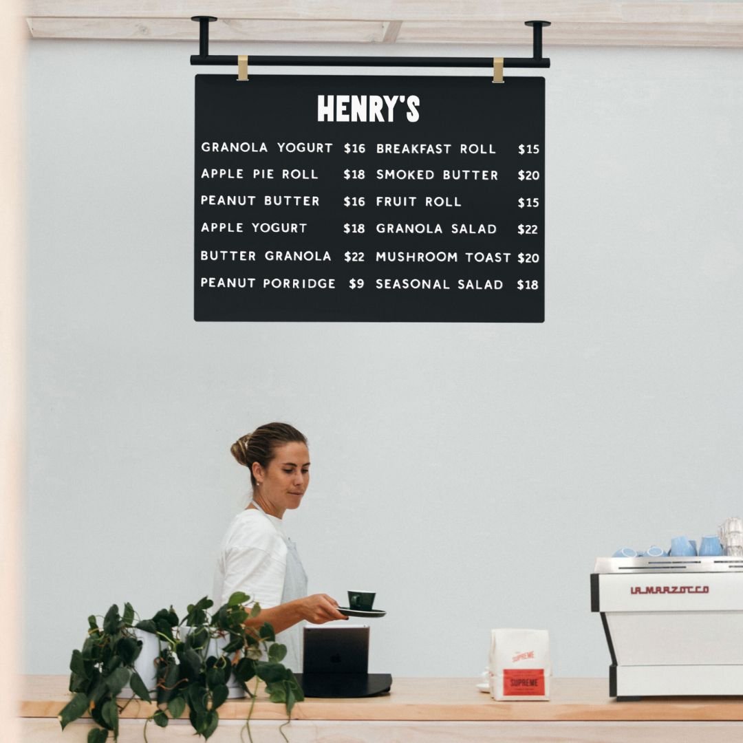
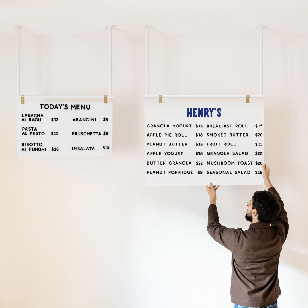
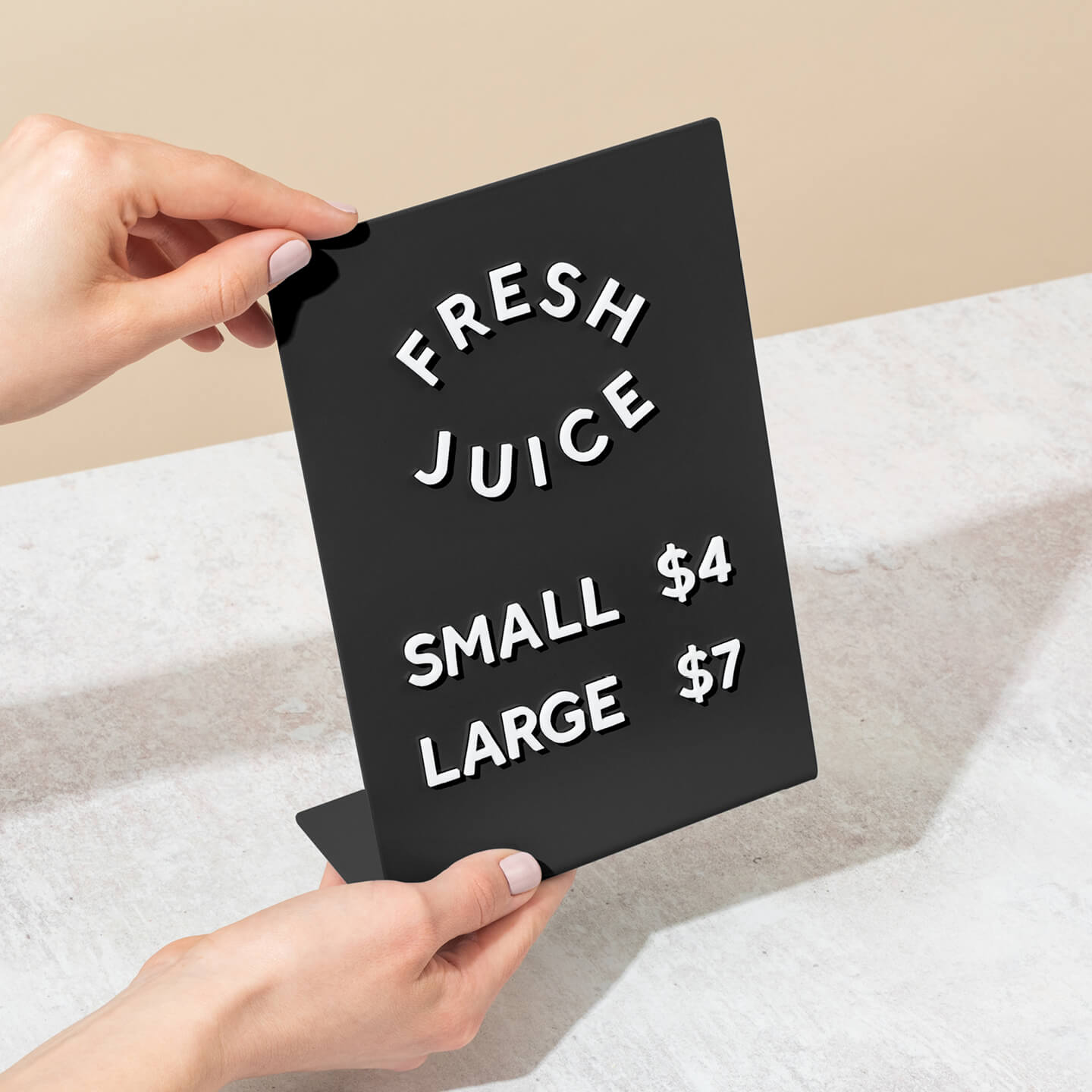
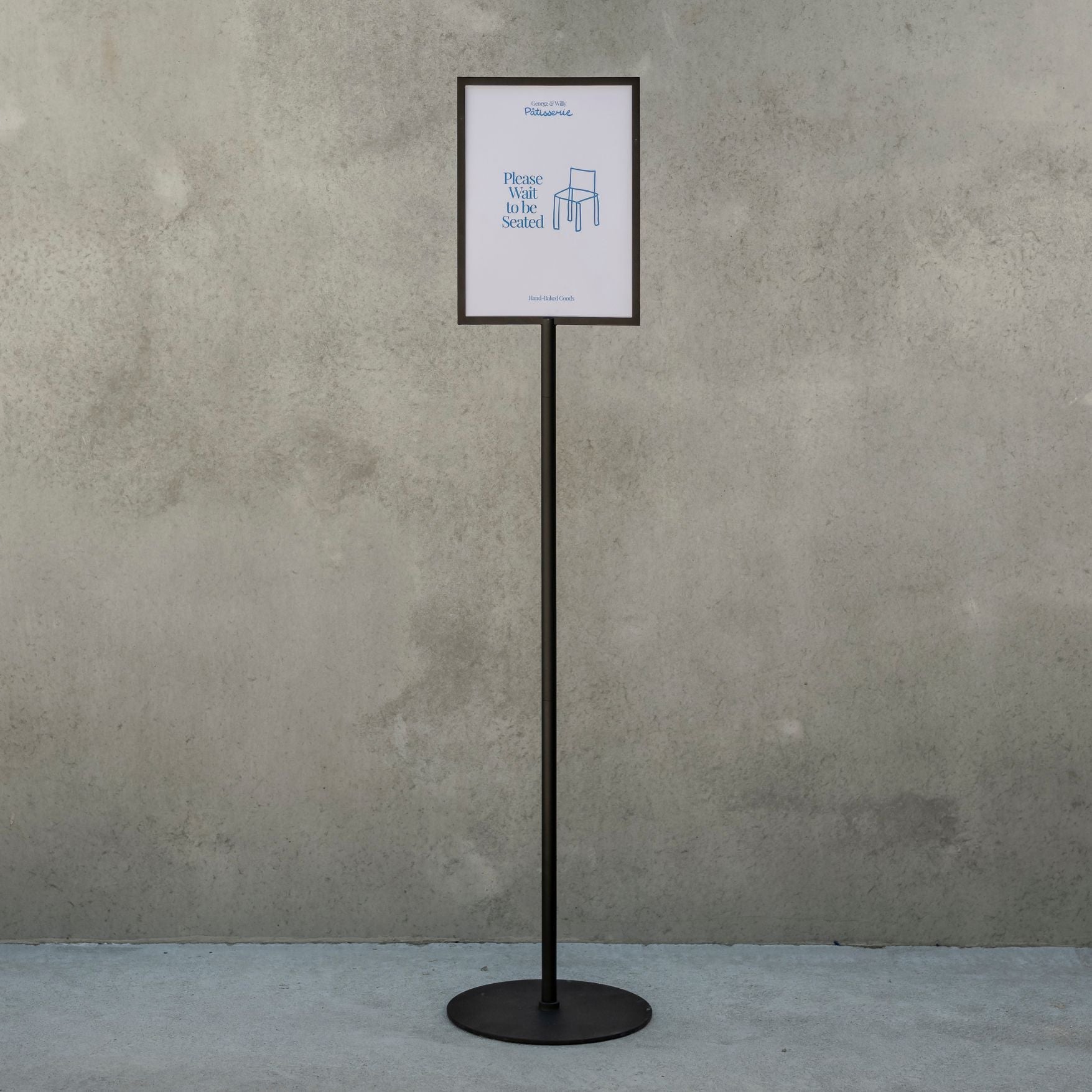
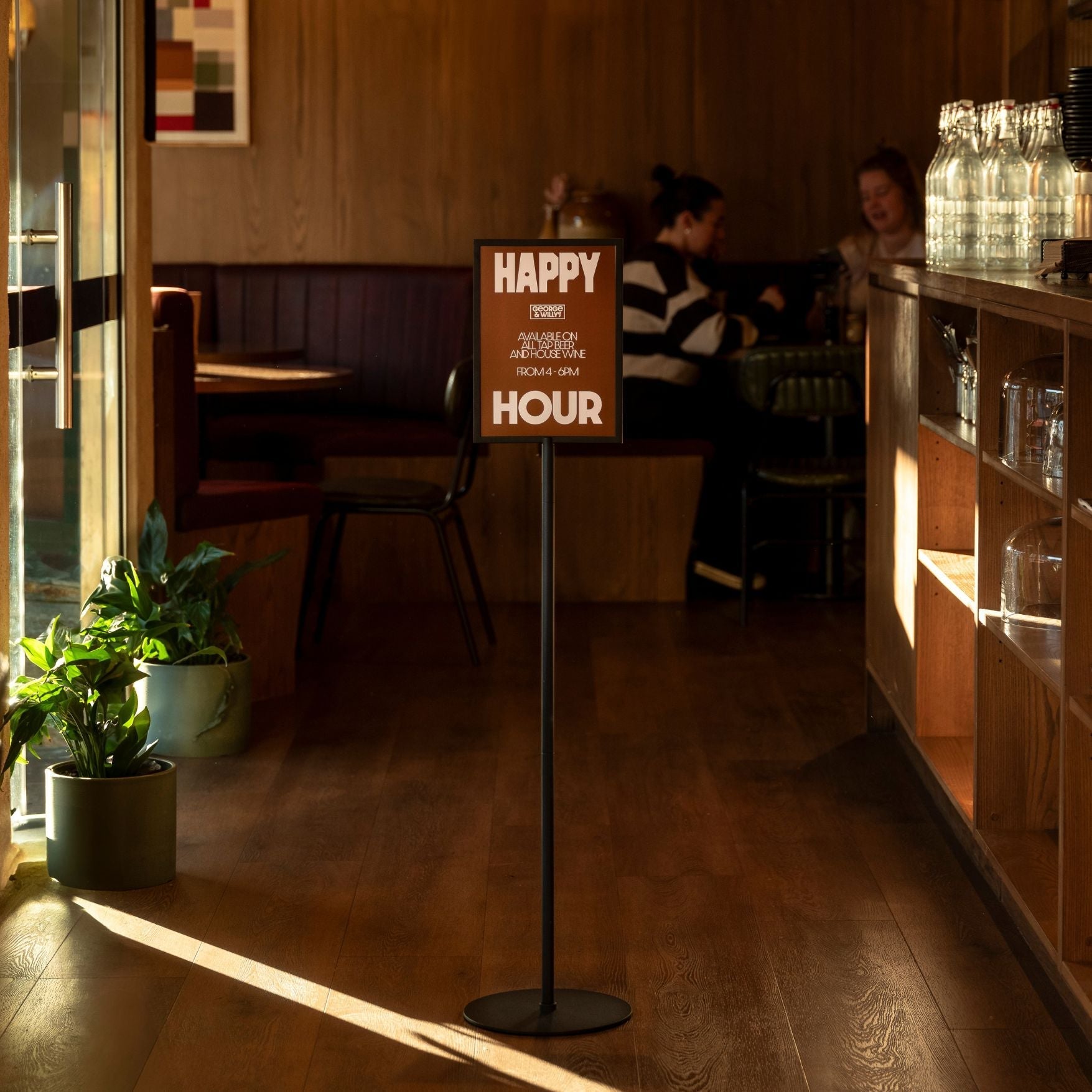
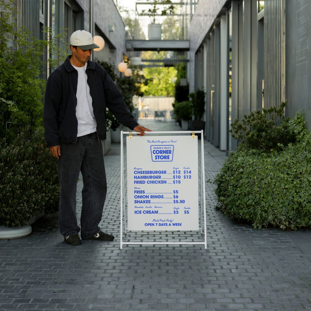
Point of Purchase: This is where counter signs become essential. They can announce promotions, provide pricing, or share important information right at the checkout.
Well planned interior signage, including clear counter signs and pricing signs, can even boost impulse sales by directing attention to items customers might have otherwise missed.
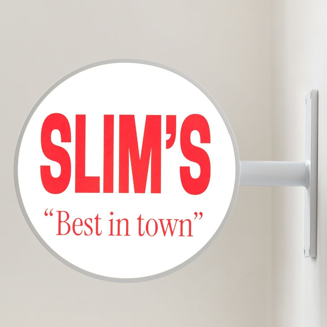
Readability is King: Keep It Bold and Simple
You have about three seconds to capture someone’s attention with a sign. That’s it. To make that brief window count, your message must be bold, clear, and incredibly easy to read.
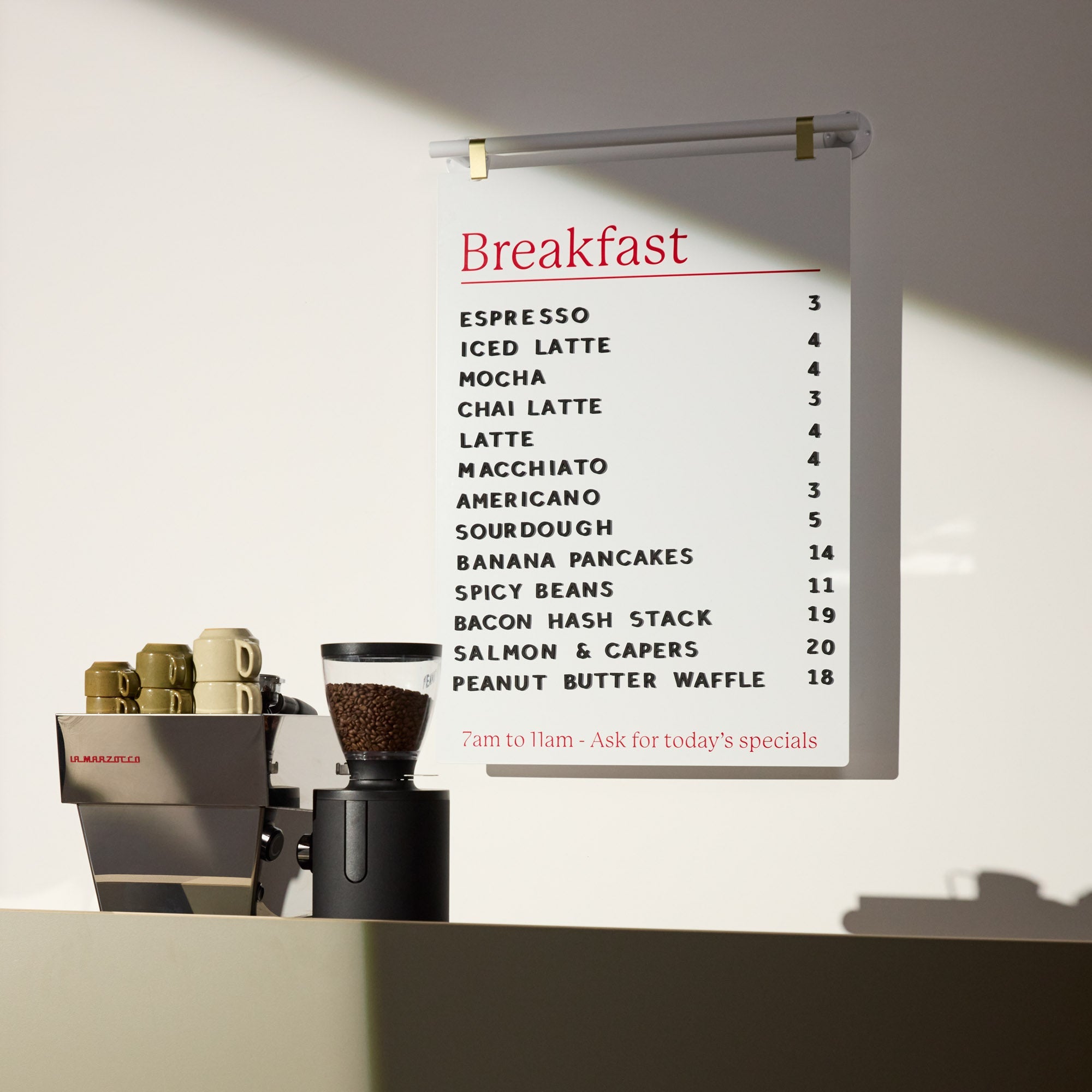
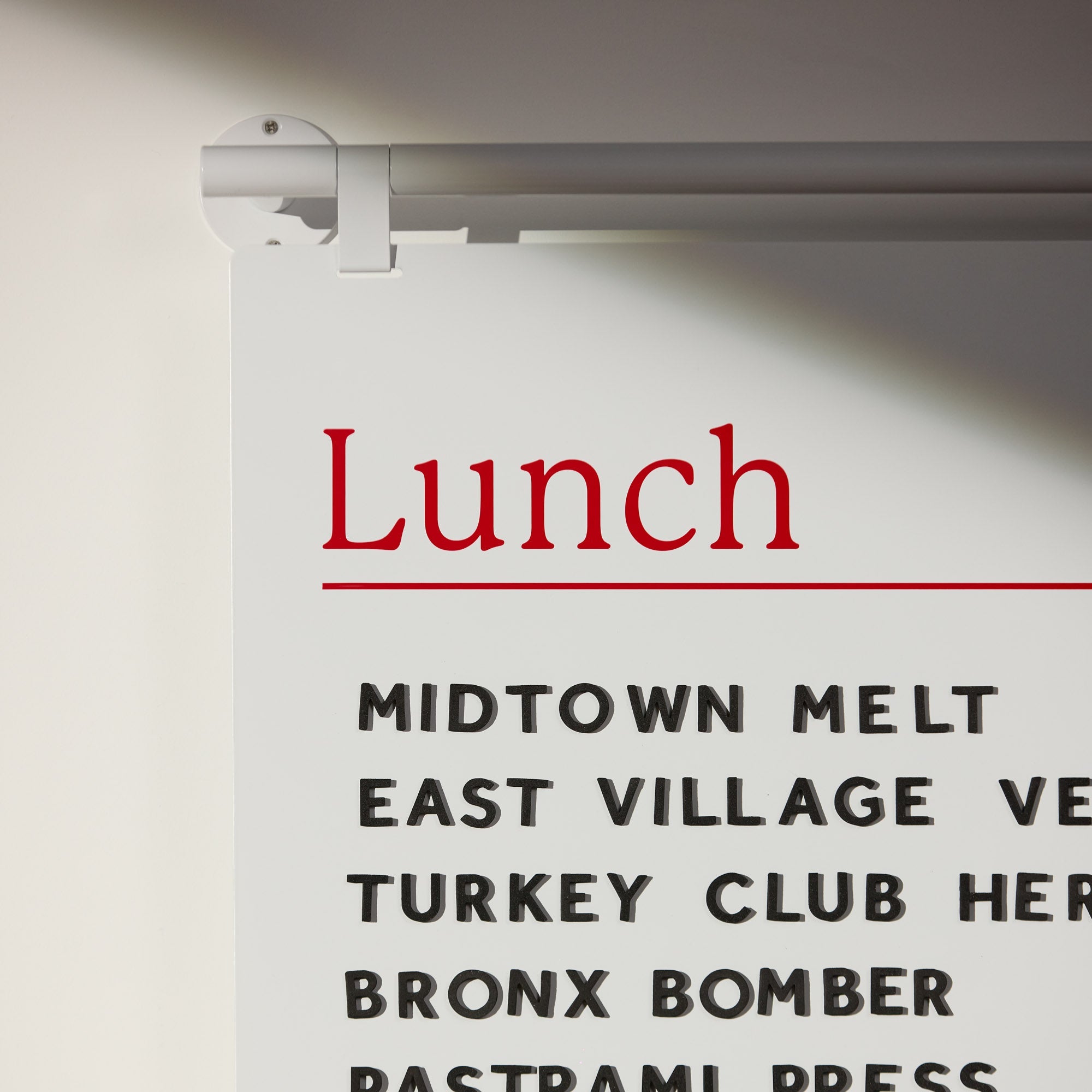
Over 83% of people say readable text is the most important part of a sign. They prefer a simple, uncluttered message over a sign packed with too much information. Use large, high contrast lettering. Classic combinations like black on yellow or white on navy are famously legible from a distance.
Font choice and size are also critical. A good rule of thumb is to have one inch of letter height for every ten feet of viewing distance. This applies to everything from your main storefront sign to the text on your tabletop counter signs. A well designed sign with a punchy message will be understood at a glance, capturing the attention of even the most hurried customer.
The Power of Consistency: Building a Cohesive Brand
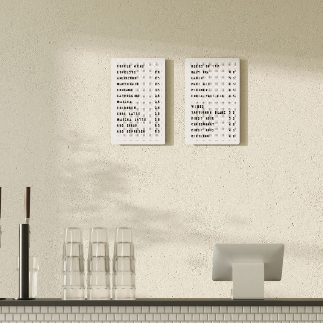
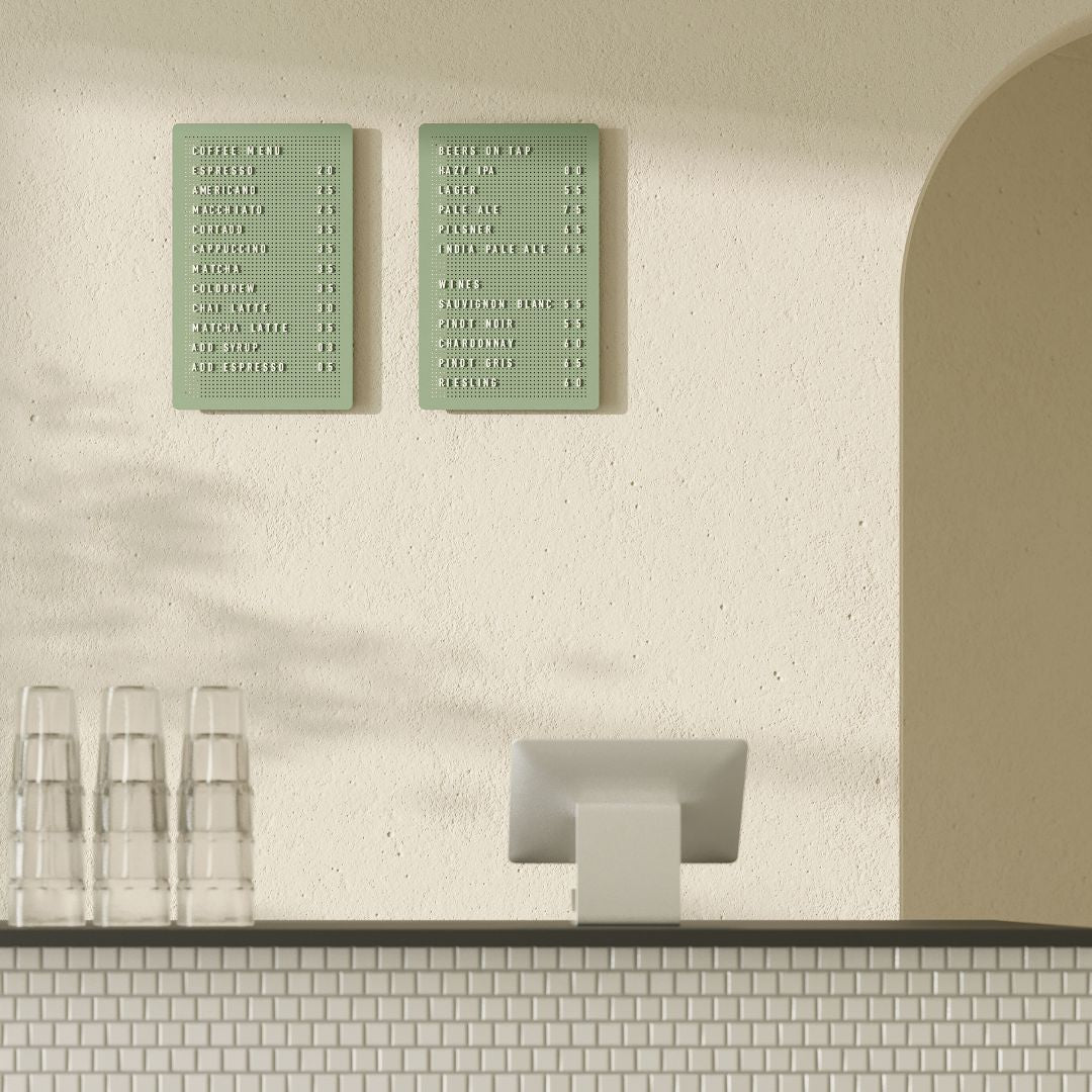
Every sign in and around your business should tell the same brand story. Using the same logo, colors, and fonts across your storefront sign, your menu boards, and your counter signs reinforces your brand identity.
This isn’t just about looking good. Research shows that maintaining a consistent brand presentation can increase revenue by up to 33%. When customers see a unified look, it builds recognition and trust. Inconsistent signage, on the other hand, can feel jarring and unprofessional.
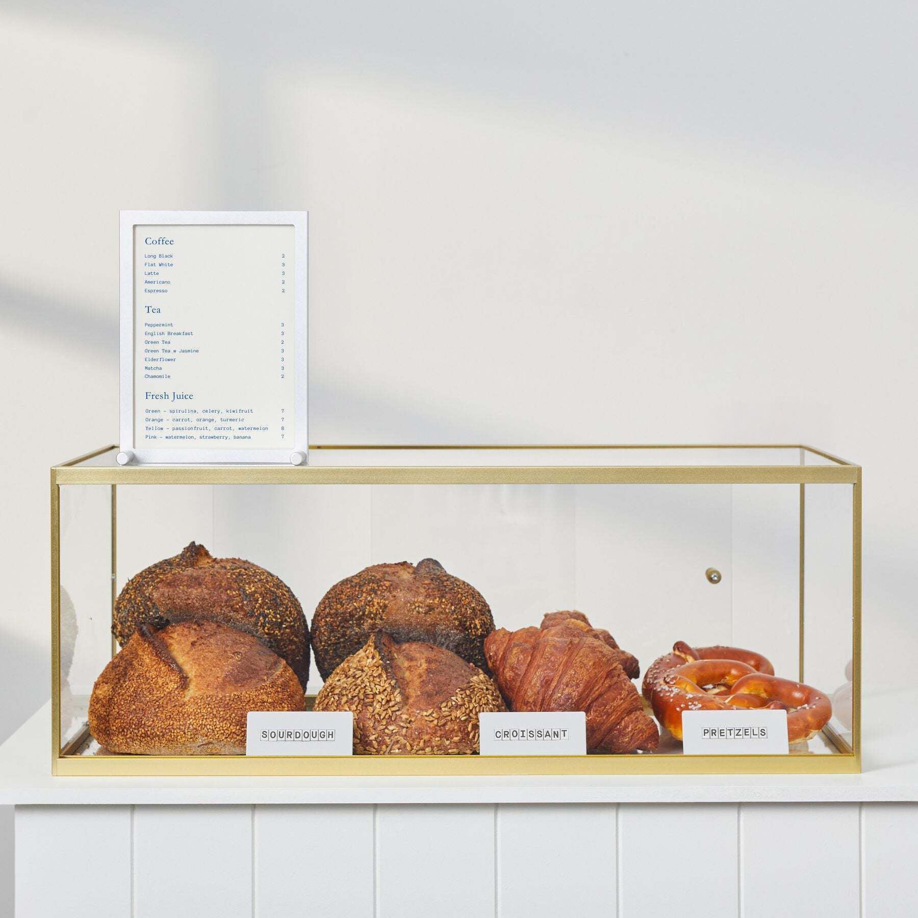
Create a simple style guide and apply it everywhere. A bakery, for example, might use the same cheerful font and color palette on its large exterior sign, its interior menu board, and the small counter signs that label pastries. This cohesive visual language makes your brand memorable and creates a seamless customer experience. For a curated look, you can explore a collection of minimalist signage designed to create a consistent feel.
Keeping It Fresh: Why Dynamic Signage Matters
Don’t let your signs become invisible background noise. Regularly updating your content keeps customers engaged and gives them a reason to pay attention.
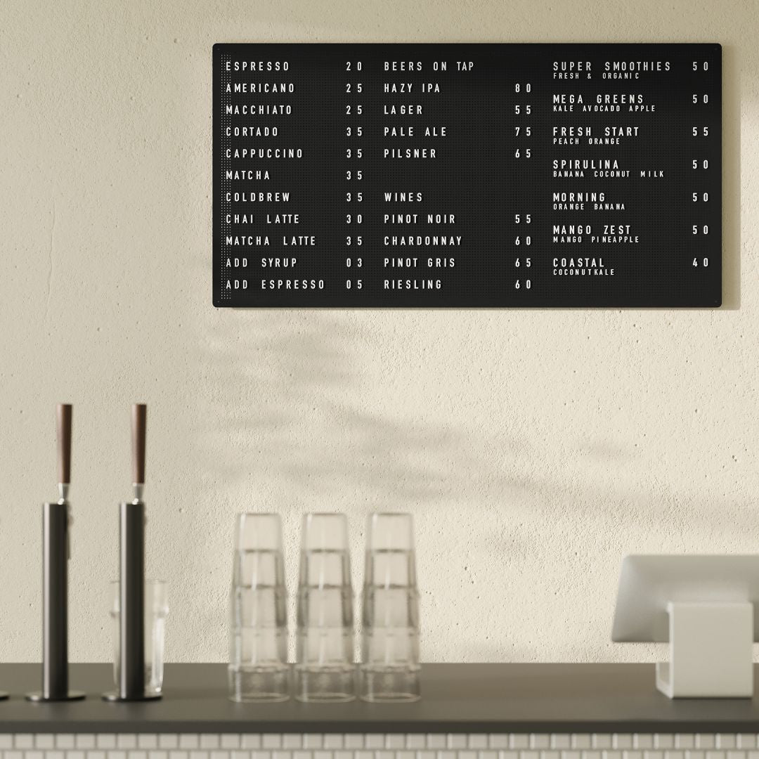
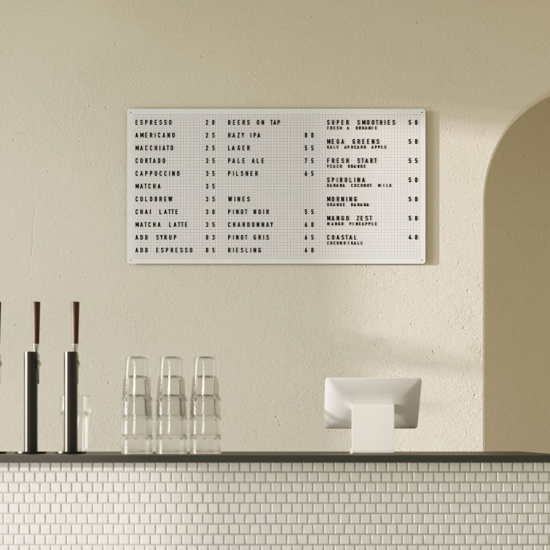
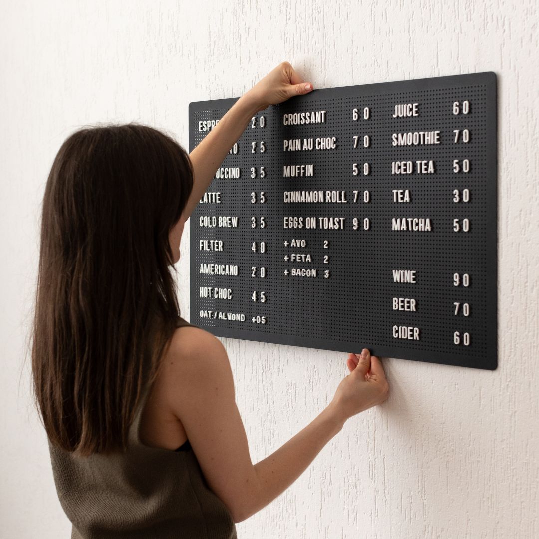
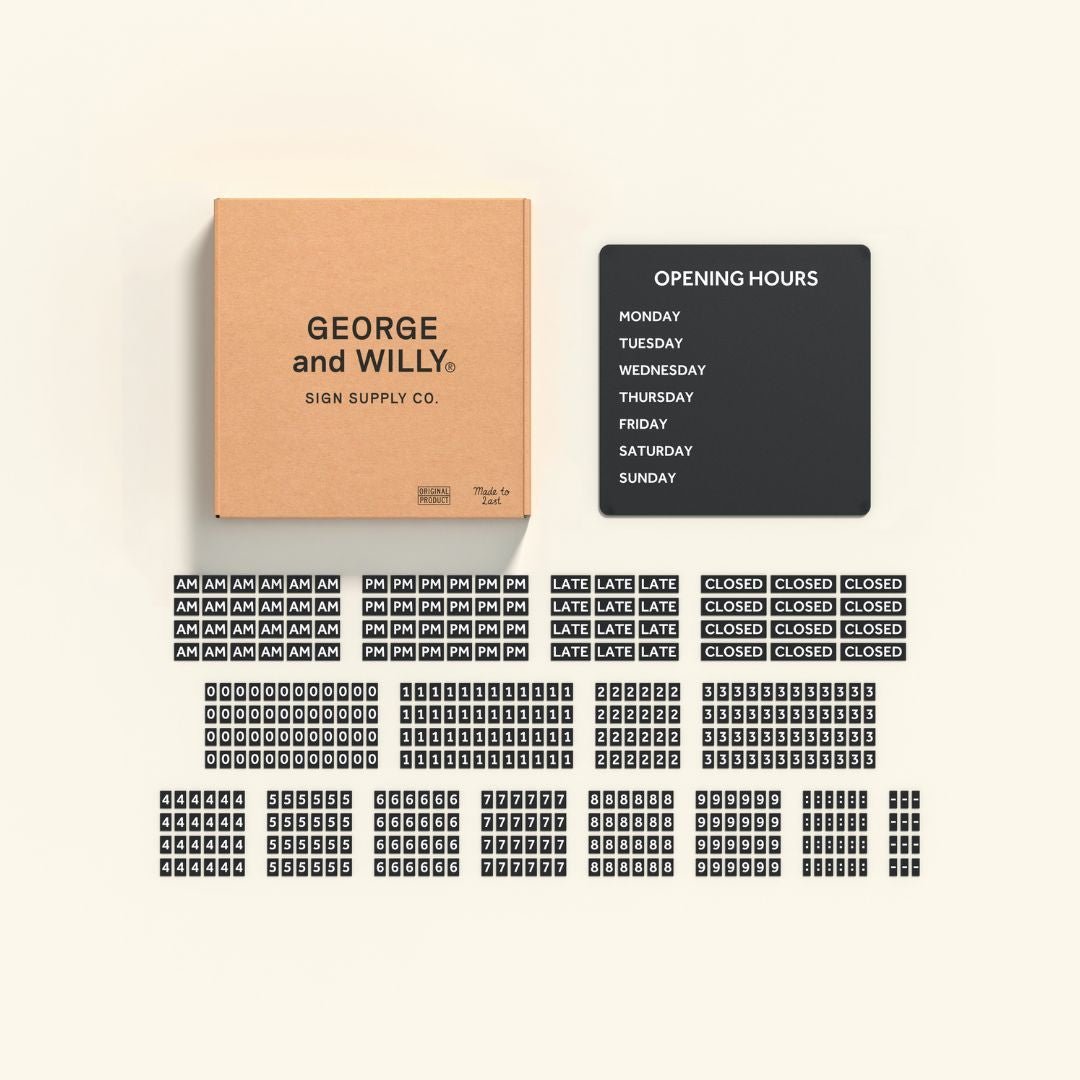
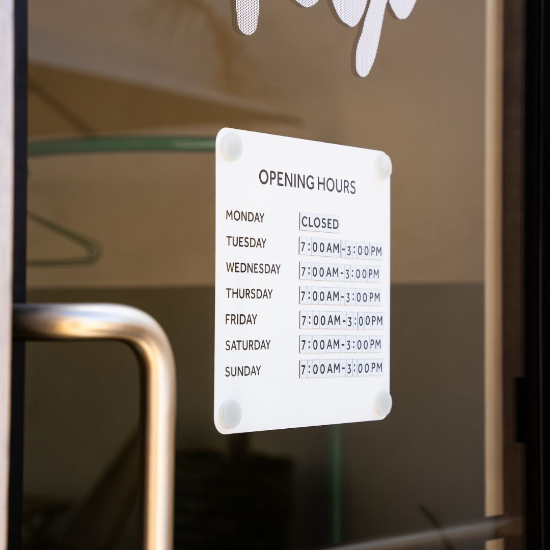
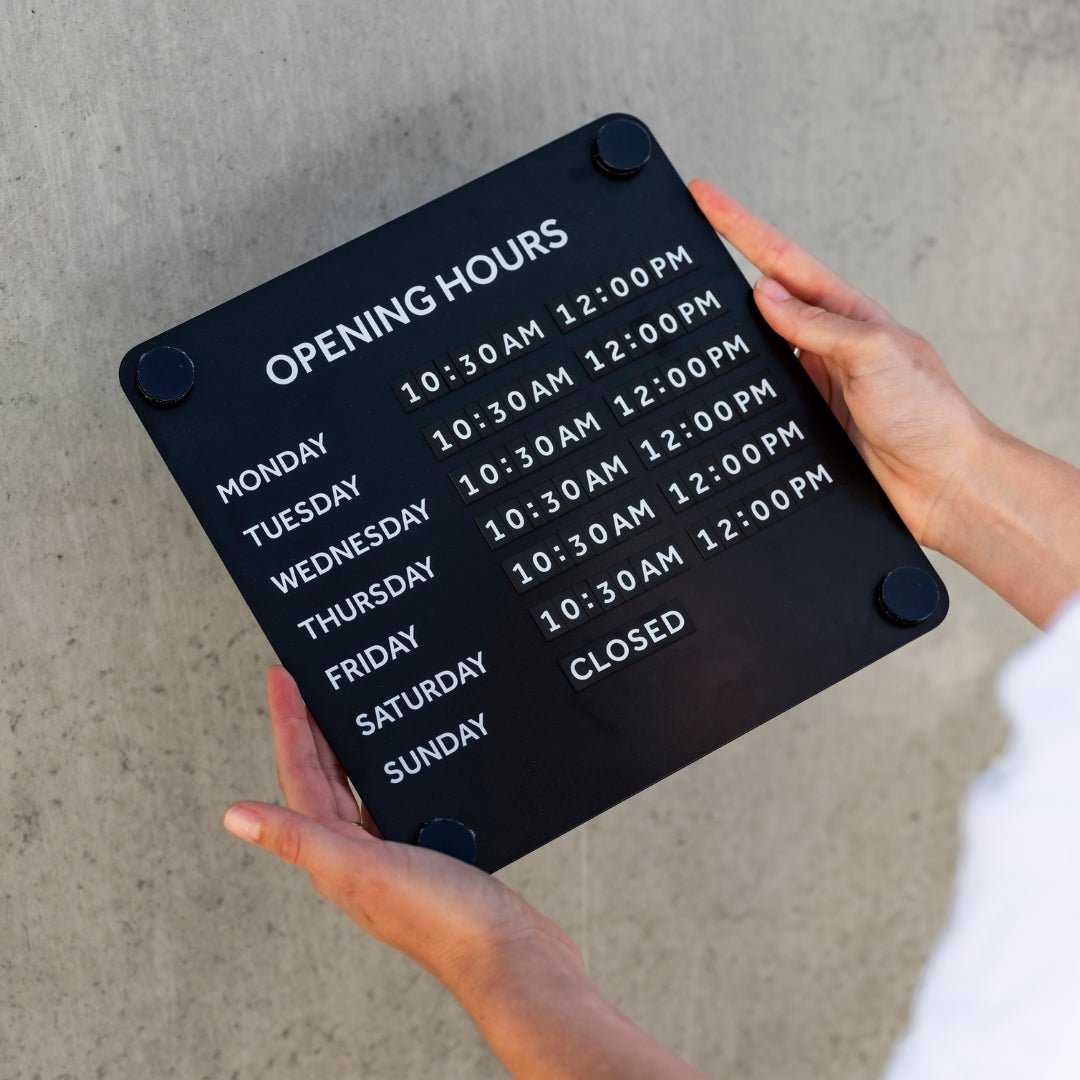
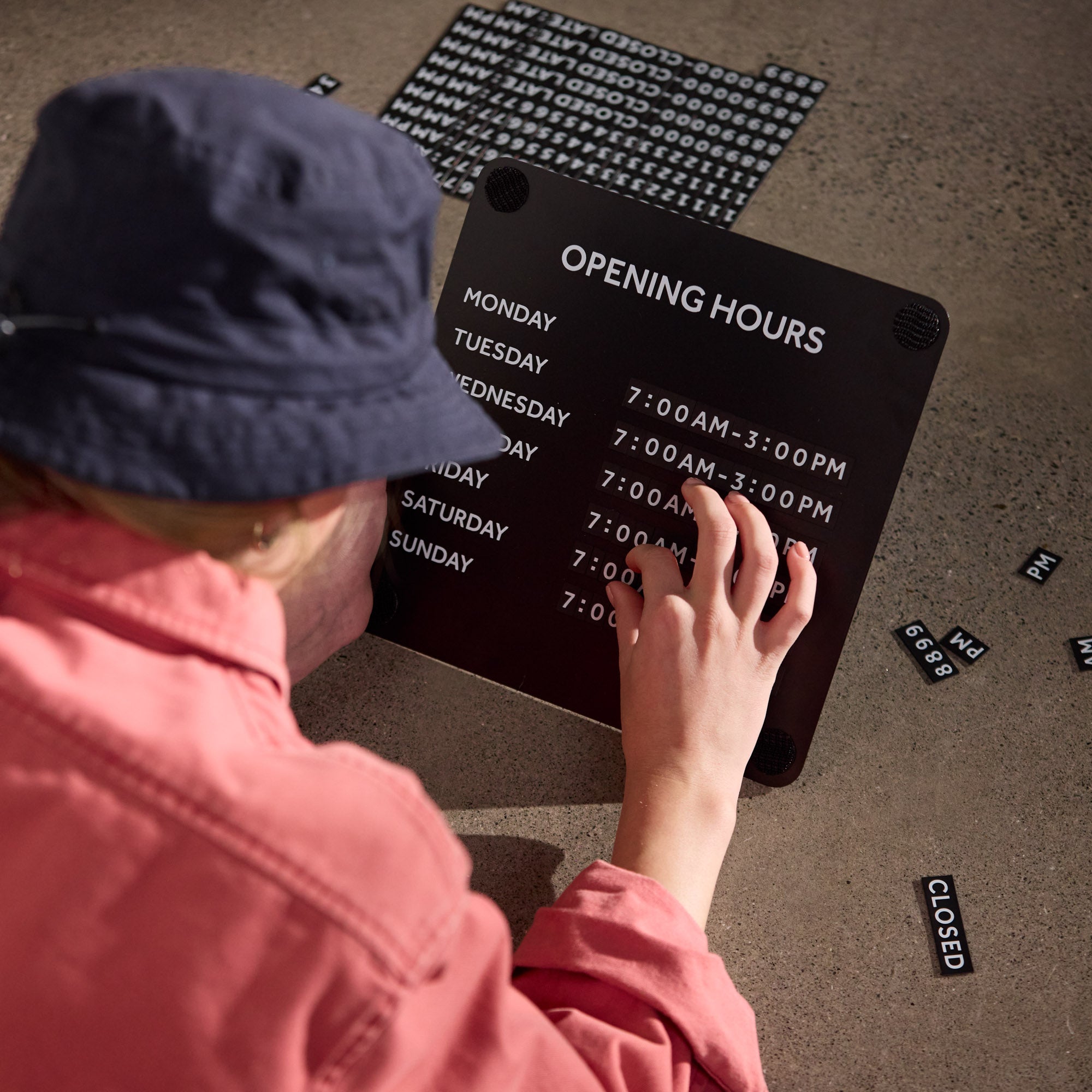
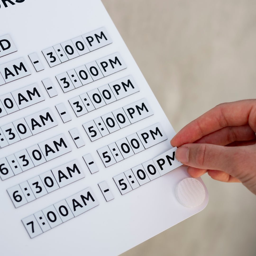
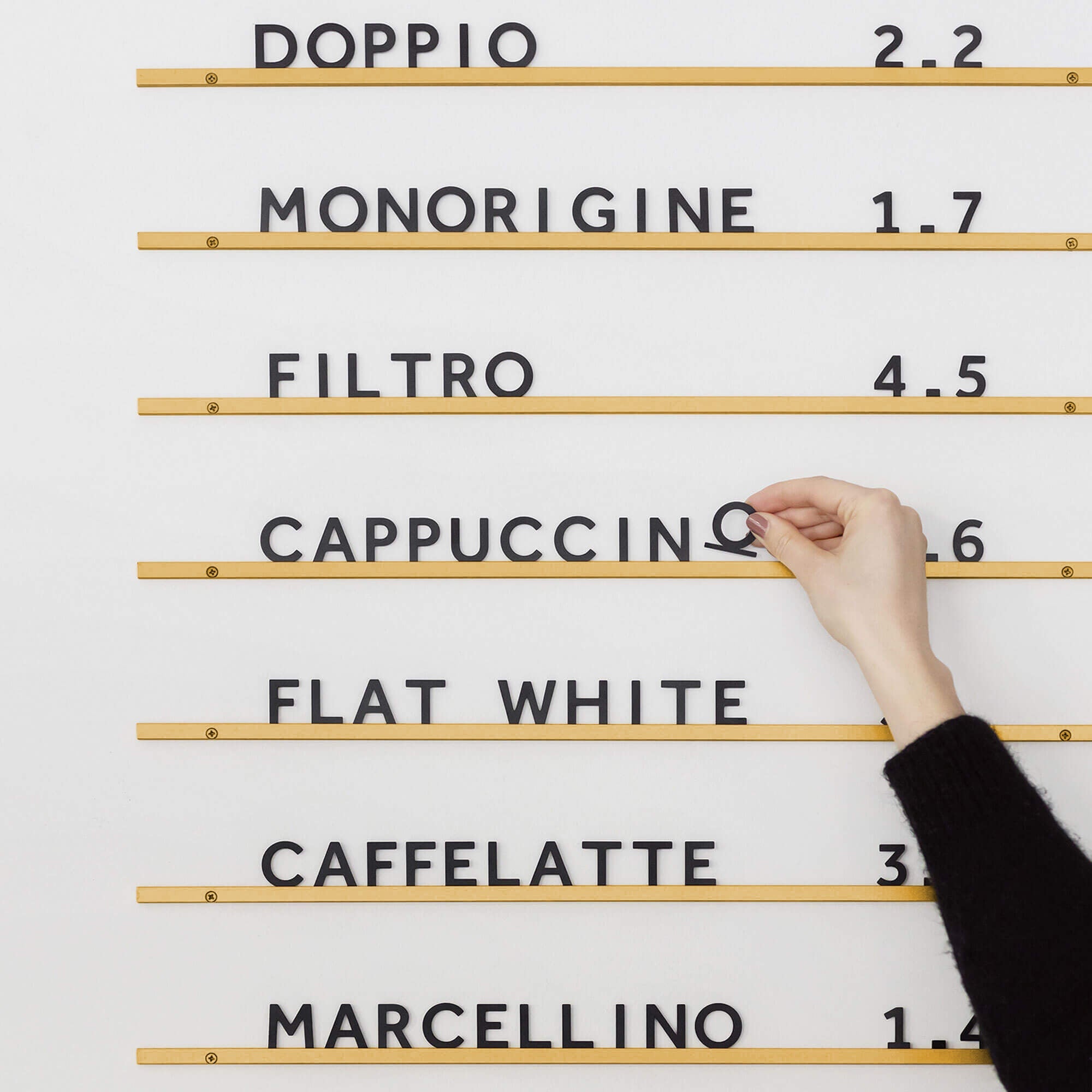
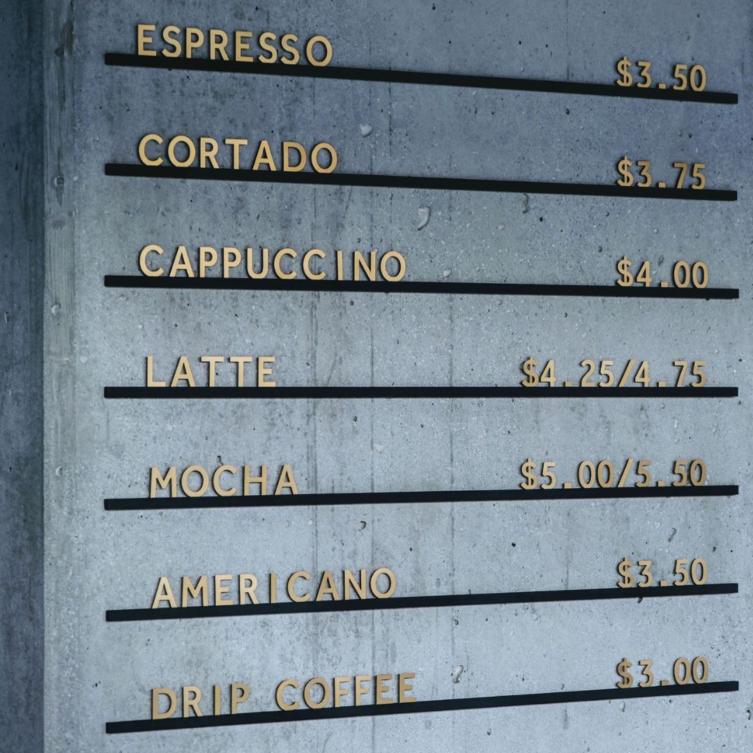
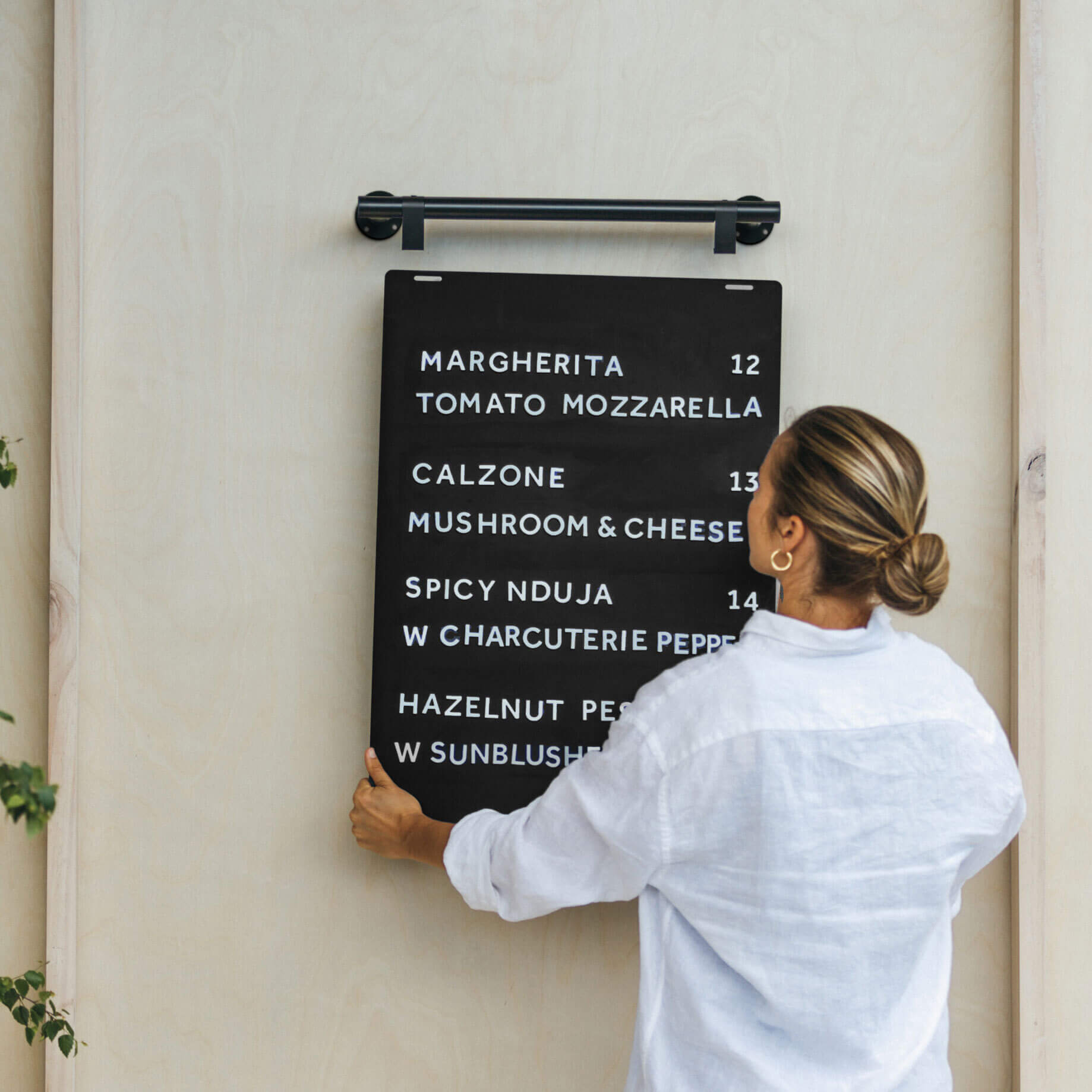
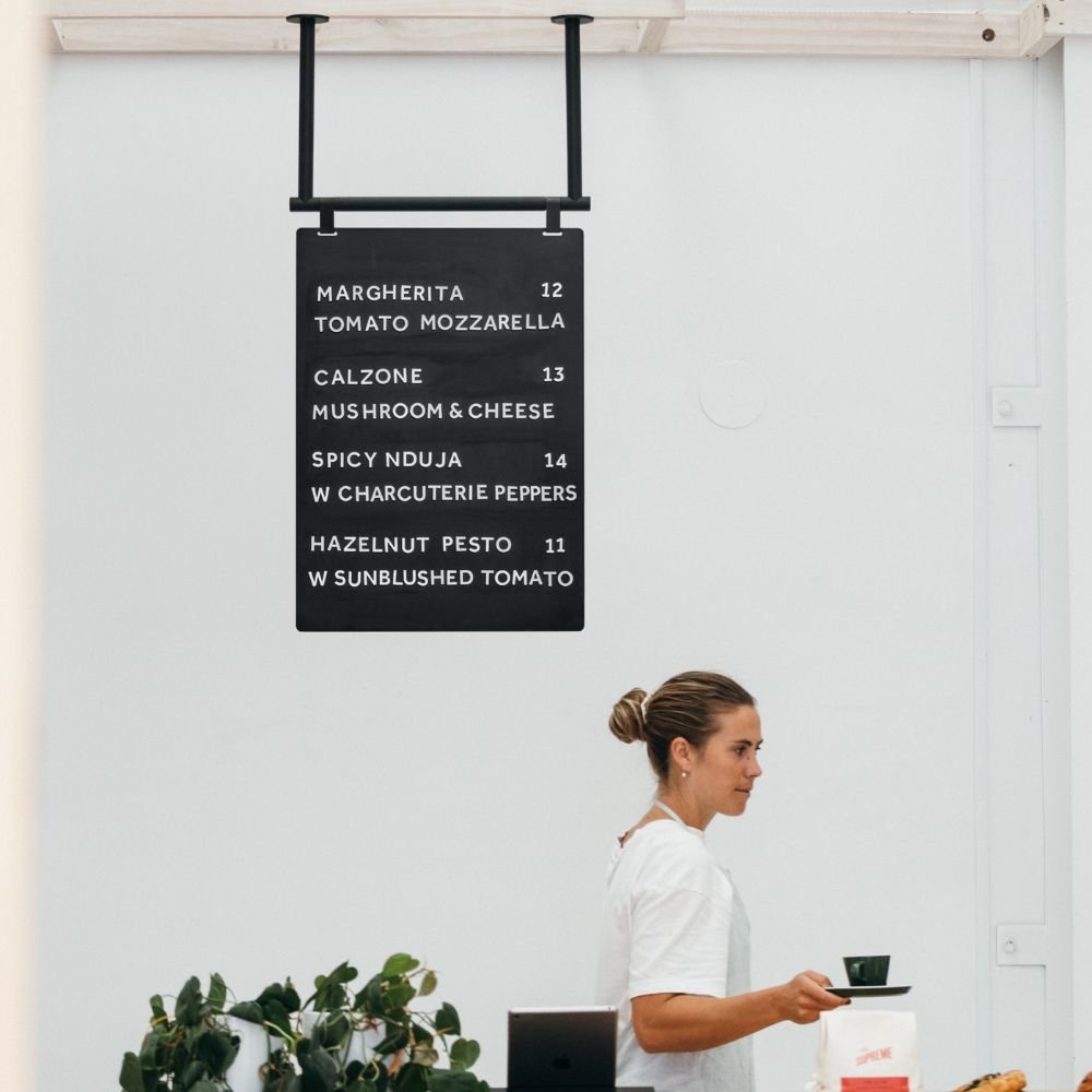
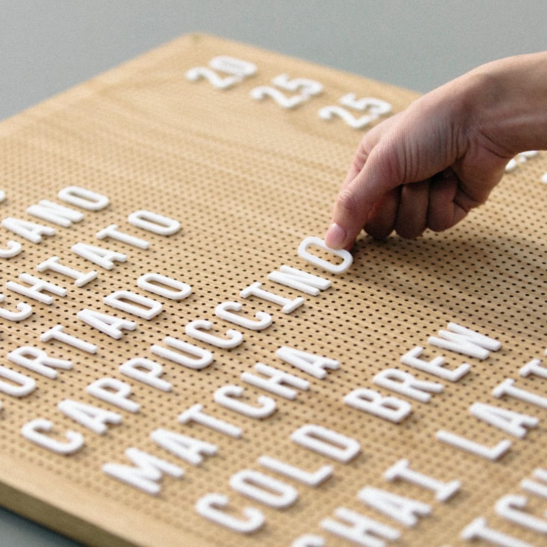
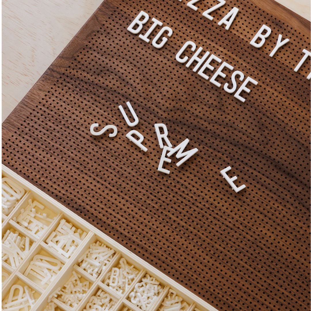
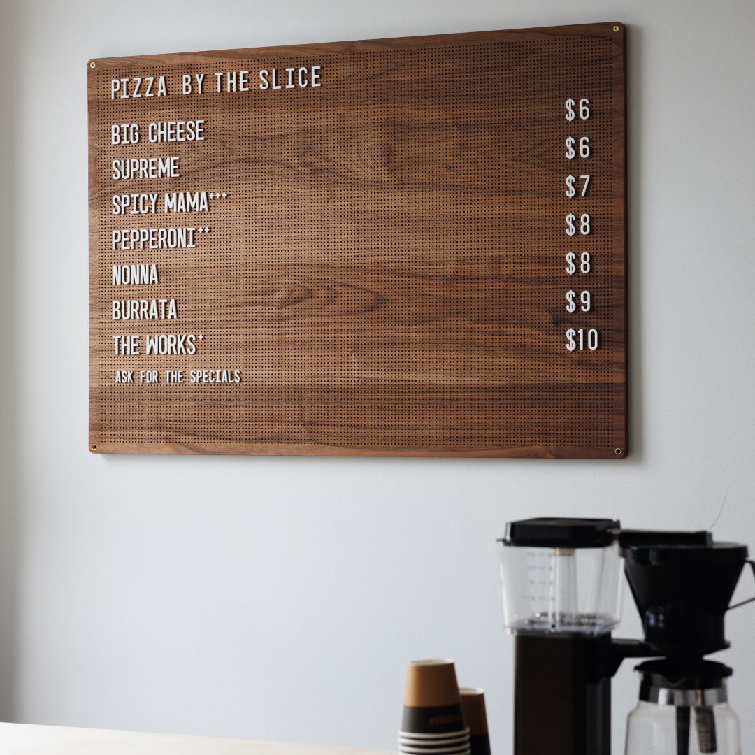
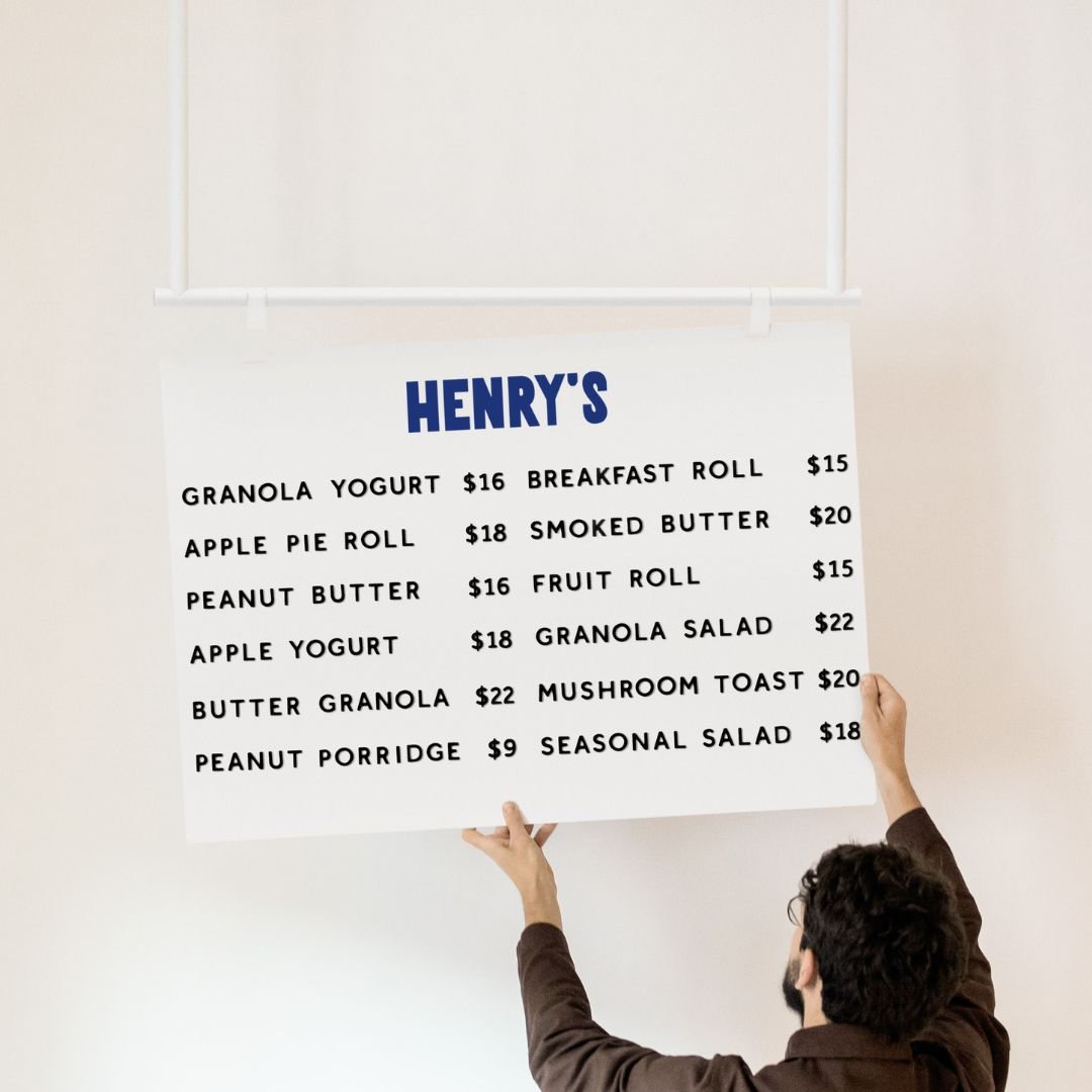
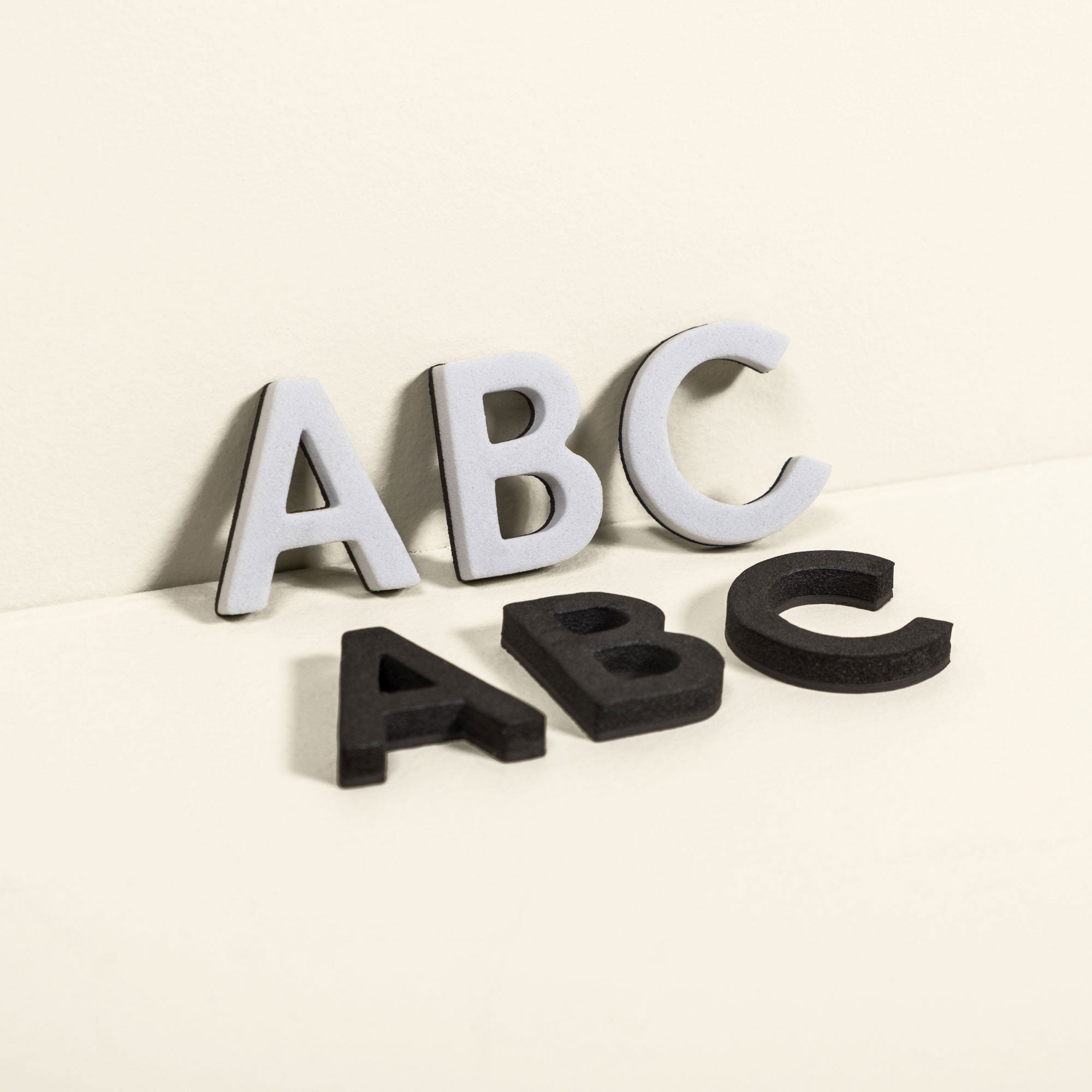
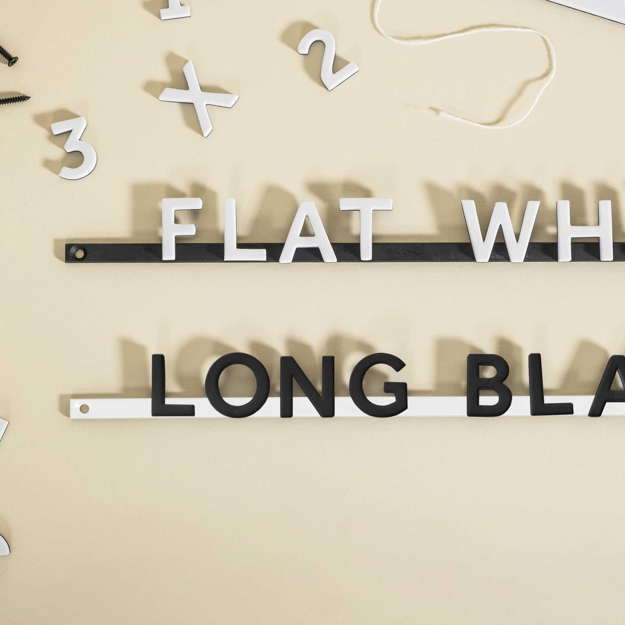
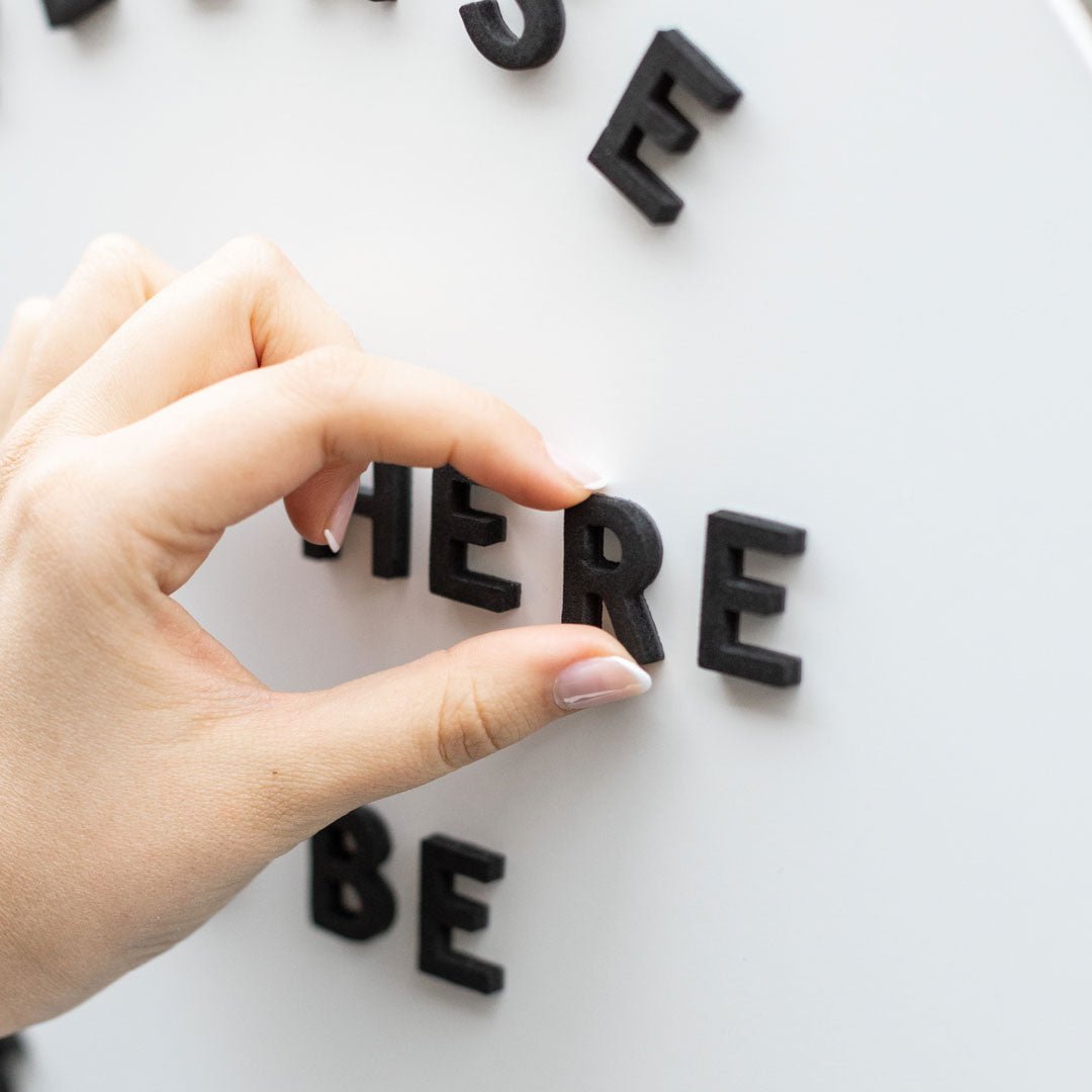
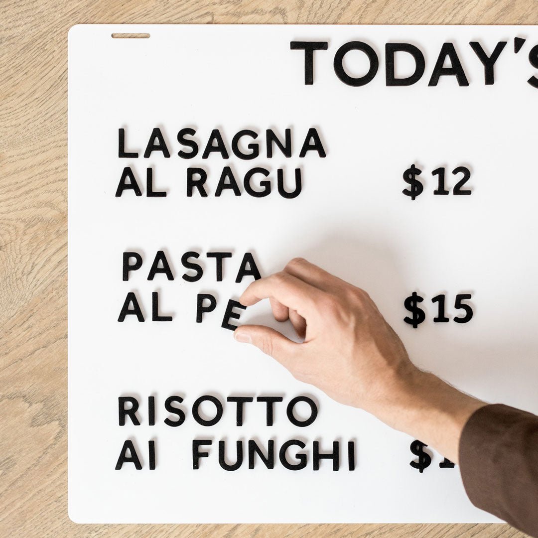
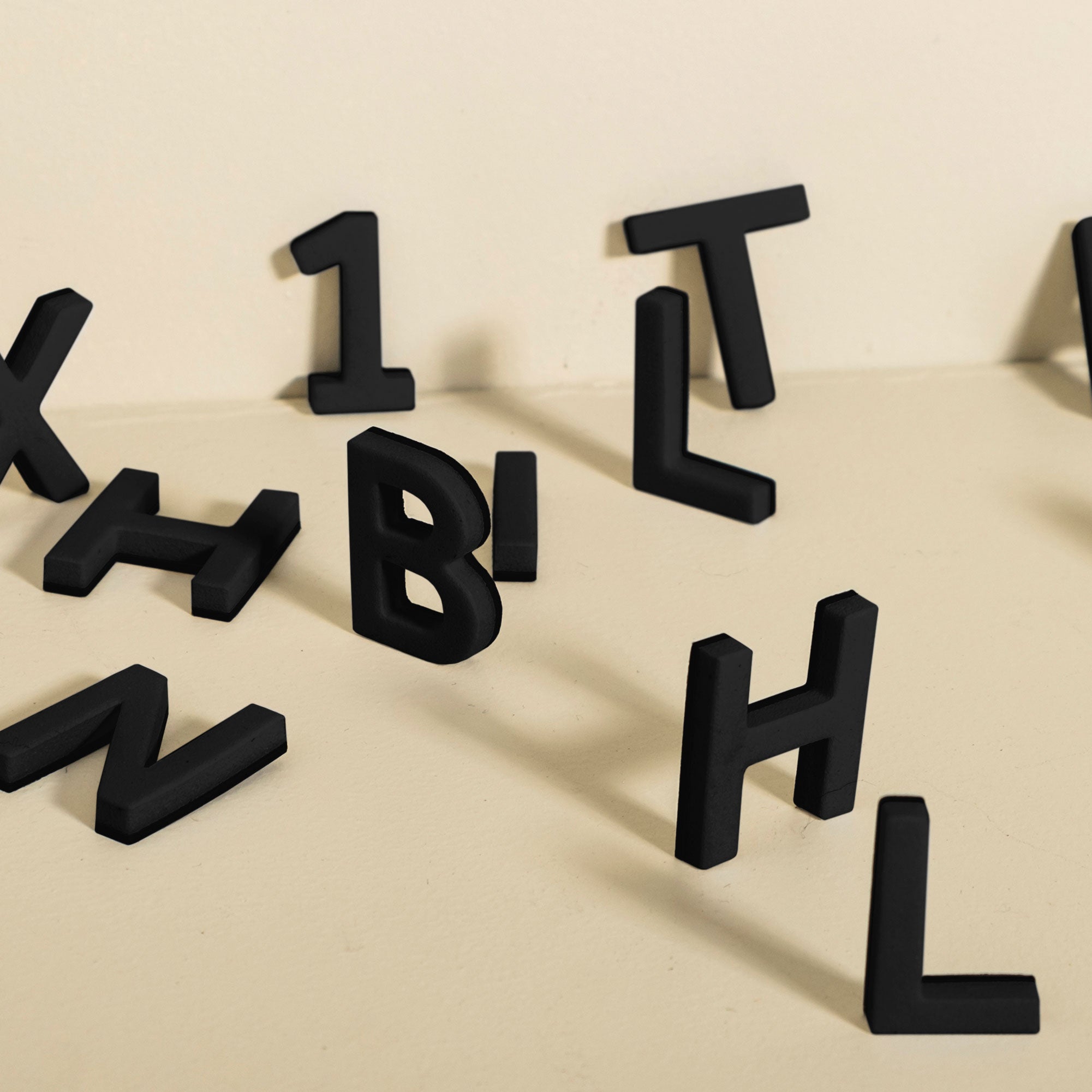
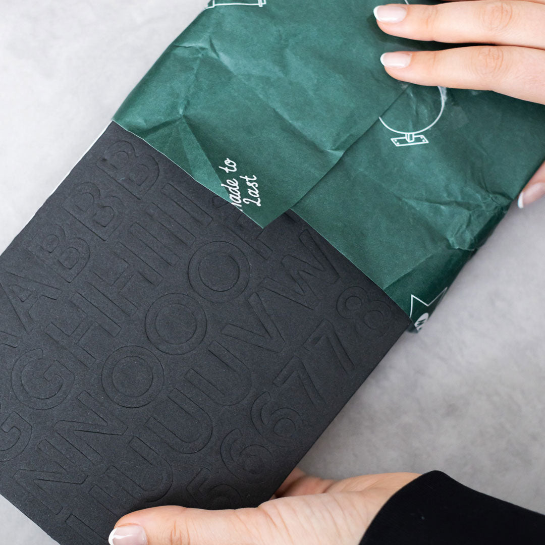
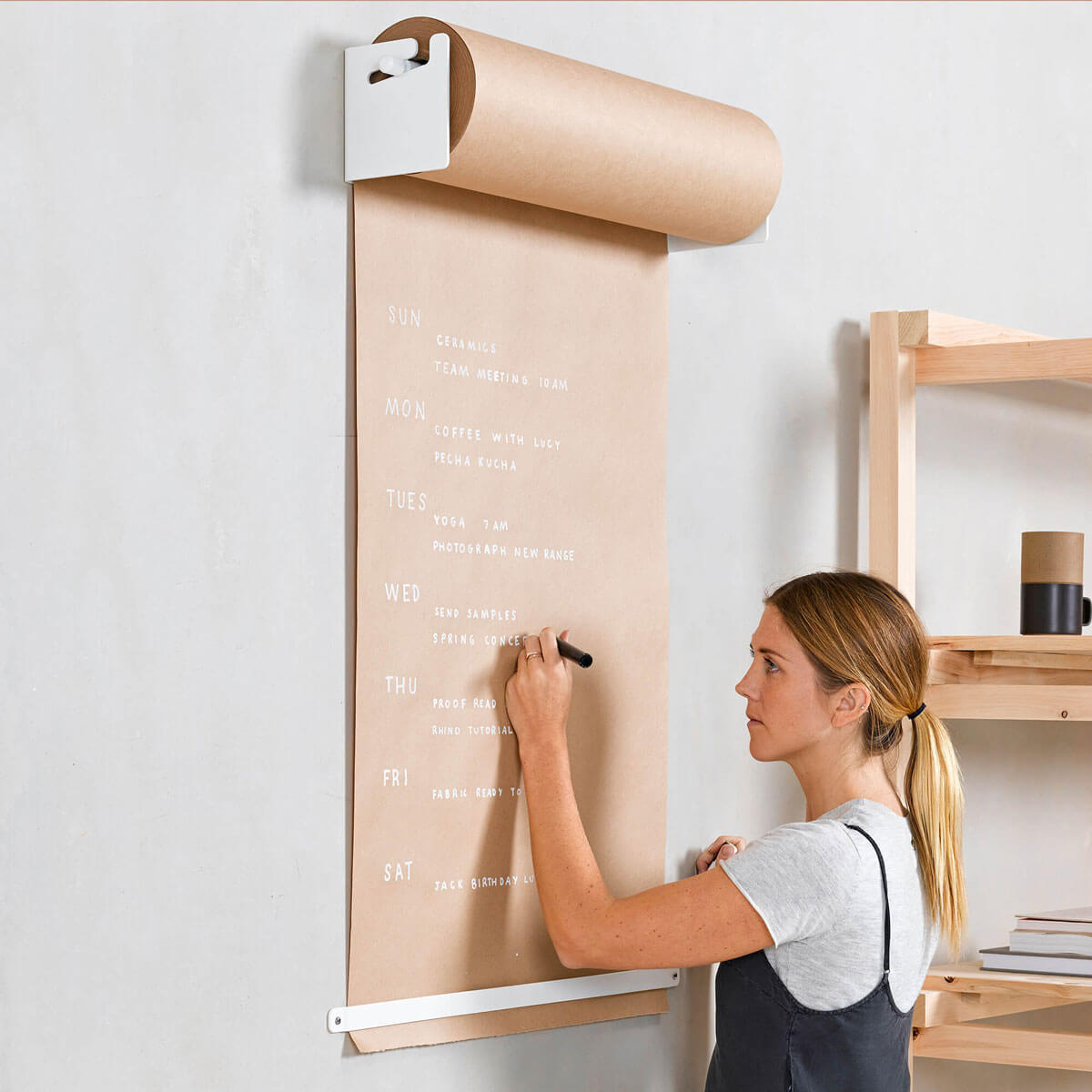
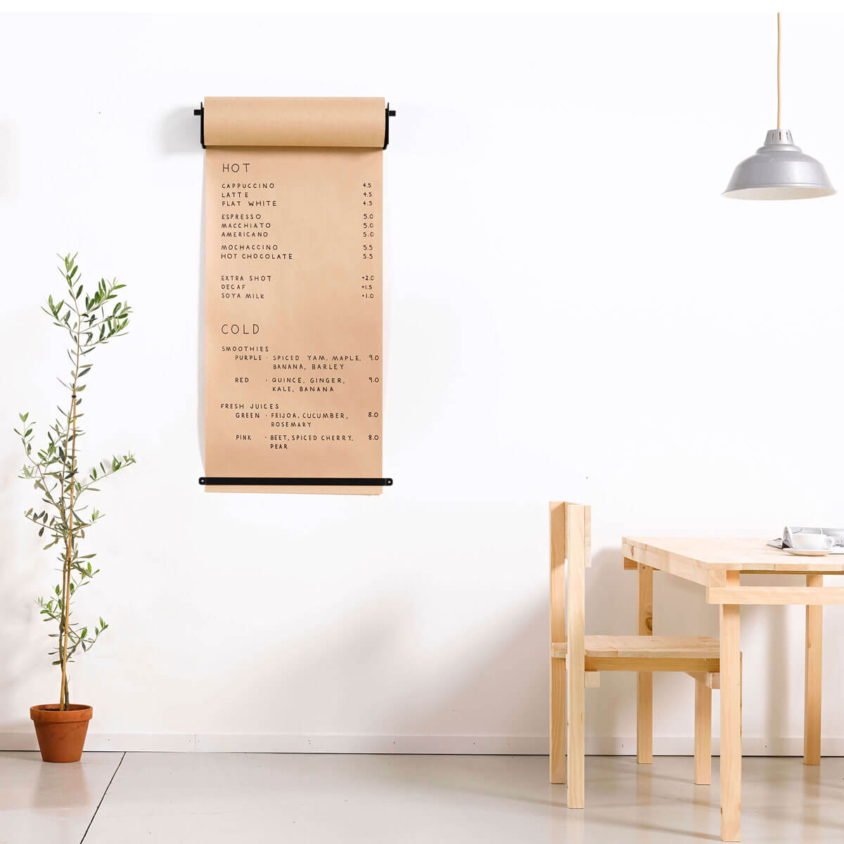
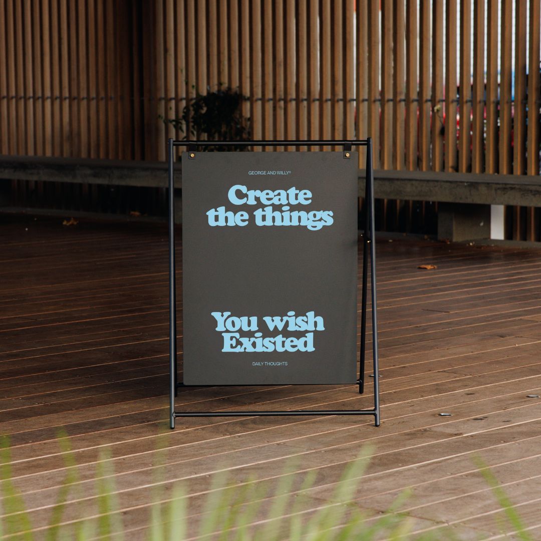
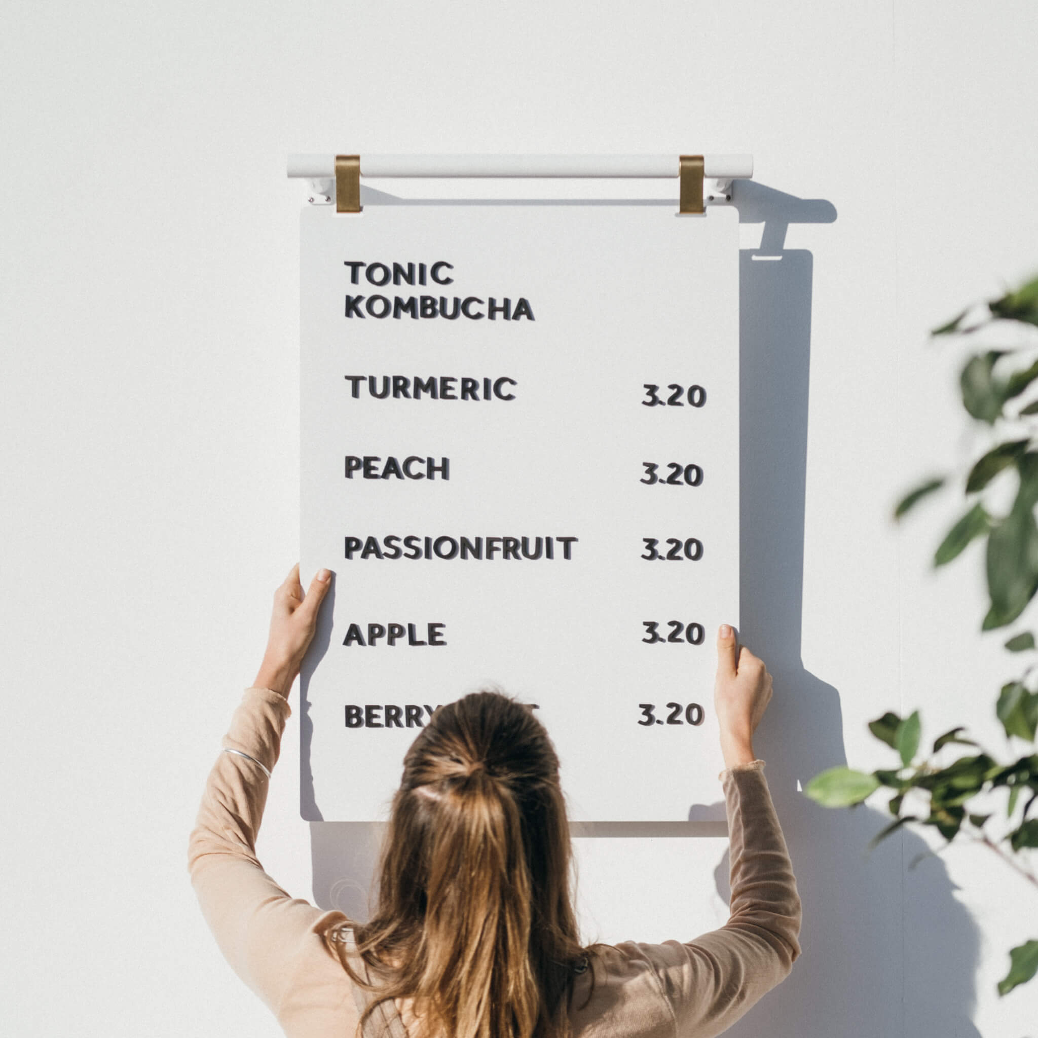
This is especially true for easily changeable signs. Outdoor business signs, letter boards like the Magnetic Letter Menu Board, and modular counter signs are perfect for this. A witty quote on a sidewalk sign or a daily special announced on a countertop display can stop people in their tracks. It signals that your business is active and current.
This strategy can be particularly effective for attracting younger customers, as a third of Gen Z consumers say ads influence them to try new things. Use your signs as a flexible advertising space to highlight new arrivals, limited time offers, or fun messages. Even small changes, like updating the message on your counter signs weekly, can make a big difference in how customers perceive your brand.
Invest in Quality: Professional Solutions That Last
Your signage is a direct reflection of your business, so investing in quality is non negotiable. Well designed, durable sign equipment not only looks better but also saves you money in the long run.
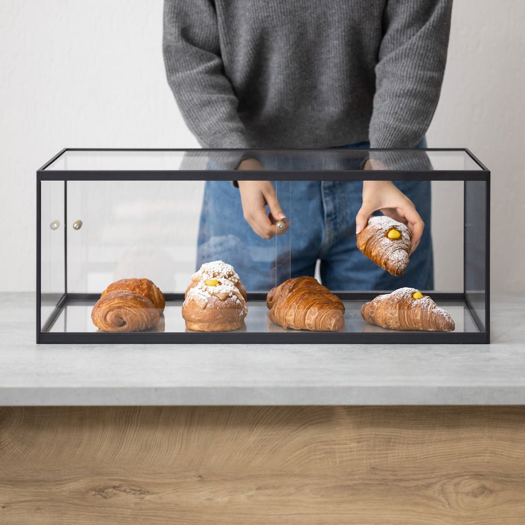
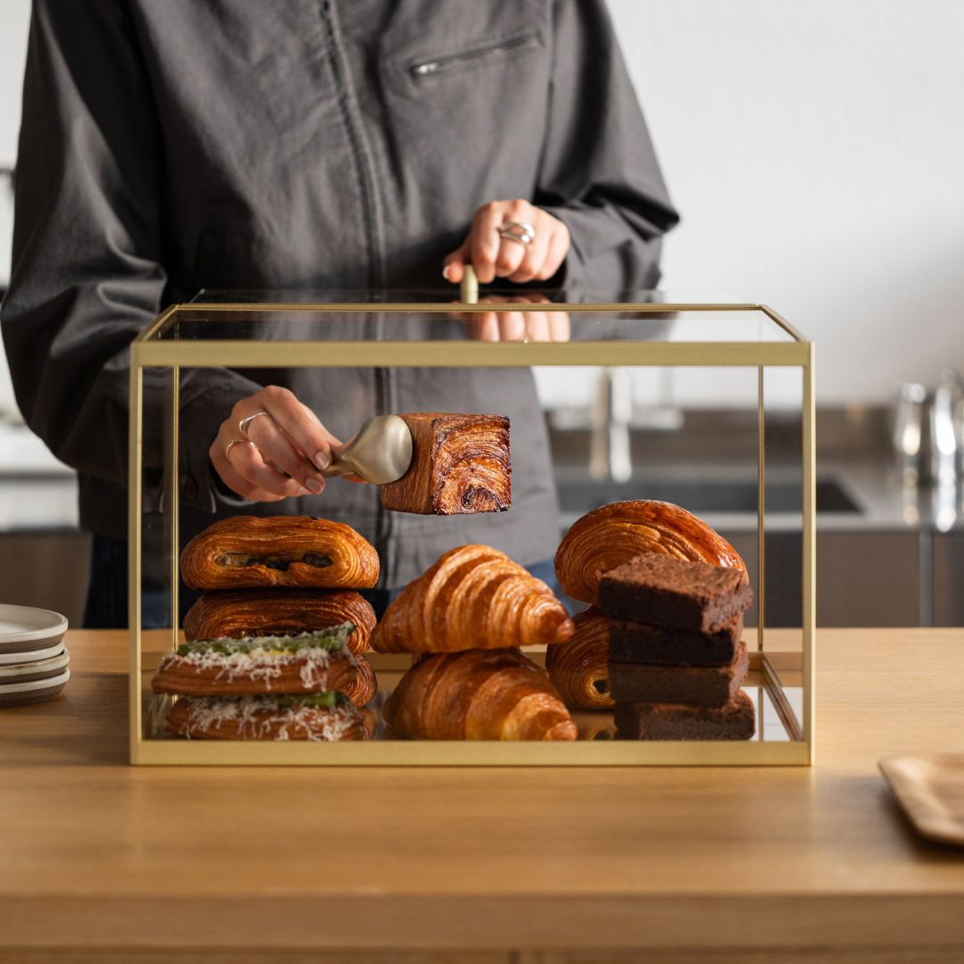
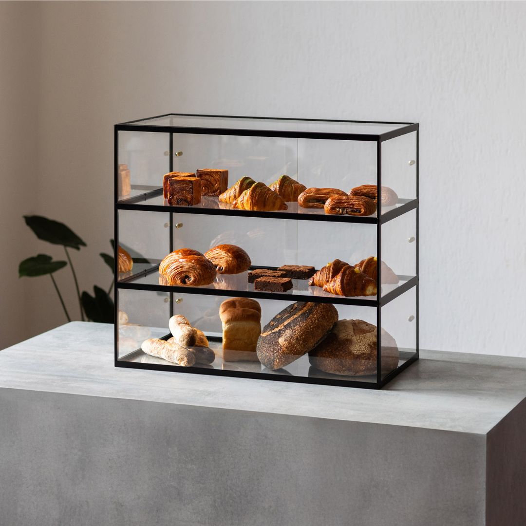
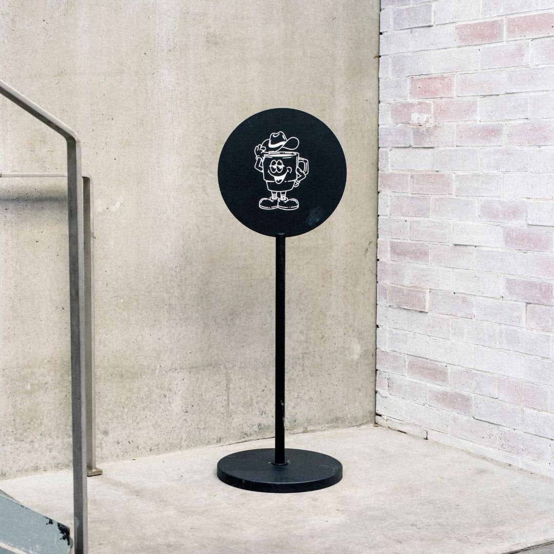
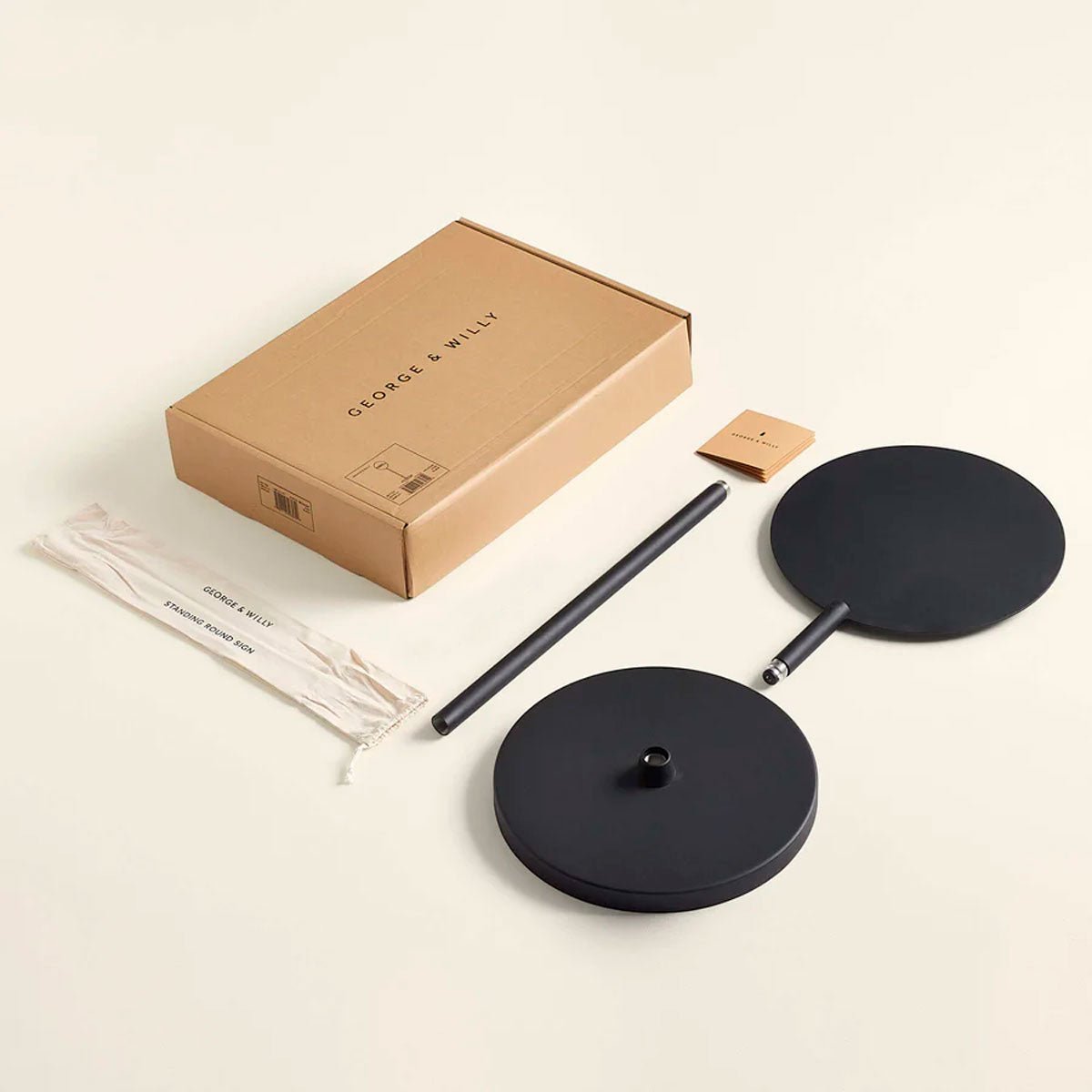
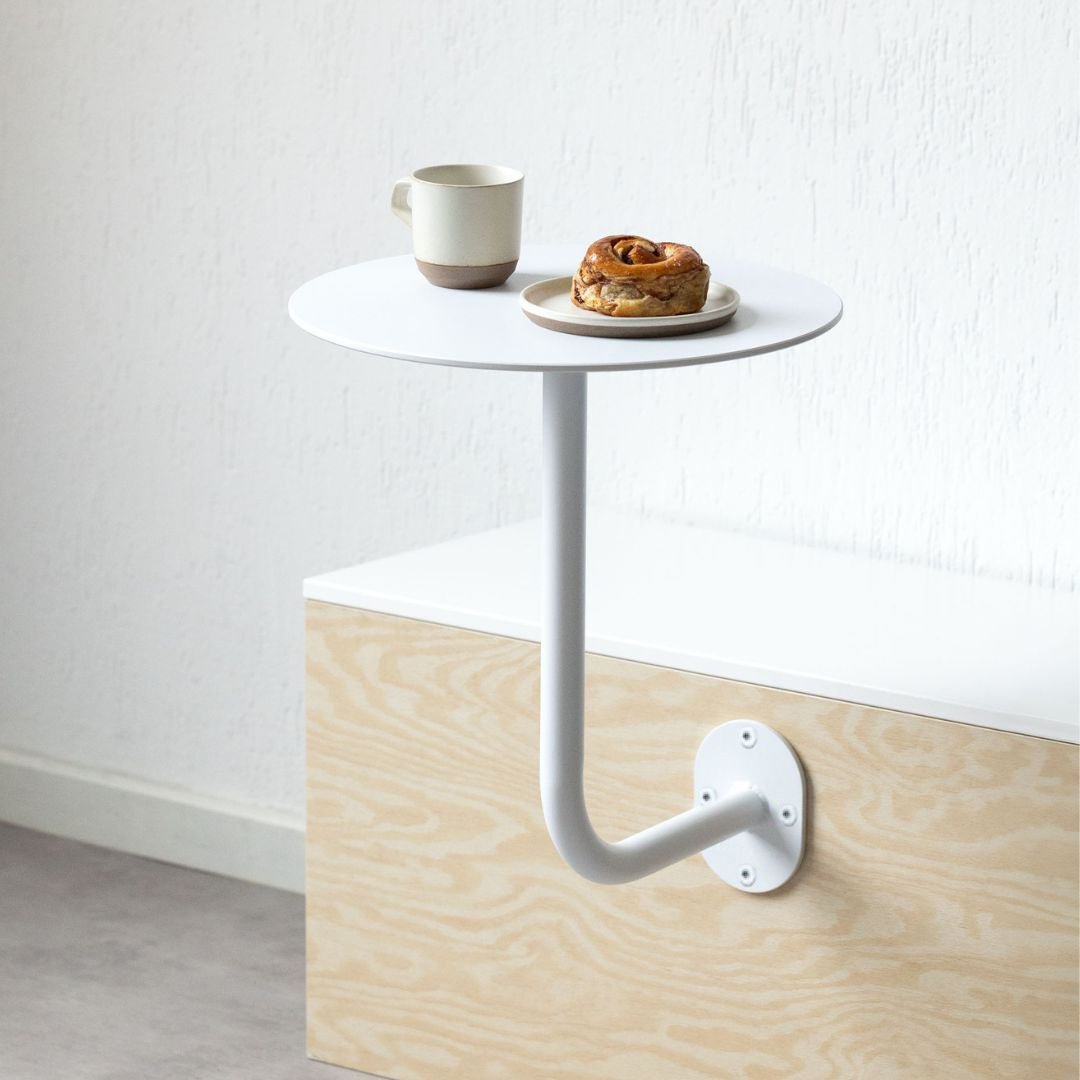
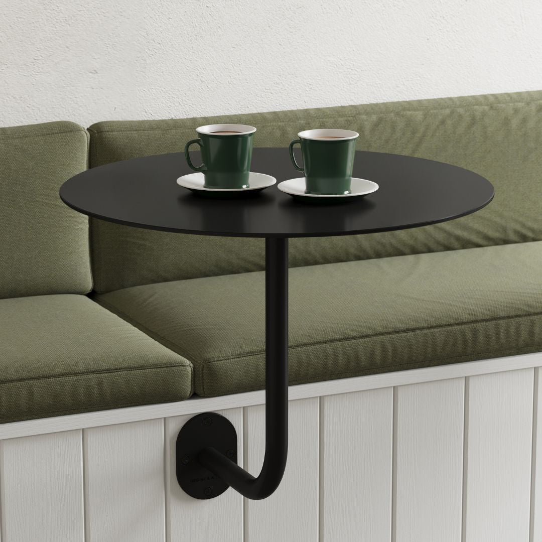
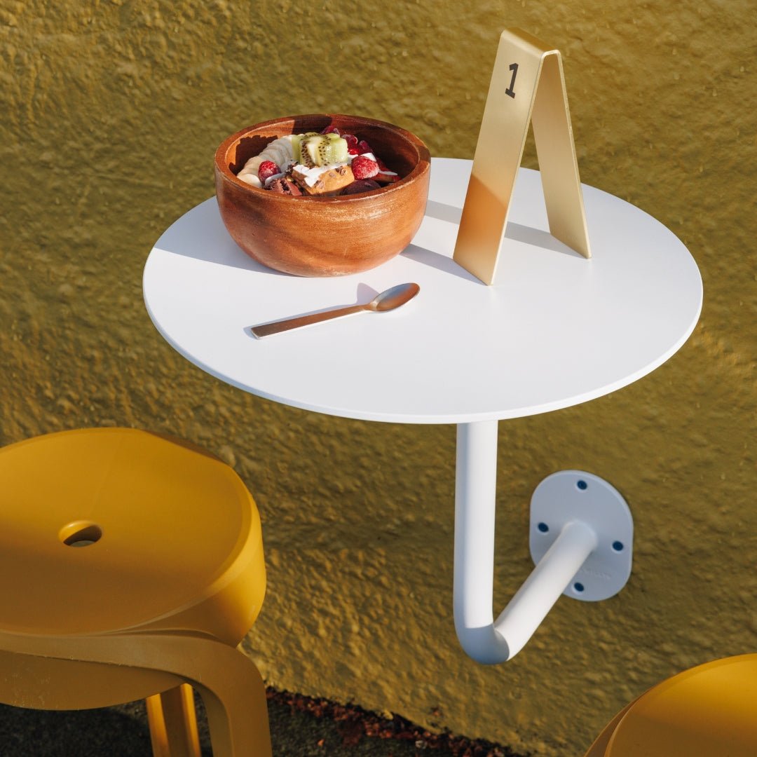
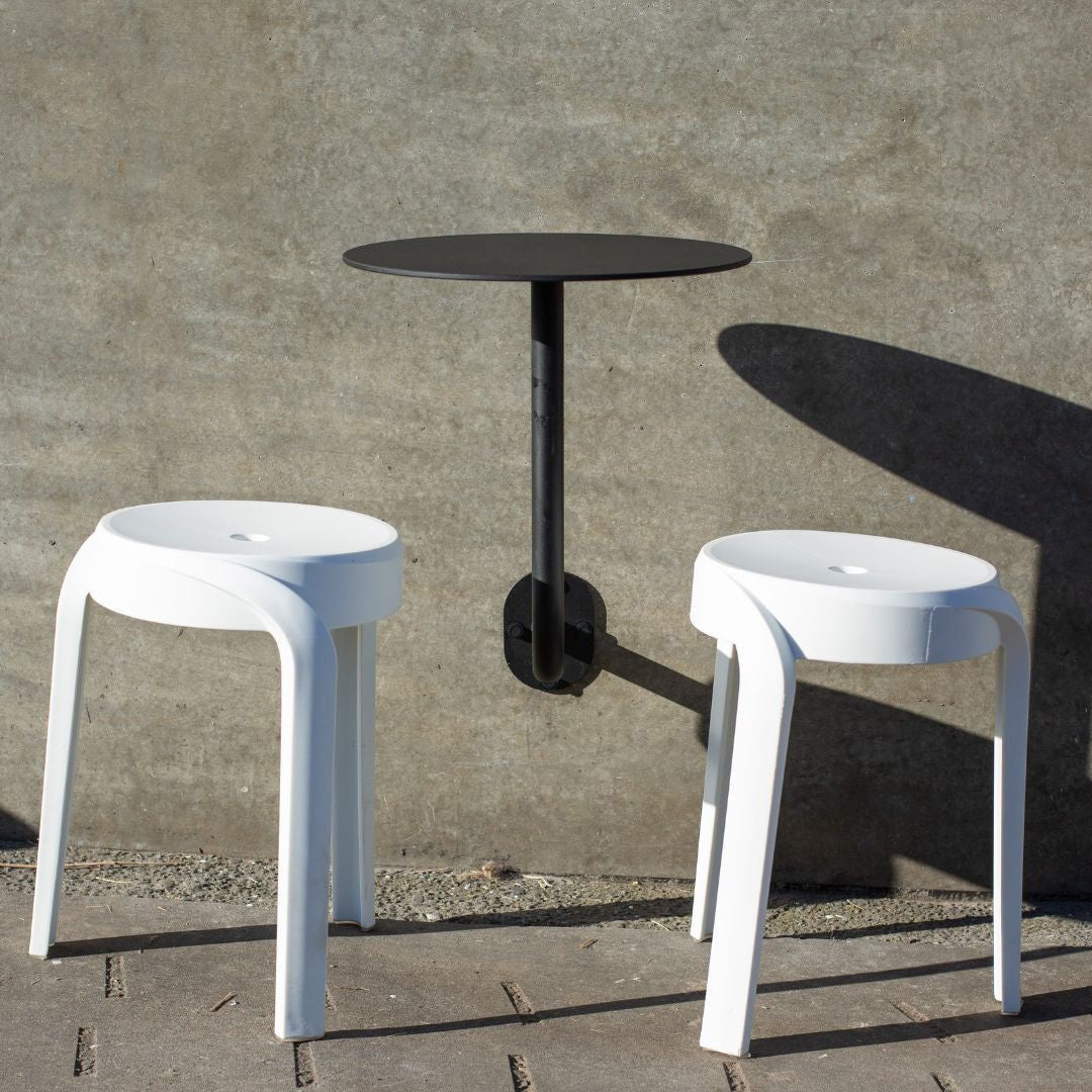
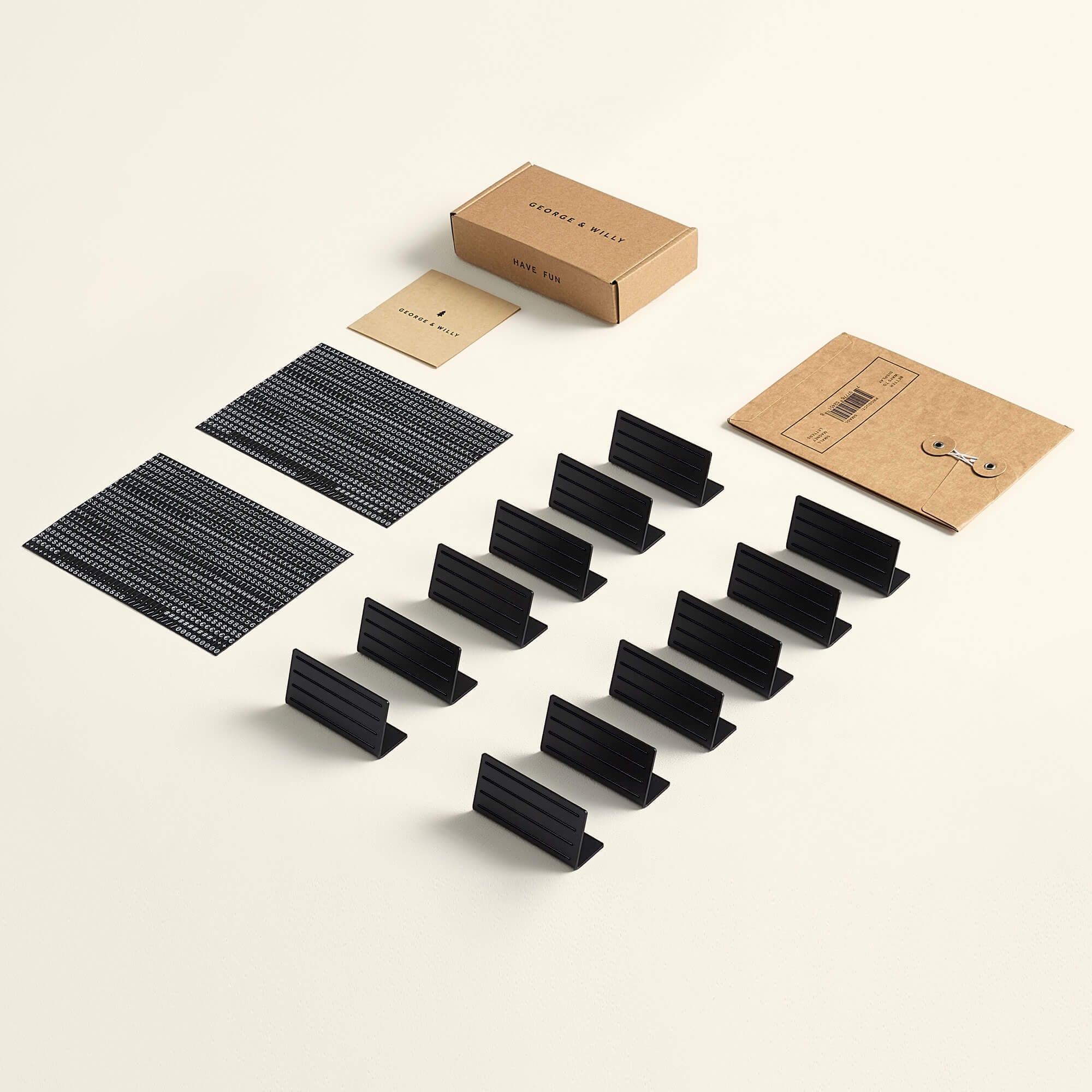
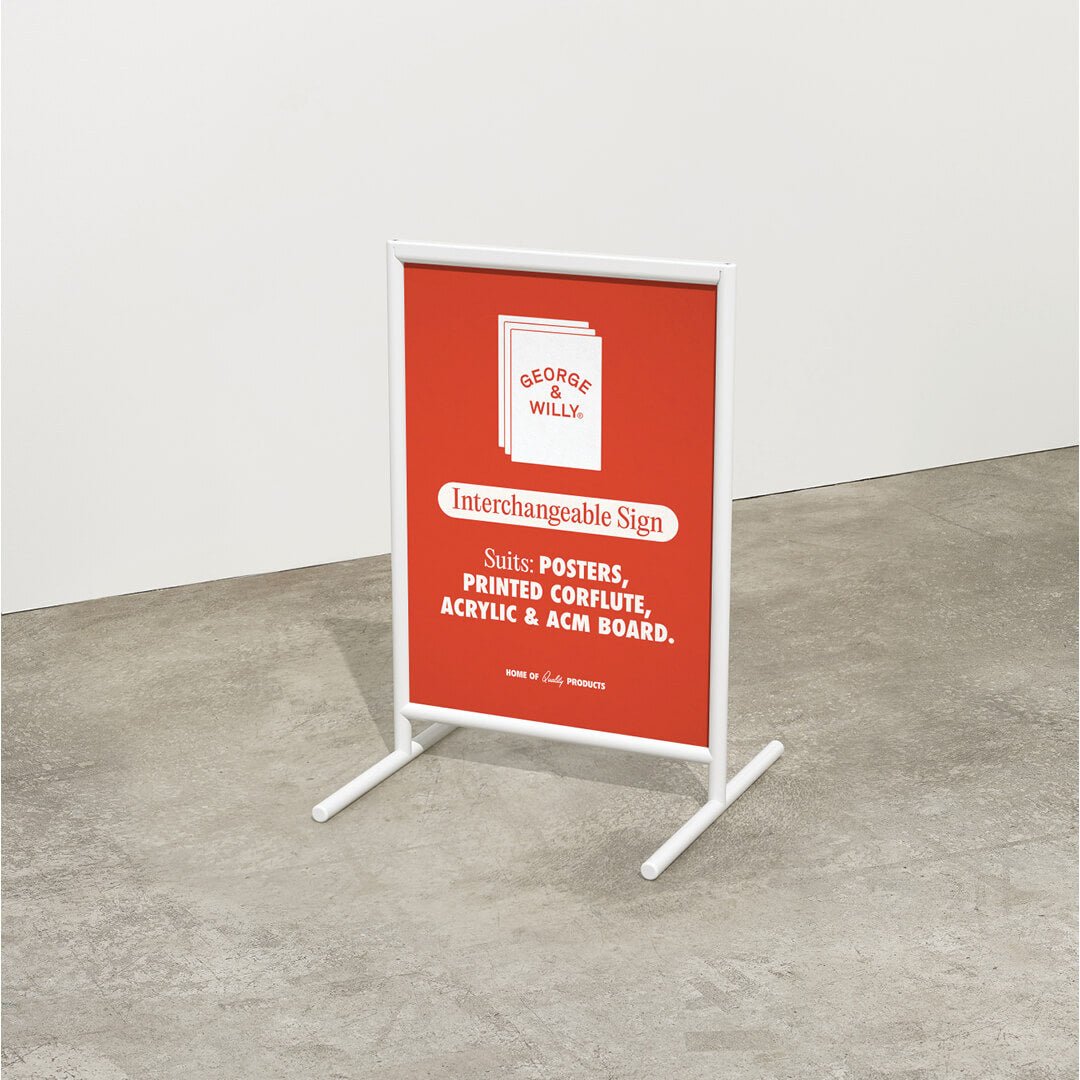
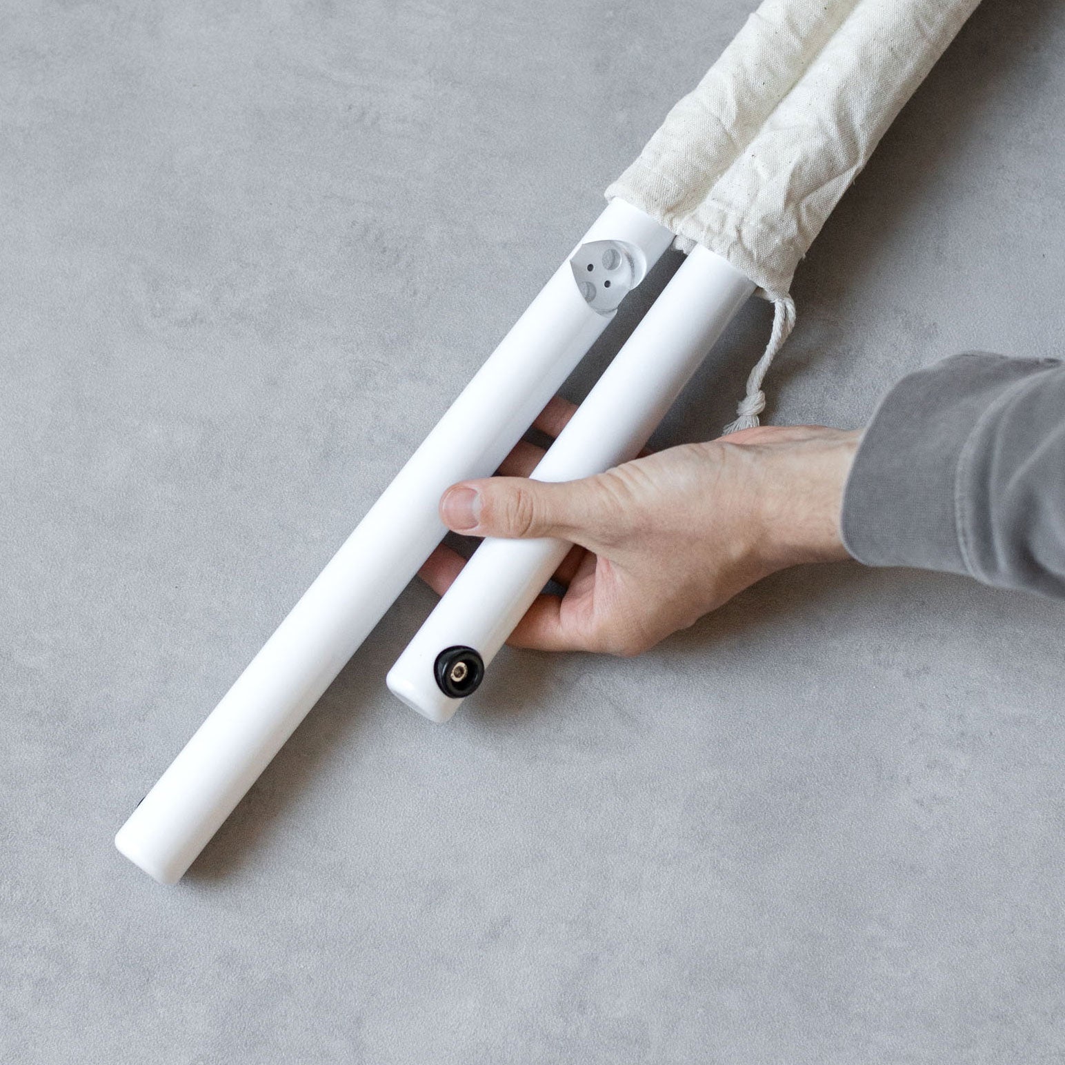
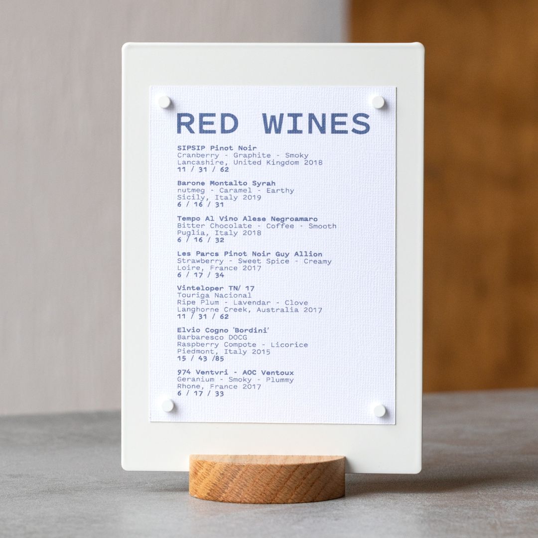
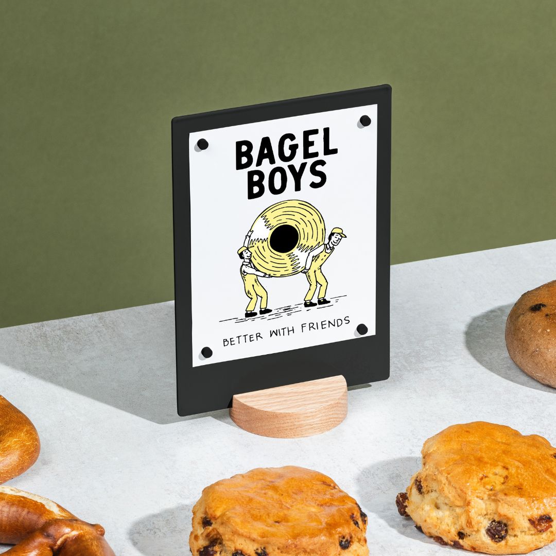
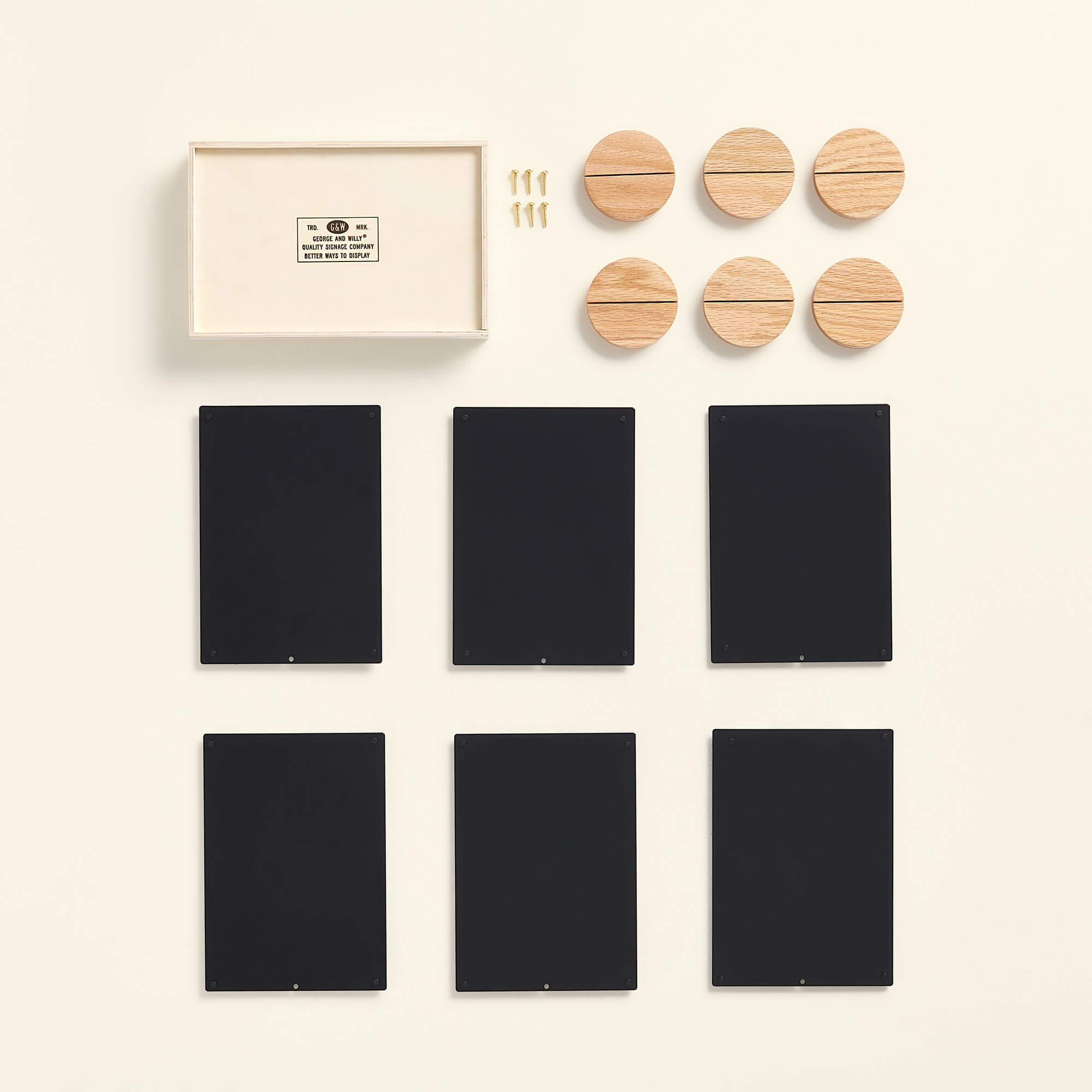
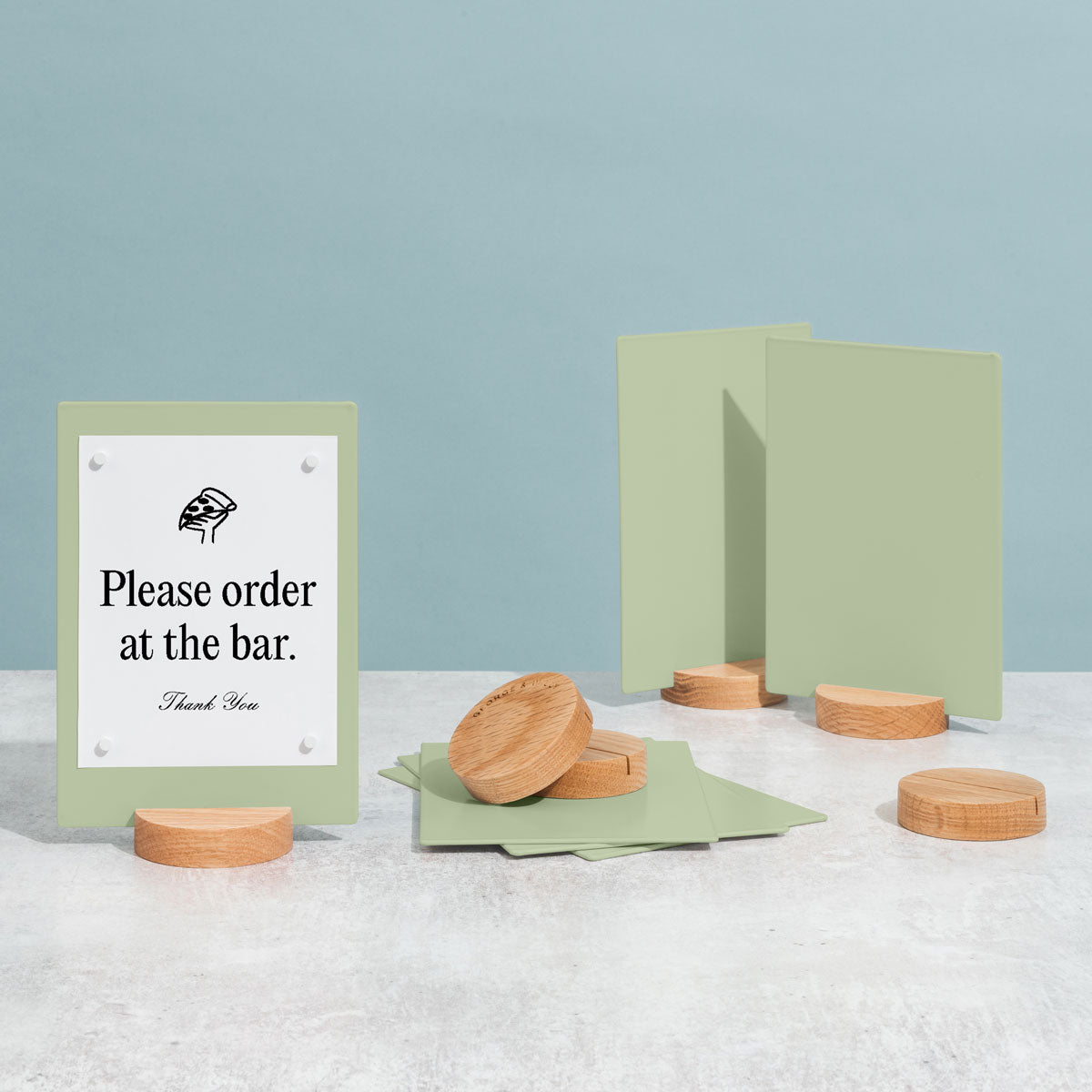
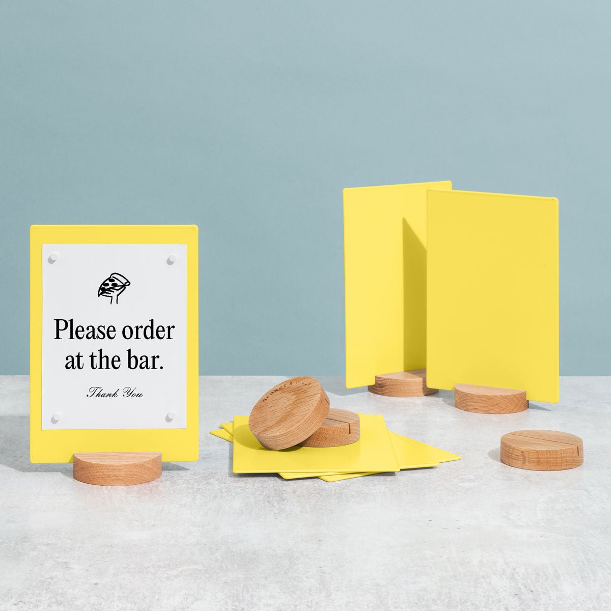
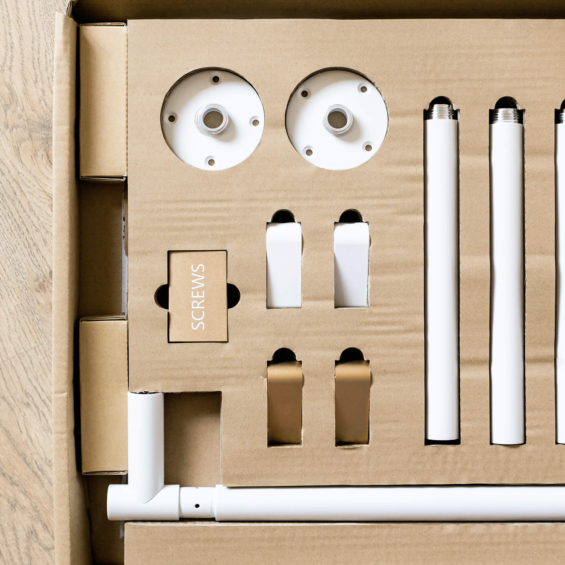
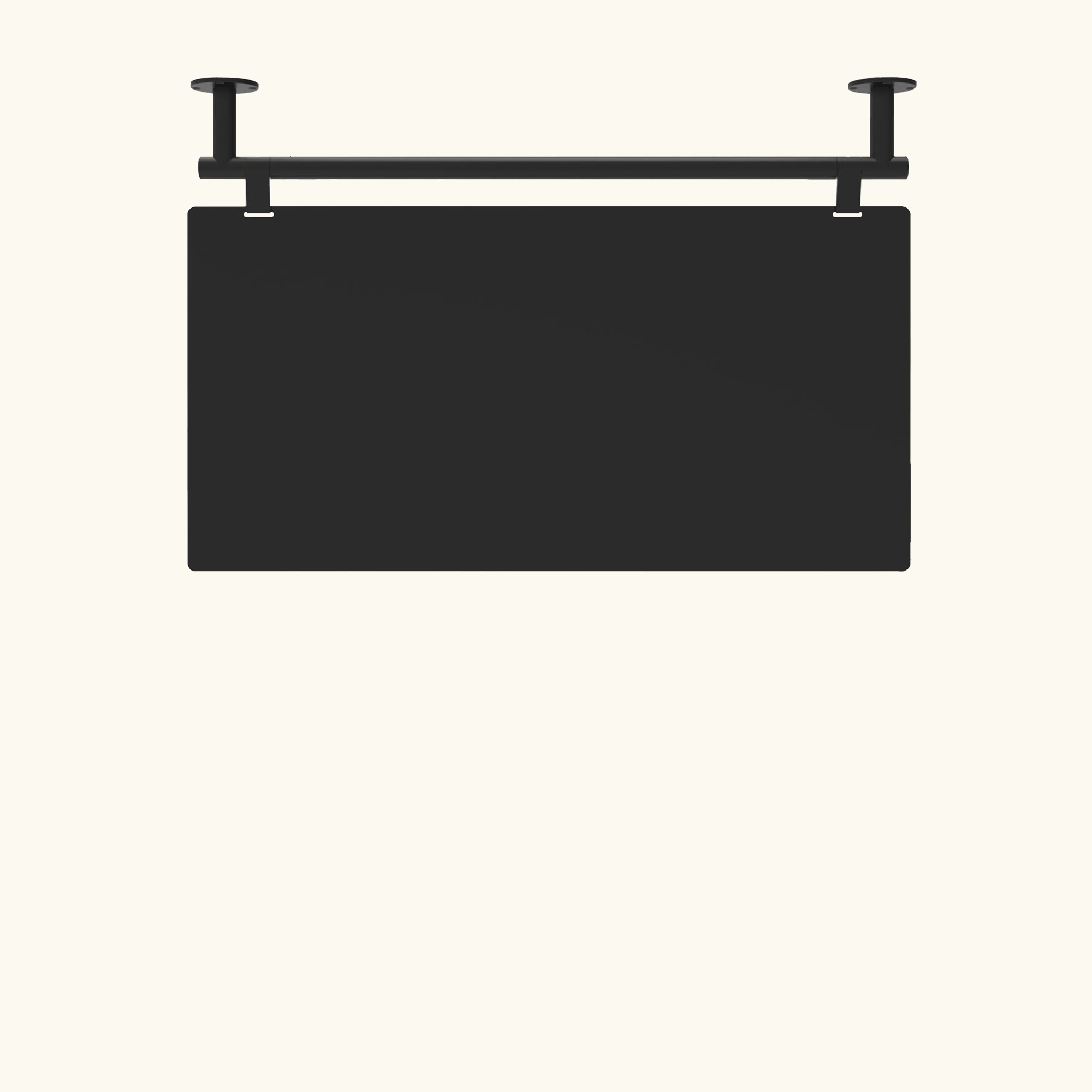
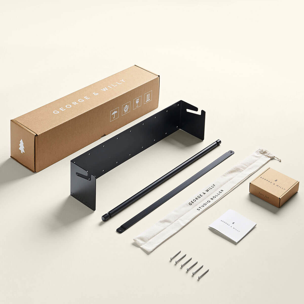
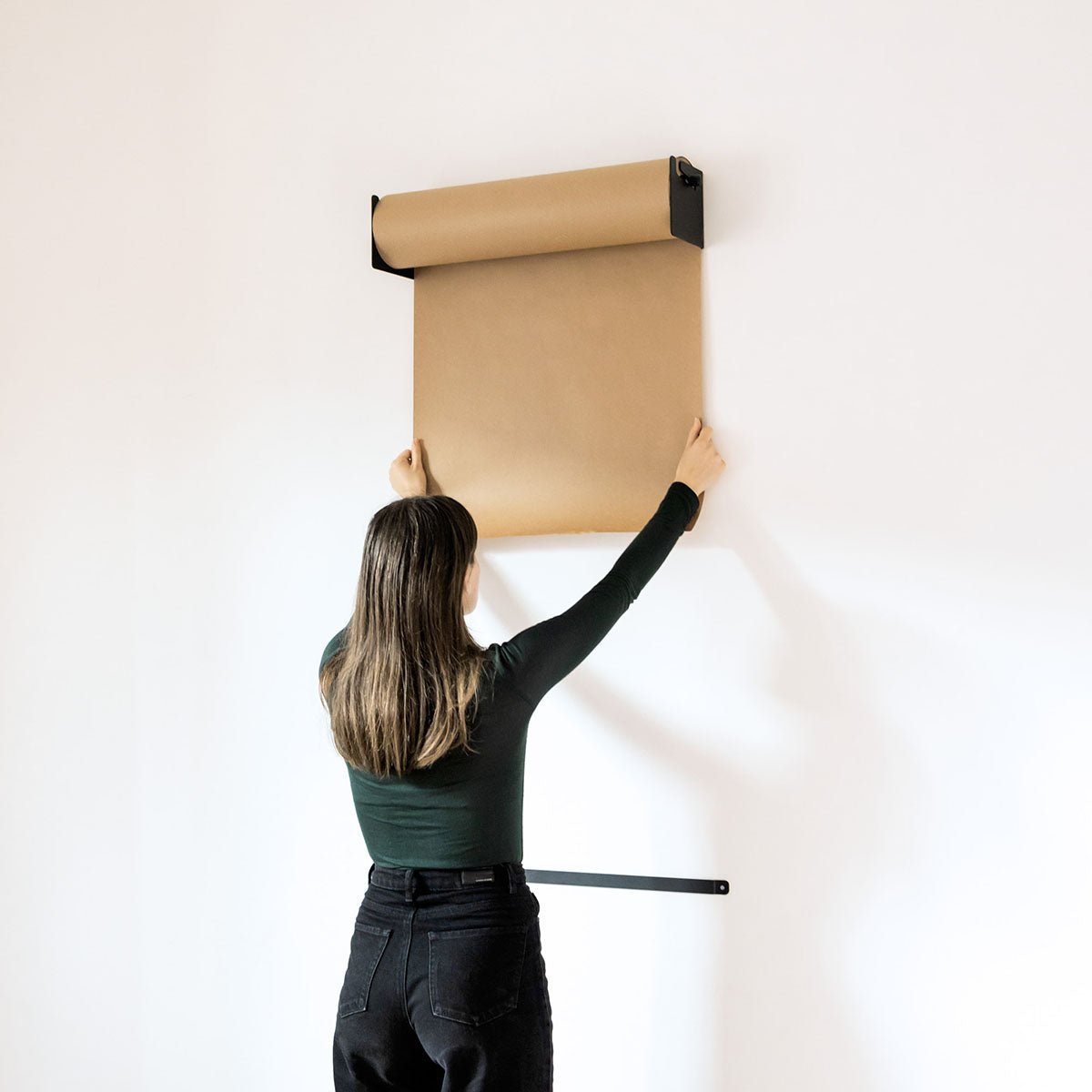
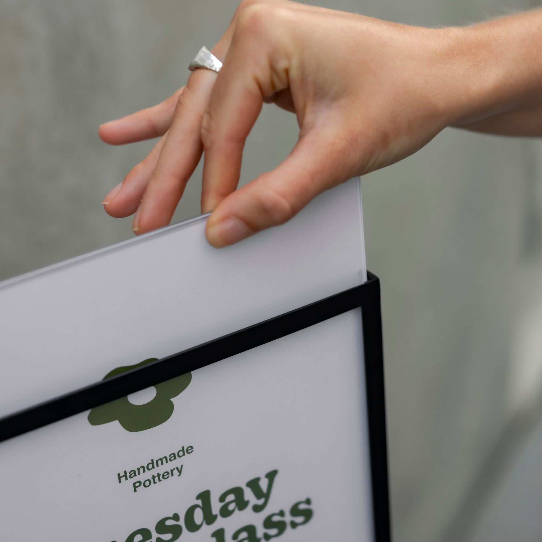
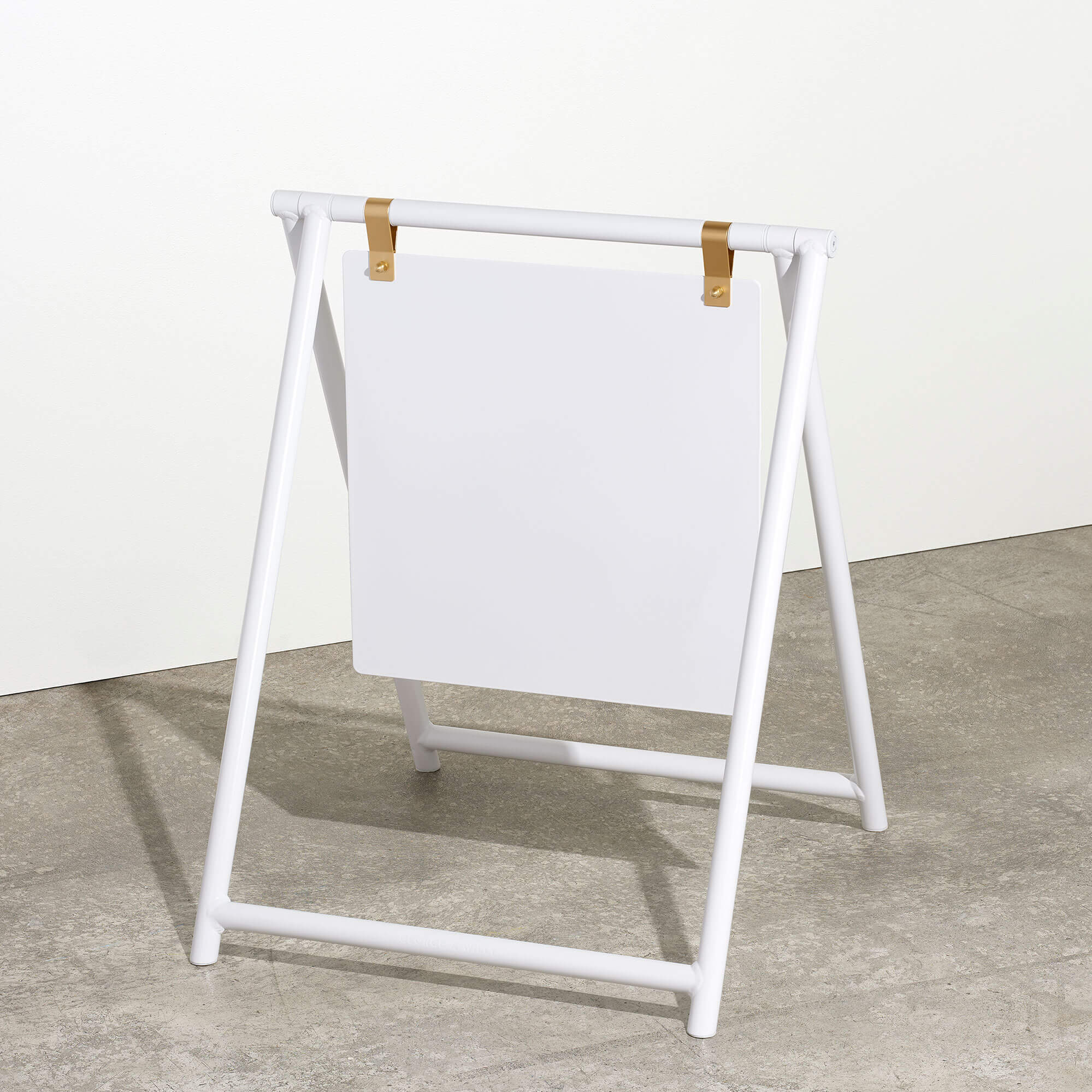
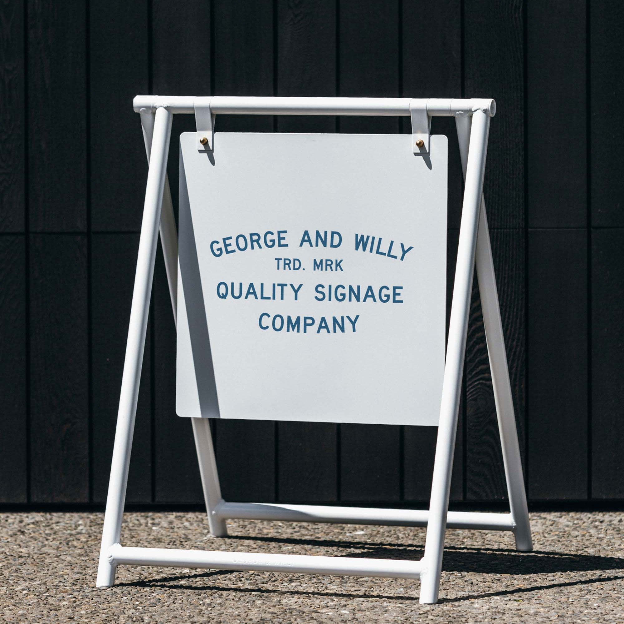
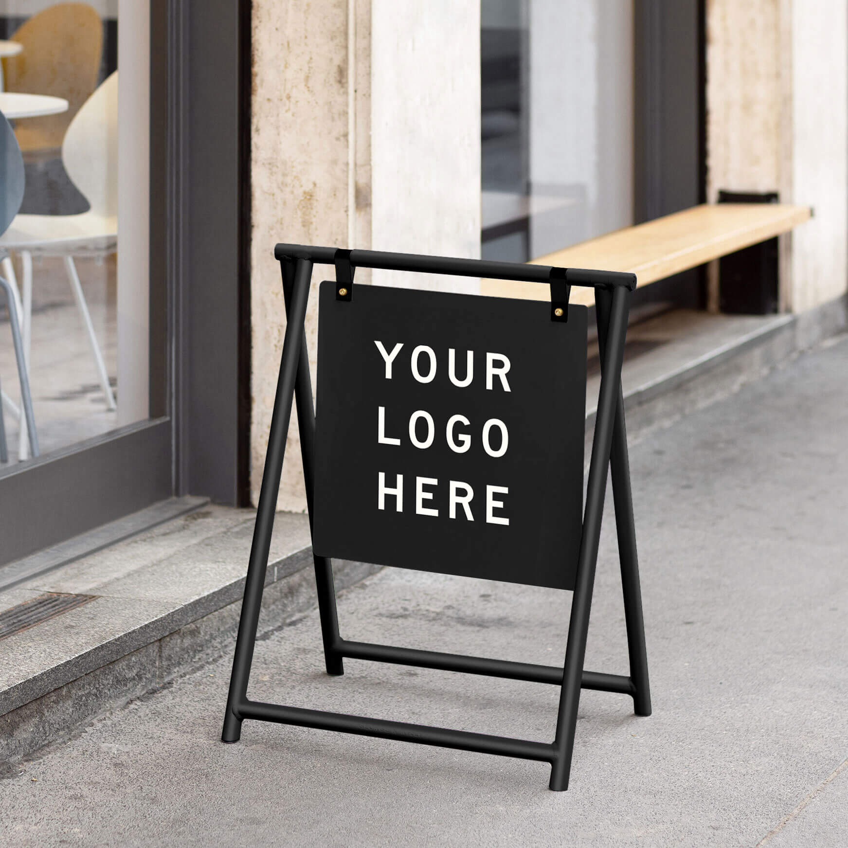
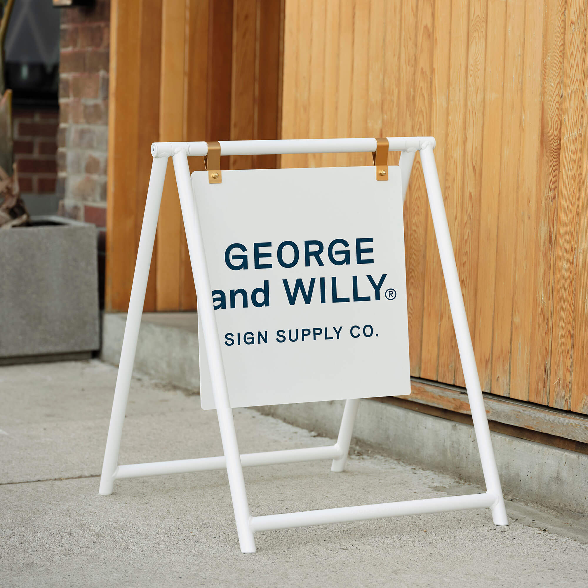
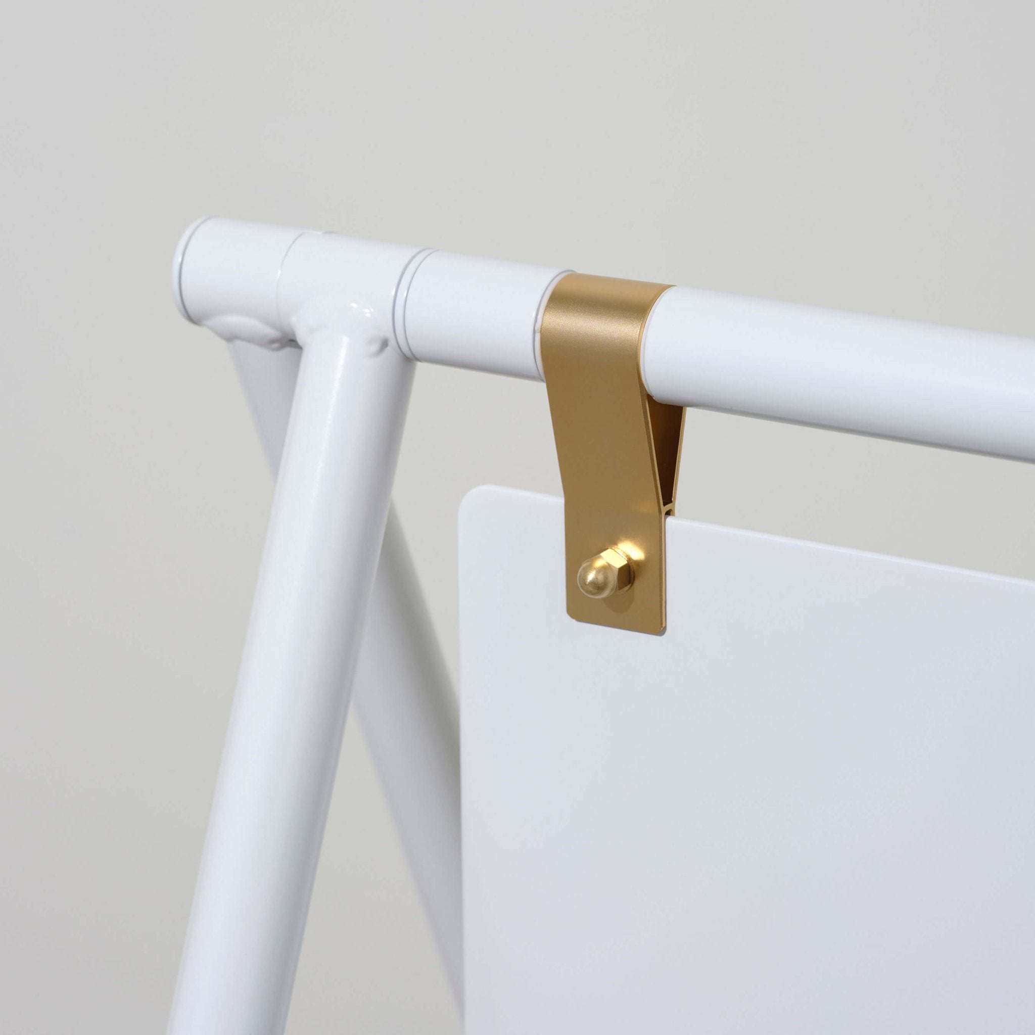
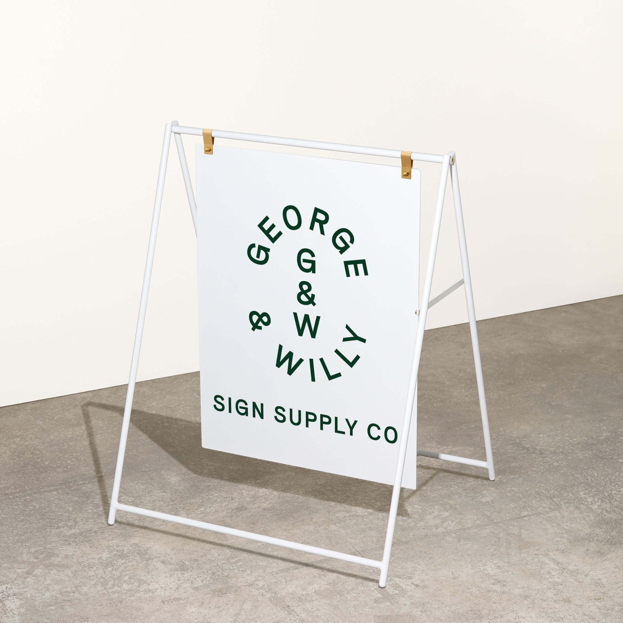
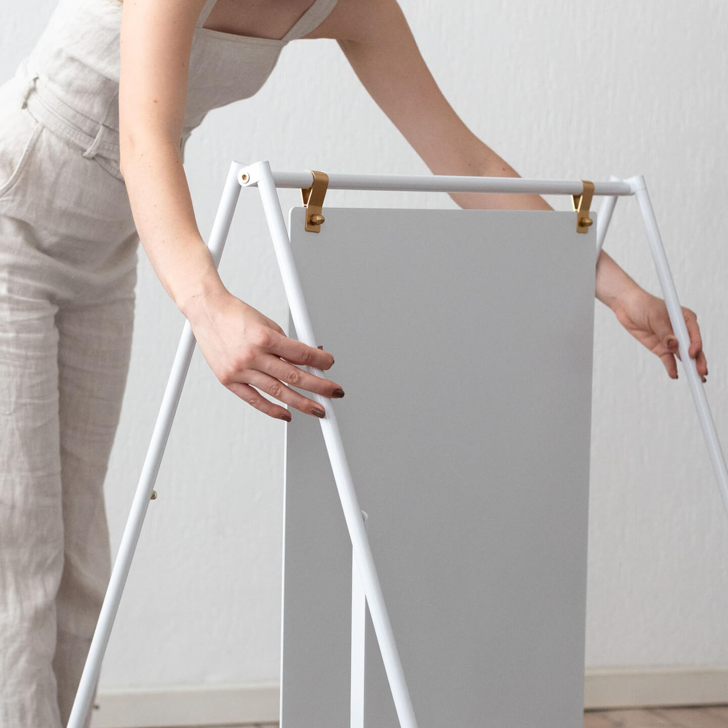
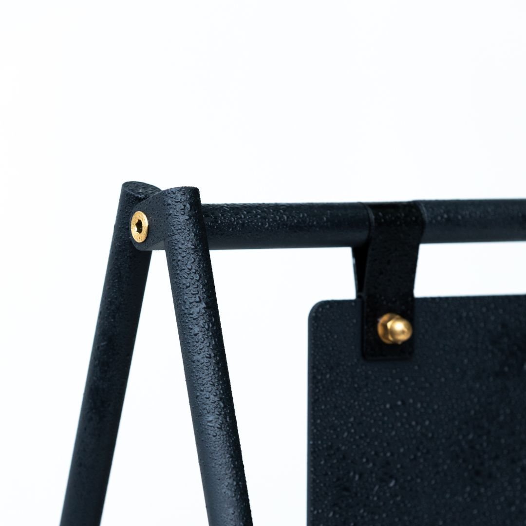
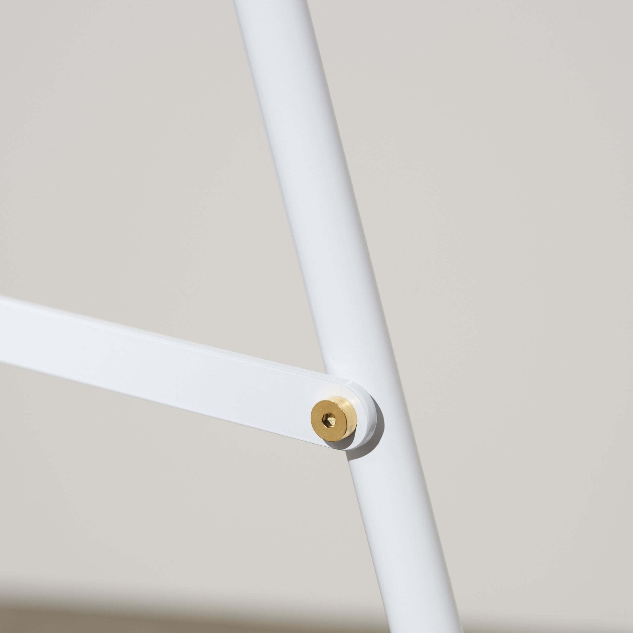
Instead of a flimsy menu board that warps, consider a sturdy magnetic letter board. Instead of paper printouts, use sleek, reusable Table Talkers. Companies like George & Willy specialize in creating professional, design forward solutions for businesses. Their products, from rust resistant aluminum A frame signs to versatile sets of tabletop counter signs, are built to withstand busy commercial environments.
High quality signage sends a powerful message that you care about the details and the customer experience. When your signs are beautiful and functional, customers notice. It enhances their satisfaction and reinforces your brand every step of the way.
Frequently Asked Questions
What should I put on counter signs?
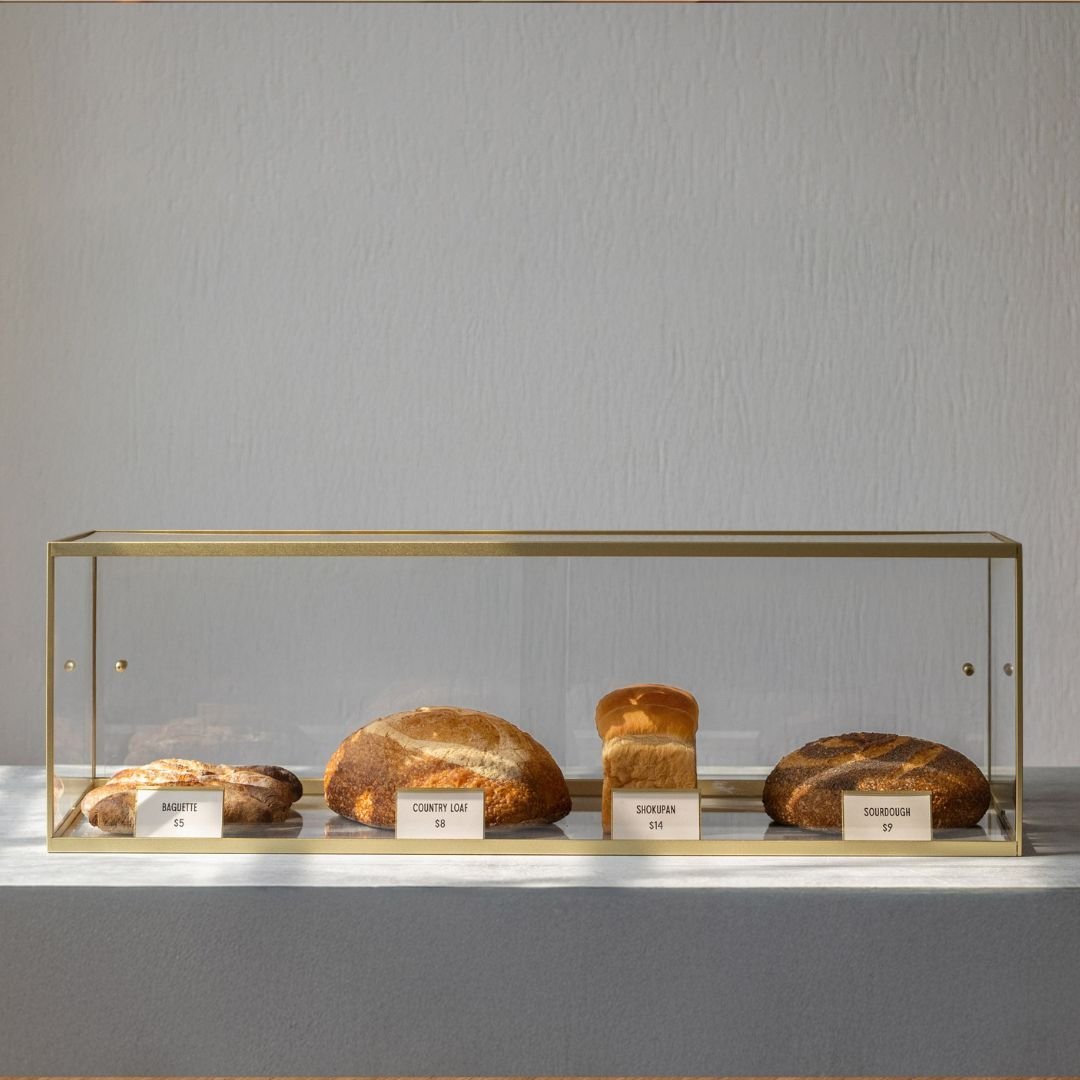
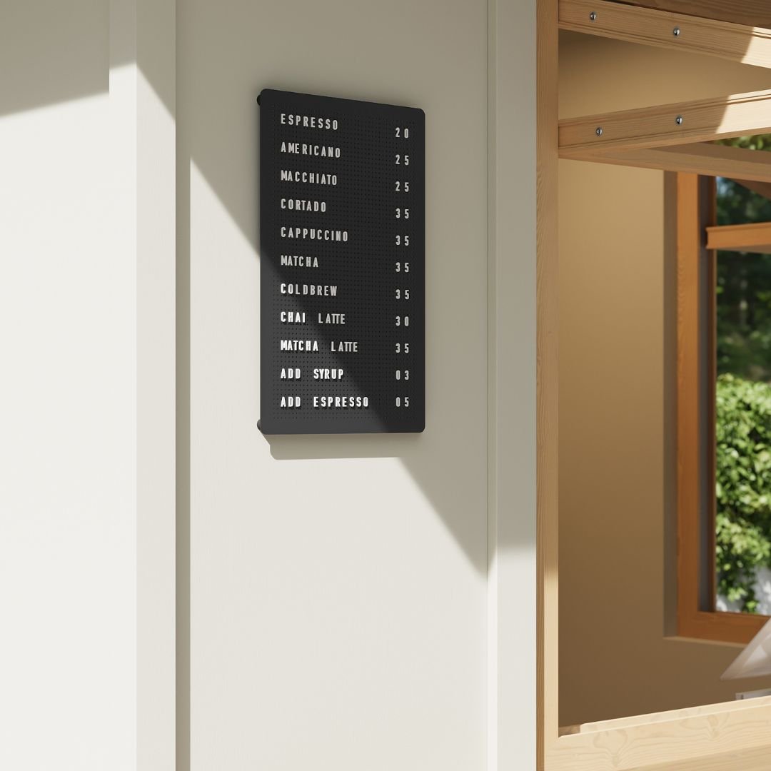
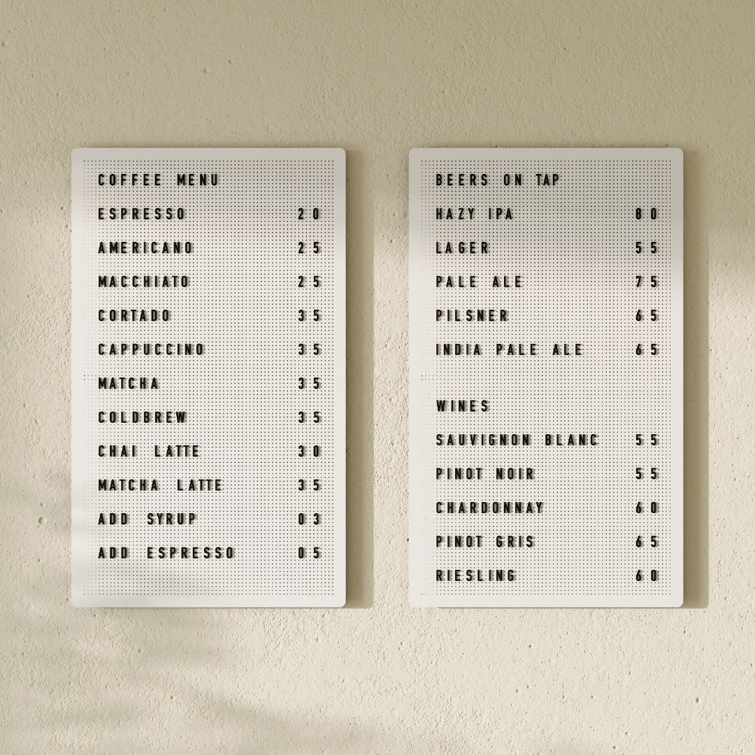
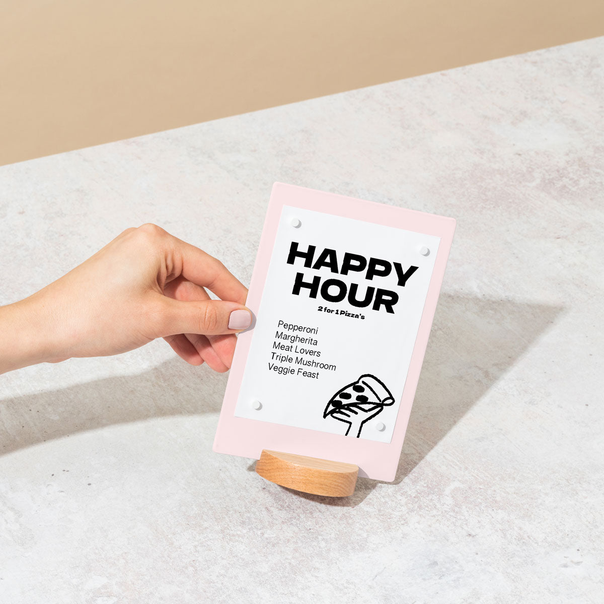
Counter signs should display clear, concise information. Use them for pricing, daily specials, Wi Fi passwords, order numbers, or simple calls to action like “Follow Us on Instagram”. Keep the text minimal for quick readability.
How big should counter signs be?
The ideal size depends on your counter space and the viewing distance. They should be large enough to be read easily from a few feet away without cluttering the transaction area. A sign around 5 to 8 inches in height is often a good starting point.
What are the best materials for counter signs?
Durable materials like powder coated steel or aluminum are excellent choices because they are sturdy, easy to clean, and look professional. Wood can also add a warm, rustic touch. George & Willy offers a range of metal Counter Signs known for their durability and minimalist design.
How many counter signs do I need?
This depends on your layout. A coffee shop might need several: one for the menu, one for specials, one for the Wi Fi code, and maybe a small one for a loyalty program. A retail boutique might only need one or two for promotions or return policies. Start with the essentials and add more as needed.
Can I customize my counter signs?
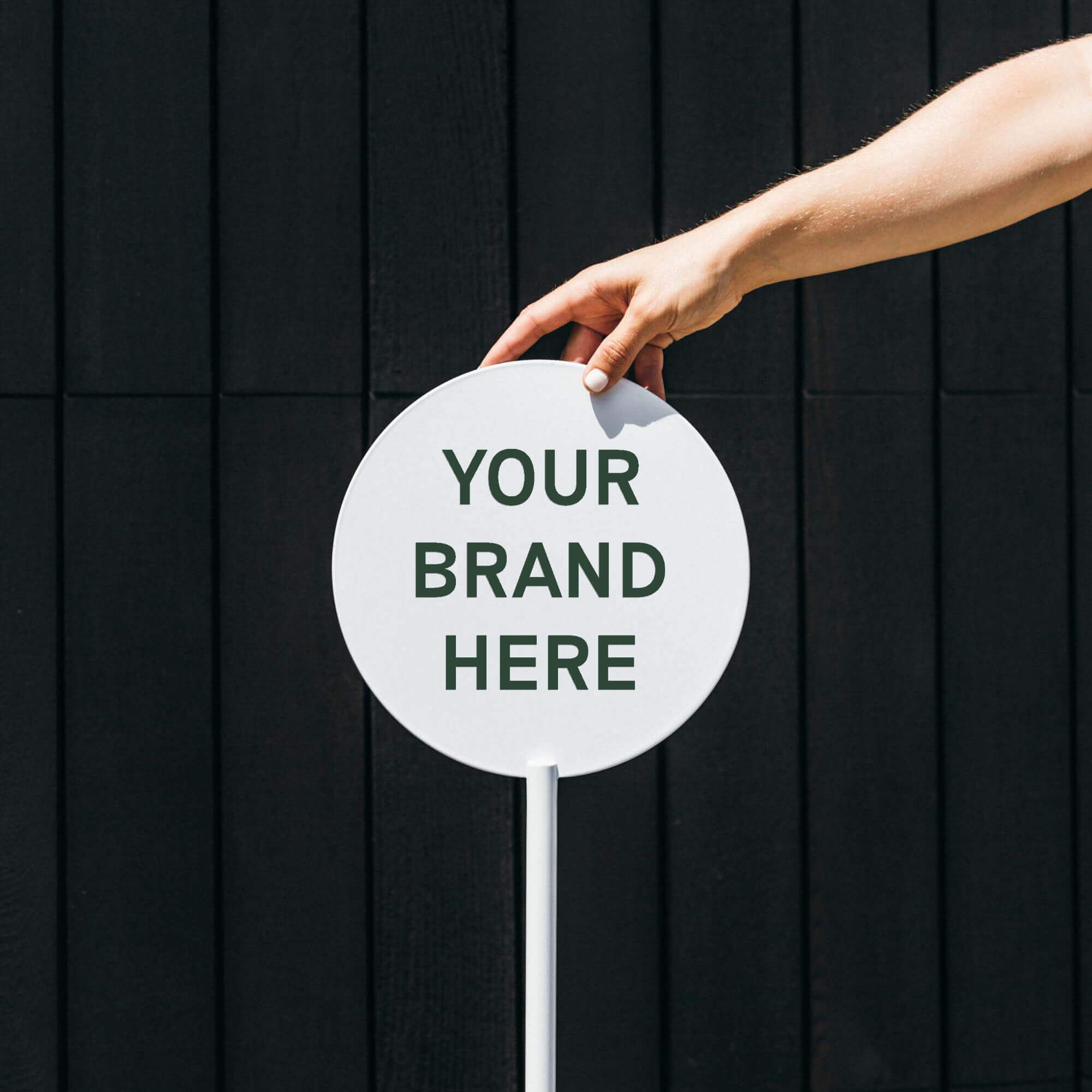
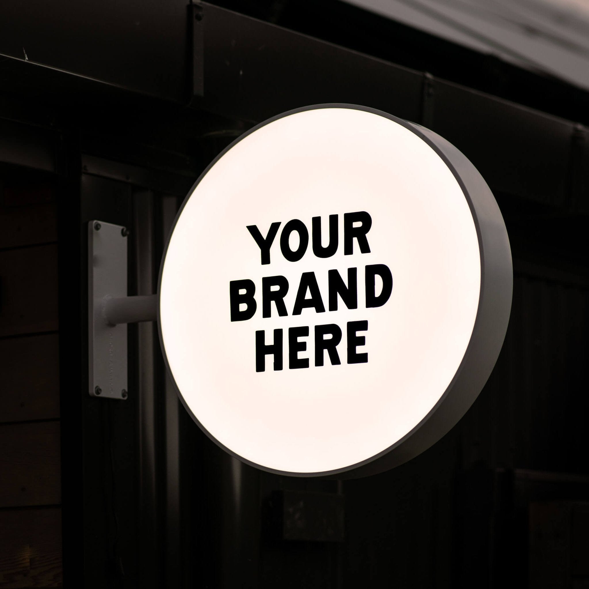
Absolutely. While many high quality signs are sold blank, they are designed for easy customization. You can work with a local signwriter to add a vinyl decal of your logo or branding. For signs with changeable letters, you can create any message you need on the fly.
Why is consistent branding important for all signage?
Consistent branding across all signs, including your counter signs, builds brand recognition and trust. When your logo, fonts, and colors are consistent, it creates a professional and cohesive experience for your customers, which can lead to increased loyalty and revenue.
How often should I update the messages on my signs?
For dynamic signs like chalkboards or letter boards, updating them daily or weekly keeps content fresh and engaging. For more permanent counter signs displaying key information like a price list, update them immediately whenever that information changes to avoid customer confusion.
Where can I find inspiration for my business signage?
Look at cafes, boutiques, and restaurants you admire. Social media platforms like Pinterest and Instagram are also full of inspiration. Following design focused signage brands like George & Willy can also provide great ideas for creating a clean, modern, and effective signage system.